Website

Client
Friends of Crocheron & John Golden Park is a NGO, founded by Jessica Burke and Christopher Petrizzo. The organization has a mission to promote the preservation and enjoyment of the park, and to raise funds for restoration and enhancement of the park.
Team Members
Eric Yu
Erin Murphy
Gaurav Patil
Nikita Bawa
Yang Cheng
My Role
- Formulating Filter Questions
- Developing the questions & tasks for the study
- Participant Interviews
- Data Analysis & Problem Identification
- Recommendations & Mock-up Designs
Process
Project Timeline
March 22 : Client Kick-off meeting
April 5 : Project Proposal to Client
April 5 – April 11 : Participant recruitment for study
April 11 -April 30 : Participant Interviews
April 30 – May 3 : Data Analysis, Problem Identification, Formulating Solutions & Recommendations
May 3 : Client Presentation
May 3 – May 10 : Final Report Drafting
Client Kick-off Meetings
The client kick-off meeting was done through a zoom video call. The objectives of the meeting were to know more about the client goals, understand the problems they are facing with their website, learn about the client’s expectations from the study, and establish key website features they want to investigate and test on target users.
From the meeting the client wanted our team to focus on investigating the user experience of a few features of the website including the history page, volunteer registration process, donations and blogs. We formulated the study objectives around the client’s needs and developed the user study to achieve these objectives.
Study Objectives
- History Page : Gauge user expectations and interest, access the usability of the information architecture, and user engagement with interactive page content.
- Blog : Investigate user needs and Interest, learn user patterns for consuming content, determine ways to improve blog experience and engagement.
- Volunteer Registration Process : Learn about user expectations and interests in volunteering, explore ways to encourage people for volunteering events.
- Donations : Assess if there is enough information for users to make donations, Evaluate the efficacy of the current donation process on the website.
Project Porposal
I drafted the project proposal that included the study objective that the whole team had formulated. In the proposal I laid down the study objective for the client with details on all the things we were going to investigate in the study. Additionally, I added broad target users categories from which the team was going to recruit from. We sent this proposal to the client for any feedback they might have.
ParticipanT Recruitment

To recruit the participants from the target user demographic we created a user participation form using google forms. In this form we included questions that would help us assess participants’ interest in parks and whether they are suitable candidates for this study.
After we had all the questions on the form finalized we used several mediums for participant recruitment including the newsletter of the client organization, several social media outlets like reddit and discord, and Pratt email groups.
Once we had positive interest responses from people, we started to schedule the interviews with them using google form to mark their availability. After we had the availability of the participants we confirmed interview appointments with them.

Participant Interviews
The team conducted user interviews for a total of 8 participants. Out of these 8 interviews, I was a part of 3 interviews in which I conducted interviews for 2 participants and took notes in 1 interview.
Methodology
The moderated user tests were conducted over interviews on Zoom video calls. The whole test was divided into 3 sections – Pre-test questionnaire, Tasks, Post-test questions. In these the participants were asked a few questions as well as asked to perform a few tasks on the website. The participants were asked to share their screen while they were performing the tasks. Additionally, the participants were asked to think out loud so that we can access their thinking process as accurately as possible. After the interviews the collected data was analyzed to identify major usability problems in the website. Further, feasible solutions were formulated for these problems as recommendations for the client.
Pre-test Questionnaire
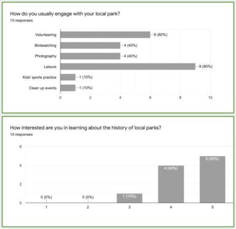
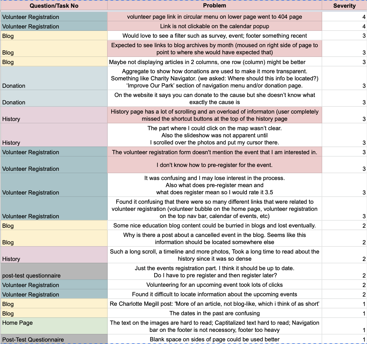
These questions were asked to gauge the participants’ interest and familiarity with the park and website.
Question #1
When was the last time you visited Crocheron park?
What do you like about the park?
What do you do there?
Question #2
Have you ever donated to the park?
How did you donate?
Question #3
Have you ever volunteered at any event in this park?
How did you register for the event?
Question #4
How familiar are you with the Friends of Crocheron website?
What have you used the website for?
Tasks
Users were asked a few questions and to perform these tasks on the website to determine the usability of these pages and features on the website.
History Page
Questions were asked to gauge the user interest in the content and structure of the history page.
Tasks were designed to learn how users interact with the website and whether they are able to intuitively understand the features on the history page.
Blog
Questions were designed to determine the user expectations from the blog as well as whether the blog page meets those expectations.
The tasks were constructed to help us understand how users engage with the interactive content on the blog.
Park Opportunities
Questions were framed to learn about user interests in activities and events in the park and their preferred means of participation in these events.
Tasks were designed to test the usability of the Volunteer registration process and the Donation process on the website.
Post-test Questionnaire
Question #1
What part of the website was confusing or lacking to you?
Question #2
Anything else you would like to add?
Question #3
Do you think this website provides enough information about the park?
Data Analysis
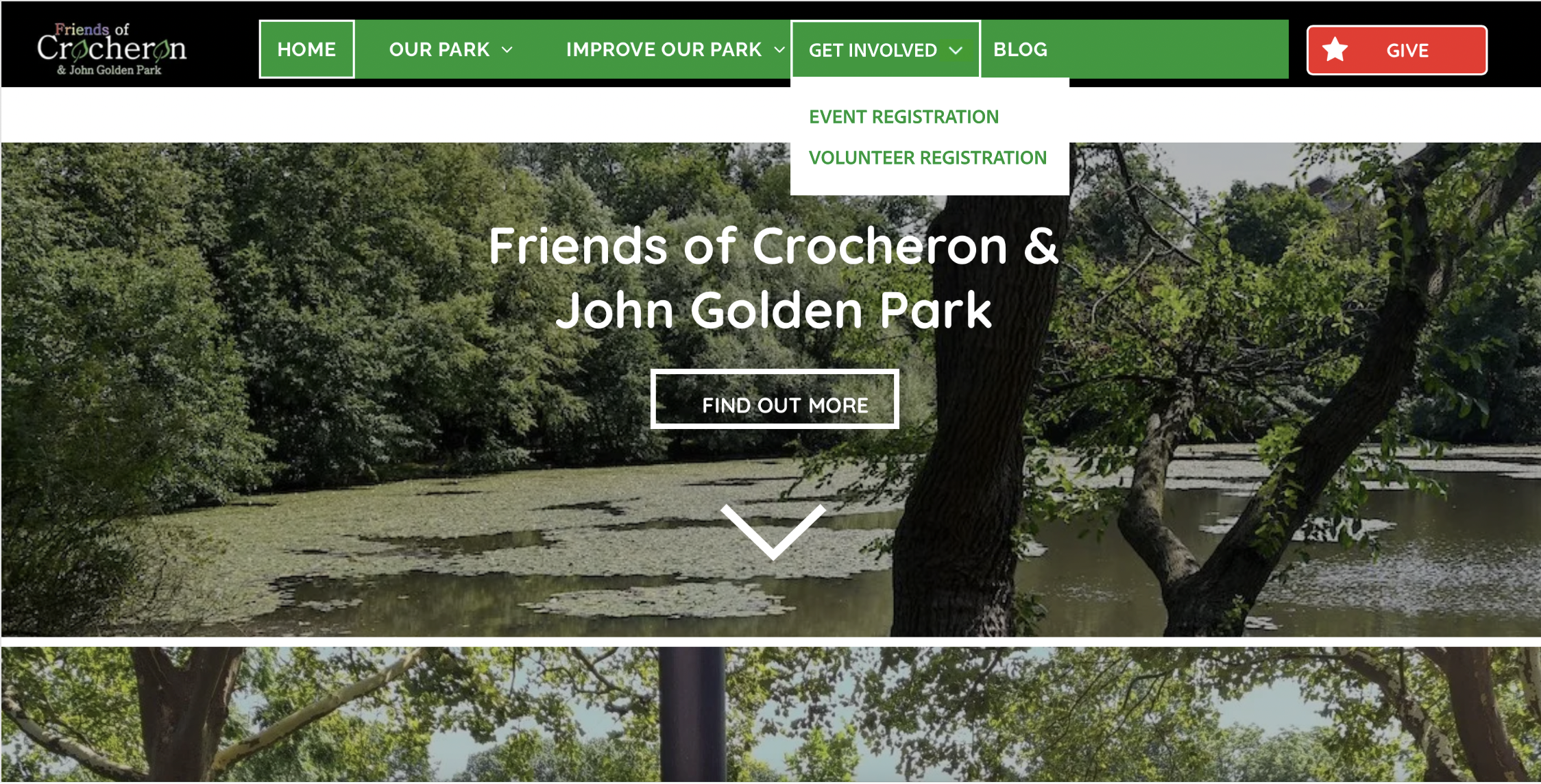
After the participant interviews, all the data from the interviews was filtered for problems. Further, duplicate problems were eliminated and similar problems were combined. Later these problems were assigned severity on a scale of [1 – 4]. Furthermore, user trends were observed from these problems to identify the root problems.
Solutions for these problems were formulated by the whole team, I specifically had major contributions towards the History page, Volunteer registrations and Donations. These Identified problems and their recommendations are presented in further sections.
Findings & Recommendations
Findings
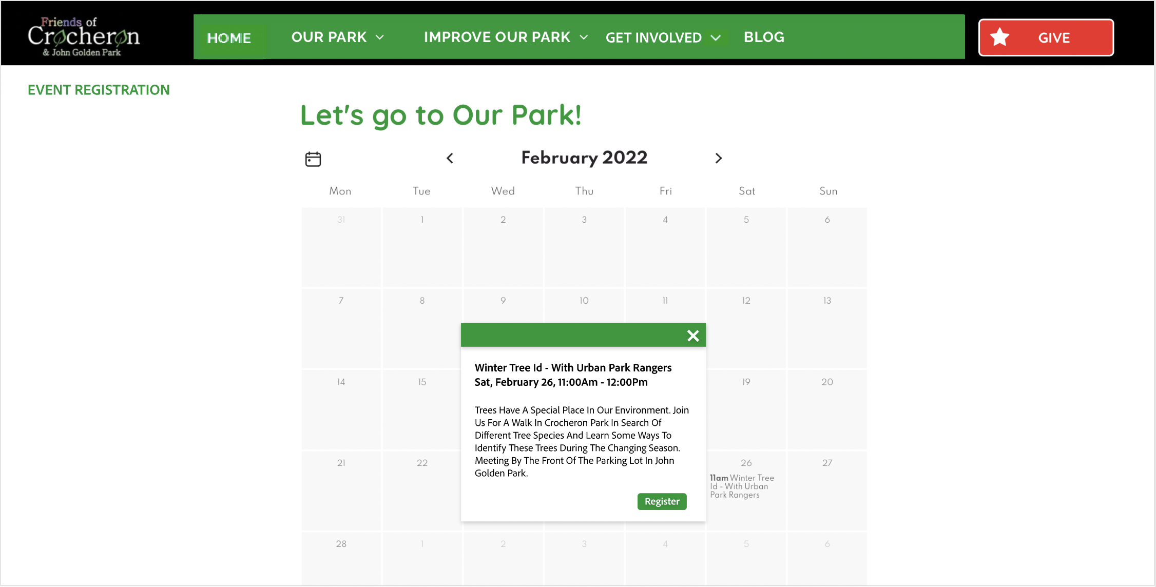
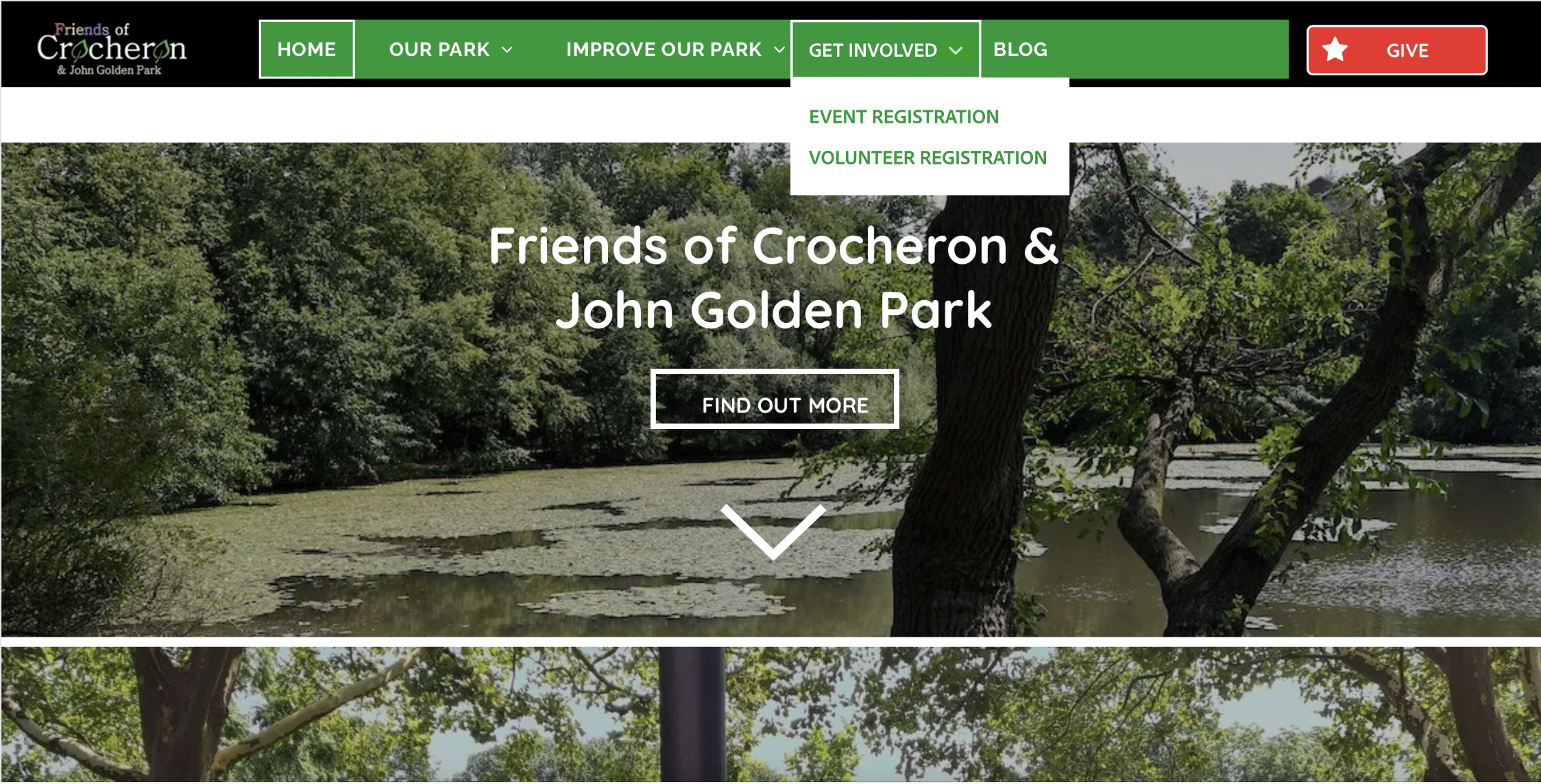
Finding #1 : On the “Improve Our Park” page, users were confused about the difference between volunteer registration and event registration. There are multiple volunteer registration links with one of the links being broken returning a 404 error page. Additionally, the users expected registration links to be present on the event details in the calendar.
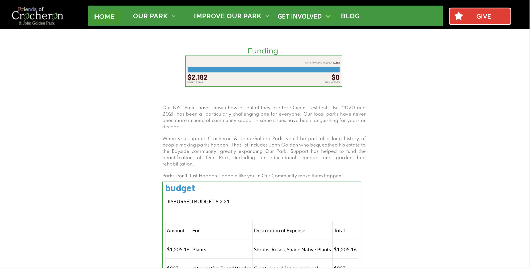
Finding #2 : When making a donation users find information about how the donations are utilized to be valuable and would like to see it on the donation page.
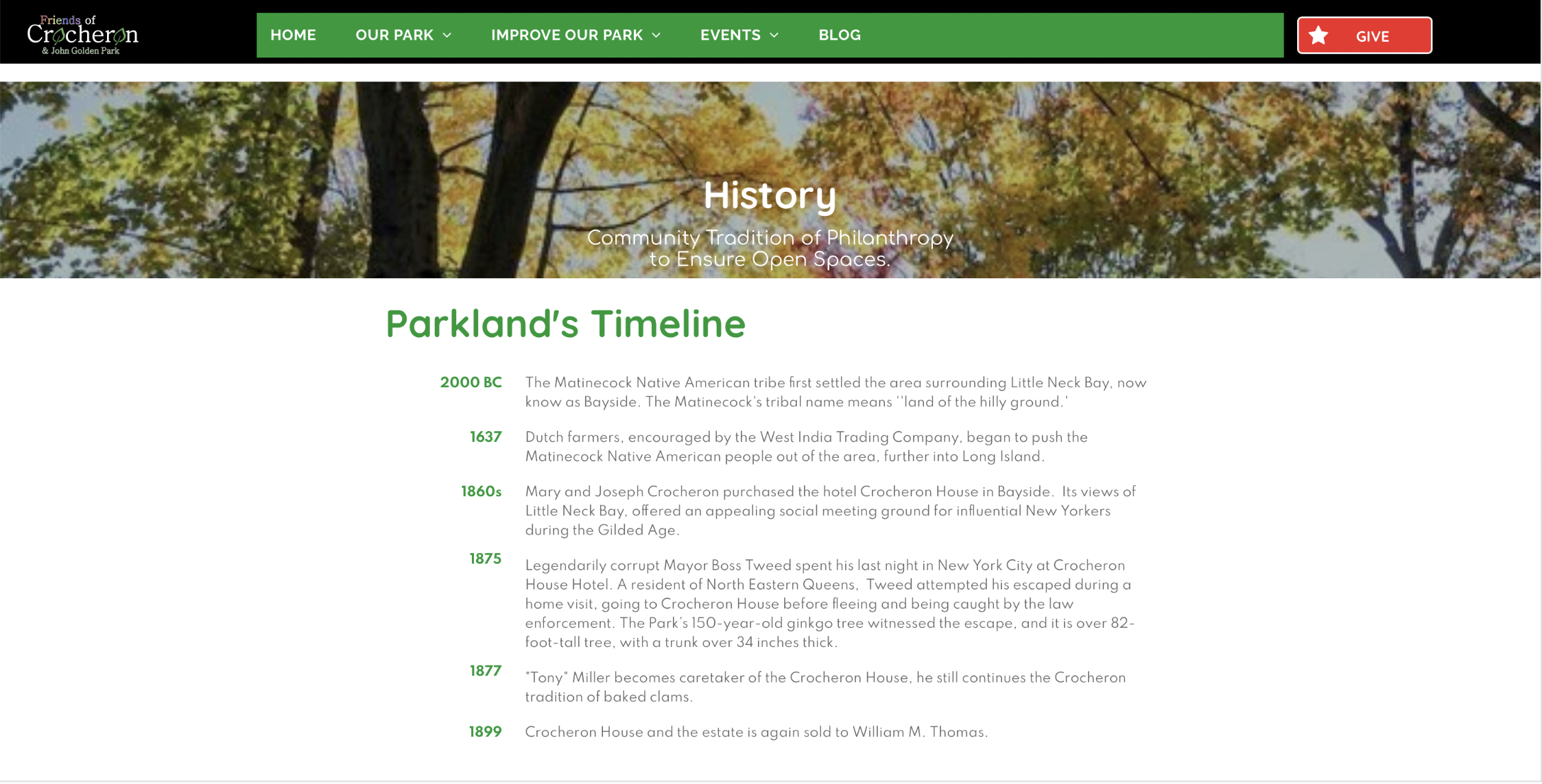
Finding #3 : Users want a clearer sense of the park’s chronology from the website. Users tend to enjoy the pictures and maps on the history page but don’t realize that they link to more in depth written content.
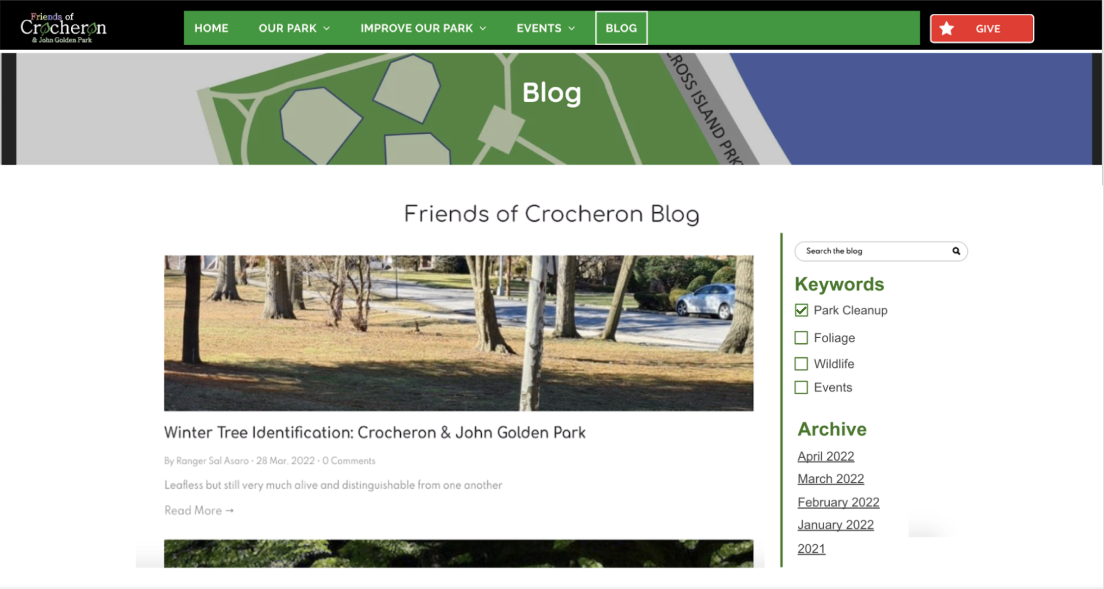
Finding #4 : Users found it difficult to search and discover blog posts due to the current layout of the blog.
Recommendations
Recommendation #1 : Create a single destination page for all the registration links from the homepage. Keep all the links consistent with the same destination webpage. Give two options once users clicks the registration button: {Event registrations, Volunteer registrations}. Users can register the events directly from the links in the calendar. For volunteer registrations provide the form you already have in the website for general registrations.
Recommendation #2 : On the donation page, provide information about how a particular donation category helps the park. Additionally, provide a link to a detailed fund usage on the donation checkout page.
Recommendation #3 : On the History page, make the section buttons present on the top of the history page more visually appealing by Increasing their size, add clickable photos, and add a timeline button as a history section that goes to the history timeline page.
Recommendation #4 : Order the posts by date in one column to adhere to the conventional blog format standards and add a clickable archive & keyword filter section on the right side of the page to assist with search and discovery.
Recommendation MockUps
After the team converged on possible solutions for the identified problems, we started to create Mockups for the recommendations. While all team members contributed in the design of the Mockups, I made major contributions in coming up with the design of the mockups of recommendations #1, #2 & #3.
Recommendation #1

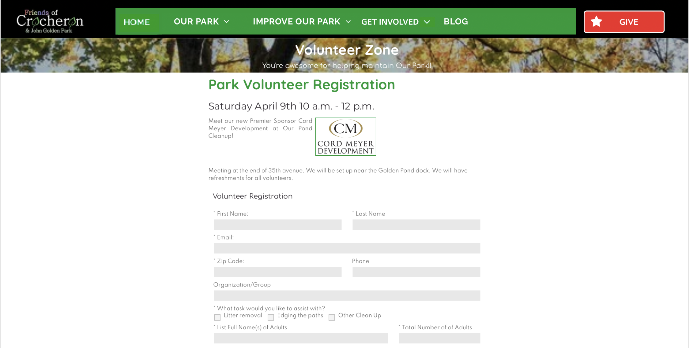
Volunteer Registration Mockup
Recommendation #2
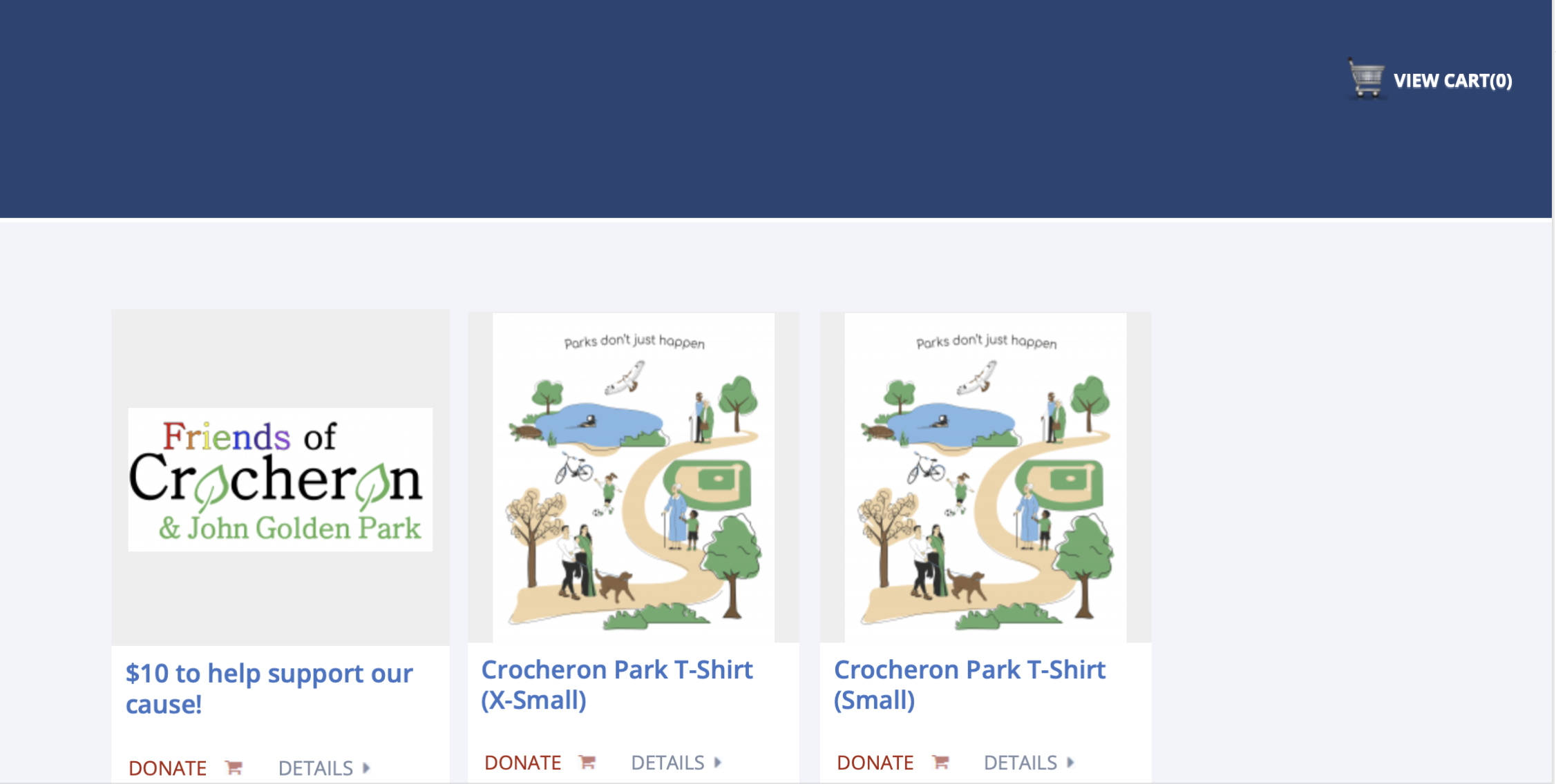

Category Donation Information
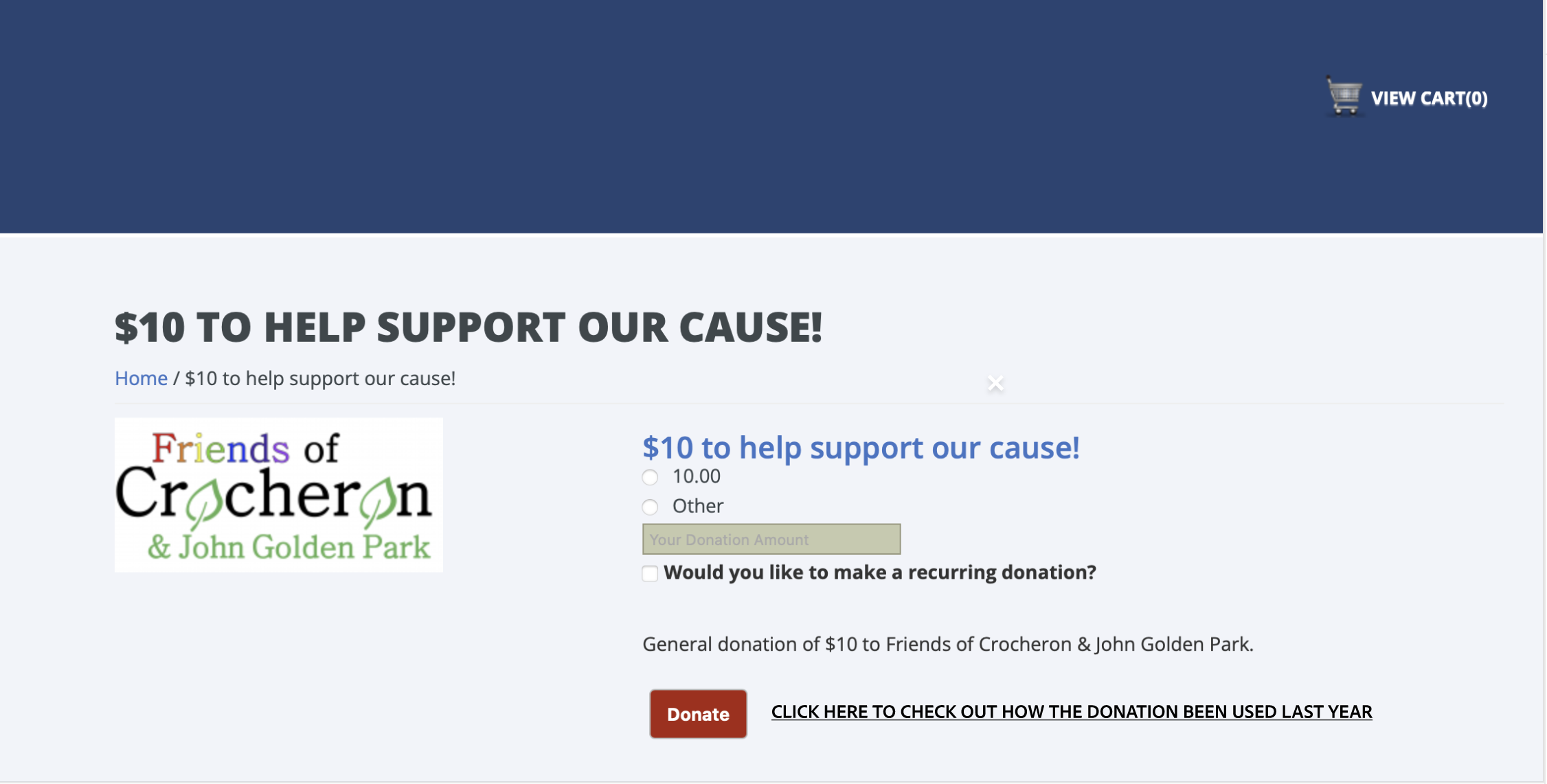
Detailed Fund Use on the Checkout Page
Recommendation #3


Addition of the timeline to the section + Cosmetic Changes
Recommendation #4

One Column Blog Posts + Keywords & Archive Filters
Additional Observations
Navigation Experience
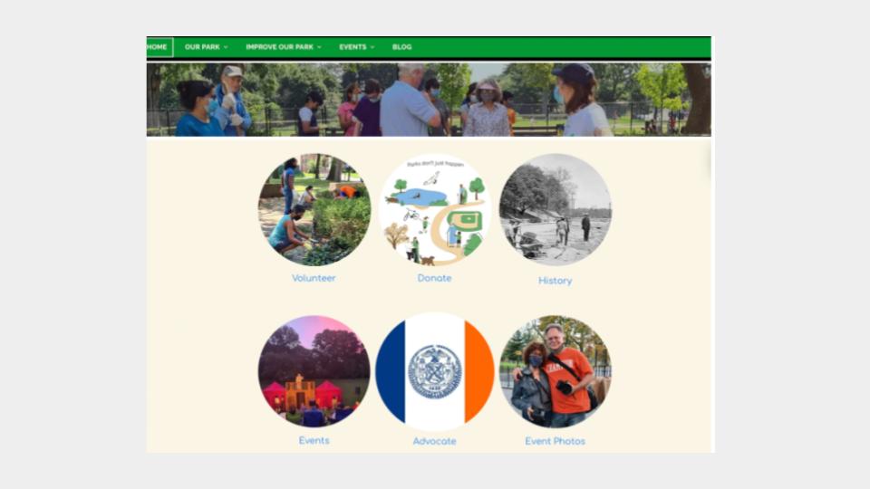
Users seemed to prefer using the photo links in the body of the home page to navigate around the website instead of the top navigation bar.
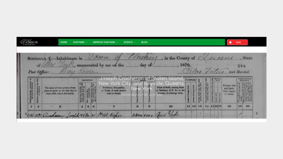
Blog by Charlotte Megill
Some users thought a blog post by historian Charlotte Megill might fit better in the history or other section.
History about John Golden
Users were easily missing the history about John Golden on the history page.

Conclusions
The Friends of Crocheron & John Golden Park website does an excellent job of providing information to its users about the park, activities & events, and park history. Additionally, it provides park goers with a medium to participate in the park events through event and volunteer registrations. Further, the website also allows its users to donate to the park. All these features make the website valuable to the community and the website helps the organization make progress towards its mission.
The website is rich in information and allows for interactive engagement by including photos, maps, slideshows and blogs. The website’s design is minimalistic, aesthetically pleasing and efficient for its purposes.
The moderated user testing conducted on the website revealed some usability problems in several areas of the website. The major were identified in the volunteer registration process, donation process, history page structure and blog design.
All the identified problems can be easily fixed by implementing the recommendation mentioned by this study. Even though the website in its current state does a good enough job of informing its users and improving user participation in the park, the implementation of the recommended solutions will help in solving the frequently encountered problems on the website.
Implementing the recommendations form this study will considerably improve and enrich the overall user experience of the website as well as provide an easy way to navigate the website for new and unfamiliar users.
What’s Next?
If I was to further continue with this project, I would like to test the recommendations by conducting another moderated user test focused on the recommended changes. This will help in assessing the efficacy of the recommendations as well as help get some feedback from the users of the website and the park.
Reference Links to the Report & Presentation Slides
Presentation Link: <https://docs.google.com/presentation/d/1sR9L89TiukyE0zbhwiEoqqh0I_FS_lPm/edit#slide=id.p1>
Report Link: <>