ADPList is a free mentorship platform that allows Mentees to connect and learn from Mentors in various fields, virtually. Mentors of varying levels of expertise volunteer to help spread knowledge to the community through this platform. This critique is an evaluation of their website ADPList.org based on Don Norman’s book “The Design of Everyday Things”.
The Home page
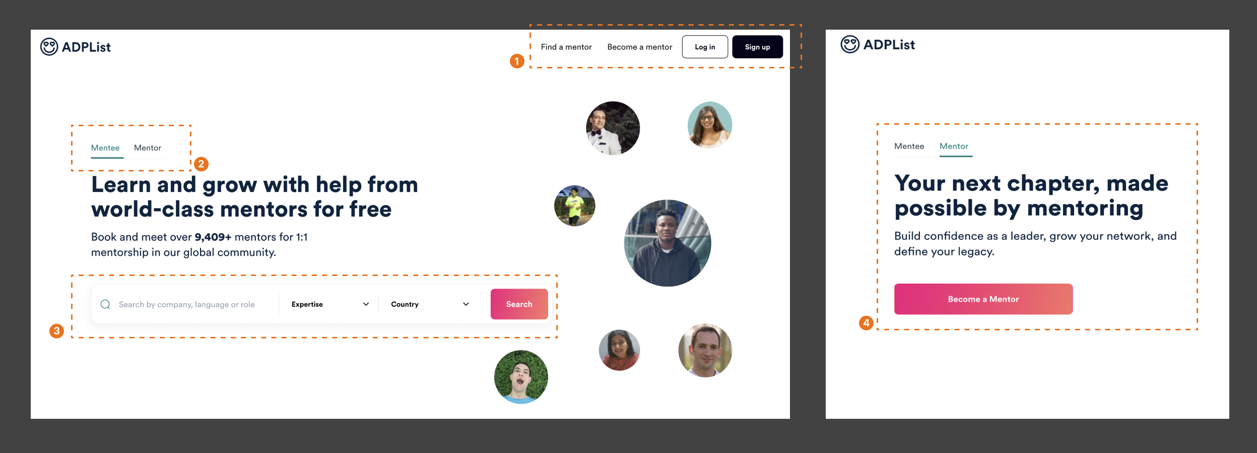
The website has two primary functions- for the user to “Find a mentor” or “Become a mentor”. These options have discoverability on the homepage by being present on the navigation bar. The “Log In” and “Sign Up” buttons are strong signifiers that the website affords logging in ( Fig 1. (1)).
The presence of the switching “Mentee” and “Mentor” options on the header, also add to the discoverability of the website’s affordances and act as a constraint, limiting the possible actions at a time. As the user switches to the “Mentor” section, the green underline switches, and the information changes, providing significant feedback that the user is now accessing information about another function. In placing the two Call to Actions in different sections, the designers avoided potential description-similarity slips.(Fig. 1 (2), (4)).
The Search bar under “Mentee” is a strong signifier that the website affords searching. Since first-time users would not have knowledge in the head, the text in the search bar further provides information to the user about what they can search for. However, the absence of constraints and feedback in the search bar, make it possible for the user to type in anything. The associated results might not be relevant to what was typed in, leading to a gulf of evaluation. Further, the Call to Action button “Search” leads to the same place as the navigation item “Find a Mentor”. The different labels disrupt the user’s mental model (Fig. 1 (3)).
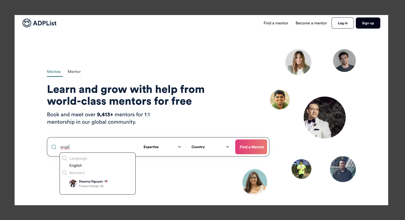
To solve these issues, the Search bar could make suggestions below it, related to the information available on the website while the user is typing, providing feedback. Further, the Call to Action button could be renamed “Find a Mentor” for consistency. ( Fig. 2).
Finding a Mentor
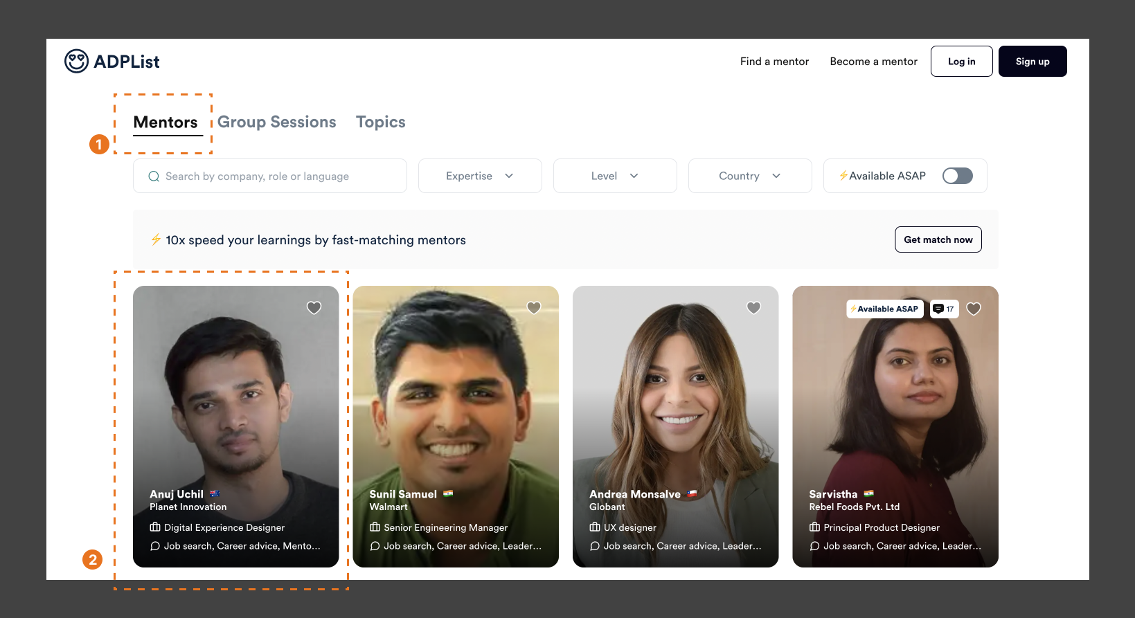
The website affords exploring mentors without logging in. The Explore page on the website, highlights the category being explored, providing feedback to the user that they are in the right place (Fig. 3(1)). Based on knowledge in the head, users know that the cards displaying information about the Mentor afford clicking, to know more about the Mentor (Fig. 3(2)).
Booking a Session with Mentor
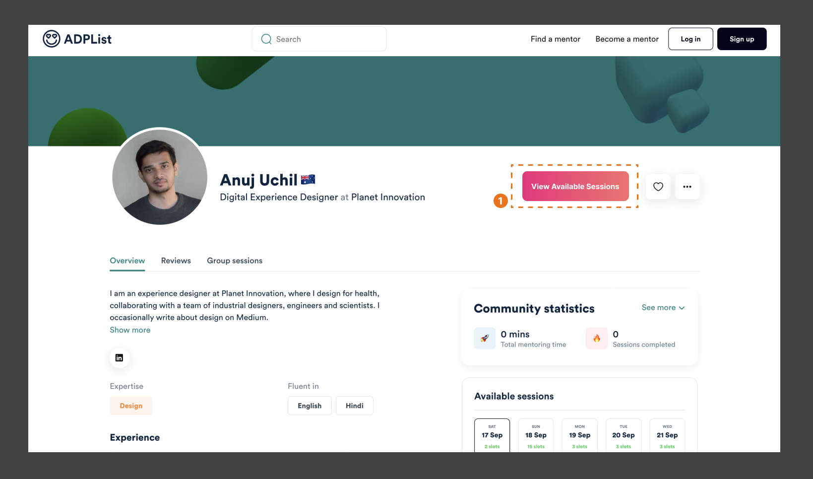
On clicking a card, the user is taken to the Mentor’s Page. Keeping the primary goal of meeting the mentor in mind, the page could improve on discoverability of what actions are possible, by placing the “View Available Sessions” signifier on top of the page, to improve visibility, which would scroll down to the “Available Sessions” section of the page (Fig. 4(1)).
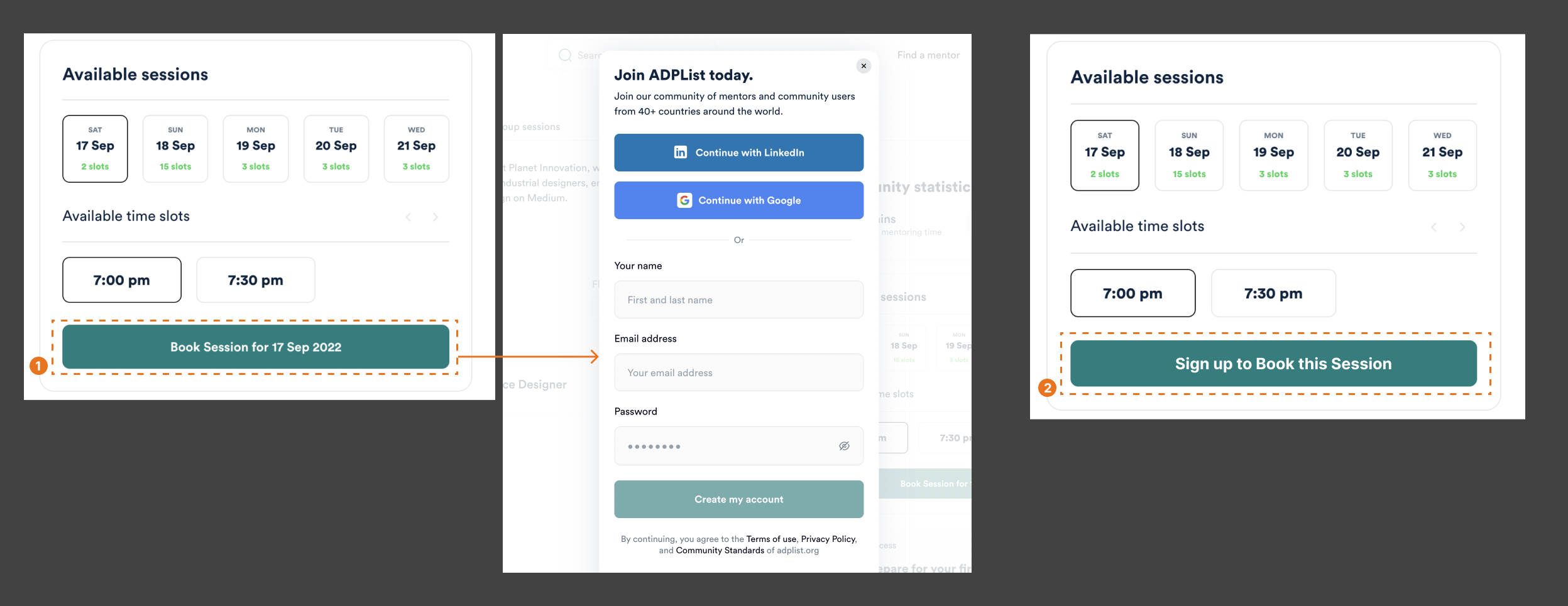
However, the “Book Session” button is a deceiving signifier, as it prompts the user to “Join ADPList”, instead of allowing them to book a session (Fig. 5(1)). This disrupts the action cycle by creating a gulf of evaluation. This can be avoided by providing an appropriate signifier that could read “Sign Up to Book this Session”, which would act as feedforward, bridging the gulf of execution by matching the feedback to an appropriate signifier( Fig. 5(2)). These deceiving signifiers are also seen in the form of other elements throughout the website ( Example: Like buttons). While they are needed as prompts to urge the user to sign up, they negatively affect the user’s experience by signifying affordances that cannot be used until conditions are met.
After Logging-In
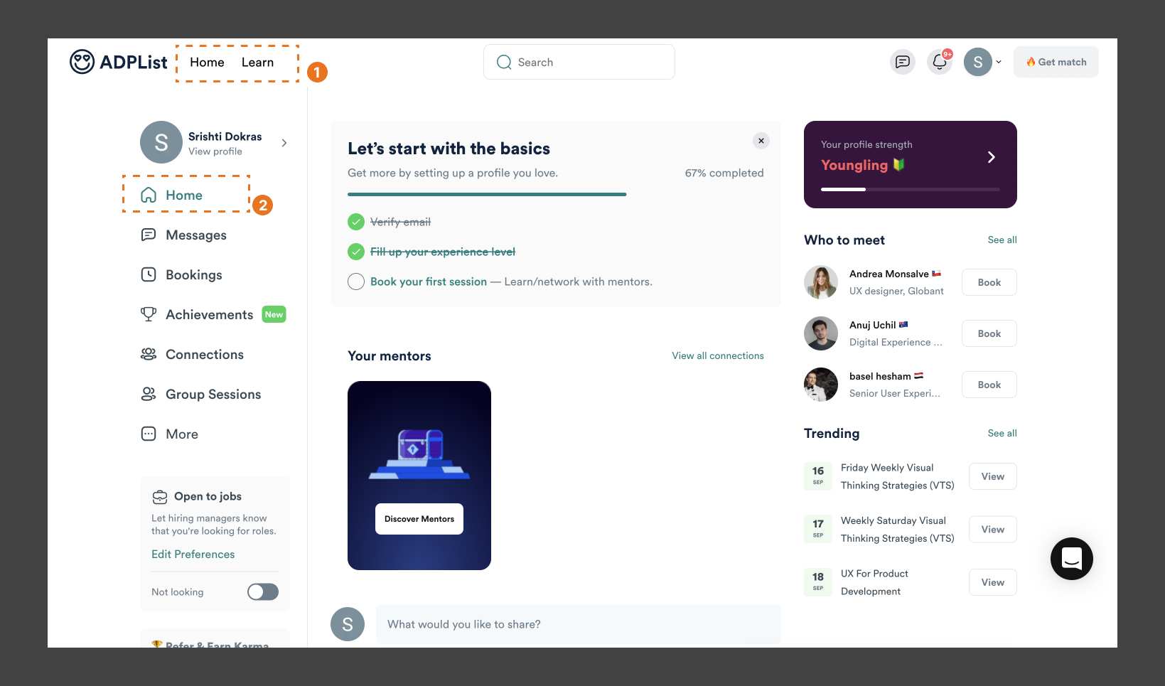
After logging in, the Home page becomes a dashboard interface, and the Navigation item “Find a Mentor” changes to “Learn” ( Fig. 6 (1),(2)). If users have spent significant time exploring the website without logging in, these new changes will negatively impact the mental model they have created, leading to user frustration.

A solution could be to prompt the user to sign-up / log-in as soon as they enter the website. Another solution could be to keep the conceptual model consistent, by keeping the same label in the navigation – “Learn” could be renamed “Find A Mentor”. Further, a consistent Home page for both versions and a separate Dashboard page on logging in could be added (Fig. 7 (1),(2)).
Conclusion
The website did a good job of keeping the two primary functions separated, with easy discoverability and understandability. However, there is scope for improvement in bridging the gulf of evaluation and execution at various points through appropriate feedback, signifiers, and conceptual model.