For over 150 years, Bank of New Zealand has served its customer’s wide variety of fiscal needs. In the modern age, this includes being available to customers as a digital/mobile experience. Their online banking app, available on the iPhone and currently in version 15.1.0, is the focus of this critique.
The following assumes that user has already established themselves both with the bank, and on the app.
Log-in screen

Upon loading the app, the user is presented with a heavily constrained login screen. The majority is taken up by a number pad, which presents familiar signifiers to both the physical (an ATM) and digital (a phones lock screen) worlds.
As the user inputs their passcode, the circles become filled, providing feedback. The code is automatically attempted once the correct number of characters has been input, and provides further input depending on whether the code was correct (proceeding to another screen) or incorrect (screen shake and the circles become unfilled).
A button titled “forget?” Is presented within the numberpad, which sends the user on the flow to reset their passcode. It relies on the its proximity to the number pad, and cultural knowledge of similar flows, to signify what it affords.
Two additional buttons, located at the top of the screen, allow the user to locate and contact the bank, respectively. Although these can be intuited based on cultural knowledge, being purely symbolic leads to ambiguity. For instance the left marker might attempt to locate you via GPS, while the right may initiate a phone call. Additional text beneath the icons, reading ‘locations’ and ‘contact’ for example, might help alleviate this issue.
Main landing
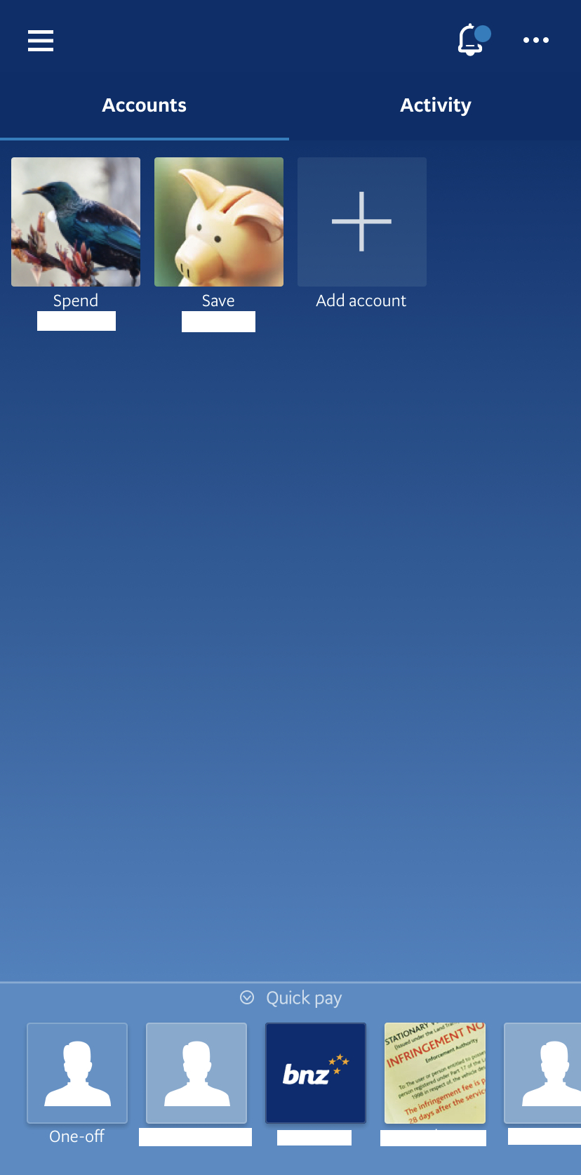
Once the user has logged in, the main landing presents a minimal amount of information. Perhaps user testing has revealed the primary activity on the app is reviewing the users accounts, which are presented with a brief summary (name and amounts). This layout is also to a iconographic interface found on an iPhone, signifying that the icons afford interaction. The users mental model would suggest that this would present additional information about the account.
Like the app overall, actions are highly constrained. Other signifiers include a quick link to transfer money, a hamburger style icon signifying additional menu items, a bell with an alert icon signifying notifications, and an ellipsis signifying more options. Much like the symbols on the login page, these latter three are familiar to those who have experience with other digital apps. All links immediately bring up either a modal or another screen, giving the user feedback. It is also possible that a new user may be presented with a tutorial flow, demonstrating what the icons signify. This would allow the app to forgo text with the icons, but was unable to be tested at this point.
Activity
Another signifier on the landing page, the blue line beneath “accounts”, suggest that it is the tab the user is currently on. This also signifies that “activity” affords interaction. Some confusion might arise in the users mental model at this point, as “activity” and “notifications” are sometimes used interchangeably. But if the user sees the bell as representing notifications, it becomes unclear what “activity” might represent. Much like the icons, effective labelling is a difficult task. Alternative terms may be used, such as “your activity” and “recent notifications”.
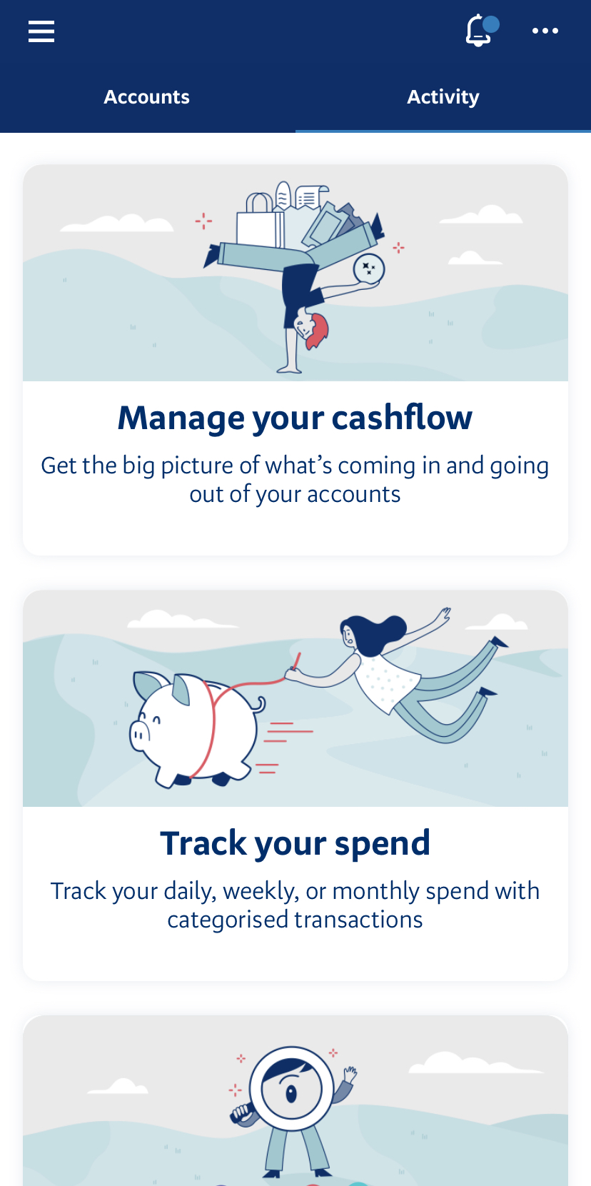
Once the user switches to the “activity” tab, they are presented with 2.5 items (the third being cut off suggests that the user is able to scroll down for additional items). Even at this point the uncertainty may persist, as the brevity of the descriptions presents little knowledge in the world that the user can utilise. Perhaps they’re articles on managing your money, or tips on how to track spending. In reality, each leads to a small dashboard with information about the users spending habits. The app however does a good job of immediately showing the user what exists on each page, and allowing them to quickly step back, meaning that a trial and error approach to investigating content has minimal pain points.
The Mighty Hamburger
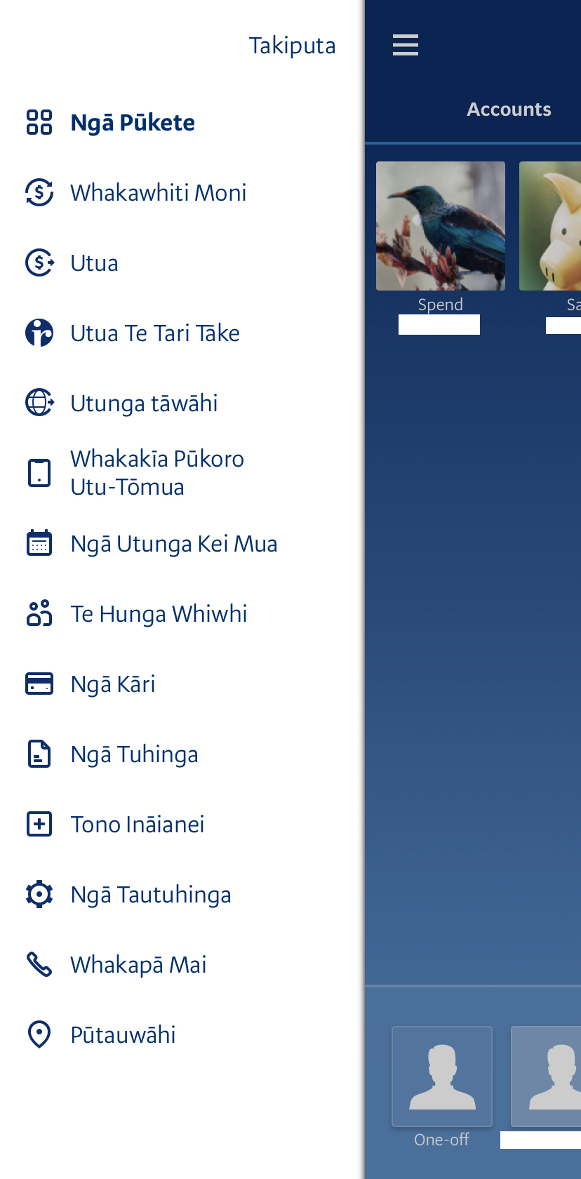
Those are the obviously afforded options available to the user from the home screen, but it theory a bank offers many more. This leads to a discoverability problem. The application enabled a streamlined experience by obfuscating many of its features. These features are hidden in the menu accessed by the hamburger symbol, which assumes a certain amount of digital literacy.
However once the menu is accessed, the discoverability concerns abate. Each menu item contains both a symbolic representation as well as a label. This includes card management, transferring funds internally and externally, and providing statements. While this critique won’t dive into them all, they each follow the highly constrained design philosophy seen throughout the rest of the app. Although, in rare instances, they instead open a browser window pointing to the much more comprehensive web portal.