
Etsy is a website and mobile app for buying and selling millions of custom and creative one-of-a-kind items, ranging from vintage decor, kitchenware, furniture, handcrafted jewelry, etc. This report will evaluate Etsy’s mobile app (specifically version 6.10.1) from a shopper’s perspective while using concepts discussed in Don Norman’s book The Design of Everyday Things.
Navigation after logging in:
Once the user logs in to their account on the Etsy app, it is clear that the app follows the principles of visibility, as the user can easily visualize what commands are available at a first glance.
The bottom of the screen displays icons which affords navigation between each page. This affordance is clear to the user due to the signifiers of the icons, specifically, the labels under the icons. These labels make the app more understandable to users who may be unfamiliar with some of the typical icons used across mobile apps. The red circles with numbers on these icons are another signifier, which informs the users that there are notifications on those specific pages and the amount of notifications they have. Once each icon is clicked, there is immediate feedback. This feedback includes: change in the entire content of the page, change in the title of the page to match the label of the icon clicked, and change in the icon color from light gray to white. The placement of the navigation bar, as well as the signifiers of the icons and feedback given provides a clear mapping between the controls, the intended actions, and desired results. However, there is some inconsistency with this feedback. Both the “Explore” page and the “You” page do not have titles at the top that match the icon’s label. In addition, the navigation bar is visible on all the pages except for the “Cart” page. When you click on the “Cart” icon, the navigation bar disappears, and the only way to view it is to click the X mark at the top left corner of that page. These inconsistencies can create confusion in the user’s conceptual model of the system image.


Recommendation: I recommend adding “Explore” and “You” titles on the top of those pages to match their respective icons. On the “You” page in particular, this title should replace the search bar. There is already a search bar on the “Shop” page, so constraining the “You” page to content that matches the intended purpose of the page would simplify it for the users. In addition, I recommend making the navigation bar visible at the bottom of the “Cart” page to create consistency.
Shop Page:
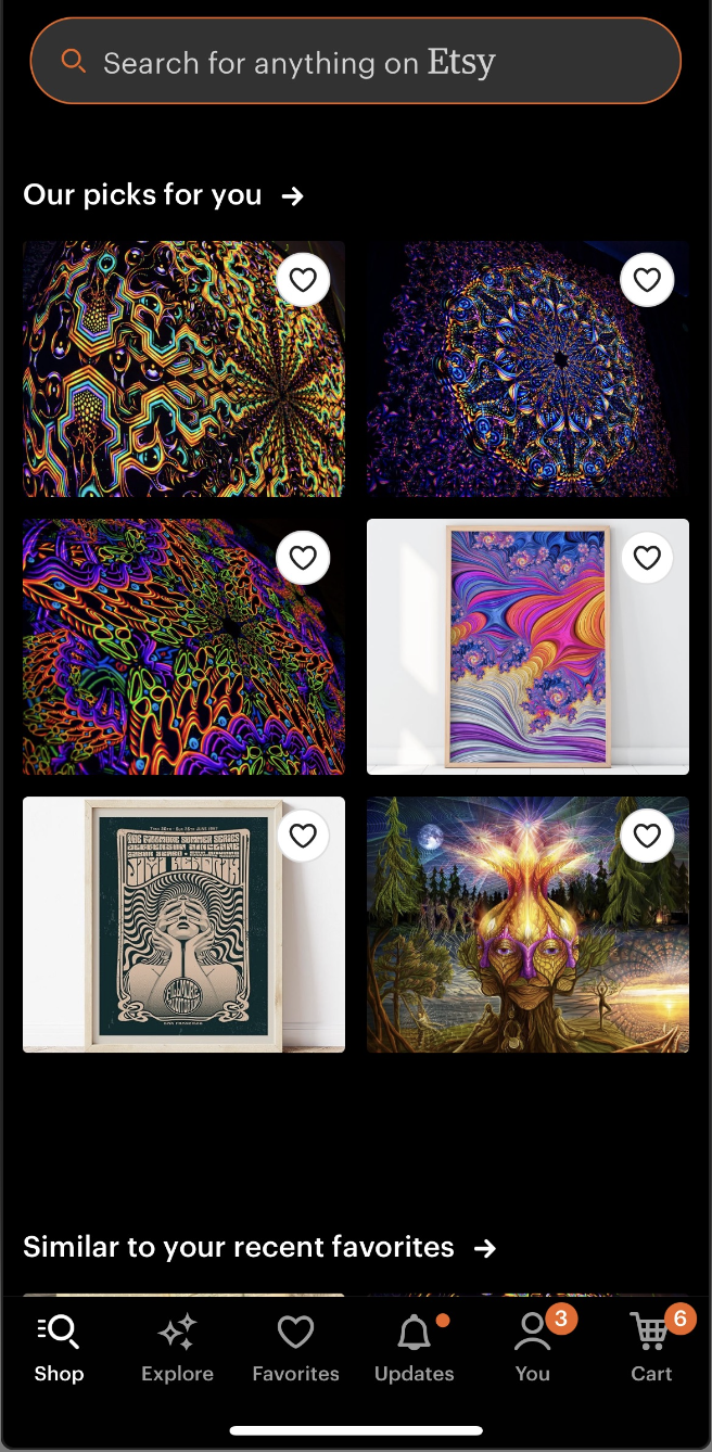
There is an abundance of valuable content on this page that can help users find the items they are looking for through complex categorical recommendations. However, the order of each category is not only confusing, but can alternate when you refresh the page. This randomization of categories can be useful if the designer’s intention is for the user to be exposed to the different categories without having to scroll. However, the current conceptual model does not match the user’s knowledge of the world. The overload of possible features on this page leads to creeping featurism, as the designers extended the number of categories beyond all reason.
(video to include here once I figure out how)
Recommendation: I recommend moving the “Recently viewed” category to the top of the page to make it more discoverable for users. Although the layout of each category is visually appealing, I would create more consistency in the alternations of these categorical layouts as they are currently randomized (ex. the 3×2 layout with square images, the 3×2 layout with circle images, the single row layout, etc.). Norman states that “complexity is good; it is confusion that’s bad.” In order to tame the complexity of the page, it must provide a good conceptual model. Thus, I would also recommend to either limit the number of categories of recommendations, or to organize them hierarchically based on importance.
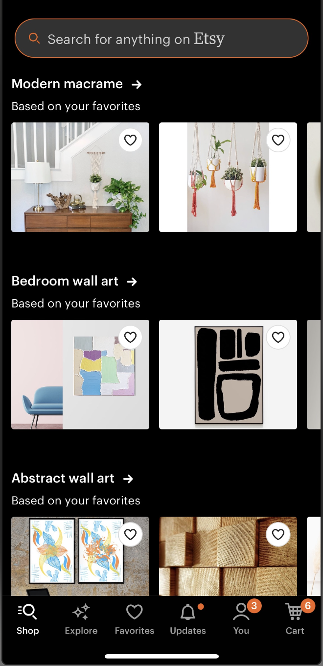
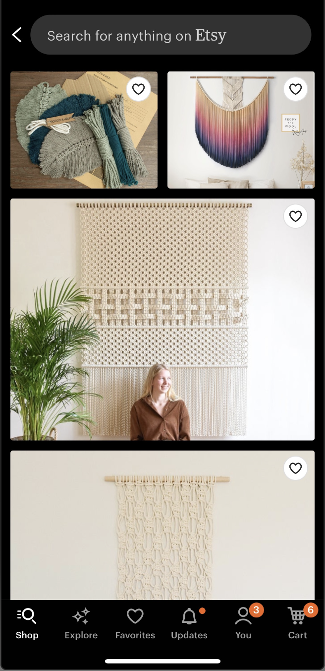
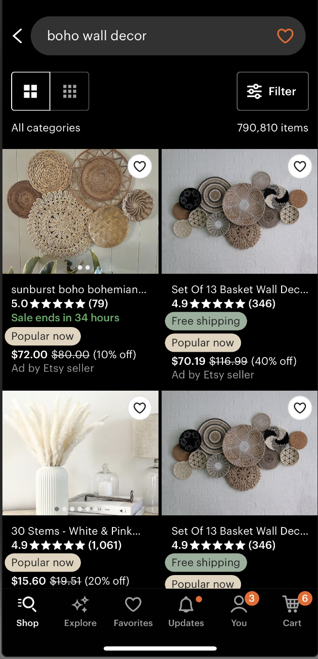
In the single row category layout, the cut off image on the right signals to the user that it affords swiping through different options. Once these options end through swiping, the user can click the arrow next to the category title which signifies viewing more options in this category through the user’s knowledge in the head. This leads to a page of more recommendations, which only shows images of the products IF you click on the “Based on your favorites” categories. Information about these products are not discoverable unless you click on them individually. However, when you click on any other recommended category aside from the “Based on your favorites” categories, or even search for a particular item directly from the search bar, the amount of discoverable information changes drastically. Now, you can view the price, rating, title, whether or not it has free shipping or is popular now, and the images themselves afford scrolling without having to click on them due to the signifying dots on the images. There is also a discoverable signifier to filter the content as well as two icons to determine how you want to view the content (2 columns or 3 columns). The inconsistency of the layout of the page when viewing content from a “Based on your favorites” category versus viewing content from other categories or the search page directly negatively impacts the user’s conceptual model of the app. It also creates a disruption in the feedforward process in Norman’s Seven Stages of Action as the same features are lacking when viewing content from the “Based on your favorites” categories.
Recommendation: Make the same features available when viewing content from the “Based on your favorites” categories as when you view content from the search bar or other recommended categories.
(video to include once I figure out how)
There are no constraints on the amount of content you can view after searching for a particular item in the search bar. Constraints simplify memory, and incorporating constraints on the amount of content users see could make it easier for the user to go back to an item that piqued their interest (if they did not actually click on the item; if they did, they can refer back to the “Recently Viewed” category). The user may run into an action-based slip, where they intend to click on an item, but instead accidentally click at the top of the page above the search bar. This would then lead to the wrong action being performed, which is the page scrolling all the way back to the top. The user would then struggle to scroll back to the item they were looking at due to the lack of constraints on the amount of available content. This feature might be intended by the creators to encourage endless scrolling so the user stays on the app longer, but it is not worth the frustration the users may run into.
Recommendation: To prevent this kind of slip from leading to frustration, I would recommend limiting the amount of content displayed after searching for an item. Once the user scrolls to the bottom, there should be a button to go to the next page of items, a button to go back to the previous page, and a list of numbers so the user can see which page they are on. If this kind of action-based slip does occur, there would be less content on the page, and so the user could easily scroll back to the image they were looking at.
Conclusion
Etsy’s mobile app is currently rated 4.9 out of 5 stars from 3.7 million ratings and ranked #7 in the “Shopping” category of the iOS App Store, providing some indication that it is a well developed interface for users. This app incorporates characteristics of good design, understanding and discoverability, as described by Norman in The Design of Everyday Things. Although Etsy’s mobile app excels in these characteristics, there is still room for improvement. Since this evaluation only focused on a few attributes of the interface, the app warrants further evaluation of other attributes. In addition, an evaluation should be done to describe the experience of the seller as well.