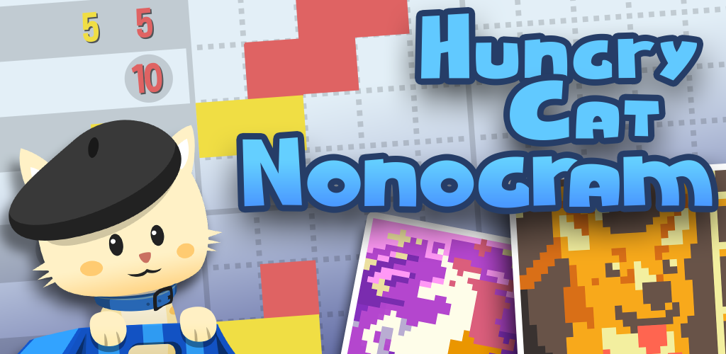
Hungry Cat Nonogram is a simple iOS game application focused on nonograms – puzzles where players use number hints and logic to correctly fill grid squares with colors to create pictures. Players can use coins gained from successfully completing puzzles to customize a cat companion that accompanies them to each puzzle.
The game was launched by the company Tuesday Quest in December 2013, and the most recent update was released in September 2022. The game is updated frequently; new puzzles are released every Tuesday.
This blog post explores the design of the application’s interface through three specific attributes of the puzzle-playing interface: buttons, the puzzle grid, and cat customization.
Attribute: Buttons
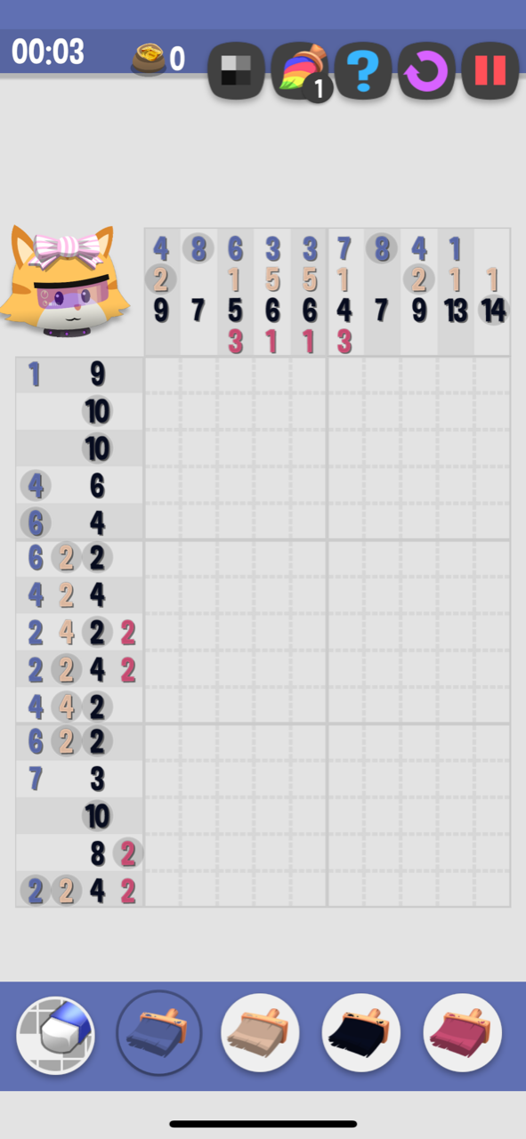
The buttons at the top and bottom of the screen are physically constrained to only include controls that allow the user to complete or pause the puzzle. These controls are given clear signifiers by outlined icons, suggesting to a user that these areas of the screen have an affordance to be clicked. Most controls, too, match a user’s conceptual model of what affordances these signifiers suggest – paintbrushes place color, an eraser removes color, and more. All of these give immediate feedback – whether through the changing of colors or the opening of a new screen – when clicked.
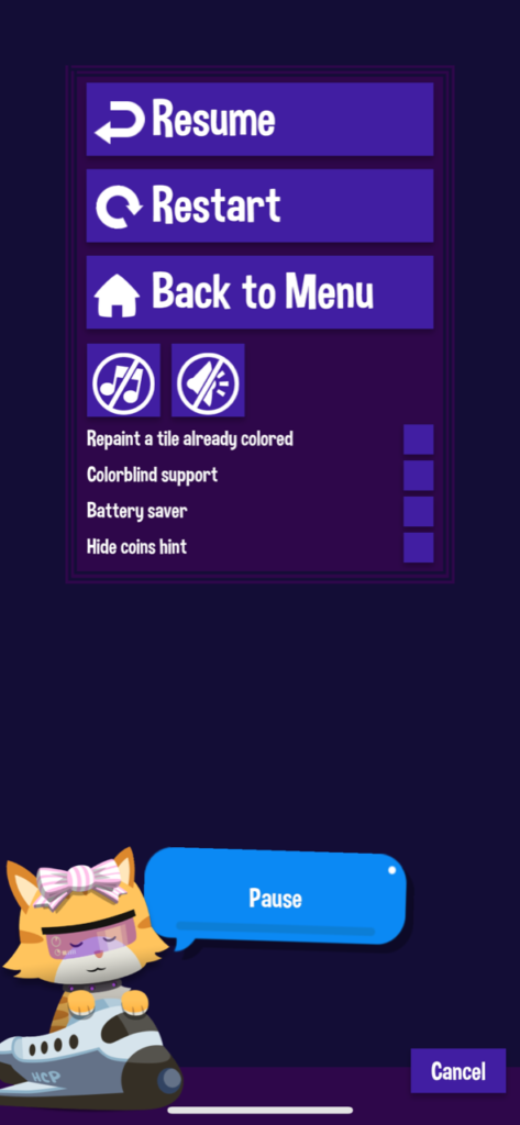
The affordance of one of these icons is designed to help a user navigate through slips: the “Undo” button, which is located at the top of the screen as an arrow rotating clockwise. Another is designed to help a user navigate through mistakes: clicking the red “Pause” button at the top of the page opens up a few settings options, including the option to start the puzzle over.
While much of the design here is clear, there is one specific signifier for an affordance that could be greatly improved. The affordance signified by the “?” button is unclear and nebulous. It is not until clicking this button and exploring the results does the user understand that this button allows them to tentatively place colors while testing out a particular solution. To make the affordance of this button clearer, the signifier should be changed to a pencil icon; in similar puzzle games, like Sudoku, this signifier is used for the same affordance, which will support those users who have conceptual models informed by those puzzle games or the temporary, erasable nature of a pencil when compared to a paintbrush.
Attribute: The Puzzle Grid
The numbers around the frame of the puzzle have unclear signifiers for the knowledge they are trying to convey to the user. From the application designers’ standpoint, circled numbers are meant to signify that the colors placed onto the puzzle must be continuous (i.e. four blue squares in a row), and uncircled numbers cannot be placed continuously. The numbers signify how many squares of a particular color should be placed in a row.
The communication of this knowledge does not exist in the world of the application. A new user must travel back to the application description on the App Store to gain this knowledge or look up a guide online. If a returning player has lost the knowledge in the head they built from previous experimentations to understand what these signifiers mean, they must do the same.
Currently, in the application, the “Pause” button opens various settings, a common design technique used in the conceptual models of other mobile and video games. A new affordance with a “Help” button signifier should be added here to allow the user to open simple and succinct game instructions. “Help” information is often included alongside settings in the conceptual models of other games, which should increase this affordance’s discoverability for new players of this game.
Attribute: Cat Customization
On the puzzle interface, the image of the cat is also interactive, and clicking on the cat will open up a window to customize the cat. Because it does not have a clear signifier that tells the user it is afforded to be interactive, it is easy for the user to slip, click it, and move away from their goal of completing the puzzle. Clicking the cat also distracts from the main goal of this interface: completing the puzzle. A physical constraint should be added here to remove the clicking affordance from the cat.
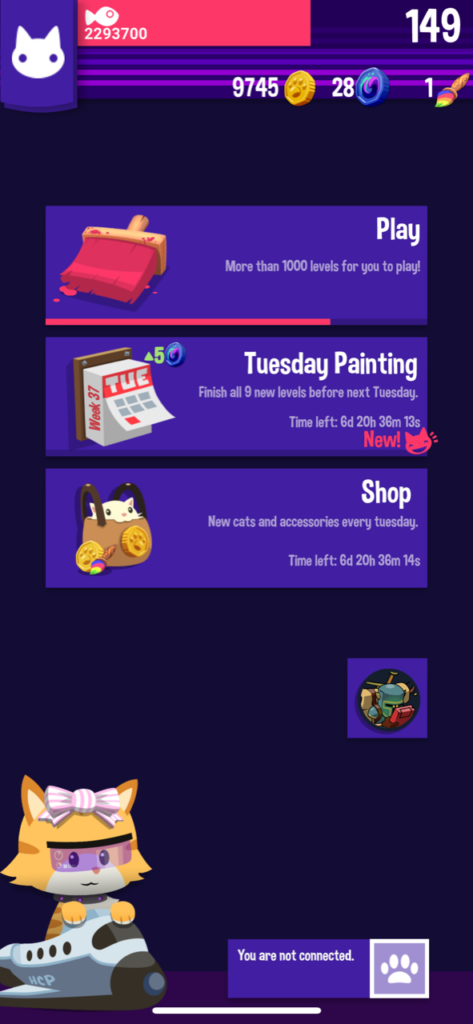
This is not the only affordance for customizing the cat in the application but, unfortunately, the other affordance is also difficult to discover. This second affordance is located on the home page of the game application as a moving image of the cat.
To fit with the cute aesthetic design of the game, a clear signifier could exist as a speech bubble coming from the cat with text that says “Click me to change my outfit!” This could also be changed to “Pet me to change my outfit,” to try match user’s conceptual models that may tell them that petting a cat requires tapping it, which users may be able to map with the action of clicking in a digital interface, but this may require user testing to understand if this signifier is clear enough to solve the problem.