
The Kayak Android mobile app provides an easy way to find flights, hotel stays, and rental car services. It is probably best known for its flight searching capabilities. The mobile app centers around a pared-down search tool but has other features as well that appear upon opening the hamburger menu or browsing through pages. Kayak excels at creating a clear conceptual model of how to set up and run a search, but not of the entire scope of the app’s features. A streamlined interface may also be a trade-off for invitations to human error, by hiding affordances or placing unrelated action items too close together. It is interesting to note that Kayak was one of the earliest exemplars of creating more usable graphical interfaces for travel booking, but now may be extending its feature list too far in an effort to retain competitive edge in the industry.
The homepage: search for flights, stays, and rental cars
Well done natural mapping places the two controls for selecting the search mode as close as possible to one another: the button the user needs to tap, and the search box below it. Signifiers on the buttons reveal what type of search this will be in the form of an icon of an airplane, bed, or car. The search bar also has placeholder text signifying what type of information should be entered next. Immediately, a new user is given a conceptual model for understanding how to complete a search: both tapping the category button and entering information are necessary before running the search. The simplified model is adjusted when tapping into the search bar, which opens a dialogue screen of information that must be entered as feedforward for the user towards completing the action. A bright orange button at the bottom with the label “Search” signifies that a user should tap it to initiate the search. Clear feedback is given right away that the search is in process because a new screen appears, featuring the brand color and logo with it’s box outline moving clockwise until the load has completed.
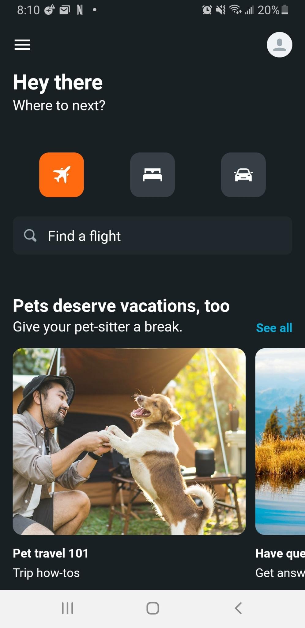

However, while the main action on the app, Search, is easily discoverable, Kayak invites some frustrating user errors. Mapping featured articles so close to the controls of the search functions may cause for a user to slip and click into the article rather than the search bar, or worse mistakenly think that they can build in the topic of the article (pets, for example) into their search parameters directly. Unfortunately, the user is brought to a completely different page with no search functions if they indeed err and click the featured article. A user’s experience would likely be enhanced if they were prompted with action items within articles, such as “Search Flights” or “Search for a flight with your pet.” An even simpler fix that would prevent navigation errors would be to move featured articles farther down on the page.
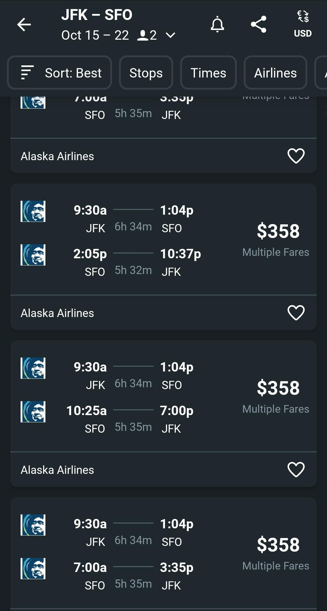
Reading flight results
The pared-down interface uses the convention of reading and working from top to bottom to direct the user’s actions and movement on the results page. The user can scroll through the results with their finger, with a small scrollbar will follow this movement for further clarity. As they scroll, each result affords saving, via the heart icon, another convention itself.
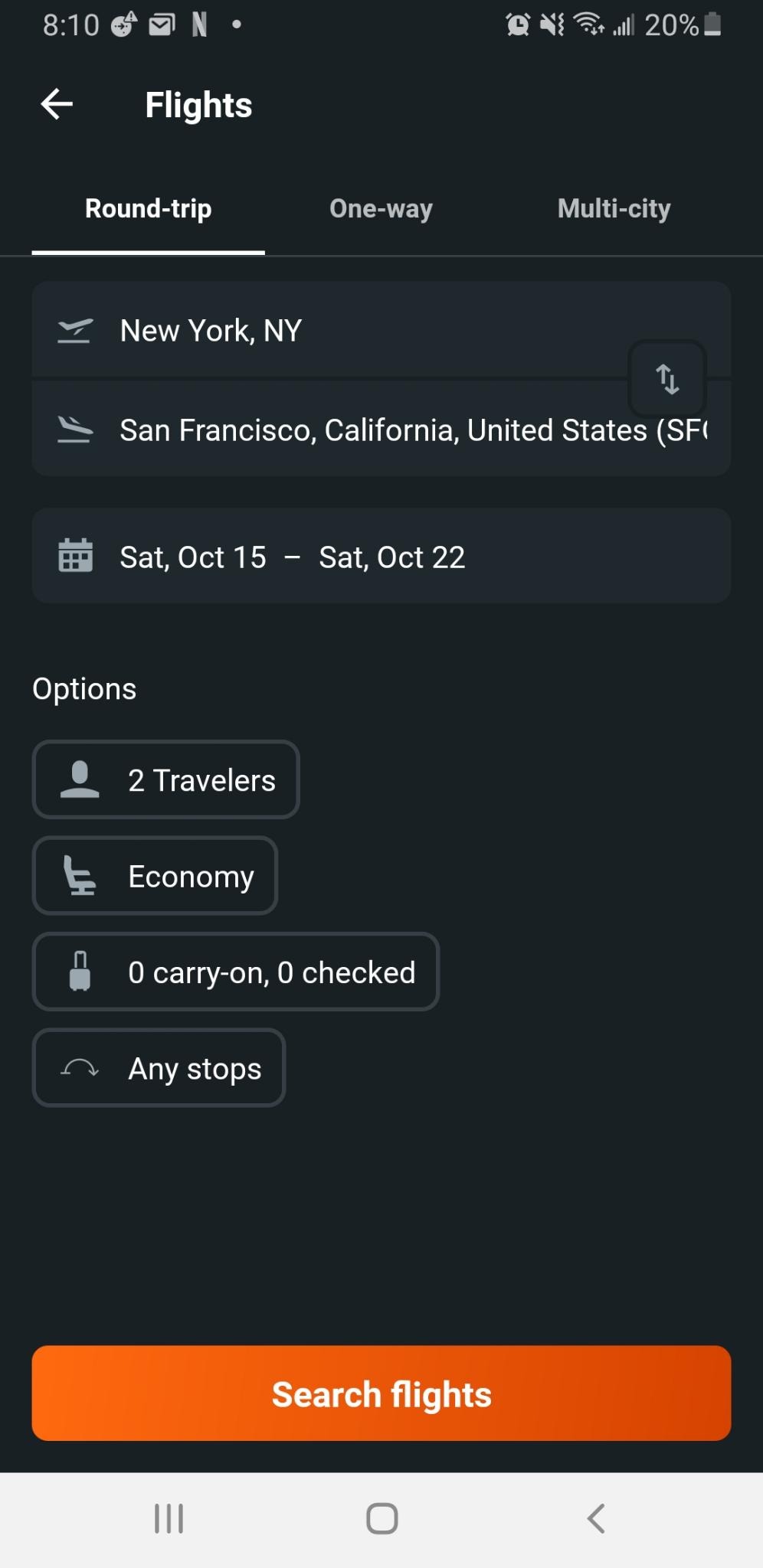
If a user makes a mistake or slips in entering any of the basic filter information from earlier steps (how many people on the trip, the dates, destination/starting location), they have two choices and only one is clear to a new user: either they can tap on the displayed filters or press the back arrow. A new user would most likely follow the signifier and press the back arrow, though this opens a new page unlike clicking directly into the filters. To add further clarity, I would recommend giving the filter setting the perceived affordance of editable buttons to be pressed rather than resembling plain text. This will tell the user to click directly on the controls in this case where the interface’s convention (working/pressing controls from the top) are not enough to combat a lack of signifiers.
Feature Overload?
As a user becomes more comfortable with the main controls of the interface: tap, type, and scroll, they are introduced to more advanced features. These can be found by simply browsing the pages, as noted above with feature articles scattered throughout the main search pages. Where the Kayak app succeeds is displaying vast amounts of knowledge in the world (ex. clear labels to follow, perceived affordances, natural mapping of controls) but the app also requires a lot of learning and memory, or knowledge in the head. A regular user will learn how to do more than execute a search from one of the three homepages, but can also memorize the options listed in the hamburger menu: Search, Trips, Price Alerts, Explore, Profile, change Region, change Currency. However, it may be difficult for a user to immediately recall any given tools they can use on the app, if say, they wanted to track a flight. That is a capability found on the Trips page, but only in as a coordinate map icon.
There are plenty of other more nuanced tools within these five menu tabs, but they are not mapped anywhere. Currently, having tools in myriad different unmarked locations (further down on the homepage, hidden in the margins of pages, clearly marked on the menu bar) prevents a user from committing the full scope of tools available with the app to memory. I would highly recommend creating nested lists in the side menu, that would alert the user to the full scope of capabilities of the app and thus lead to higher learnability and a more confident conceptual model for them. Currently, not having all features listed in the menu also invites the question of which features Kayak considers most vital, and which features are only there to keep a competitive edge in the travel industry.


From left to right: Kayak Explore (hamburger menu –>Explore); Flight Tracker and Measure Your Bag tools (Flight/Stay/Rental Car home page–>scroll down); Track Flight Schedule (hamburger menu–>Trips–>coordinate icon)
Embrace the Rise of the Small
We are in an era that Don Norman deems “the rise of the small.” For the travel industry, that means that people today have their choice of hundreds of specific apps to choose from to accompany them at every step of their travel journey: from AirBnB (non-hotel stays), BringFido (travel with pets), to TripIt (scheduler) and many more. Kayak excels at search and they have other core functions that they are loved for (namely: Kayak Explorer). They should focus on continuously providing the best user experience there, so that people are always sure to add them to their digital travel mix.
This page features screenshots of the app from the author’s device, and the logo image was sourced from Wikimedia Commons: https://commons.wikimedia.org/wiki/File:Kayak_Logo.svg, and the featured image comes from the Kayak website: https://www.kayak.co.uk/news/new-look-app/.