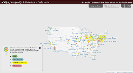
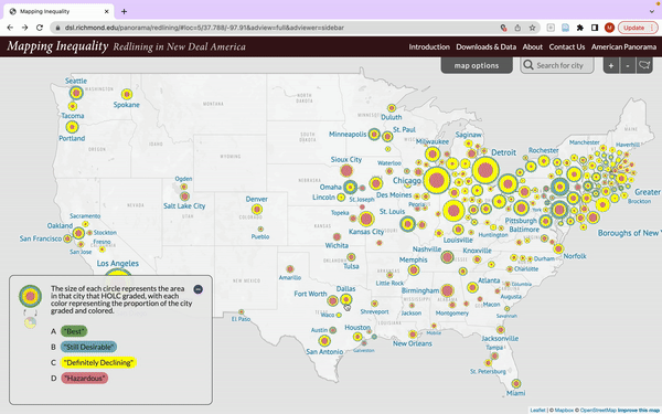
Mapping Inequality’s project page features a white map of the U.S. with circles of varying sizes that are all a combination of green, blue, yellow, and red. However, the proportion of each of these colors is different from circle to circle. At the top of the screen is a navigation bar with the project title and titles to other web pages. Right below the bar is a tab called “map options,” a search bar, a tab with a plus sign, another with a minus sign, and finally, a small outline of the map of the U.S. The layout and vocabulary of the navigation bar follow cultural mappings for web page navigation. The positive and negative signs are a conventional signifier of the affordance of zooming in and out. Feedback from the cursor and text that emerges while hovering over each title communicates the affordance that a user could navigate to each page.
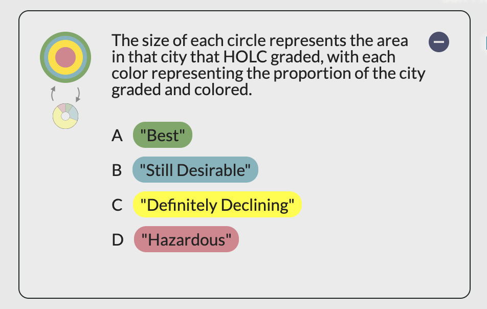
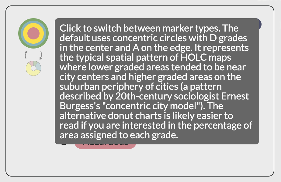
A legend rests at the bottom of the screen relaying knowledge in the world to the reader about what each circle represents. While there is an option to choose a different visualization scheme for the circles, the legend lacks appropriate feedforward because there is no signifier indicating that this information is there or that the circle is clickable. A solution to enhance the discoverability of this knowledge could entail changing the cursor to an arrow when it is not around something clickable since in the legend it remains a pointer no matter where it’s moved. The different color schemes of the circles utilize natural mapping – one theme would allow the user to visualize housing data by percentage and the other by location.
Examine (Zoom in): View a City and Area
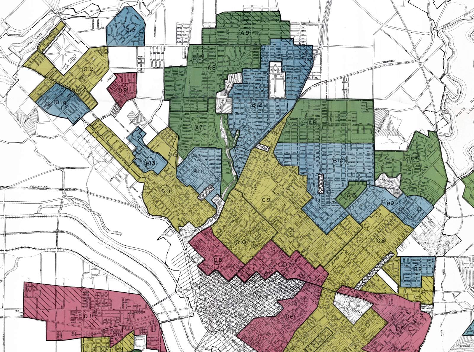
The next section would allow a user to examine a specific city and, more granularly, areas within those cities that house the bulk of the historical data in the project. The circles on the maps afford clicking as evidenced by the feedback of the cursor when placed upon them. Once a city is selected, just the map of that city is shown on the screen, allowing for an intuitive conceptual mapping for interacting with spatial software. The user can toggle between different mapped visualizations according to their needs. The archival maps, though, are quite darkly colored and thus can negatively impact data exploration since important area-specific information is concealed. This lack of knowledge in the world can lead to both a gulf of execution and a gulf of evaluation during the seven stages of action because users would not be able to see important location-based variables on the map, as the color choice allows an unintentional constraint. The polygon map option for data exploration is thus most useful, and a small note under this view stating that “best for observing areas” could act as a signifier for the affordance of area-level data exploration.

There is an information box of data in addition to the map when a user first zooms into a city. There is again a problem of feedforward, signifiers, and perceivable affordances here. The box helpfully offers definitions of historical grading terms (knowledge in the world), this is not discoverable without some poking around. Despite this, however, the feedback offered from hovering over these definitions – seeing all areas of that particular grade – is very engaging.

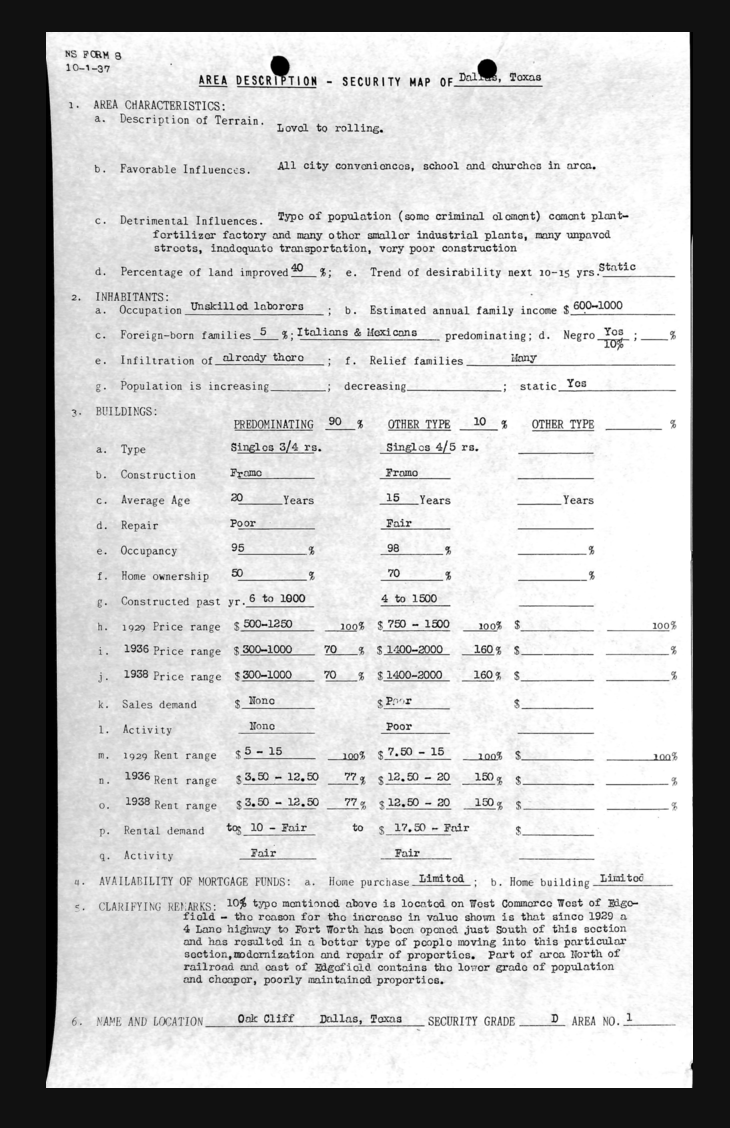
Further exploration allows the user to view specific areas within each city. Since the map affords clicking on blocks that are pre-determined through physical constraints, a user can easily access a more granular level of data.
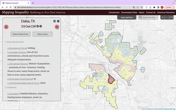
The user can then scroll through different areas of the map through the use of the information box’s natural mapping, which allows movement to the left and right through the clicking of circles on the left and right of the box. Historical characteristics of each area are listed in two ways – in the list as the box and as a scanned archival document. These colors of the buttons make them discoverable and the cursor change indicates that they afford clicking. The button colors also map to the color grades of the geospatial data. The rapid feedback allows confirmation that user actions of exploration are being performed.