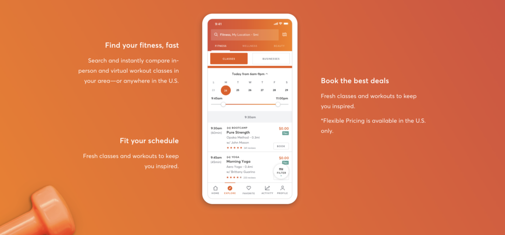
Mindbody is a U.S.-based “software-as-a-service company” that allows users to locate, purchase and schedule “wellness experiences,” such as workouts at gyms, massages at spas, and more. Users can create profiles, save and curate a list of favorite businesses, leave and read other users’ reviews and ratings, and explore local deals and wellness destinations based on their location and interests. This critique follows a user with a Mindbody account logging in to their profile and searching for a new nearby fitness class.
Logging In
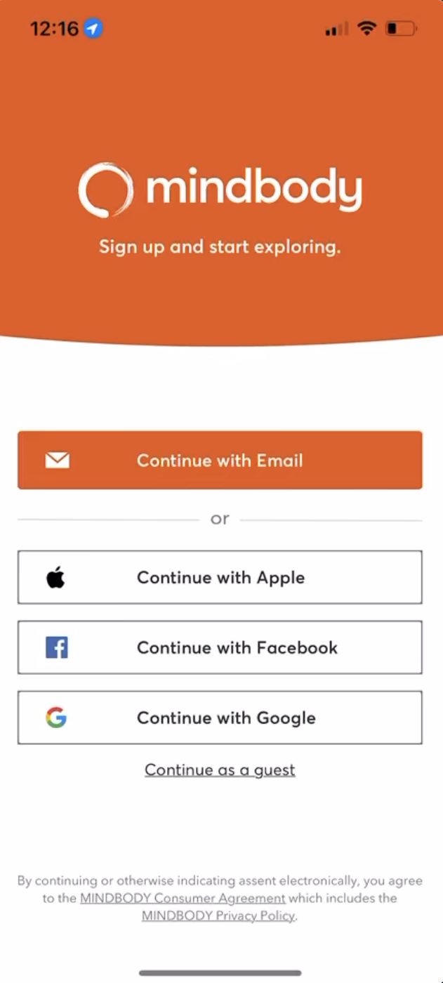
MINDBODY’s login process is fairly straightforward. Upon opening the app, the user is met with a screen with four discoverable buttons that afford the options of logging in or proceeding as a guest. Despite having to choose between several options, the button design indicates their relative importance, with the email option prioritized in bright orange and separated from the others. Physical constraints force the user to choose an option to click, with the email login prioritized as a top choice. This helps bridge the gap of execution.
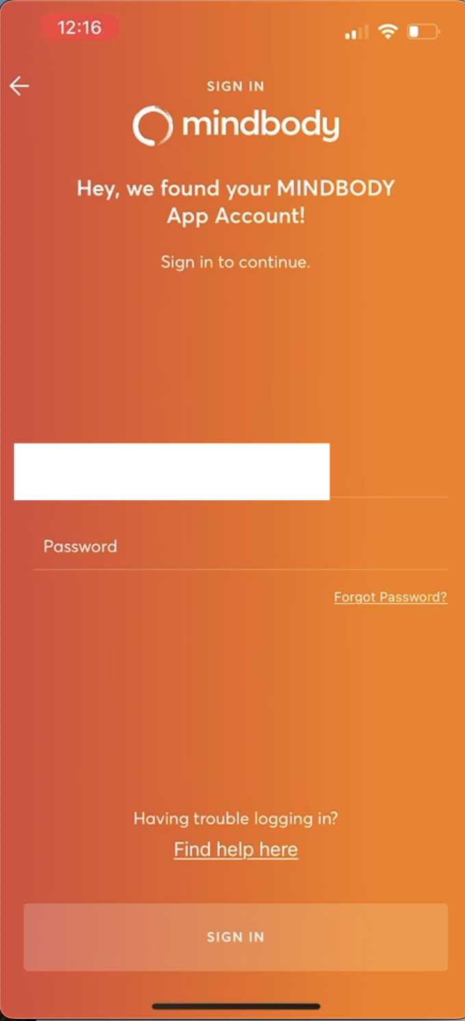
Once clicked, the app loads a new page with the prompt, “What is your email?”, giving immediate visual feedback that helps bridge the gap of evaluation. The text box signifier affords typing in an email address, then a password. The user can use knowledge in the world to click “Sign In,” a highly discoverable button design with text signifying to them, via knowledge in the head, that they will be able to move forward to their profile.
Navigating MINDBODY from the Home Screen
Logging in, users land on the home screen and again receive immediate visual feedback that they have logged in via the “Good afternoon, Anna!” text at the top and a thumbnail profile image visible in the bottom left corner above “Profile.”
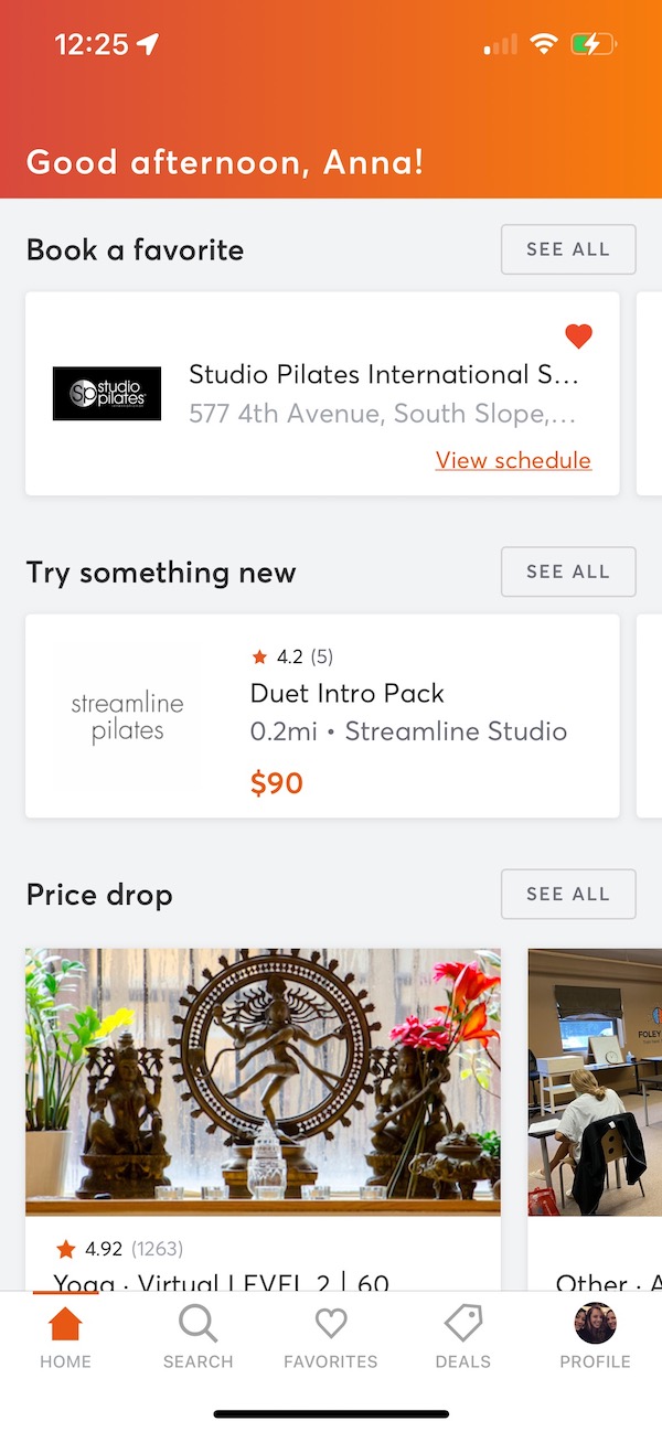
A bottom navigation bar displays icons labeled with text: Home, Search, Favorites, Deals, and Profile. Each of the image icons (the house, magnifying glass, heart, tag, and thumbnail profile image) mimics those used by other popular apps (e.g. Instagram). This allows a consistency in design for Mindbody users to again easily access knowledge in the head, while the corresponding text labels tell the user exactly what to expect, drawing on knowledge in the world.

Each is easily discoverable, has a clear signifier showing where to click, and affords clicking to visit different pages. Immediate visual feedback is reinforced here: the Home icon is orange with an orange bar above it, while other icons remain gray. All of this helps establish a good conceptual model of the app’s current state and functions.
The main content of the page also mixes knowledge in the world and knowledge in the head. Under “Book a favorite,” for instance, one business is clearly visible in a rectangular frame, while another partial frame peeks out from the right hand side of the screen; to view it, users simply swipe left. The natural mapping of this activity works via logical constraints, where the user knows that the swiping- left convention — a form of cultural constraint — will correspond to a desired effect of seeing more content to the right.
Finding a New Fitness Class
To find a new class, users can click the Search tab. The top of the Search page prompts you to “Discover your next activity,” with a text box next to an orange magnifying glass icon, a signifier that the search functionality will be used once “go” is pressed.
(Occasionally, the search results do not load immediately, but MINDBODY still employs immediate feedback via a rotating orange circle to indicate loading is in progress. This cultural constraint employs users’ knowledge in the head, letting them know to wait for results to load, and follows the convention of other digital products.)
If the user searches for “pilates,” the app loads all classes occurring that day, organized by time but not by location or studio. Users likely want to know how easy it might be to physically get to a new studio before booking a class, however, in this view, they initially see a long list of oftentimes indecipherable class names from a mix of businesses (e.g. “Orange 60 Min 2G Mask…” at 12:25pm for 60min). This could cause a negative visceral reaction to the overwhelmingly long list of results, plus a negative behavioral reaction to the difficulty of trying to weed through them.
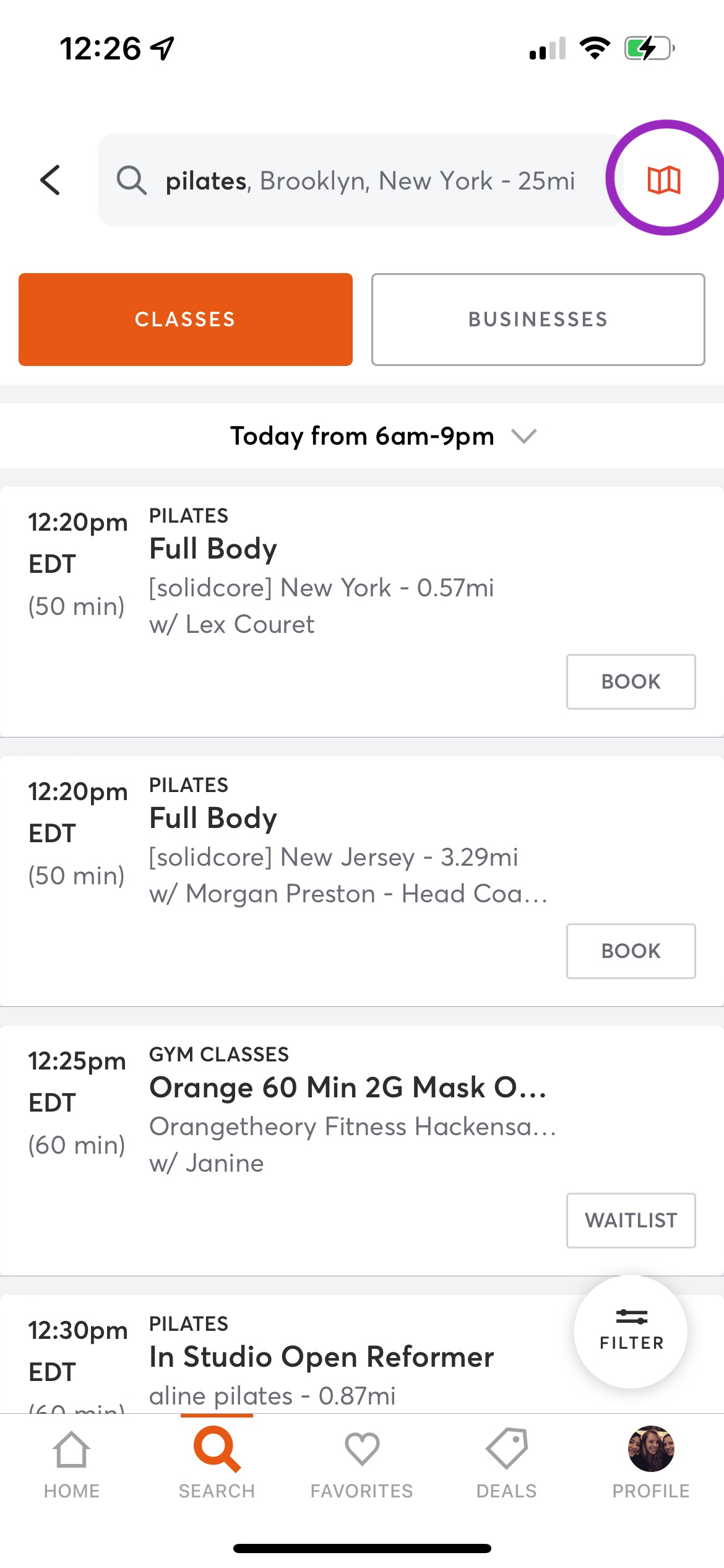
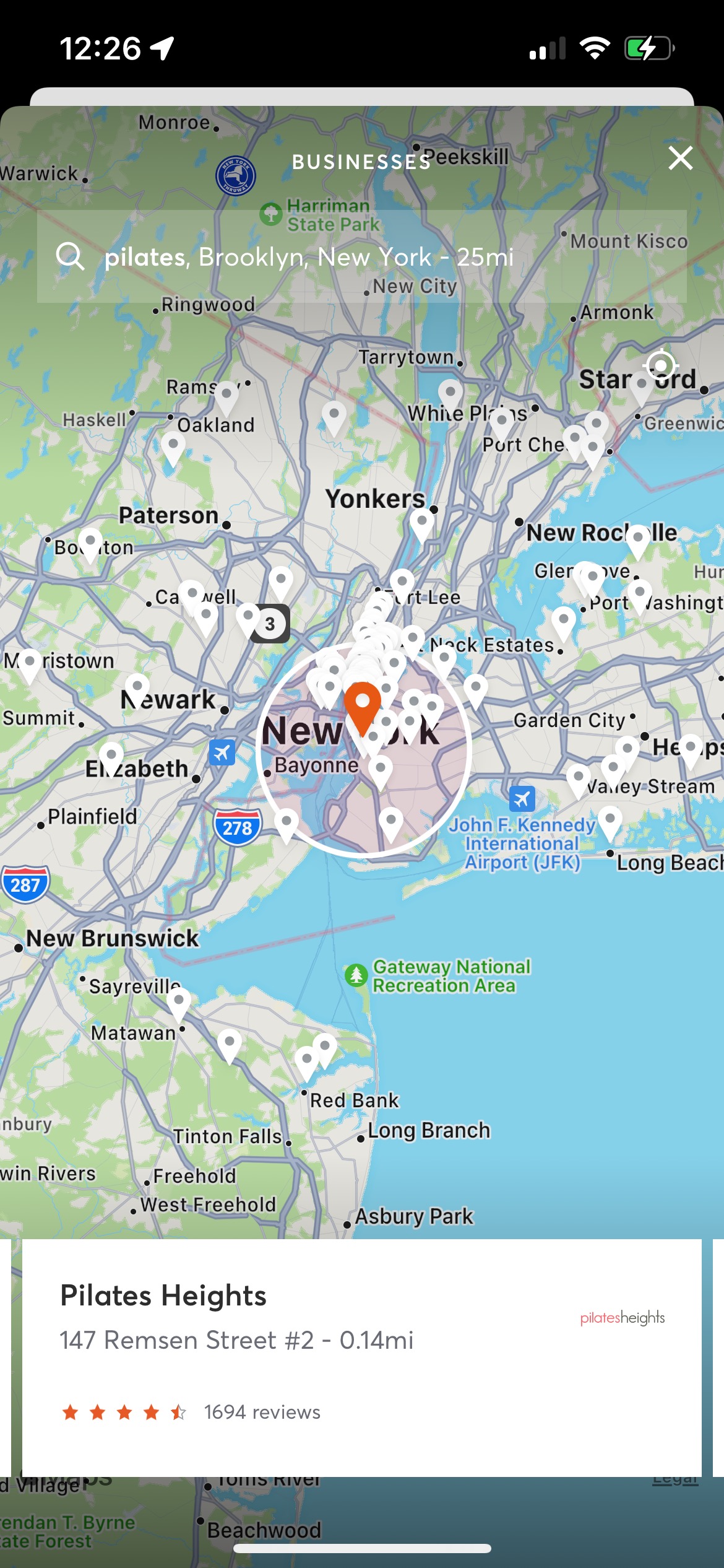
Suggestions: Switching the default results view to a map view, or to first showing the fitness studio names alongside their ratings and relative distance, would address this. However, users can switch to view these results this way by clicking the “Businesses” button, or clicking a (quite small) map icon in the top right.
The map is not highly discoverable, but once loaded, works similarly to other products like Google Maps, where pinching zooms and auto-adjusts the map area. Having these options available, while slightly harder to discover, may allows users’ reflective reactions to end up net-positive.
Conclusion
Mindbody features a consistent, easy-to-use, and pleasantly navigable design that allows users to explore a wealth of fitness and wellness options and form a well-defined conceptual model. However, room for improvement exists, specifically within the search function and in helping users organize the clutter that can accompany the amount of text information presented to them.
Side Note: This critique focuses on the Mindbody app for clients, though it’s worth mentioning that there is also a Mindbody app for businesses and enterprises. One connects customers to fitness and wellness experiences while the other focuses on connecting businesses and brands to customers. I would add a potential red flag for product developers balancing these two design requirements and not succumbing to what Norman terms “featuritis” (adding more features to an already information-dense experience).