
nypl.org is the official website of the New York public library system where users may access library resources, get information on the library, and learn about upcoming events, among other things. For this article, I will be focusing on the process of placing a hold on a book for pickup at a local branch and then viewing/editing current holds.
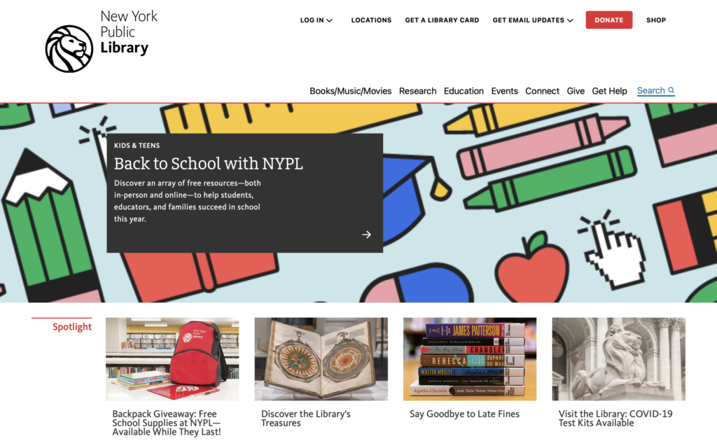
Step 1: Landing Page

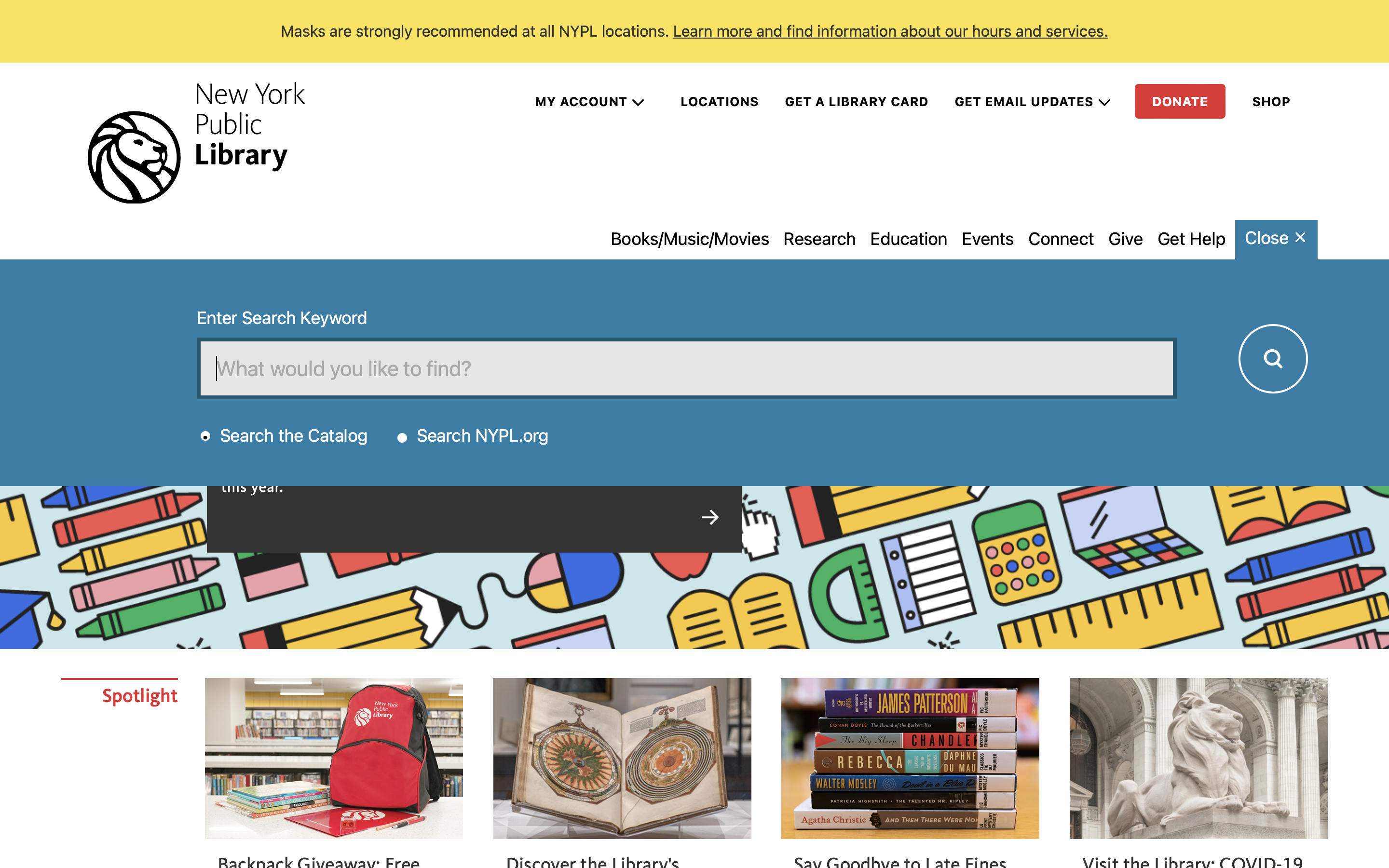
When the user opens nypl.org they will see the available resources in the header, including a search bar which can be opened and closed. The landing page header provides clear discoverability for the user. From here a user searching for a book may either click “Books/Music/Movies” or search directly using the search bar, proving flexibility and efficiency of use.
Suggestion: Make the search bar be permanently opened on the page rather than a dropdown for improved visibility.
Step 2: Searching
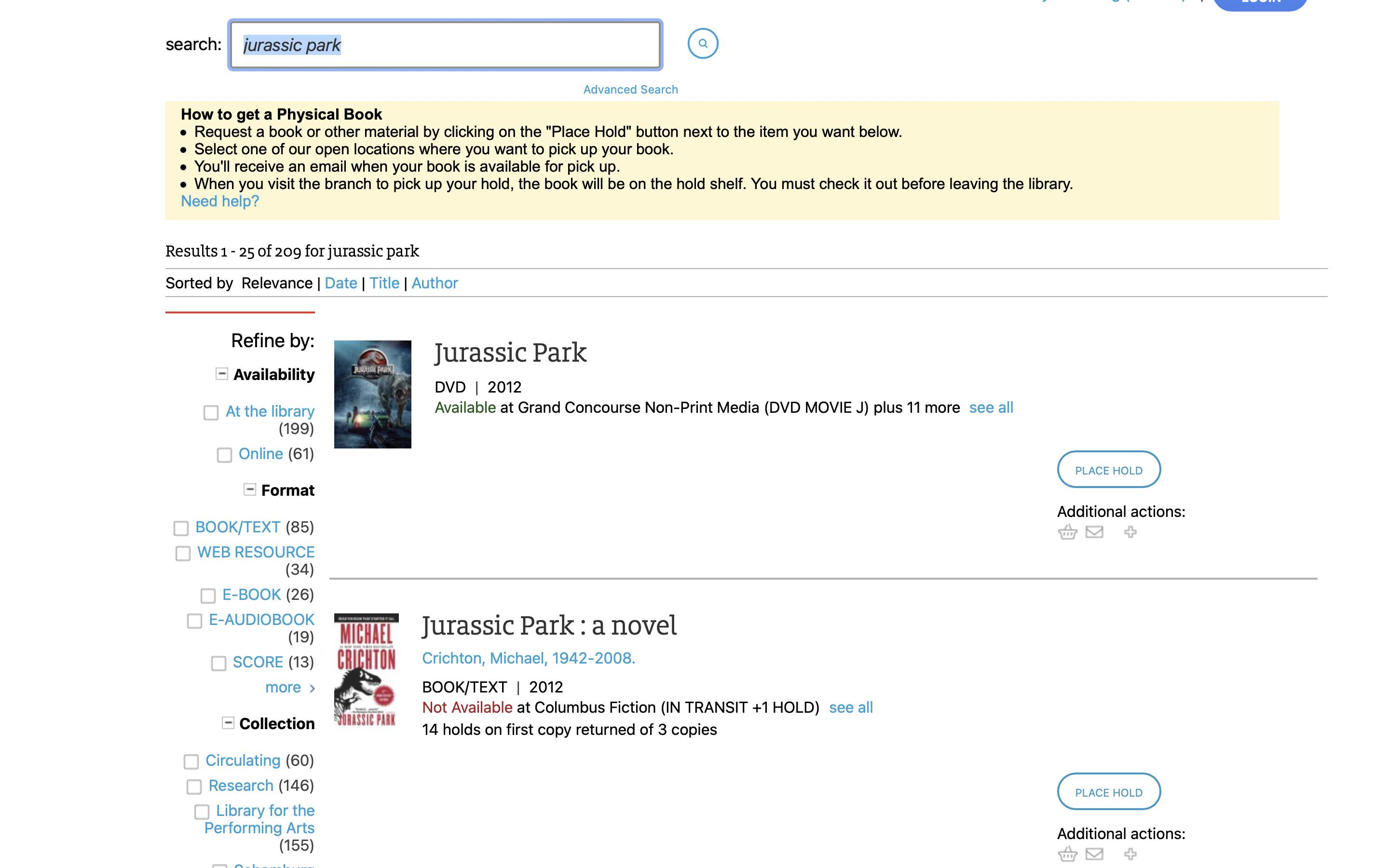
Once the user enters their search, a page with all media sorted by relevance appears. For the purposes of this critique I searched Jurassic Park to test how well the search results displays different media. Along with the results the website displays media type, availability by location, and number of copies available. On the right, there is a clearly distinguished “Place Hold” call to action.
Step 3: Placing a hold
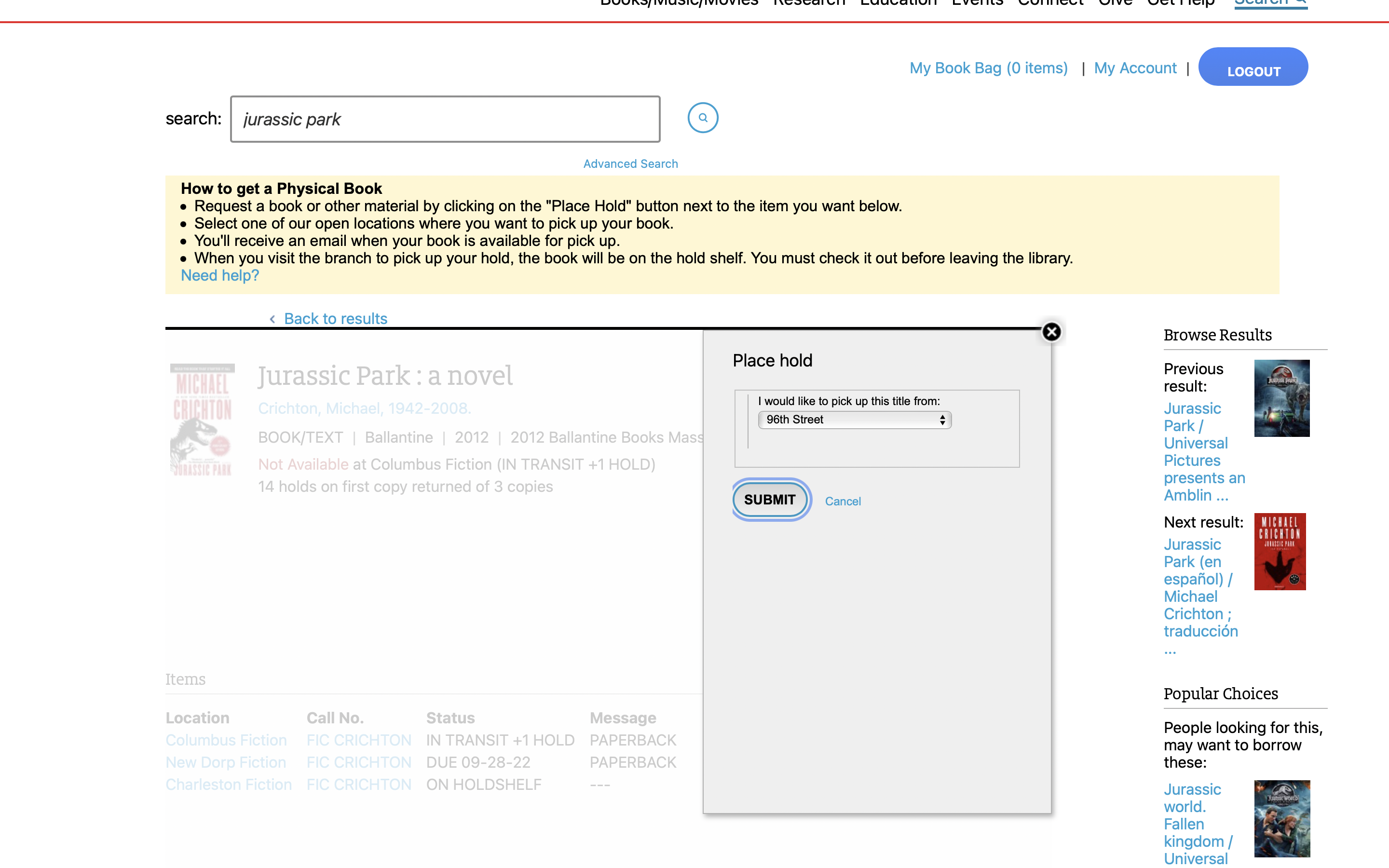

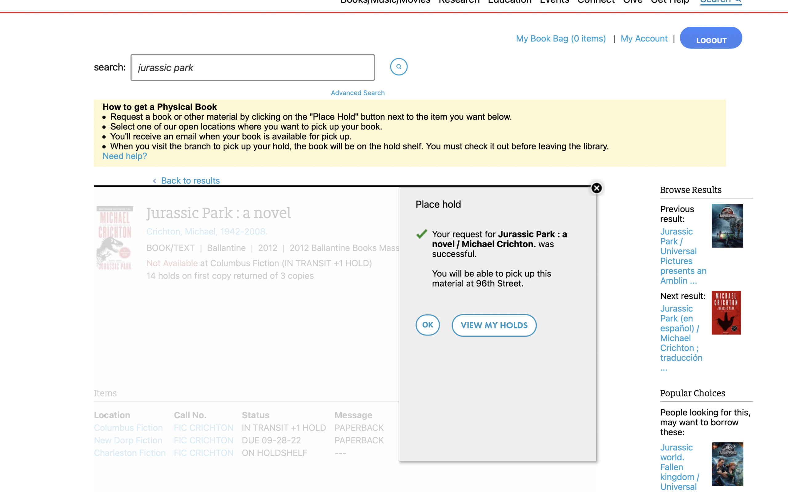
Clicking “Place Hold” brings up a pop-up prompt with a dropdown menu where the user may select which branch they prefer to pick up their hold from. The location defaults to whichever one the user has set as their preferred branch (Note: in order to place holds users must have an NYPL card and account). Once the user confirms their pickup location, the prompt displays a confirmation message that a hold has been placed at their selected branch (Good example of proper feedback).
Suggestion: Under the confirmation message, add a “View my holds” button for users that want an overview or might want to cancel their holds (increased user control and freedom).
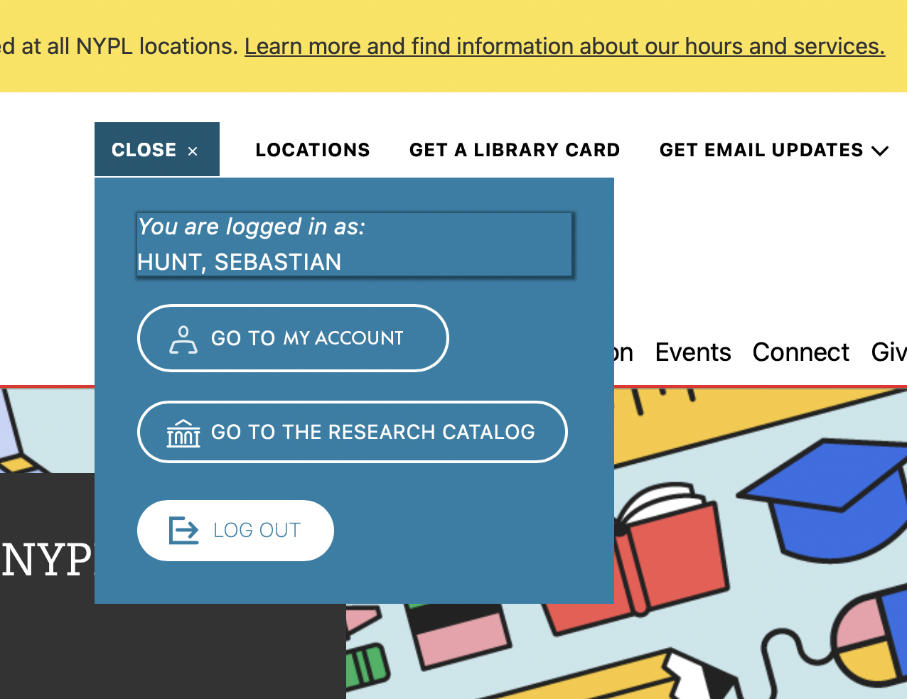
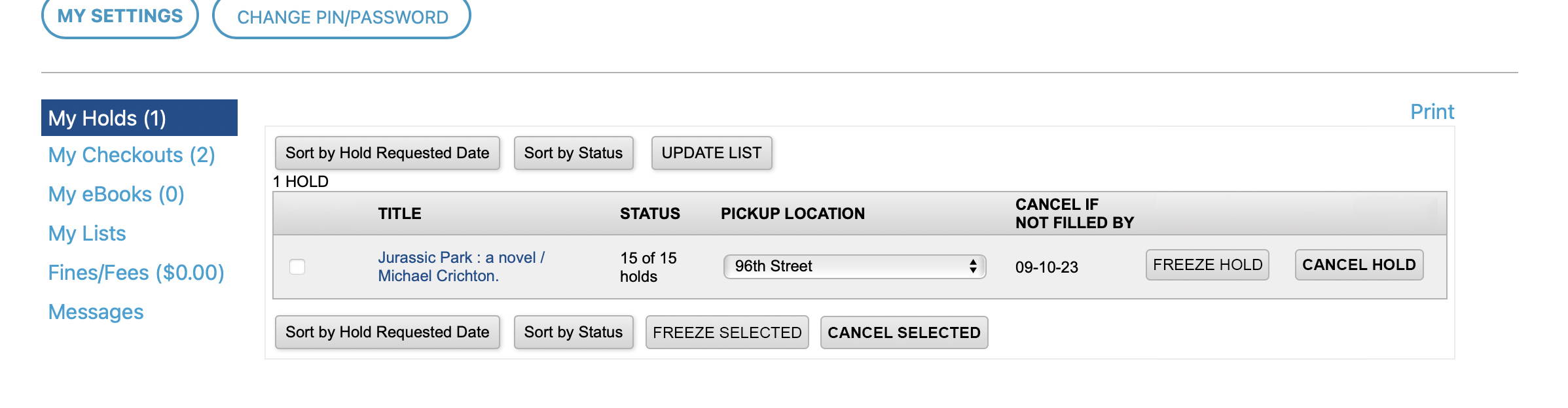
Step 4: Viewing and Editing Holds
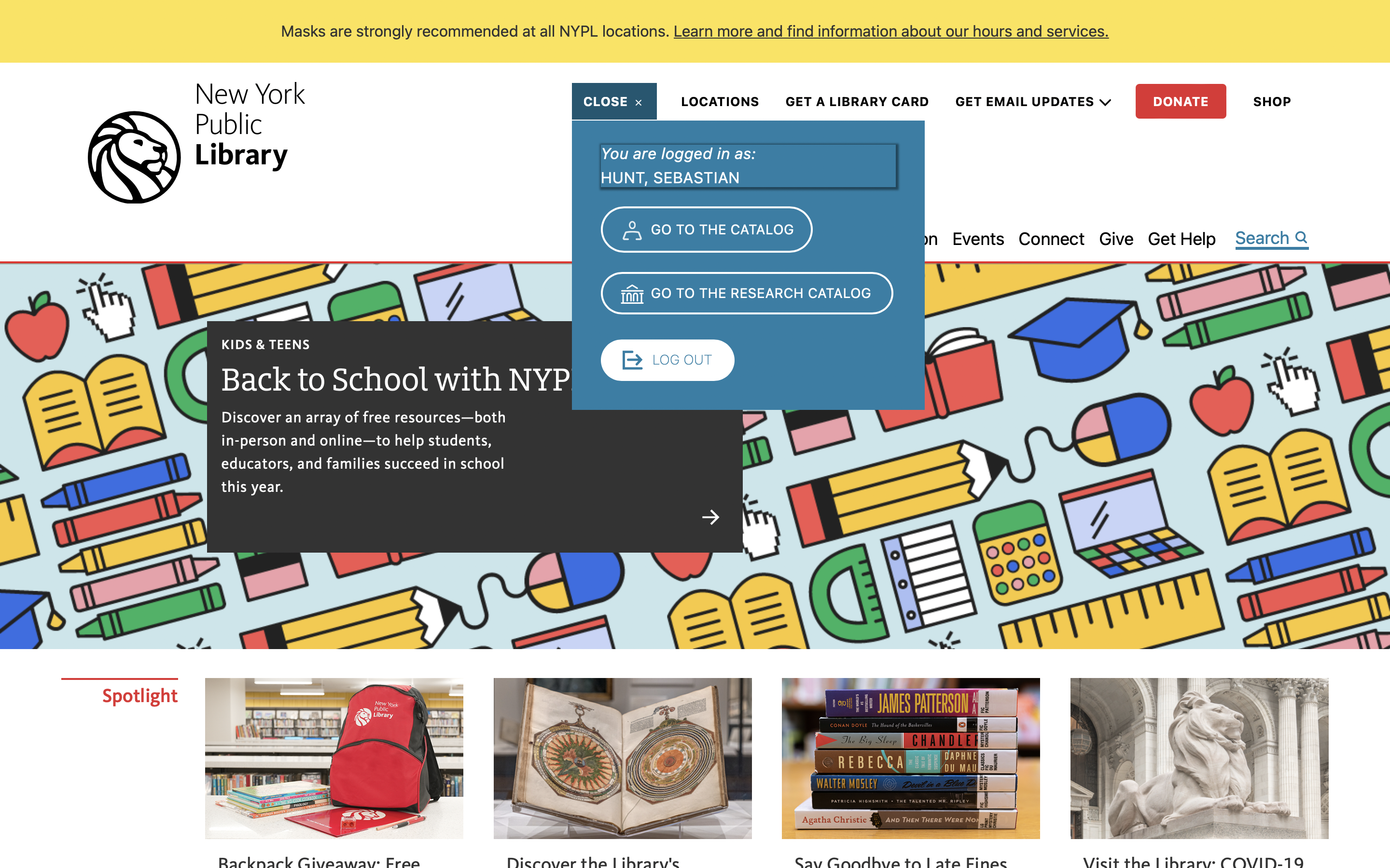
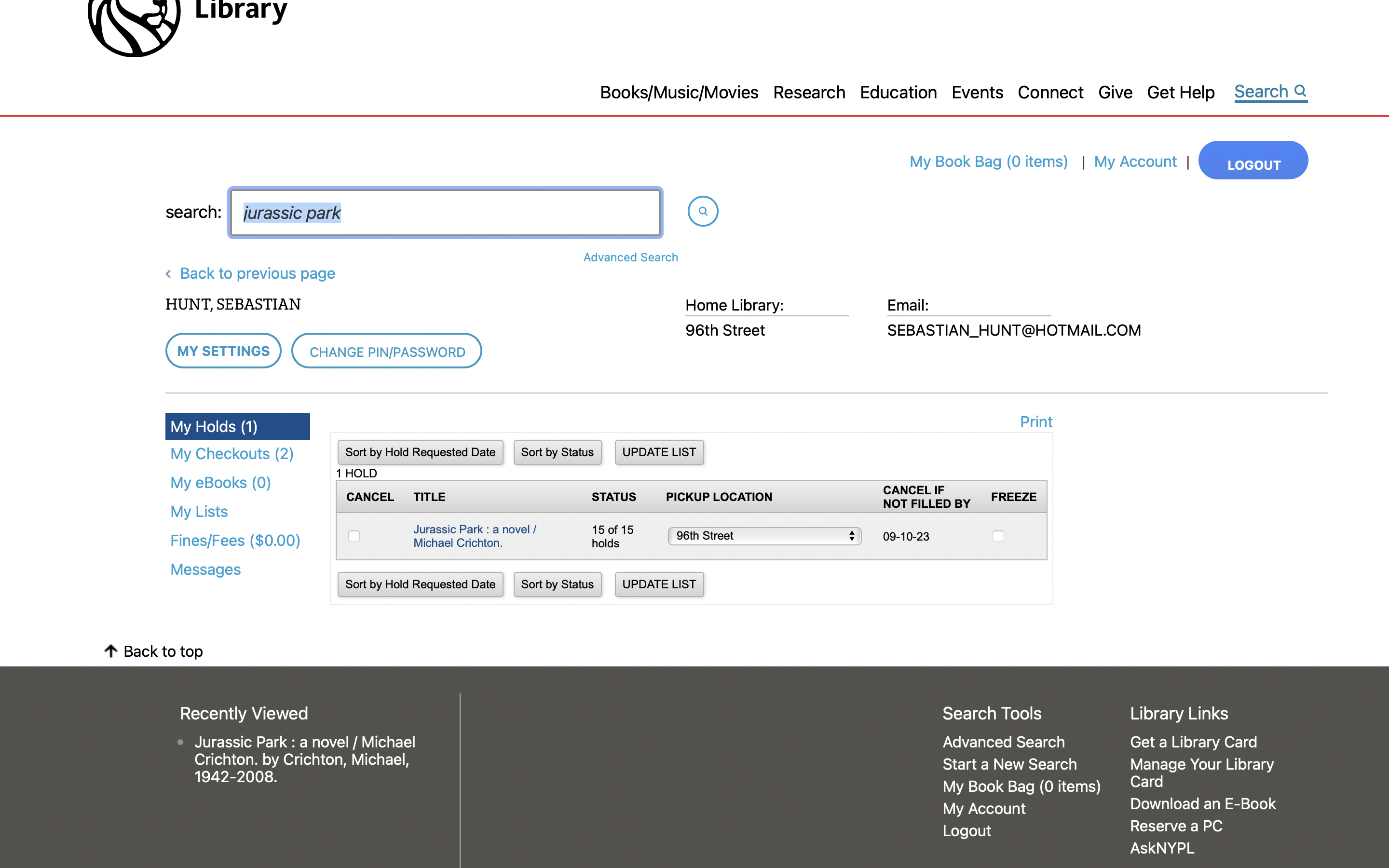
To view current checkouts and holds, the user navigates to “my account” in the header and clicks “go to the catalog”, which brings up an overview page. The “go to the catalog” is confusing terminology and makes it seem like it should instead go to the library catalog rather that the user’s personal account overview.
From the account overview, users may cancel or freeze holds and see any currently checked out material. Holds are cancelled by highlighting the “cancel” checkbox and then clicking the “update list” call to action.
Suggestions:
“Go to the catalog” should be replaced with “Go to my account”, which improves visibility and error prevention.
A dedicated call to action to cancel/freeze holds would provide better affordances.
Conclusion
Overall, the NYPL library provides an effective way for users to find and place holds on material thanks to its conceptual model, in that it works similarly to searching on other websites, particularly retail websites. However, the account overview does have usability issues which can be resolved by clarifying call-to-action texts and improvements to the UI.