Notion is a productivity software, used primarily for project management and taking notes. It is an excellent tool for working in teams since the users can organize all of their information and projects in just one platform. It can be used by companies, students, or individuals who need a more efficient way to work.
In this article, I’m going to go through some of the features that notion offers:
Sidebar
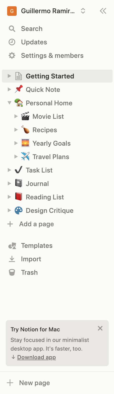
One of the first things you see when first using notion is the sidebar. It has a list of preset pages that can be changed later. It also has the access to the search bar, updates, and settings where the user can manage other members using the platform among other stuff. Finally, there are also the options for importing templates, HTML pages, and looking at deleted pages that were sent to the trash.
What I like about this feature is that the mapping of it is good and simplified, meaning that the user can easily understand how everything is distributed and what is the relationship of the sidebar with the work area and other features. It’s simplified because new subpages can be added inside the main pages.
One aspect I dislike about this feature is that, because of its simplicity, fails to give information about the rest of the actions that can be done within the platform.
Another negative aspect is that the option for adding a new page appears twice with different tags: “add a page” and “new page”. This can lead to confusion among the users. One way to solve this would be to change the name of one of them so both could be called the same or just delete one of these buttons.
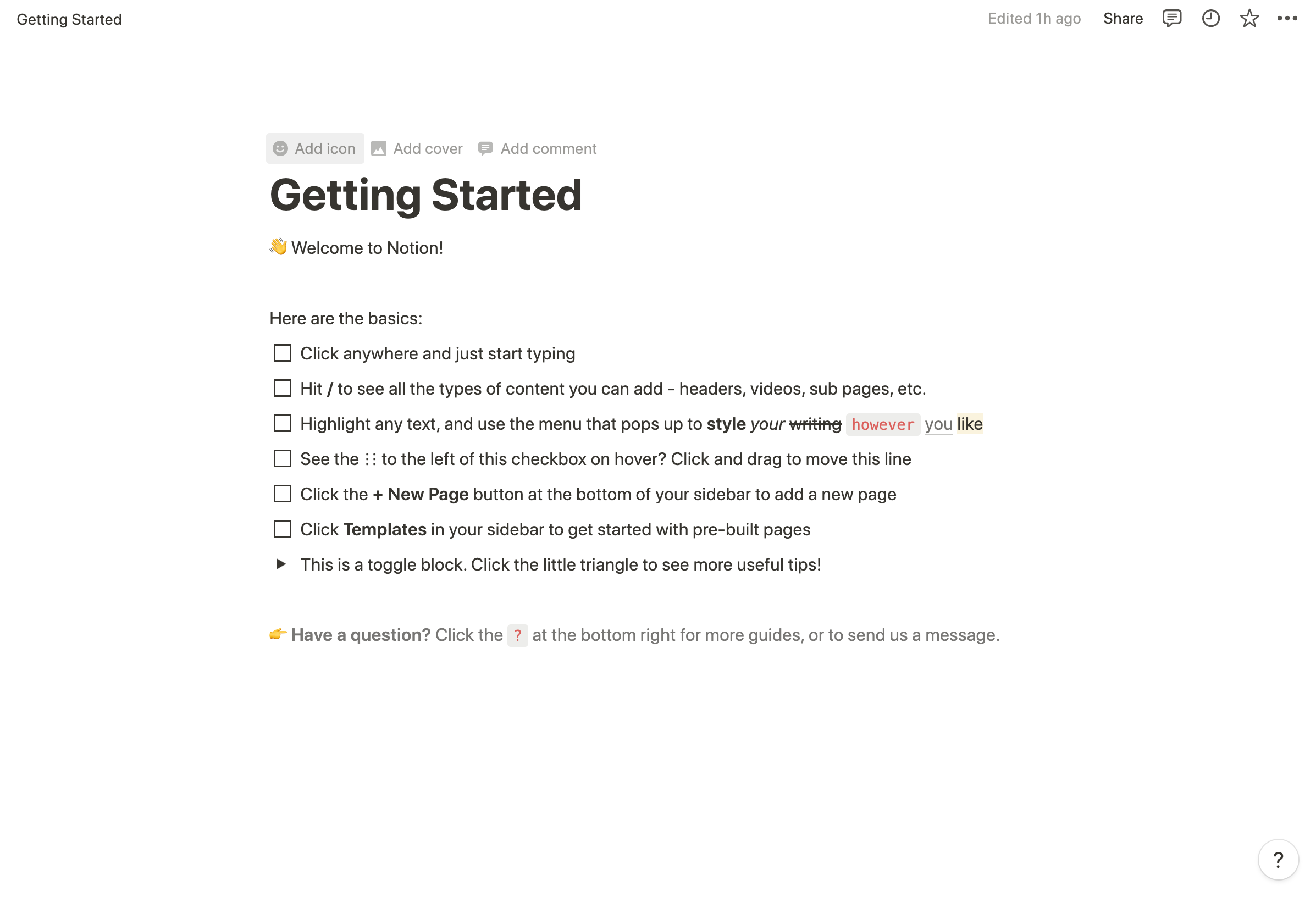
Search Bar
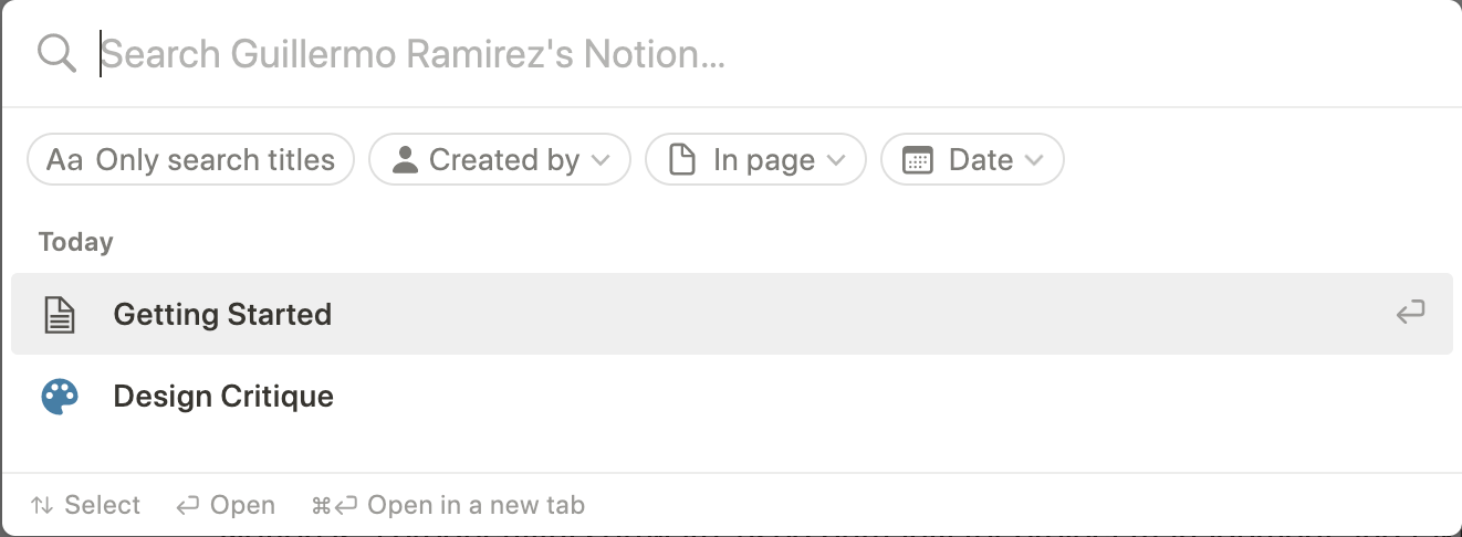
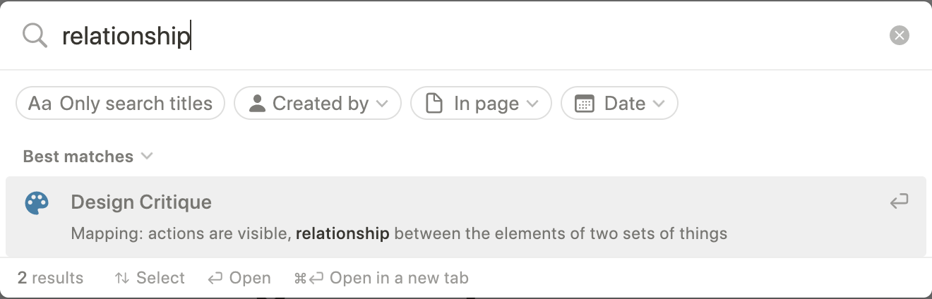
The search bar in notion is the first feature listed in the local menu once you’re logged into the platform. Once you click on it, a popup is displayed in the middle of the screen with a list of the projects you’ve edited today. There are also 4 filters: only search by title, created by, in page, and date.
A positive aspect of the design of this search bar is that it’s very intuitive. The user can easily understand where to write because the signifier (in this case, the magnifying glass icon followed by the text cursor) is the first thing you notice within the popup box.
However, one negative aspect of it is that the user can only find a specific word once it is completed. This aspect could lead to a misuse of the search feature, causing slips for the user. A solution would be that the results appeared according to the letters written until that moment instead of the entire words.
Workspace
This workspace is what occupies the most space within the screen. It’s very friendly and intuitive to use. The conceptual model is very understandable due that it’s very similar to take notes in notion to any other similar platform, some examples include the notes app on the mac or word processing software such as Microsoft word or Google Docs.
One positive aspect of my experience with working with this feature is that my computer turned off suddenly but all my work was still there when I turned it on again. In this case, I don’t need to save a lot of information in my memory to work with this platform since it does that job for me.
Another positive thing I noticed about this section is that it gives you subtle feedback. For example, when clicking on one of the checkboxes in the previous image, it changes and you know that an action has been made.
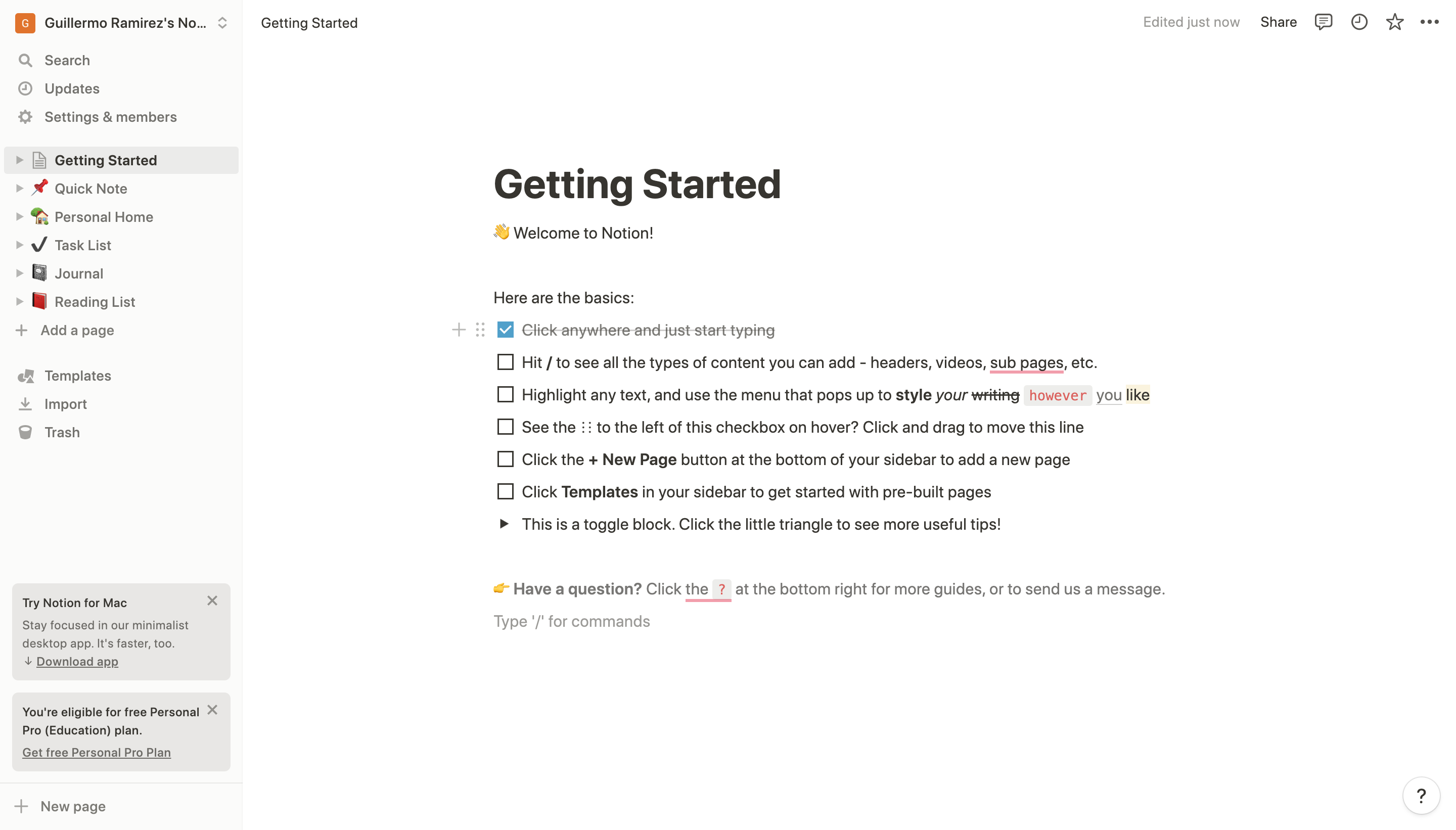
A negative aspect is, once again, the simplicity of the product. I’m always discovering new actions that can be done with notion, to the point where I don’t know if the way I am using the platform is the right one. There’s not enough feedback in that case. To solve this problem, I would make the “?” section more visible by placing it on the sidebar instead of the bottom right.
New Page / Add Page
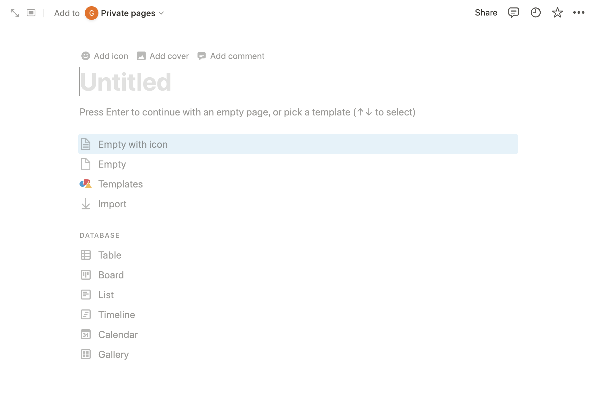
Finally, one of the easiest things to do in notion is to create a new page. There’re even two different ways to do it (which I mentioned earlier). After you click on the “add a page” or “new page” buttons, the platform will display a popup with a lot of information and buttons to select how would you like your new page to be.
What I liked about this feature is that it’s customizable, you could add a cover picture or something as simple as an icon to differentiate it from other pages. Here you have the option again to import templates or other formats into notion and also you can select what kind of information the new page will have (tables, lists, calendar, etc.)
There isn’t anything I didn’t like about this feature since it’s intuitive, gives you feedback, and has great signifiers for the user to know all the actions available to do.
Final thoughts
Notion, as mentioned at the start of this critique, is a platform where users can work in teams, plan projects and take notes. What I liked about it is that it’s very similar to other platforms which makes it intuitive in some ways. It has a lot of features and is very simplified, you can easily organize your information as well as you can find it. It is friendly with other platforms (Google and Apple for login, Unsplash for finding images, etc…). However, If you don’t look up how to use the platform, the experience it offers is limited since a lot of the features are hidden within other features. What I would do to solve these problems is to create a menu (or a more complete menu since the sidebar already exists) where you can find all of the features and not just some of them, or at least incorporate a more complete guide that’s visible for first-time users so they can learn all the options available for them.