NYC parks is a government department which looks out for parks and recreational areas in the entire New York City, including all the five boroughs. They have an official website made for the visitors to check and explore all the parks locations, events, amenities, information and job opportunities.
Homepage
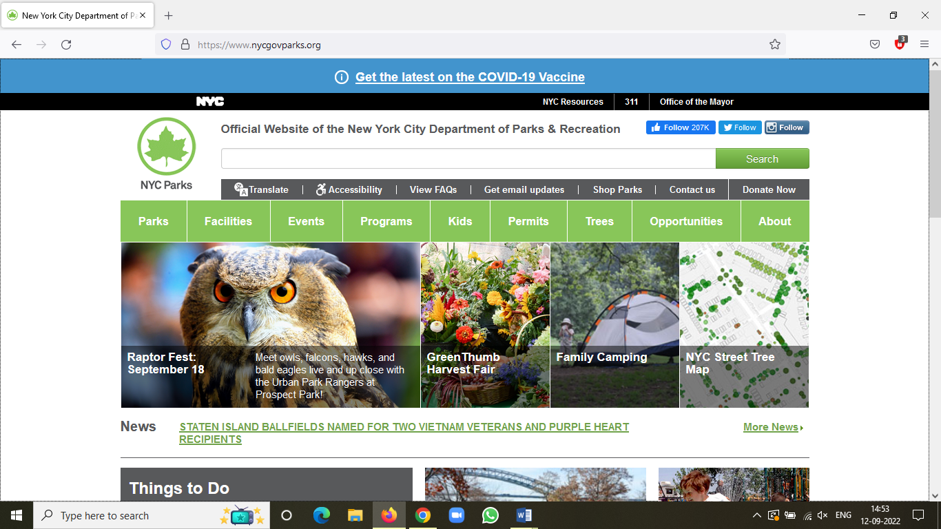
As you open the homepage, multiple options highlighted in a light green color with extra height are clearly visible, making it discoverable for the user. All these options provided gives the user an insight of what are the activities and information they can get by using this website. They can look according to their interest and goal. For example, if someone simply wants to explore the parks, they can simply click the ‘park’ and go further in that section. And if someone is more inclined towards attending events of a particular artist or genre they like , they can search the events and then decide which park to go to. Simply put, there could be people who would intentionally like to visit a specific park because they want peace and tranquility. They might like exploring different parks nearby. While someone else might not be interested to go to the specific park but they might want to visit the park because of a certain event , activity or workshop which will take place in any park. Based on the user’s purpose , it is easily discoverable which section they want to look into. And if the user knows what they want to do , they can conveniently use the search bar at the top and proceed further. One can see , the website also puts on multiple ads of events happening around the city with a brief description of what activity that event is hosting and on which date, which also helps the user discover new event. But it can also feel a bit overwhelming for the first time user.
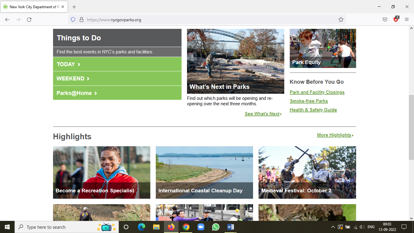
As we scroll down, the table reading ‘Things to do’ comes up, which helps us find events according to the time that the user prefers , be it the same day or on the weekends. Below that, the highlight section shows all the important events yet to come. The homepage of this website does stick to the Norman’s discoverability principles.
All the links on this website, like the News heading in image 1 and under the ‘know before you go’ section in image 2 , acts up as good signifiers as they’re underlined. Also, the other links leading to more in depth information like ‘ more news’ and ‘more highlights’ has a little arrow in front of them which acts as a signifier for the next step.
After clicking ‘Parks’
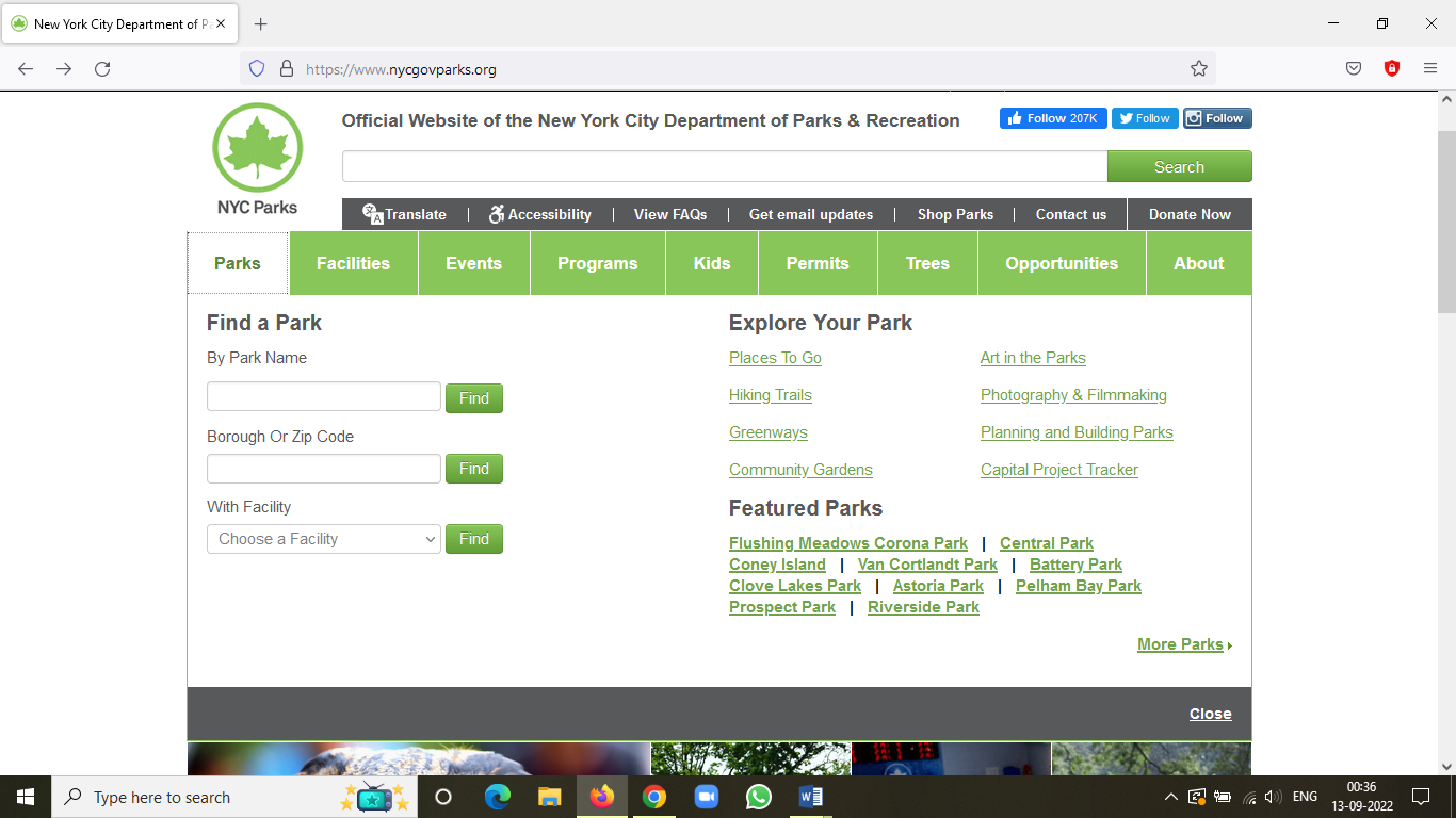
A dropdown pops up, giving us the immediate feedback by guiding us to further steps. All the links under ‘Explore your park’ and ‘Featured parks’ does a good job of being a signifier. The subtle difference between the tint used for the links under these title sections indicates the careful mappings done by the designer. Not to forget the spatial layout of the dropdown , the three sections viz ‘Find the park’ , ‘Explore your Park’ and ‘Featured Parks’ have a gap between them helping us decipher the information they are leading to. Under each individual section, the corresponding links or tabs have a close proximity, giving a proper layout without confusing the user.
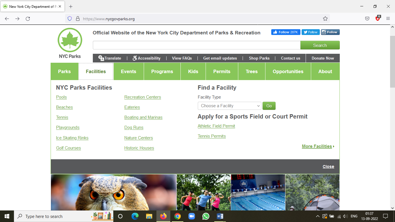
In the ‘Find a park’ section, the user can use more specific information according to their personal needs and preferences to search the most convenient option. This feature allows the understanding of the user’s specific demands like if they want to visit a park which is near them or if it’s in a specific borough. But , personally, I feel the last option named ‘with facility’ is a bit unnecessary as the main highlight tab in the green color also has a dropdown menu exhibiting various facilities. The user might get confused and take more time to reach the end goal.
As Don Norman says “Understanding is most important characteristics of good design.”
After clicking ‘Events’
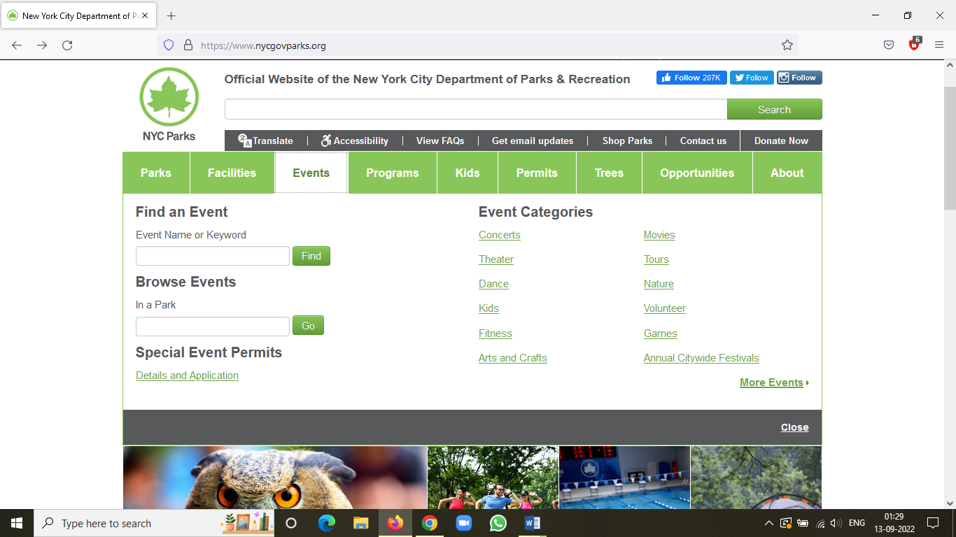
In the events dropdown, the mapping arrangement is great along with the signifiers. User can find an event if they have something on their mind or see what events are gonna take place in a specific park. These search tabs build on a constraint to search only an event or a park unlike the main search bar at the top beside the logo where you can search any keyword you want. The good thing is you can get events description along with the calendar and timing due to this constraint.
Conclusion
This website is usable and helpful and gives the appropriate clues and visible course of action. Nonetheless, the interface can be a bit minimalistic and remove the extra ads and features which can baffle the user with loads of information which will only lead to delayed decision making on the user’s end.
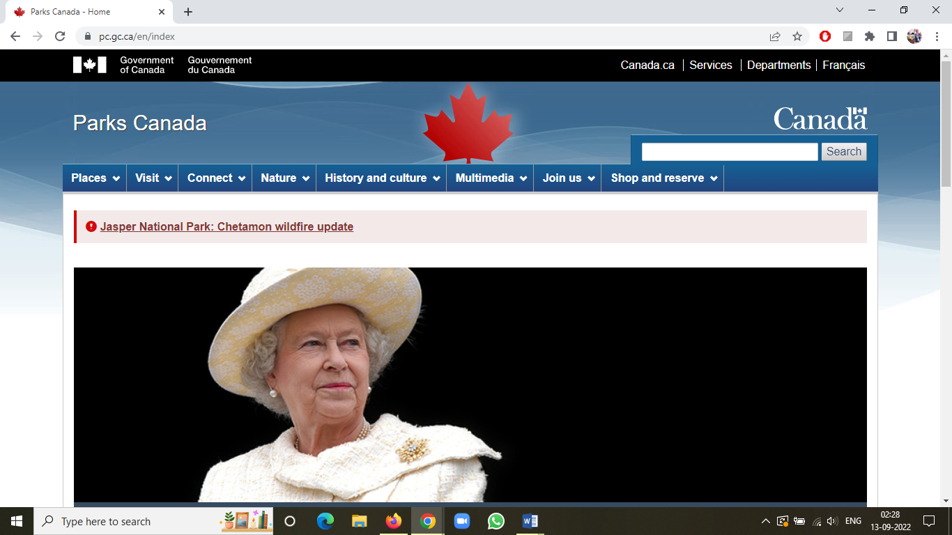
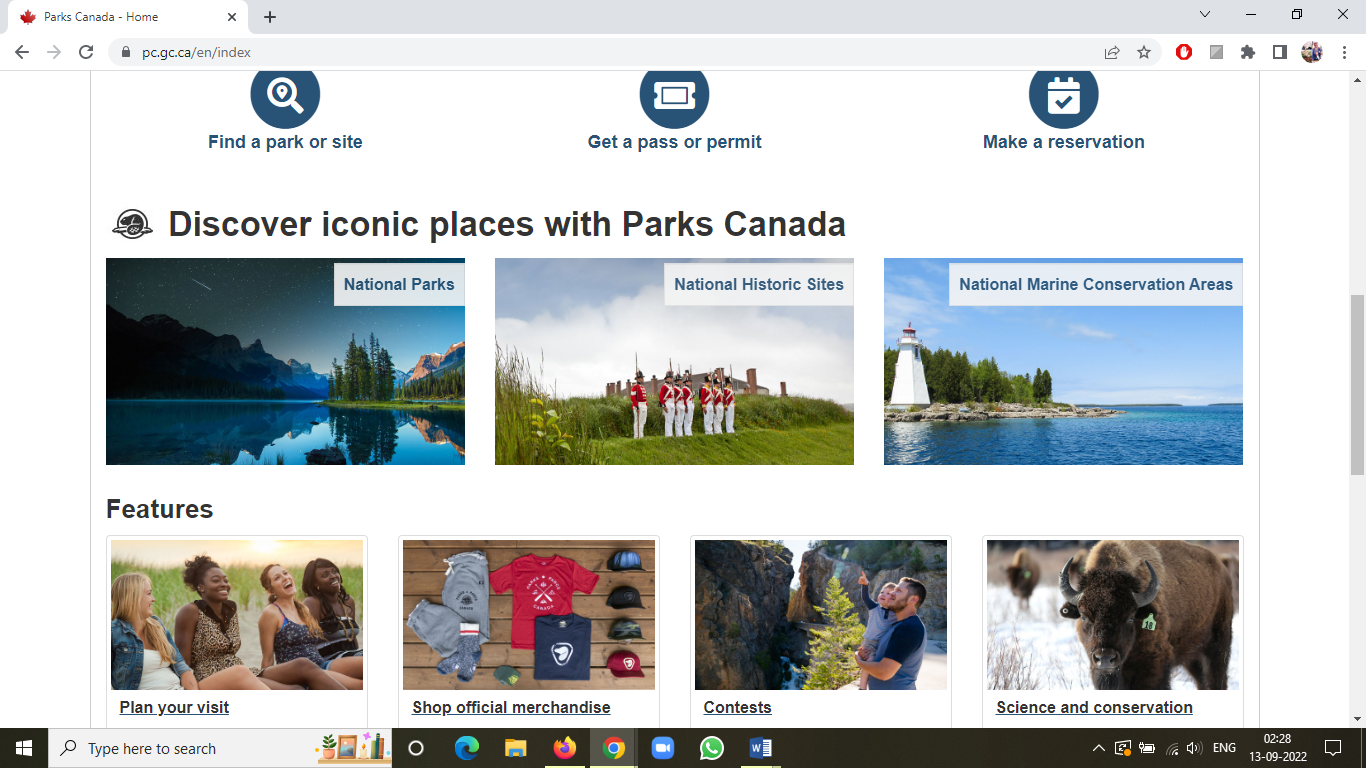
A good example for the improvement would be the ‘Parks Canada’ website with it’s sorted layout, big icons with proper spatial disposition and no unneeded ads or information. Below I have attached the screenshots of the ‘Parks Canada’ website.