User Goal: Check whether one is summoned to serve on a Brooklyn jury
For any juror summoned to serve in New York State, the NY Court website is the main artery through which one can uncover information about serving on a jury (or find any other court-related information.) This includes critical updates about whether or not one is called to serve on their expected summons date, or whether they are dismissed from being summoned.
Homepage:
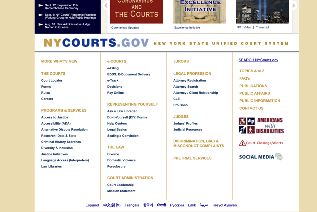
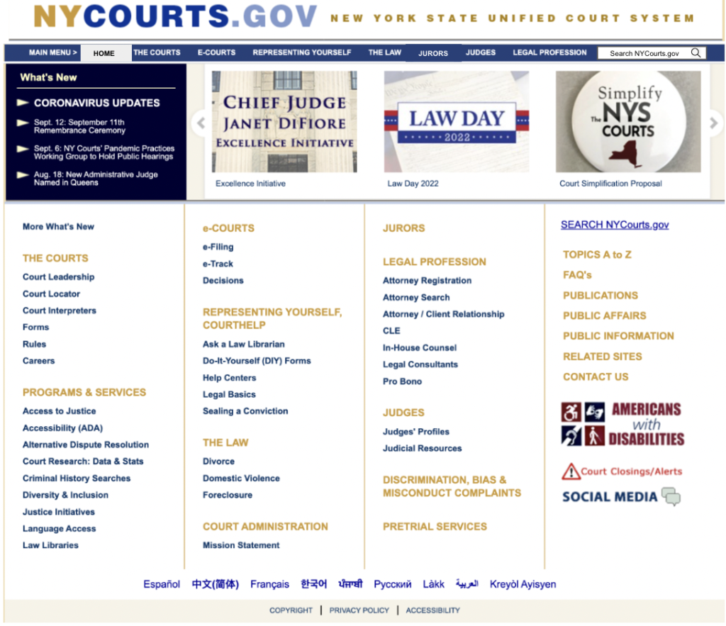
The NY State Court homepage has low discoverability in that it isn’t clear how users should interact with the webpage without testing it, and low findability in that information users seek is difficult to find. This is in part because the homepage is physically constrained in ways that do not map to the mental model of the contemporary website experience. Namely, the website lacks 1. a top-bar navigation and 2. a search bar.
The website instead employs signifiers of bolded capital letters and yellow text to indicate that the capitalized headers are the website’s navigation system. These capitalized headers convert to white text on a yellow background on hover, as pictured below, which provides feedback that they afford clicking a link. Once a user hovers over one capitalized header, they can also begin to close the gulf of execution between the website’s system model and their own conceptual model. They can intuit based on this new information that any capitalized header, and likely the subheads, will be linked.
Based upon this deeper understanding of the system, users can try to find the “Jurors” page. Despite an understanding of the system image, a user may encounter that the findability of the jurors page is low. The columns, for instance, do not necessarily map to the English-language reading mental model of reading from the top left to the bottom right. The user has to read through every column to reach their content. In addition, the content is not organized alphabetically, another mental model users may have and a form of knowledge in the head which can be utilized to make this task easier. While there is a “TOPICS A-Z” sort option in the far right column, it is the last column an English reader will reach and thus lacks findability. In addition, the yellow header text is hard to read: the color, #C49A45, fails the WebAIM color contrast checker.
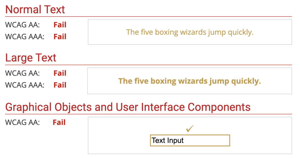
While the text contrast would likely be an easy fix using WebAIM, I would recommend that the NY Court website team conduct a card sort or tree sort to better understand the categories they need on this homepage and how to organize them meaningfully into a navigation bar or another navigation tool. This would increase findability and better map to most users’ mental models of an informational website.
“Information for New York State Jurors” Page
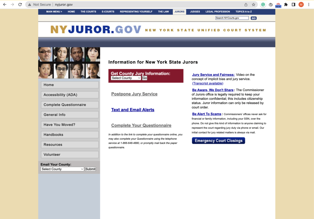
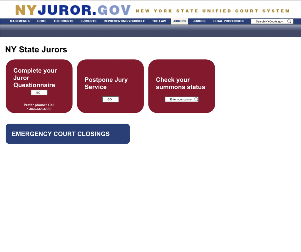
When a user finds and clicks on the “Jurors” header, they receive instant feedback they have performed the right action and are directed to the “Information for New York State Jurors” page. It is interesting to note that this page has top-bar navigation, while the homepage does not. The page a user is currently on is highlighted white with blue text.
Some of the affordances on the “Information for New York State Jurors” page have very clear signifiers. Users can easily tell that “Postpone Jury Service” links to another page, for instance, as it is underlined and colored “hyperlink blue.” The “Emergency Court Closings” button is also a clear signifier that it affords linking to information about emergency court closings. It would be similarly helpful to have a straightforward signifier like “Check whether you are summoned to jury duty” on this page.
There are two drop-downs on the page, signified by the contrasting white box, dropdown arrow, and “select county” prompt text. Because of the low contrast of the “Email your county” header on the lefthand dropdown, there is potential for users to make a mistake and try to select their jury county with the perceived affordance that they would be linked to information. The dropdown on the right has better visibility in the form of high-contrast white text against a black background, but low discoverability: it isn’t clear what this dropdown does. A clearer header like “Summoned Juror Information by County” would help signify what the dropdown accomplishes.
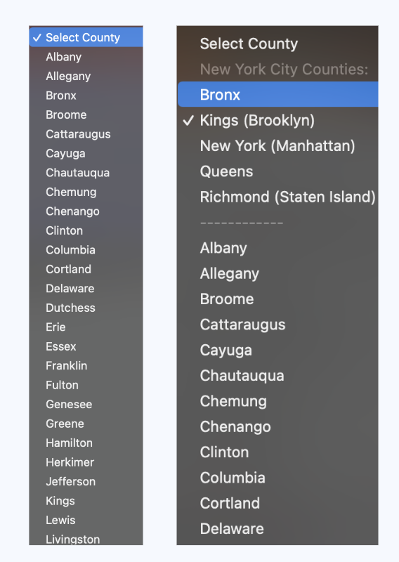
The dropdown itself maps well to a mental model of clicking the arrow to open and scrolling counties in alphabetical order. The “Go” button also clearly signifies that a user can be directed to another page once they make their dropdown selection.
It’s worth noting, though, that these dropdowns are not standardized:
“Kings County Jury Information” Page
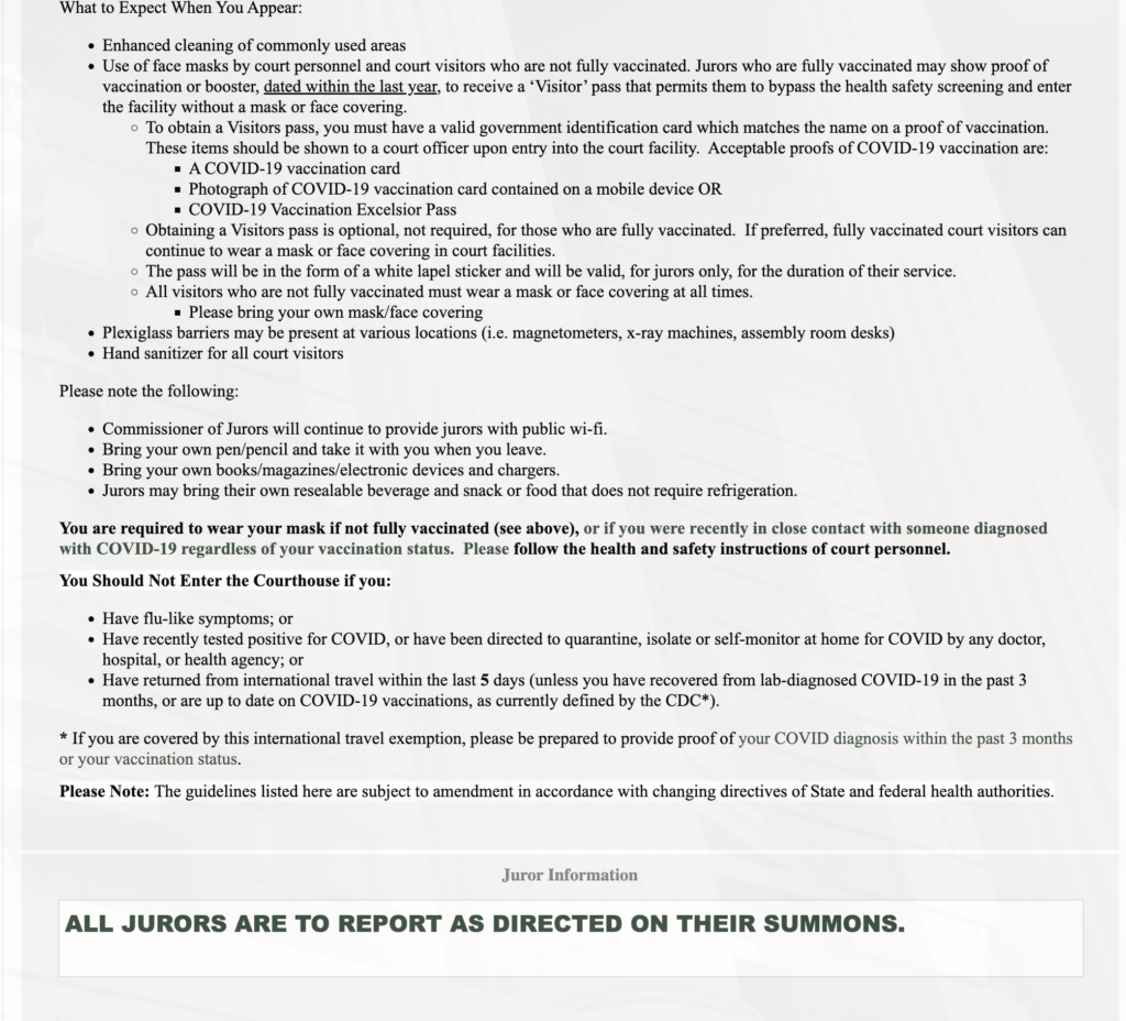
While this page has the signifier of a “Kings County Jury Information” header, the entire upper fold consists of COVID recommendations and information about what to wear to jury duty. It would be helpful to conduct user interviews with potential jurors to see what information they are looking for on the Jury Information page and how that can be best organized. I hypothesize that the summons updates, which require a scroll and are below the “fold”, may be higher in importance to users, as they need to know whether or not they are called to court before they need to consider COVID precautions.
Once the user scrolls, though, the summons information is highly findable in that it is differentiated from the other text using color, bolding, font size, and a contrasting background:
Conclusion
The NY Courts website has a lot of opportunity to better understand user needs and behaviors, as the current structure makes it difficult for users to understand what actions they can perform on the site and to find the information they are looking for.
Here are some visuals of what potential changes could look like:
