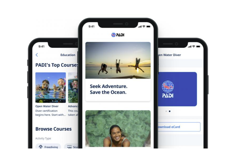
PADI is the only official diving app developed for divers. It aims to enhance their diving experiences by providing easy-to-access e-cards, online courses, dive shop locators, checklists, hand signal/knot guidebooks, online equipment shopping, and an online booking system (as of Version 1.34.0 updated on Sep 12th, 2022 ).
Homepage

The homepage uses boxes to differentiate between individual sections and signify rolling. For each area, users can click on and see the relevant information, providing explicit affordance and feedback. The bottom navigation bar uses natural mapping so users can easily know which part they are at and direct themselves to the wanted areas. It also follows the rule of practical measures of STM (Short-term memory), restricting the number of signifiers in five items. However, the homepage itself is a bad example of obeying the memory rule. It has ten varying sections on the same page, which may confuse users by offering too many options. Moreover, the “Explore PADI Gear” breaks the format with other sections, creating an inconsistent system image.


The Login system is easy to discover as it is on the top of the homepage. The application also keeps a standard format in terms of the login process. It employs the concept of knowledge in the world, which affords users an effortlessly and smooth login experience. In another way, it is novice-friendly. The “Create an account” button acts as a signifier and informs first-time users that the application affords them to sign up.
Retrieve E-cards
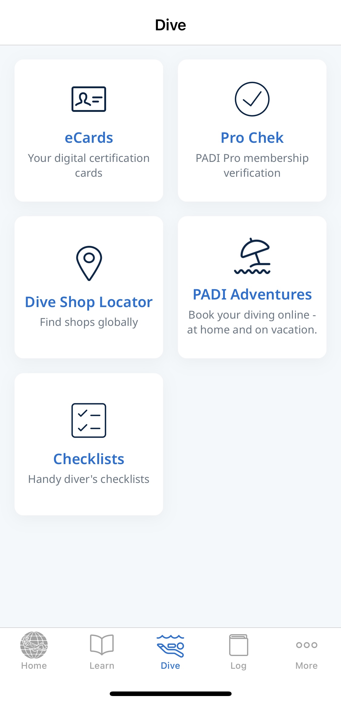
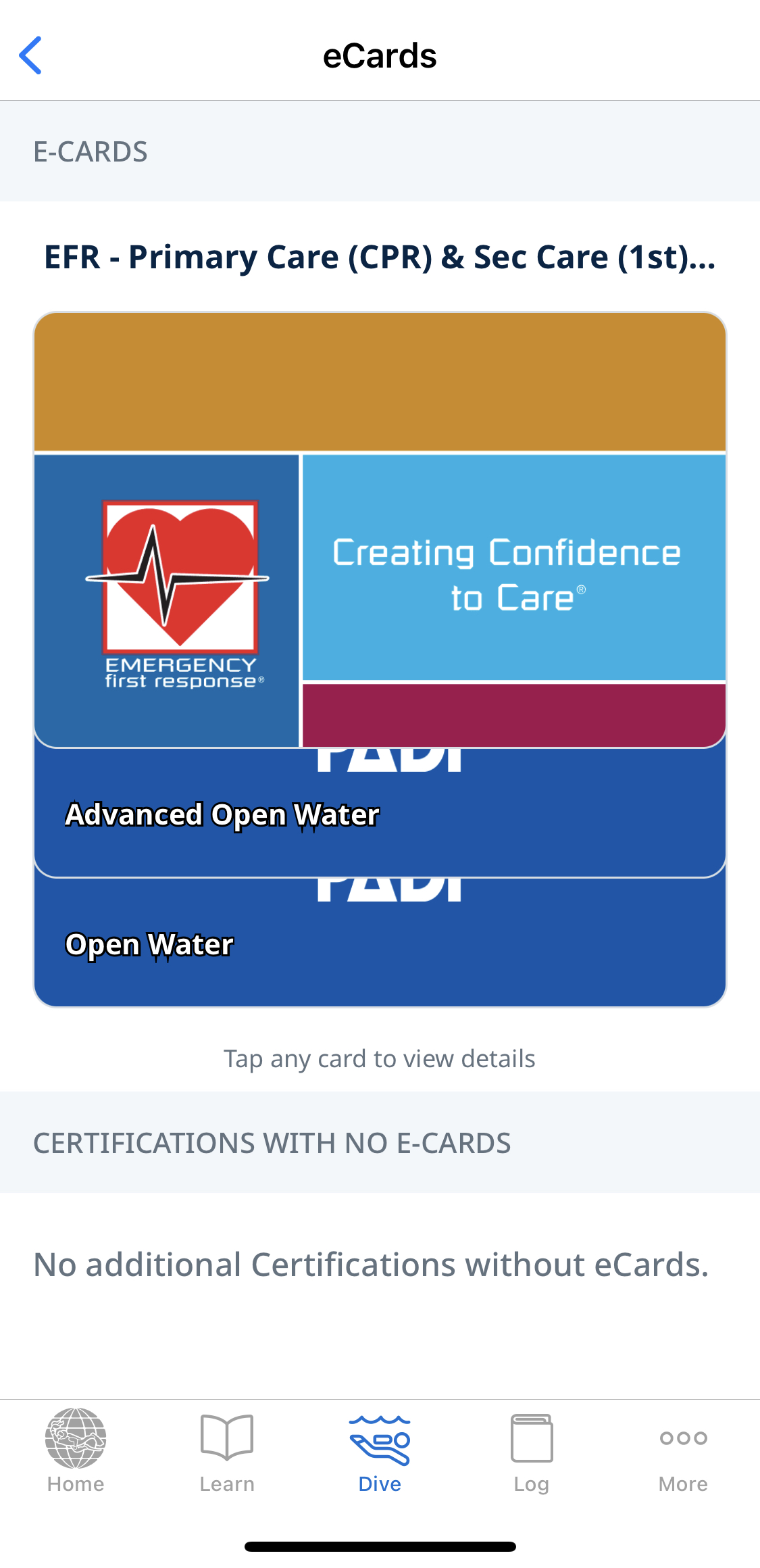
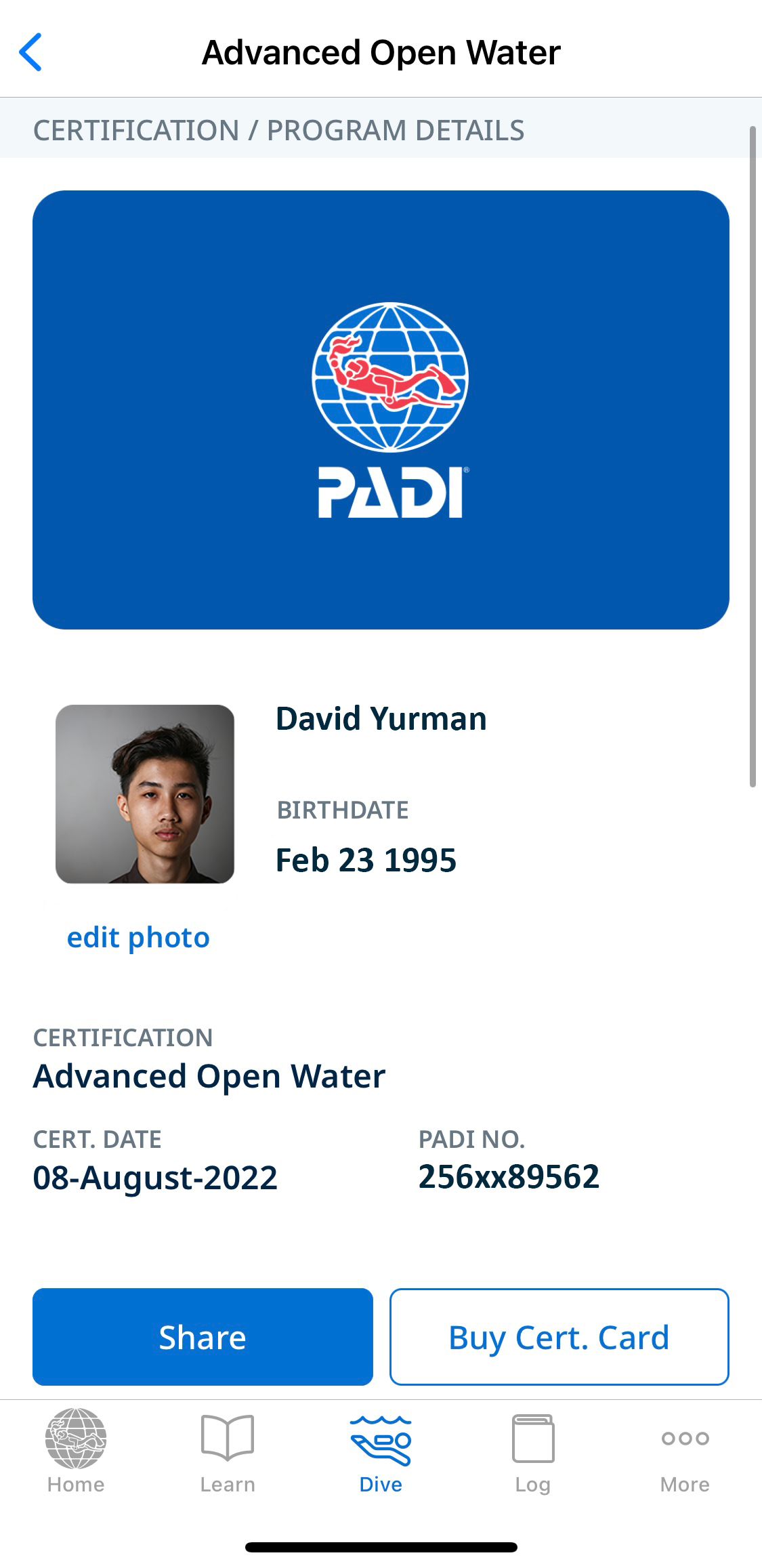
Once logged in, users can view their diving certifications/e-cards in the center “Dive” menu. It uses the conceptual model of the physical card here. Users can easily tap on the card they want, automatically becoming the first one. When the card is selected, it will show the basic information of the diver, along with the type of certification and certificate date. The “Share” and “Buy Cert. Card” act as signifiers to offer users other possible operations toward the virtual card.
Logbook
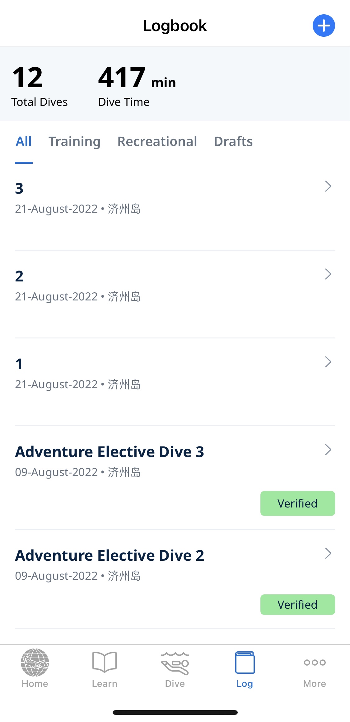
For divers, recording each diving data is vital. It means the accumulation of experience and needs numerical counts as evaluations. The “Log” icon on the menu bar with the book look effectively features the function so that users can immediately know what it’s for. The function of adding a new log is made discoverable. The blue bubble with the white “plus” icon at the top right corner tells users that it affords to add a log, wherein the icon itself acts as a signifier. The log creation page has multiple images, so it uses dots below each page to give feedback about where the user is in the stack of pages. Dots also act as signifiers, indicating which direction the user could swipe to view the rest.
Dive Shop Locator
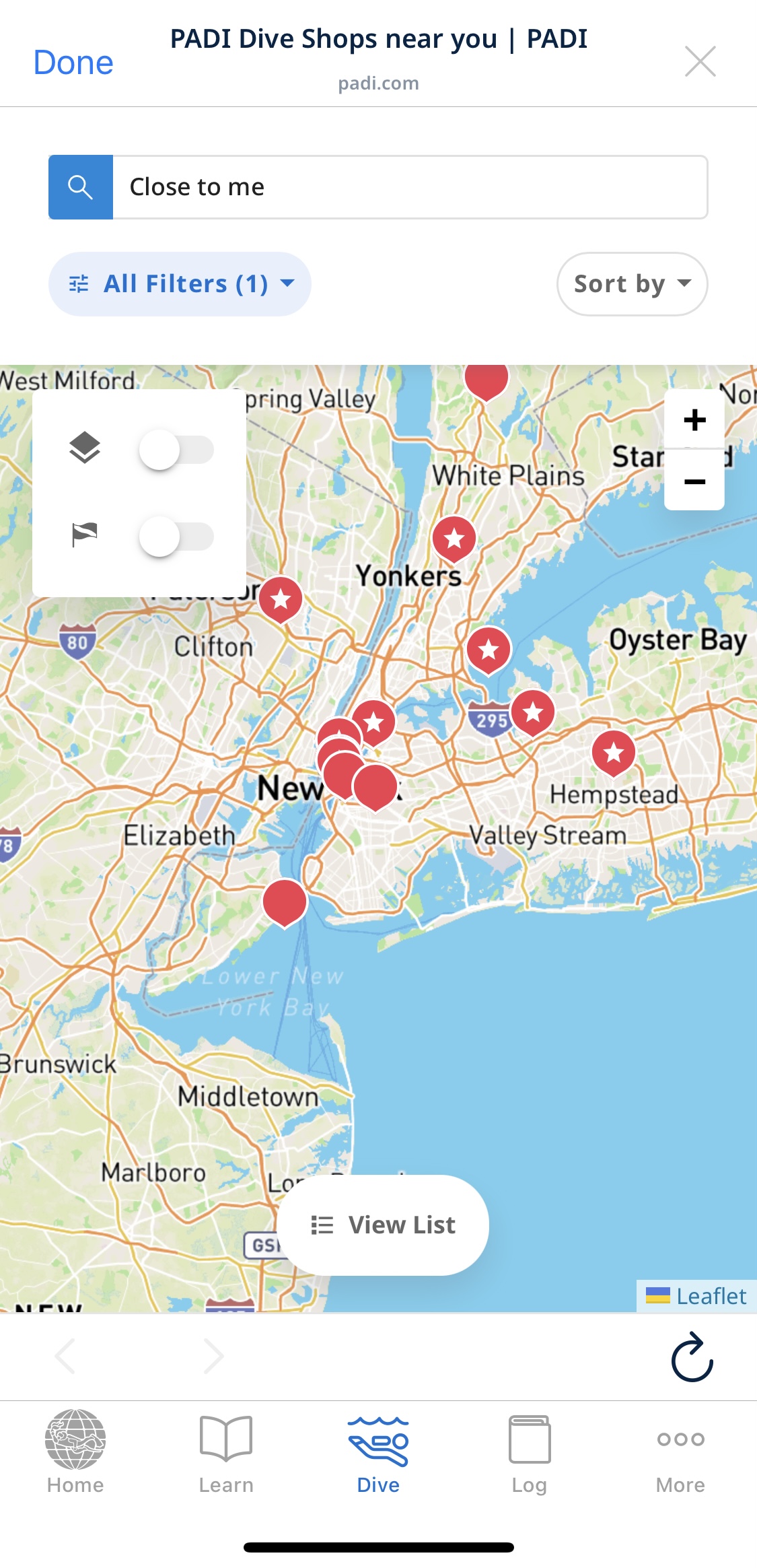
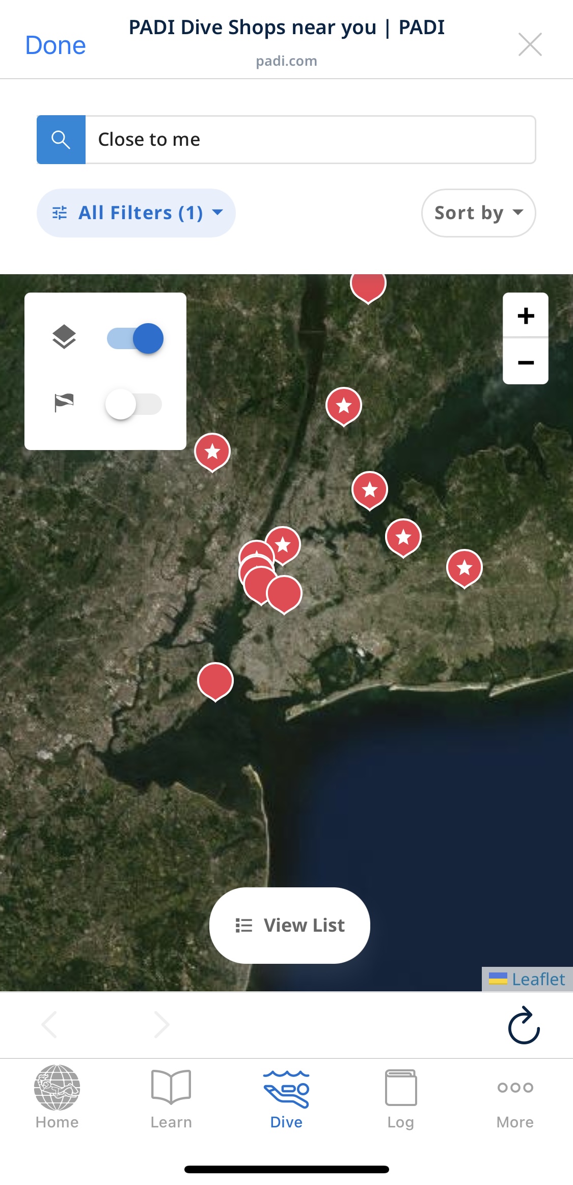
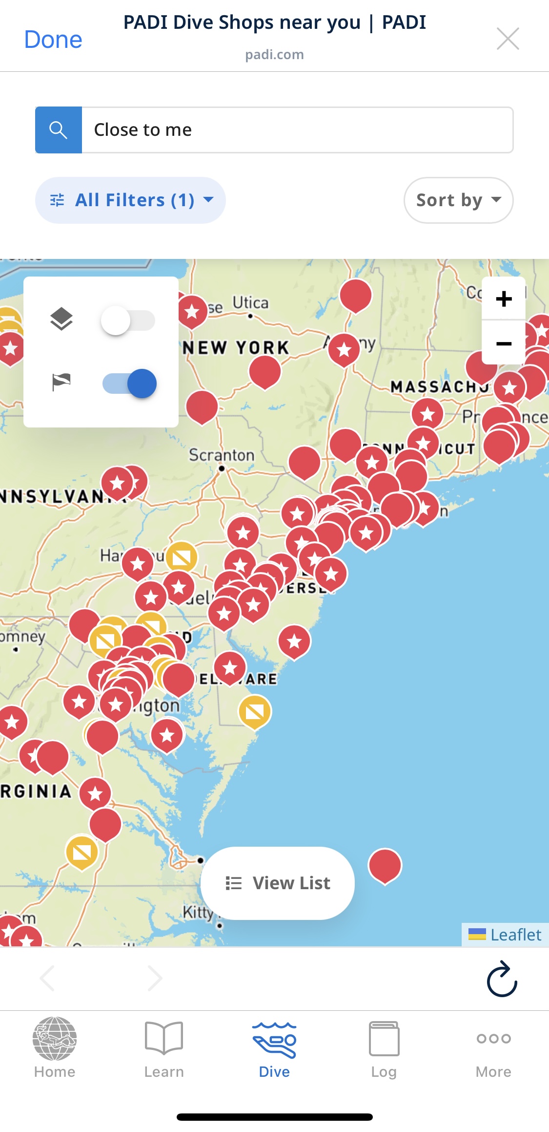
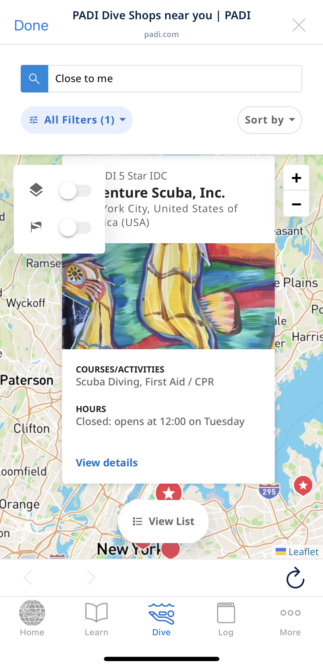
When the diver clicks on the “Dive Shop Locator” on the “Dive” page, a map within verified dive shops labeled on it will come up. The different styles of buttons on the map tell users that they are different types of shops at first glance. The one within a white star means it’s a five-star diver center, which signifies itself as a top choice for users based on common sense. Users can zoom in or out of the map by sliding two fingers across the screen or using the “plus” and “minus” buttons” at the top right corner. Through this natural mapping, users can take a close look at the map using actions they are already familiar with. The “View List” button at the bottom affords another view mode for users. It will list dive centers’ information in grid and text format. Users will maintain a smooth and easy transition between the map and list modes using the bottom button. However, in the map mode, the top left box may lead to the gulf of execution and evaluation. Without text comments, it is hard for users to know their meanings based on the icons themselves. Knowledge-based mistakes may appear during use. The map will change its style when activating the first layer-like icon; turning on the second flag icon will label natural diving spots. Without trying two or three times, users cannot find their proper indications, resulting in wrong interpretation and misuse of the map. Moreover, those two icons overlay the dive shop’s information when clicking on a store close to them. To enhance this, turning the current icons into texts, like “Geographical Mode” and “Natural Diving Spots”, and then move them to the filters bar will be more helpful.
Conclusion:
Overall, PADI has a very clean and straightforward design. Some of the design is understandable and easy to use, like the log page and color-coded icons, while some are a little bit creeping featurism and lacking mapping, like the homepage and map filters, which may cause confusion for users without knowledge in the head.