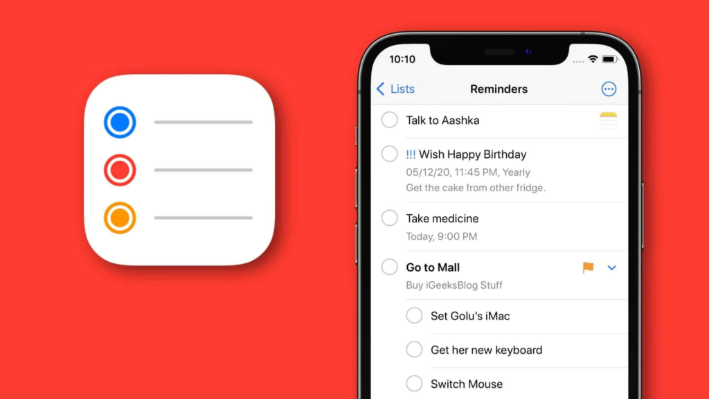
Reminders app helps people remember things they can easily forget, such as grocery lists. It gives users interface with daily checklist without making any additional effort. Throughout this blog, I will review the Reminders app in correlation with Don Norman’s ‘Characteristics of good design’, mentioned in his book “The Design of Everyday Things.”
Viewing scheduled checklist
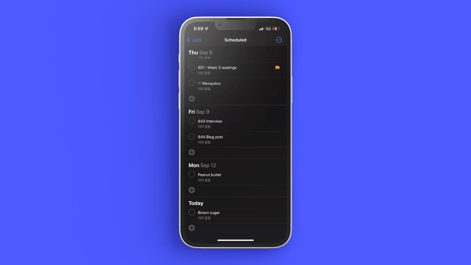
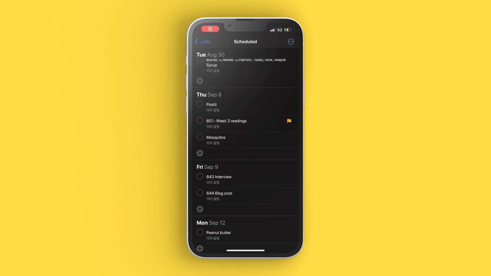
The ‘Scheduled’ button with calendar icon allows the user to view all the checklists. The icon works as signifiers as it is differentiated with the ‘Today’ button on the left which shows a calendar with one date.
However, as the user clicks the ‘Scheduled’ button, the order is viewed in an ascending order showing older lists first. This contradicts conceptual model as people usually view lists in a descending order. For instance, Mail Box is sorted in descending order showing newest mails at the top. The ‘Checklist’ is important for people to know what they need to remember right now. If the user wants to see or make the checklist for today, they have to scroll all the way down. Additionally, considering mapping, people scroll down to see past information as they view the screen, as seen is News app, which contradicts the design of Reminders app.
Solution
Make the order descending from Today to Past.
For users to easily see what they have on their plate right now, redesigning to a descending order would benefit users more.
Creating a checklist
Even after users pick the date they want to make a checklist for, they can change the date while typing. It is useful for users who change their minds while writing or made mistakes in the first place. The date option can be easily found with the icon of ‘calendar’ – signifiers.
However, when users click ‘Tomorrow’ from the options, the date of the checklist they are making at the moment does not change until clicking ‘Done’ on the top right. This can be viewed as a lack of Feedback because it may confuse users questioning if they are doing it right.
Solution
Immediately change the checklist position under the date the user picked.
Right after the date the change has been made, moving the checklist position under the changed date immediately will give users feedback of what they have done.
Setting priority
As users make a lot of checklists in one date, they might get confused which one is important. To solve this confusion, the app has ‘Priority’ functions with icon of ‘!’. Priority function has four options – High / Medium / Low / None. In addition ,the users are easily able to identify the importance with the number of ‘!’ which works as a conceptual model.
However, when the priority has been set, the order of the checklist does not change. Considering Conceptual Model of viewing importance, the users have to take a closer look at how many ‘!’ shown.
Solution
Change the order of the checklist into High-Medium-Less-None order.
Ordering the checklist from the highest to lowest priority items will help the user to know immediately what they have to remember first, which can also project better Mapping.
Setting Flag

Reminders app also has a ‘Flag’ function. It could be confused with the ‘Priority’ function as its meaning may be ambiguous for users. The ‘Flag’ icon is shown on the right side unlike the ‘Priority’ icon, ‘!’ (which is placed closely to the left of the text, which could be looked like an exclamation point the user wrote compared to the Flag) which is a more visually noticeable Sign.
However, for people who do not use ‘Priority’, the ‘Flag’ items could be the ones that are the most important to them because if you think of Mail Box again, it even has a distinct folder for it!
Solution
Change the ‘Flagged list’ order to the top.
Like the solution for ‘Priority’, changing the order of the flagged items into the top might be useful for users for Mapping.