
Slack is a messaging platform used by many companies and organizations to help facilitate communication and collaboration among groups of people. It offers a wide variety of features and functions such as sending pre-scheduled messages, recording audio clips, setting up small meeting sessions, and integrating popular apps.
Viewing Specific Messages
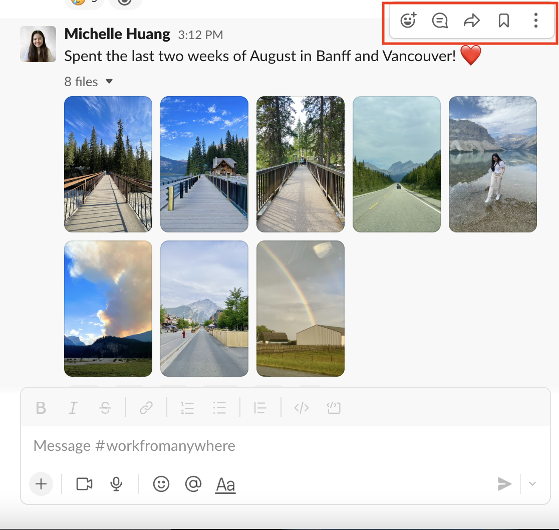
Messages afford many kinds of actions such as responding with emojis, replying in a thread, sharing in another conversation, and saving it for later. If you are the first person to see a message in a conversation, there are no instant, noticeable signifiers to show these affordances. In order to discover any of these affordances, the user would have to hover over the specific message to see these options in the upper right hand corner (Figure 1).
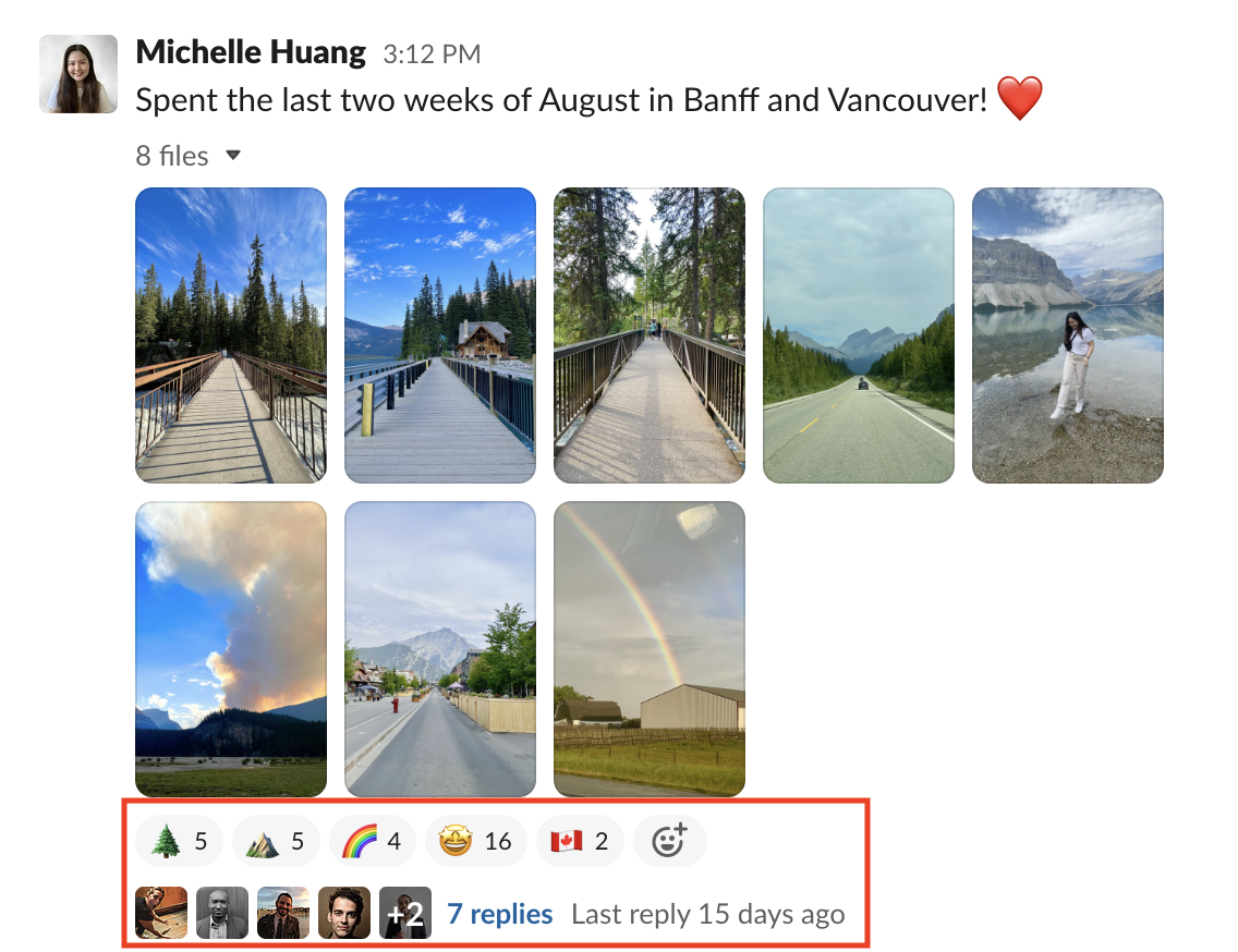
On the other hand, if other people have already reacted to a message with emojis or with a reply (Figure 2), without hovering, the user can already see the number of people who responded through these two methods. It is visible to the user which emojis were used and how many times. As for the replies, the “+2” example as shown in Figure 2 informs the user that more than five people have responded.

When a user decides to react to a message with an emoji previously used by another person, they can directly click where the emoji count is. The system provides feedback by increasing the count and highlighting the emoji icon with a light blue color (Figure 3).

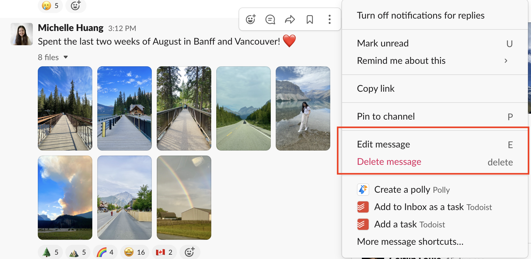
When a user clicks on the three dotted icon after hovering over a message they have written (Figure 4), they can view other affordances such as editing and deleting a message (Figure 5). These two options account for possible slips and mistakes that could occur and allow users to recover quickly.
Scrolling Through Conversations

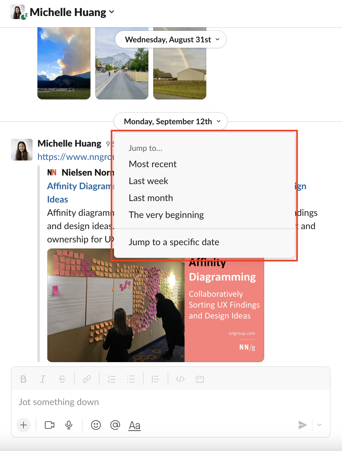
Slack messaging follows a good conceptual model because messages are displayed and ordered in chronological order. It allows users to jump back to a specific place in a conversation. The arrow next to a date signifies to users that it is a clickable element (Figure 6). Once a user clicks on this and selects a place they want to jump to (Figure 7), natural mapping occurs when the user is brought to the specific dated section of the conversation they requested.
Searching for Past Messages or Files
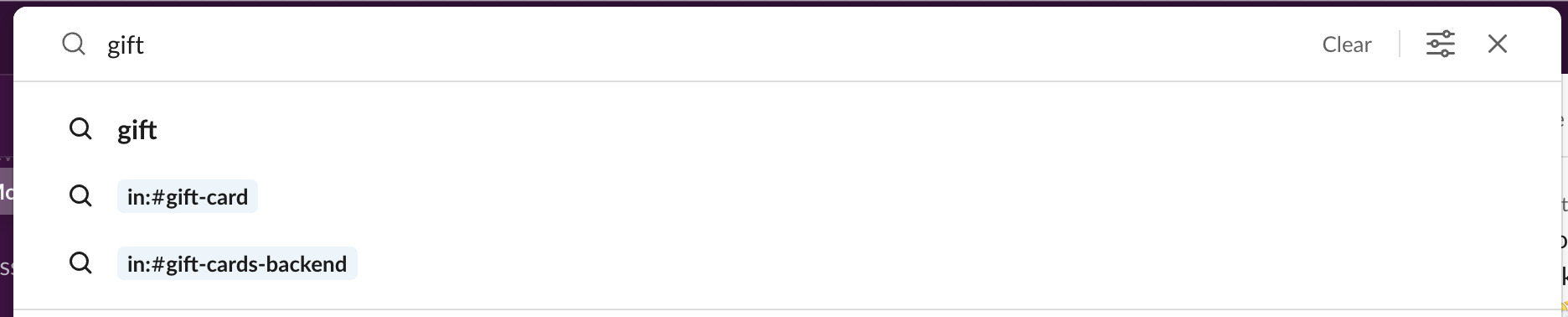
The search function is made discoverable at the top of the desktop app window. When a user wants to refer back to any messages or files that they recall mentioned in a Slack conversation, they can use the combination of knowledge in the head and knowledge in the world to help achieve this goal. By typing in the little bits that the user remembers in the search bar, feedback is given by displaying search results that could potentially be what the user is looking for. However, the feedback generated while the user types could be confusing, especially to a novice Slack user (Figure 8). The last two results indicate that the mention of the word “gift” was found in two conversation channels called “gift-card” and “gift-cards-backend.” The lack of spacing and the combination of the characters “in:#” could make it frustrating and confusing for the user on a visceral level.
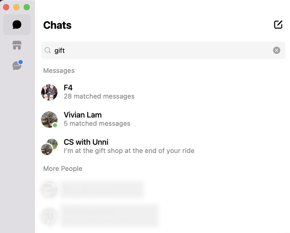
A potential solution to this issue could be something similar to how Meta’s Messenger app deals with search results (Figure 9). The system categorizes the results with labels so it is clear to the user where the knowledge in the world is being drawn from. Plus, the visibility of the number of matches in a chat and the snippet of conversations further help the user locate what they are searching for.
Conclusion
Slack offers many features that help boost productivity. The challenging part of designing such a platform is making it feel intuitive and not overwhelming while encompassing all these platform capabilities.