
Tinder is a popular dating app used for meeting new people, casual hookups, or finding your soulmate. Tinder revolutionized the online dating industry and introduced the notorious phrase, “Swipe Right” as a means of showing interest in other’s dating profiles. The popular dating app is available as both a mobile app and desktop application.
Note: All screenshots have been edited to ensure privacy of Tinder users
For the purpose of this design critique, we will be focusing on the mobile app for iPhone (Version 13.16) and using concepts from Don Norman’s The Design of Everyday Things to explore and analyze this app’s components. Upon the app’s initial launch, you are brought to the main screen where you are shown one person’s profile at a time.
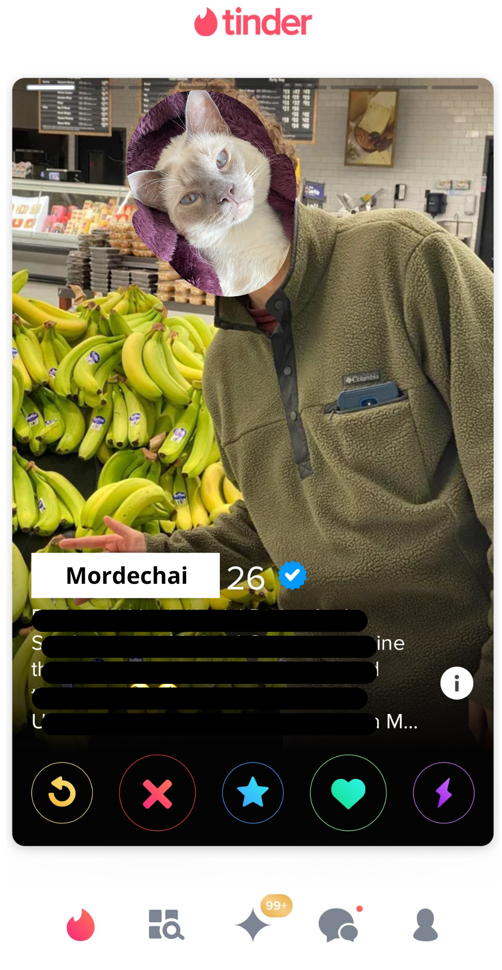
At the bottom of each profile, there are five signifiers that allow you to interact with the given profile (as shown below in Figure 2.) These signifiers are represented with symbols, including an arrow, an “X”, a star, a heart, and a lightning bolt. The “X” and the heart are visually larger since these are the two signifiers that a user will engage with the most. The app also offers a system image for new users in which each signifier is explained. Each symbol is very distinct in both color and shape to allow for easy differentiation, especially when the user enters subconscious thinking as they use the app more regularly.

Tinder coined the popular phrase “Swipe Right,” which has become a cultural norm when discussing dating profiles. Their main actions on the app are swiping right to like profiles and swiping left to ignore others, which have remained consistent throughout the app’s life.
Despite having consistent controls, the app’s mapping can cause users to slip and perform the wrong action. As you can see in Figure 1, the small transparent bars at the top of the given profile afford that there is more than one image in the profile, but there is no clear signifier to cue the user to tap through the profile, which is the correct action. Swiping through photos is normally the accepted action for many social media platforms, but if it were to occur on Tinder, the user could slip and accidentally like or dislike a profile.
Slips most often occur in subconscious thinking, which is a typical state for a user to be in while sifting through close to 40 different people every few minutes. A possible remedy for this occasional slip would be to allow the user to expand the profile by tapping on it since it is natural to tap on a profile on social media, make the images “swipeable,” and leave the signifiers at the bottom to tap and engage with the given person’s profile.
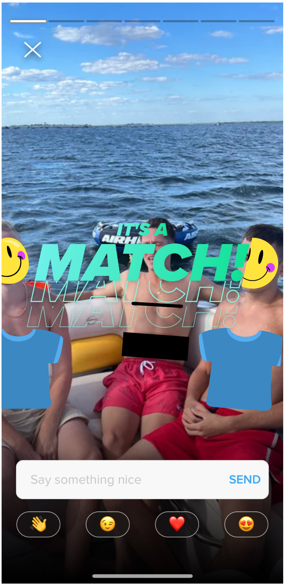
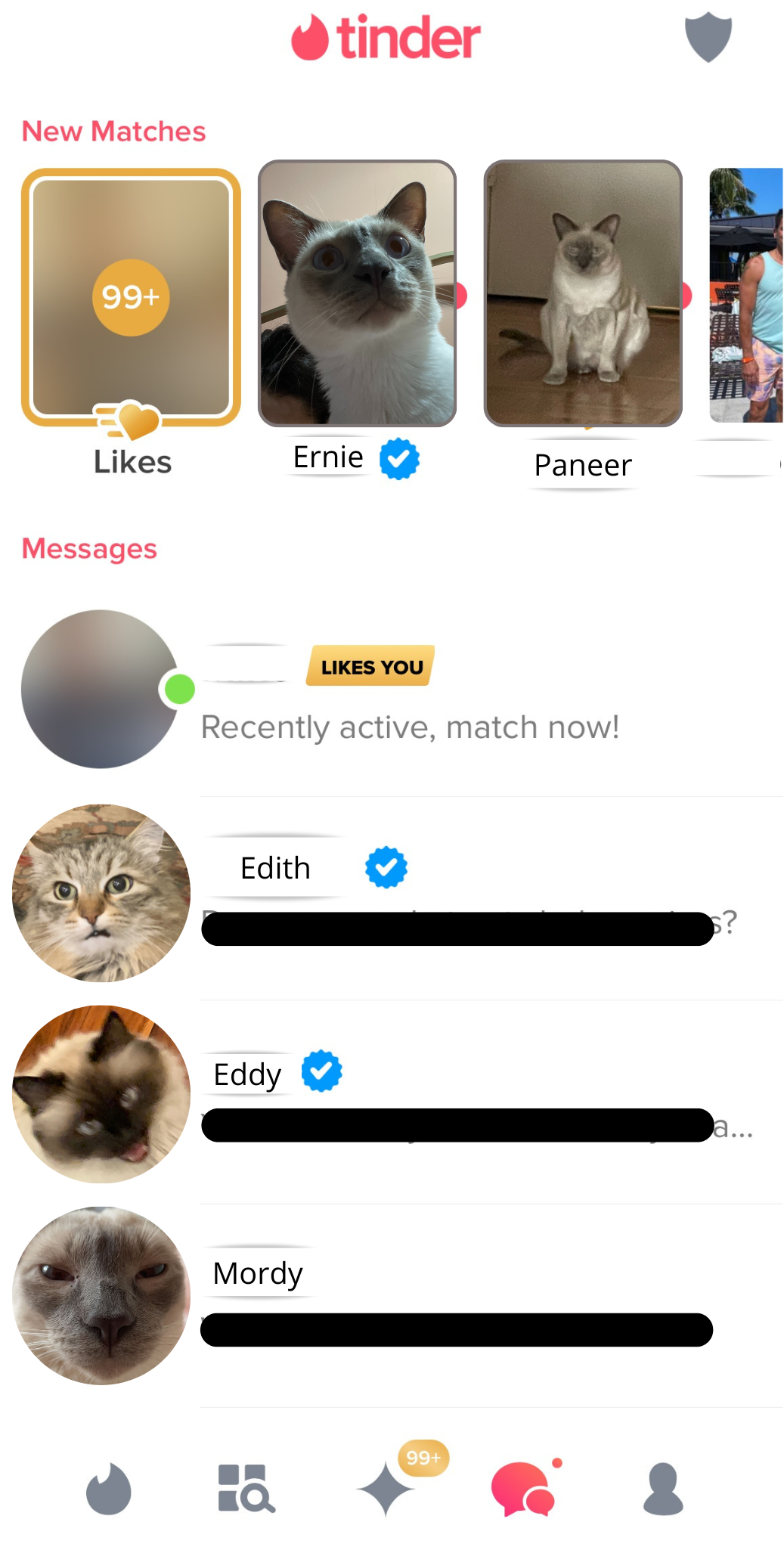
After spending some time on the app, it is likely that you will match with a profile – match meaning you have both swiped right on each other. You are given immediate feedback that you have matched with another profile, as shown below in Figure 3. This immediate feedback helps to show you that the app is working and your swipes are being registered. Not only are you immediately notified, but the app includes a signifier to send a message to the user to get the conversation started. Your match is then added to your messages window, which is conveniently located at the bottom of the screen (Figure 4).
Tinder created a revolutionary and convenient way to find that “special someone” right at your fingertips. The app overall is well designed, and easily discoverable for new users looking to get into the dating scene. Despite some slips that can occur due to the mapping, Tinder was first among many to create an easy-to-understand dating app interface. For better or for worse, Tinder successfully created a space that allows the user to slip into subconscious thinking and decrease the anxiety and emotions faced in dating.
Header image from tinder.com