Zoom became one of the most popular platforms for live video chat during the yearlong COVID-19 pandemic. Zoom is a video conference platform that connects users to online video meetings, webinars and live chat and can be used through a desktop computer or the Zoom mobile app. I will be critiquing the Zoom mobile app regarding some usability factors.
Meet & Chat screen on Zoom
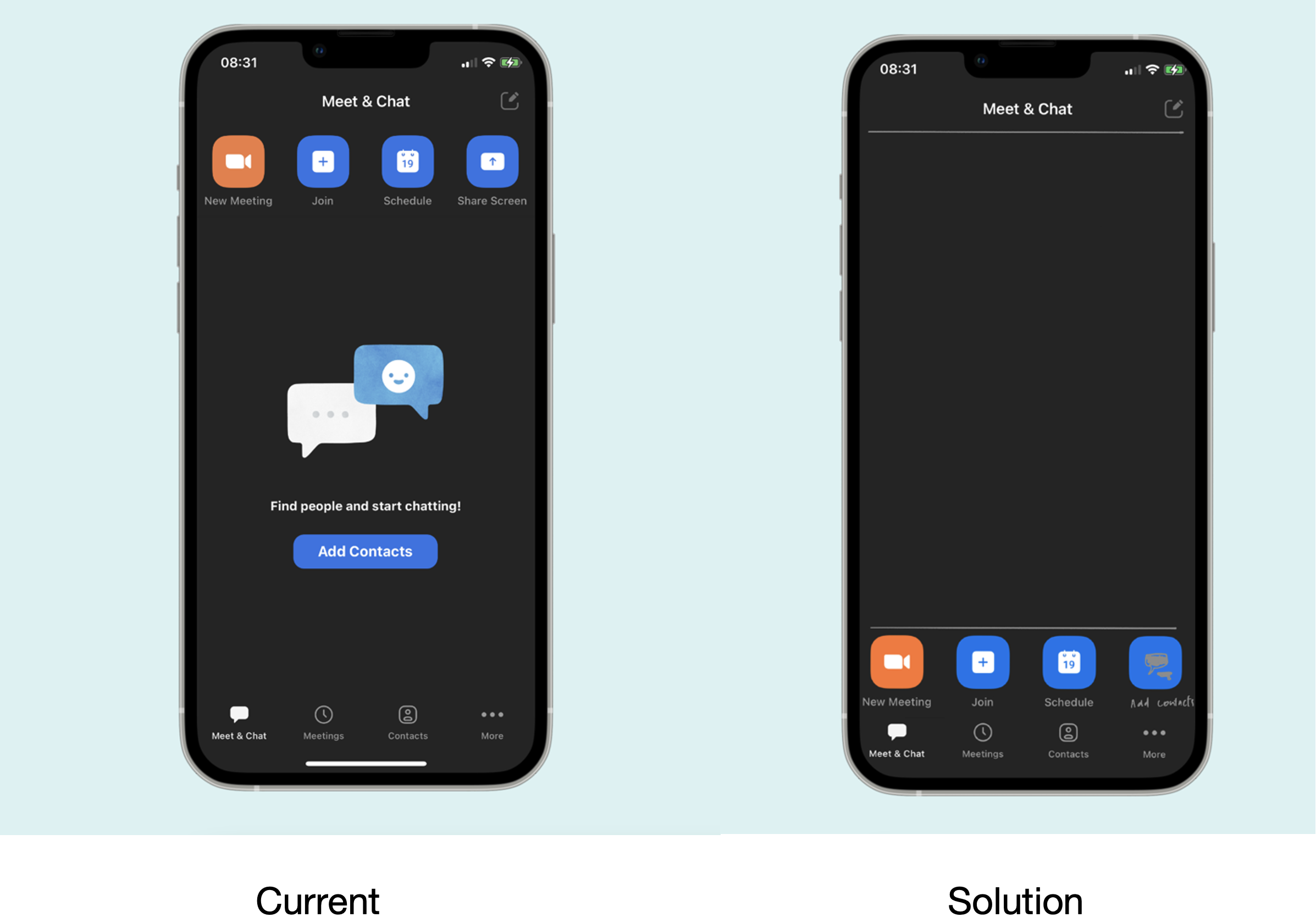
Upon logging in to Zoom, the app opens to show the “Meet & Chat” screen which is straightforward and easy to understand. It features icons that indicate possible actions that the user might be interested in doing like joining a meeting, scheduling, or starting their own meeting. The discoverability of these icons is good, however their hierarchy and the way they are displayed on the “Meet & Chat” screen could use some improvements. When a user first logs in and sees the “Meet & Chat” screen, the layout gets a little crowded with the bigger more relevant action items at the top of the screen and more action items on the bottom with the center of the screen displaying a large chat box image and an “Add contacts” sign. Additionally, the share screen option on this page seems a little irrelevant since once the meeting is in progress this button is disabled on the “Meet & Chat” screen. As a first-time user trying to use the app, this might seem a little confusing and maybe a little overwhelming if the user is trying to join the meeting in a hurry and their first instinct would be to look at the action items at the bottom. This type of behavior is typical as it occurs without human awareness and users subconsciously try to look at the bottom of the screen showcasing the behavioral design issues since most of the app’s usually display major action items at the bottom.
Solution
By getting rid of this constraint and simplifying the interface helps guide the user to the next action. In this case, the organizational hierarchy of the “Meet & Chat” screen needs to be reorganized. This can be done by mapping the bigger action items like “new meeting”, “join”, “schedule” and “add contacts” to the bottom of the screen right above the meet & chat, meetings, and contacts option.
Making sure if you’re on camera or unmuted?
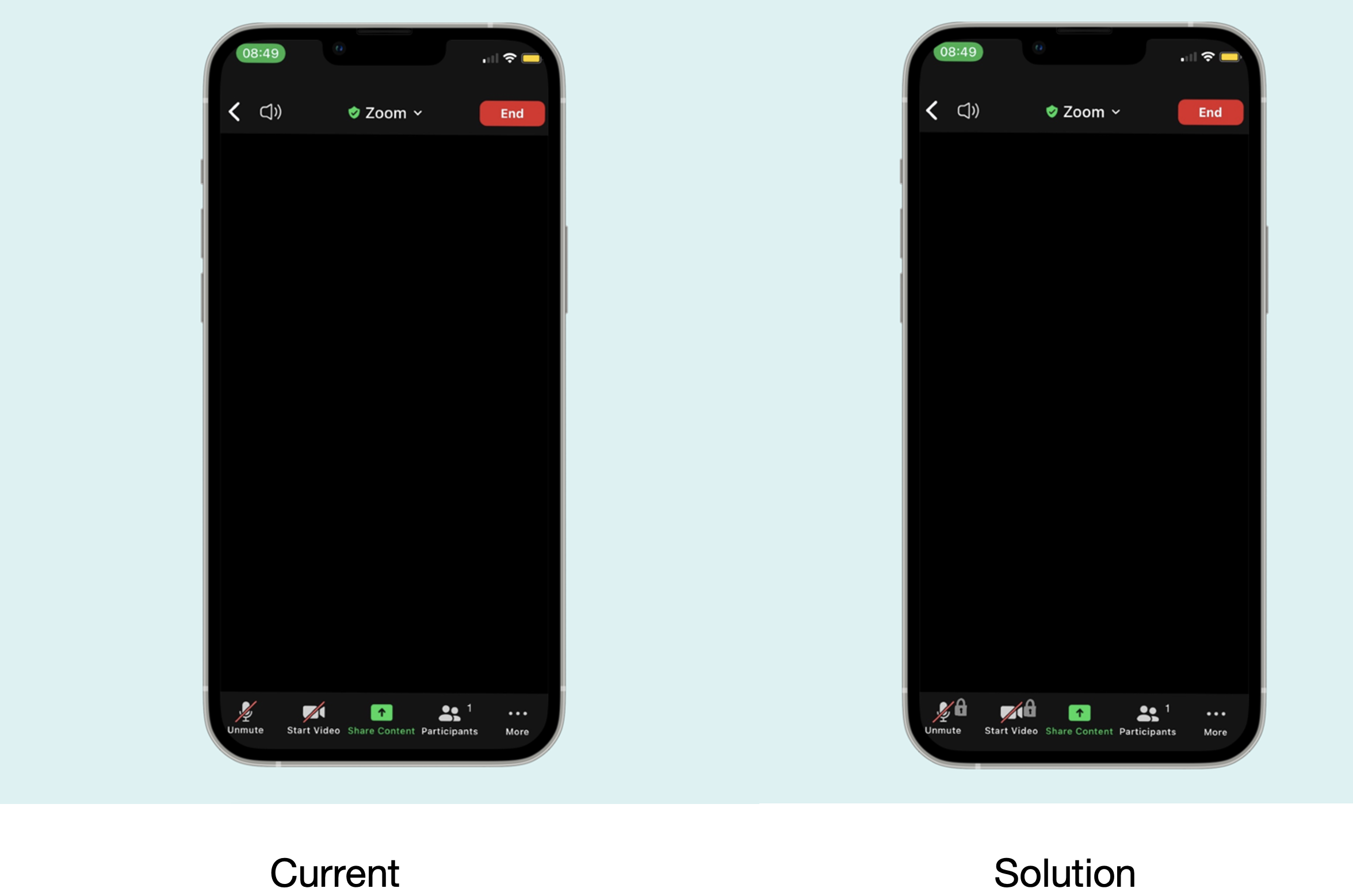
The “mute” and “start video” on zoom are very discoverable on the dashboard of the meeting screen. If a user wants to mute, unmute, and not show themselves on camera they can achieve all of this just by tapping the “mute” and “start video” icons, which then makes a sound in confirmation for the action that was just performed. However, this can become a little problematic if the user has their phone on silent during a meeting or if they accidentally drop their phone facing forward while the meeting is in progress. The increased sensitivity of the touch screen has the potential to accidentally unmute or start the video without the user even finding out about it and this can be quite embarrassing in some situations. This type of error can affect the behavioral and reflective levels of design. While muting the zoom call is almost an unconscious behavior, accidentally unmuting it can make the user feel paranoid about using the app, constantly wondering if they’re muted hence, also affecting the way they perceive the app.
Solution
In order to prevent slips in design, when users tap the “mute” or “start video” option on the screen, they should be able to tap it twice to lock it in place. Additionally, having a tiny lock icon next to the unmute / start video option would keep the users’ minds at ease while they’re in a meeting instead of feeling paranoid that they’re unmuted or on screen.
Prioritizing actions that are used often
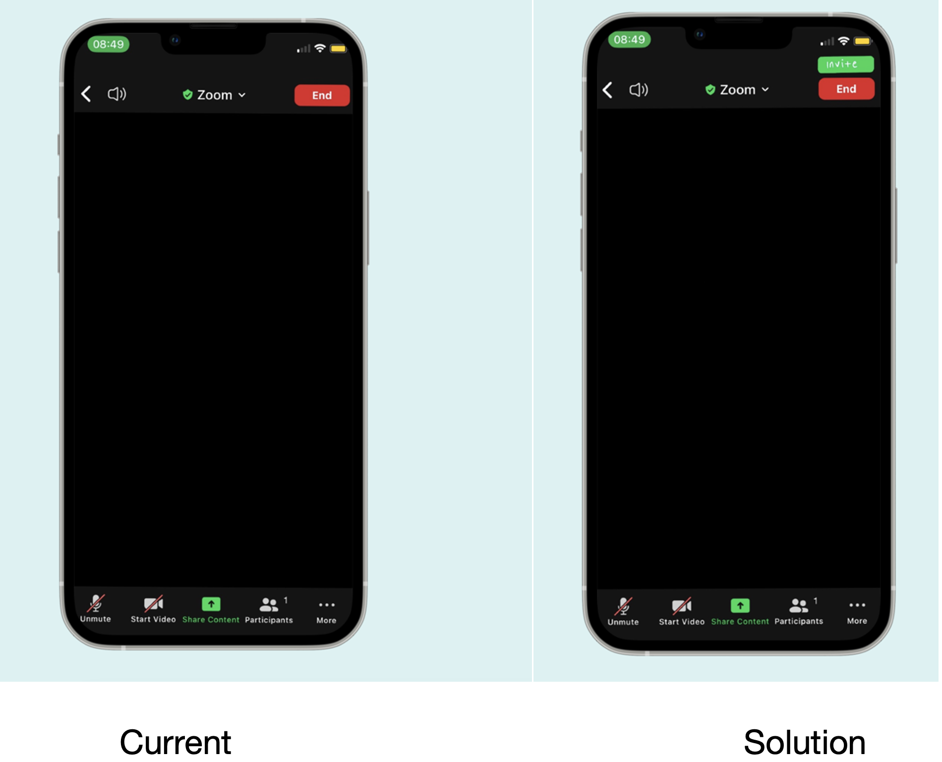
Actions like “share screen”, “invite” and “end meeting” are actions that are used often if not almost every time a user is in a meeting. As soon as a user creates a meeting room there’s a share screen right in the middle of the dashboard and an end meeting sign on the top right corner of the screen. The discoverability of these items on the Zoom app is good. However, the invite option on the meeting screen is very small and hidden in a busy menu with all the participants that are in the meeting.
Solution
Rearranging the dashboard on the meeting screen to have an invite button instead of hiding it in the participants menu. This can be done by adding the invite button right above the “end meeting” button.