Recreational Equipment Inc. (REI), is an American consumer co-operative retailer with over 100 outdoor industry brands, suppliers, and manufacturers. REI strives to promote both large scale retailer brands and small specialty brands for their customers, while also providing accessible services to include: informational classes, outdoor related-events, expert advice, and sustainable consumer options. With the vast selections of products and services, let’s take a look at REI’s retail side of product browsing via mobile web browsers.
In this article, we will be focusing on the structure, layout, and use of interface design elements of REI’s e-commerce homepage, which also functions as its landing page.
The homepage layout consists of a top navigation bar, page header, secondary navigation bar, and a full-page featuring one product section that continues below the fold, leading to a long scroll before reaching product category, and information about the organization.
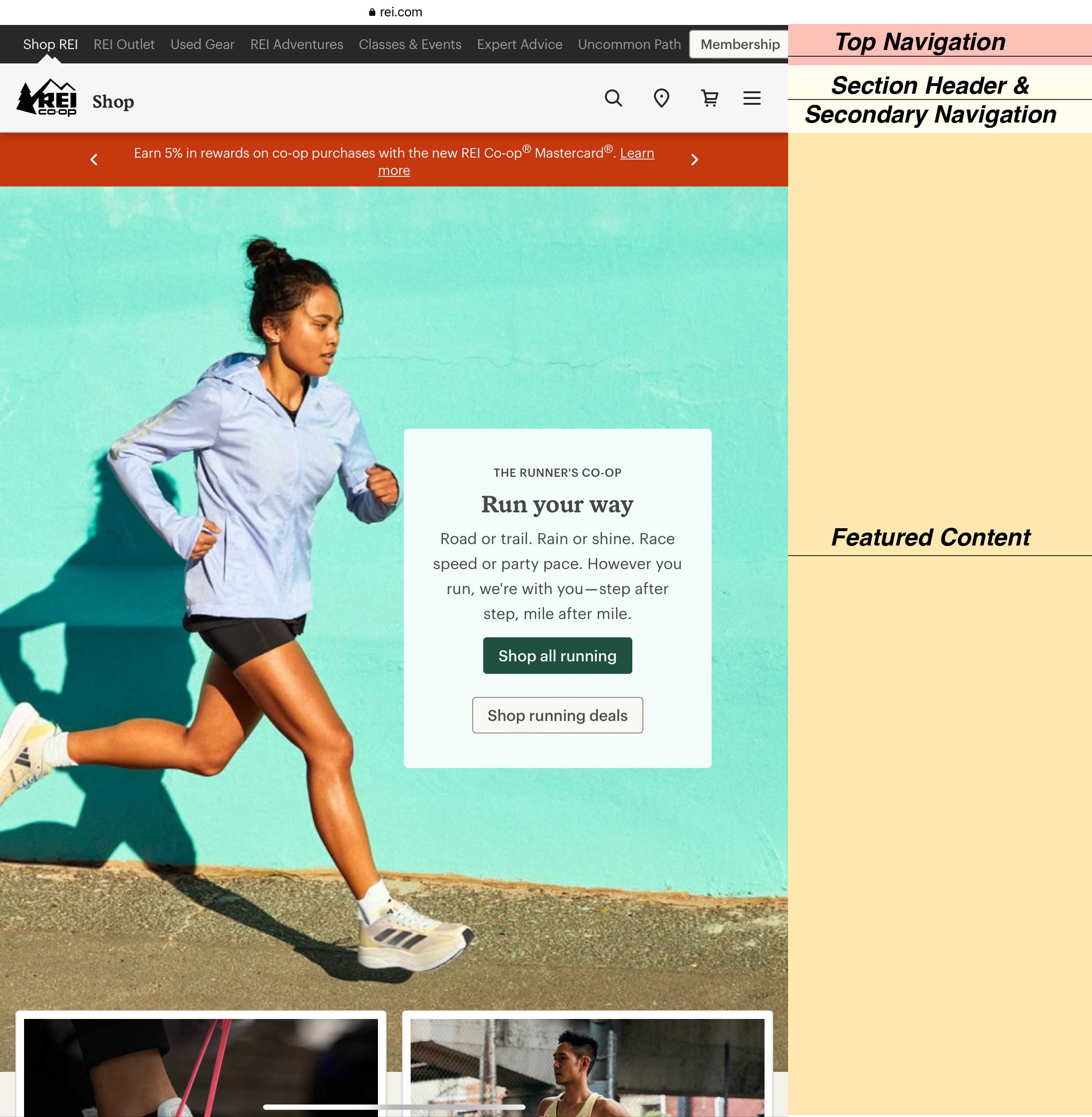
I. TOP NAVIGATION BAR
The top navigation provides users affordances to explore other aspects of REI’s business outside retail/e-commerce offerings. Upon landing on REI’s homepage, users will notice the use of color differentiation of white text against a black background vs gray text against black background is a signifier of the clickable top navigation items, while indicating the user’s current location and section within the website. A small image of white mountain peaks bleeds upwards from below the active text in white, used to also reemphasize the text signifier of an activated state. The framing of the elements and use of color help separate and establish hierarchy of the top navigation bar.
Based on Figure 1, we can see that as a user we are currently on the e-commerce section labeled: “Shop REI”.
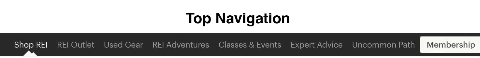
II. SECTION HEADER & SECONDARY NAVIGATION BAR
Section header is located immediately below top navigation. The section header has a white background with dark gray text overlay, provides the user’s active location within the site, along with options to begin their browsing experience through the use of iconography to the right.
The iconography located to the right of the header provides an affordance to the users that which allows for the browsing of the e-commerce section of REI’s website. These icons are all declarative knowledge to common familiar iconography found on other e-commerce websites, which include:
- Magnifying glass: A search bar feature
- Pin Marker: Closest relevant retail location
- Shopping Cart: User’s choices of goods before starting check-out process – Hamburger Menu: reveals other options for browsing not present on the secondary shop navigation bar.
The downside to having just iconography, is that there are no signifiers (to include text descriptors, hover states, shadow overlay, etc.)to indicate that they are active functions to click on. This can pose a logical constraint for users attempting to use the for browsing product. The use of smaller icons without signifiers also creates a semantic constraint in showcasing what kind of functionality each icon represents, which can lead to the possibility of being overlooked as an initial means of discovery of the site’s offerings. Instead the eyes are immediately drawn to the next layer of the page below the secondary navigation, into the featured content.
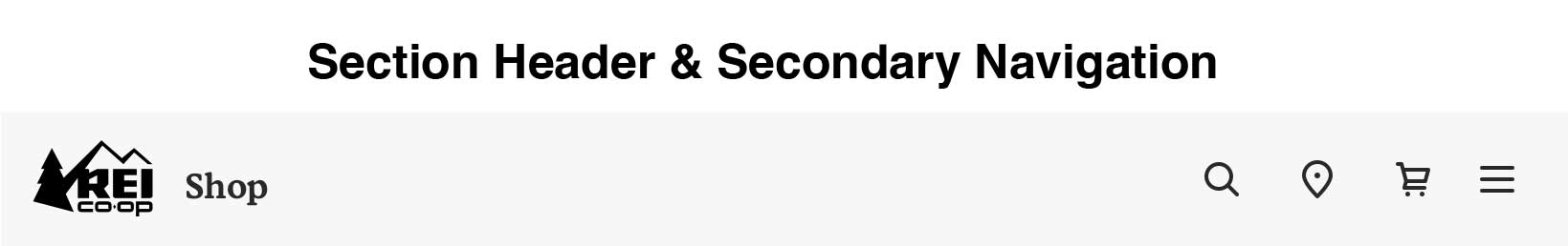
III. Featured Content
Below our top-level navigations lays almost a full page that highlights a specific product category, in this case products associated with the activity of running. The featured content also bleeds below the fold, which infers users that there is more content to consume as you scroll further down the page. The size of this content imposes physical constraints on user’s options to browse other product categories, as they are not given the option when landing on the page, without having to click through iconography and subtext categories. When product category is not the lead signifiers below the top-level navigations, this can confuse users trying to discover other products outside of the activity of running. This can also lead to a visceral reaction that the top content implies that REI drives the activity of running as its leading recreational sport and product line, instead of considering other categories of products and sport. In addition, because of its large size comparative to all other functional elements seen on first landing, attention is redirected off the other browsing features seen in the iconography of the second navigation and onto the signifiers, having the users feel forced to one option of an active action button labeled “Shop all running”.
Conclusions and Suggestions
A user who is coming onto this website will face challenges browsing freely based on the features provided. One suggestion would be to utilize the space on the first page where the featured content is located to showcase different product and/or sport-related categories, instead of highlighting just one category. This would give the users more choice of product offerings to browse through.
In conjunction to supporting the diversity of product, the second navigation bar can also have a call to action signifier such as a button to start the shopping process. The feature can work either as a button to anew page, or as a stacked sub navigation in an accordion drop down, that can lay under the second navigation bar to include the multiple categories.