TERRA Foundation for American Art Study: Abstract
The TERRA Foundation for American Art is non-profit organization aimed at supporting American exhibits, artists, and scholarship. Recently, the Terra Foundation reimagined their Mission, making it more inclusive, and they redesigned various pages to go a long with with this new vision. This project primarily focused on the performance of these redesigned pages and tasks that are critical to the organization’s operations, such as applying for art related grants or artwork loans. My team collected and monitored user behavior through tools such as Hotjar and Google Analytics in order to come up with recommendations to support.
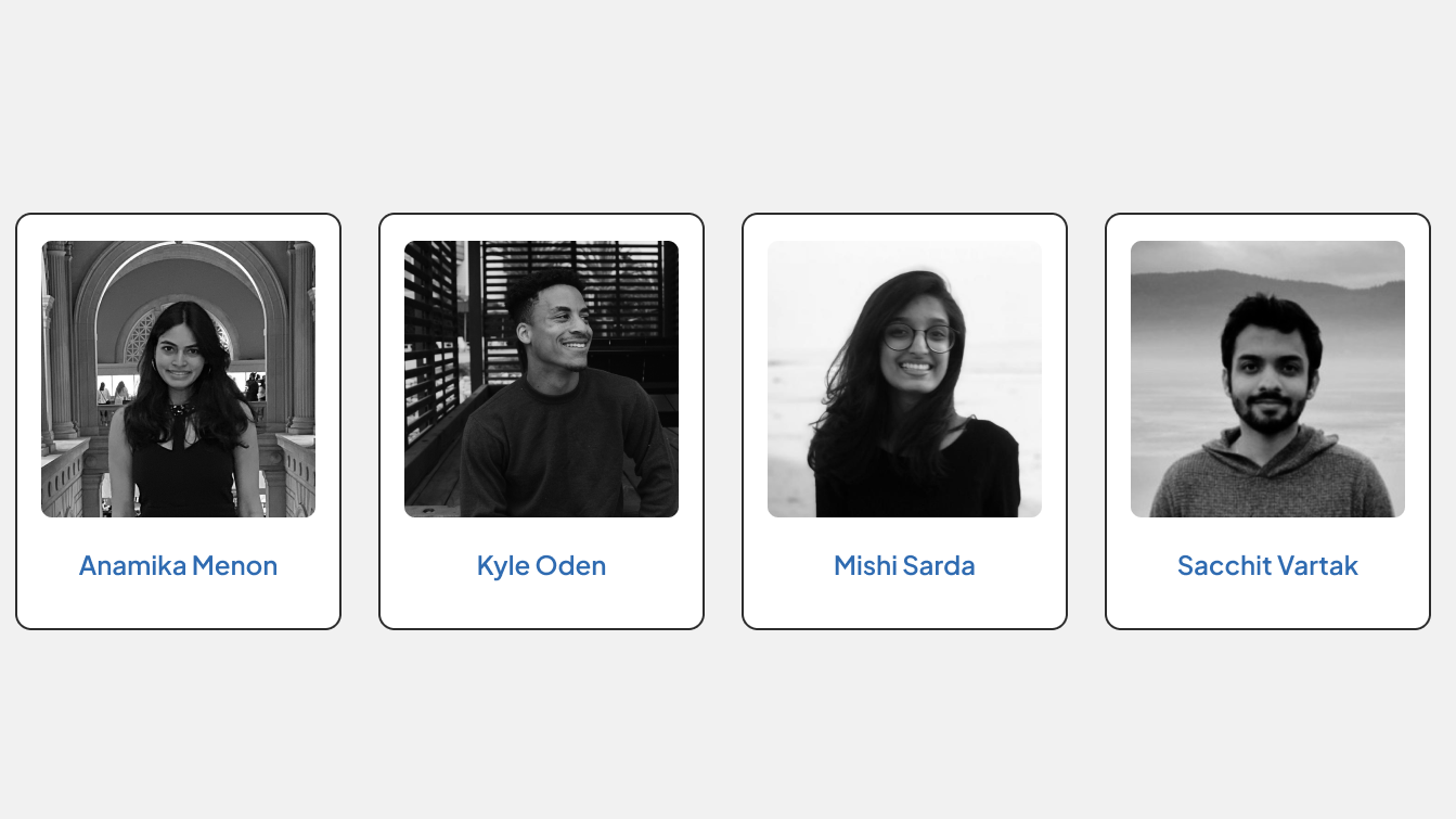
Our Team
For this project my team was divided into the following primary roles which helped structure our meetings and work flow:
- I was the team facilitator
- Anamika Menon was our editor
- Mishi Sarda was our administrator
- Sacchit Vartak was our manager
As facilitator my primary duty was keeping the team on task, guiding our discussions, and ensuring we all knew our assignments for our next check-in. More generally, for this project, I analyzed and collected data from Google Analytics and Hotjar to help create our findings, recommendations, and mockups; drafted and finalized our slide deck report; and presented our findings and recommendations to key stakeholders.
The Challenge: Understanding the limitations of behavioral analytics data
The nature of this project was initially challenging. Knowing that we were collecting and analyzing rather indirect data, the team had to figure out how to translate our data to actionable findings and recommendations for the TERRA Foundation. We also were working withe a partially redesigned site and wanted to know about their effectiveness on the site. With only behavioral analytics in our toolkit it seemed that we might miss a really important factor about the redesigned pages: User opinion. Our client, however, was a really big help in providing background for what internally led to the desire to redesign: a reimagined and more inclusive Mission.
Kickoff Meeting: DEFINING AND DISCOVERING Goal
This project started with a kickoff meeting with two representatives from the TERRA Foundation. They gave us a lot of background on the general user trends of site and which areas they would like us to focus on. This meeting provided us with the following goals and scope for our study:
- Identifying the limitations in the website’s navigation and user flow and its resulting impact on the user’s journey.
- Analyzing and understanding how new and returning users interact with the various elements on the website and how it impacts their experience.
crafting the right Research Questions
With our goals in mind, we had to make sure our research questions addressed the areas our clients asked us to focus on:
- What was the overall impact of the redesigned pages in helping users access/ consume content on the website?
- How do new users approach the process of applying for grants?
- What pages do users generally find challenging to navigate through?
- What are the most frequently performed tasks and how do users navigate around them?
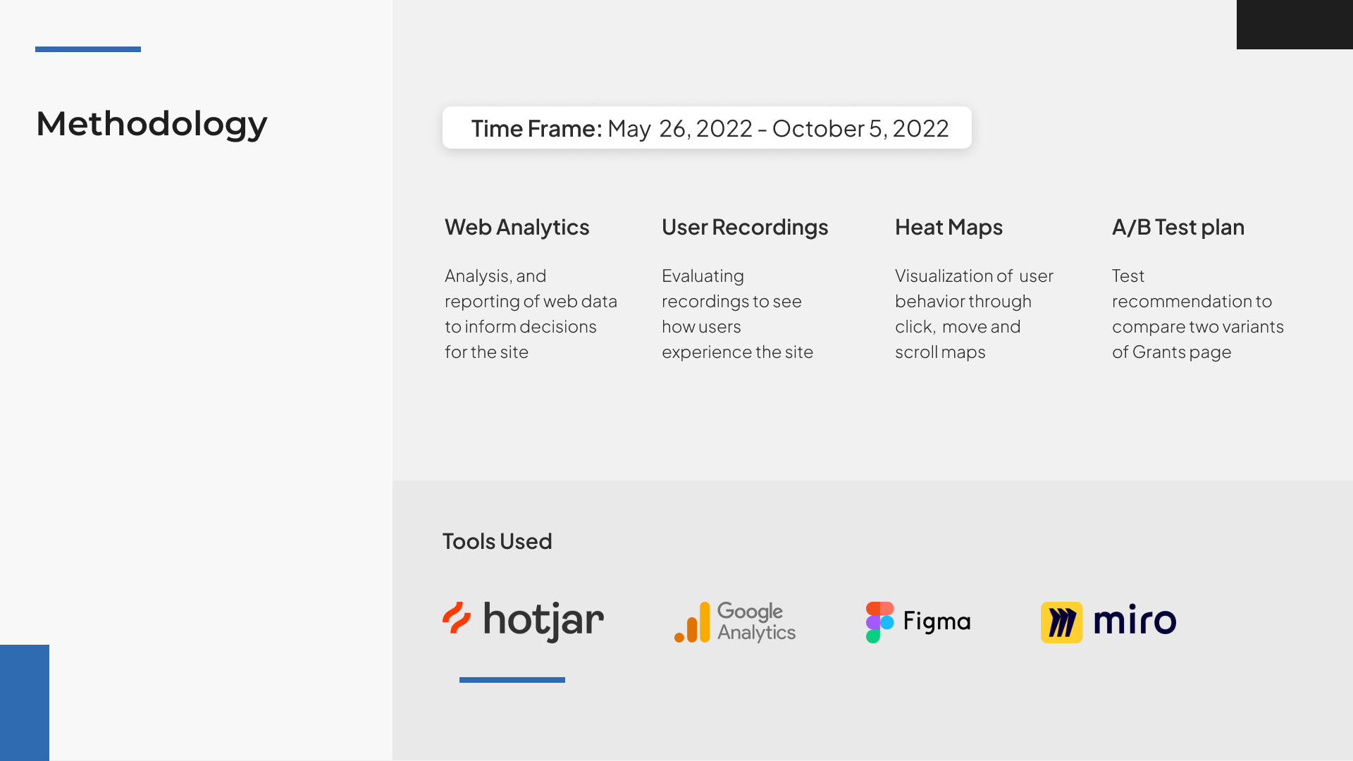
MEthodology: DATA COLLECTION AND ANALYSIS TOOLS
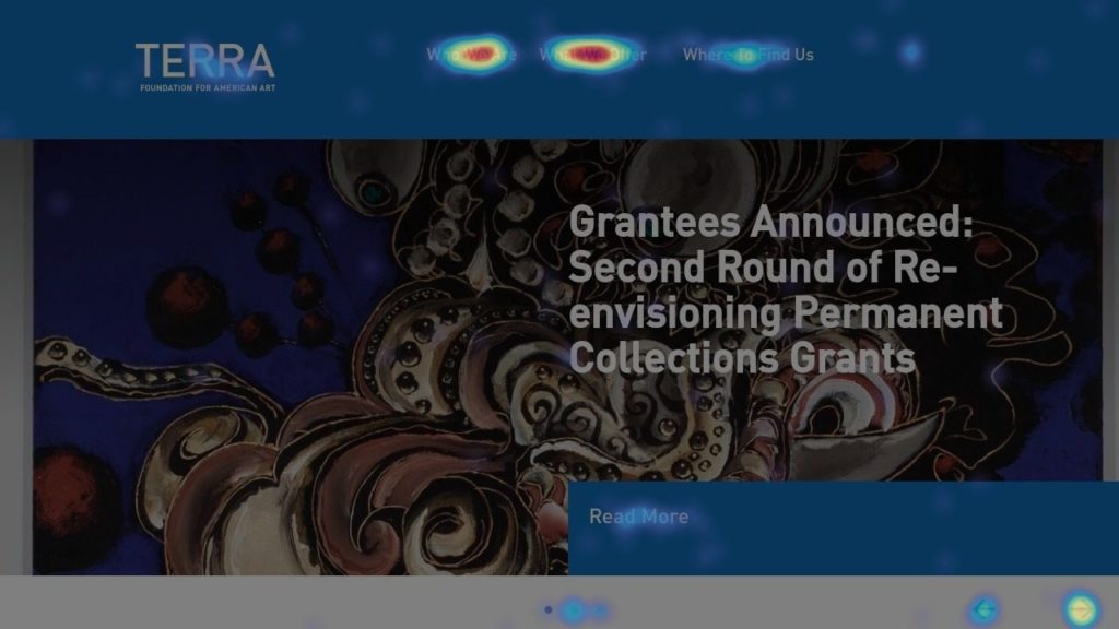
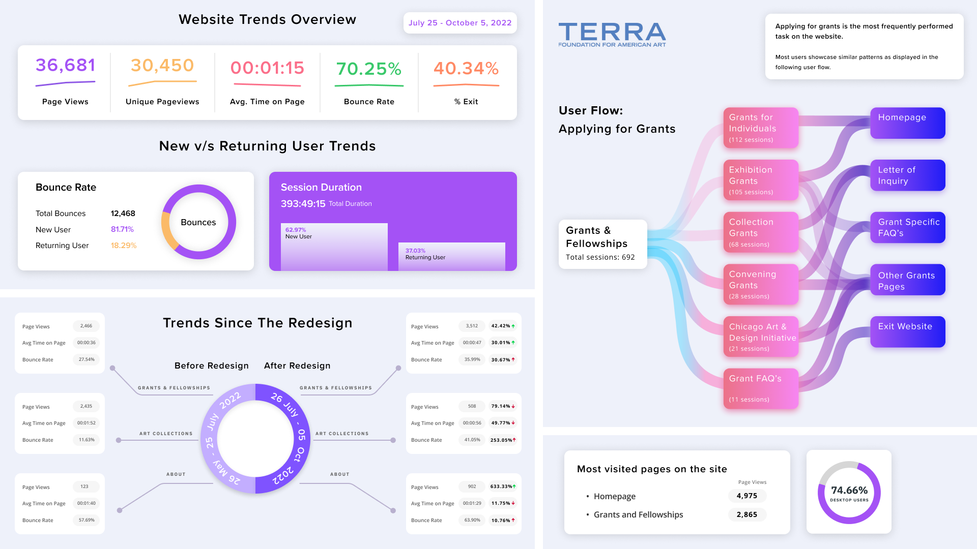
The Redesign: An Overall Success with Some Areas for Improvement
Overall, the TERRA Foundation website showed increased performance for most metrics with the redesigned pages. There were a few tasks on the site that did seem to be slightly mentally taxing based due to the current layout hiding certain key information.
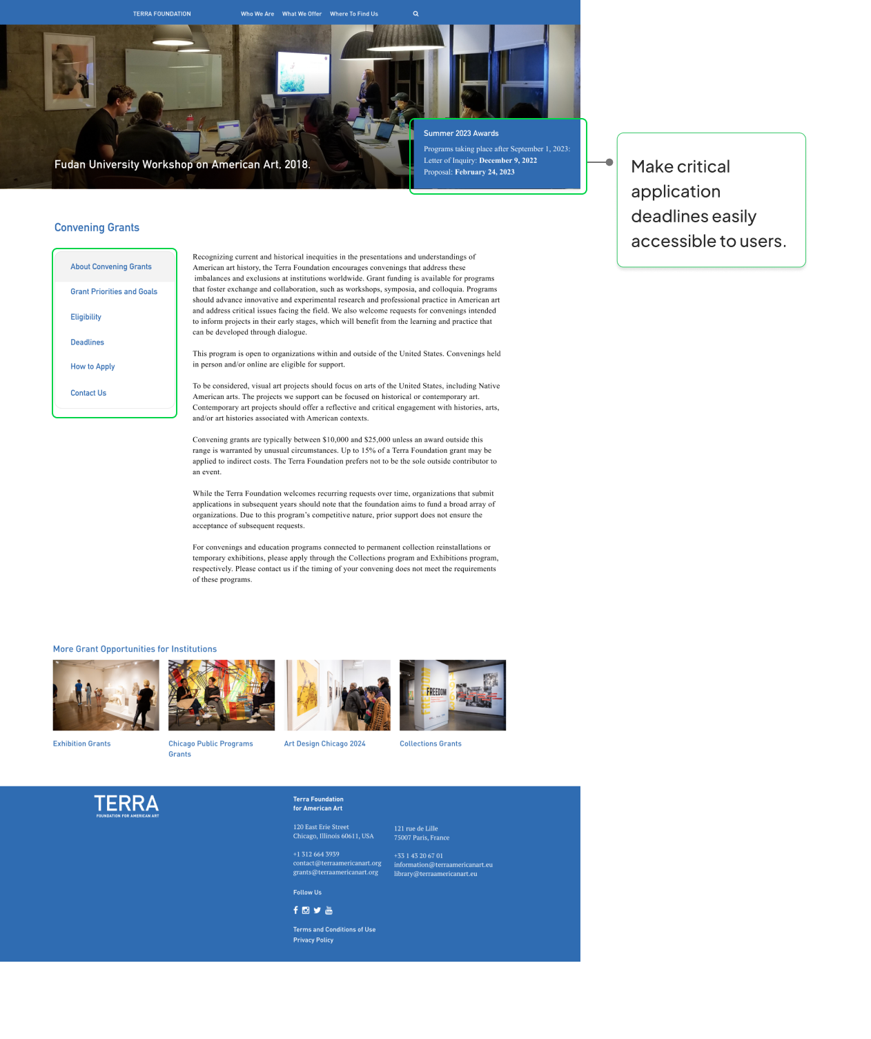
Vital Information was not easily discoverable for users
Our first finding was that users have to scroll well below the fold of the page to get all of the information essential to the grant application process. Additionally, a lot of this information was hidden in accordion elements which adds extra steps and effort for users.
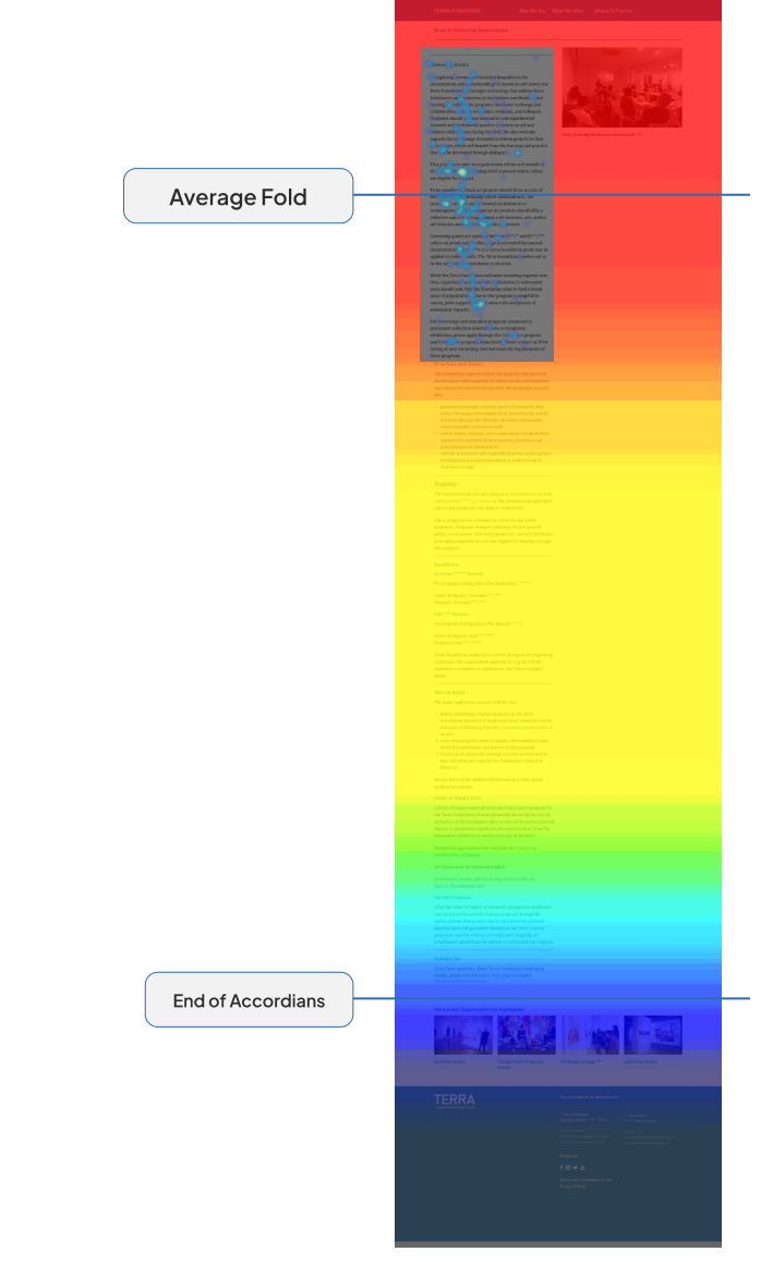
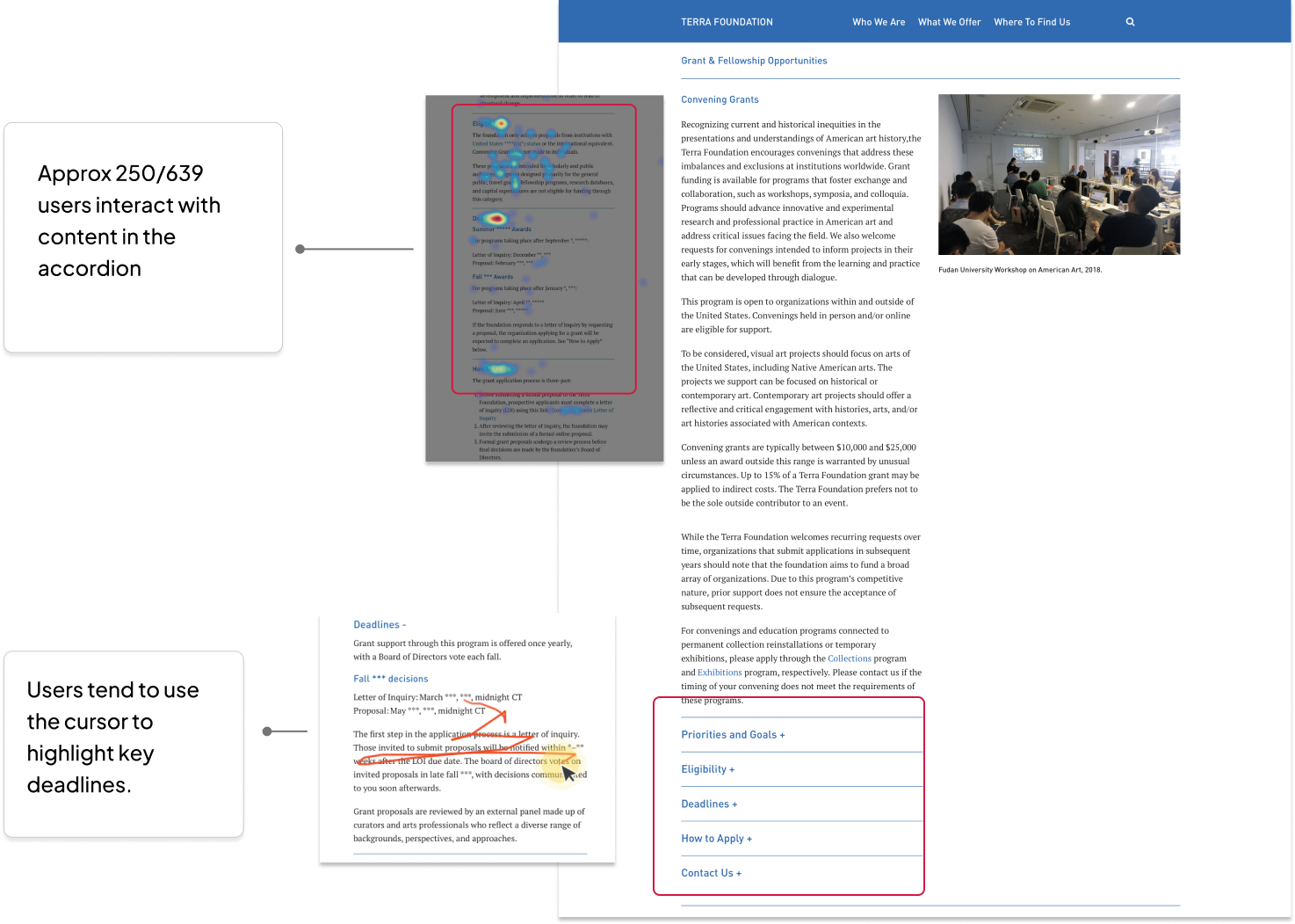
Our recommendation is clearly show the most important information towards the top of the page, and change the accordions to a side panel that updates the information on the page as a user selects it:
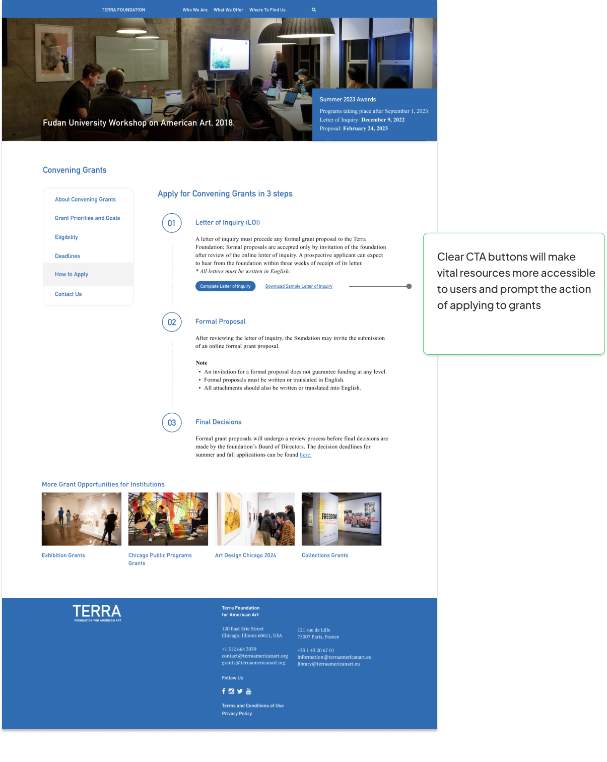
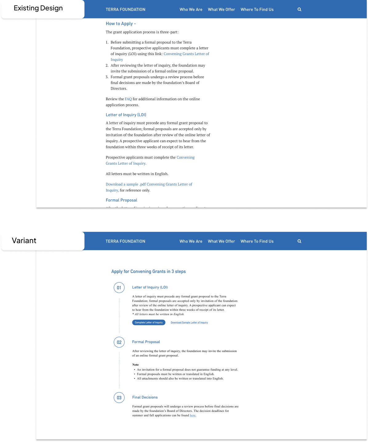
Grant application process appeared difficult for users to follow
The second finding was that the steps to apply for a grant are not in a clear structure and associated CTA’s are not very obvious for users.
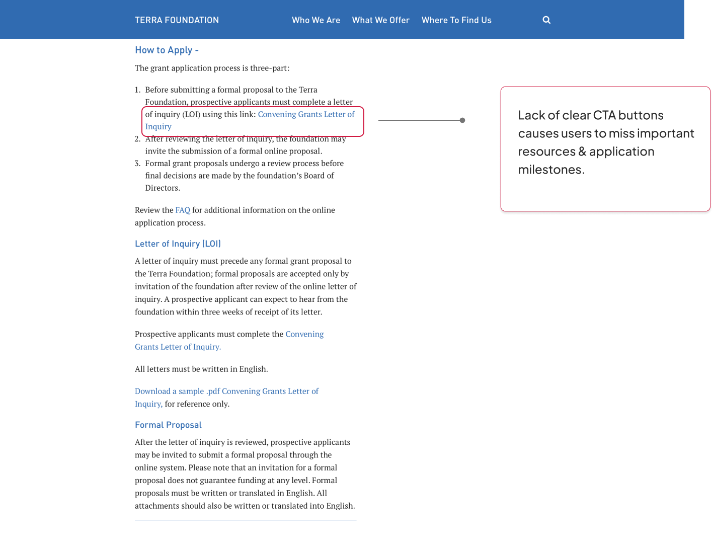
Our recommendation is to clearly label the steps to apply for a grant and add good signifiers for the associated CTA’s:
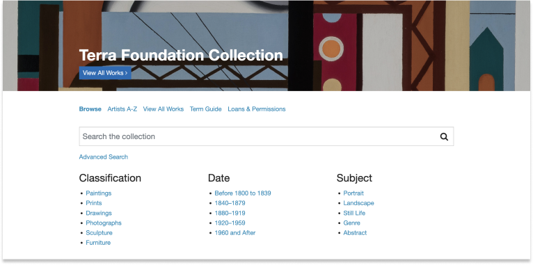
redesign irregularly affected the performance of the art collections Landing page
Lastly, the redesigned Art Collections page had rather contradicting metrics since the redesign:
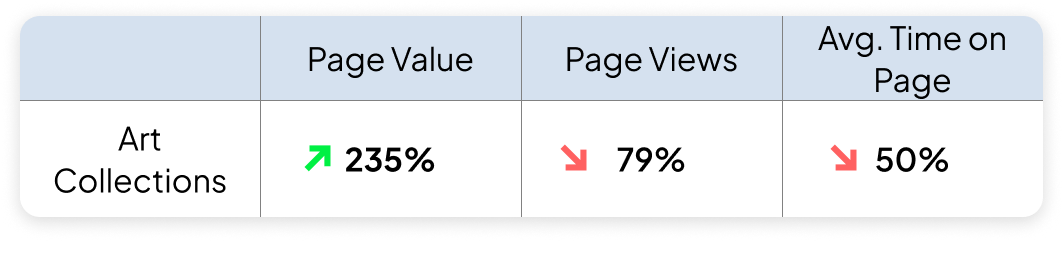
We recommended conducting a Usability Study to observe and evaluate the user behavior on the redesigned Art Collections page. Areas to consider while researching can be:
- Challenges faced by the users in performing various tasks
- If the information on the page is structured appropriately for the users and the improvements to be made
- Completion of goals associated with the page
Deliverables: A/B Test plan & Visual Summary
Our A/B Test Plan focused on the grant application process. The information was a bit difficult for users to find so we came up with the following test:
Goals:
Restructure content on the grants application page to simply the process and reduce cognitive load .
Hypothesis:
Structuring the grant application process into smaller steps and adding clear CTA’s will result in improved discoverability and understanding of the process and an increase in the number of grant applications.
Audience:
New and Returning Users
Metrics:
- Number of new grant applications
- Number of clicks on CTA’s
- Number of downloads on LOI.
Client Feedback: “Excellent Work, Excellent Analysis, Great Design.”

Overall, our clients were very pleased with our work and presentation. They were very excited about getting our A/B Test up and running as well as seeing our other findings and mock ups. They gave us some feedback about some areas for further exploration that they saw as their next steps.