About the Case Study:
This case study describes a real-world client project I worked on with three other classmates from INFO 645: Advanced Usability and UX Evaluation as part of my coursework at Pratt Institute. The client for this project was the Staten Island Hunger Task Force (SIHTF), and our goal was to use behavioral analytics data from Google Analytics and Hotjar to understand how the users of the SIHTF desktop website find information about pantries. Based on our insights, we came up with several recommendations for improving the discoverability of information about pantries, to ensure that users of the website are able to find food efficiently and seamlessly.
What is the SIHTF?
SIHTF is a non-profit whose goal is to “connect community members to pantries and pantries to community and government resources”. As the name suggests, SIHTF’s focus is residents and pantries in Staten Island. The organization is working towards achieving their goal by:
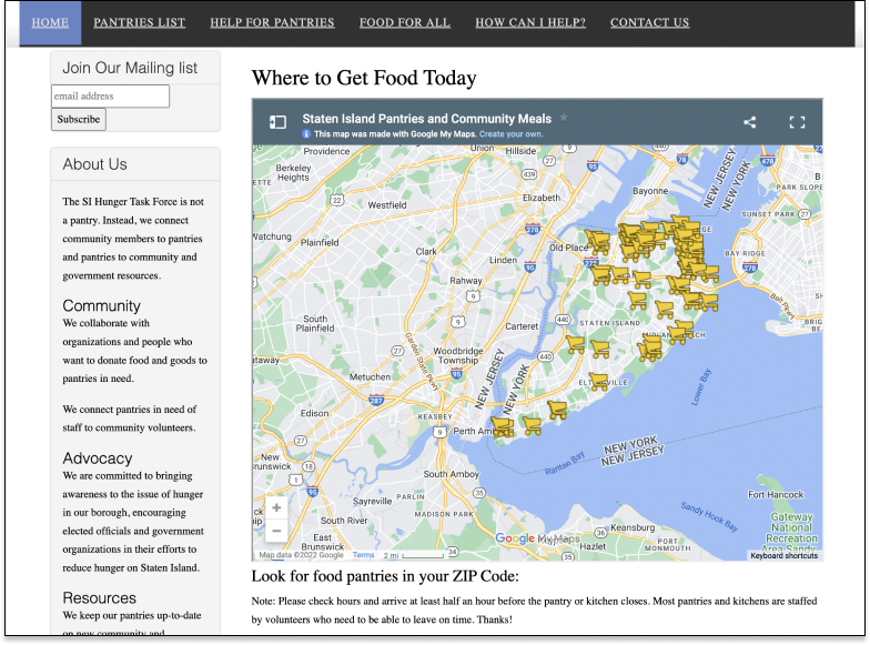
- Providing information about pantries in Staten Island (e.g. pantries’ locations, hours of operation etc.) to those looking for food through a desktop/mobile experience
- Supporting Staten Island pantries with finding food, volunteers, and resources
Project Process Overview:
| Step 1 | Step 2 | Step 3 | Step 4 | Step 5 |
| Kickoff call with client | Created a research plan | Analyzed data in Google Analytics and Hotjar | Developed recommendations based on key insights | Insights share-out with client |
Client’s Goal:
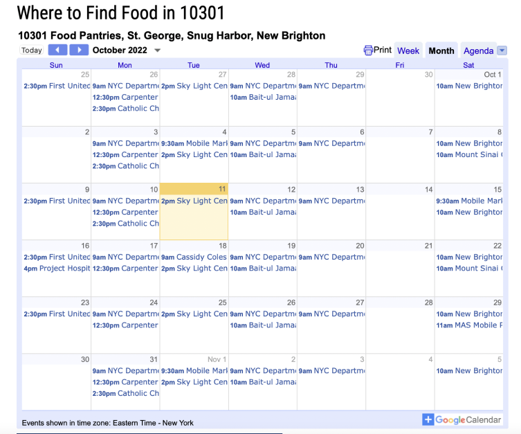
- We worked with a representative from SIHTF over the course of this project. During our kickoff call, we learned that our client’s biggest pain point at the moment is that she has to keep updating two features on the SIHTF desktop website – the zip code calendar and the pantries map. The client believes that these two features help users find pantries. However, the process of keeping these two features up-to-date is very laborious and time-consuming since she has to manually input new information about the pantries’ working hours and locations each time. Hence, her main question to us was if it is worth it on her part to keep updating these two features on the website, based on what the data says.
Research Objectives:
Based on the client’s ask, our research objectives were to:
- Understand how frequently the zip code calendar and the pantries map are used on the SIHTF desktop website
- Understand how the zip code calendar and pantries map are currently used on the SIHTF desktop website
- Identify any other resources users utilize on the SIHTF desktop website to find information about pantries
Methodology:
We analyzed data from two behavior analytics tools to answer our research questions:
- Google Analytics data
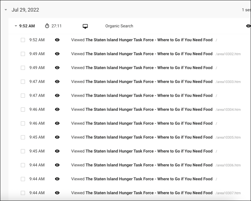
- We looked at the number of sessions, pageviews, and sequence of pages visited between January 1, 2022 – October 5, 2022
- Hotjar
- We analyzed real-time recordings, website page clicks, mouse movements, and scrolling patterns between September 4, 2022 – October 5, 2022.
Unfortunately, due to the technical limitations of Hotjar, we were unable to watch real-time recordings of users interacting with the pantries map and the zip code calendar.
My Role:
- I was responsible for answering the first research question: How frequently are the Map and Zip Code Calendar features used on the SIHTF desktop website? (see Insight & Recommendation 1)
- In addition, as the editor, my job was to make sure that all of our final deliverables were well-organized and well-written.
Key Insights & Recommendations:
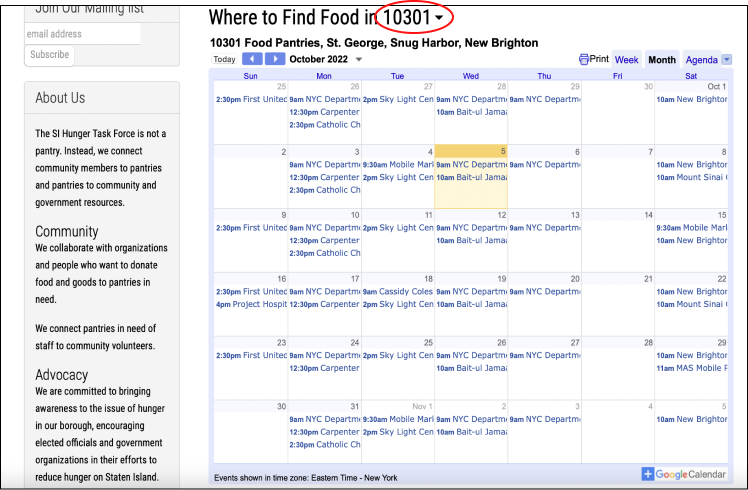
Insight 1: Some users kept going back and forth between the zip code calendar pages and the home page, most likely because at the moment, there is no functionality on the zip code calendar pages to toggle between different zip codes.
Recommendation 1: Allow users to change the zip code on the zip code calendar page itself so that users don’t have to keep navigating back and forth between the zip code calendar pages and the home page.
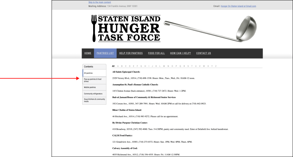
Insight 2: Although the pantries page is one of the most visited pages, it has a high drop off rate (36% of pantries visitors) and bounce rate (81.4%).
- These drop-offs could be attributed to the fact that the majority of users only scroll till the first half of the page, and hence, potentially miss out on important information about soup kitchens and additional pantry details located in the second half of the page.
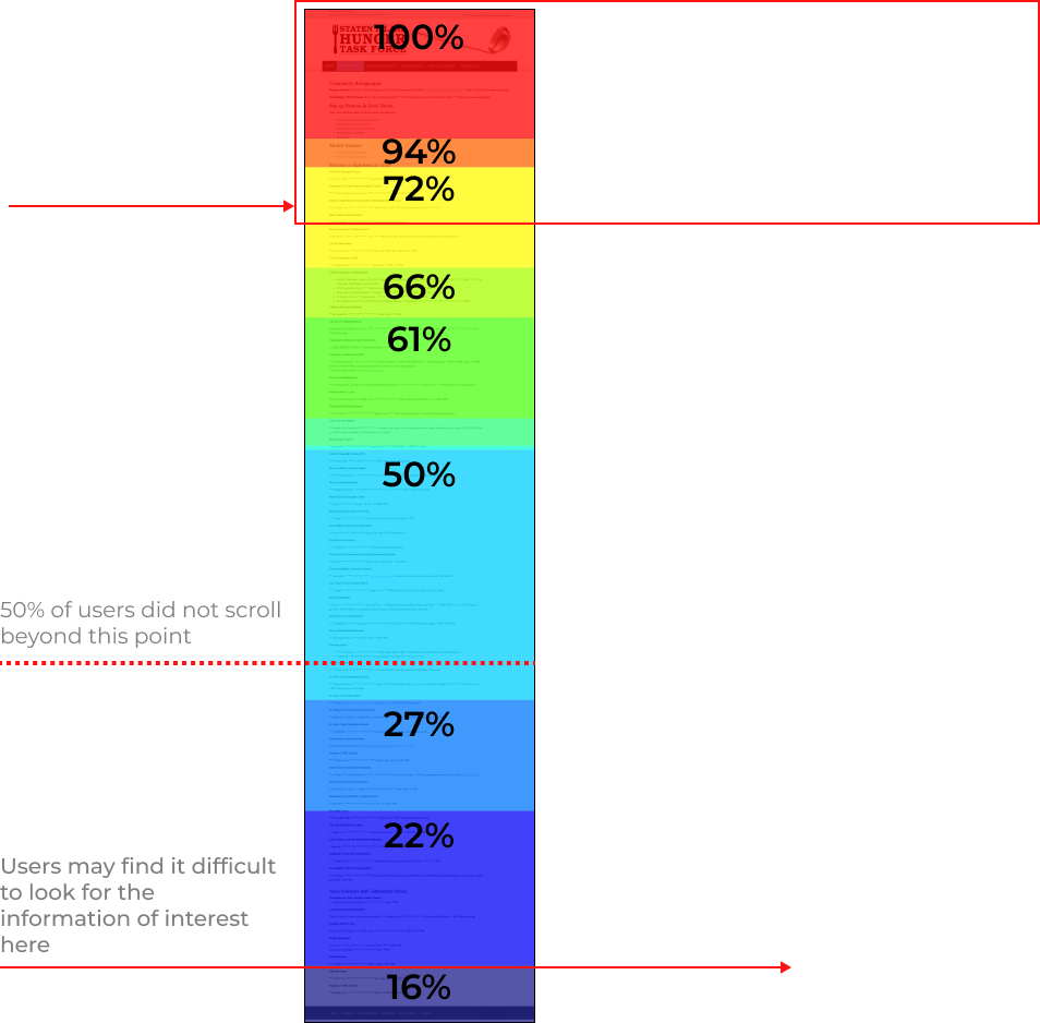
Recommendation 2: Update the design such that scrolling is minimized and information is organized in short sections, which users can navigate through via a left navigation menu.
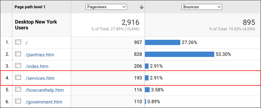
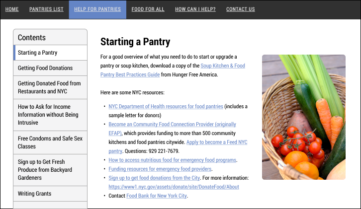
Insight 3: While the “Help for Pantries” page is the third most-visited page, only half of the users scroll to the bottom, and only ~10% of users click on the side navigation bar.
Recommendation 3: Make the left side navigation bar more prominent and keep the content concise to make the page more accessible and appealing. (In our recommended design, when a user clicks on a particular section in the side navigation bar, only that section’s content will be shown on the page)
Other Notable Observations:
- The zip code calendar has potential to be used more, but it is already showing an increase in usage in 2022 compared to 2021!
- Between January 1, 2022 and October 5, 2022, 486 (4.86%) NY Desktop users visited the zip code calendar. While this may not seem like a large number of users, the good news is that the zip code calendar had more visitors between January 2022 – October 2022 as compared to January 2021 – December 2021.
- Compared to the 486 visitors to the zip code calendar pages between January 1, 2022 – October 5, 2022, there were 361 visitors between January 1, 2021 – December 31, 2021.
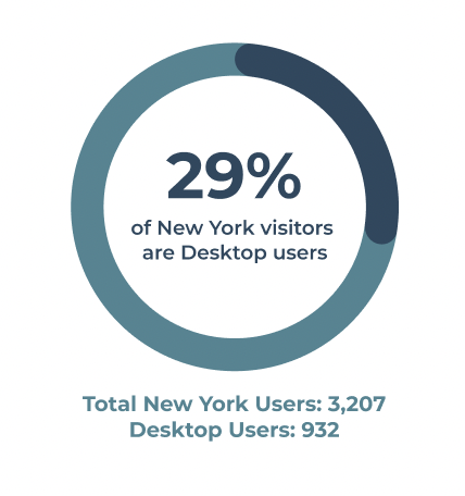
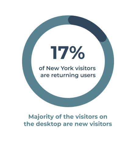
- The primary users of the SIHTF website are mobile users, and the majority of SIHTF desktop users are returning users.
Final Outcome:
We presented our key insights and recommendations along with plans for future usability and A/B testing to the client on October 12, 2022. Our recommendations were well-received by the client and she expressed interest in going forward with the A/B test. The A/B test will be launched before the end of 2022.
In addition, further usability testing will certainly help the client better understand how users are using and interacting with the two features of interest – the zip code calendar and the pantries map – which will help her determine the strategy for these features going forward.