Who are the Girl Scouts?
The Girl Scouts is an American youth organization aimed at empowering girls through a variety of programs that include outdoor activities, STEM programs, leadership training, and so on. Since it is a nonprofit and has an event-driven focus, one of the most consistent demands of the Girl Scouts organization is for volunteers. In this project, our team took the website of its New York branch – the Girl Scouts of Greater New York (GSGNY) and redesigned its information architecture as well as the event search and application pages. Our main goal was to simplify the process of volunteering at an event through the use of effective filtering and constructing an intuitive, guided process.
What was the problem?
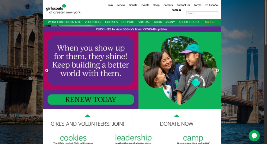
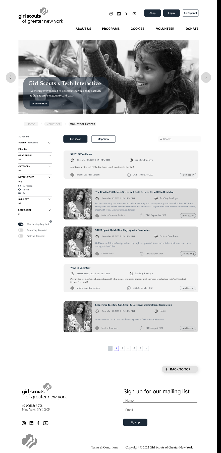
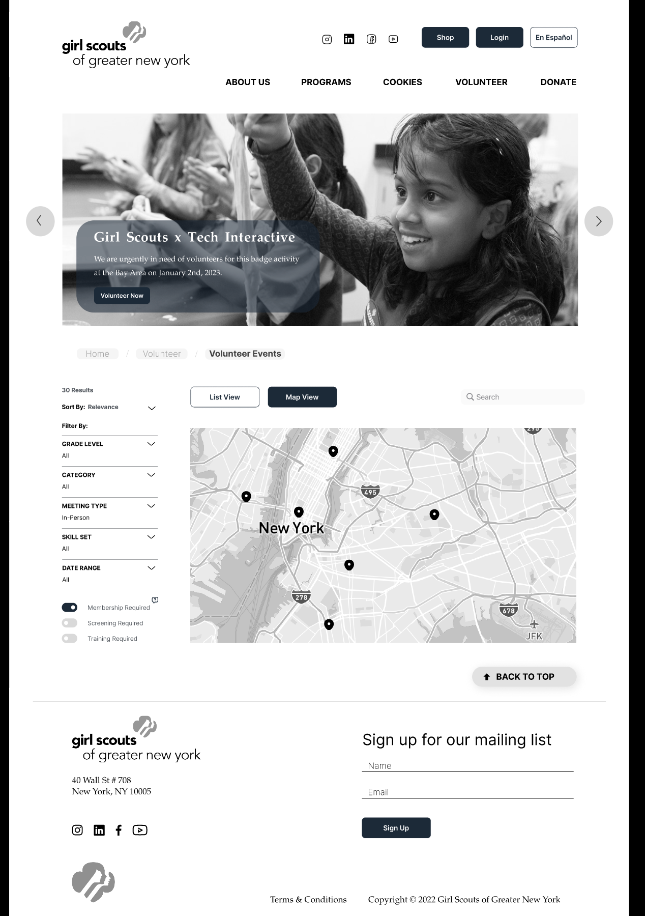
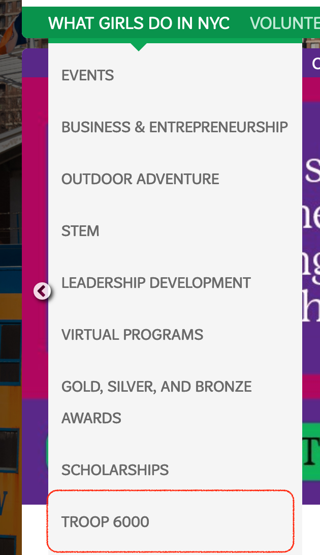
The main difficulty of the Girl Scouts website design lies in the complexity of the information that needs to be conveyed. As the Girl Scouts is a large, national organization with many branches throughout the country, there is both overlap and divergences between the top-level organizational information and the regional-level program information. The website also needs to speak to different types of users (eg. parents, volunteers, staff, etc.) and cater to their unique, individual user tasks. The current website design (see screenshot below) suffers from information overlap issues across its navigational structure (eg. the same information being displayed in different areas), unclear labeling, and lack of a clear direction when completing a user task.

Who are the users?
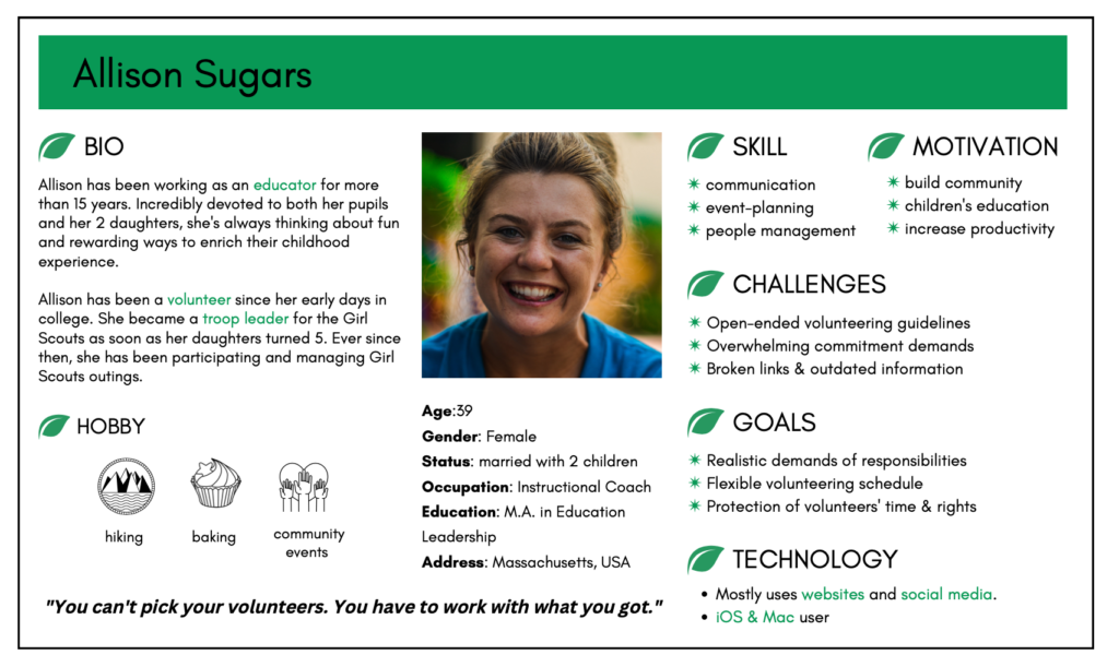
Our project targets potential and existing Girl Scouts volunteers. To begin with, we interviewed 8 active volunteers – 2 of which I recruited and who already had extensive experience volunteering for the Girl Scouts. This helped us understand what to look out for when redesigning the website. Among all the interview questions, we were most interested in understanding their digital habits, their process of applying to a volunteer role and the main difficulties in doing so. From these interviews, I built a user persona of what a Girl Scouts volunteer could look like. A lot of them are parents of girl scouts and are often passionate about education, very sociable, tech-savvy, and have busy lifestyles.
Some of the interview takeaways that could translate directly into the website re-design include:
1. The guidelines to becoming a volunteer is often unclear or ill-defined → the volunteering requirements should be made very clear early on in the application process
2. The volunteers often had a busy schedule and were frustrated by broken links and outdated information → simplifying navigational structuresshould be the foundation to the redes
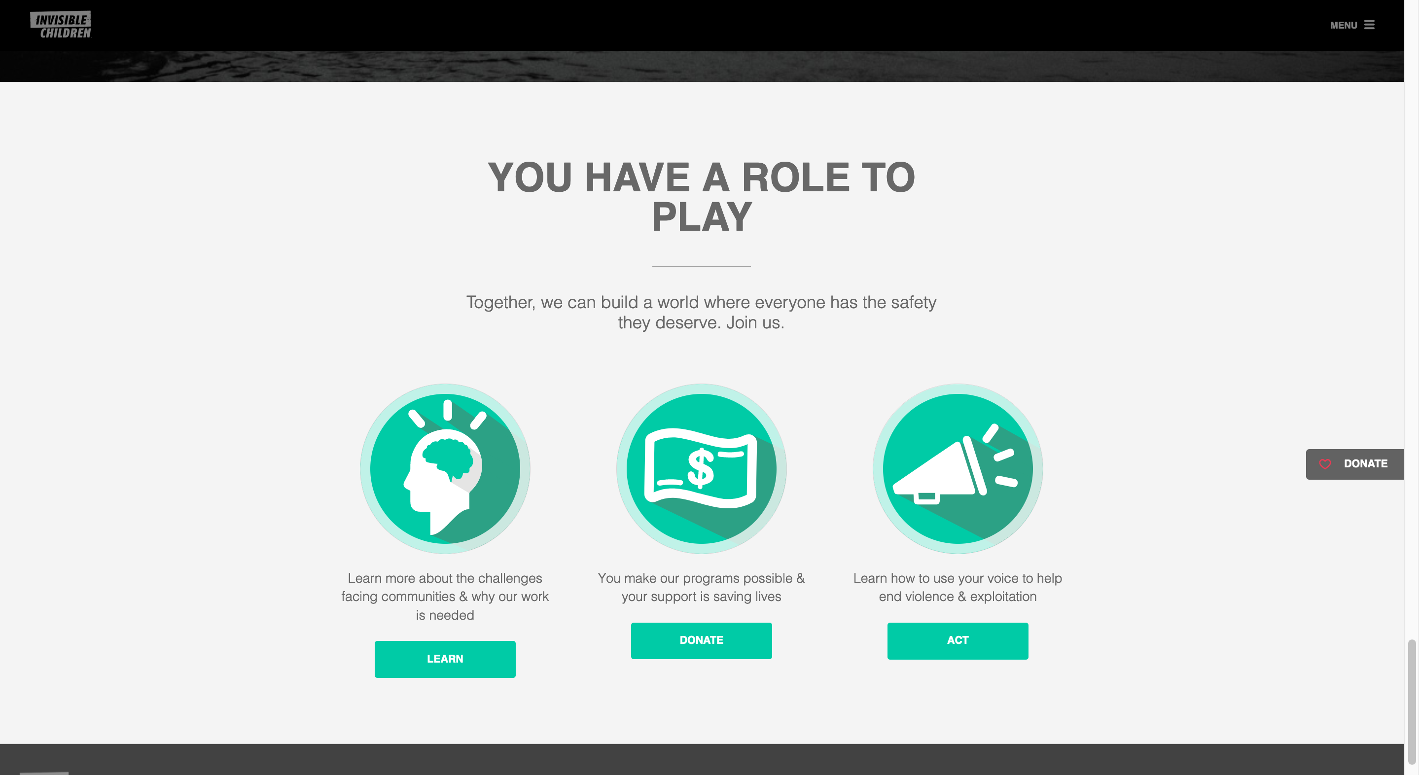
Step 1: Looking at competitors
First, we looked at similar nonprofit organizations to the Girl Scouts. As these organizations have similar content, we looked at them for inspiration on design and content layout. Our findings (see pictures below) included:
- The 3 vital Girl Scouts “call-to-action” buttons (volunteer, donate, join) should have a central focus (preferably its own row) on the home page;
- Girl scouts are divided into 6 grades (eg. Cookies, Brownies). As these names are not self-explanatory, a short description of them should also be listed at a high position on home page.
- The placement of “Cookies” was a point of contention among our team. We differed on whether to have it as its own section or to place it under “Programs”. Although they’re technically a Girl Scouts program, it’s so iconic to the Girl Scouts brand identity that we ultimately decided to separate it into its own section.
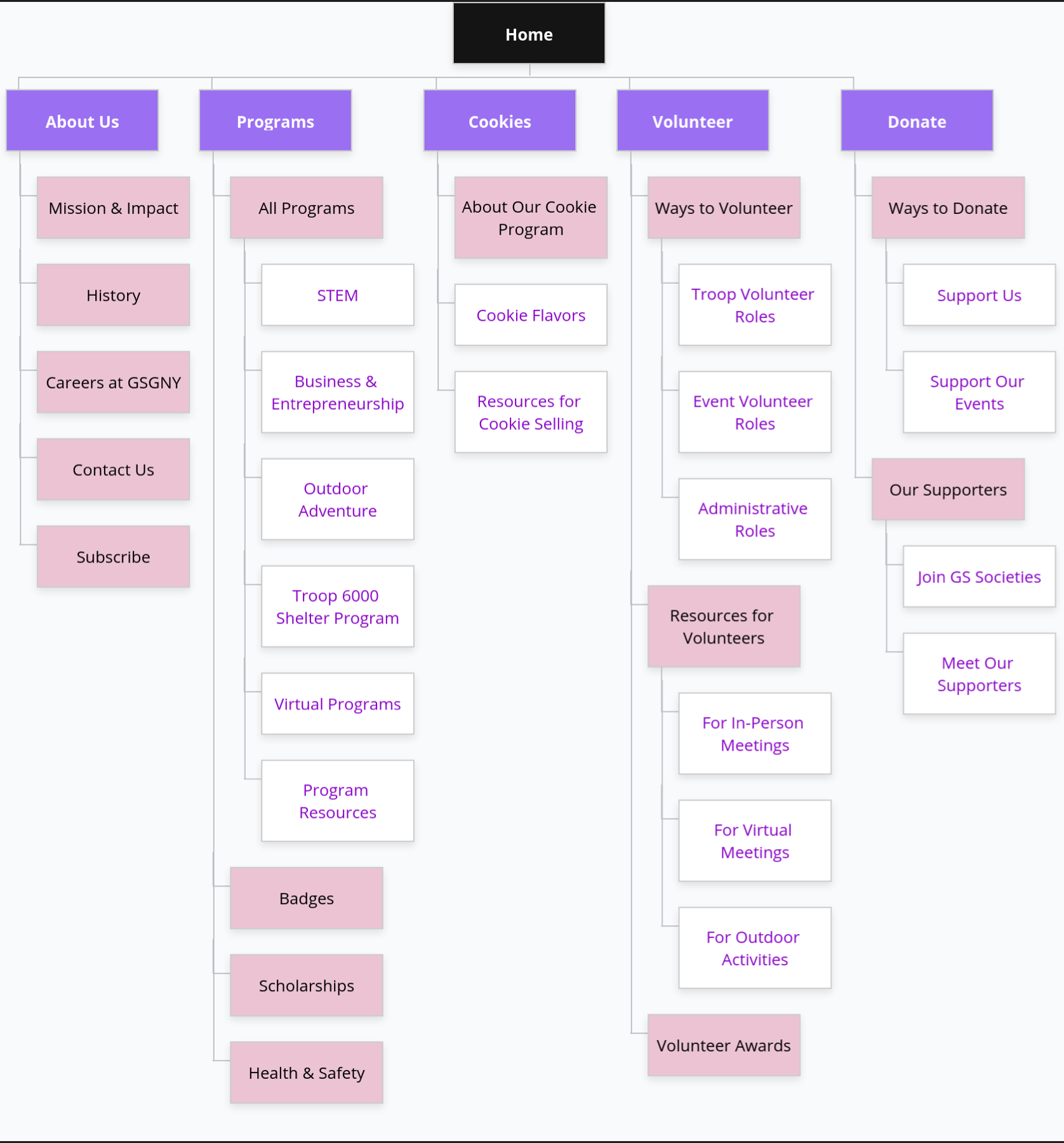
Step 2: Designing a new site map
- Content Audit: as the current GSGNY website contained many overlaps amidst large amounts of information, a new site map couldn’t be completed without a complete content audit first. I focused specifically on pulling all volunteering-related information together.
- Card Sorting: our team subsequently classified all the information into one-line description “cards” and recruited 8 participants to classify these cards into whatever categories they deemed fit. As our re-design is a user-centered process from beginning to finish, this helped us gain an understanding of the user’s mental model, a.k.a., what grouping made sense to them. Using these results generated from user insights, we created a draft of the new sitemap.
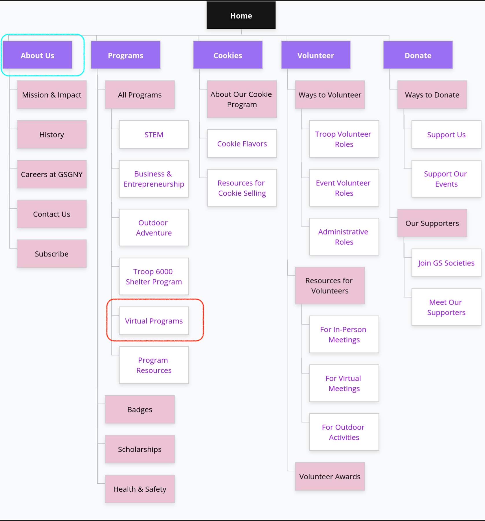
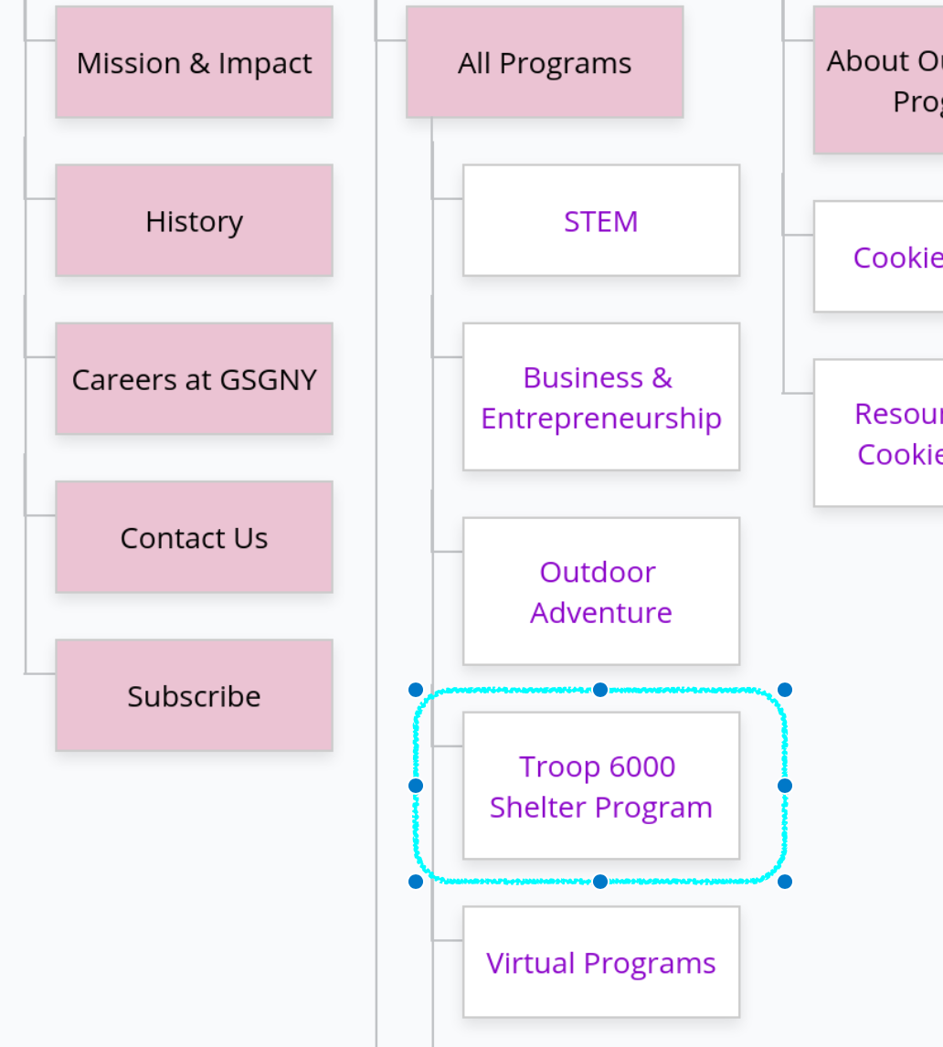
- Tree Testing: in order to test the functionality of the new sitemap, we recruited another group of over 30 participants to try to find certain information on the new site map. This step was crucial to our project, as the users pointed out confusion in our labeling and their actions eventually led us to remove “Resources” as a main category. This was a learning process for me as well, as it demonstrated what made the most logical sense wasn’t always the most user-friendly approach. Using these user-generated insights, we modified our draft and created a finalized site map for the new GSGNY website (see below).
Step 3: Creating a Prototype
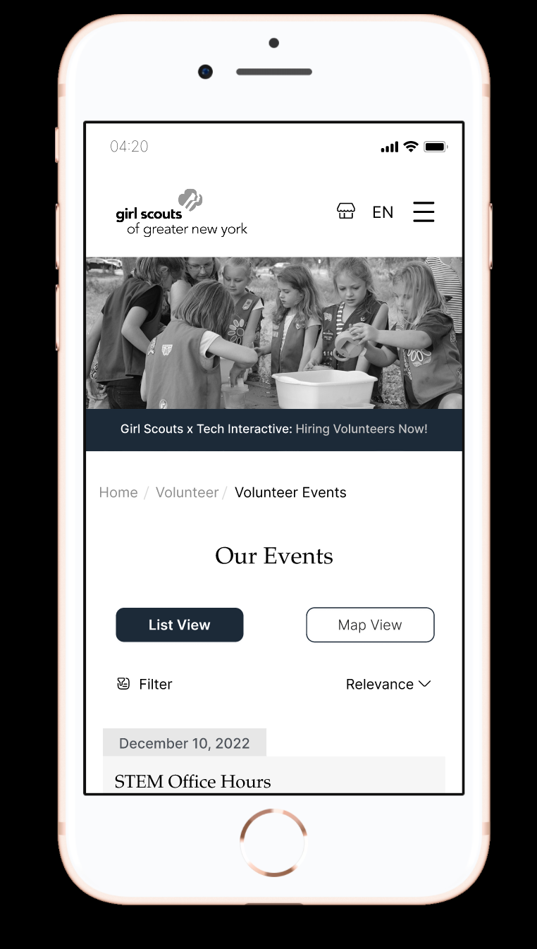
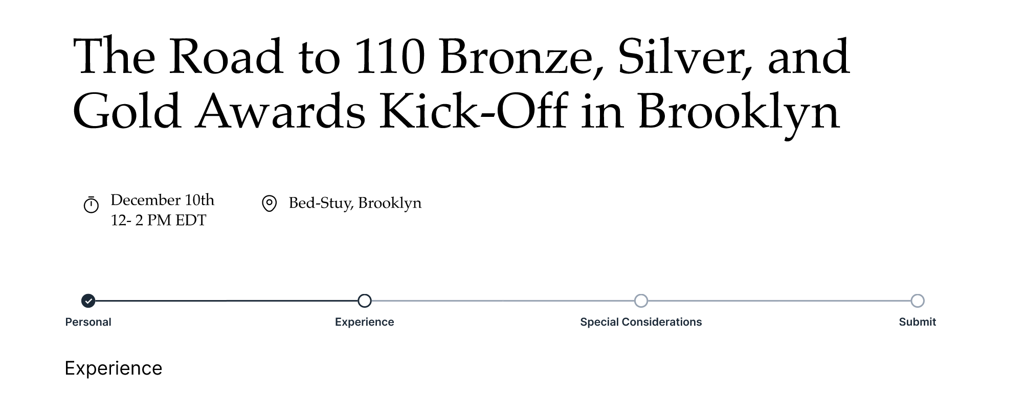
For our final prototype, we focused on re-designing sections of the GSGNY website that directly related to applying to volunteer at an event. The pages we needed to design thus included: home page, an event listing page, an event details page, and application pages. As most of our interviewees relied heavily on mobile use, we designed these pages both on desktop and on mobile.
In order to ensure we’re moving in a direction that made sense to the users, before we designed the final prototype, we first created a low-fidelity prototype on Balsamiq (see sample pages made by mebelow) and tested its functionality through more user testing. We asked the users to find an in-person event to volunteer at, as this enabled us to test the filters. This was also an instrumental step for our team, as the user gave us their preferences in design choices (eg. the placement of certain UI elements), and pointed out important errors (eg. there should be a warning page before canceling an application).
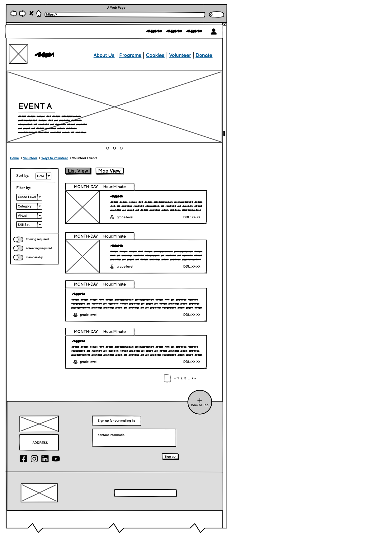
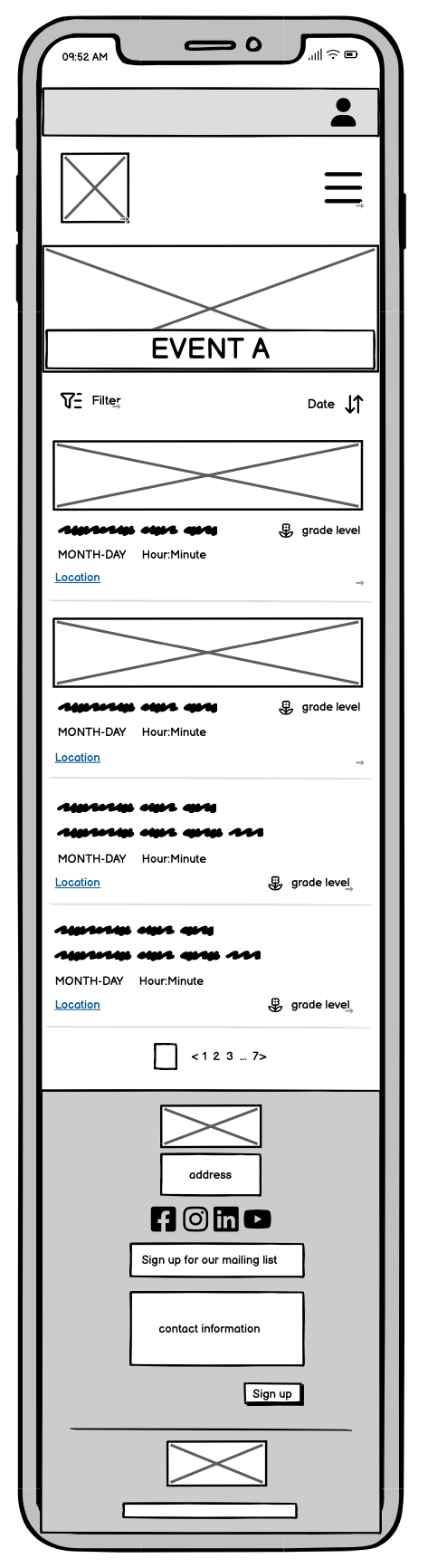
Finally, we created a medium-fidelity prototype on Figma. During this step, our main focus was on delivering a product that looked clean – making small adjustments to the original low-fidelity prototype as need arose – and considering interactions. Should this be a hover? Or a click? Or a drag? As the design of filtering and adding in a “list view” and a “map view” was my idea, I mainly designed the pages revolving these UI elements. Thus was our final desktop and mobile prototype created.
How did we solve the problem?
Returning to the issues the old GSGNY website suffered above, this is how we fixed them through our re-design:
- Overlapping content → in our new sitemap, we removed these “semi-duplicates” and only kept 1 reference. These redundancies are some times the result of the same organizational information of the main GSUSA (Girl Scouts of the USA) and GSGNY displayed twice.
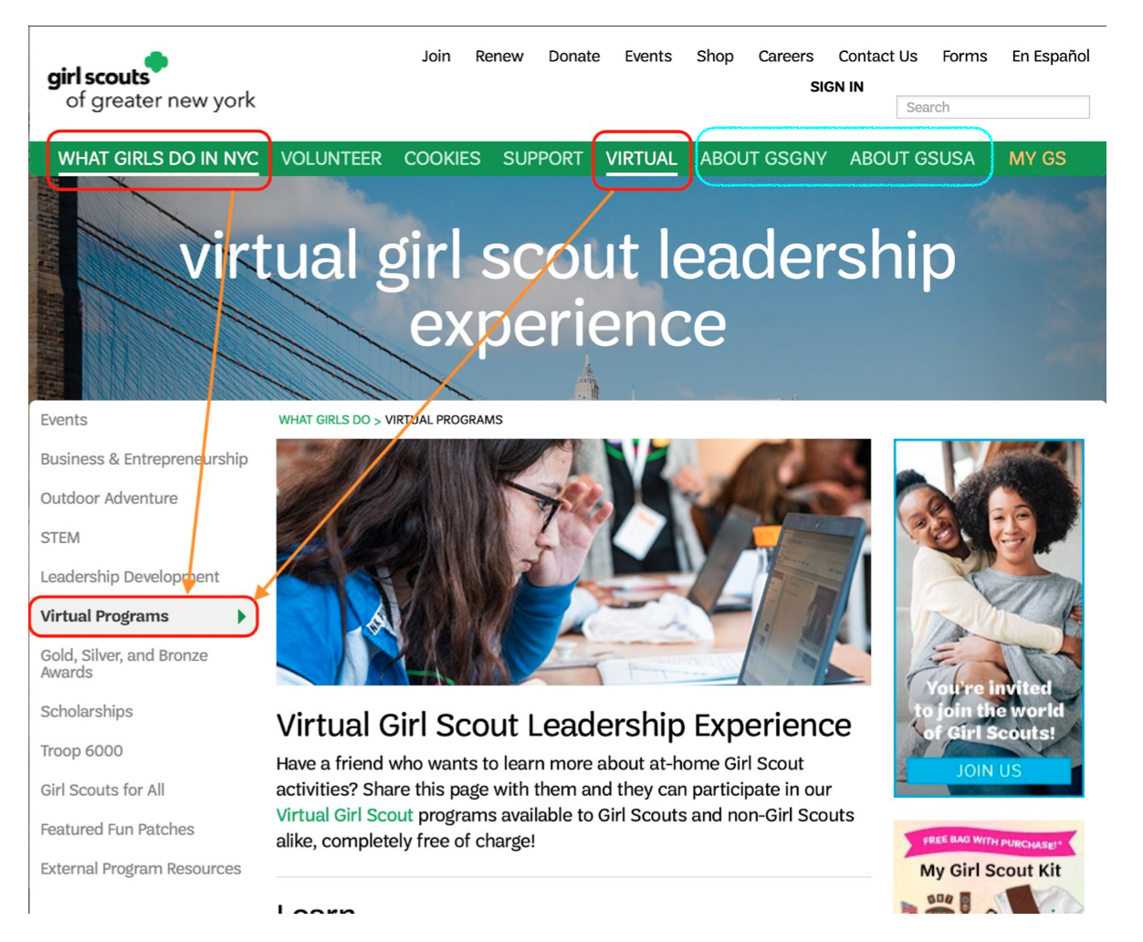
“ABOUT GSGNY” and “ABOUT GSUSA” contain overlapping information.
Both organizational information on GSUSA and GSGNY are consolidated into a single “About”.
- Unclear labeling → we tested all our current labels through iterative user testings (tree testing and low-medium prototype user testing) and this our current result is what made the most sense to users.
- Lack of guidance through a user task → as our task was to “find an event to volunteer at”, we added a progress bar as a visual aid to the application and simplified the process to only 4 main pages: home > search > read > apply.
What are my personal reflections?
One important thing I learned from this process was that we should always design for the future. Some UI elements may not be needed now (eg. most GS events listed on the calendar right now don’t have a suitable picture), but should be included (for example, I designed two versions: one with a photo and one without). The same thing goes for adding pagination to the event listing page.
A direction that the project can move forward in was adding color to the prototype; another is to expand the current design approach to even more pages. I am personally interested in the latter one, as it will give me more challenges on organizing and presenting complicated, multilayered data.