The New York Philharmonic is one of the city’s most prestigious institutions, and its archive represents over 180 years of cultural heritage. In 2011, the Philharmonic founded the Shelby White & Leon Levy Digital Archive to undertake the herculean effort of digitising the contents, including thousands of scores, programs, and photographs, and making them publicly accessible. 10 years on, the Digital Archive contains over six million pages of material. The interface, however, remains the same. This project works with users to explore both what makes the Digital Archives interface wonderful, and also to identify ways that it can be improved, as they seek to revitalise the entire site.
Introduction: Assembling the Orchestra
The team at the New York Philharmonic Digital Archives contacted the Pratt Center for Digital Experiences (Pratt dx) in the fall of 2022. As part of a National Endowment for the Humanities grant, the Digital Archives was to undergo a redesign, and they wanted user testing done to inform where they should best direct their efforts. The project was passed along to our team, a group of graduate students at the Pratt School of Information currently studying Usability Theory and Practice.
An initial meeting was set up to discuss its scope and goals. From this meeting, we established the following two ideas.
The first was that Moderated Remote User Testing would be best suited to their needs. This is a form of lab experiment that involves users as participants, is conducted in a controlled environment, and is actively moderated by a usability expert. This is widely considered the gold standard for user testing research, as it gives the evaluator more control of the test, such as asking follow up questions or directing participants through pain points. It also provides richer information, as evaluators can observe actions and body language and engage in follow up discussion. Although it is a time intensive approach, it is balanced by the quality of the results.
The second point was that the scope of the project was incredibly broad. While it would all be contained within the Digital Archives interface, there was a want to explore all the features the Digital Archive had to offer. The same was true for their users – although a couple of distinct user groups were identified (see below), the only limiting factor for our participants was that they could access the site. Some key pieces of information were gleaned from the meeting, such as a focus on both accessibility and discoverability of content.
Methodology: Tuning the Instruments
Preparing for Testing
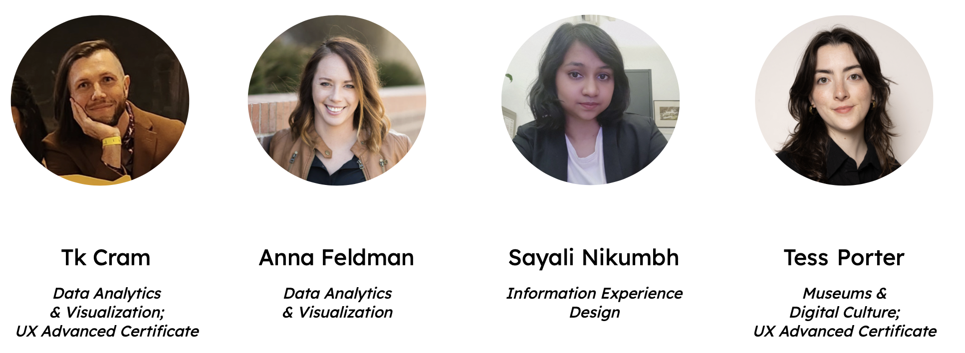
After our initial meeting with the Digital Archives, the team got to work. We decided the efficient use of our time would be to divide out the initial tasks between us, and reconvene periodically to review each other’s work. While my teammates got to work on creating the communications, surveys, and testing material, I began formulating the user profiles.
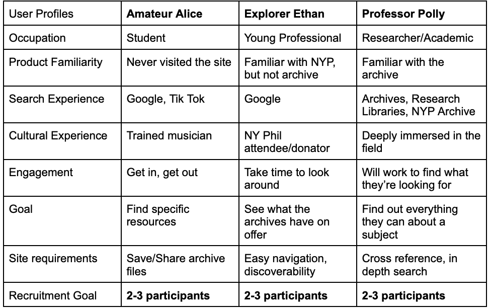
As mentioned, the Digital Archives wanted to test their interface on as broad a user group as possible, meaning that we didn’t need to account for demographics or psychographics. However, in our initial consultation they did state how they wanted it to be intuitive for new users, but powerful enough for established ones. Amateur Alice and Professor Polly were the first two user profiles created, looking to capture those two user groups. A third profile, Explorer Ethan, was was made to cover those that existed between the two groups. However during testing, we determined that the key factor was whether they were experienced with archives, and so the distinction between Ethan and Alice became less relevant.
After a few rounds of edits on everyone’s material, to get it to a place that we were all satisfied with, we moved on to the next stage of preparation. I paired with the author of the tasks to develop the testing script. We decided on using a reasonably strict script, to ensure minimal variance across evaluators due to confidence, language proficiency, or simply our own natural cadence. However this style of script also required a significant amount more testing and refinement for the tests to go smoothly when read entirely verbatim. We did this by running a series of pilots, initially by ourselves and then with family members, revising and tightening the language at every step. We also touched based with the Digital Archives to ensure we were capturing the data they were looking for, and wound up adding an additional task to our script.
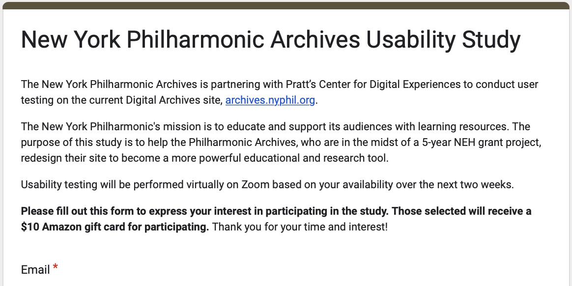
During this same period, the other two members of our group had been working on recruitment. They had created both the communication templates, as well as the screening questionnaires for participants to express interest. These were circulated initially on the Pratt internal mailing list, and later by members of the Digital Archives team. Once participants had signed up and met our current recruitment needs, they were sent an invite with a link to schedule a testing time.
User Testing
In total 10 moderated user tests were performed, with three matching the “Professor Polly” profile, and seven matching a combination of the others. All team members both moderated and spectated an equal amount. Tests typically took the expected amount of time, approximately 30-45 minutes, with our highly proficient users taking the least amount of time.
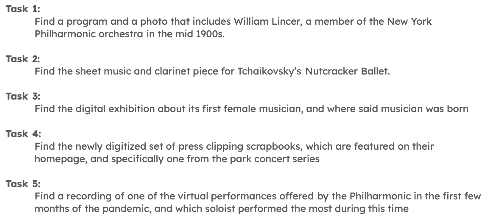
Abridged versions of the tasks are listed below. Initially we had considered modifying the tasks based on which user profile the participant matched, but ultimately decided that we would receive better data noting how novice vs expert users solved the same tasks. Each task also featured two follow ups – “How difficult was this task to complete” and “How successful do you feel you were in completing this task”.
At the completion of the five tasks, participants were asked to complete a post-test questionnaire based on the System Usability Scale. Users were also asked about their emotional response to the interface, but due to an error in the initial survey this data is incomplete.
Analysing Test Results
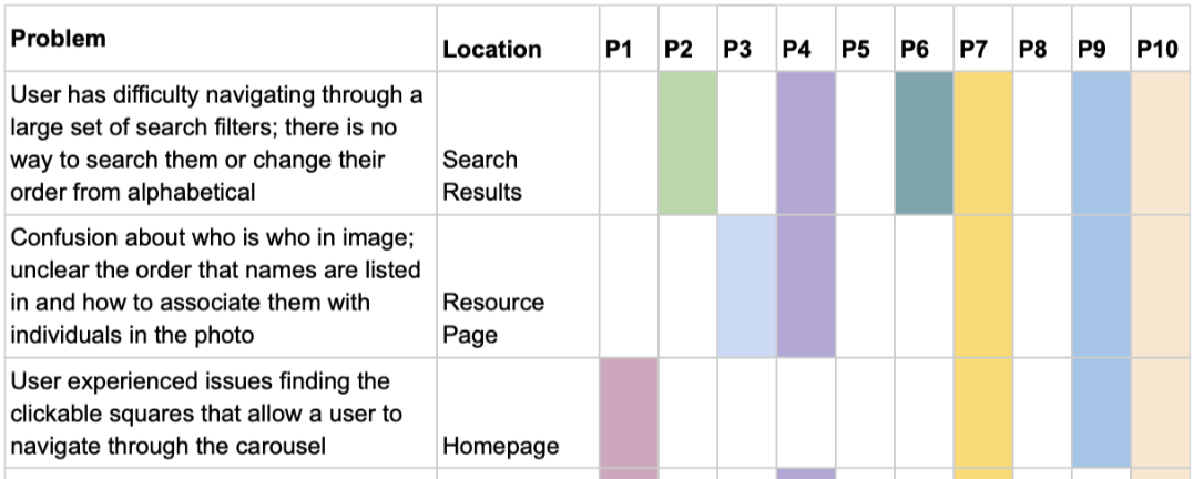
After all participants completed testing, the team reconvened to discuss our findings. Our participants had provided us with a wealth of information, and after some initial discussion we decided on using a Rainbow Chart to analyse the information. This involved each of us reviewing our notes and listing any issues the participants encountered, before pulling the list into a single spreadsheet. We then consolidated the items, combining any that were functionally the same and which participants encountered it.
We used several other tools to help inform our recommendations. The System Usability Scale data from the questionnaires was analysed, for a benchmark score of 60.3/100 (“okay”). Myself and another teammate also sat down with an accessibility domain expert to run an ad-hoc audit on the Digital Archives website, giving us insight into specific accessibility issues that could be remedied.
Results & Findings: Assembling the Set List
There were a few pages a lot of people visited, and a lot of pages a few people visited. This set out the narrative for our report, targeting the areas that were most commonly visited while also keeping notes on all other potential improvements. In particular, we found users spent the majority of their time on either the main landing page or on the search results page.
Homepage
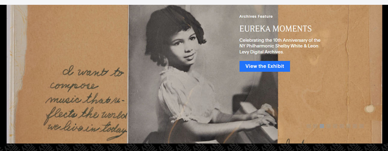
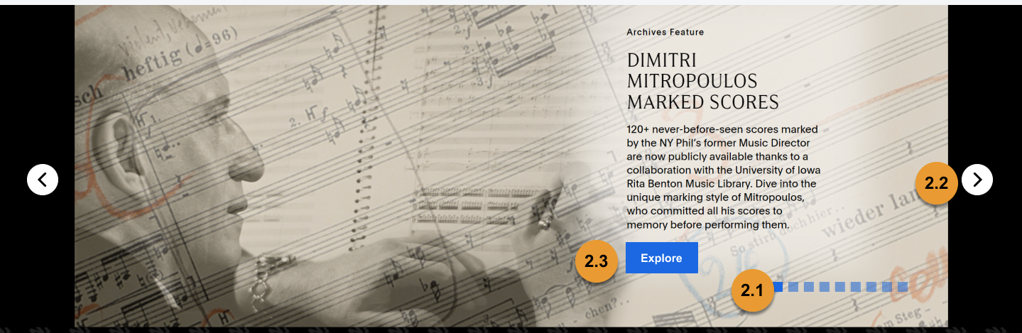
The first recommendation involved updates to the homepage. While initially only presented as one recommendation, we soon discovered that the two main areas of improvement, the navigation and the carousel, had little commonality between them. This led to us splitting the recommendation into two seperate items.
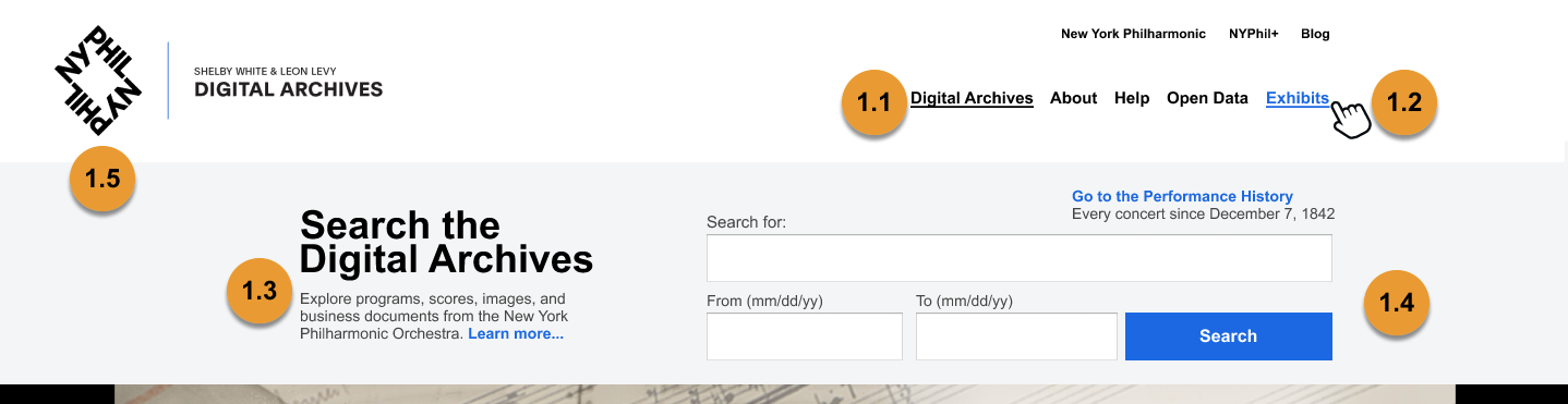
Recommendation 1 focused on the navigation menu, and was mostly intended to be small, actionable items. This included several accessibility minded updates, including increasing colour contrast and adding hover states, and renaming some labels that our participants found confusing – such as changing ‘features’ to ‘exhibits’.
Recommendation 2 involved the carousel, which the Digital Archives had indicated was an area of interest. Again we opted for simple solutions mainly focused around usability. However compared to the navigation bar, we were surprised when the client requested grander changes on how the carousel could be resigned from scratch. This led to us updating our report to include other examples of carousels and alternate ways of displaying this information.
Search & Filters
Much like the main landing, it was evident that the findings from the search results page warranted being two seperate recommendations, one about the overall layout, and one specifically targeting the filter modal.
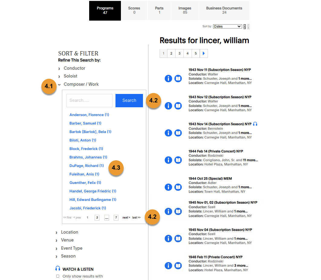
Recommendation 3 was about making sure the search results page better matched the users’ mental model. The most substantive change was to create a consolidated results page, rather than the current version where it is pre-filtered. Several visual changes were made to help create consistency between the different filters, namely grouping all the filters together in a single place, as well as formatting all results in the same style.
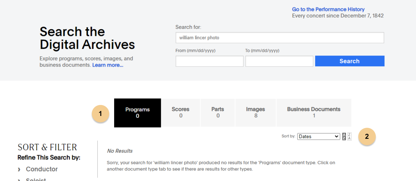
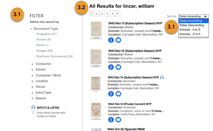
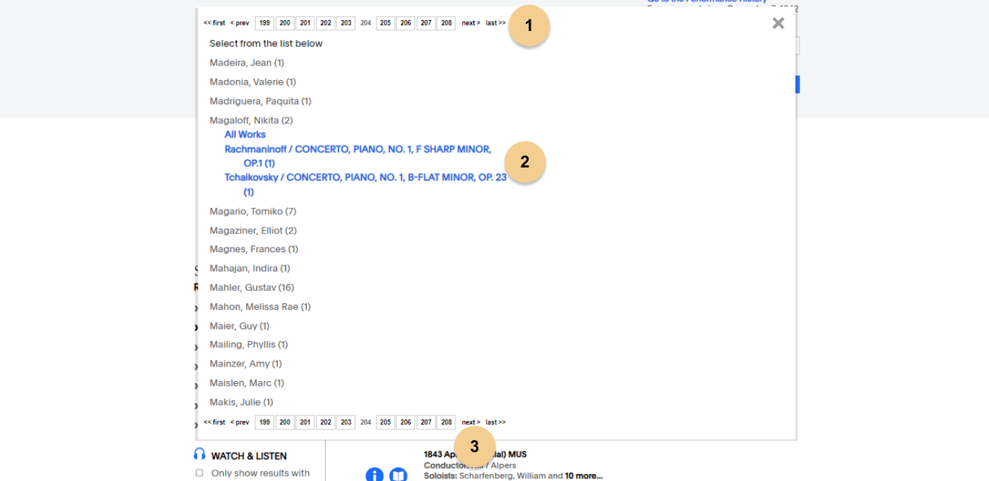
Recommendation 4, the filter modal, was the screen that was displayed when selecting filters. The team was aware this was a problem area, as users were consistently overwhelmed by the sheer volume of filters (sometimes over 200 pages), but didn’t know how to best resolve it. Options included changing the pagination to a scroll function, reordering the results, and creating different modals for few vs many results. In the end we decided that the simplest option was to allow users to search through the filters to find the one they were looking for. We also moved this view to the sidebar, to help create the consistency that we mentioned in recommendation 3.
Everything Else
While I personally was involved in the discussion around the other recommendations, my main task was focused on how to convey the miscellany of other insights we gleaned from our user testing. While many narrative structures were attempted, a tabular format proved to be the most efficient. None of these recommendations alone have much depth nor a mockup. 5 broad categories were created:
- Accessibility: This was something that was important to the Digital Archives per our meetings. We aimed to incorporate as much as possible into our other recommendations, but we wanted to state that these were items that should be updated site wide
- Metadata: With Google being such a feature of modern life, novice users typically ran into roadblocks with stricter search queries. Terms like “ballet” or “image” weren’t indexed, and there was no fallback state for the user.
- User Interface: Some items we described were intentional design choices, this category was for the rest. Object overflows, loading times, etc.
- Links and Labels: Naming things is difficult. This section also gave us the chance to offer further testing opportunities through A/B testing.
- Knowledge organisation: Again, structuring information is a hard problem to solve. This again offered future testing opportunities, for instance a Tree Test
Client Presentation: Striking the Right Note
After a significant number of revisions, we had our report in hand. The next step was to present it to the client. We tried to showcase our work in the nicest format, but refining the content of the report took longer than anticipated, leading us to run out of time for slide formatting. However we tried our best to present the intense amount of information in a concise and understandable manner.
We each presented a section, with myself doing the introductions and methods, followed by a discussion session. Although the sentiment in the room was positive, it was obvious that there was a significant amount of information for the client to digest. One surprise, as mentioned when discussing recommendation 2, was how much interest they had in ‘Blue Sky’ approaches. As they were actively in the middle of a redesign, the Digital Archives was also interested in larger improvements that could be made to the overall design, in addition to smaller, easy to implement fixes. While we added some items to the appendix of the report, this remains a topic for future work.
Next Steps: Encore
Client Takeaways
The Digital Archives has walked away with a lot of information, and a report totalling almost 50 pages. But even with that, there’s still more testing to be done. A/B testing on the labels, Tree testing the sitemap, and completing an official accessibility audit should all be on their roadmap. Once the changes outlined in our report are implemented, they should themselves be testing to ensure they achieved the desired effect.
Personal Takeaways
I’m eternally thankful to have worked with such an amazing team throughout this project, and wouldn’t hesitate to collaborate with them again. I learnt a lot about how to trust the work of others, and knowing when to let them handle the work. Time management was an issue on the project, as even with the best of coordination, working with teammates, participants, and clients all requires a lot of moving parts. But being aware of it, I’ve learnt how to build in more time for unexpected delays in the future.