Our Project
The Girl Scouts of Greater New York (GSGNY) provides girls across New York City opportunities to build skills and make friends as part of the nationwide Girl Scouts organization. Core to fulfilling their mission and gaining new members is ensuring that the caregivers of potential and current members find what they need on their website. This case study presents a project to redesign the GSGNY website to meet those needs and includes high-fidelity prototypes and key findings for content, layout, and navigation structure.
Redesigning the GSGNY Site to meet caregiver needs
GSGNY’s last major site redesign was launched in September 2017 and it’s vital that their next design iteration meets the needs of caregivers. Caregivers — parents, grandparents, older siblings, nannies, and others who care for children — serve as the lead researchers and final decision makers for what extracurricular programs children will participate in. The structure and content of the site must convince these individuals that this program is something worth their child’s time.
Given this, when presented the opportunity to redesign the GSGNY website, our team quickly decided to design for a target audience of caregivers and focus our research on the following question:
How can we design a more intuitive, helpful, and exciting site for
caregivers of current and prospective Girl Scouts members?
a complex Information architecture
The current GSGNY website offers a unique challenge: a complex information architecture that required reorganization in our redesigned site. At the time of our site map export in October 2022, it included around 135 pages, the majority of which were tucked into a navigation structure of 10 heading navigation labels, 8 main navigation labels, and over 50 second-level labels that would appear as a user hovered the main navigation labels.
Our Team & My focus
Our team comprises graduate students Jiacheng Chen, Esther Kim, Bella Jiang, Becky Su, and myself. We started our work with four members and gained a fifth after completing our site map. To our team, I brought experience with usability, accessibility, and cultural and educational institutions. Some of the aspects of our work I was most heavily involved in include designing the first draft of our site map for the tree test, building prototypes for pages about becoming a Girl Scouts member, and building an accessible style guide for our high-fidelity prototype.
Our Research
Our research involved a series of user-testing techniques that each answered a key question for the design of the final prototype. Each section here presents the key question, techniques used, and major findings that informed our final design.
What motivates a caregiver to register their child for an afterschool program?
Interviews with Four Users
We began our research conducting interviews with four caregivers of children who are or previously were in the Girl Scout’s target age range to understand caregiver needs in regards to an updated website. Our interview questions focused on understanding three items: 1) Impressions and past experience with the Girl Scouts, 2) How they learn about and research extracurricular programs their children participate in; and 3) What they value the most when looking for and selecting programs for their children. I analyzed our team’s responses using empathy mapping and synthesized our findings into a user persona, linked below.
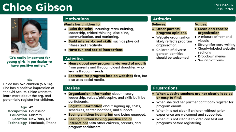
Key Findings
- Motivation: Caregivers are motivated to register children for extracurricular programs so they can learn life (i.e. leadership) and interest-based (i.e. creative) skills while having fun, social interactions with others.
- Communication: Caregivers most commonly learn about new programs via word of mouth from other parents, and they highly value other parents’ opinions.
- Website Visuals: It is important to see children having fun, being engaged, and having positive social interactions with other children, parents, and program facilitators.
- Website Organization: Caregivers value clean, organized, and easy-to-navigate web design with concise, straightforward text and clear navigation menus.
- Desires: When visiting a website for the first time to learn about a program, caregivers look for organizational information (i.e. values), logistic information (i.e. how to sign up), and evidence that their children will have a fun, positive experience (i.e. photographs of participants).
- Frustrations: Caregivers become frustrated when a website is not straightforward and easy to navigate, and when contact forms only allow one caregiver to sign up for information.
How do other program providers share content for caregivers, and what can we learn?


Dimensional Analysis of Six Competitors
We next analyzed the websites of six extracurricular program providers to determine how they attempted to meet the needs of the same target audiences: Girl Up, Civil Air Patrol, 4-H, Girls Who Code, Air Cadet Canada, Girl Scouts USA.
Our analysis included deep dives into eight dimensions relevant to our users: homepage, navigation, organization, links/labels, appearance, search, content (usefulness for caregivers), and mobile-friendliness.
Key Findings
Implement:
- Showcase vision on homepage
- Make use of infographics and white space
- Emphasize navigation options to learn about programs and joining
- Provide an efficient contact method for users
Avoid:
- Using too much text; make text as concise as possible
- Putting elements too close to each other
- Minimizing program information; it is worth spending the space to explain what people will gain from participating
- Layering too many calls-to-action on top of each other in mobile.
How do users make sense of the content GSGNY has to offer?
Card-Sorting with Eight Users
To understand how users might make sense of and navigate the wealth of content GSGNY has to offer, we conducted a card sorting analysis with Optimal Workshop (OW). This process began with an automatic export of all page URLs on the current website: 135. To minimize the amount of cards our users would be asked to sort, we decided to focus on the first three levels of the GSGNY website structure and organize any content sitting in fourth or lower tiers under their third-tier counterparts. However, while this technique helped, we still entered our test with a total of 56 cards.
Responses from our eight user participants varied widely, but we were able to use OW’s 3D cluster and similarity matrix tools to build a draft site map that we hoped would fit the mental models of most users.
Key Findings
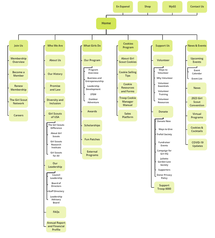
As an example of how the site structure evolved based on our card-sort findings, compare the GSGNY’s original first level labels (left) with our new version created after the card sort (right).
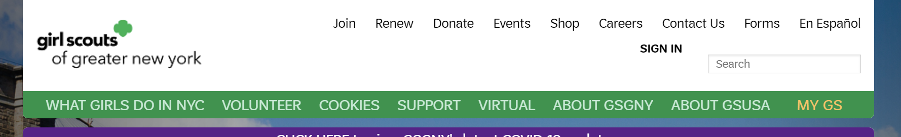
Original GSGNY First-Level Labels
- Header nav
- What Girls Do in NYC
- Volunteer
- Cookies
- Support
- Virtual
- About GSGNY
- About GSGUSA
- MyGS
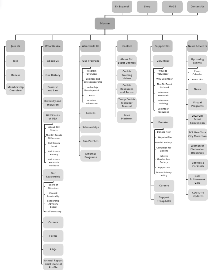
First-Level Labels built from Card Sort Analysis
- Header nav
- Join Us
- Who We Are
- What Girls Do
- Cookies
- Support Us
- News and Events
Tree-Testing with Eight Users
To ensure we correctly predicted how users would attempt to navigate through GSGNY content and, if not, how we could improve, we tested the viability of our new site map with eight additional participants using a tree test on OW. Our results were less than ideal — a fairly poor success and directness rate (34% and 47%, respectively) — but we received clear data to improve by tracking how participants navigated while trying to find the content they needed.
Our first level labels stayed the same in the next version of our site map (with the exception of “Cookies,” which was relabeled “Cookie Program” for clarity), but the location and naming of many second- and third-level labels changed significantly.
Key Findings
The most significant changes were made to the “Join Us” section. We originally designed this section to only contain pages related to registration, but learned during our tree-test that many users interpreted the “Join Us” label as providing ways to join in a newsletter or apply to be a staff member. Two pages — “The Girl Scout Network” and “Careers” — were moved here from “Support Us,” and the labels of pages previously included in this section were adjusted for clarity.
How do we build intuitive pages to support the accomplishment of caregivers’ key tasks?
Remote moderated tests with eight users
To develop testable low-fidelity desktop and mobile prototypes that incorporated our findings, we first developed three main tasks that we wanted caregivers to be able to complete on our site, each with its’ own user story, and outlined the pages required for users to complete these tasks: “Home,” “About Us,” “Leadership Development,” “Program Overview,” “Membership Overview,” “Become a Member,” “Trefoil Society,” “Ways to Give,” and “Campaign for Girl HQ.” After building prototypes of these pages, we conducted remote user tests that asked users to navigate through the mobile and/or desktop prototypes and complete the tasks, talking through their process out loud. Our tasks:
- Task 1: Find information about the Girl Scouts of Greater New York program, and learn more about what their Leadership Development and Science, Technology, Engineering, and Math (STEM) programs entail.
- User Story: Caregiver is interested in understanding how the Girl Scouts helps children learn about leadership values and STEM skills.
- Task 2: Learn about what membership with the Girl Scouts of Greater New York entails and register a child as a Member.
- User Story: Caregiver is curious about what GSGNY can offer her child and, when satisfied, wants to enroll their child in GSGNY.
- Task 3: Learn about ways to give to the Girl Scouts of Greater New York, learn more about the Trefoil Society (a donors-only group), and make a donation to the Campaign for Girl HQ).
- User Story: Caregiver is stratified with their children’s experience at the GSGNY, and want to contribute to the GSGNY.
Key Findings
Analysis of our tests — what users enjoyed, and where they ran into trouble — led to our team’s development of 19 total recommendations, 14 of which our team decided to implement in our final prototype. These involved:
- Navigation: Adding clarity to our navigation bar’s dropdown menus by adding arrows next to labels that lead to additional navigation options.
- Consolidation: Combining redundant information located on the “Membership Overview” and “Become a Member,” “Ways to Give” and “Donate Now,” and “Events List” and “Events Calendar” pages; create a new second-level label, “Donor Societies,” to lead to two related pages, “Trefoil Society” and “Juliette Gordon Low Society.”
- Graphics and Layout: Reducing blank space on all pages, ensuring content boxes are no larger than they need to be for the content offered, and redesigning infographics to have clear visual hierarchy.
- Homepage: Leveraging the homepage to highlight additional items important to caregivers, such the Girl Scouts mission and vision.
An Intuitive, Helpful, and Exciting Final Prototype for Caregivers

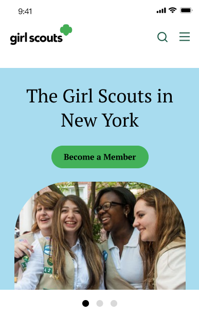
Our team created high-fidelity prototypes for desktop and mobile to synthesize our research. This prototype incorporates Girl Scouts’ visual identity, and all pages incorporate findings surfaced throughout our user tests and market research.
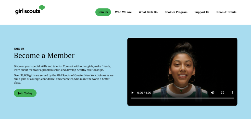
A key example of the impact of our testing is our Become a Member page, of which I led the design. Our tests, and a sampling of the findings that informed this page, are as follows:
- Tree Test: Going into the card sort, our team originally labeled this page “Join” and included it alongside other pages related to membership in the first level label “Join Us.” During our tree test, we learned that users expected to find more than just registration information under “Join Us,” such as joining as a staff member and signing up for a newsletter. To incorporate those other options for joining, we needed to clarify the purpose of this page with a new label: “Become a Member.”
- Moderated User Testing: Based on user feedback, we merged together two redundant pages on the original site (“Join Girl Scouts” and “What Girls Do in NYC”) for prospective members and their caregivers to have easy access to all the information they need to understand what membership entails.
- Market Research: This page has consistent and significant spacing between sections to make visual navigation easy, mirroring the design of some of our most highly-scored competitor websites.
- User Interviews: We added a new section pulling together information previously buried in the FAQs page to address needs of caregivers surfaced in user interviews. Caregivers prioritize looking for this information when researching, and making decisions to register for, activities for their children.
Key Takeaways
In sharing our prototype with peers, it was well received with positive comments on infographics, colorful design, and use of carousels, and opportunities to improve signifiers for interactivity on the main navigation. Key takeaways, including opportunities for further research, are as follows.
Trust your gut on color combinations
Our prototype uses the combination of black text and #00b451 — “Girl Scouts Green” in the Girl Scouts visual identity and their primary color — to identify navigation labels and page buttons. Girl Scouts Green is accessible as a background with black text at WCAG AAA; its contrast ratio is 7.64:1, far above the minimum ratio of 4.5:1 for normal text as outlined by WCAG v2.1 success criteria 1.4.3: Contrast (Minimum). However, in sharing our final prototype with peers, multiple individuals commented that the combination was hard to read. This echoed concerns our team had, and dismissed, during prototype development because the combination met contrast requirements. Future work on our prototypes should involve experiments to change this color to combination to meet both accessibility requirements and manual user review.
Clear information architecture must come before aesthetic design
The visual design of our new GSGNY site wouldn’t matter if users could not use the navigation structure to find the information they needed. It was vital that we started our design work with testing, through card sorting and tree tests, our information architecture.
Testing is never really done
Outside of receiving informal feedback from our peers, our team hasn’t had the chance to formally test our final prototypes. If we were to continue our work, our next step should be continuing user testing — to measure success in completing tasks and gain qualitative feedback on our aesthetic design — to understand if this final prototype is a viable solution, and to confirm if some of the issues raised by our peers are shared by other users.