Role
UX Research, Data Analysis, Designing Recommendations, Reporting
Team
Ariella Brown, Johna Shi, Samika Rastogi, Shubhangi Singh
TIMELINE
Oct 26, 2022 – Dec 14, 2022
Overview
Our team worked with Pratt Institute to evaluate the performance of their re-designed website, launched in the Summer of 2022. The objective of this study was to understand the pain points prospective graduate students experience on the desktop website while applying to programs and seeking information that encourages them to apply to Pratt. We used eye-tracking technology to identify four findings highlighting users’ pain points with element discoverability and misleading CTAs across the website. Recommendations focused on restructuring navigational flows for quick and easy access to information.
The Problem
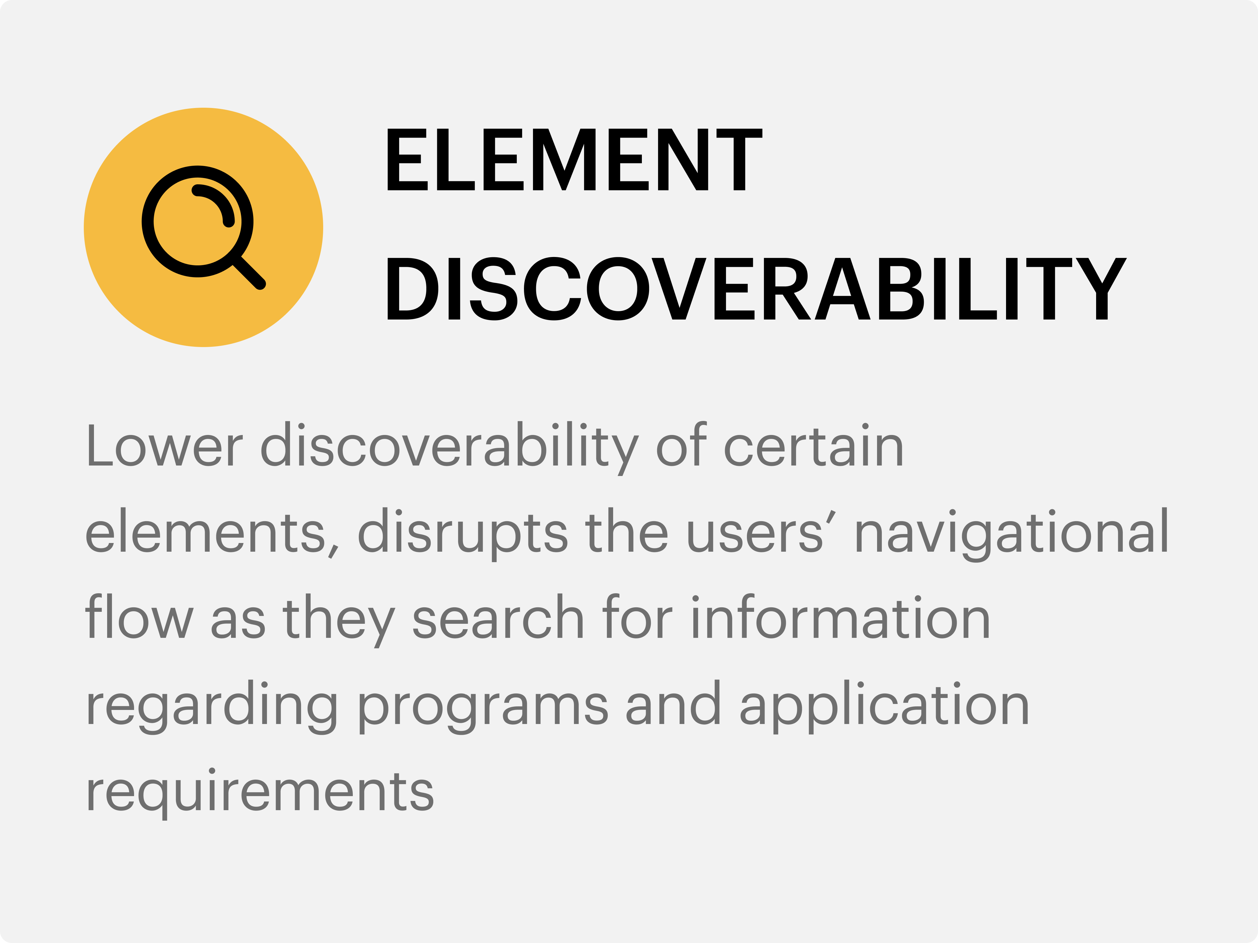
Lower discoverability of important information across the website
Pratt Institute’s website acts as a recruiting tool to teach prospective students about programs and subsequently encourage them to apply to Pratt. The redesigned website received positive feedback on its performance, though our team identified 2 main areas of improvement.
Hence, to solve these problems our goal was to :
- Emphasize inconspicuous elements to drive users in the right direction
- Get users to their intended destinations and information with less effort.
Defining Key objectives Based on our personal experience of applying to graduate school
We defined 4 research objectives for this study by recalling what information was important to us while we applied to graduate school and referring to the inquiry emails the admissions office receives everyday.
Getting To Know the Users
8 prospective graduate students, actively applying to graduate school or considering applying in the future
We were able to categorize these 8 participants into 2 categories – Novice and Expert. Through this study, we observed that Expert users completed most of the tasks assigned, faster as compared to Novice users
Methodology
Conducting moderated usability tests with eye-tracking technology

We conducted moderated usability testing sessions using the Tobii Pro eye-tracking software with 8 participants.

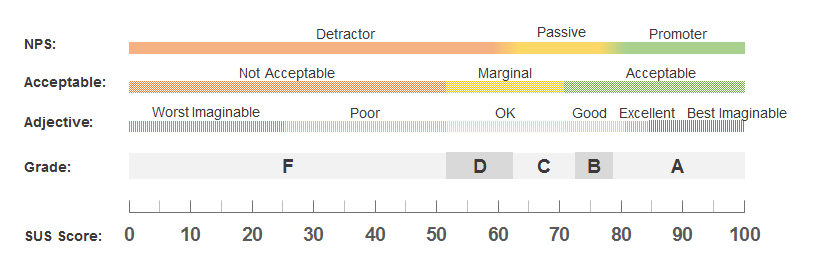
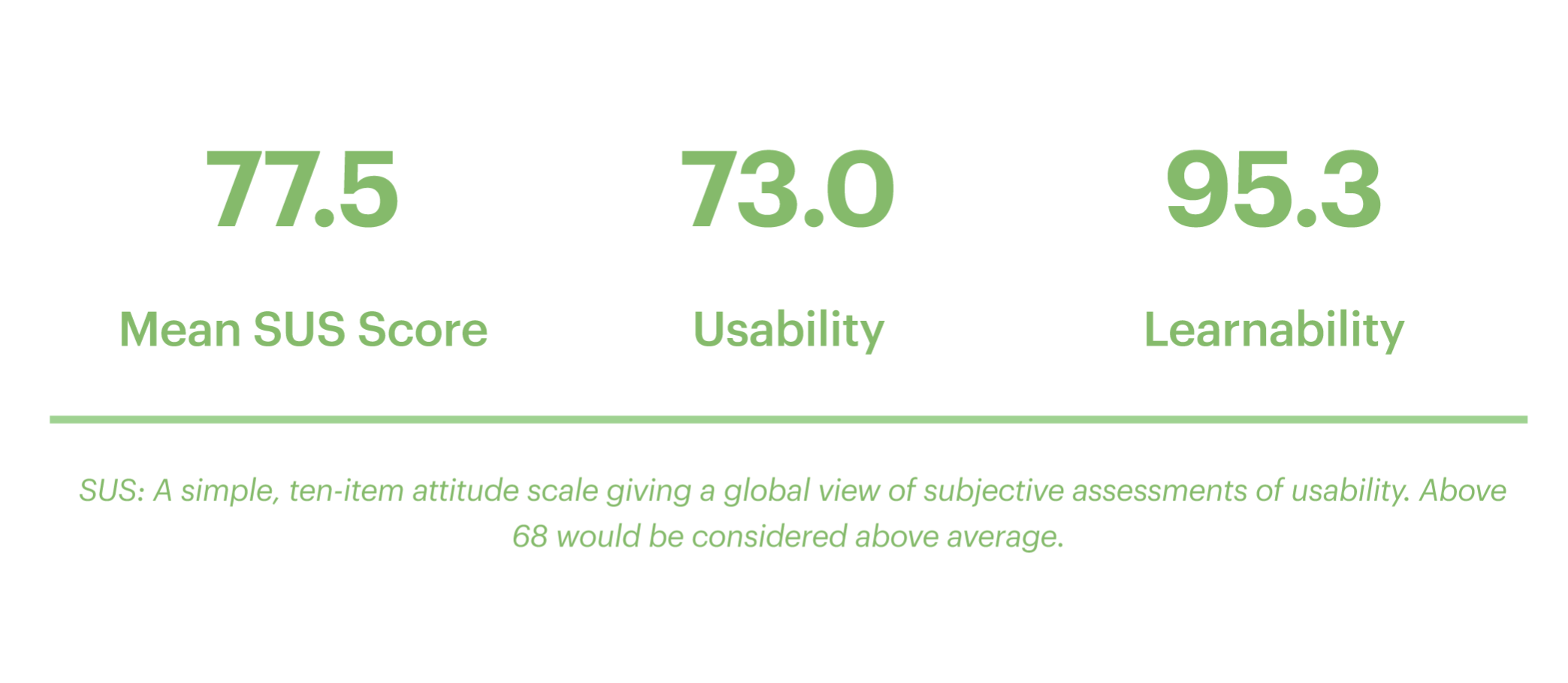
Later, we used the System Usability Scale to measure the system satisfaction score. The SUS score is a single number measured on a scale from 0-100, where 100 is “perfect” usability while 68 is considered an average score.
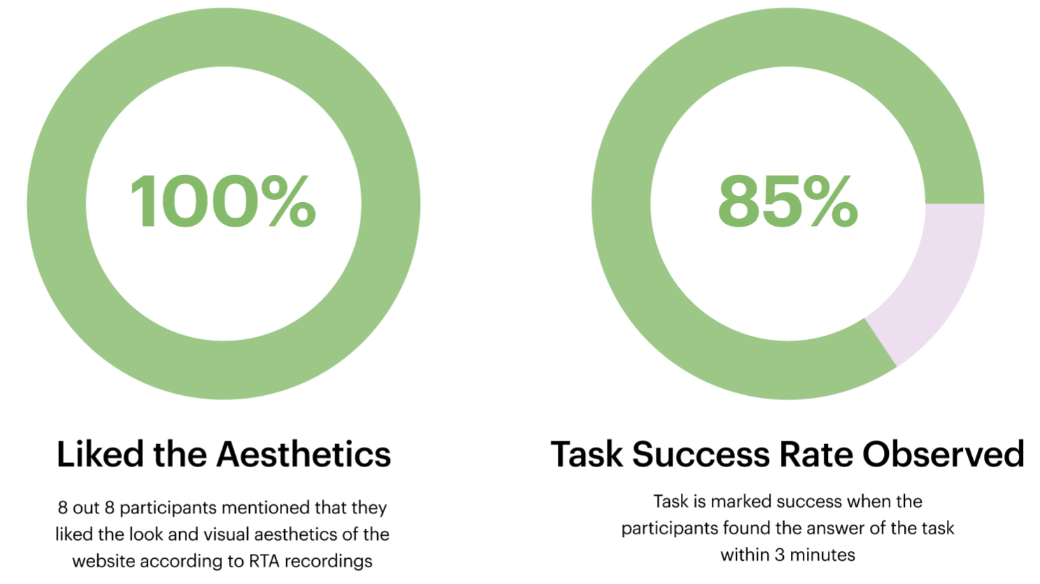
POSITIVE FEEDBACK
“It was great! I thought it was very clean and I enjoyed using it. I like seeing all of the courses, it was detailed as far as the outline of the courses, and everything was explained very well.
-Participant
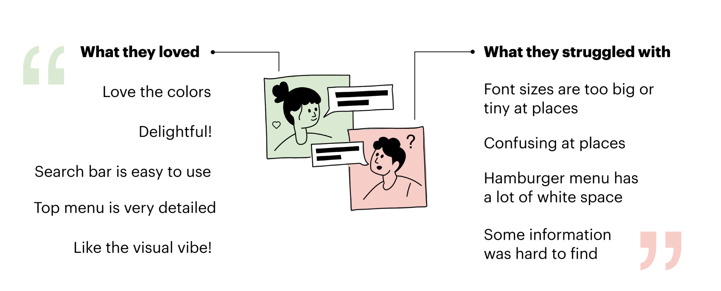
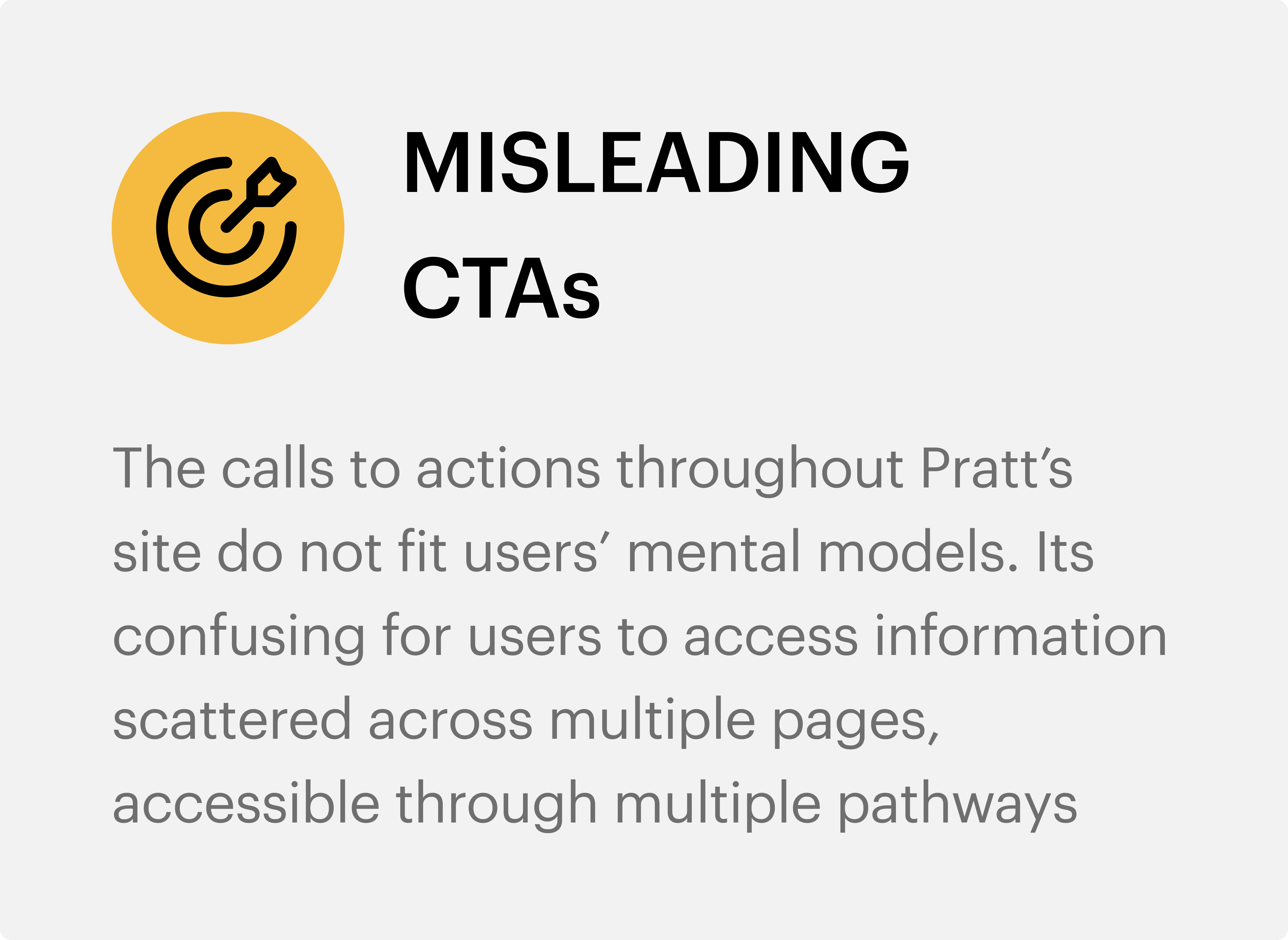
Although the website got overall positive feedback from most users, we gathered findings and provided recommendations for 2 areas of improvement :
- Elements Discoverability
- Misleading CTAs
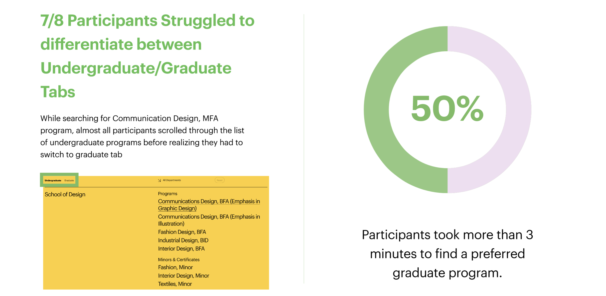
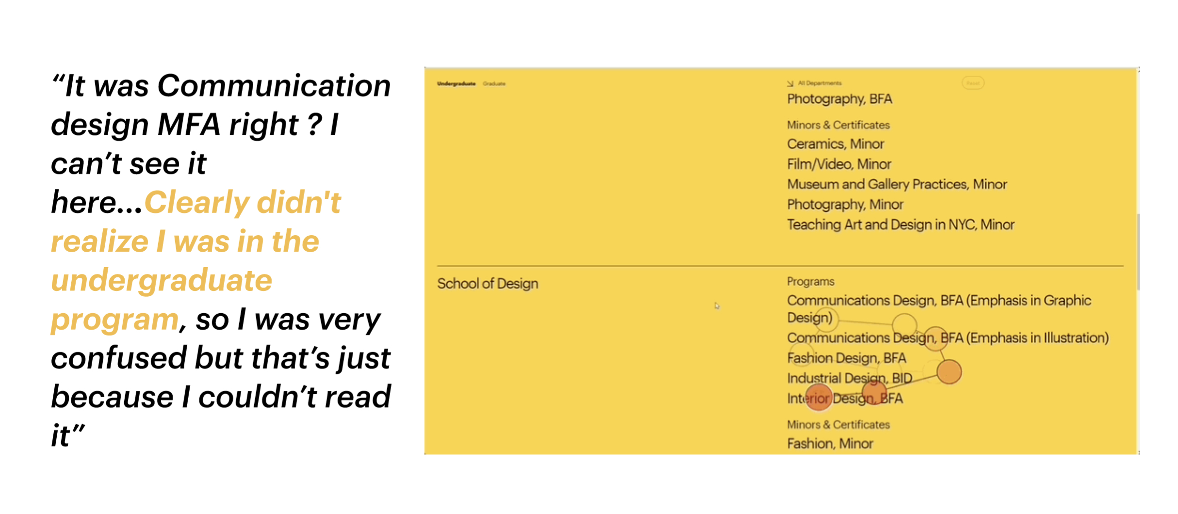
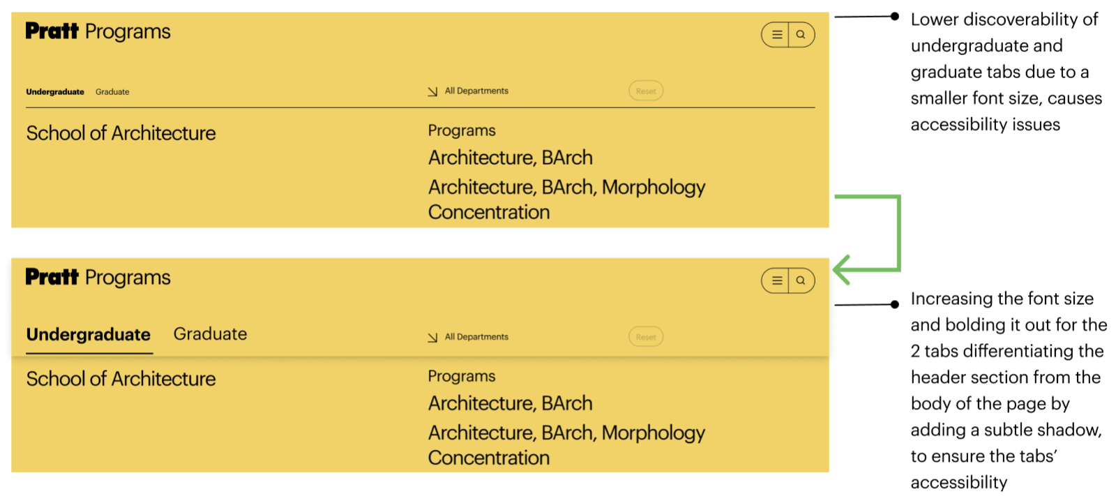
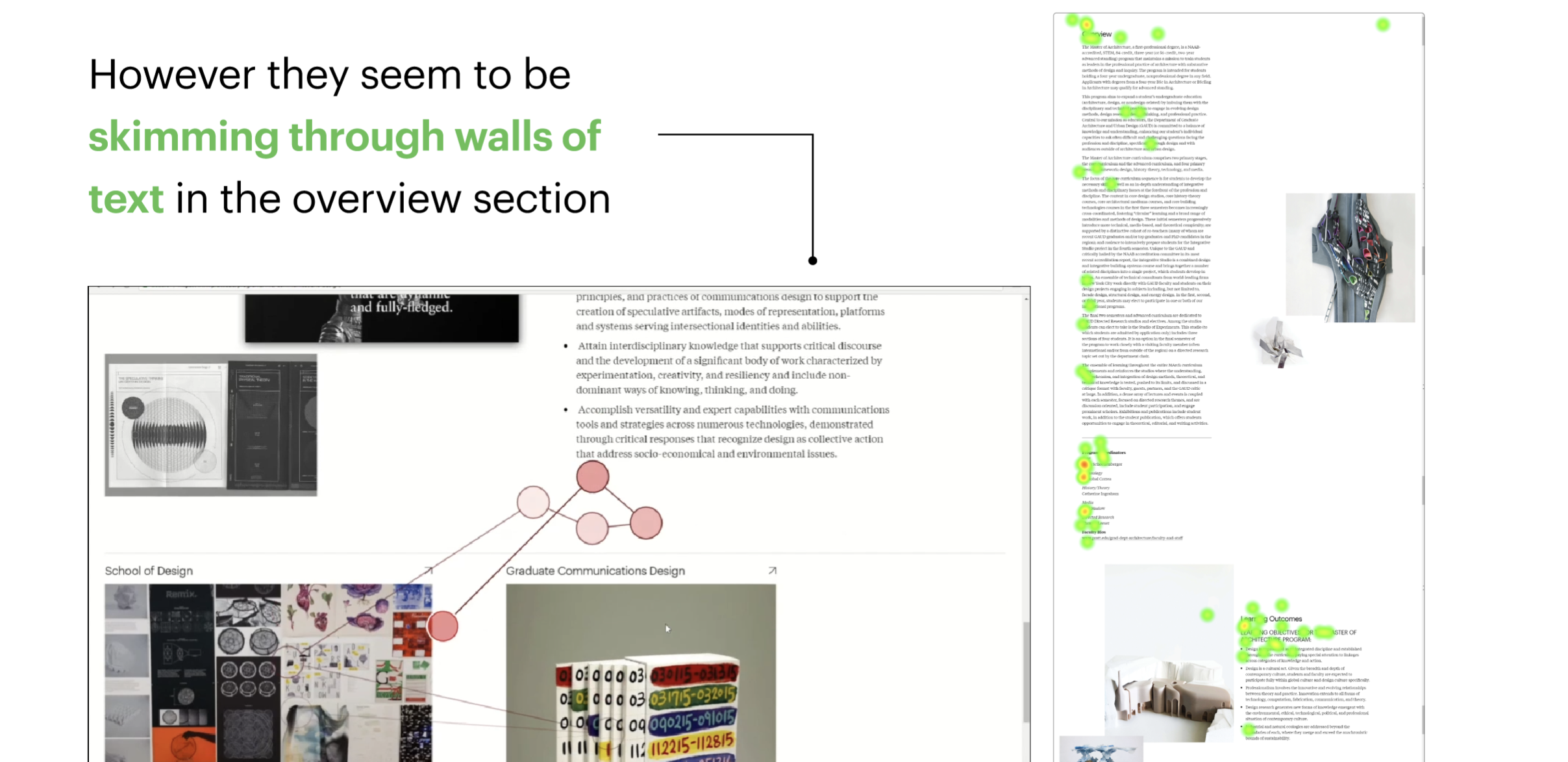
FINDING 1
Most users struggled to discover separate tabs for graduate and undergraduate
“Took me some time to realize there was a second tab for “graduate” which i do think is something that should be bigger and more obvious. It very small and it’s just at the top…Its easy to ignore”
– Participant
RECOMMENDATION
Emphasize Undergraduate and Graduate Tabs to enhance their discoverability
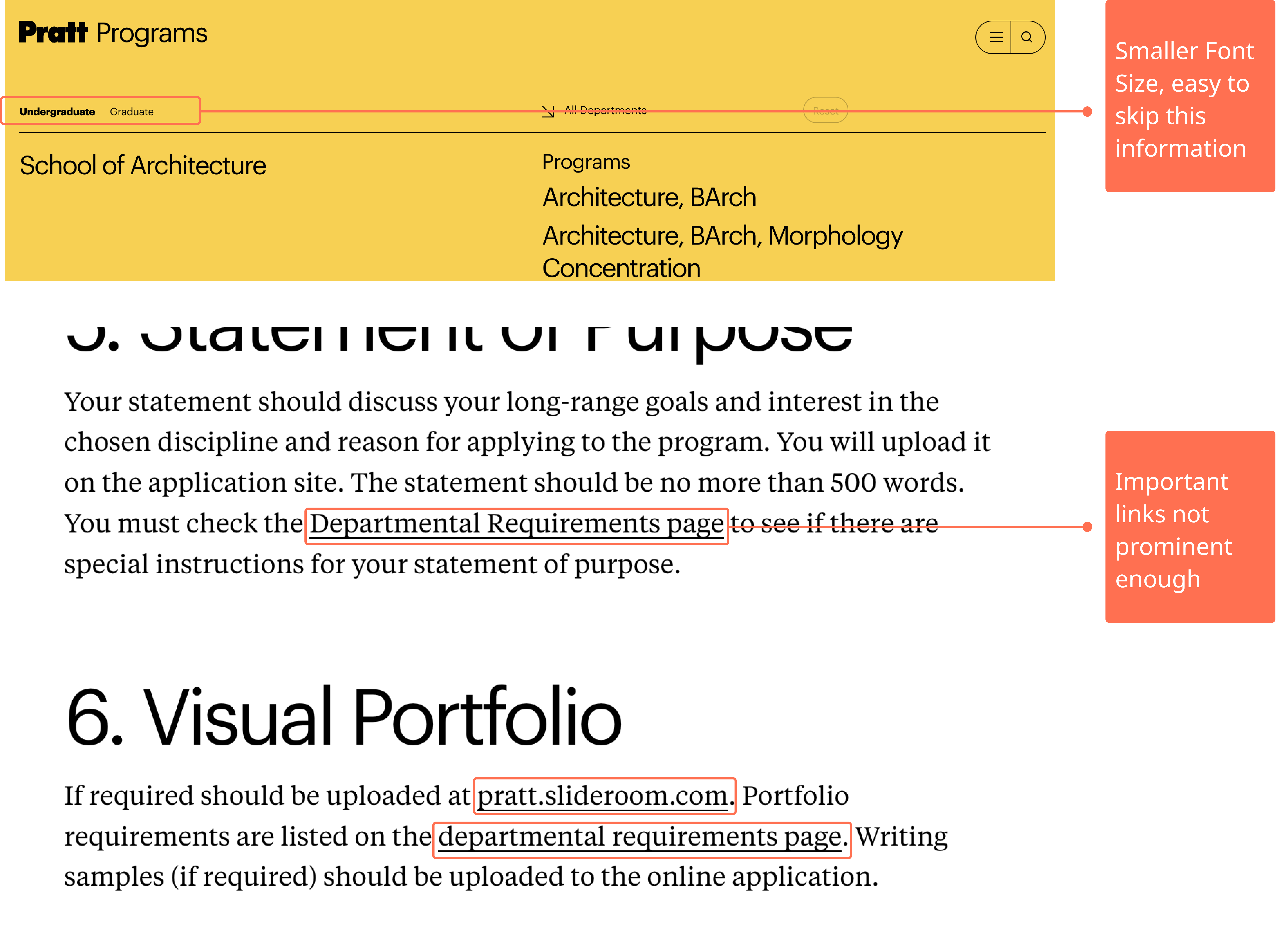
Finding 2
Users overlook links that are Nested in large paragraphs of text
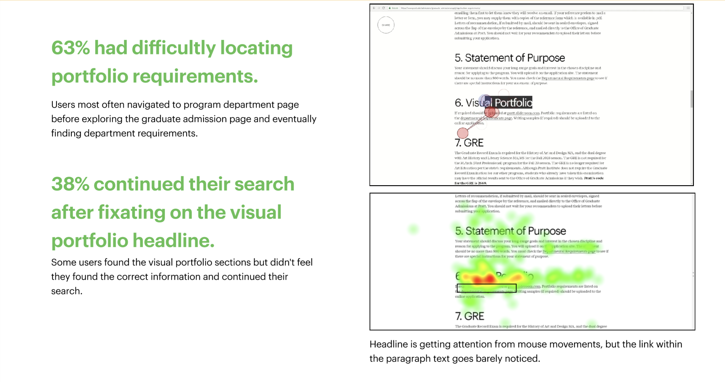
Even though they are underlined, they are not as easy to find out
– Participant
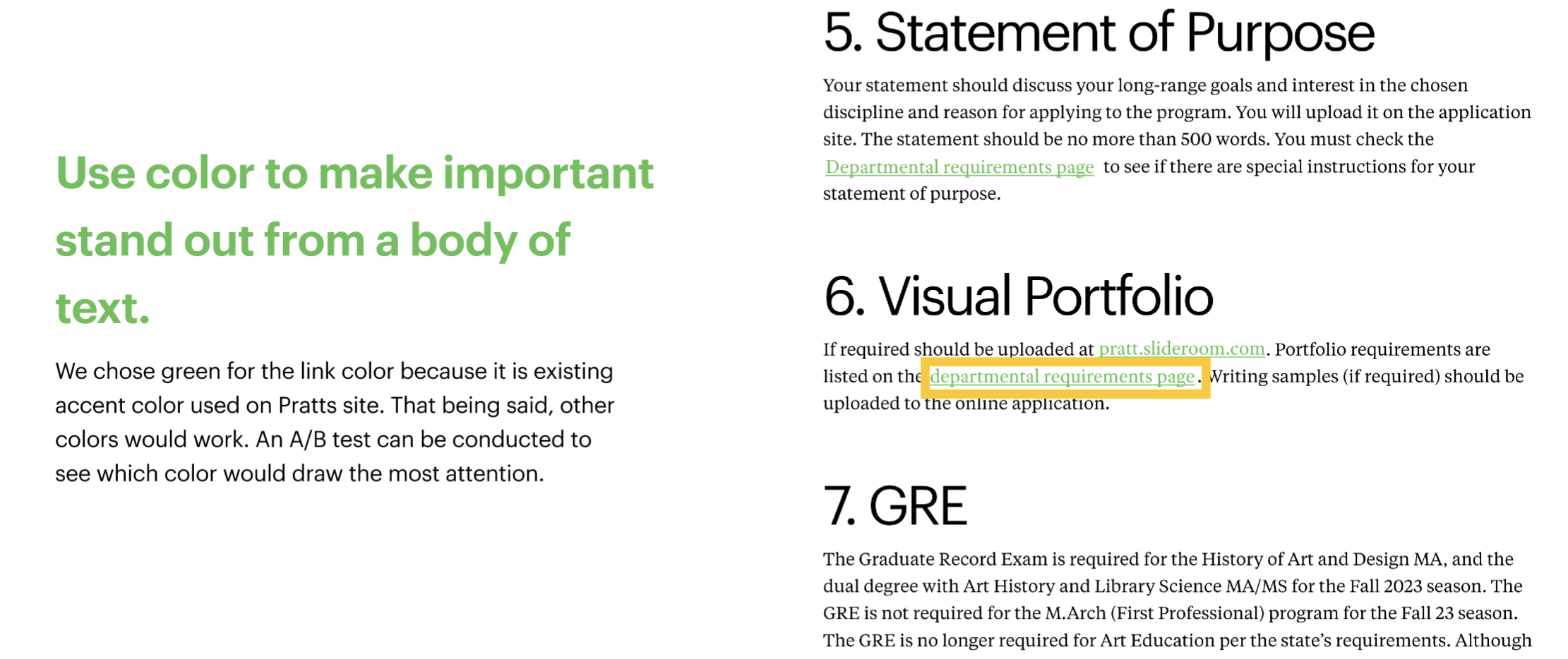
RECOMMENDATION
Highlight links with color to Increase their visibility
FINDING 3
Users expect to start their application when clicking Apply to Pratt or How to Apply
“ I was taken to another ‘how to apply’ screen, I sorta had to navigate to actually submit my application, but eventually I got there and I was ready to apply.”
– Participant
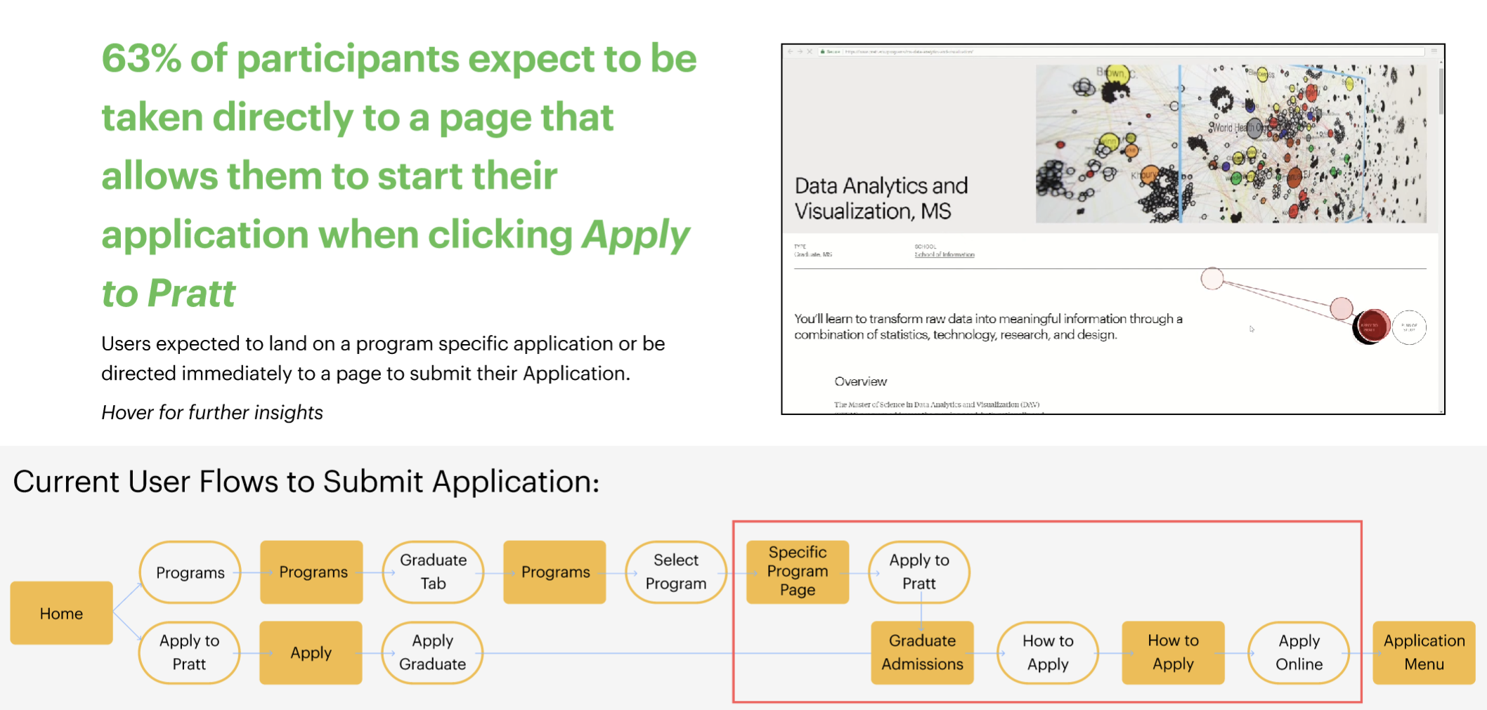
When asking our participants to find a way to begin their application, our users mainly took two paths :
1. The first path they would navigate was to graduate admissions, make their way to the how to apply page, and find where to submit their application on that page.
2. The second path they would take was to their graduate program of choice, they would then click the apply to Pratt button, then be led to the graduate admission page.
We witnessed our participants looping in circles from the graduate program page and graduate admissions page.
RECOMMENDATION 1
Eliminate unnecessary steps in the application process
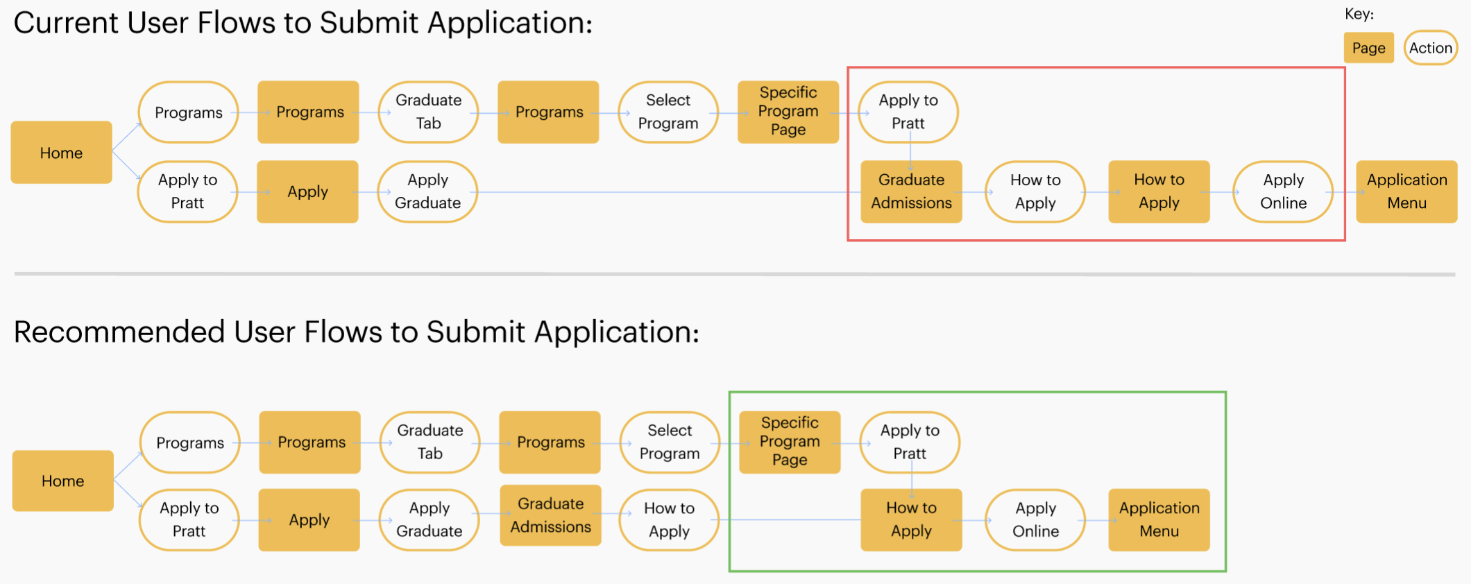
We suggested removing the “Graduate Admission” page when a user clicks the CTA on the program page. Rather than searching for the How to Apply page on the Graduate Admission page, they would be taken directly to the How to Apply page.
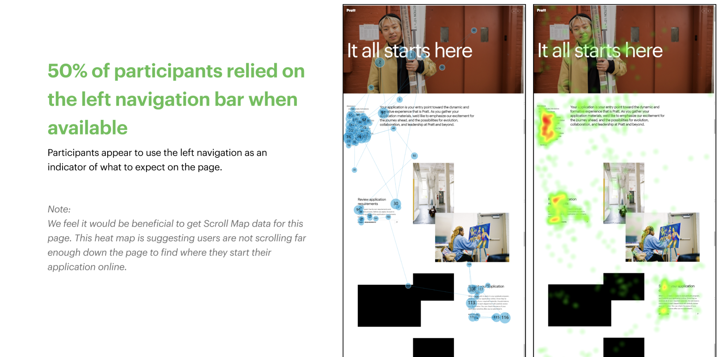
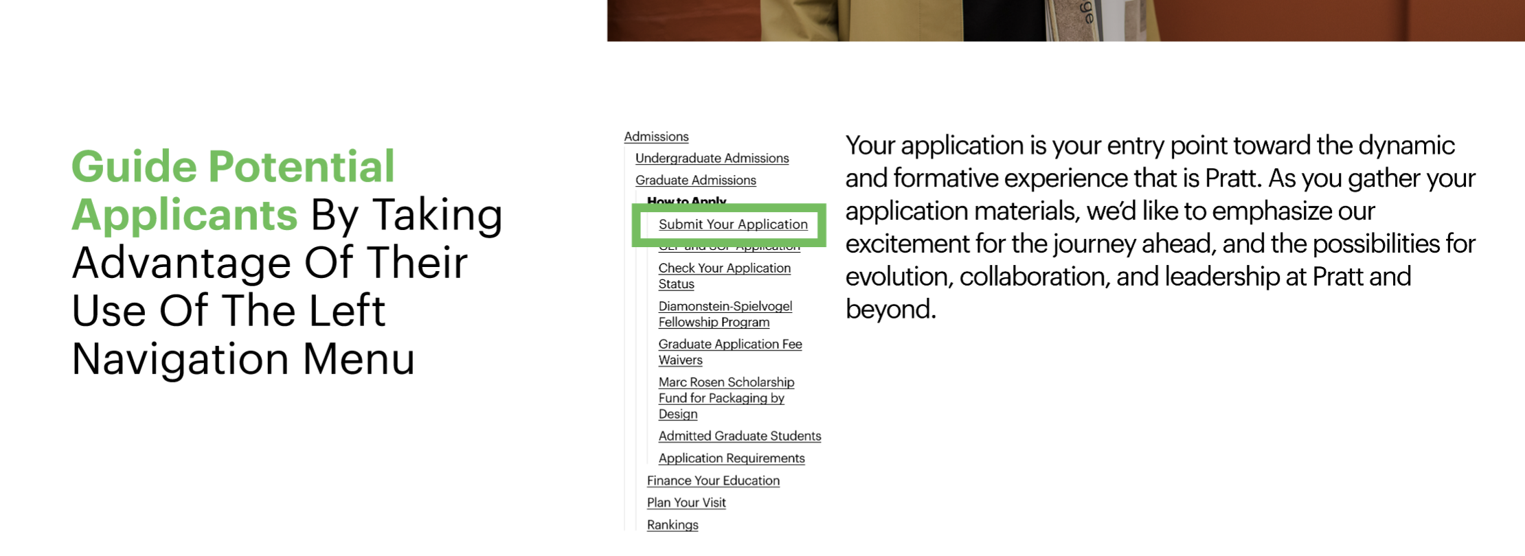
RECOMMENDATION 2
Add “Submit Your Application” to Left Navigation
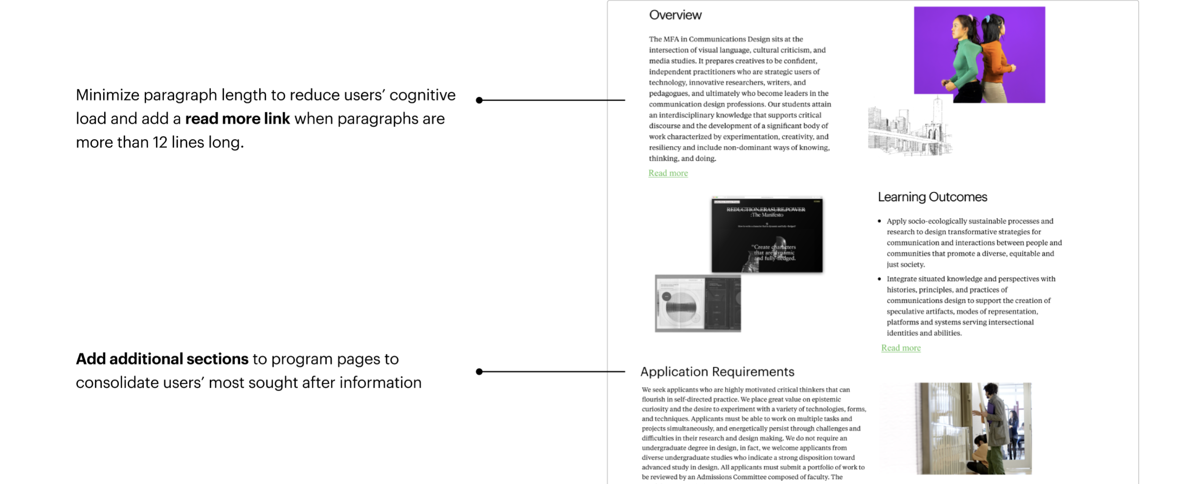
FINDING 4
Users expect to find all the information related to a program on it’s specific page
It felt like I was jumping a lot of hoops than I would have wanted to. I do wish that on each graduate specific page, you could list all the detailed information.
– Participant
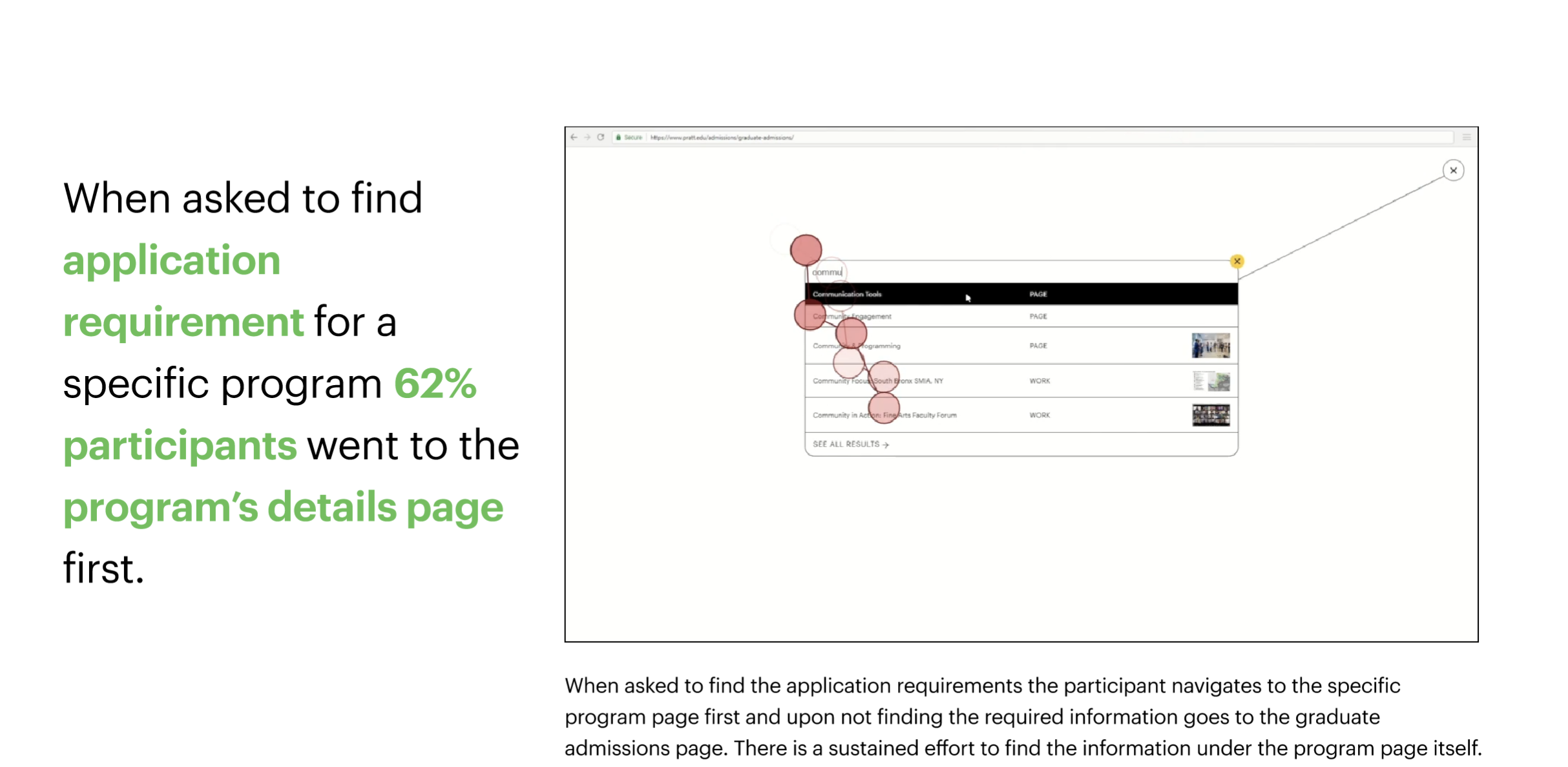
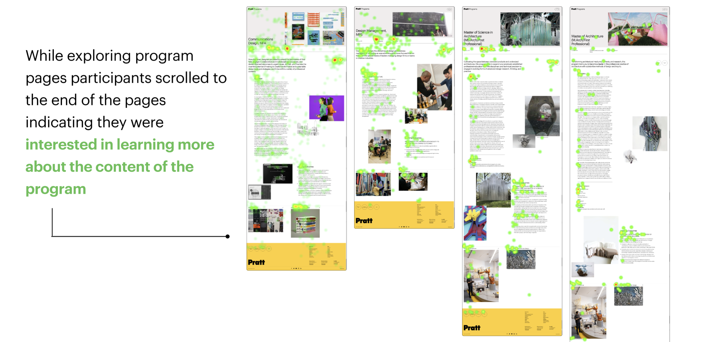
Recommendation
Consolidate and organize information based on user needs on program page
Conclusion
These recommendations were very helpful indeed! We were aware of a few issues but some highlighted in this study are new.
We presented our findings and recommendations to our stakeholders and received positive feedback. While many of the issues identified by our research aligned with the stakeholder’s hypothesis, they appreciated a few insights that were new to them.
To further improve the user experience of the new website we recommended the following:
- Conducting more moderated usability tests to validate/ invalidate the recommendations made through this study
- Identifying problem areas to re-define a more specific research objective for further usability testing
- Utilizing analytical tools (Google Analytics) with eye-tracking and moderated usability testing to gather deeper insights quantitatively as well as qualitatively