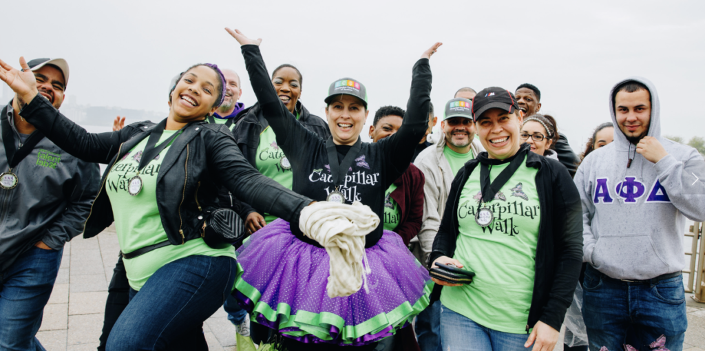
Fibromyalgia Care Society of America (FCSA) is a non-profit organization dedicated to providing care, supportive services, and education to individuals with Fibromyalgia, their families and friends, and the community at large. The FCSA website is an entry for anyone wanting to learn more about the organization or contribute to the cause. To help FCSA achieve its goal of supporting the community with fibromyalgia, this project primarily focuses on redesigning the website to accomplish accessibility, enhanced user experience, and growing digital footprint.
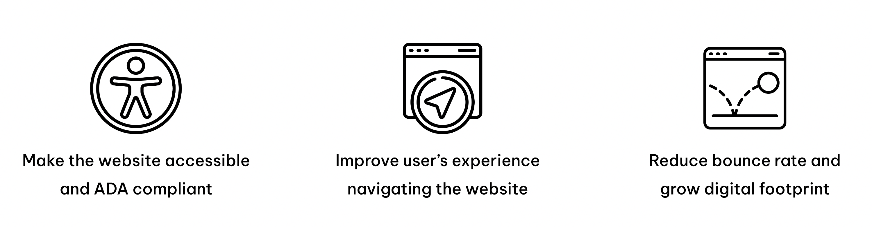
Project Goals
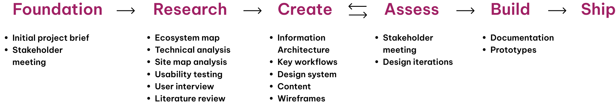
Project Process
Research Process
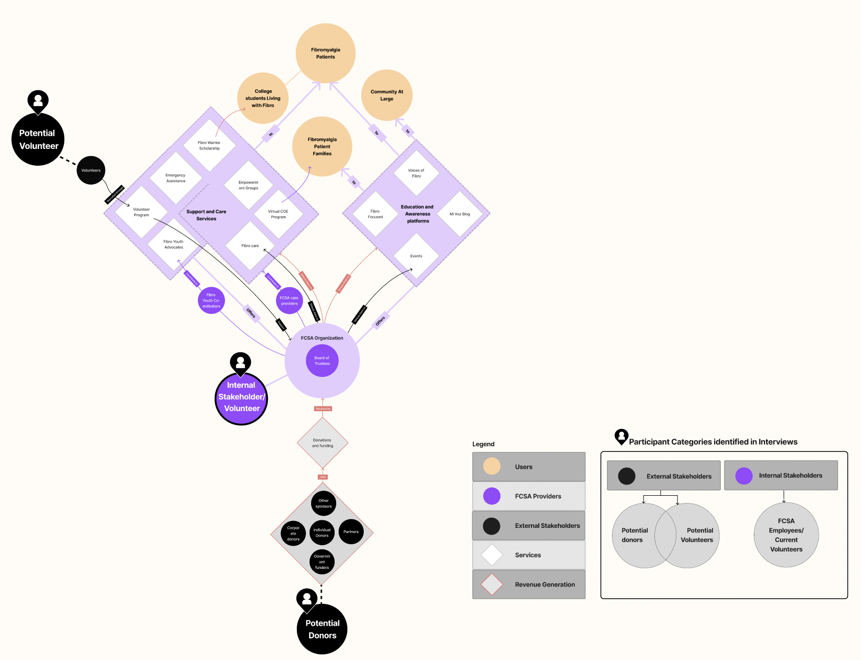
1. Built an ecosystem map
It helped us understand:
FCSA as an organization and how they interact. Understood the services being offered, and categorized the user profiles; potential donors, potential & current volunteers as well as internal stakeholders.
2. Conducted Technical Analysis
It helped us understand:
The technical analysis of the FCSA website helped us understand the areas that could be improved especially from an accessibility stand point.
We analyzed what works well for the website and the areas that can be improved upon.
3. User Interviews
It helped us understand:
The participants’ background, website areas and features that are liked and disliked.
4. Usability Testing
It helped us understand:
Observe and analyze how users interact with specific pages of the website.
Pages for the usability test were selected based on the services and pages described as being core to FCSA’s business.
Key Findings from Research
- Retaining the colors, content and interaction elements
- Identified challenges associated with discovering some of the sections of the website
- Scope to improve design consistency across the website
- Use of colors, pictures, and the font style can be refined further for an elevated user experience
- The call-to-action buttons can be better integrated with the website’s layout
- Immense scope to improve the accessibility of the website (legibility, text styling, minimal design)
- Scope to improve the Information Architecture.
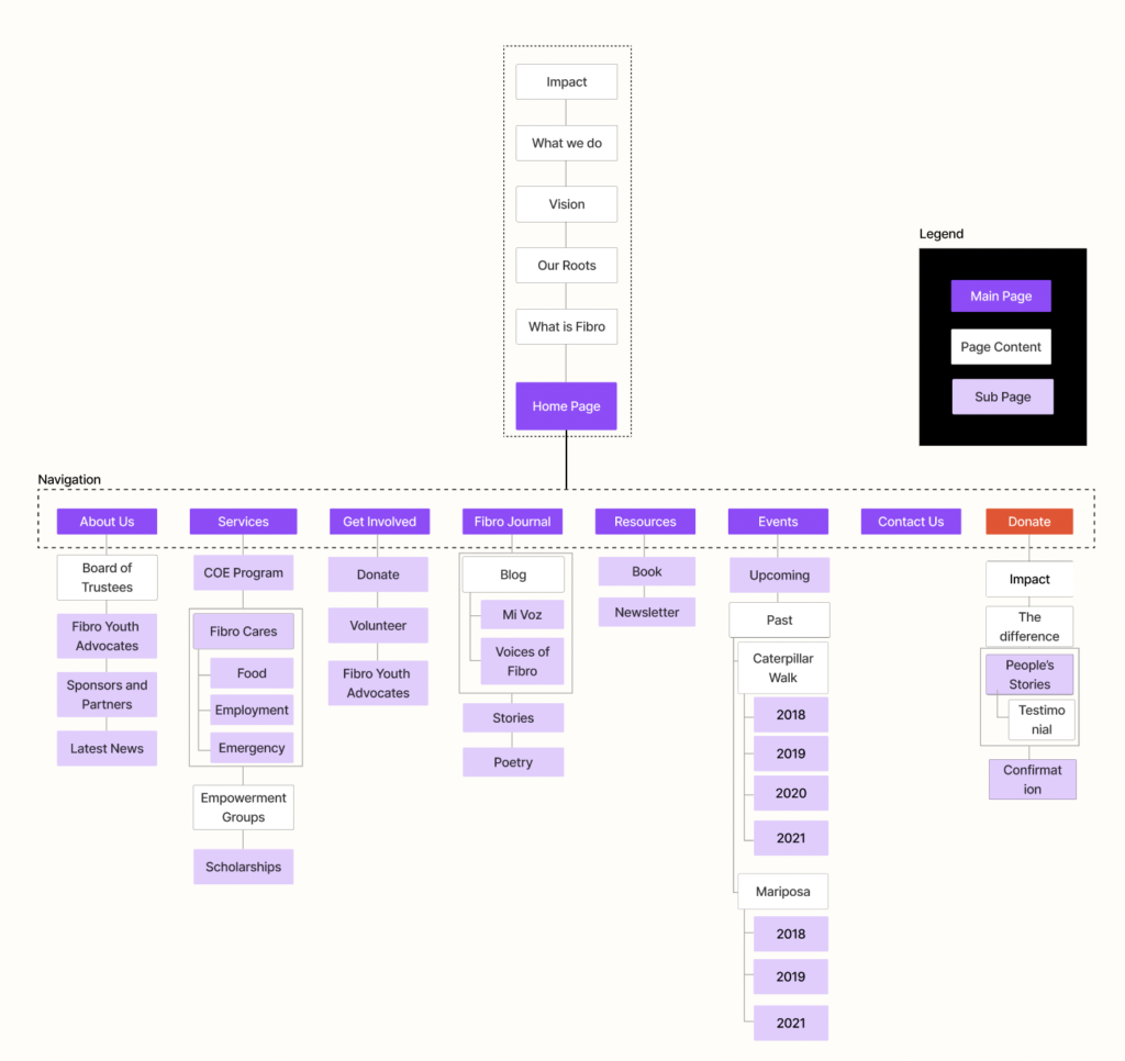
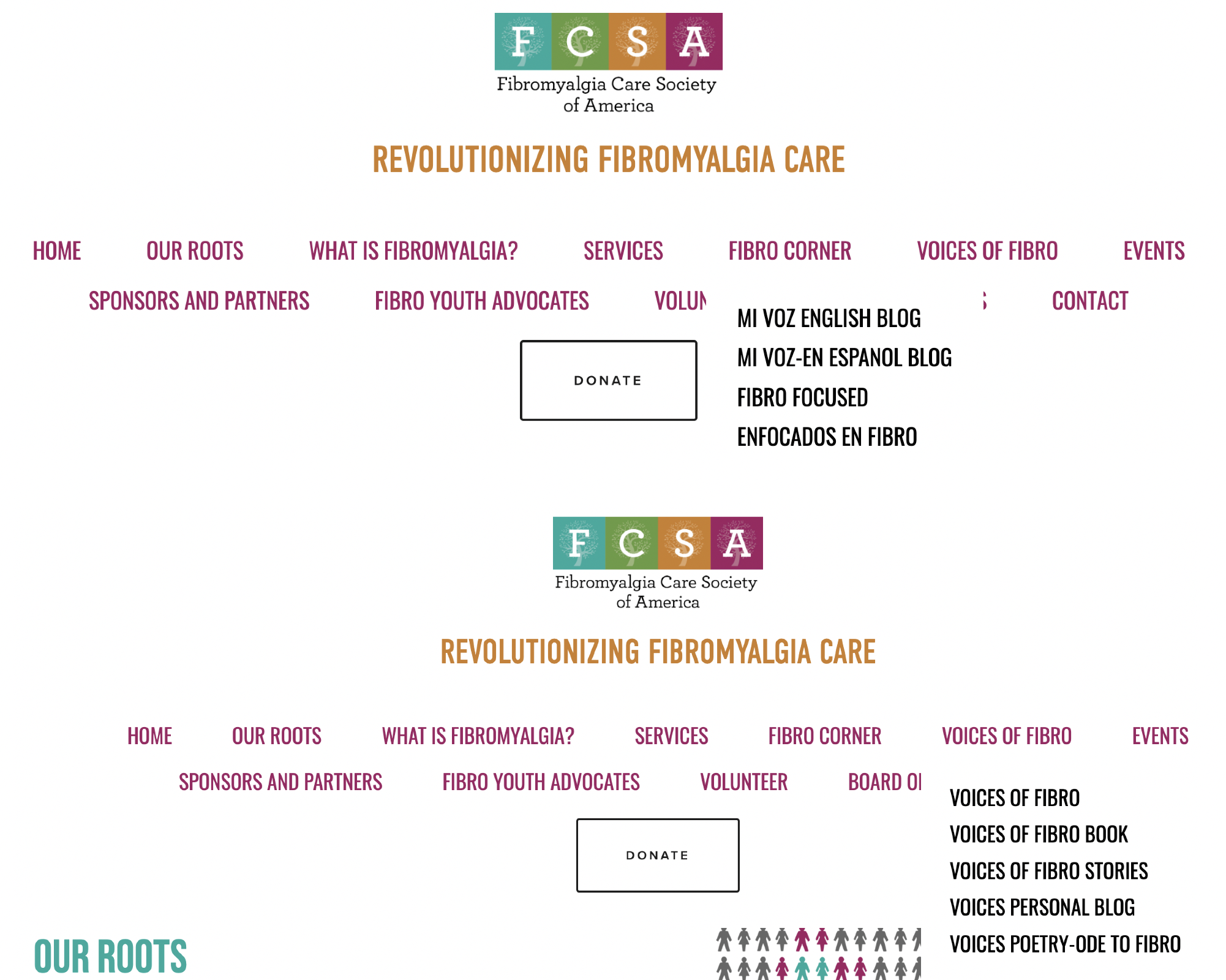
Information Architecture
The proposed Information Architecture focused on accessibility to maintain consistency and predictability.
- Redesigned homepage for better reach to other areas of the website.
- Consistent navigation across website.
- Fewer navigation items by defining broader categories.
- Consistent Donate button on navigation.
Design System
Squarespace Template:
The existing website is built on Squarespace. For convenience to our client, our proposed design is based on a template on Squarespace – Roseti. The template was chosen for its simple layout to avoid visual overload.
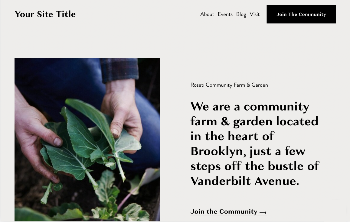
Squarespace’s Grid System:
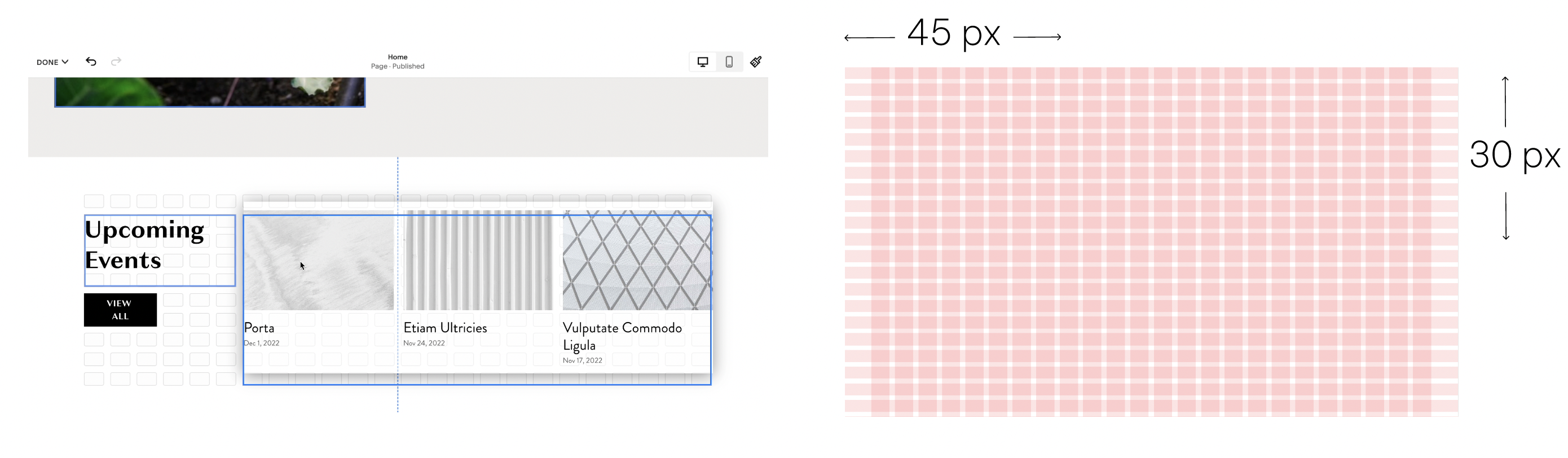
We followed the 24-column grid layout on Squarespace for our design.
The Font:
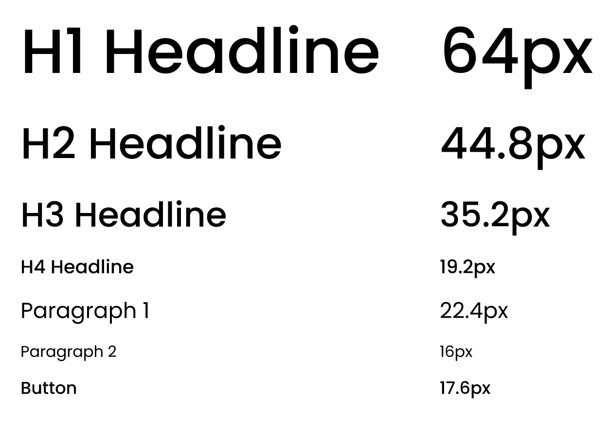
To improve accessibility, the redesigned website uses a sans-serif font, Poppins. The minimum font size was kept at 16 px for better readability.
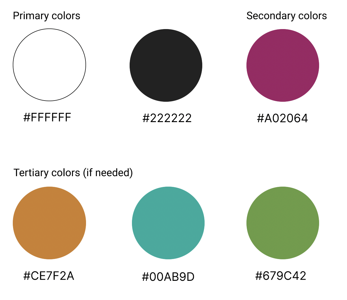
The Color Palette:
The current website’s colors are primarily retained in the new design to maintain visual consistency.
Interaction Design:
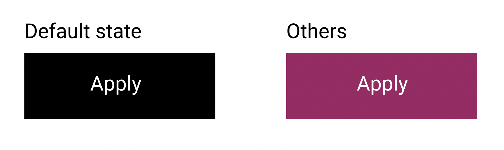
For accessibility, the design of buttons had a standard form, high contrast colors, descriptive and short button text, and consistent shape, color, and text size.
Key Workflows
1. homepage
Context
The homepage is the landing page for users to choose between two options, learn more about the organization or apply for the COE program.
Findings
All users expressed that the paragraph is hard to read due to the low contrast between the text and the background. Several users also said that they need more context on the homepage
“Although uppercase is bold and makes it (the homepage’s headline) prominent, it also makes it hard to read. I also wear glasses. Without my glasses, it’s just like looking at words rather than that instant readability. Also, the mission of FCSA has a very busy picture underneath.”
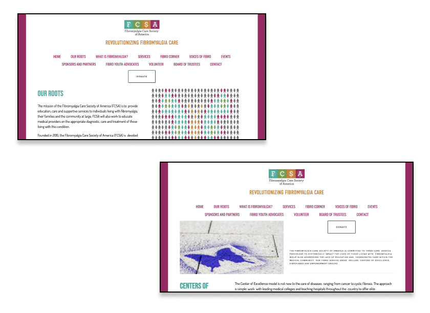
Current design
- The text above the background image
- Two options for users to choose
- Brief description of the organization
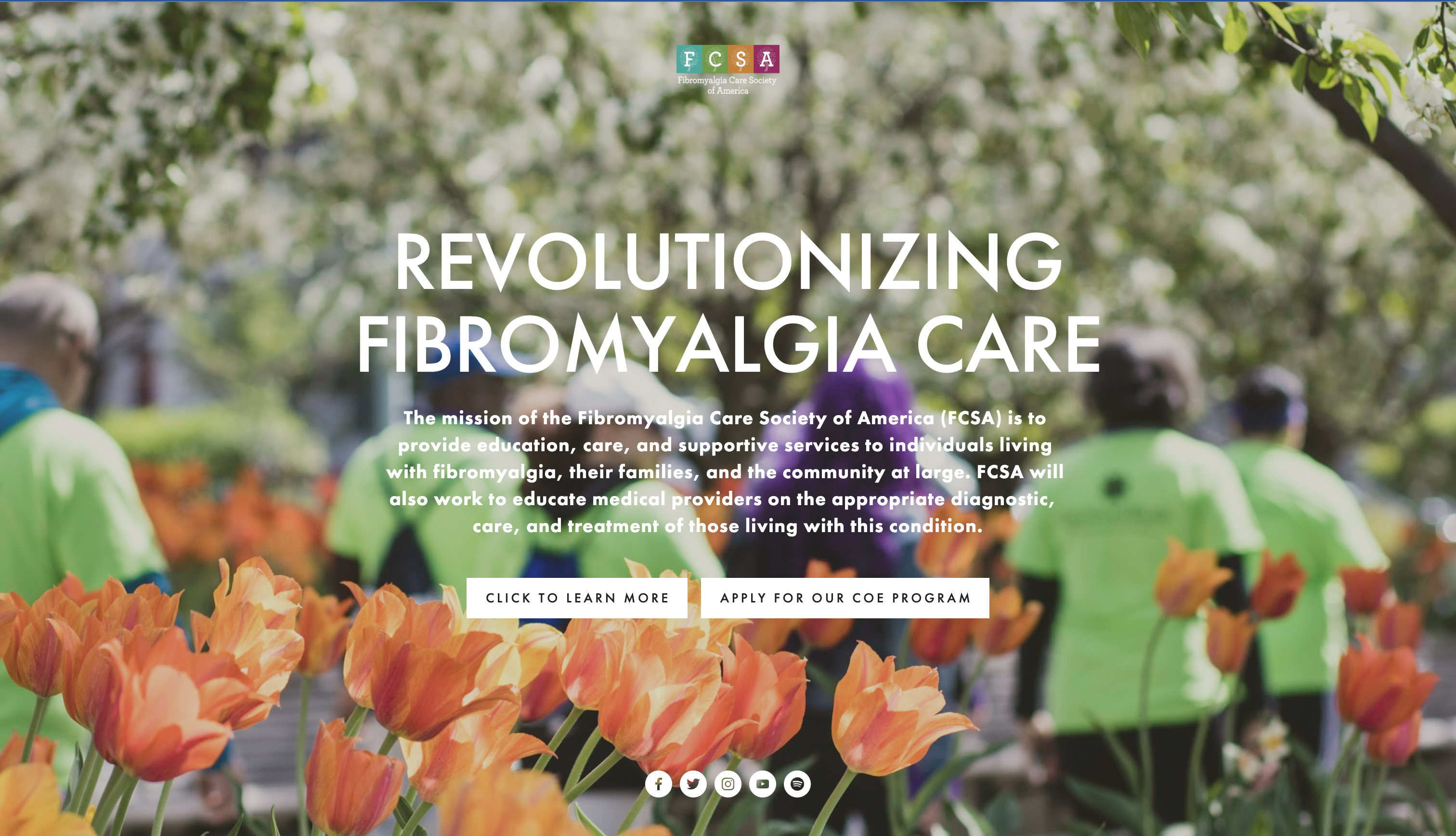
Proposed design
- Introduce what, why, and who FCSA is
- Shorten user’s journey by providing three possible options that users can choose based on their needs above the fold
- Introduce essential services and impact on the organization
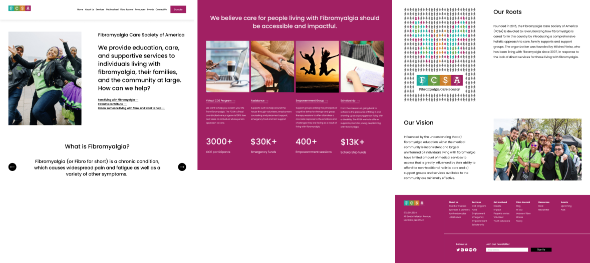
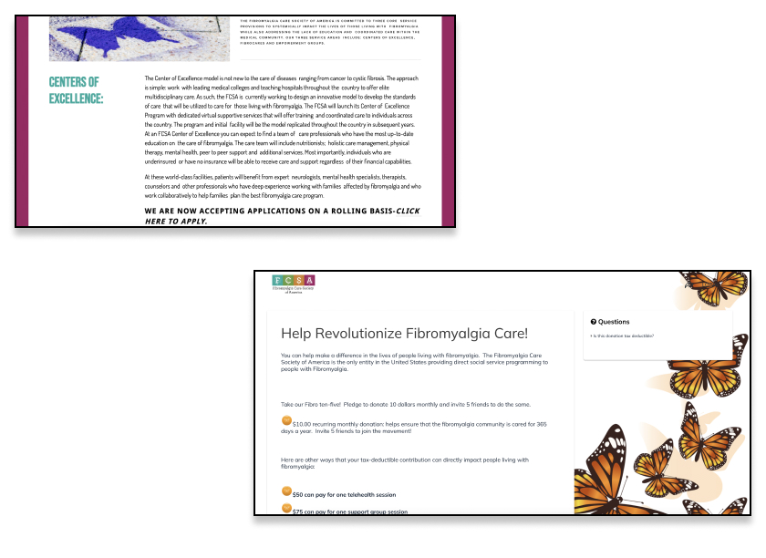
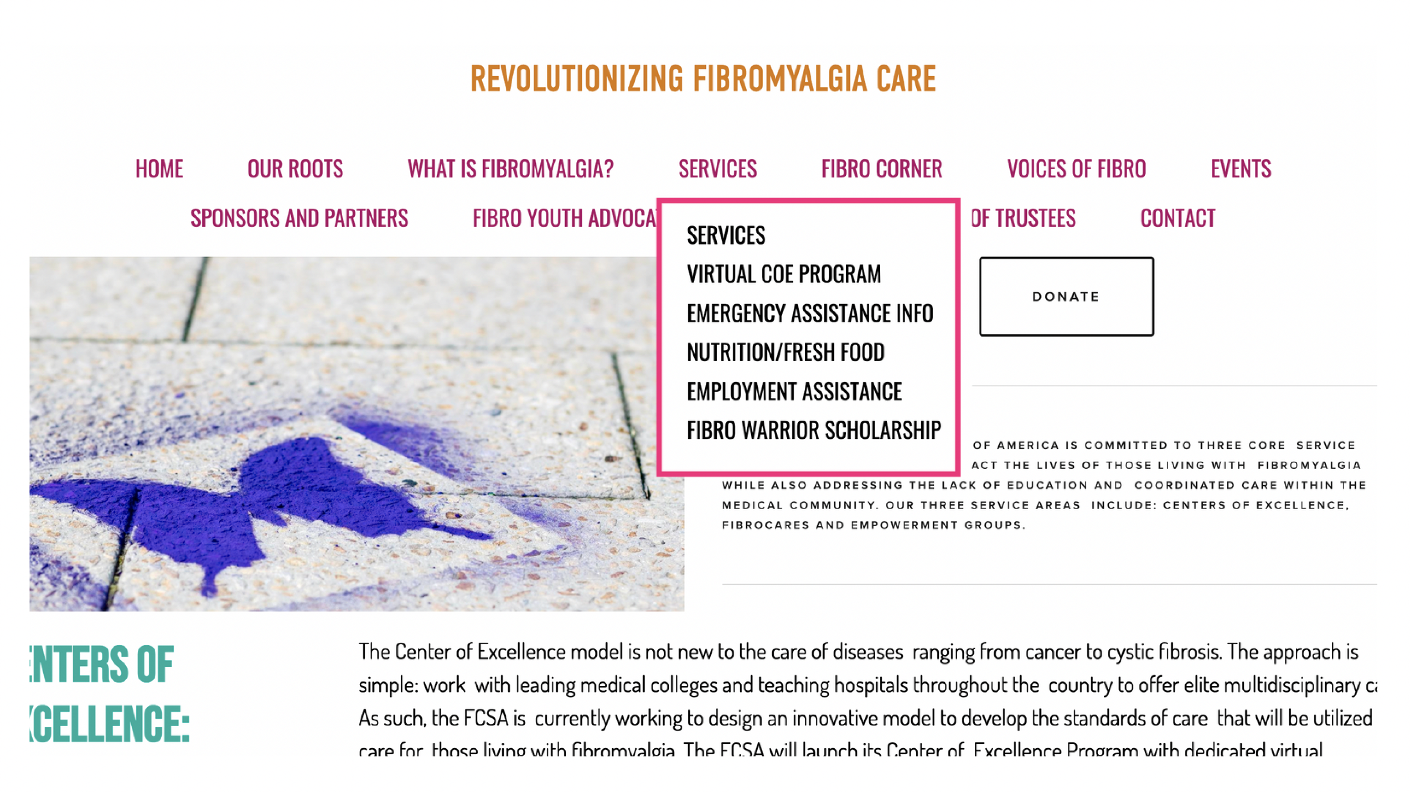
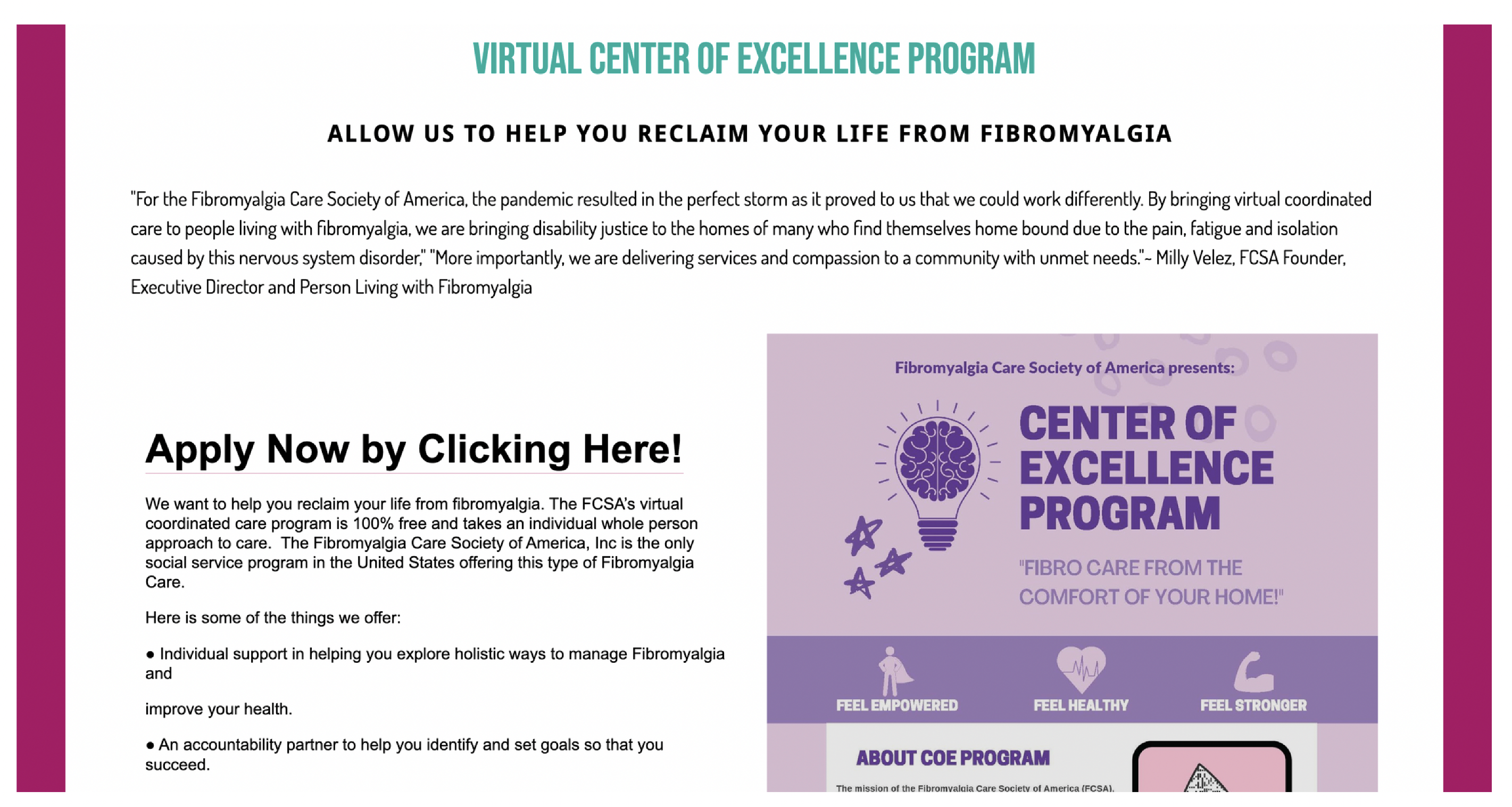
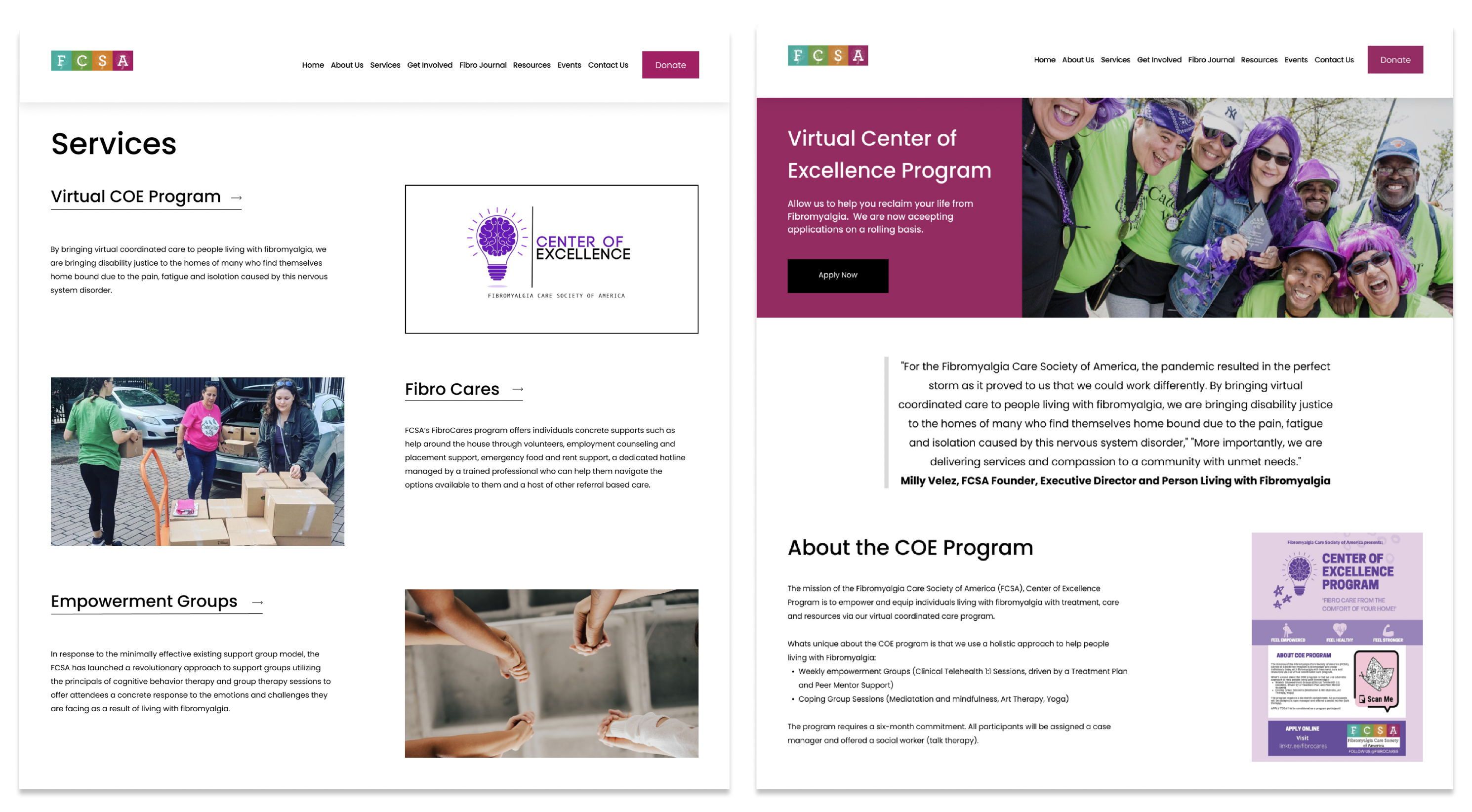
2. Services – COE program
Context
The services are one of the core features offered by the FCSA to its users , with the COE program being one of the major services offered.
Findings
It was revealed in the Usability Testing that “The COE program” was a term users were unfamiliar with and did not recognize as a service.
While users recognized Fibro Cares and Empowerment Groups as Services, these did not show up in the dropdown menu.
Current Design
- Inconsistencies in categorization of services in the drop-down and main services page.
- Inconsistencies in the Call-To-Actions on individual service pages.
Proposed design
- Main services page redesigned to give access to all services.
- Consistent Call-to-action buttons added in the hero section of all services.
- Design consistency with the rest of the website
3. Volunteer
Context
Many ways an external stakeholder/website viewer can participate or collaborate with the FCSA
Findings
2 users expressed that the option of volunteering is not easy to spot although it’s in the navbar menu. All of them prefer seeing the list of volunteering options before having to fill the form out.
“I couldn’t see the option to volunteer although it was right there.”
Current design
- Large image as compared to the text
- CTA is towards the bottom of the page
- Not an easily identifiable link
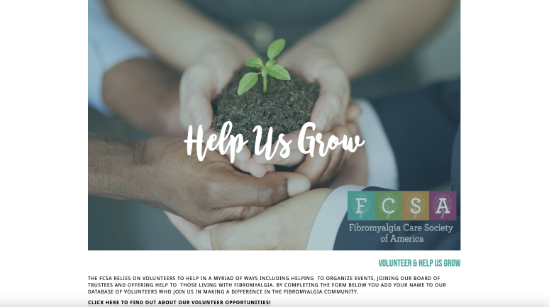
Proposed design
- Design consistency with the rest of the website
- Provide a glimpse into the types of volunteering opportunities to the viewers.
- The calendar provides a view into upcoming event based volunteering opportunities.
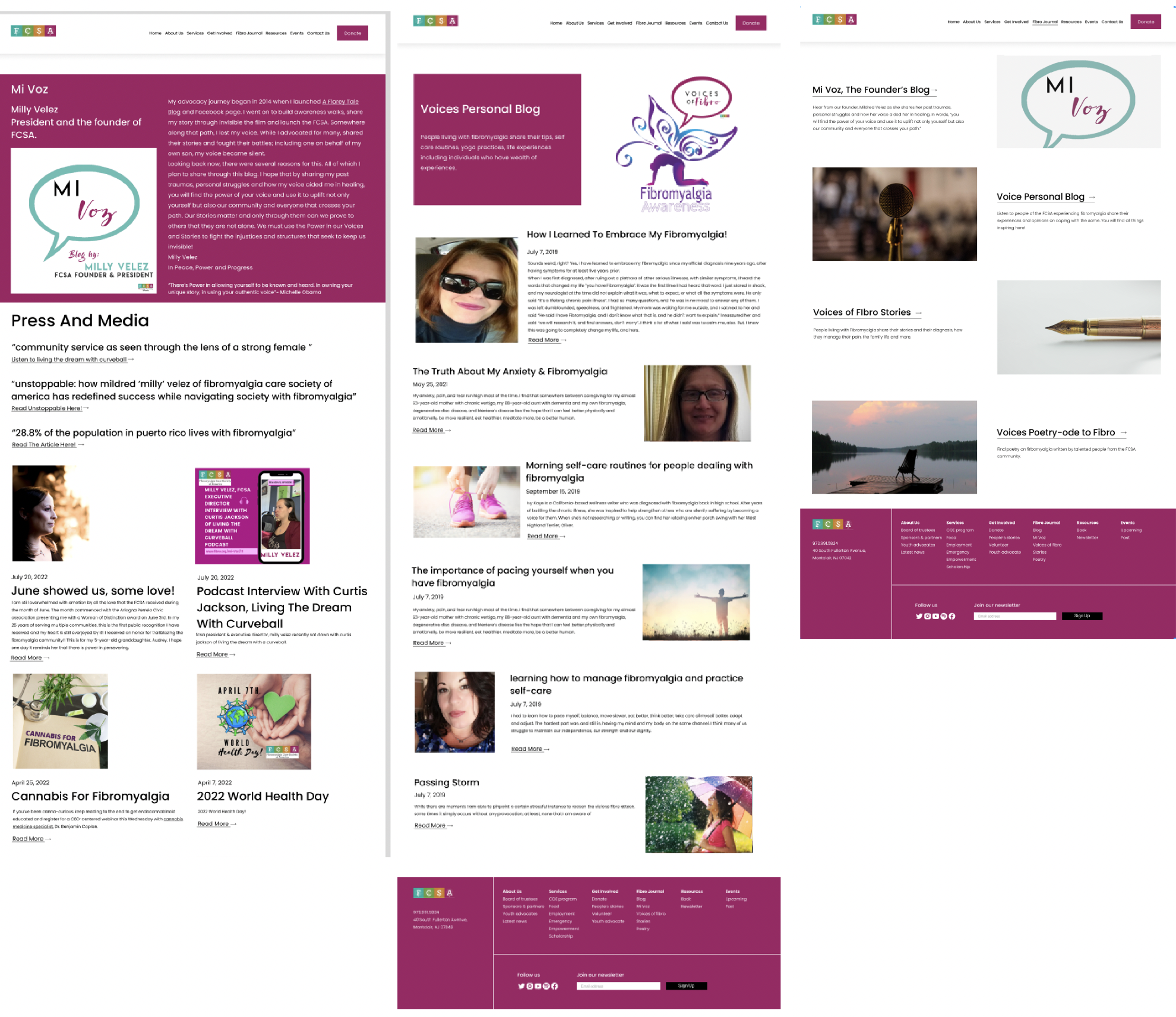
4. Fibro Journal
Context
FCSA’s website offers different resources to the readers This can be seen in the form of personal blogs and stories which creates an environment of support.
Findings
All users expressed that it was not very intuitive to find the required content. The terminology and categorization of the blogs was not clearly defined along with a few visual inconsistencies.
Current design
- Blog posts are under two different categories.
- Terminology not very intuitive.
- Scope for better visual consistency especially in terms of accessibility.
Proposed design
- Combine Fibro Corner and Voices Of Fibro as it for the people and by the people.
- Keep the design consistent for a more intuitive experience.
- Give a brief description of the blogs for the knowledge of the user.
Experience the website!
Click on the following Figma link to browse the redesigned website – Link
Defined Analytics
- New vs repeat visitors – Increase in repeat visitors could reflect user comfort with the website.
- Finding COE – In page path, we can learn if users are able to seamlessly find COE programs without having to jump across many pages.
- Behavior flow – Identifying additional pages that take a long duration to find can indicate the need to improve the website navigation.
- Low bounce rate – Aim to have a low bounce rate on pages like the COE, volunteer, donate, etc.
- Donations – Critical to identify the channels and pages from which users land on the donations page. Once identified, efforts can be made towards improving traffic via those channels.
- Sessions – Identify the pages that have the highest sessions to improve engagement further.