Our Project
New York Philharmonic’s Shelby White & Leon Levy Digital Archives makes available to the public over 4 million pages of material connected to their symphony orchestra. To inform website redesign decisions to be made as part of their larger five-year NEH-funded grant project, this study assesses the usability of the current Digital Archives’ website for amateur and expert audiences and presents recommendations for improving the platform’s main portals for accessing archival resources: the home and search pages. This case study presents a summary of methodology, homepage recommendations, key takeaways, and links to the full report and client presentation.
Understanding usability barriers for new and existing users
The Pratt team met with the Digital Archives at the beginning of the study to confirm their research goals and to understand their mission, target audiences, and main usability questions. The Digital Archives serves a broad audience of researchers, music students, musicologists, historians, genealogists, and casual visitors (“the general public”), and the study’s research goals are as follows:
- Evaluate and improve the exploratory experience for new users landing on the site, and
- Evaluate and improve the experience for experts/researchers seeking out specific archival information.
A focus on pathways to find highlighted content
In our kickoff meeting with the Digital Archives, one of the areas of exploration that stood out most strongly to me was how they made available information about their collections and special projects to new and existing users. Their primary method is the carousel, but there is also a secondary pathway made available through the “Features” label in the navigation header. As this impacts both audiences, but especially those new users who are visiting the site for the first time and want to understand what the Digital Archives has to offer, my team and I decided early that this was an area we wanted to test.
A focus on accessibility
The Digital Archives expressed a strong interest in ensuring that their site complies with the Web Content Accessibility Guidelines (WCAG) at v2.1. While our usability study could not encompass a full accessibility audit, another team member and I conducted an ad-hoc accessibility audit with the WebAIM WAVE tool tool and a domain expert to analyze the accessibility of Digital Archives pages most frequently visited during the user tests. Our findings informed the recommendations of the entire team and opportunities for the Digital Archives’ further investigation as they look towards doing more detailed accessibility work.
A focus on actionability
Knowing that we were testing the usability of a site in the midst of a larger redesign project, it was important to our team that we provided actionable recommendations that could be implemented quickly on the existing site to improve usability while that redesign work takes place and provide the basis for further redesign testing. In our full report, we also included multiple secondary findings-based recommendations and opportunities for further exploration to support that larger work.
Our Team & My Focus
Our team comprises graduate students Tk Cram, Anna Feldman, Sayali Nikumbh, and myself. To our team, I brought experience with information architecture design, interaction design, accessibility, and cultural and educational institutions. In our work together, some of the areas I was most heavily involved in included task design, designing the rainbow chart, synthesizing overall findings, and leading the design and writing of recommendations 1 and 2.
Our Research
Kickoff
Nov. 1, 2022
➜
Test
Development
➜
User Tests
Nov. 17– 29, 2022
➜
Test Analysis
➜
Client
Presentation
Dec. 13, 2022
Our team ran a series of ten moderated user tests to analyze the usability of the Digital Archives for new and expert users: what they enjoyed, and where they ran into trouble. Each test was conducted remotely over Zoom to facilitate the recruitment of a broad range of users and involved participant navigation through a series of five tasks that tested user workflows that the Digital Archives team was most interested in understanding. Each was also facilitated by two team members: one moderator, who prompted users via a script to complete the tasks while sharing their screen and thinking through their thoughts and navigation processes out loud, and one observer, who took detailed notes for later analysis.
Who are the Digital Archives’ target audiences?
Existing users are thought to be a combination of researchers regularly performing investigative searches and non-scholarly users performing casual research — for instance, seeking records on a relative, a specific performance they attended, or a piece of music they enjoy. The Digital Archives seeks to serve and continue to attract these types of users. With this in mind, we identified the following three user groups to inform our recruitment:
Amateurs
Students and other first time visitors who are highly familiar with the internet and may be looking for a specific resource, such as a piece of music.
Explorers
Young professionals with some exposure to the New York Philharmonic who are exploring what the archives have to offer.
Professors
Researchers highly familiar with online archives and the Digital Archives site; specifically, those who want to do deep dive research into a subject or person.
Our team conducted a total of ten user tests with a diverse set of participants, ranging from those with expertise with the Digital Archives to users with little to no familiarity with the Philharmonic. Per the NN Group’s research, moderated users tests provide valid results when at least five user tests are used, but more are required when varied user groups need to be tested; when the tasks for two user groups are only slightly different, three to four users per group should be tested. Our recruitment involved reaching out to Pratt Institute’s user testing listservs and leveraging our partner’s outreach to connect with student groups that visited the New York Philharmonic during the recruitment period. Recruitment also included an incentive of a $10 Amazon gift card to compensate participants for their time.
What key tasks should new and expert users be able to complete?
Five tasks and corresponding user stories were designed to cover the major areas identified by the client and team as important to their target users’ experience of their site. These tasks enabled the team to study and compare users’ thought processes as they navigated the site and how well the most important features and sections of the site worked for different users. These tasks were presented with a series of open ended questions to gain additional qualitative data: an initial question about first impressions of the homepage, and questions about self-perceived difficulty and success of a task after the user completed each. The five tasks and user goals are as follows:
Task 1:
(a) Find a program that includes William Lincer, a member of the New York Philharmonic orchestra in the mid 1900s.
(b) Once you have found a program, find an image of William Lincer that is not included in this program.
User goal: I want to find a resource connected to my family member who I know was a member of the orchestra.
Task 2:
(a) Find the music for Tchaikovsky’s Nutcracker Ballet.
(b) Find the sheet music for a clarinet.
User goal: I want to find sheet music of a piece I want to play.
Task 3:
(a) Find the New York Philharmonic Archives’ digital exhibition about its first female musician.
(b) Once you have found the exhibition, find out where she was born.
User goal: I want to understand what types of resources are available through the NY Phil Archives website and find something that’s interesting to me.
Task 4:
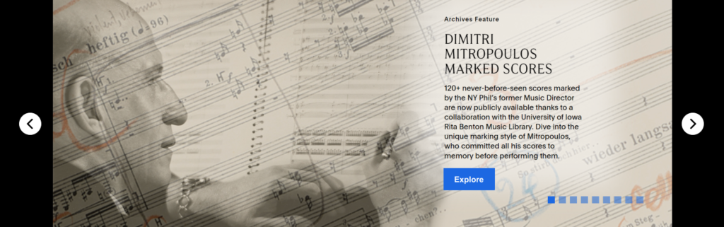
(a) Find the New York Philharmonic Archives’ newly digitized set of press clipping scrapbooks, which are featured on their homepage.
(b) Once you have found the set, locate a press clipping scrapbook that documents one of the New York Philharmonic’s park concert series.
User goal: I want to explore newly digitized resources that are relevant to my research interests.
Task 5:
(a) Now, imagine you’re researching how orchestras like the New York Philharmonic reached audiences during the COVID-19 pandemic, which began around March of 2020. Find a recording of one of the virtual performances offered by the Philharmonic in the first few months of the pandemic.
(b) Going back to your search results, which soloist performed the most times during the first few months of the pandemic?
User goal: I want to find contemporary musical recordings and records for research.
Our Findings
Overall, participants had positive first impressions of the Digital Archives. They appreciated how clearly the Search was featured on the homepage, and often commented that the site felt welcoming in comparison to other archives sites they’ve visited in the past. Impressions of the site as a whole, however, were mixed. The Digital Archives received a raw SUS score of 60.3, equivalent to a D grade (average=68). The score is higher than 29.29% of other websites, and correlates to an “OK” rating of usability on a scale of Best Imaginable to Worst Imaginable.
These results offer the Digital Archives a clear opportunity to improve. The report presents five detailed sets of findings and recommendations to address usability concerns selected based on their frequency and severity:
- Recommendation 1: Improve navigation usability and accessibility by updating styling, spacing, and text.
- Recommendation 2: Update style and navigation elements on the carousel to make it more intuitive and accessible.
- Recommendation 3: Streamline search results page with consolidated sort and filter options and highlighted search results.
- Recommendation 4: Move pop-up modal underneath each filter and introduce a search bar for the filter options when opened.
- Recommendation 5: Minor findings and recommendations (Which broadly cover: Accessibility, Metadata, User Interface, Links and Labels, and Knowledge Organization.)
View the full findings and recommendations in our final evaluation report and presentation linked above. Here, I’ll summarize the findings and recommendations from the two recommendations I was most heavily involved in: Recommendations 1 and 2.
Improve navigation usability and accessibility by updating styling, spacing, and text
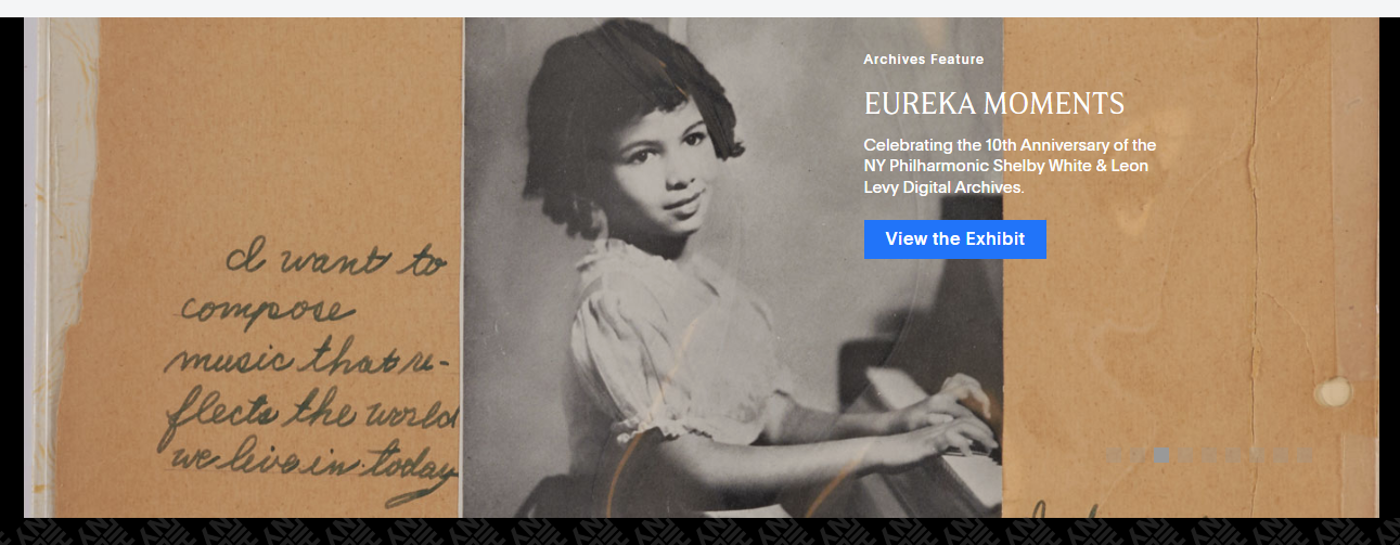
First impressions of the homepage and the main navigation were generally positive. Users appreciated that the search bar is featured prominently and recognized it as the main way of engaging with the Digital Archives’ collection. Many users commented positively on the inclusion of the eye-catching carousel and identified it as a place to find things that the Digital Archives wanted to highlight to its visitors. In attempting to interact with these elements, however, users ran into several issues.
A summarized list of recommendations and issues from the full report are as follows:
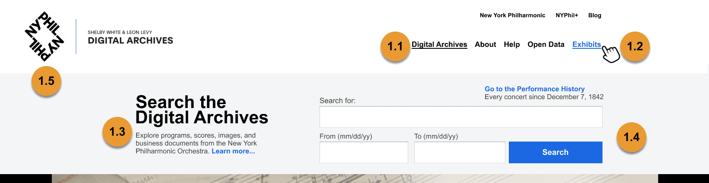
- Recommendation 1.1: Add link styling to the navigation labels to make it clear that they are interactive links and that each label on any given page signifies the active page. These changes meet WCAG v2.1 success criteria on Use of Color and Location.
- Related finding: When visiting the homepage for the first time, several users experienced issues using the main navigation bar. Participants attempted to click the “Digital Archives” label when exploring what the site had to offer, which resulted in confusion — “Digital Archives” is the name of the homepage and is not designed to be interactive while the user is on that page. All navigation labels are styled the same regardless of whether or not they represent an active page. Their styling also matches the styling of body text and no changes occur to the labels when a user hovers over them — both signifiers that text is, or is not, interactive.
- Recommendation 1.2: Change the “Features” label to “ Exhibits.”
- Related finding: Users who interacted with the “Features” label also had difficulty understanding what it signified. Using the “Features” page was an option for completing multiple tasks in our tests, but only one user found and clicked the label to attempt to find task information. Suggestions for ensuring “Features” is the most intuitive label for Digital Archives users is detailed on page 13 of the report.
- Recommendation 1.3: Add “…from the New York Philharmonic” to the explanatory text offered about the Digital Archives’ collections by the search bar.
- Related finding: Users who were less experienced with searching archival sites, or with the New York Philharmonic, often did not understand that the Digital Archives specifically offers access to resources related to the New York Philharmonic, not traveling orchestras or other musical institutions. This confusion resulted in later issues with searching for and filtering through search results. Most users in our tests did read this text, and this simple addition would make it clear to them what the site contains.
- Recommendation 1.4: Shrink the top navigation slightly to ensure the primary content on all pages is emphasized.
- Related finding: On some browsers, such as Safari and Chrome, the size of the navigation bar pushed down the main content of the page — not just on the homepage, but also on Search Result pages — creating frustration for multiple users. One credited the size of the Navigation bar as the reason they missed the Document Type categories when searching for the part of a score.
- Recommendation 1.5: Make additional adjustments to improve accessibility of main navigation and search. The mockup above addresses the following WCAG v2.1 success criteria:
- Contrast: All instances of the use of Digital Archives’ brand-blue (#1276FF), which do not meet WCAG success criteria for contrast ratios against the site’s light gray, have been adjusted to brand-blue-ada (#0E6AE7), which does.
- Target Size: The size of the form fields and the “Search” button have been adjusted to a height of 44 pixels, which meets WCAG’s success criteria.
Opportunities for additional analysis and work on the accessibility of the homepage are detailed in the report (see page 14).
Update style and navigation elements on the carousel to make it more intuitive and accessible
While users often commented positively on the carousel on a first visit to the homepage, multiple users experienced issues attempting to interact with and navigate through it. Adjusting the code of a few simple elements of the carousel could greatly increase its usability, and recommendations to do so are as follows.
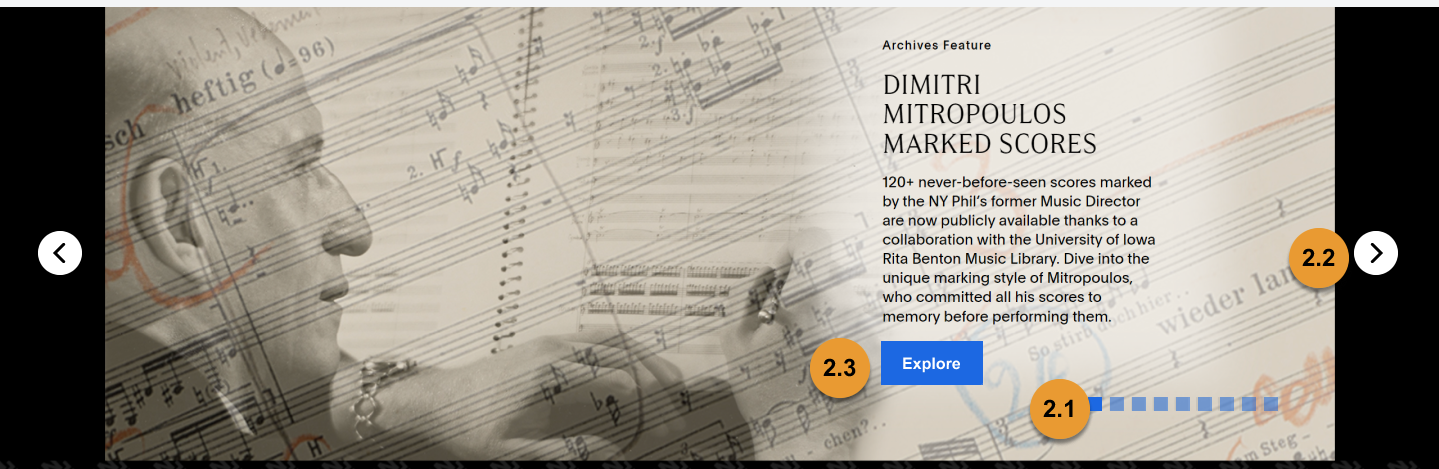
A summarized list of recommendations and issues from the full report are as follows:
- Recommendation 2.1: Change the color of the navigation buttons. This mockup uses brand-blue-ada (#0E6AE7) at 100% for active squares and 50% for inactive squares. Note, this is not contrast accessible on all banners, so it must be used in combination with 2.2.
- Related finding: If the user didn’t experience serendipitous discovery of the content they needed by the carousel happening to be on the correct slide when they looked, the user ran into trouble attempting to engage with and move forward through the carousel slides. There are two options to use the carousel on desktop, the primary of which are squares that signify how many slides there are and enable a user to navigate forward and backward, and a dragging functionality. The contrast is on these squares is too low and few users engaged with them.
- Recommendation 2.2: Navigation arrows, which are available in the Flickity carousel code, should be unhidden.
- Related finding: The second option for navigation through the carousel is a dragging functionality. No users attempted to use the dragging functionality.
- Recommendation 2.3: Change the color of the “Explore” buttons that appear on each header to brand-blue-ada (#0E6AE7) and the height to 44px which is accessible by WCAG v2.1 and mirrors changes suggested in Recommendation 1.5.
Opportunities for additional analysis and work on the accessibility of the carousel, alongside other websites whose use or replacement for carousels may serve as inspiration for future work by the digital archives team, are detailed in the report (see page 17).
Key Takeaways
In sharing our recommendations with the Digital Archives team, it was well received. While our work focused on understanding the usability of the current site, the team was also interested in our personal observations and recommendations for a full redesign — such as, if they were to fully redesign the carousel on the homepage, what other institutions have implemented that we’ve found usable. Based on our conversation, we met as a team after our client meeting and brainstormed recommendations to provide them that were added to the report (see Appendix F) and sent via email. Key takeaways, including opportunities for further research, are as follows.
Accessibility impacts usability
Accessibility guidelines are vital to follow in ensuring that a website is usable by all, and the majority of the issues our users experienced on the homepage are also accessibility barriers: the navigation bar and the carousel as explained above. Their severity is strongest for new users, who are attempting to build a new mental model of how the site works, and their occurrence for all users could have been prevented by following WCAG. While the accessibility recommendations included in our report are a strong staritng point, the Digital Archives’ next steps should be to 1) conduct a full accessibility audit to identify other accessibility issues and 2) ensure that any new features designed for the website as part of their larger redesign work follow WCAG.
Look to other sources of inspiration
In envisioning how to solve user issues, pulling examples of how other platforms address and prevent those issues serve as useful inspiration for project teams, especially those who, like the Digital Archives, have the exciting opportunity to fund a larger redesign of their website. Based on what my team learned from the conversation with our client at the end of our project, I’d like to incorporate references to other platforms from the beginning of recommendation development.