Drawing from observations of moderated remote user testing of K-12 educators, as part of the INFO 644-01 course our team identified usability issues with the resource pages on the Smithsonian Museum of Natural History‘s website and provided actionable suggestions in regards to Menu, Search, and Registration Calendar features.
Context
Our team, consisting of Bella Jiang, Srishti Dokras, and myself met with three representatives from the Smithsonian to understand their goals and needs for this project. While the museum has the broad goal of promoting greater understanding of the natural world, over the course of our kickoff meeting we were able to clarify that while they were interested in how users in general navigated the site, the audience they were primarily interested in was K-12 educators and their thoughts on the resources presented. These resources included both the content accessible on the website and the museum programs classes could register for. We did have to do some expectation managing with explaining the scope of the study couldn’t accommodate in-depth review of the specific content, but they were very understanding and confirmed our goal of identifying areas that needed improvement on the educational resource pages. As the clients were concerned with the applicability of the results to their target audience, we asked and received their approval to recruit from their educator mailing list.
Process
With a clearly defined participant pool and focus area in mind, our team then turned to developing tasks that would balance exploring the Smithsonian’s areas of interest and being flexible enough to foster natural use of the website. After several rounds of work-shopping tasks and questions, mostly resulting in reducing the directness of the language, we settled on three that would address the following points:
1- General website feedback
2- Education Resource navigation and applicability
3- Museum Program exploration and registration
While the Smithsonian representatives had agreed to make their educator mailing list available, we would find out their security team had additional concerns about the data being collected from participants. After multiple weeks of back and forth, modifying our pre-test and post-test questionnaires and consent form, and ultimately scrapping the Google recruitment forms and calendar I’d created, we arrived at a compromised acceptable to them. The Smithsonian sent out an email we’d written explaining the study to sections of their educator mailing list, and individually passed on to us the contact information of interested responder to directly arrange for a testing session. Despite the compressed time frame this imposed on us, our team did manage to conduct a full Six Remote Moderated User Tests in less than a fortnight in early December with four being recruited through the Smithsonian and two being K-12 Educators located through personal networking.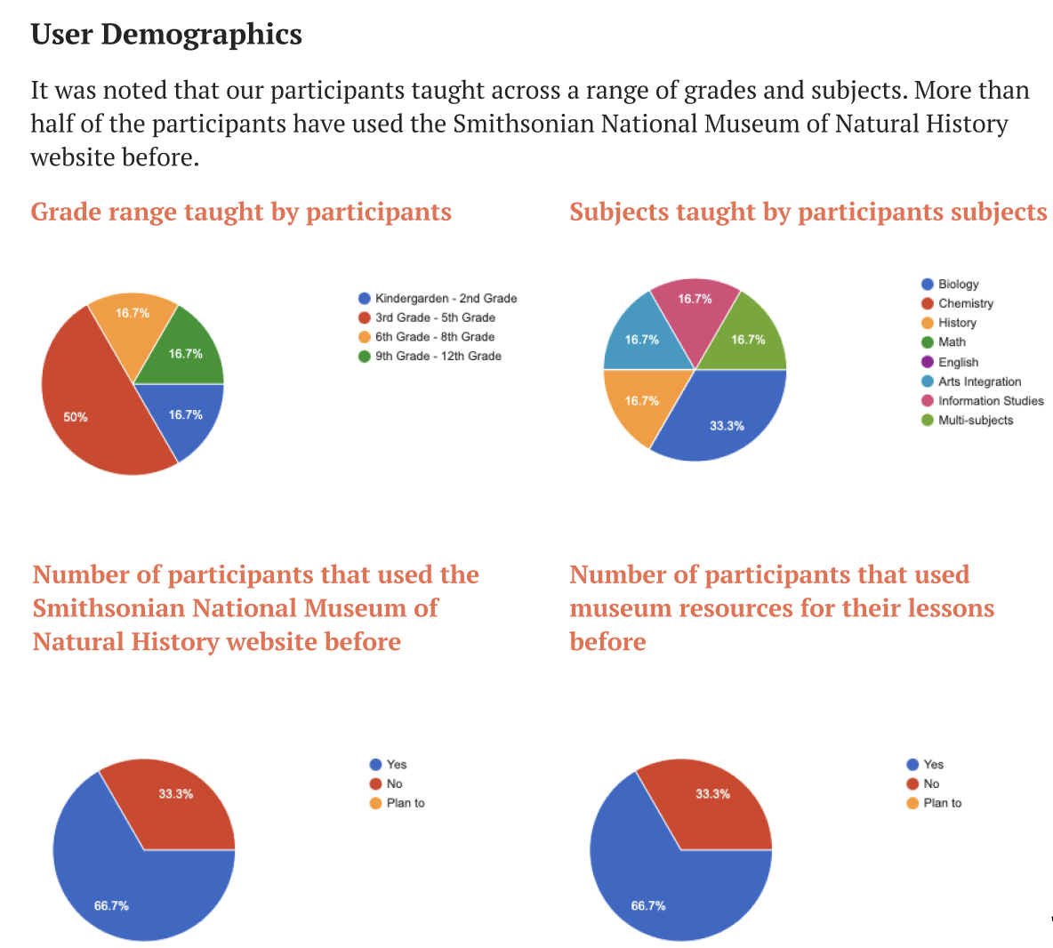
Outcomes
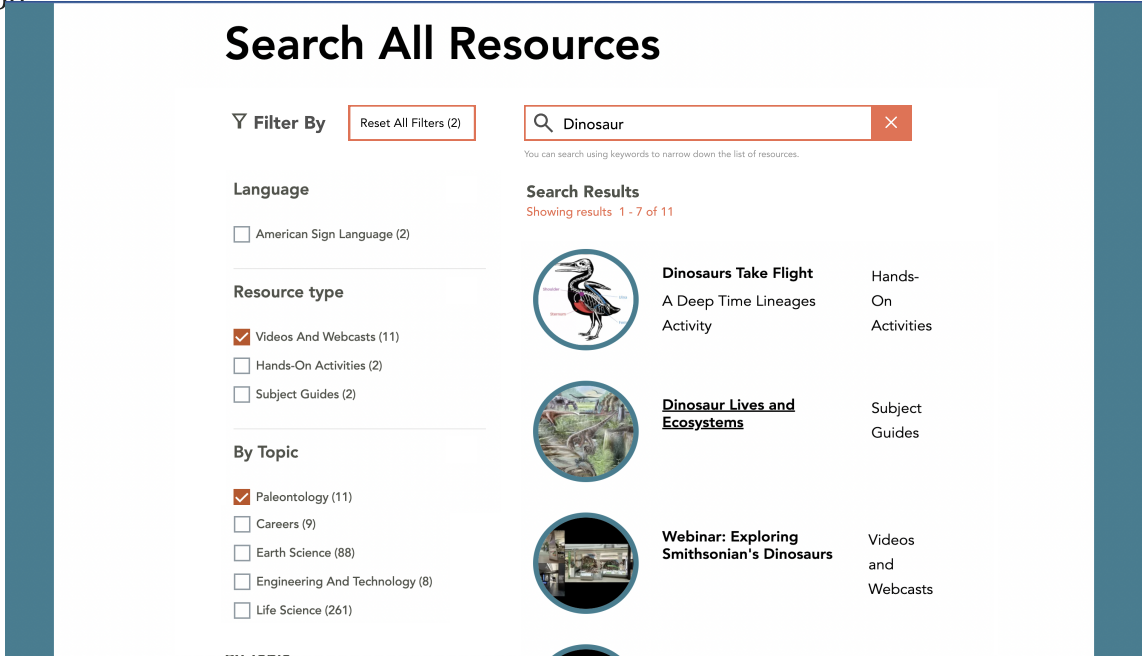
In regards to general website features, we found a strong preference for locating educational resources through the website’s Filter options over using the website’s search or manually searching. We did observe use of the accordion menus our clients had asked about during our initial meeting. While all types of educational resources available on the museum website had at least one participant who was likely to use them, popular options were clear.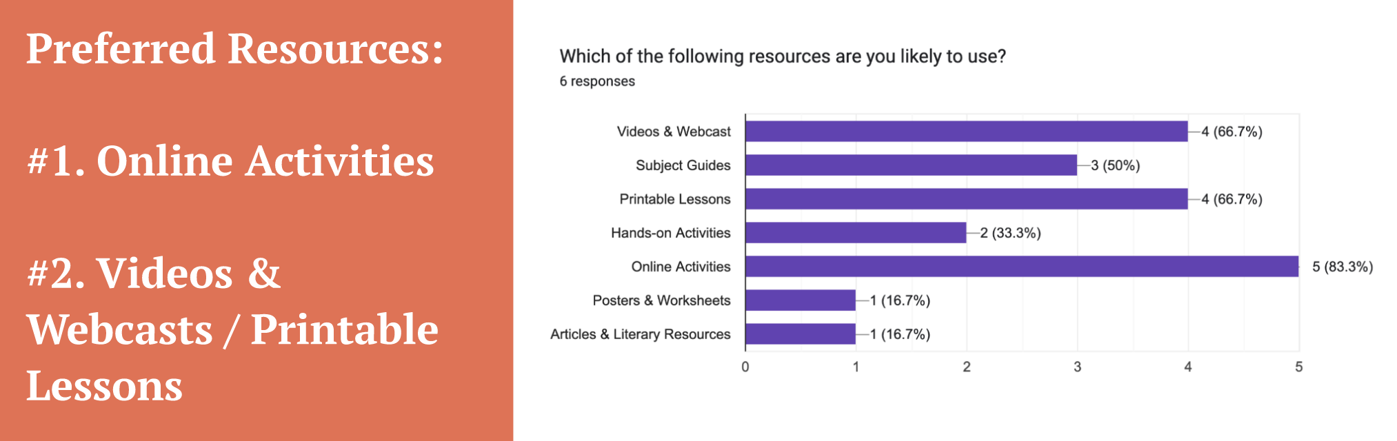
Based on our results were able to identify areas of the website where the most issues were encountered and provide the following recommendations to our clients:
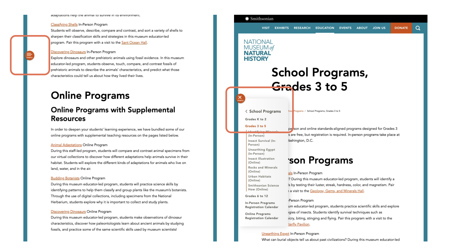
Recommendation #1 Improve the Overall Usability of the Sidebar Menu
Currently the sidebar menu on the Smithsonian’s site closes quickly, doesn’t move with the user as they scroll down a page, and is inconsistent in it’s labeling across the website. We recommended delaying it’s automatic collapse, making the menu ‘sticky’ so it remains visible as users scroll, and altering the labeling to make it consistently clear backwards navigation is possible.
Participants expressed frustration with lag while utilizing these features, and some missed available search options specific to the education resources pages. Our team’s suggestions were to make a clear loading page to forestall confusion about the page’s responsiveness as well rearrange and relabel the search page for improved clarity.
Recommendation #3 De-cluttering the Registration Calendar
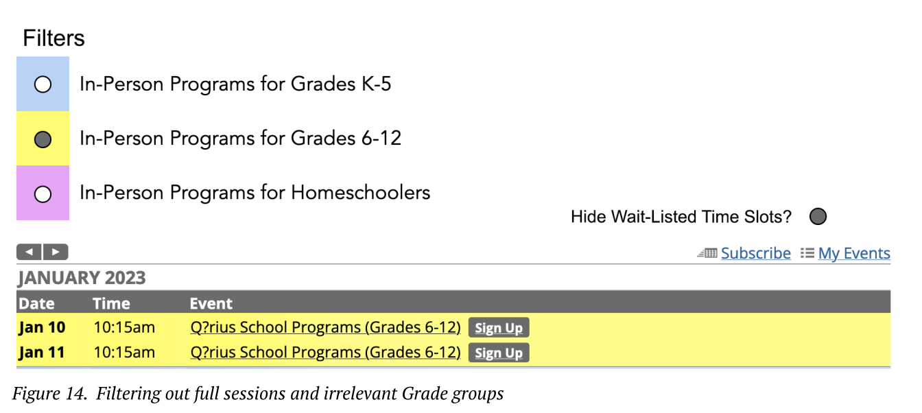
While usable, the calendars used by visitors to register groups for online or in-person museum programs resulted in some frustration for our participants as they had to view all time-slots, even those that were irrelevant to them. As the calendar offers sessions to classes of three different grade types, we proposed creating a filter so that educators only had to look through times applicable to their students. An additional filter to hide wait-listed sessions was also suggested, as the programs are popular and fill up quickly.
Closing
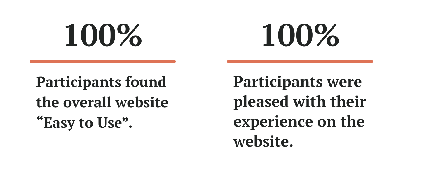
In our closing meeting with nine representatives from the Smithsonian Museum of Natural History they seemed satisfied with our findings, mentioning that they found it “very helpful” and that they “Appreciate the clarity in laying out the issues, and the problems, and the possible solutions”, specifically commenting “that’s very good information” in regards to how teachers responded to grade level of resources. After the presentation they did note that the registration calendar was not directly managed by the museum, but that our work gave them specifics to bring up in future discussions with that third party provider.
While I feel this project was a positive experience individually, as a team, and for our clients, it did leave with me a greater appreciation for building in buffer time for inevitable challenges an endeavor will run into. More specifically, the main thing I’ve learned form this is the importance of making sure a client’s security team is fully aware of what’s going on with a project, and ideally present in the initial meeting to clarify and resolve their concerns as soon as possible.