Abstract: The Girl Scout of Greater New York (GSGNY) website was in need of a redesign that would better cater to its most important audiences. Our team researched volunteer needs and how to create a streamlined information architecture for key website visitors. We created a new medium-fidelity prototype website for the organization. The redesigned site is much easier to navigate and use, and volunteers can now accomplish a very relevant on the site: find a volunteer-based event and apply for it.
The Girl Scouts: About the parent organization
The Girl Scouts of the United States of America are a century-old organization that support girls across the country grow into compassionate, courageous, and leading individuals through a choice of activities outdoors, learning STEM (Science, Technology, Engineering, and Math), practicing leadership development pr engaging in business ventures (through their famous cookie-selling program). The main organization (GSUSA)has its own website, girlscouts.org. Every local chapter across the country creates its own website.
Why redesign GSGNY
The Girl Scouts of Greater New York (GSGNY) website is very different from its parent website in many ways: aesthetically it features more colors per page, its content feels much more overlapping and cramped, and structurally there is much redundancy across the site and its pages. Where GSUA has a simple main navigation bar and unique calls-to-action on each page, GSGNY information can sometimes be found across many pages, or sometimes hidden deep within the site.
The redesign team
I worked with three fellow graduate students for 15 weeks; our team consisted of Mehika Singhal, Alexis Li, Xinyu Wang, and myself. We call ourselves team MAAX.
Design focus: People looking for volunteering opportunities on our site
Volunteering is a key aspect of the Girl Scout organization’s structure. Volunteers lead the girls in activities as troop leaders or extra volunteers, they support and staff events, and are generally present at every level of the organization.
What does the redesigned website need to address for volunteers, specifically?
The current GSGNY website does not make volunteering with the organization seem accessible or provide clear definitions of how volunteers fit into the larger organization.
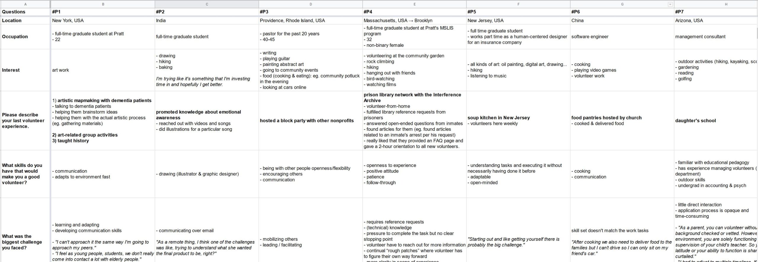
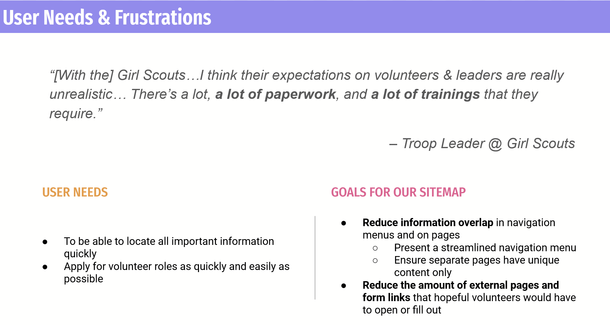
Interviews taught us more about volunteers and gave us key design goals
We conducted a series of 8 interviews of people who volunteer regularly or when they can as one of the first steps in the design process. We learned that people want to feel low barriers to entry for new organizations and little up-front commitment, have enough flexibility that they can fit the opportunity into their busy schedules (bonus finding: people who enjoy volunteering for nonprofits also generally like to stay busy), and they want to see how they fit in to the larger organization. This includes knowing who they can contact and getting visual feedback from sites about how the organization operates with different types of participants (for example, girls, volunteers, and administrators work together at the Girl Scouts).
Maintaining empathy for the user
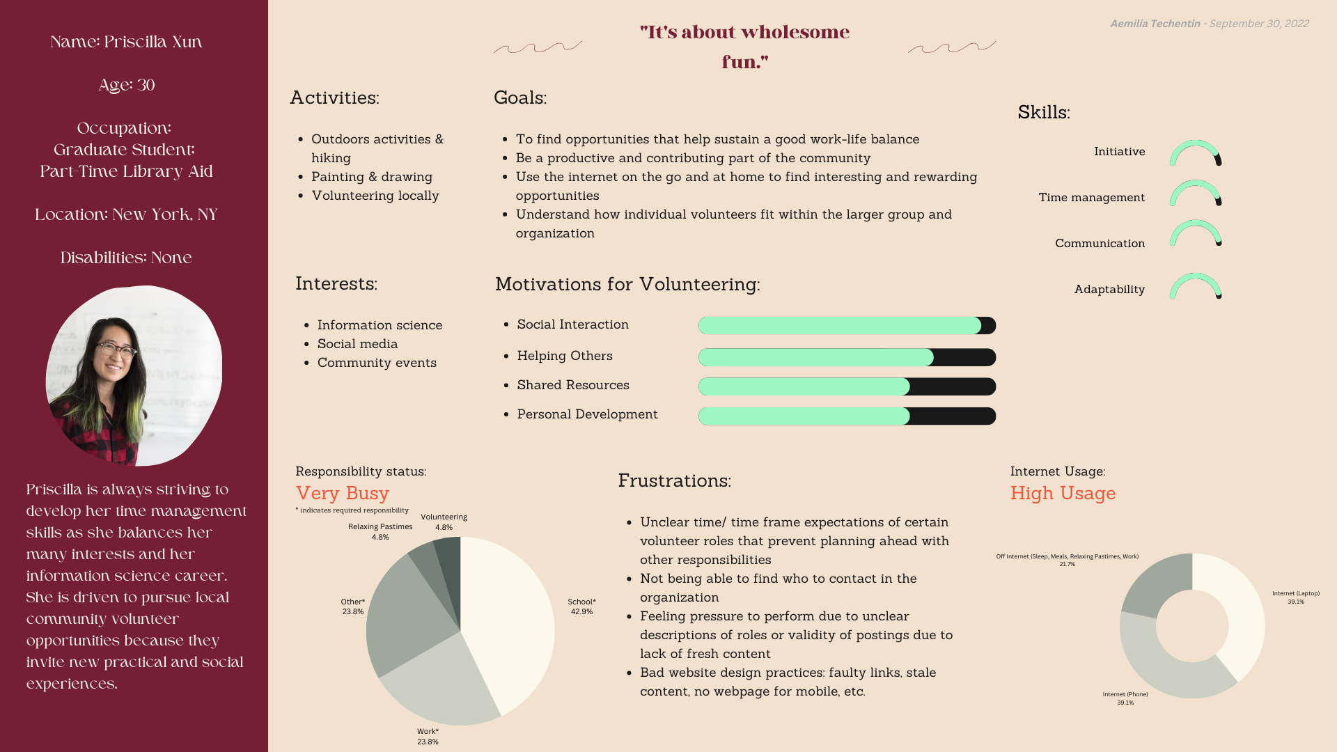
We maintained empathy for volunteers throughout the redesign process by creating personas that we refer to for questions about how he/she would enjoy the new site.
Content Audits and Tree testing gave us a final sitemap and much more straightforward navigation structure
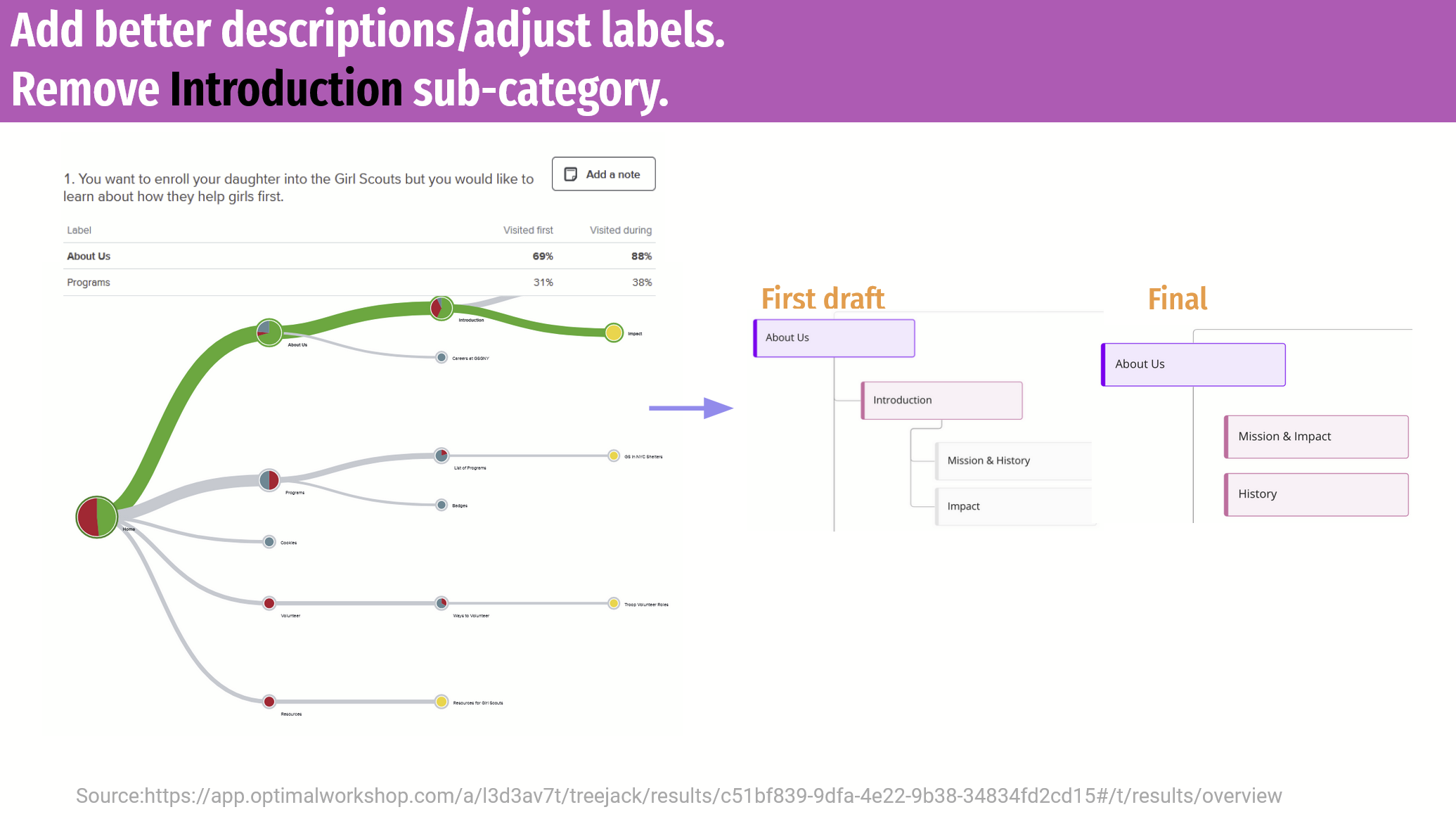
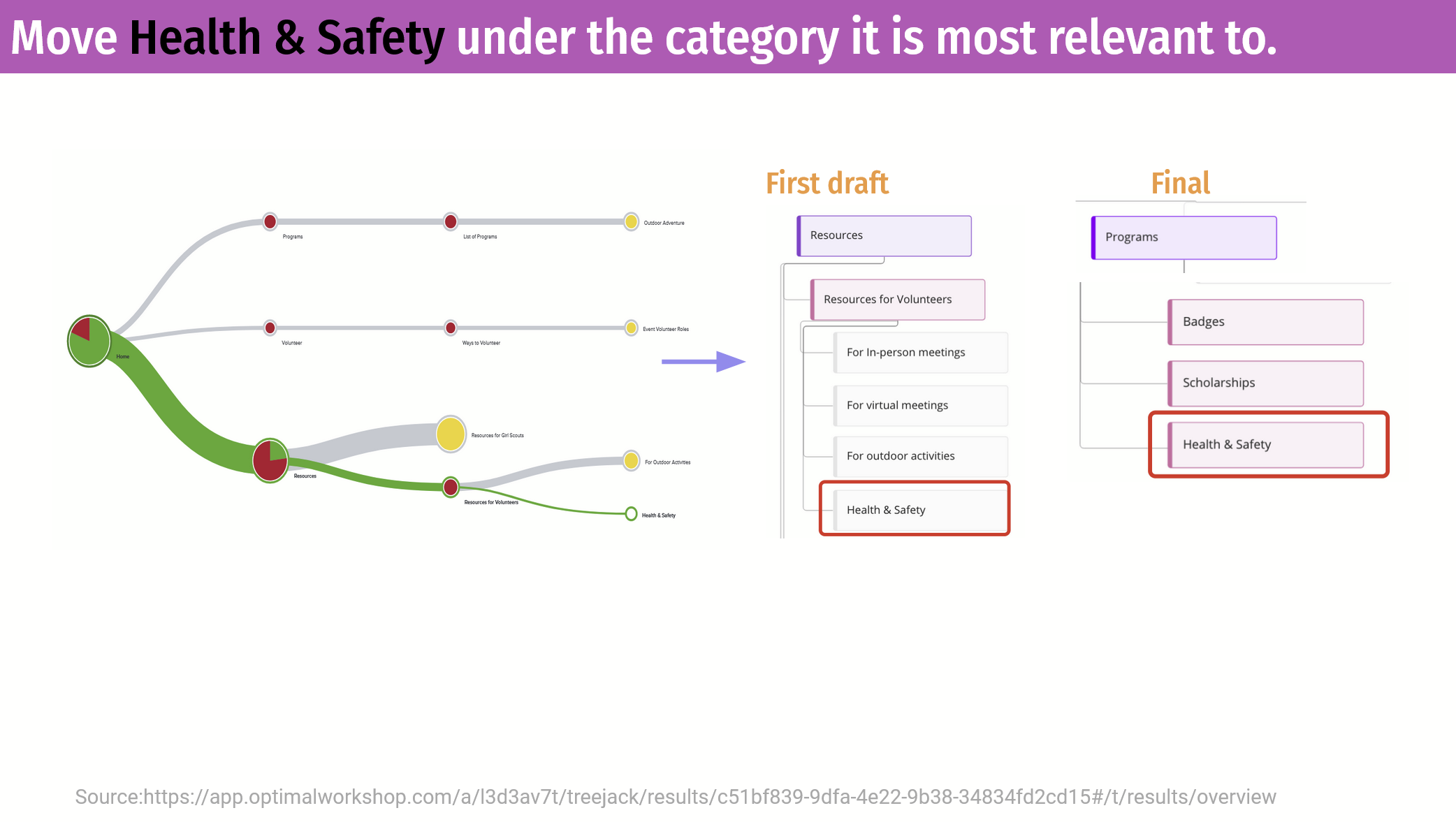
Tree testing out first draft of the sitemap gave us great data points that would directly inform our redesign. We asked participants to tell us where they would expect to find information across almost all of our crucial categories. When analyzing the results, we broke down insights by each task:
Insights about how to improve the site’s structure were found tools provided by Optimal Workshop’s test analysis tabs.
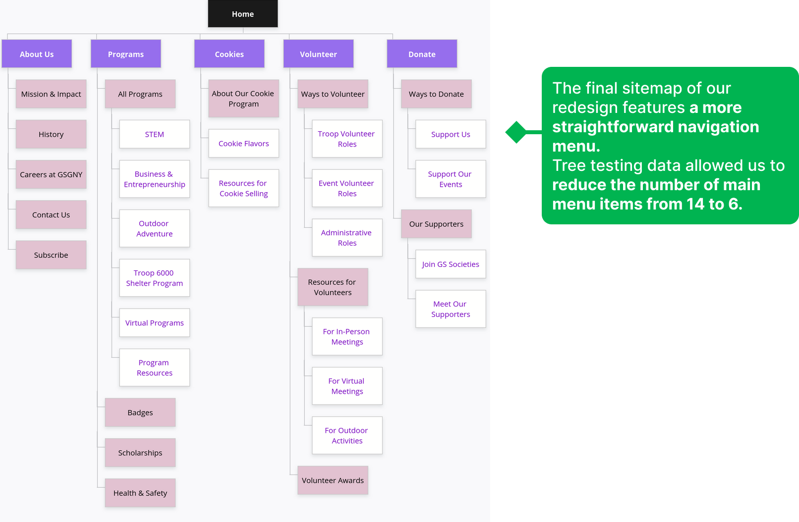
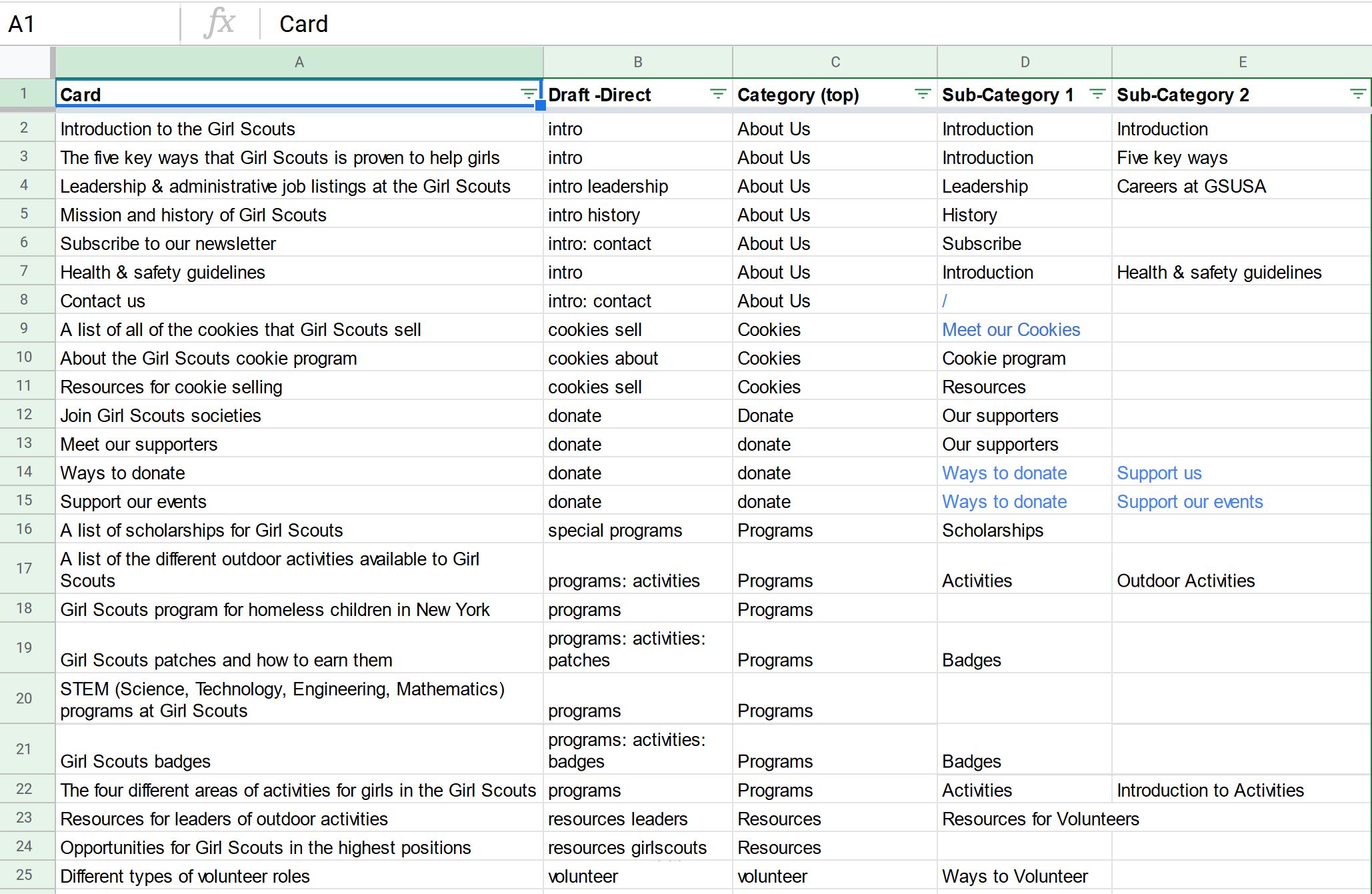
Step 1 of a redesigned information architecture strategy: audit the site’s content
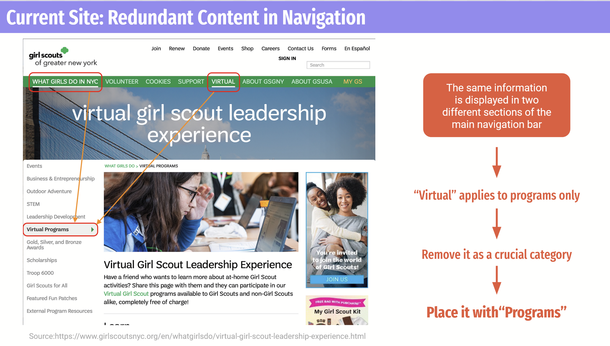
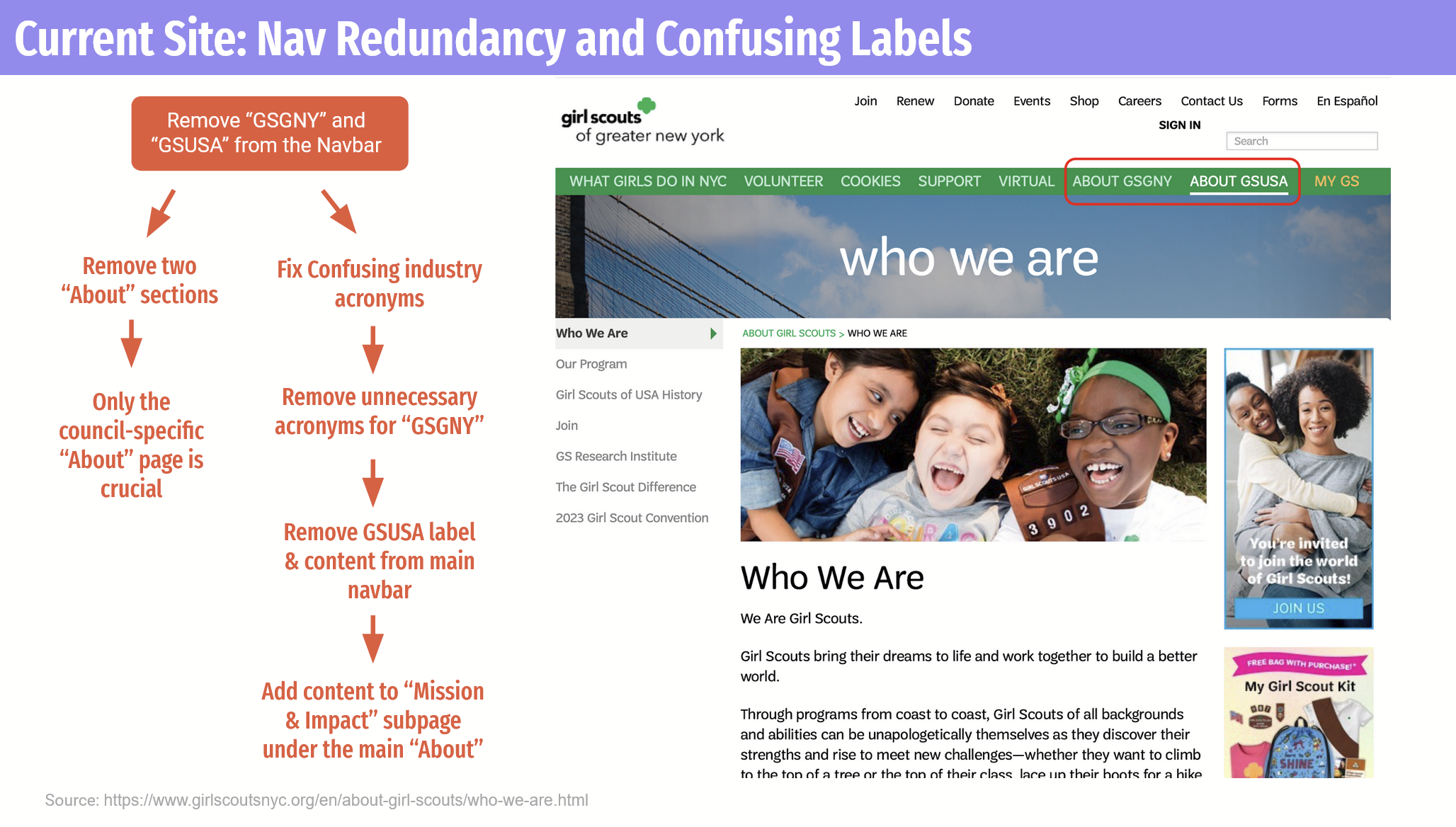
Originally, there was an overly complicated site structure on the GSGNY west because of multiple navigation bars with varying levels of content, and the same content in many different places.
Too many options were presented to visitors as “crucial categories” even though they were not. Our goal here was to discover what is “crucial,” versus secondary and tertiary, for visitors to the site and thereby create a more streamlined navigation experience. We judged the first categories in our new audit spreadsheet would be for “Crucial” categories for the draft, or the labels on the main navigation.
Key considerations for the sitemap after auditing all site content:
Before drafting the sitemap, user needs and our design goals were established.
Not all research will be useful – a lesson of when to use personal judgment from card sorting
After identifying the main content of the site, we conducted card sorting analysis to see how potential users thought it should be grouped. This generative research method did not yield much useful information because almost all groupings were unique, and no trends emerged from the data. Therefore, our first draft of the sitemap was primarily based off of the team’s personal judgement.
Step 2: Tree testing our best initial draft of the sitemap
We shared our draft sitemap with 30 participants for a tree test. The results gave us clear trends that directly informed the clean and straightforward navigation of the final product.
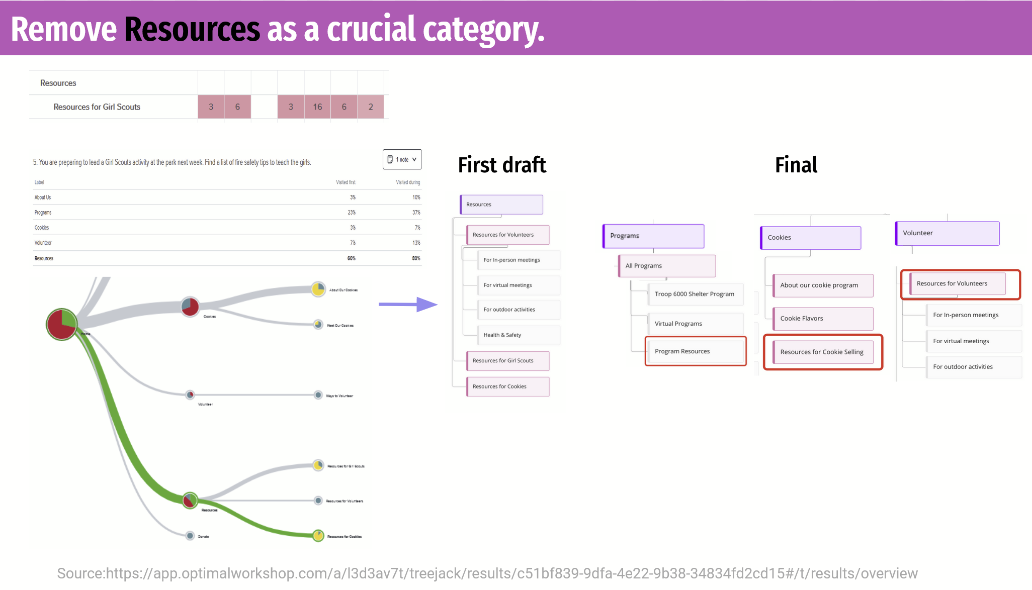
* Additional research lesson learned: Post-test questions often give the most useful data in any research study
We learned that post-test questions can be included at the end of user research tests. It turns out that directly asking a question leads to direct answers.
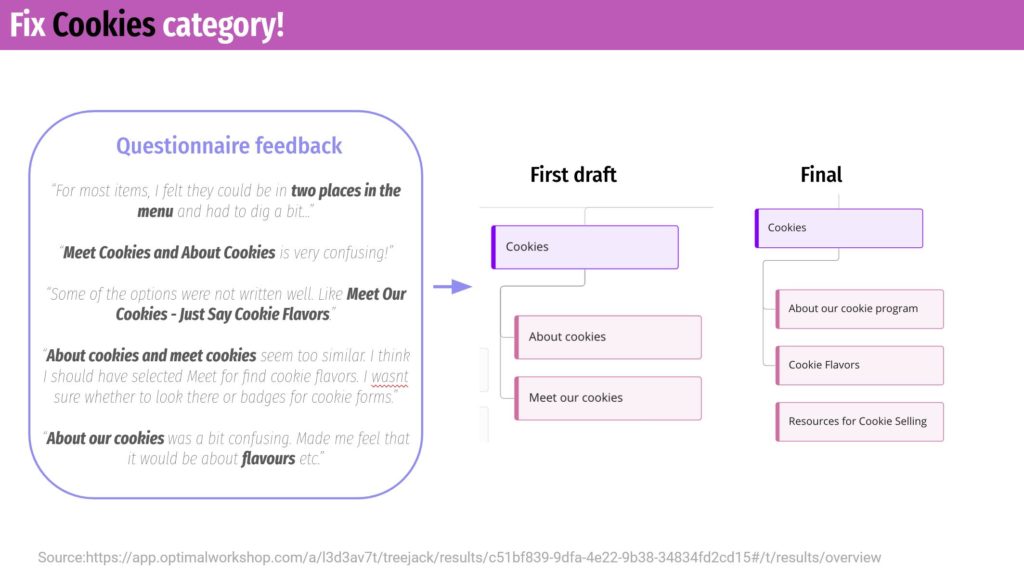
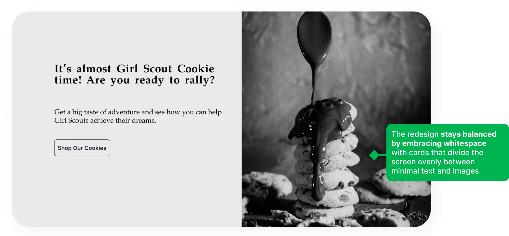
At the end of the tree test tasks, we included one question, “Was there anything that was particularly challenging to find?” More than half of the participants pointed to the same answer: Cookie Resources. This was something that we would definitely change to better align with user needs.
We strategically went about addressing this confusion by analyzing first click and final click data, as well as when users clicked into the “Cookie” tab during other tasks.
Simplifying our user’s flow on the new site
The redesign needed to support key user tasks. Our target user is a volunteer or potential volunteer with the Girl Scouts, and may be seeking to sign-up for a one-time volunteering event. According to research, a one-time event-based opportunity is a great entry point for this type of audience, as it does not require too much commitment and can more easily fit into busy schedules.
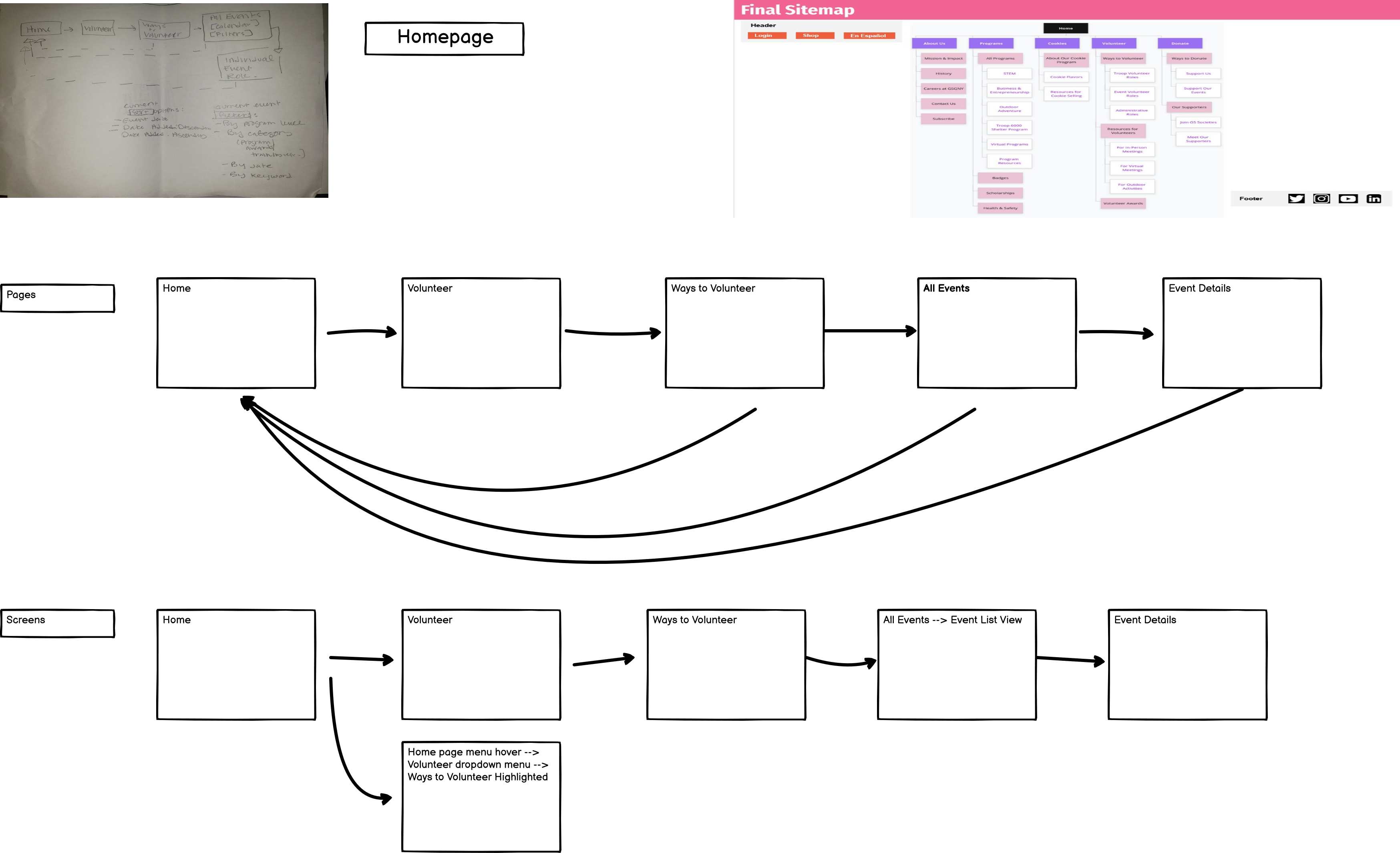
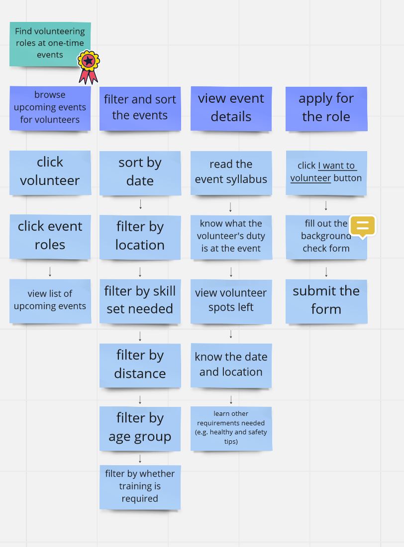
User stories gave us insight into the screens our redesign should prioritize
Mapping user flow via user stories allowed us to dive in and discover which screens users would be looking at. It made us consider granular items that we hadn’t before, like form pages and where membership details should be found.
Iteration: Designing for interaction with Balsamiq and Figma
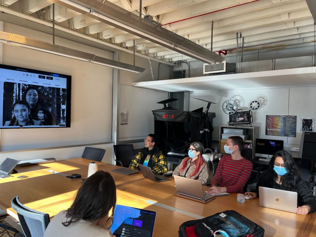
Our first draft of the redesign was focused on layout and button placement. More detailed elements, like padding / whitespace, button shapes, and font, would be decided afterwards. Once we had wireframes of page layouts that we liked (created in Balsamiq), we tested our proposed layout and page structure once again on six real users.
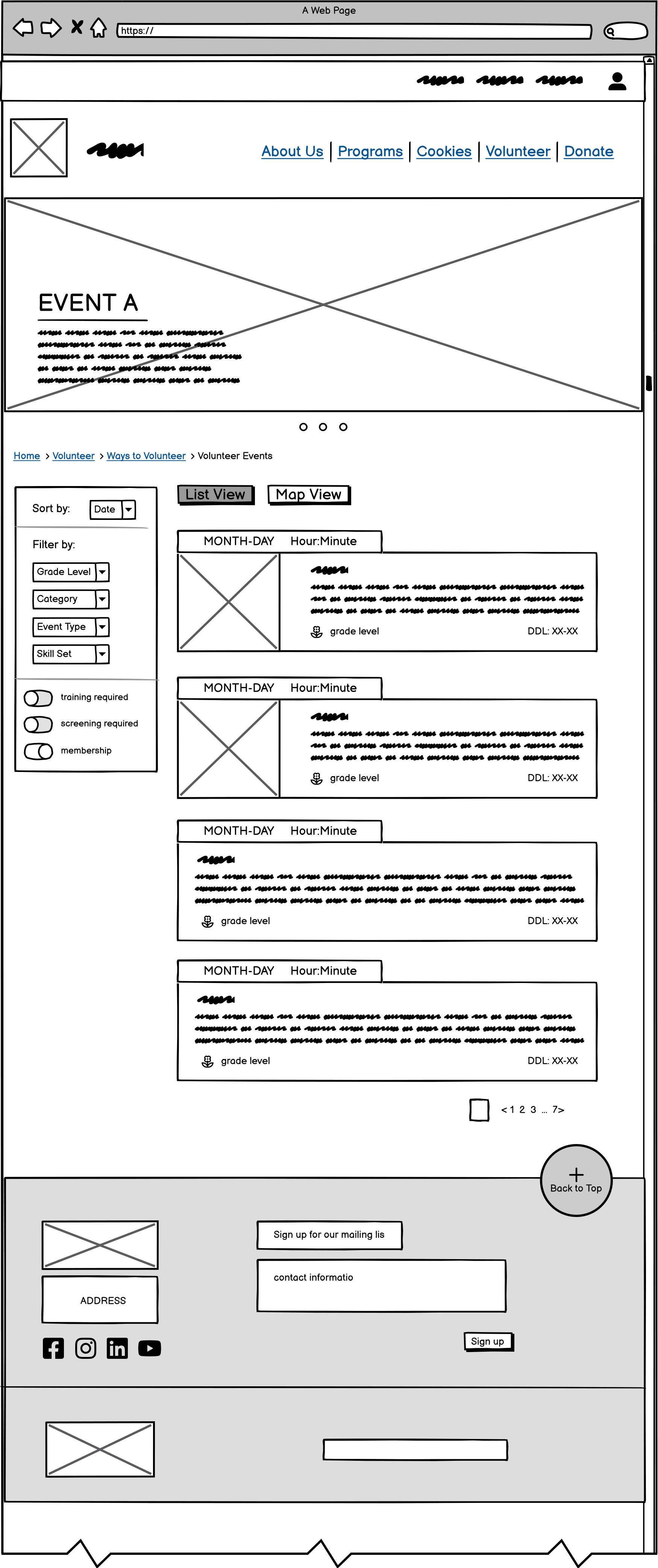
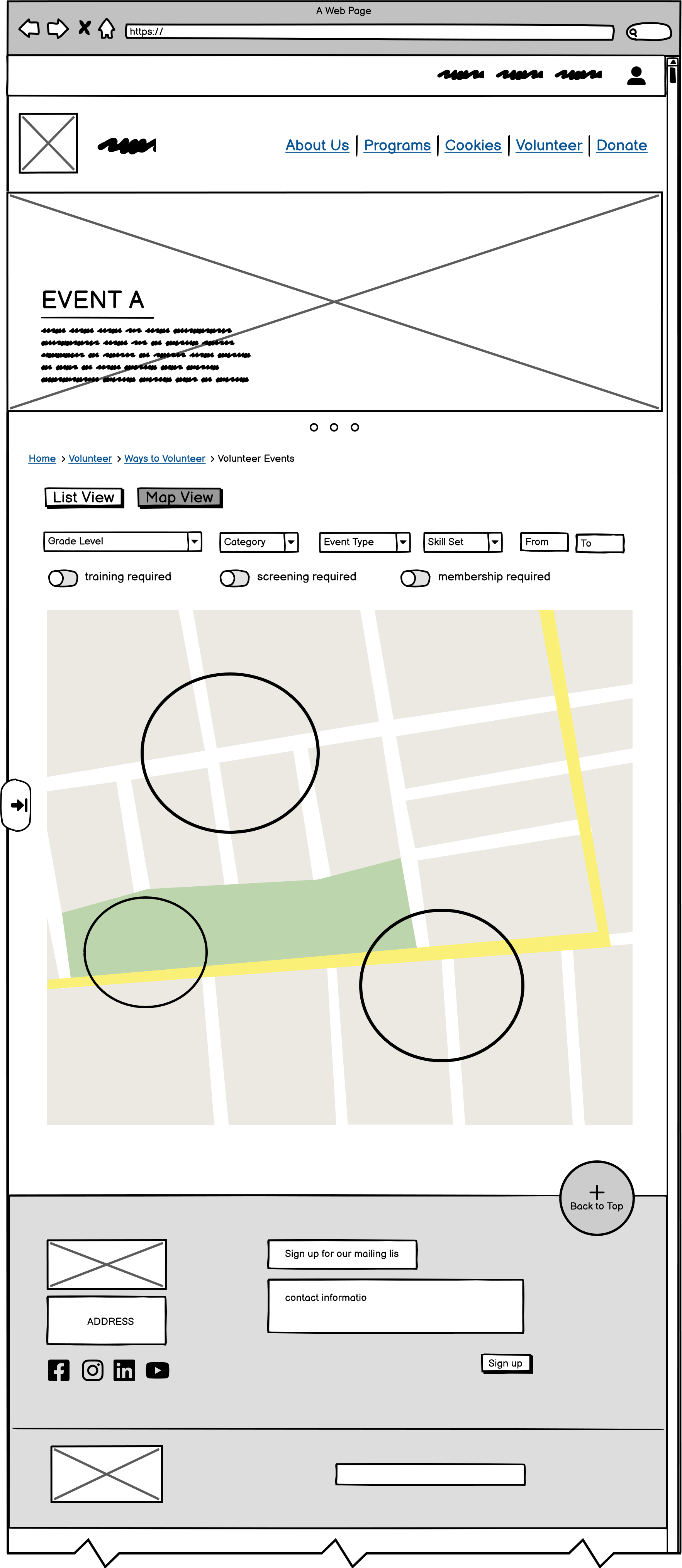
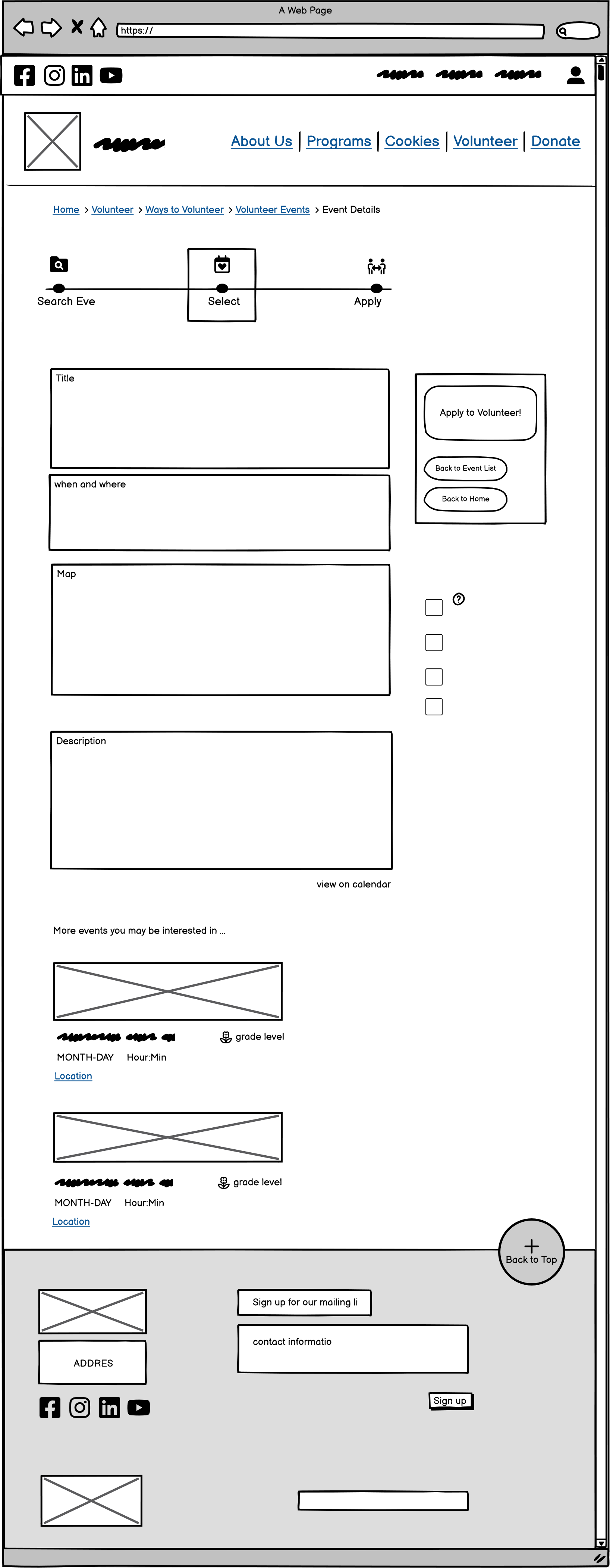
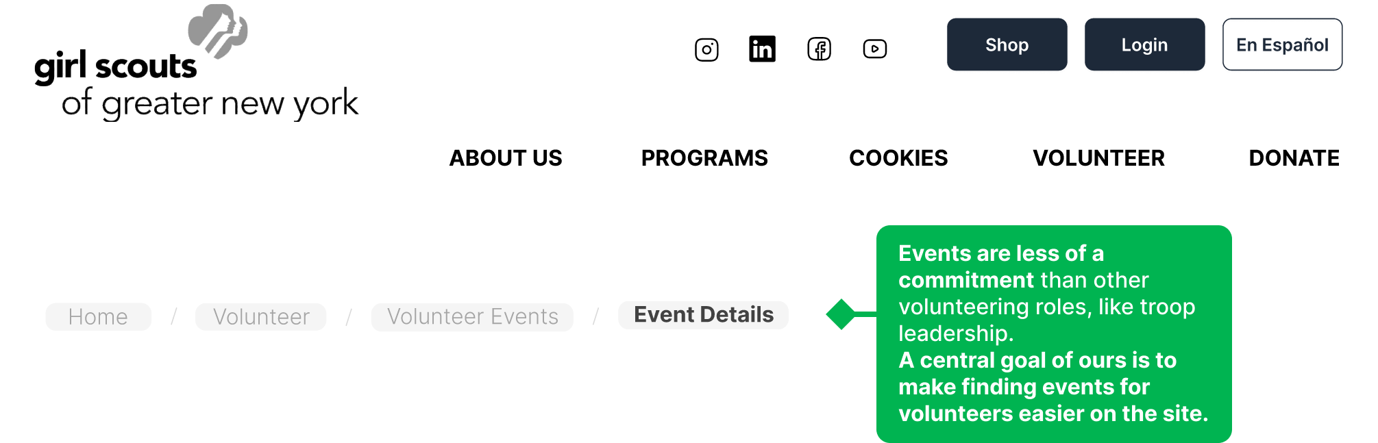
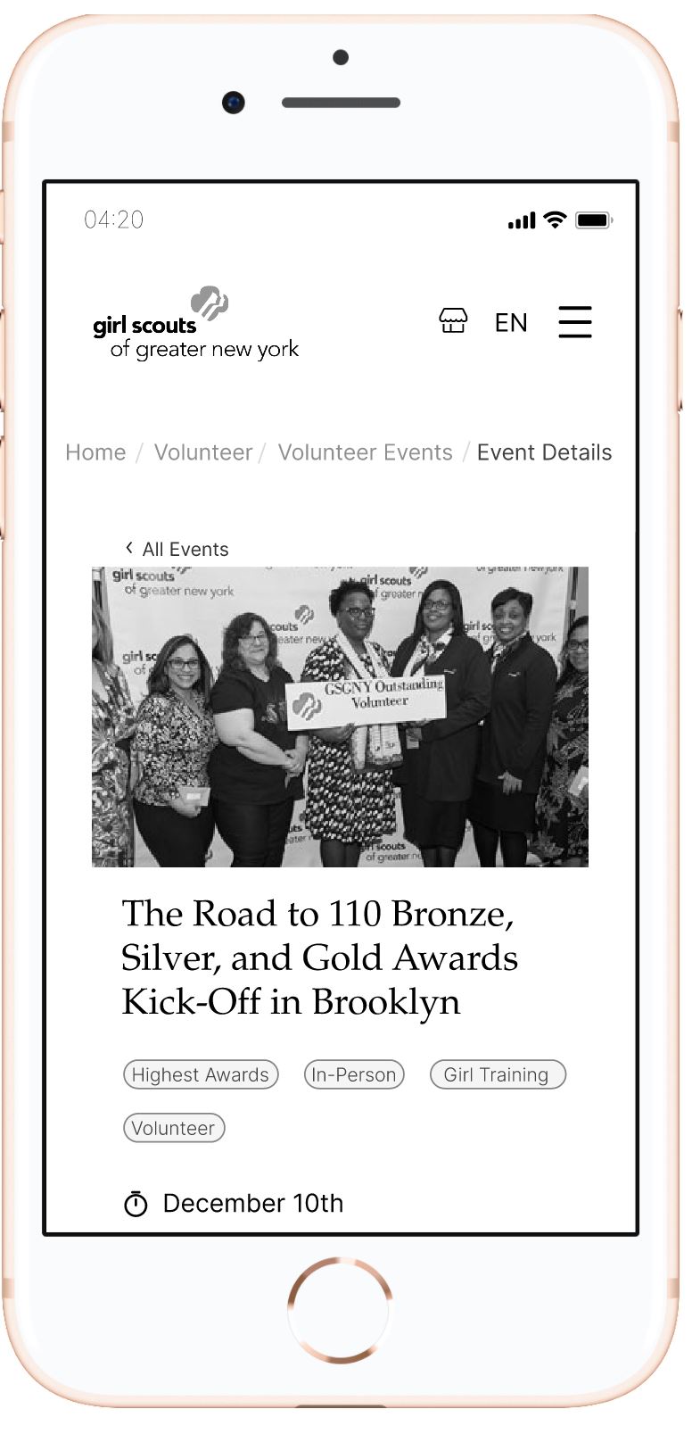
Wireframes created in Balsamiq to test the site structure and page layouts that users would see. Pictured [left to right]: the Volunteer Events (by list), the Volunteer Events (by map), and the Event Details page on desktop screens.
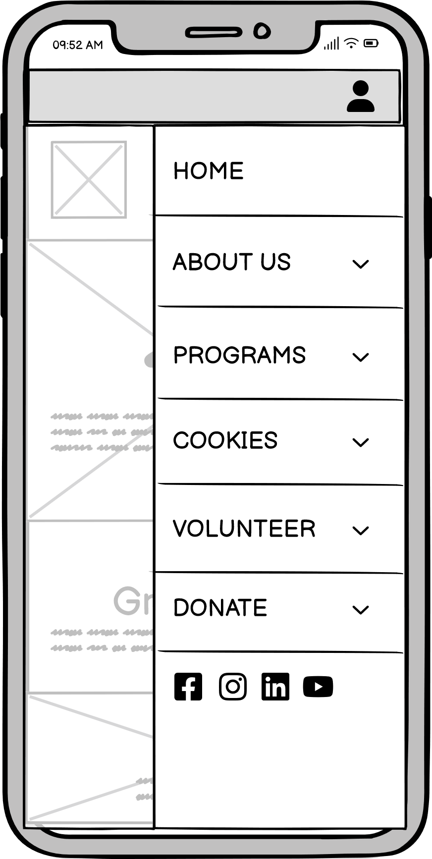
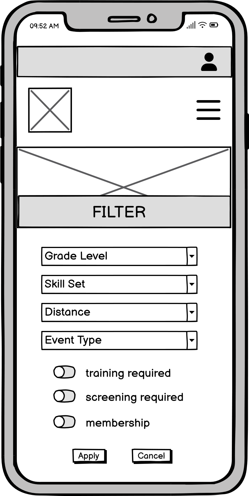
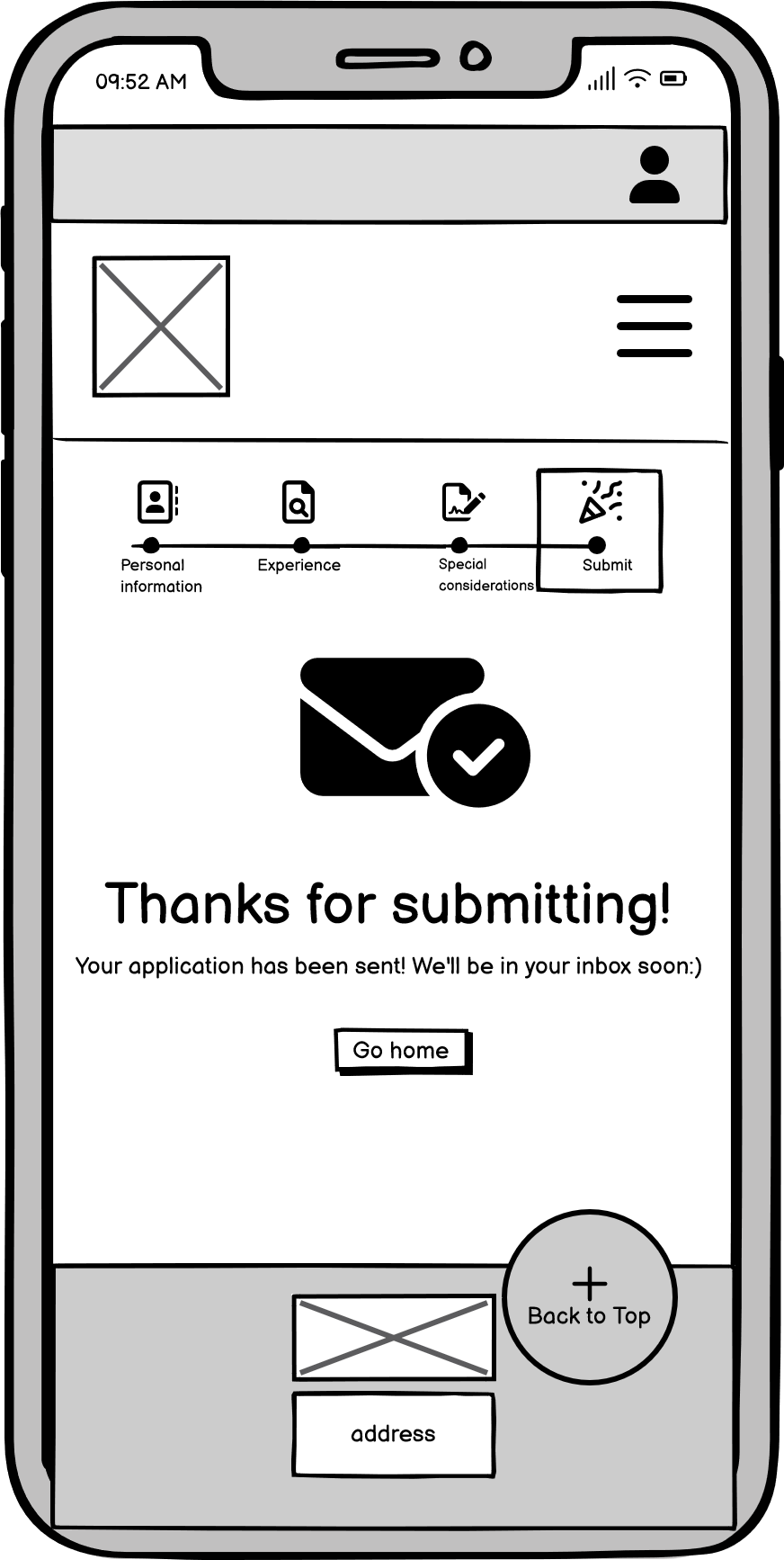
Wireframes created in Balsamiq to test the site structure and page layouts that users would see. Pictured [left to right]: the expanded hamburger menu navigation tool (mobile specific), the even filters, and the Thank You page on mobile screens.
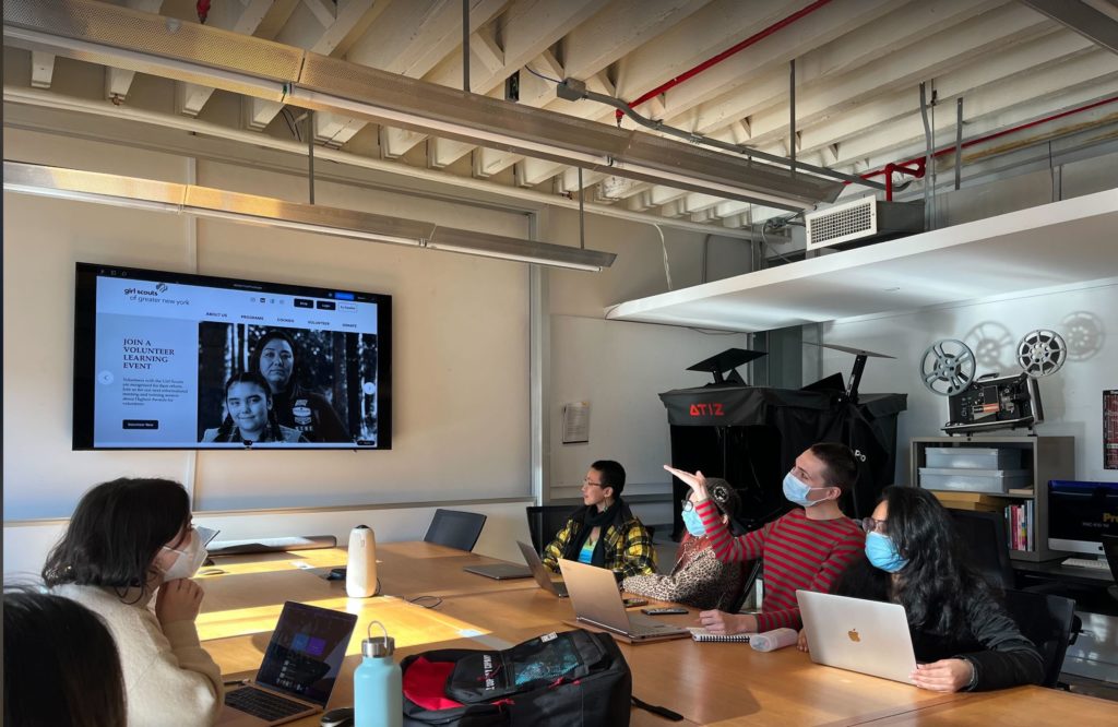
Moderated user testing on Balsamiq led to significant usability improvements
Our team asked six users to perform the same task on the desktop and mobile interfaces, while thinking aloud at every step of the process. The task was to “Find an Event online and apply as a volunteer. Please also exit of out of the hamburger menu on mobile.”
Overall, the participant’s opinion of the prototype was positive because our layout was clear enough that users did not struggle to complete any part of the task. This was reflected in the short amount of time it took for everyone to complete the task, and the entire test itself.
| Screens participants interacted with: | Areas where participants comment on most: |
| The homepage | Button placement (Application page) |
| The navigation menu | Text Size (Navbar, [Desktop] Application page) |
| The Events Listing page | Progress Bar (Event Details vs. Application page) |
| The Events Detail page | Filter labels (Event Listing pages) |
| Application pages | Filter layout (Event Listing pages) |
| Confirmation/ “Thank You” page | |
| Filter views |
User testing of our wireframes provided invaluable insights for the final redesign:
| 1. Font sizes are sometimes too small/text is too heavy on the desktop application pages | ||
| 2. Event list filters need to stay in one place on the “List View” and “Map View” screens Participants seem to like the filters on the “List View” page which are on the side. | ||
| 3. Having a progress bar on the “Event Details” page is confusing for all users It does not seem necessary and it is different than the one on the next page | ||
| 4. People love the progress bar on the application page! Some users would find it helpful if it were clickable so that they could navigate with it. | ||
| 5. The “Next” and “Cancel” buttons are in awkward places in the “Application” section. Users hover over the “Cancel” button before clicking “Next.” | ||
| 6. People did not like the idea of accidentally clicking “Cancel” One participant suggested adding a warning pop-up | ||
| 7. Lack of an exit/close menu icon on mobile can make users nervous that they will click into the wrong this They intuitively know to click outside the menu to exit (a mobile format consistency), but they may still see unrelated clickable elements they want to avoid | ||
| 8. The current “Thank you for submitting” page is not giving users enough feedback that their task is completed Nearly all users were observed to immediately click the “Back to Home” button underneath the “thank you” header and either begin the task again or ask the moderator if they were indeed finished. | ||
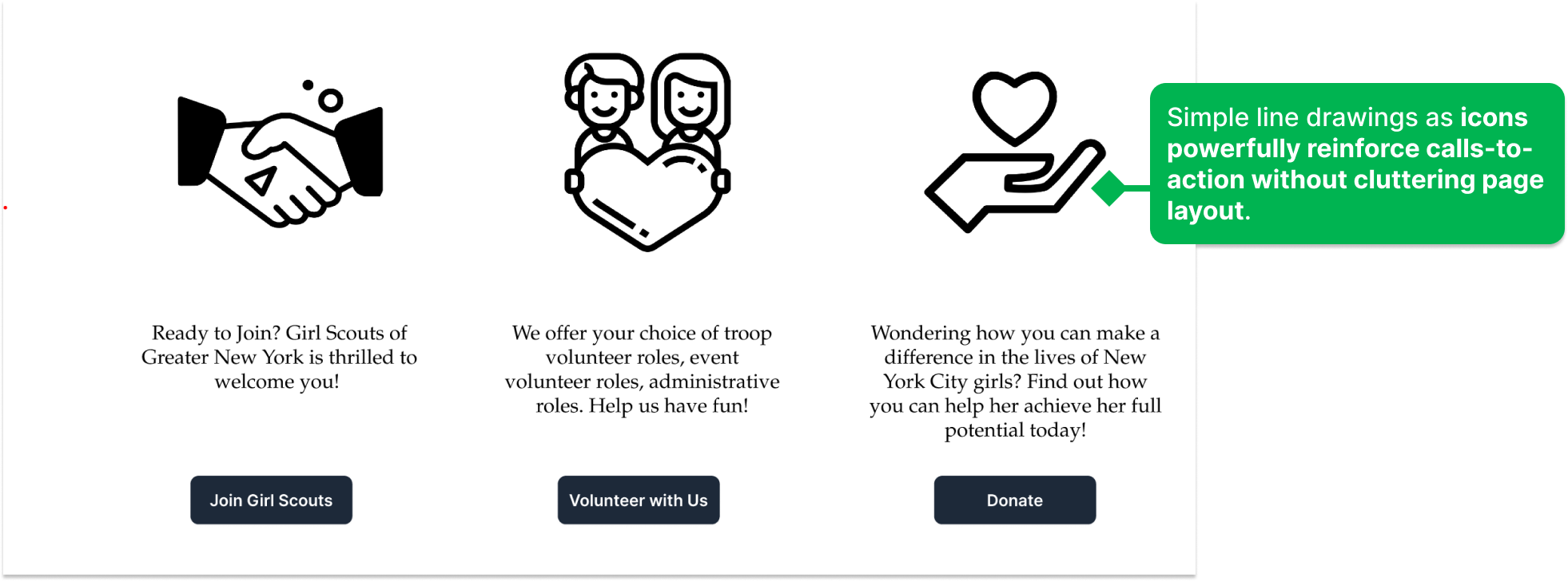
Focusing attention on clear calls-to-action featured on competitor scouting sites
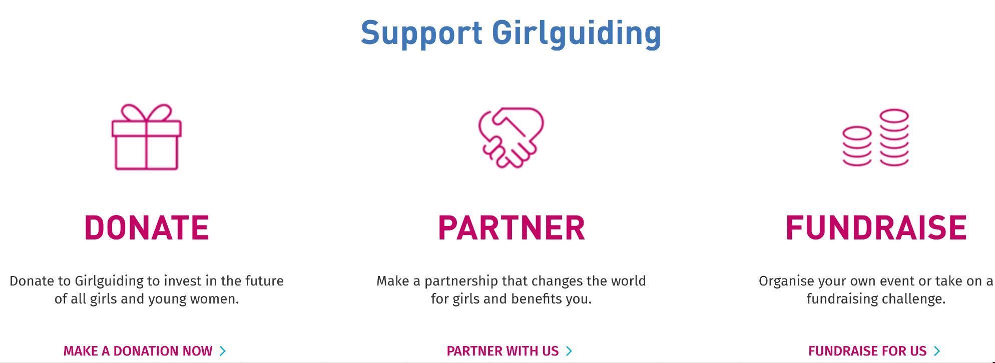
Criteria for competitive organizations: nonprofit, youth-oriented, volunteer-based. The design of the pages themselves, their layout, reusable elements, and key graphics, were strongly influenced by competitive analysis of similar organizations. Other scouting websites, like scouts.org and girlguiding.org.uk, have great feature reusable elements of their website.
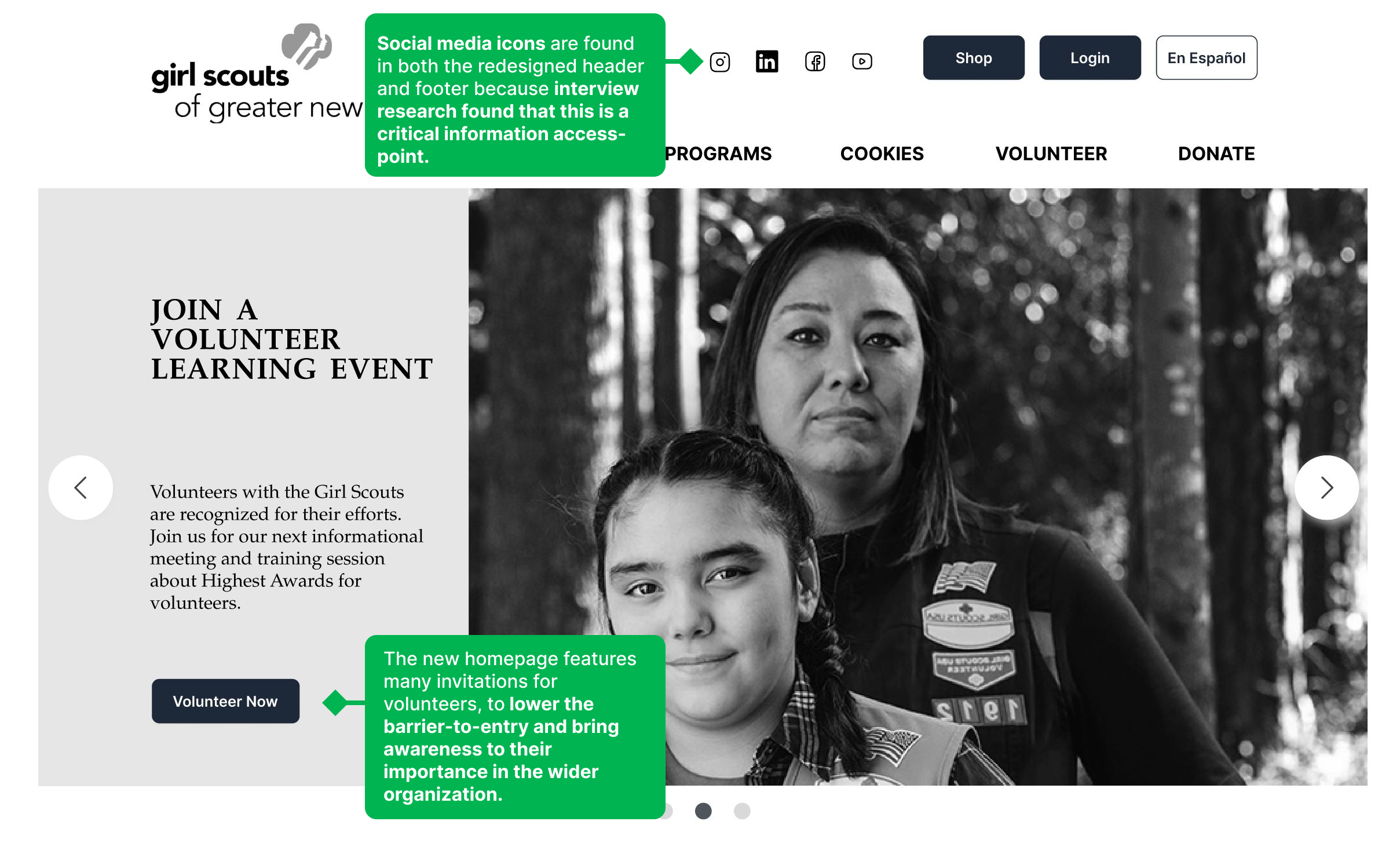
We were inspired by the Scout’s user of banner images on the homepage with text overlay, their use of cards that feature media and text, and Girl Guiding’s clean icon design and their layout on the page.
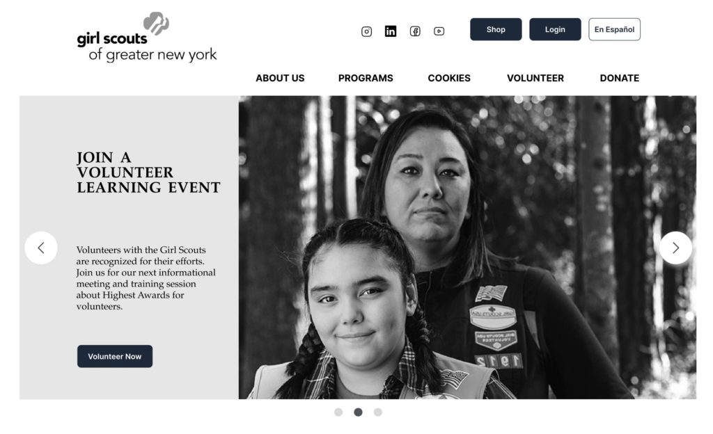
The final product: Streamlined navigation, page layout, and clear emphasis on volunteering
Our final medium-fidelity prototype is the culmination of rigorous user testing of wireframes, sketching, iteration, and a close look at what our competitors are doing that works.
Our prototype is designed to support a volunteer looking for an event that will take place in-person. This design supports viewing events by list and filtering the MEETING TYPE to “In-Person,” and also viewing the event on a map and filtering by CATEGORY as well as MEETING TYPE. The user can then apply to join the event. If the user is a returning member of the Girl Scouts already, they can save their details so that the form is auto-filled and the application process is just a matter of clicks. Additionally, if at any time the user accidentally clicks “cancel” in the application, studies show that a warning sign before the application is erased will improve their experience, and therefore they have the option to press “No” when prompted if they really want to cancel. Nearly every decision we featured in this prototype, from the tasks supported to the elements of the screens, is based on research.
Final Critique: Ideas for the future
FEEDBACK FROM COLLEAGUES TELLS US WHERE WE CAN STILL IMPROVE
It turns out that redesigning a whole website requires a lot of details. During the final critique of our product, we were pleased to have our colleagues respond enthusiastically about the careful consideration and polished looks to some elements, like image banners and the style of our drop-down menu. They also provided us with suggestions for improvements that I would like to implement to our design:
The progress bar –
- currently the design that indicates the current page is not clear (this is most visible on page one)
- greying out future steps that are not yet completed would help those sections 1) not look clickable 2) clarify the sequence/order of operations
Desktop Event listing –
- Cards on Event Listing pages need to show a visual hierarchy. Increase text sizes accordingly.
- Make the list of events easy to scan and comparable. Maybe do this by aligning the three different types of tags vertically. (“the point of a list is to compare the items from a distance.”)
- Add more padding between cards
Mobile Event Details–
- Add more padding between elements
- Add more padding around the word on each tag
- Categorize the body text to break it up in reusable ways
Mobile Homepage –
- Remove style from grade level images – too small and hard to read
Lessons learned takeaways for future research
There were many things I learned from working on this project. They vary from very high level–like, trust is the foundation of good teamwork–to granular things like–do not start to build a medium fidelity prototype in Balsamiq if you don’t have to, move to Figma (or any higher fidelity software) ASAP. My research was improved with additional usability theory that informed my moderated testing of our prototype at different stages, which was much more structured because of it.
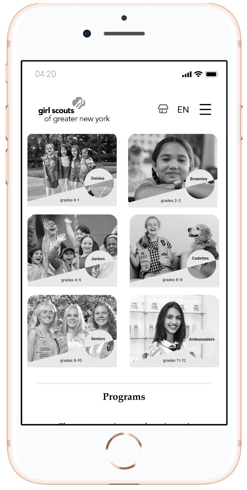
The design can still improve with increased spacing and some design elements not suitable for mobile. Pictured: The new Volunteer Event Details page and a section of the new Homepage (grade levels) on an iPhone 8 screen.
Viewing other team’s products also inspired me to bake some of their ideas into future designs:
- Accordion Menus (full-screen width when on mobile) – PRO: Hide too much information from view but allow users to click to read more if they are interested in the title content
- A group of buttons that allow for users to filter by audience type – PRO: Only information pertaining to the selected audience is visible on the screen at a time
- Info-graphics and journey maps – PRO: Use visuals to distill complex information (often seen as tables or lists in text form)
- creating a high-fidelity prototype in color!
Simplifying a website architecture by simply taking the time to understand all content site-wide, and group it carefully, will help users navigate more directly and with confidence. Our redesigned GSGNY website accomplishes this by featuring only six crucial categories in it’s main navigation, allowing “Volunteers” to appear as a significant group within the organization, and featuring familiar, clean, and aesthetically pleasing design elements.