Pratt Institute Undergraduate Desktop Study: Abstract
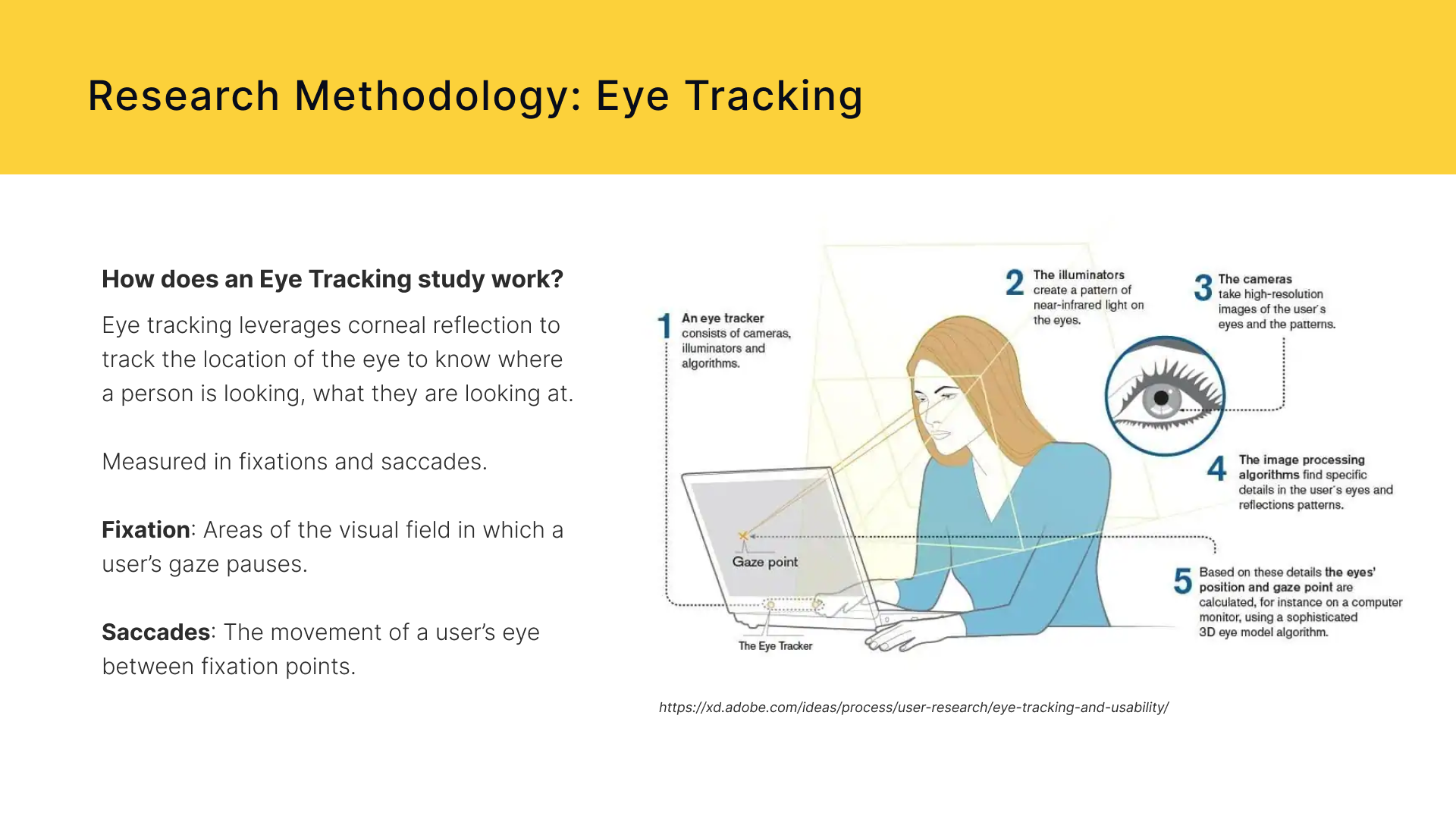
The Pratt Institute is a leading art and design university that aims to provide students with the knowledge and tools to affect the world creatively for the better. One of most important parts of any university is its students. Pratt.edu recently went through a site wide redesign and had concerns about whether or not this redesign aided prospective students in finding information and applying to the Institute. For this study my team conducted a usability audit focusing on the undergraduate experience of the Pratt.edu desktop site using eye tracking software to address our stakeholder’s concerns.
Our Team
Our team consisted of 4 members and we organized our overall duties as follows:
- I was the team facilitator
- Anamika Menon was our editor
- Mishi Sarda was our administrator
- Sacchit Vartak was our manager
As the team facilitator, my role was to guide our team meetings and discussions as well as confirming what our next steps were after each meeting. Besides facilitator I also performed the following:
- Collaborating with teammates to create our testing materials
- Moderating eye tracking sessions with participants
- Analyzing Eye tracking data and recordings
- Synthesizing data to form recommendations
- Creating slide deck report and other deliverables including video highlight reel and problem list
- Presenting slide deck report to key stakeholders
Challenge: How does one recruit prospective undergrads (in less than 6 weeks)?
The recruitment phase of this study was unarguably the hardest part. Finding and ___ prospective undergraduate students aka high school student in most cases brings a lot of challenges. Not only do you have to know where to recruit this demographic, but also since most high schoolers are under 18 years of age, you receive parental consent to perform a study. Additionally, due to the fact minors would be involved our entire study procedure and result would potentially have to be reviewed to make sure it’s ethical and safe for minors. No one in my group knew of any high schoolers in the NY area, and we surely weren’t ready to have our study reviewed. The only way to over come this obstacle was for my group to expand our target participants to current undergraduate students. This still worked out for us since all of the current undergraduate students at Pratt applied under the old website so it was still a new experience for all.
After expanding our target participant range, we continued working out the other areas of our study. We selected to focus on the desktop experience for undergrads on the Pratt site. With all of these concerns in mind, we were ready to meet with our client.
Kickoff Meeting: DEFINING AND DISCOVERING Goals
Our team met with two representatives from Pratt to discuss what initiated this request and their goals going forward. By the end of the meeting the team left with the following goals to guide us:
- To understand whether the current user flow helps in effective task completion.
- To recommend necessary changes/ developments to improve the overall experience for the prospective undergraduate students.
- Provide data to the stakeholders to support the findings (positive or negative).
crafting the right Research Questions
With these goals in mind, we came up with research questions to address the areas our clients asked us to focus on:
- How do students approach the process of gathering information about courses and programs on the website?
- How effective is the website’s Information Architecture and content hierarchy?
- How are users are using the navigation and sub navigation on the website?
- Are the CTA’s on the website easily discoverable and accessible?
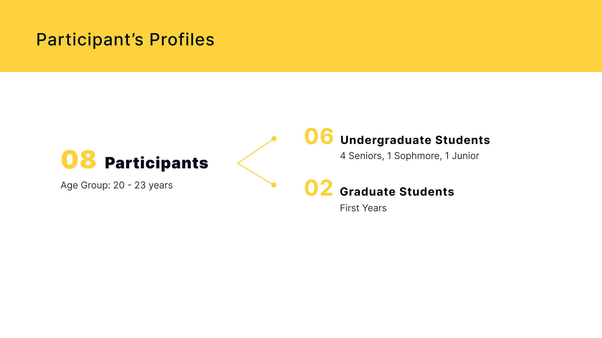
Recruitment: Actual vs Target participants
The study: Participant Scenario and task
Since our actual participants weren’t prospective undergraduate students we had gave the following scenario to our participants:
Scenario: You are interested in pursuing a Bachelors Degree at the Pratt Institute. You want to know more about the college and the program.
Then participants were given 4 task to complete on the desktop version:
- Find out more about the duration of the program and a few courses of interest.
- An important part of college is finances. Find information on the total cost of the program and possible scholarship opportunities.
- Find out more about the application requirements and deadlines for the program.
- Now that you have found this information, start the process of applying to the program.
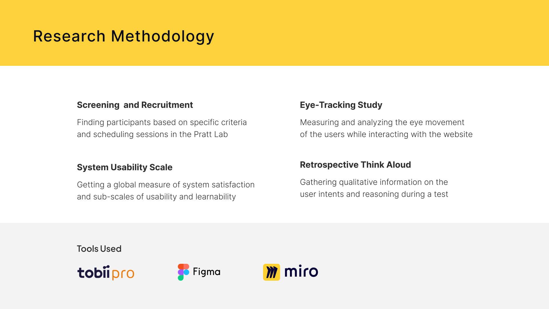
MEthodology: DATA COLLECTION AND ANALYSIS TOOLS


The Redesign: Visually Striking but Mentally Taxing
Overall, the results of our study demonstrated that our participants really enjoyed the aesthetic of the newly designed website but faced real obstacles when trying to complete our tasks. In fact, some participants themselves noted no problems with the website despite not being able to finish all the task successfully. One positive finding, however, was that everyone was able to complete the final task of applying to Pratt with relative ease.
To succinctly show some results see the following measures:

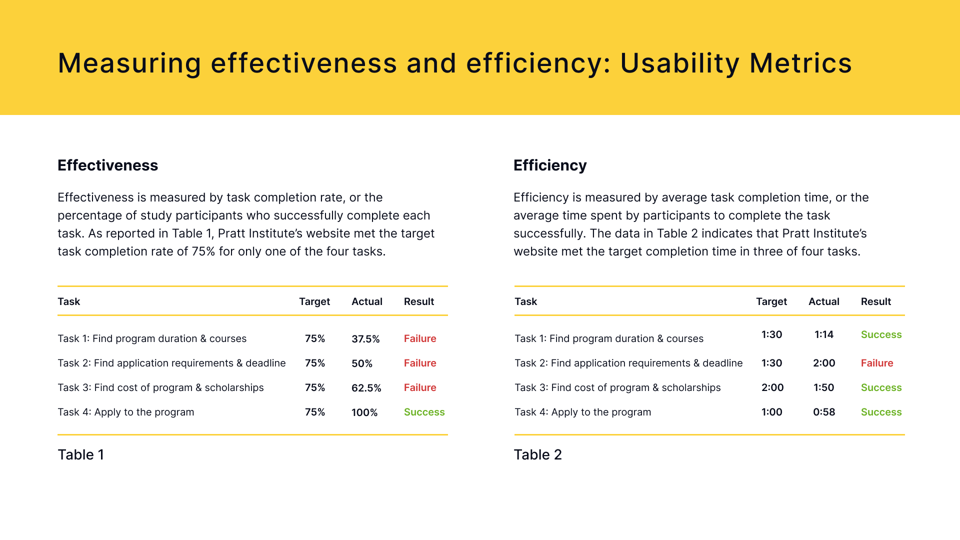
The rest of our findings along with our specific recommendations will be shared below.
Finding 1A: Low visibility + Inconsistencies affecting discoverability
Our first finding is split into two parts but both focus on the discoverability of information that is key to applying.
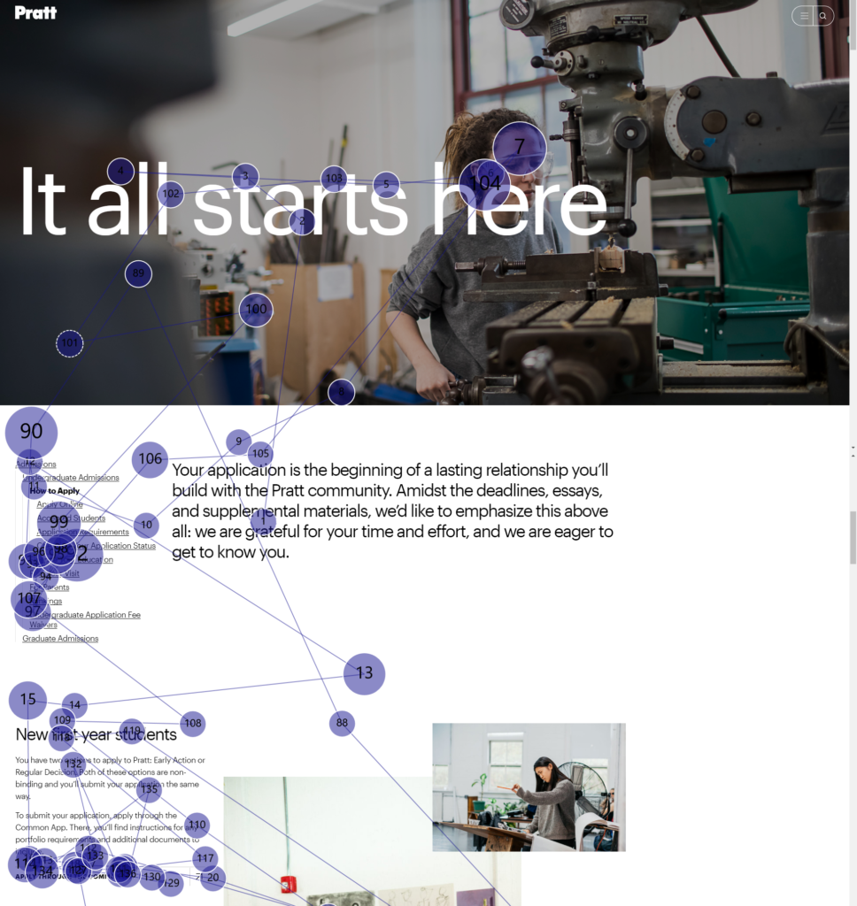
The main result that brought about our first finding is that all 8 of our participants failed to find the program duration on the specific program pages. We were able to observe how participants scanned through the big blocks of text on the program pages, just missing the program duration; additionally, we noticed inconsistencies with the key information on different programs.
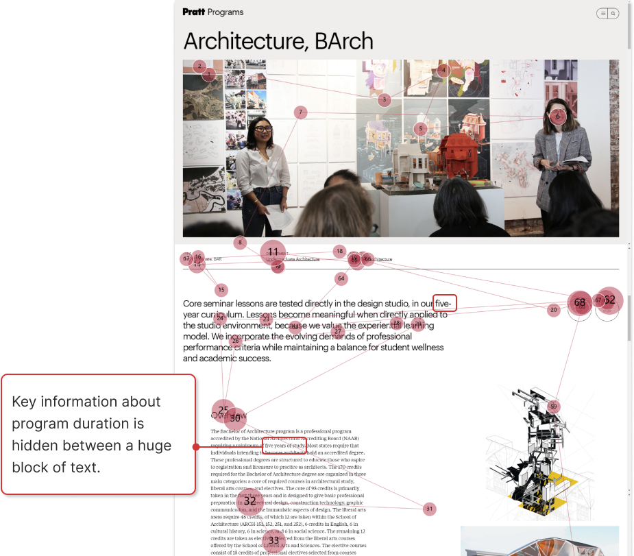

“The huge block of text gets me immediately disinterested”
Participant 8
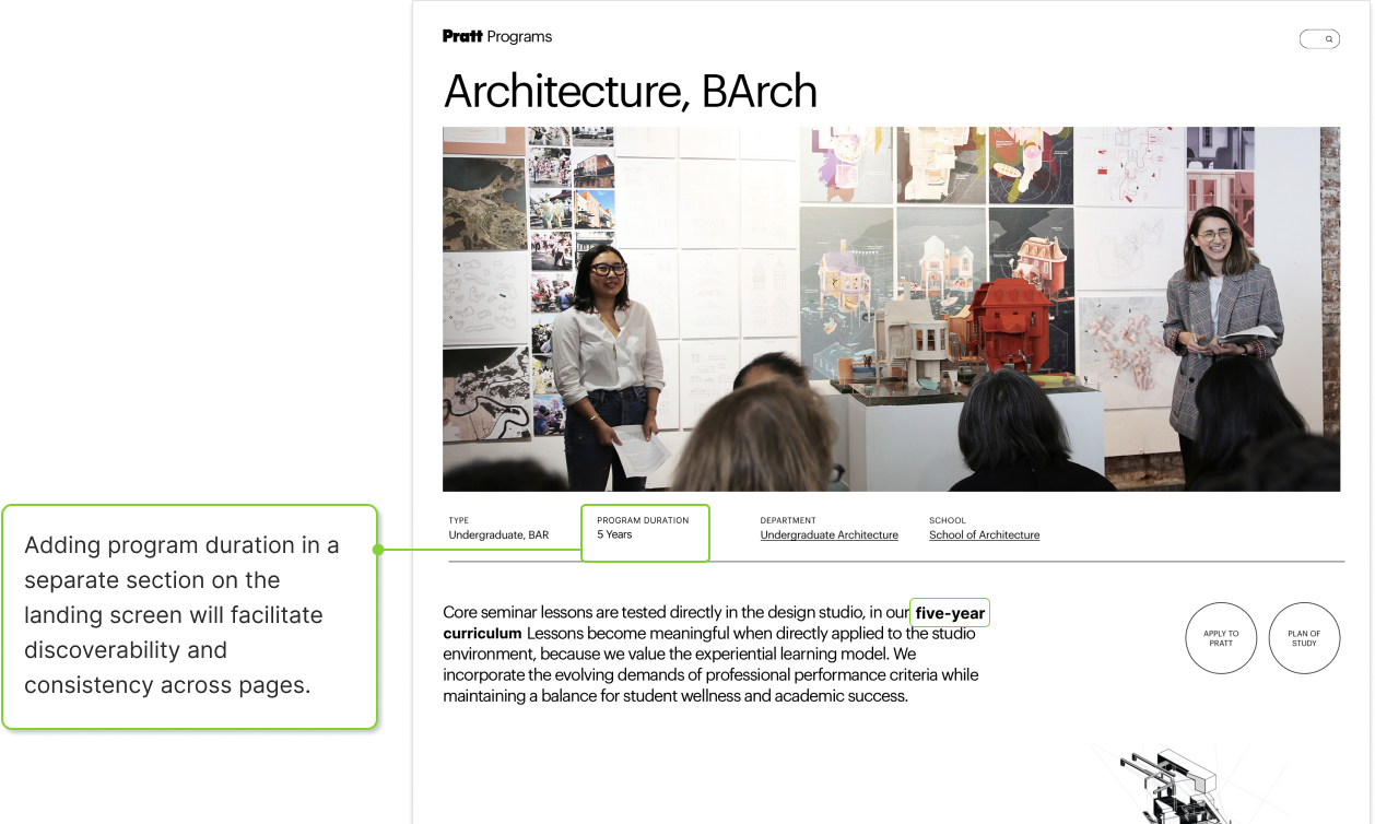
Recommendation 1A: Highlight vital content to increase discoverability
To address this issue we proposed adding key program information to the top of every program page and bolding important information that might be lost in the block text.
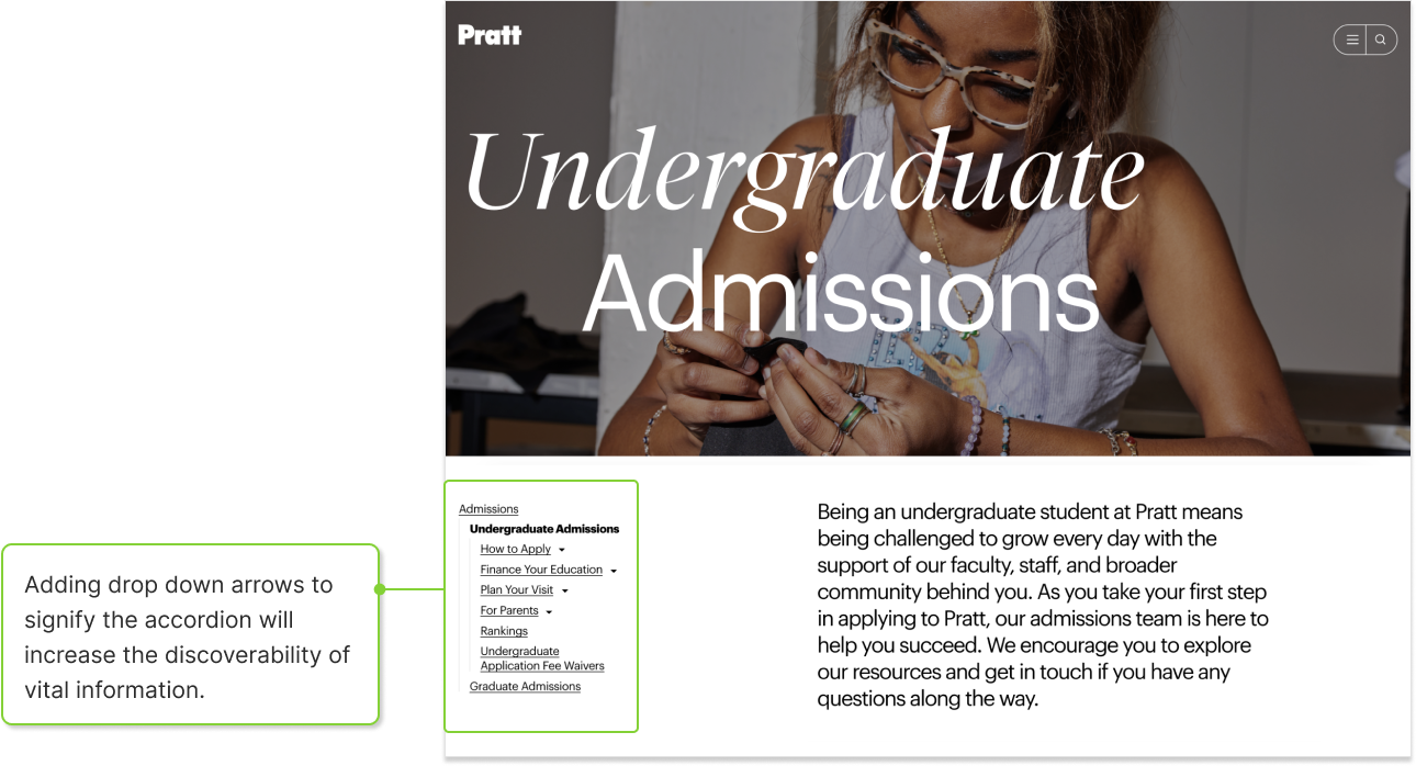
Finding 1B: Lack of visual signifiers affecting discoverability
The second half of finding focused on the side navigations that are found throughout the site. 4 out our 8 participants struggled to find the program application requirements which is hidden under the “How to Apply” section on the side nav. There are no signifiers for participants to know that there are options under the main side nav categories.
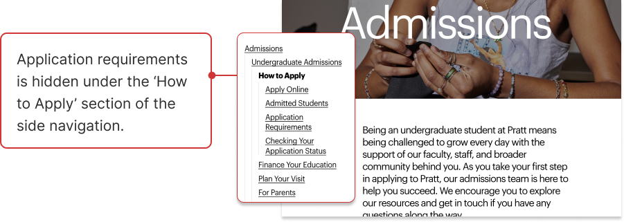
“I had trouble with the task of finding application requirements and deadlines.”
Participant 2
Recommendation 1B: Adding visual signifiers to facilitate access to content
To amend this issue we propose adding a symbol to show that the sections on the side nav act as accordions and hinting that there are more options below each section.
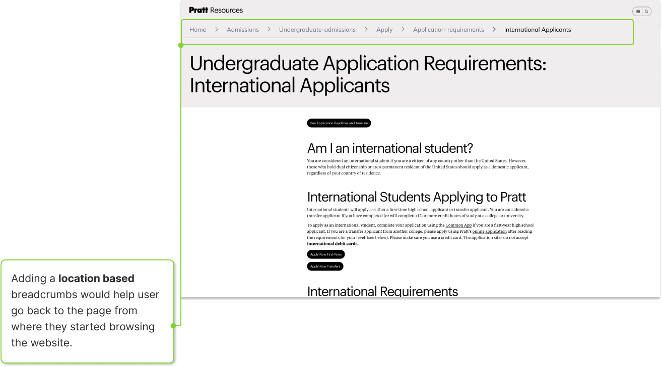
Finding 2: Backtracking on the website proved to be difficult for participants
For finding 2, we noticed that 4 of our participants had some trouble backtracking to a previous page on the site. Participants would remember that they saw information pertinent to the latter tasks on a previous page and would attempt to back track to find that one page, which makes for a poor user experience.
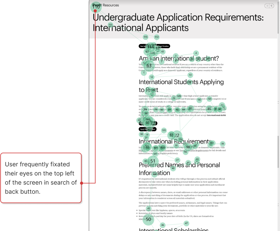
“The part that I was irritating was that there is no back button.”
Participant 7
Recommendation 2: Use navigational aid to keep track of users’ location on the site
Our suggestion for finding 2 is to add a navigation aid, such as bread crumbs so that users can see and have more control their journey through the site.
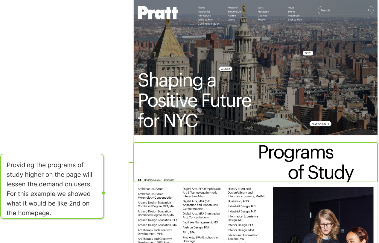
Finding 3: Content hierarchy does not match user goals
7 of our participants utilized the “Programs of Study” section that can be found at the bottom of the homepage. This information appears to one of the first steps users take when figuring out what programs they are interested in. One participant didn’t make it down that far on the page.
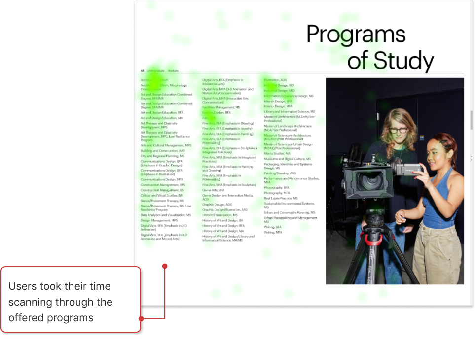
“I thought this [section] would be useful for the next task.”
Participant 8
Recommendation 3: Restructure content hierarchy to prioritize key information
This recommendation is pretty obvious given the finding, since this appears to be important information for the prospective student it should be very easy to find; therefore, we suggested rethinking the content hierarchy and make sure that users’ goals are reflected in that hierarchy.
Finding 4: Similarity in navigation categories increases the likelihood of confusion
The final finding was focused on the homepage navigation menu. The names/options offered to users, especially prospective undergraduate students, appear redundant and confuse them. 5 out of 8 of our participants expressed that they felt the menu was confusing and menu didn’t use it at all when navigating the site.
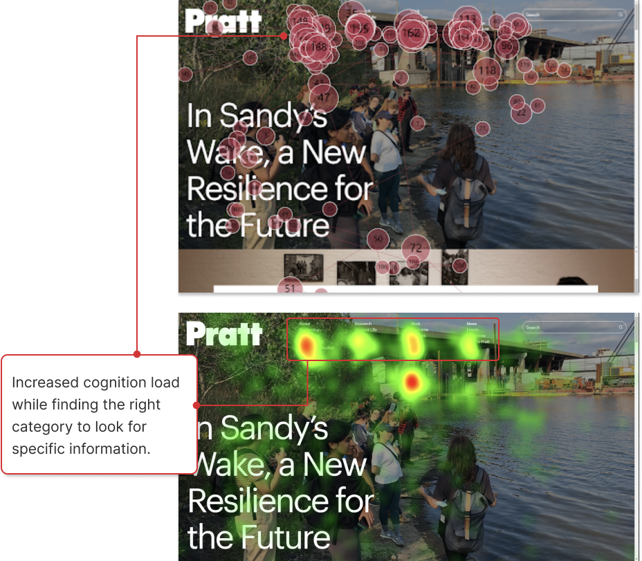
“Too many options given on the navigation bar. There was a lot of repetition.”
Participant 4
Recommendation 4: Further analysis to improve category taxonomy
Since this issue fully concerned the navigation and categorization of the site, our team suggested further testing, specifically in the form of card sorting and tree testing. Both would help to provide insights on what names users think of for specific actions concerning the university and what they expect for groupings / navigation pathways.
Deliverable 1: Highlight reel
To summarize all of our findings we created this video highlight reel to showcase real participant feedback:
Deliverable 2: Problem List
Our final deliverable, was a problem list featuring all usability issues our participants faced while completing the study. It features the following columns: Usability Problem, which provides an overview of the issue; a more detailed Description of the issue; Frequency, to see how many of our participants were effected; and Severity, to assist with figuring out the priority of all the issues.
We utilized Jakob Nielsen’s 4 point severity scale which has these levels:
- Cosmetic problem only: need not be fixed unless extra time is available on project
- Minor usability problem: fixing this should be given low priority
- Major usability problem: important to fix, so should be given high priority
- Usability catastrophe: imperative to fix this before product can be released
| Usability Problem | Description | Frequency | Severity |
|---|---|---|---|
| Low Discoverability in finding course information | All the participants found it hard to discover course duration on the Program page. Refer key Finding 1 in the slide deck to learn more. | 8 Out of 8 | 2 |
| Increase on the user’s cognitive load due to information overload | Participants struggled to consume and interpret content on the website such as categories on the top navigation and the information listed in text blocks. Refer key Finding 4 in the slide deck to learn more. | 5 Out of 8 | 2 |
| Website structure results in increased Visual Load | Participants’ eye gaze reflected that their eyes jumped all over the pages and the hamburger menu while struggling with the website’s structure, element placement, and formatting. | 5 Out of 8 | 2 |
| Difficulty accessing key information such as Application Requirements | Participants found it difficult to find information on program application requirements and kept navigating back and forth on the website. Refer key Finding 1 in the slide deck to learn more. | 4 Out of 8 | 3 |
| Website lacks consistency in structuring the content such as side navigation | The study reflected that certain elements were inconsistent in the website’s interface such as the side navigation on different pages, the hamburger menu, course duration information in the program brief, etc. None of the participants found the different hamburger menu options on specific pages such as ‘Undergraduate Architecture page’. It’s not discoverable and inconsistent in different pages. Refer key Finding 1 in the slide deck to learn more. | 4 Out of 8 | 2 |
Find our full problem list here.
Client Feedback: “Fantastic Presentation, So Thorough, You’ve Collaborated Very Well”

Our clients were very happy with the final work and presentation we provided from this study. Both mentioned that our insights were interesting and made sense given some of the behind of the scenes involved in terms of decisions during the development phase of the website. It felt like our recommendations were taken seriously and might actually end up being implemented in some form on the next design. I look forward to seeing how the site is improved for the future students at Pratt.
Reflection + NExt Steps:
In terms of my thoughts, I felt as though I learned a lot during this study and worked really well with my team to give a great presentation and deliverables. As it pertains to eye tracking, I thought it was really cool being able to get this experience and I am really intrigued about by some of other data points we didn’t use during our analysis. I also really enjoyed the retrospective think aloud as it made me feel more comfortable with the participant and I feel like it did for them too. Lastly, I do wonder what the study would’ve been like if we were able to get our original target participants in the lab.