Abstract: We conducted seven remote moderated usability tests with the target audience members of the Norman Sicily Project website: Scholars, Students, and people with a personal interest in the subject. We carefully matched user goals with pages of the site and found that there is room for significant improvements to usability on important pages to the site. All issues found relate to overall navigation and special site features.
Introduction to the Norman Sicily Project and Their User Testing Needs
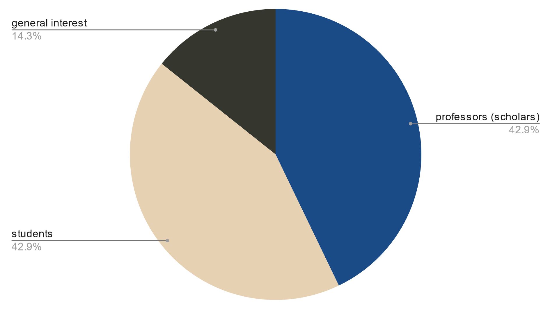
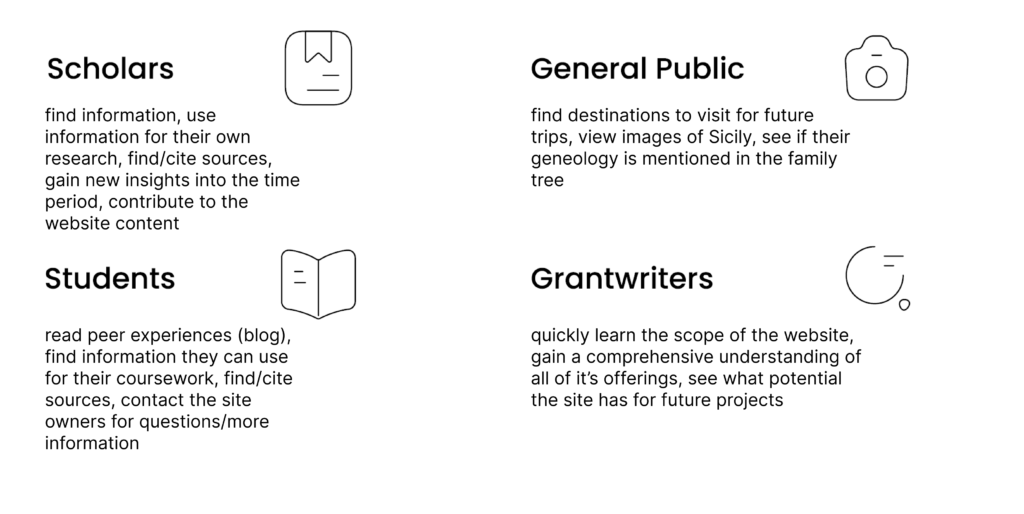
The Norman Sicily Project (NSP) is a website whose mission is to document the cultural heritage of Sicily from c. 1061 – 1194 by identifying and bringing context to all of its monuments. It is still considered to be a prototype for the final version. The site creators, Dawn and Joseph Hayes, have created this site from a driving passion for the subject matter. On it, Dr. Hayes channels her expertise as a Southern Italy and Sicily scholar and Medieval History professor at Montclair university to develop rich content and resources for audiences. As a developer, her husband is key to the functionality of the site, where viewers can download and view data, and interact with it directly through GIS software powered by offsite databases. The site’s most unique offering is in presenting visitors with open access to raw datasets while also providing interpretations and analysis in varying formats. Because of the rich choice of offerings and generally interesting subject matter, each of the site’s key audience segments are expected to have very different goals and expectations during their visit. Key audience are: scholars, students, people with personal interest in Sicily of the Norman period (termed “General Interest” for this study), and grant writers who may navigate to the site with an expectation to gain a quick overview of the site’s structure and mission.
The site creators hired the Pratt Center for Digital Experiences to measure the usability of the website in the face of these different audience segments. Specifically, they wanted to know how to amplify their overall message that NSP was built for scholars, students, and welcomed general public audiences interested in learning more about Norman period Sicily. A great way to find insights to this problem, then, is to conduct moderated usability testing of the site.
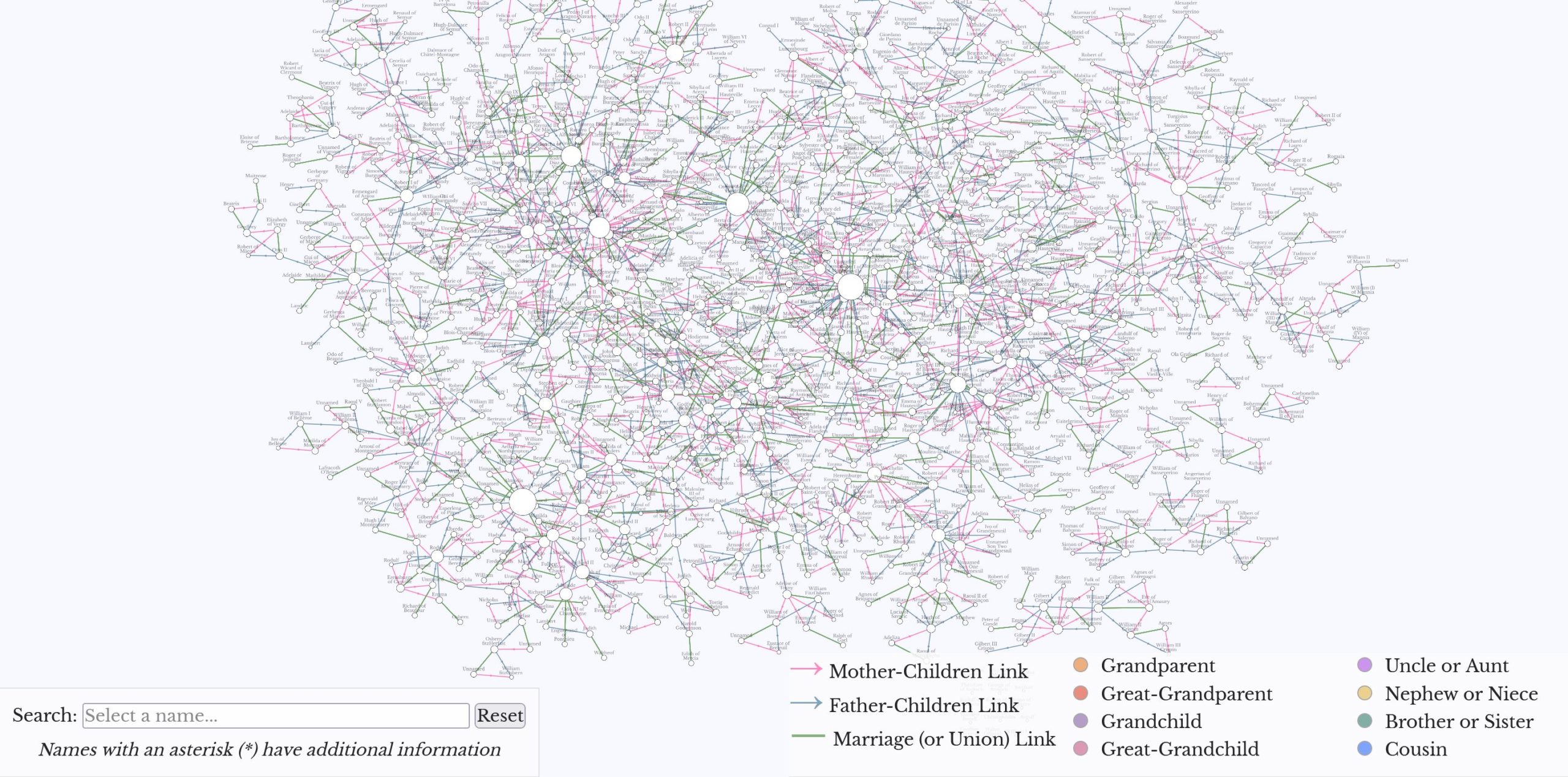
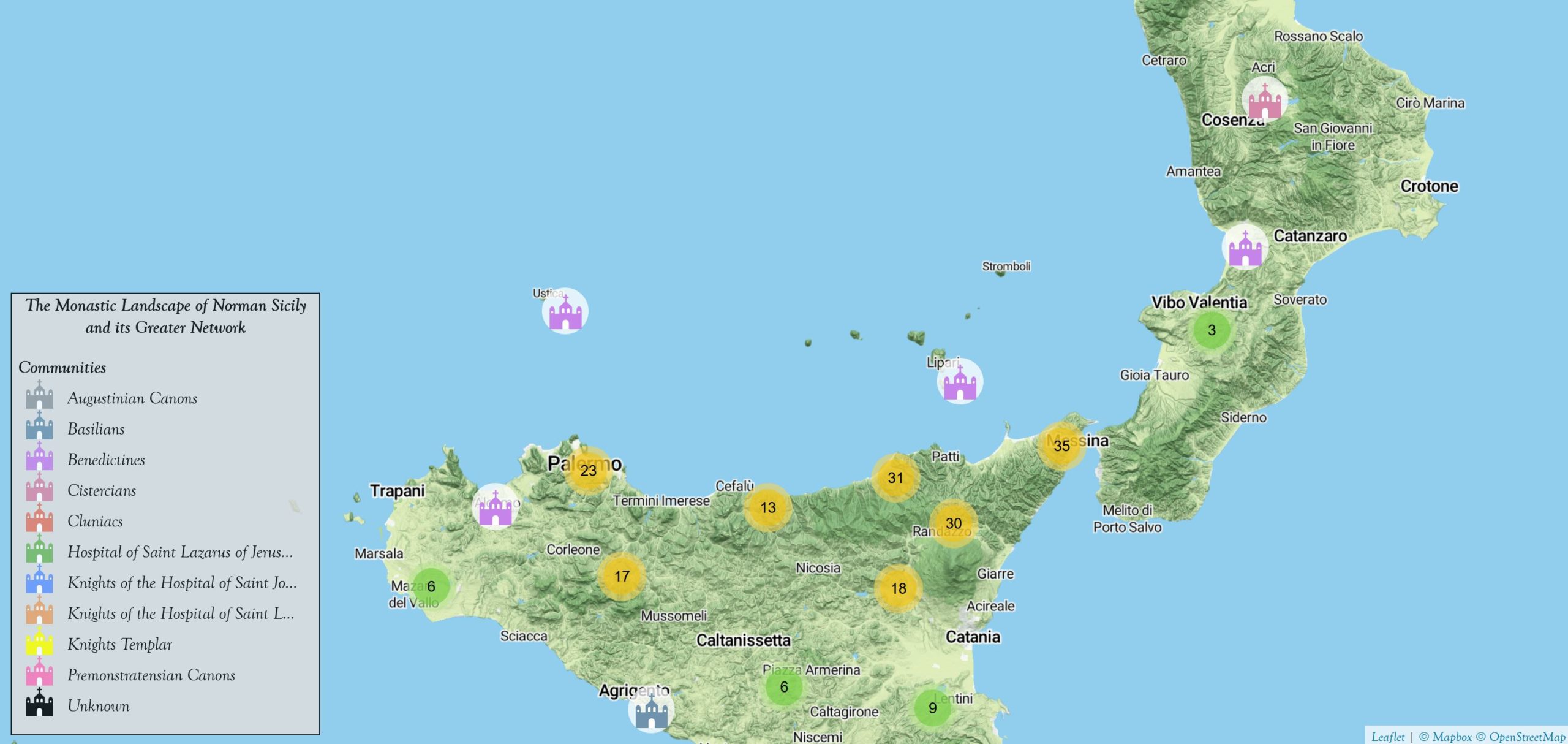
(Top Left): “PEOPLE” – A page that visualizes the data of thousands of people from the period in genealogical format. (Top Right): “PLACES” – A page that features the visualization of the geographical distribution of Norman period monasteries on a map.
Introducing the Team: Van, Nishi, and Aemilia
I was joined on this team by Van Nguyen (MS, Museums and Digital Culture) and Nishighanda Chitale (MS, Information Experience design). We were all very grateful to work with Dawn and Joseph, as felt we felt that our backgrounds in art history and design would bring us closer to this project. Together, we helped each other grow and continually deliver results through every step of this elaborate research project.
Project Background
Objective:
To improve the usability of the site for its target audience members (scholars/professors, students, general public, and grant-writers)
Scope:
Design a moderated test structure & conduct seven moderated remote usability sessions that test the current 1) labels, 2) Homepage, 3) Places page, and 4) Resources page
Time Frame:
- Seven Weeks (November – December 2022)
Outcomes:
- get valuable user feedback from target audiences on their experiences using the site and performing relevant, realistic tasks
- identify and rate (via severity ratings) navigation and feature-related usability issues for key users across the site
- deliver a series of recommendations for usability fixes across relevant pages
- produce mockups of recommendations for client reference
- document methodology, all findings and recommendations and additional notes in a usability report
- present final findings and recommendations quickly in under 15 minutes to the client
Part 1: Preparation
Recruitment of scholars, students, and other contacts
Immediately after meeting the clients for the first time, we were thrilled to kick-off this project. All three of us knew of relevant groups that we wanted to reach out to. I was thrilled for potential opportunity to bring in my past art history contact from undergraduate studies– and indeed a former professor of mine, as well as two other art history scholars / university contacts– joined our final participant group. One of those contacts happens to also specialize in medieval Southern Italian history.
After three weeks of rigorous recruiting efforts, our team had seven participants. The participants each fit into a key user group.
The benefits of planning for a moderated user test vs. unmoderated
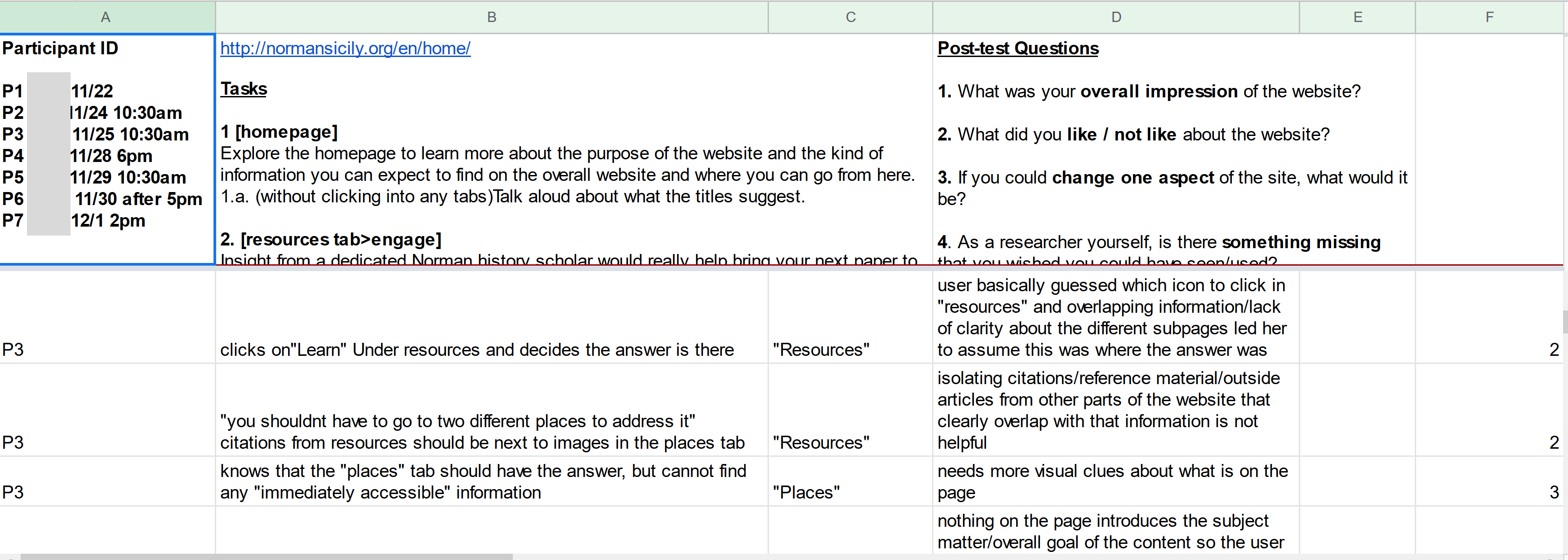
Usability testing is task-based research method. Previous experience has shown that task preparation is critical because this is where we, as UX experts, have the most opportunity to make user insights. In unmoderated tests, the stakes of writing clear tasks are raised ten-fold because if a user does not understand a task, misinterprets it or has any other error, the evaluator is unable to help. It may be a lost test.
However, with moderated tests have the evaluator in the session along with the participant, and can work to prevent or correct set-up errors. Additionally, we chose to adopt a communicative moderator style, so that we could provide verbal feedback to keep participants talking and ask additional questions during the test session.
Strategic task set-up: matching audiences to their most likely goals, those goals to website pages
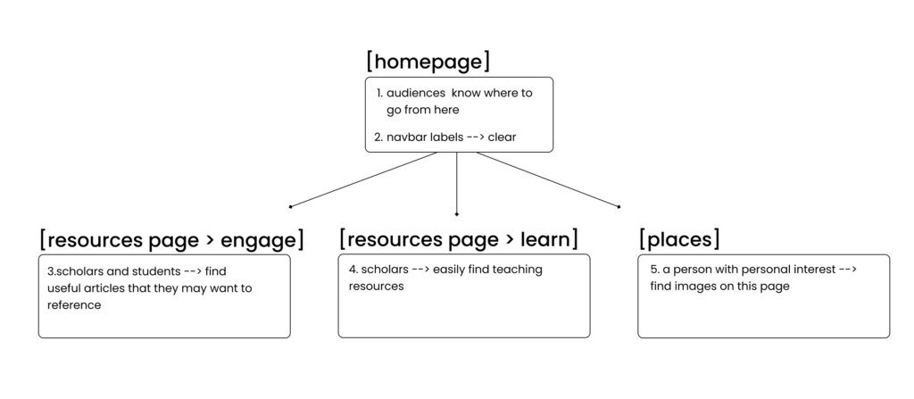
Task set-up revolved around strategically mapping out the most likely goals of target user groups, and where on the website they can currently complete those goals.
Step 1
Identify key goals of target audience segments specific to the sites offerings.
Step 2
Match pages on the website to audience goal completion.
Routine communication with our client helped us make key decisions while preparing the test structure
In addition to task-data, our findings were largely influenced by post-test questions. I have found that these questions, when even as bland as “Please describe your overall satisfaction,” can often yield direct and useful results. Our post-test questions were informed by our best judgement as usbability experts, and also by the client’s goals.
During the preparation stage of the study (the first three weeks), we met with the client every Friday at 3pm. During our second update and check-in call, I asked Dawn and Joseph if there was anything that we didn’t cover during the kick-off call, that they would like to add, regarding their questions of usability. Dawn’s answer gave us our fourth and final post-test question:
- “As a researcher yourself, is there something missing that you wished you could have seen or used?”
This question gave us very specific questions related to audience segments. It made participants stop, and remember their role in the outside world, outside of this controlled testing session. Our other post-test questions were more vague but let to other direct insights:
- “What was your overall impression of the website?”
- “What did you like / not like about the website?”
- “If you could change one aspect of the site, what would it be?”
These three post-test questions showed us how user experience does not always match up with individual usability issues (many reported positive feelings overall toward the site, but were unable to complete all tasks because of severe usability issues). They pointed us in the direction of most severe problems or audiences’ favorite parts of the site.
Part 2: Getting meaningful user insights from remote moderated user testing
This study was conducted remotely, which added a lot of flexibility to our recruitment strategy. Four out of seven participants lived out of the state and would not have been able to join otherwise. Running the tests remotely also allowed us to more easily record the sessions while seeing what the participant was looking at and doing.
We each gained a lot of practice being a good moderator for the tests
Each of us moderated at least two tests. I moderated a third recruit that confirmed her interest in participating after testing had already begun. While not necessarily essential, we deemed think-aloud data a big part of our testing structure and data for recommendations. We found that many participants forgot to think aloud while searching for information. In previous unmoderated testing with usertesting.com, all of my participants were very good at thinking aloud throughout the test. I had not realized the significance of practicing how to encourage them to keep speaking, without sounding judgmental or rude. Questions like “Why did you choose to do that?” are not what you want to ask — but rather “What are you looking at right now?” This was a good lesson to keep in mind.
Each team member was on the calls together (with one exception), as moderator, note-taker, and observer for every session This was invaluable in terms of making it easier to observe trends and patterns emerging across all participants. For this reason, consolidating our problem report into a rainbow spreadsheet was much simpler, as we were familiar with each other’s notes.
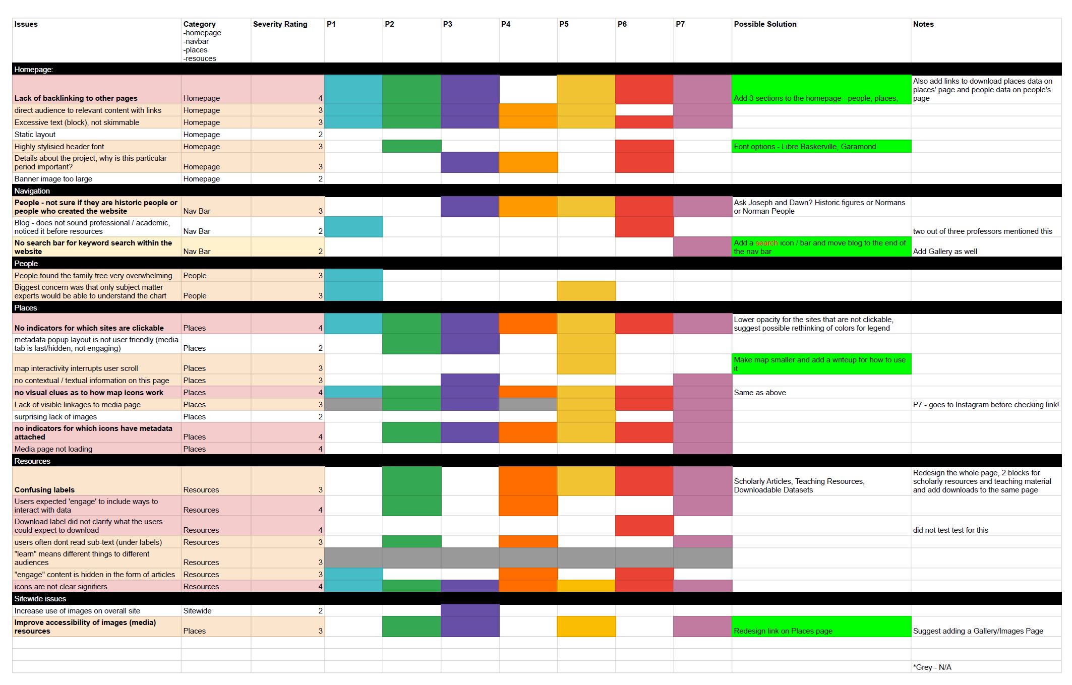
Recommendations based on severity ratings to focus our scope
We used Jacob Nielsen’s severity ratings 0-4 (4 being catastrophically sever and inhibiting the user from task completion) to choose which problems to address in our recommendations. I find that sometimes individual elements like persistence and frequency of problems can outweigh severity ratings when selecting recommendations, if they are great enough. Based on what we observed, however, there were many 4 – catastrophic issues that would need to be addressed.
Main trends observed were that people were having difficulty in finding pages, because of a lack of backlinking or any contextual information provided, or they did not have enough instruction on how to use certain features of the site. We decided that the main categories of our findings would be: 1) overall navigation-related issues, and 2) feature-related issues
As is shown in the above rainbow spreadsheet, quite a few issues were found. For this reason I think it’s clearest if I will structure the presentation of our team’s findings based on our mockups of the site based on our recommendations.
Recommendations per page: our mockups
Homepage
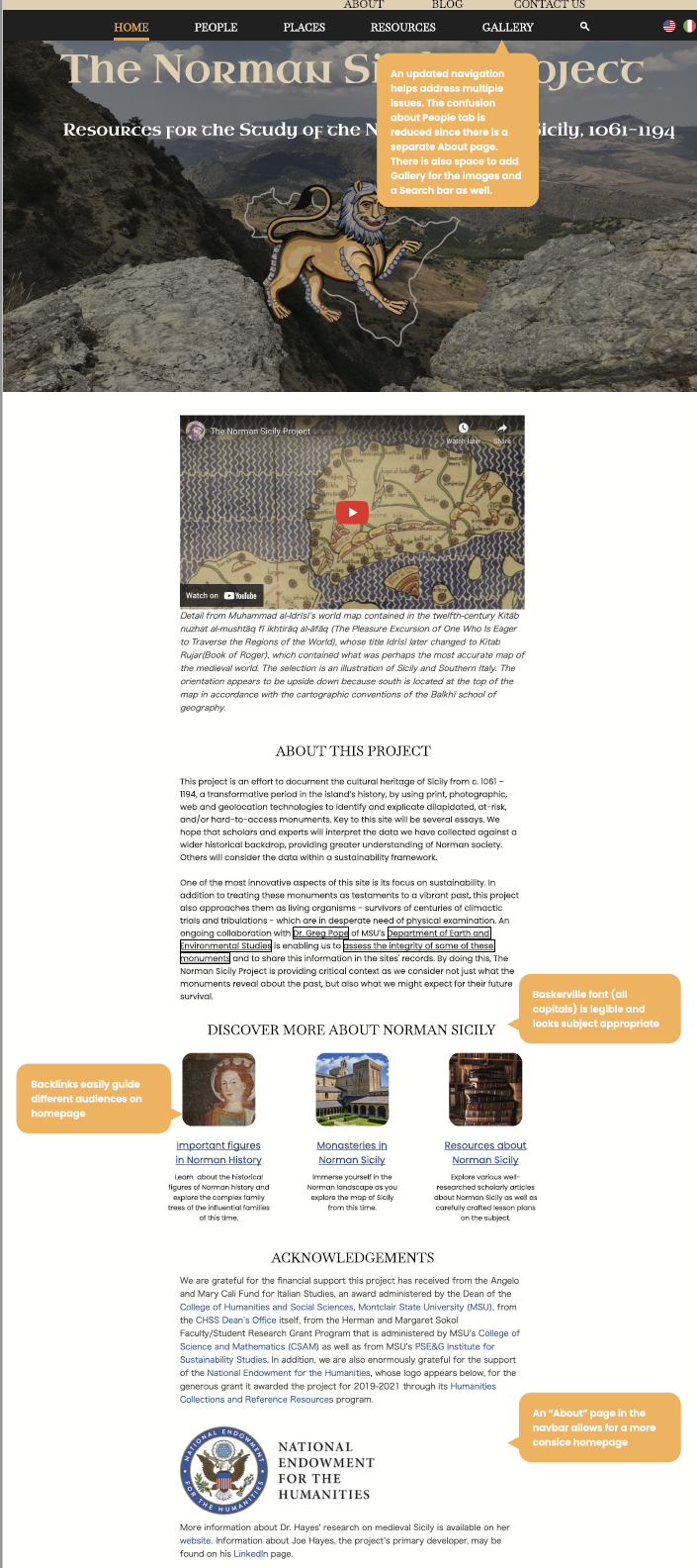
Our Homepage mockup addresses the following observed and reported issues:
- lack of backlinking – Severity: 4
- confusion over navigation terms – Severity: 3
- difficulty accessing image resources – Severity: 3
The new mockup features an new two-tiered navigation bar, which groups like content in two different categories for users to better understand the meaning of page labels. Two out of three professors voiced concern about students mistaking “Blog” content as content that had the same academic rigor as most of the other pages. It also adds clarity to the label “People” by placing “About” with similar site admistrator-facing pages like “Contact Us” and “Blog.”
Places
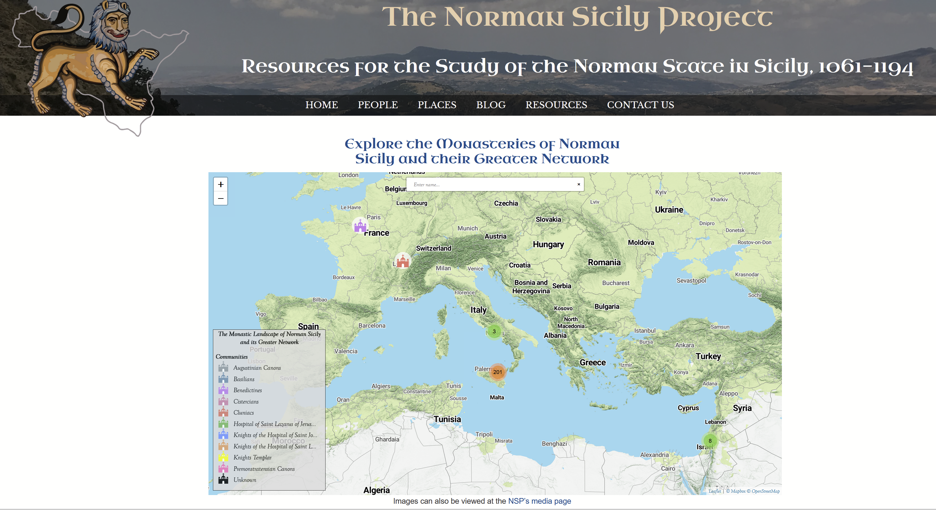
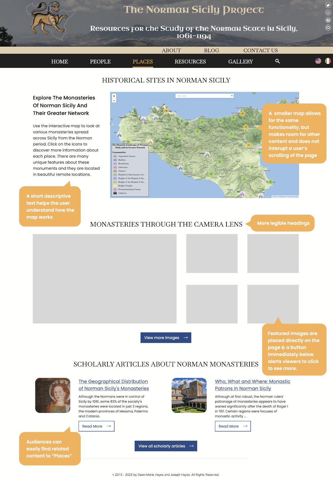
Our Places page mockup addresses the following observed and reported issues:
- Map interactive interrupts user scroll – Severity: 3
- No contextual / textual information on this page – Severity: 3
- No feedback indicators for which icons have metadata attached – Severity: 4
- Lack of visible linkages to media page – Severity: 3
Reducing the size of the map frame, a very small small change, immediately eliminates a major usability error (interactive interrupts scroll) and allows for the contextual information that users asked for on this page to be introduced. All participants sought more information on this page: we observed that all of them navigated to this page first when looking for images of monestaries (because this is a map of monasteries), most of them voiced confusion with how the map worked, and many of them expressed frustration with the fact that other information from the site, like articles written using this data that is only found on the Resources page, is not also linked here.
Resources
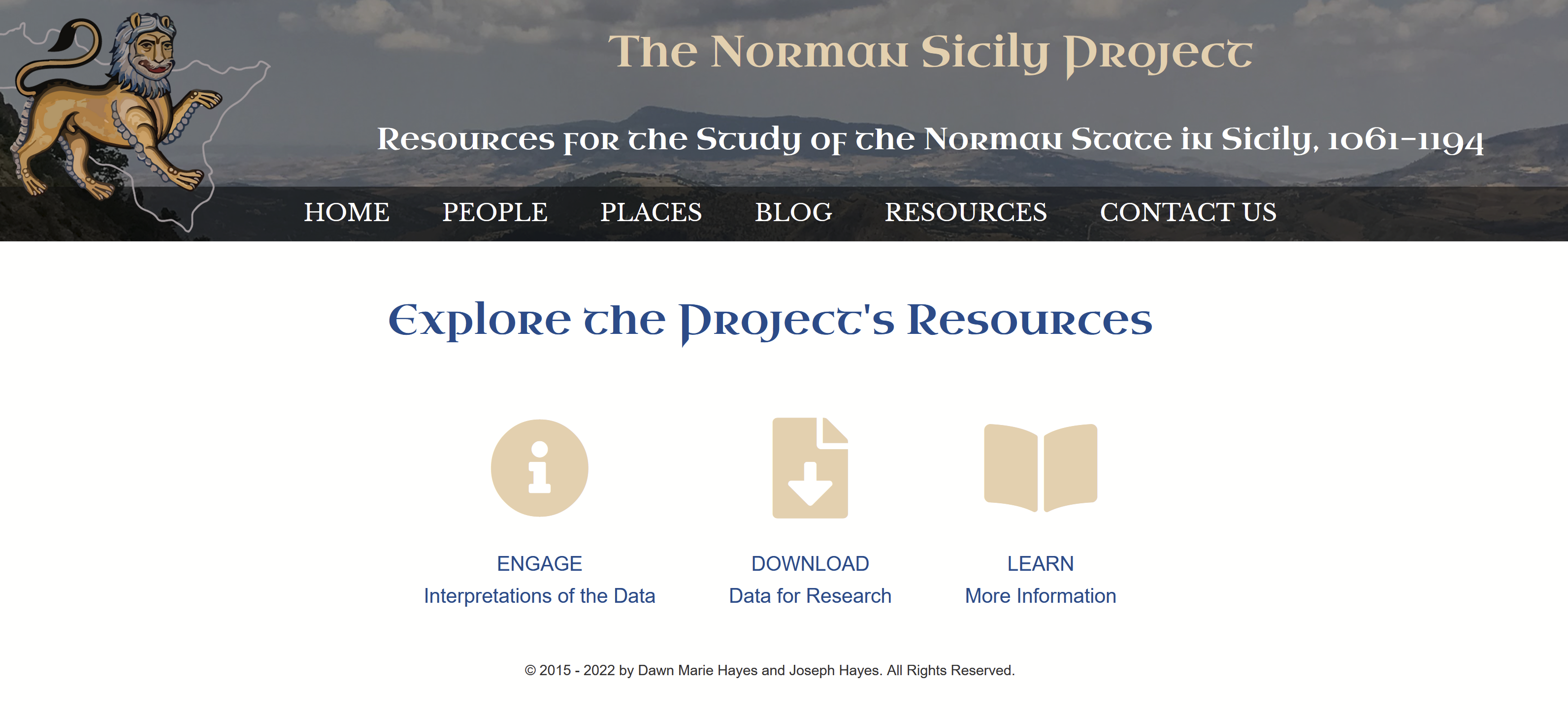
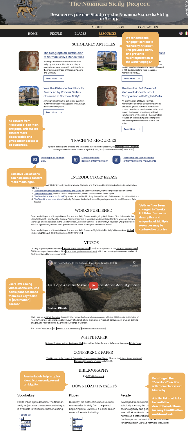
Our Resources page mockup addresses the following observed and reported issues:
- unclear labels and icons – Severity: 4
- “Engage” content is hidden in the form of articles – Severity: 3
The most salient usability issue that would need to be fixed on the site was the confusing landing page in Resources. Every user who navigated to this page visibly and audible became confused. One user repeatedly assured us she was not “lost” and another said the one thing she would change about the site was the Resource page layout. Essentially, we were seeing that the icons and their labels that needed to be clicked into before any content could be previewed, and that such a simple layout could not adequately describe the content it was alluding to. Users had different interpretations of each of the three labels “Engage,” “Download,” and “Learn.” We saw that depending on the background and profession of the user, “Learn” meant two different things to them. I learned from this part of our test that even if the user completes a task correctly, they will be much less confident in their destination if there was trouble navigating to it earlier.
How We Can Make These Recommendations a Reality: Feedback From the Clients
The clients loved the presentation and had many questions. Dawn and Joseph had always been proud of the smart visual design of the site, and for good reason. The pleasing visuals created feelings of satisfaction and promoted curiosity for almost all participants.
Certain recommendations that we initially made, we would like to adjust so that our mockups can better become a reality for NSP. In our redesigned navigation bar, we included a site search option (a search icon), but that would be very difficult to build for this site. Before suggesting search bars for websites, it’s always a good idea to understand the back-end development of the site and where data is stored. For NSP, their large datasets are stored in several different databases offsite. Additionally, right now the amount of information that is housed behind all Resources pages fits nicely onto one page and is very scrolling-friendly. However, when designing a website we should design for the future. Accordion menus may function nicely to collapse greater amounts of content in the future.