Introduction
This project was completed as a part of the Usability Theory and Practices class at Pratt. The aim was to analyse the website of the Norman Sicily project and understand any gaps in the usability of the same. The Norman Sicily Project’s website is currently in a prototype mode and was created jointly by Dawn and Joseph Hayes after their extensive research on the subject. The usability testing was completed as a group of three members who are currently graduate students at Pratt. We used the remote moderated usability testing method for the analysis of the website. Recommendations in the form of design mock-ups were given to the client at the end of the project for improving the user experience of the website.
Client Kick-off meeting – establishing goals
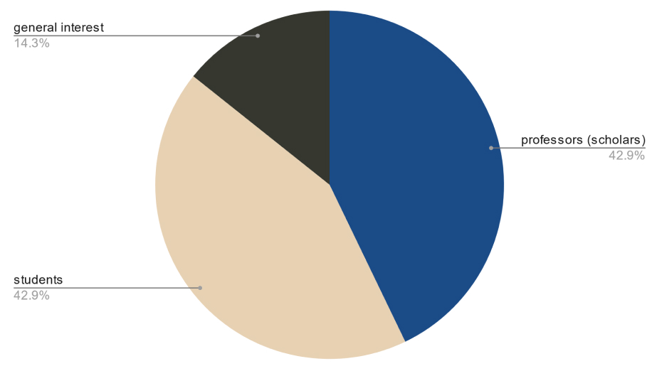
In the initial meetings with the client, our aim as a group was to understand the though behind the creation of the website as well as the potential target audience of it. Through our discussion with Dawn and Joseph, we understood that the Norman Sicily website is the conclusion of a research project and is primarily academic in nature. However, they wanted their website to be used by different groups of people that included but were not limited to scholars, academics, grant-writers, tourists visiting Sicily and people generally interested in the history of that region.
We established the primary goal for the project was to ‘Improve the usability of the website for easy navigation and seamless access to different types of information.”
Methodology – Remote Moderated Usability Tests
We decided to use Moderated Remote Usability test for analysing the website and understanding gaps in the experience. This method was chosen since it is considered “the gold standard” of usability testing methods (MacDonald, 2022) as it gives direct feedback from real users. Ideally, these users should match the most relevant audience type to the specific interface. It is a task-based method that requires a team of experts (often three people) who guide, take notes, and observe participants while they perform a series of tasks on an interface. Traditionally, this type of testing is done in-person, though today video conferencing software is making remote moderated usability testing increasingly possible and desirable.
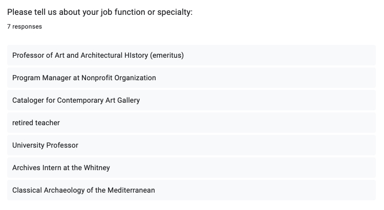
To recruit participants that closely matched our target audience, we created a screening questionnaire and shared it across different listservs at Pratt. One of the team members also leveraged her personal contacts to recruit professors from University of Rhode Island. We recruited a total of 7 participants for the study. Participant details were:
Preparing for the usability tests
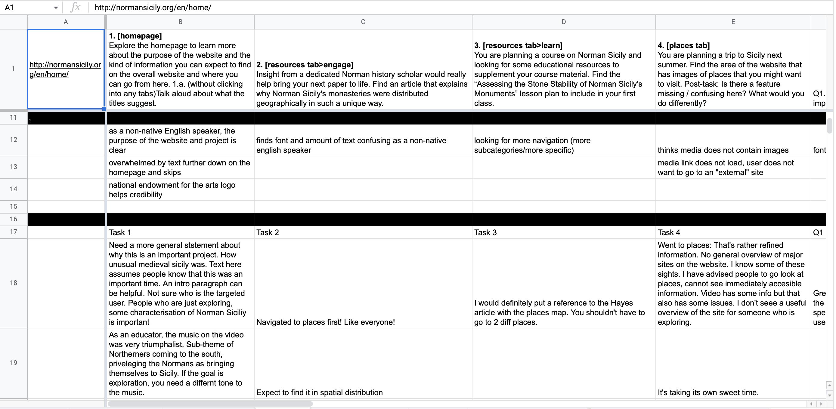
While we recruited our participants, we also created a set of tasks for the users that would closely align to the goals of the project and would help users get a sense of the overall website as well. The tasks included exploring the homepage, finding a specific article and a lesson plan and finding images on the website. Users were expected to complete each task in 3-4 mins and they could abandon it at any point if they were feeling stuck or frustrated. We also crafted a set of post-study questions to understand their impressions of the website and get some overall feedback. The post study questions were:
- What was your overall impression of the website?
- What did you like / not like about the website?
- If you could change one aspect of the site, what would it be?
- As a researcher yourself, is there something missing that you wished you could have seen/used?
Test Moderation and note-taking
As a group, we aimed to complete two moderations each and complement the moderator as a note-taker in the other tests. During the tests, I encouraged participants to talk through their processes and helped guide them when they were about to give up on a particular. This was done with the intention to understand ‘why’ the participant was struggling and what it is that they were looking for.

Analysis of collected data
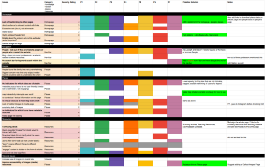
As a team, we went through the detailed notes for each test that were taken and then consolidated them into a rainbow sheet The spreadsheet allowed us to see how many participants experienced each problem. It also helped us gauge how prominent a usability issue was by the frequency of how many participants experienced it in a quantifiable way to ensure objectivity.
We then applied severity ratings to each problem that we observed on the site to help prioritize our recommendations. Our severity scale comes from Jakob Nielsen of the Nielsen Norman Group. It scales from 0 (no problem) to 4 (catastrophic) and depends on three criteria:
● The frequency with which the problem occurs: Is it common or rare?
● The impact of the problem if it occurs: Will it be easy or difficult for the users to overcome?
● The persistence of the problem: Is it a one-time problem that users can overcome once they know about it or will users repeatedly be bothered by the problem? (Nielsen 1994)
Findings and Recommendations (Design Mockups)
Overall, the participants really liked the website experience. They particularly liked the Homepage graphics and also liked the clean layouts and well-researched content. There were particular instances from the tasks where most of the participants struggled or were confused and these were the issues that we seek to address.
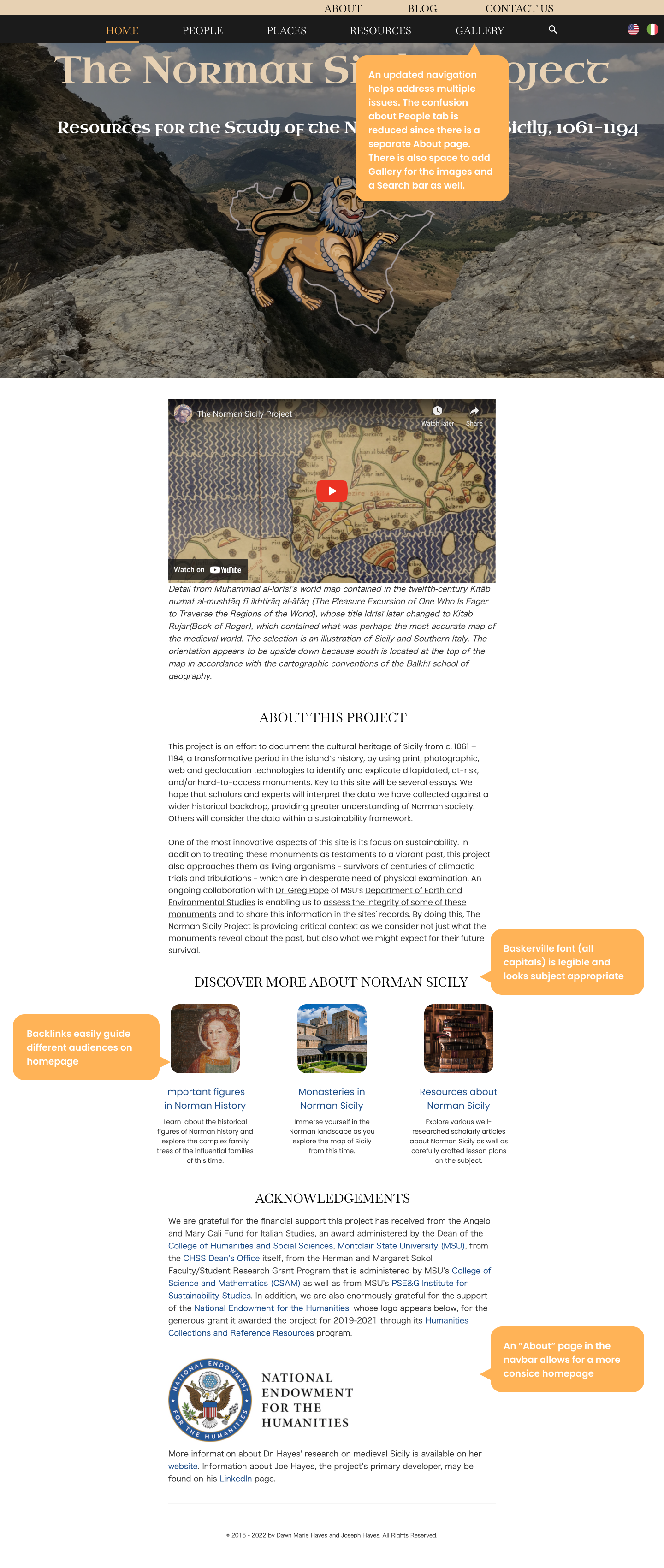
Overall Navigation & Homepage Problems:
- Confusion over navigation terms (eg. “People” navigation tab would lead them to people who worked on the project or key historical figures in Norman Sicily) (Severity: 3)
- Lack of search bar. (Severity: 3)
- Difficulty accessing image resources. (Severity: 3)
- Lack of backlinking between different pages.(Severity: 3)
- Non-skimmable text blocks.(Severity: 3)
Homepage Mockup with Recommendations:
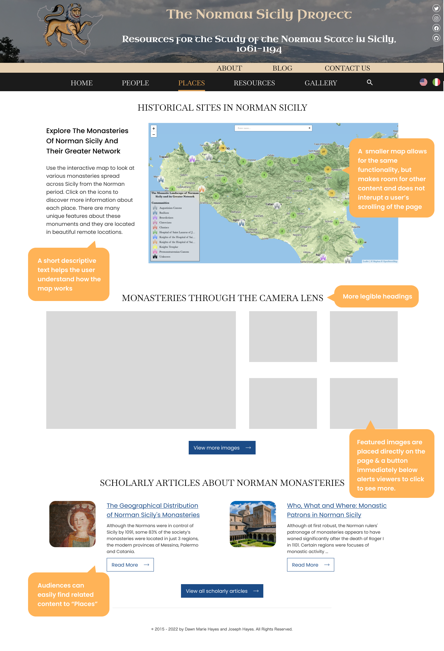
Places page issues
- Map interactivity interrupts user scroll. (Severity: 3)
- No contextual / textual information on this page. (Severity: 3)
- No feedback indicators for which icons have metadata attached. (Severity: 4)
- Lack of visible linkages to media page. (Severity: 3)
Places Page Mockup with Recommendations
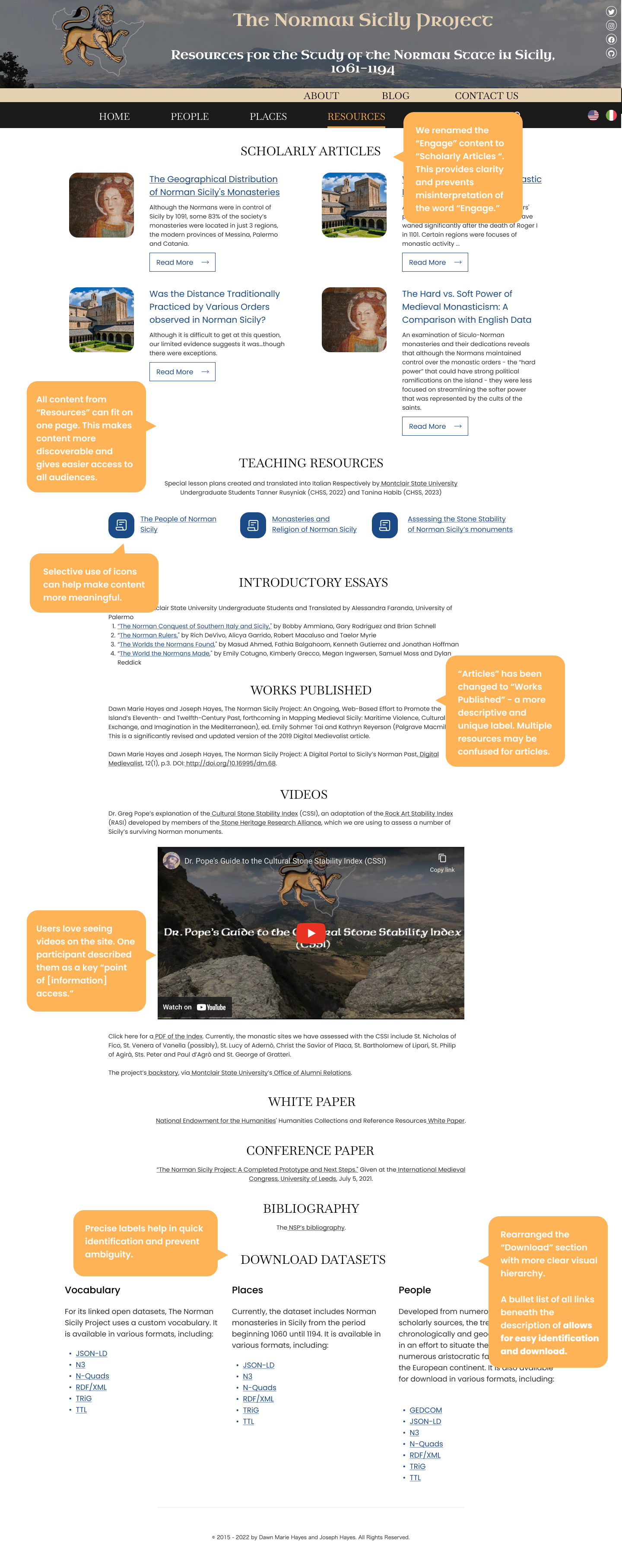
Resources page issues
- Unclear labels and icons (Severity: 3)
Resources Page Mockup with Recommendations
Retrospective
Personally, I really enjoyed working with Dawn and Joseph as well as my group members. Going through the entire process taught me a lot about collaboration, communication as well as the power of effective work management. Moderating the user tests was a great learning experience and it was helpful to see users discover the paths to complete the tasks in unique ways. It goes on to underline the fact that everyone has a different way of experiencing websites and there is always more than one solution to a given task.
Given more time, we would have liked to add more details to our mock-ups as well as rethink some of the overall design decisions to make the website more modern and engaging. It would also have been good to schedule some of the tests in person for better observation and control of the test. However, I believe the current recommendations will help the Norman Sicily Project to significantly improve its user experience and we sincerely hope to see some of the changes implemented in the near future!