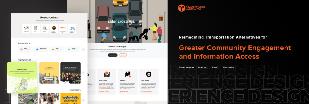
Transportation Alternatives (TA) is a non-profit organization based in New York City that works to change and improve NYC’s transportation priorities by encouraging and increasing non-polluting, quiet, city-friendly travel and decreasing automobile usage. The website serves as both an informational hub about the organization, as well as a means for supporting and donating to TA. In order to help Transportation Alternatives provide a more seamless user experience to its members, volunteers, and all NYC residents this project focuses on improving users’ ability to navigate the website more easily and find appropriate pages when they seek information about making donations, doing research, and finding information about data, and/or policies.
UXR Research + Analytics
Research Goals and Methods
Research Goals
- Encourage people to get involved as supporters, volunteers, and activists
- Increase user engagement/awareness of TA goals and get the existing target audience more involved. Expand target audience.
- Improve the Information Architecture and overall usability of the TA site
Methods
- Background research on organization and mission
1. A client meeting is facilitated to identify stakeholders’ goals and agenda.
2. The website analysis provided by the client helps gain an understanding of existing user behavior on a large scale.
3. An ecosystem map is generated to capture critical roles influencing the user, organization, and service environment.
- User Research
Six user interviews and remote moderated usability testing are conducted to gather users’ stories, motivations, and issues they meet while interacting with the TA website.
- Data Analysis
The technical analysis is created to evaluate current websites’ IA, contents, Visual Design & Interaction design.
Key Insights
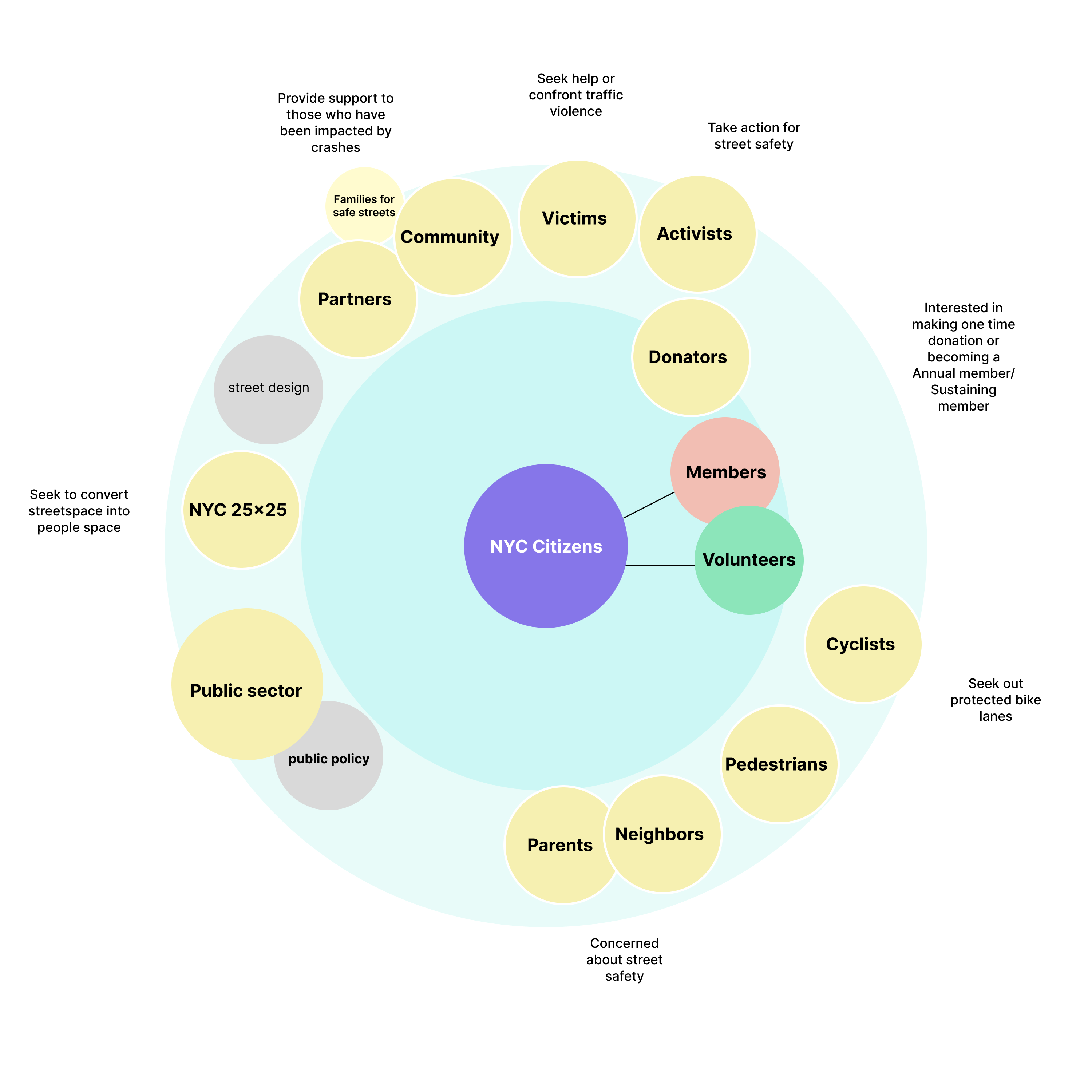
Ecosystem map
Since TA advocates for better walking, biking, and public transit in NYC, all New Yorkers are potentially involved in giving and receiving value in the loops. The primary participants are volunteers, members, and donators interested in making a one-time donation or becoming Annual members/Sustaining members. Other relationships and flows include pedestrians and neighbors concerned about street safety, cyclists seeking out protected bike lanes, activists taking action for street safety, victims seeking help or confronting traffic violence, etc.
Technical Analysis
The technical analysis is created to evaluate current websites’ Information architecture, contents, Visual Design & Interaction design. We reviewed each top-level navigation page and their associated sub-navigational pages to get a comprehensive insight into the existing Transportation Alternatives web presence.
- Information Architecture
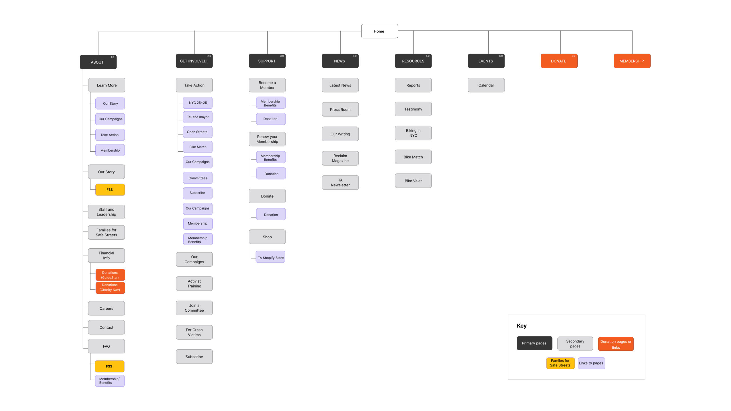
- Content
- Visual Design & Interaction
Interviews & Usability Testing
- We conducted Moderated Interviews and Usability Testing with 6 volunteers over Zoom to gain key insights into how users navigate through the TA site.
- 4 volunteers were recruited with the help of Jacob DeCastro at TA.
- 2 participants were recruited via our personal networks, choosing participants who had some baseline familiarity with TA.
- Based on our six usability tests, we identified the following key issues :
- The majority of participants found it difficult to describe the difference between donating and becoming a member based on the website information.
- TA’s homepage message does not clearly convey what they are, what they offer, or what the mission is.
- The process of joining a particular committee can be challenging and is not straightforward.
- There is a lack of regular updates to the event/news content, which may result in a loss of traffic or losing the trust of users.
Defined Analytics
Project Goals
Analyze users’ behavior and their flow as they access the Donations, Membership, and Get Involved pages and identify where they fall off.
- Get Involved Borough-Specific Pages:
- How often do people land on these pages?
- What links do they click on? (meetings, campaigns, etc.) Are they a) getting to information relevant to them before acting on it?
- Time spent on page and bounce rate of the homepage, About, and other informational pages.
- Can we identify informational pages and track user journeys throughout these?
Specific Workflows
- Donations/Memberships:
- How often do people follow through with a donation or membership?
- If/when they fail, at what point does that happen?
- Volunteer sign-up:
- What is the process for becoming a volunteer, taking action, or joining a committee?
Concept
Given the organization’s stated goals, our own analysis, and the information we have analyzed from our research, we have a strategy that falls into four distinct categories of improvement. Our main intention is to improve the way the TA website functions as an informational resource for new users, as a hub for existing and prospective members, and as a pathway for donations and memberships.
- The four categories of improvement for our strategy are as follows:
- Consolidate and Better Define the Donation and Membership Flow
- Clarify Information and Definitions for New Users
- Improve Access to and Functionality of Borough-Specific Pages
- Manage Events and Highlight Other Channels
Information Architecture + Content
Prioritize information accessibility across all pages. Be direct with the information people are expecting on a page. Create new sub headers and apply them throughout the pages for a consistent organizational structure. Group/chunk relevant information and provide clear pathways to interaction.
Visual and Interaction Design
Refine usage of images – reduce the number of “fluff” banner images. Focus on images that provide context alongside information and create icons that create “cards” of information.
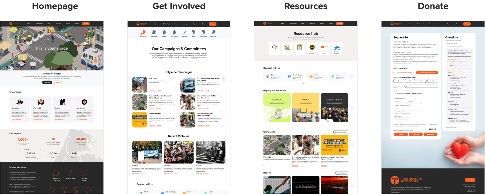
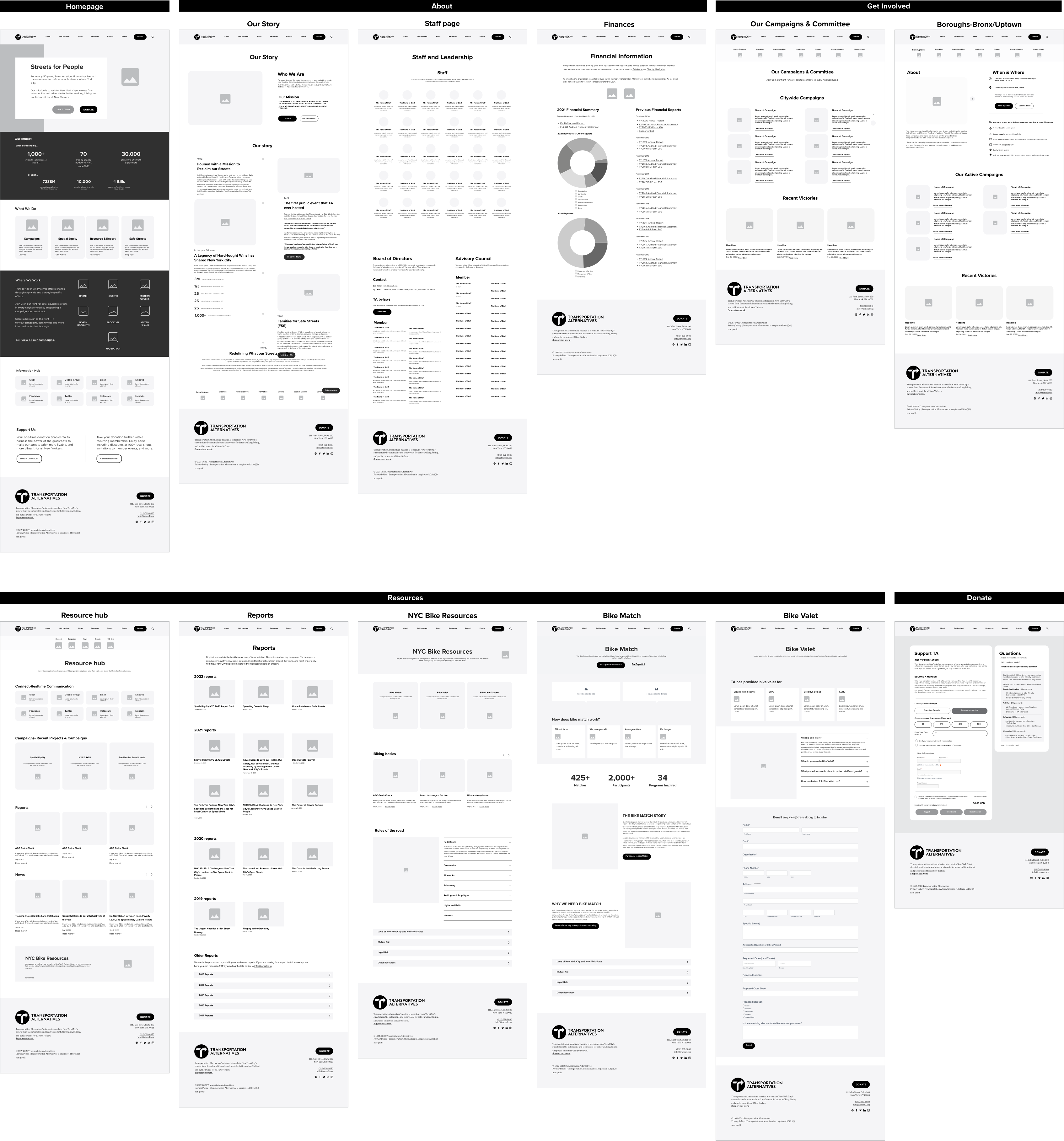
Redesign of Transportation Alternatives’ website
Information architecture
- Consolidated Categories
To make it easier for users to find key information. Key areas: resources, news, about - Added Borough specific navigation
During our user testing we learned that users want an easier way to locate information about their own borough - Created Resource Hub
to ensure there is an easy way to find key information for users - Removed membership & search from top level
Consolidate membership and donation forms; Search did not work
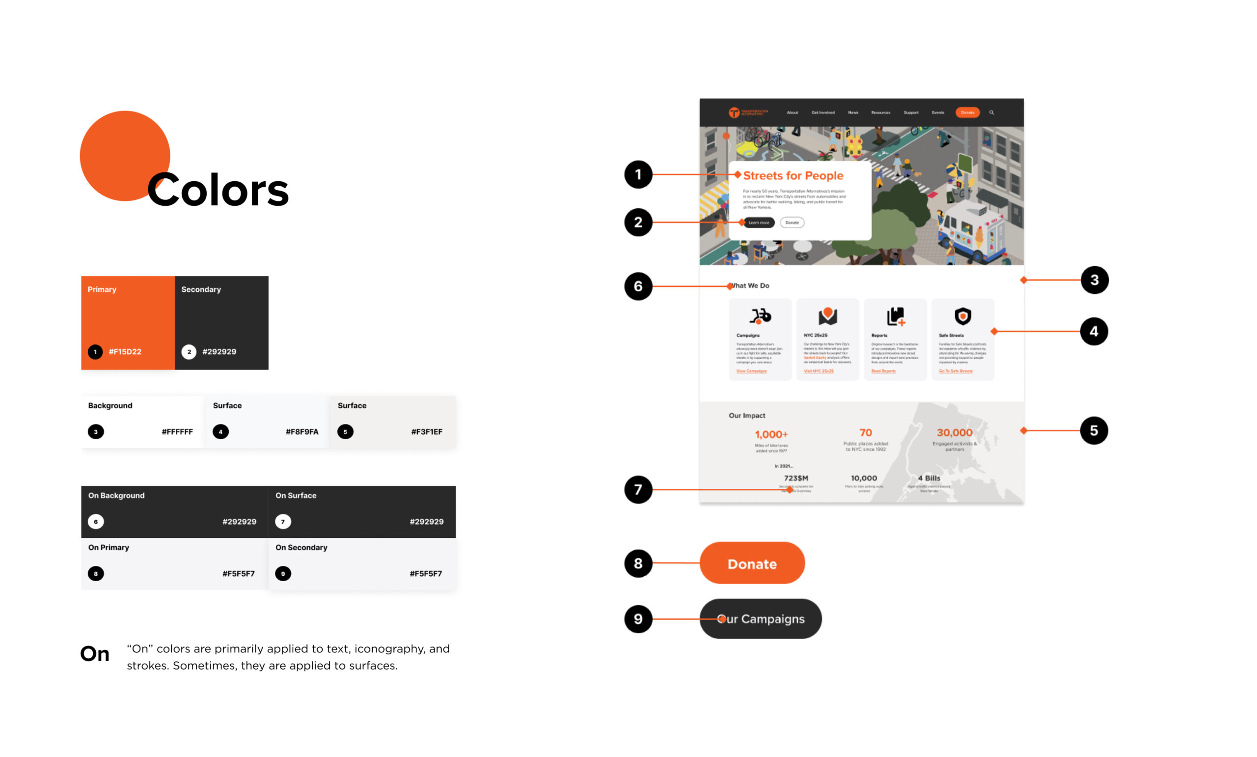
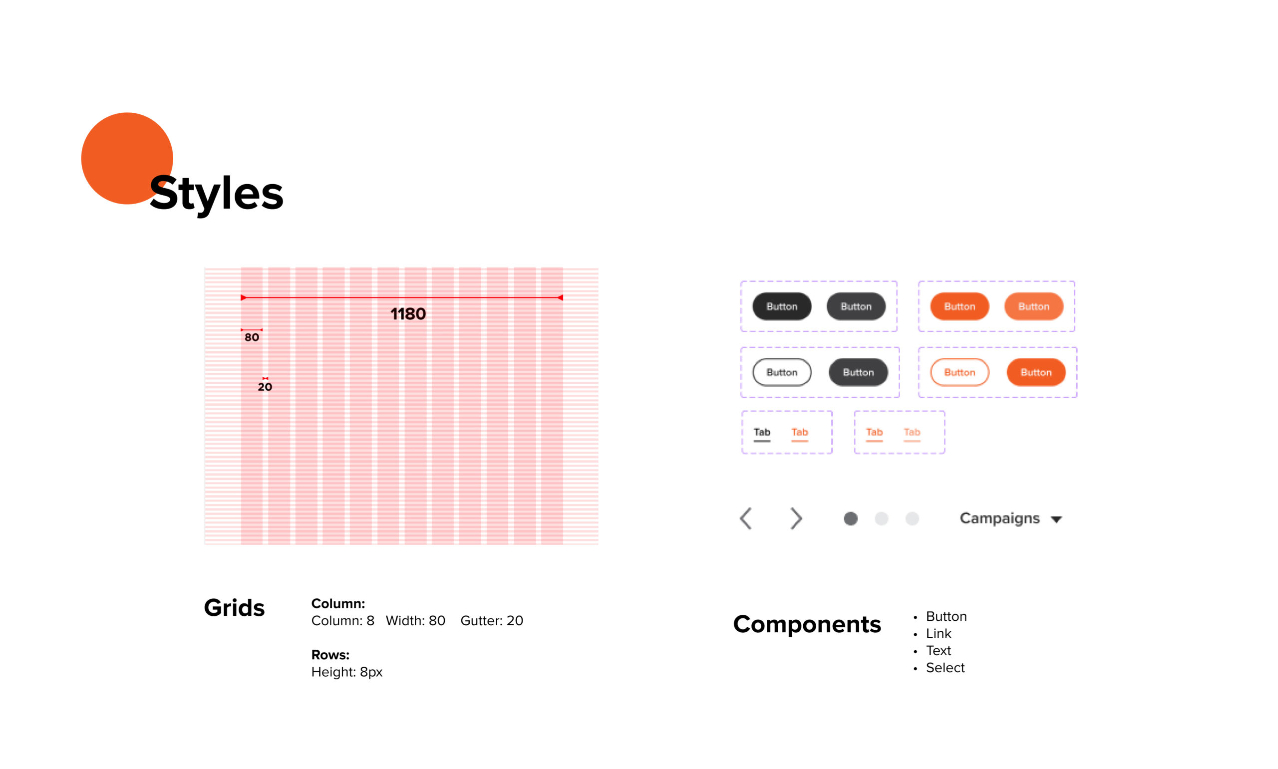
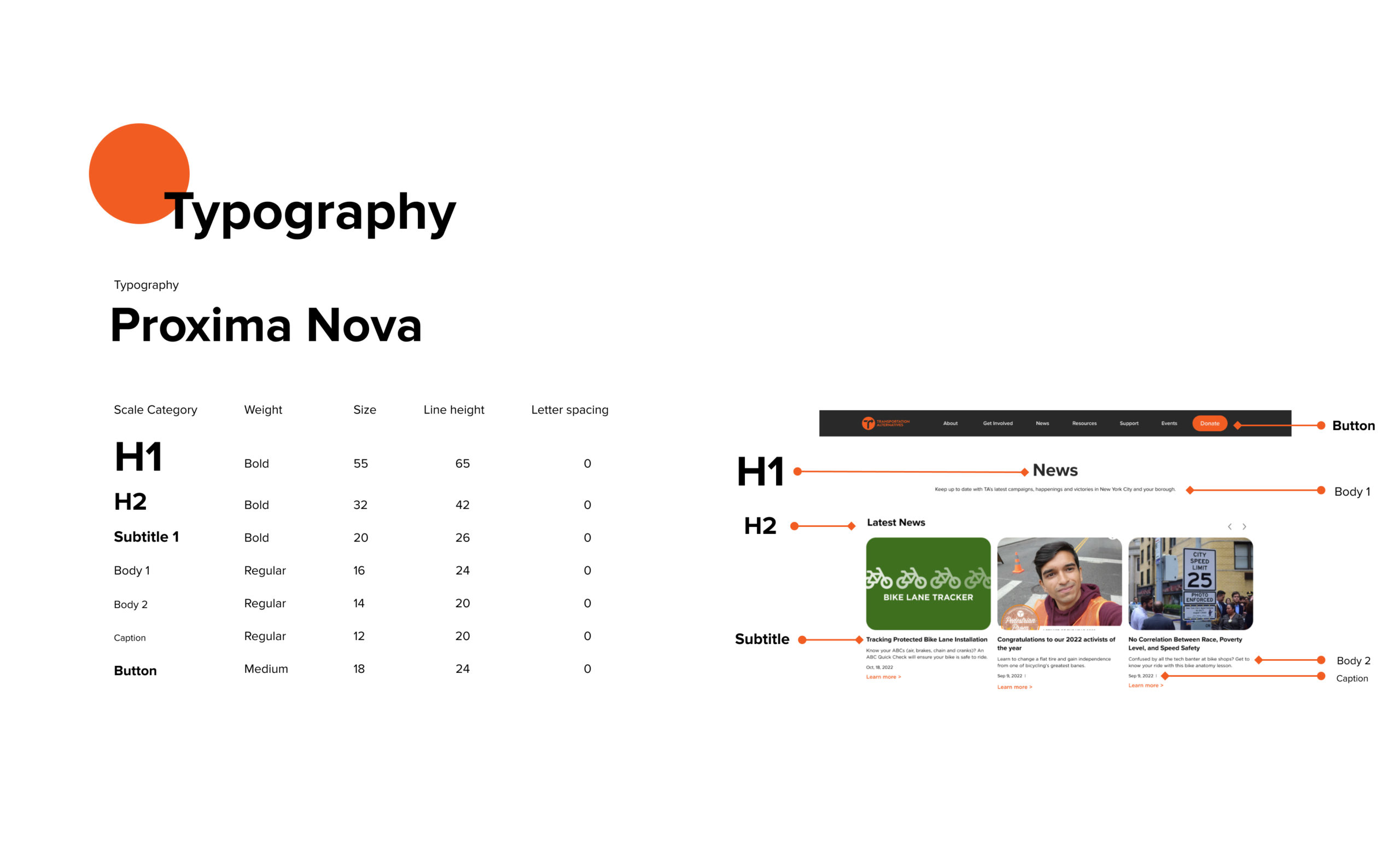
Design system
The design system has been consolidated based on constraints and limitations of the Squarespace Impact template.
Wireframes
Prototype
- Key workflows