A remote moderated user testing case study with the Pratt Center for Digital Experiences and INFO644, Usability Theory & Practice.
Cultural Legacy at the New York Philharmonic Digital Archives
The New York Philharmonic’s history spans over 180 years and their Shelby White & Leon Levy Digital Archives includes a catalog of over 6 million pages of material covering this historical and cultural legacy (New York Philharmonic Digital Archives, n.d.). The Digital Archives recently received a grant from the National Endowment for the Humanities to optimize their digital catalog and website to better serve a broad audience – from researchers to music students to genealogists and casual explorers of the site. As part of this project, they applied to partner with the Pratt Institute Center for Digital Experiences to improve the discoverability and accessibility of their archival materials. Our team of four UX consultants self-selected into a team that would work with them to accomplish that goal through a series of moderated user tests and a corresponding usability report with recommendations.
Strategizing with the Client to Study & Improve User Experience
At the kickoff meeting, our team asked exploratory questions to get to know the Digital Archives’ mission, target audience, and usability questions and concerns, then set out to co-create the usability study’s scope with our client. He took us through an overview of the site’s history and two reasons for a redesign: optimizing usability and accessibility for potential and existing users. We learned that existing users are likely to be a combination of a) researchers regularly performing investigative searches, and b) non-scholarly users performing casual research — for instance, seeking records on a relative, a specific performance they attended, or a piece of music they enjoy.
Our guiding strategic goals became twofold:
1) Improve the exploratory experience for new users landing on the site
2) Evaluate & improve the experience for researchers seeking out specific archival information
Recruiting Target Users: “Amateurs,” “Explorers,” & “Professors”
Following our meeting, we identified these three target user groups:
- Amateurs: Students and other first time visitors to the digital archives site. Highly familiar with the internet and search tools. Maybe looking for a specific resource, e.g. a piece of music or photograph of a relative.
- Explorers: Young professionals with some exposure to the New York Philharmonic. Exploring what the archives have to offer.
- Professors: Researchers highly familiar with online archives and the Digital Archives site. Seeking deep dive research into a subject or person.
We aimed for six to eight users total, with two from each group, especially targeting at least two from the Amateurs and Professors groups to reach both the “new user” and “expert/researcher” audience. We launched a Google Form to collect users interested in participating, as well as to determine what, if any, user group they fit into. Our team circulated the form on both the Pratt listserv and, through our client, with visiting student groups and other internal NY Phil representatives.
Recognizing early on that scheduling a slew of users via email could become hectic, I created a new scheduling system through Google Appointments to attempt to streamline user test logistics. To do this effectively, first our team shared with each other our hourly availability. From there, I created a Google sheet displaying the times over the following two weeks that would include two moderators for each time (one leading and the other note-taking). I then created a Google appointment calendar for the potential participants to schedule their preferred time for a user test session, as well as initial and follow-up scheduling emails that contained everything that moderators and participants would need to know in advance of user test sessions. From there, my teammates compiled everything into a recruitment guide shared doc for everyone to use, and we split off to tackle moderating at least two user test sessions each.
Structuring Team Roles & Responsibilities on a Tight Timeline
I was lucky to be paired with three like-minded and hardworking teammates and co-consultants in Tess, Tk, and Sayali, all fellow Pratt School of Information graduate students. While we came from a range of different programs and career backgrounds, we all worked together early on to divide up responsibilities equally and create informal systems for reviewing each other’s work. Our strengths from the beginning lay in our ability to look at the full scope of what we need to accomplish, then divide up tasks between different team leads. For example, with recruitment and client management, I sent initial recruitment emails with consent information to potential participants, set up the scheduling system for the team, and stayed in email contact with our client at the Digital Archives. My teammates drafted the script and the many other required documents for user testing, then we split off to use all of these on our own as moderator leads and note-takers in the tests. Once it came time to write the report, we all put our notes into a consolidated Google sheet, then met together to hone in on and discuss the major findings. Finally, we divided up sections of the report to lead drafting certain sections, leaving extra time before each deadline for everyone to review and comment on each other’s writing. While drafting the report, in addition to drafting one recommendation, I wrote up the methodology and parts of the appendix, with my other teammates dividing up remaining sections equally.
Matching User Test Methodology to End Goals
A remote moderated user testing approach matched our project scope and goals well: it allowed us to obtain substantive results with relatively few users (at least five), to easily screen and voice record the tests over Zoom, and to cast a wide net for participants during recruitment, regardless of their location. It also allowed us greater flexibility in scheduling for both users and ourselves. The moderated user testing process involved two representatives from the team, with one facilitating the test and the other note-taking, together leading users through a series of tasks focused on the big user goals as identified with our client. See below for full task list with user goals.
We conducted a total of ten remote moderated user tests (surpassing our goal!) on Zoom in just under two weeks. The usability study included a diverse set of participants, ranging from those with expertise with the Digital Archives to users with little to no familiarity with the Philharmonic or its archives. Seven were “Amateurs” or “Explorers,” while three were “Professors.”
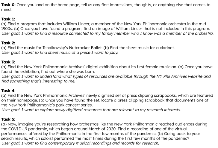
Tasks:
After the tasks ended, participants took a brief System Usability Scale (SUS) survey, then answered one emotion-focused question to gauge their overall experience. Then, once all tests wrapped up, the team came together to compile and synthesize findings via the Rainbow Sheet method, prioritize the findings by severity, and create a handful of actionable recommendations addressing the major issues this list revealed.
Complimentary First Impressions, Challenges with Finding Information
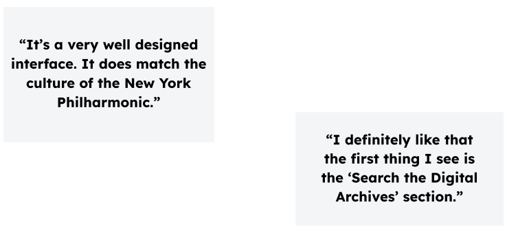
Overall, first impressions of the Digital Archive were positive. Users appreciated the clear Search feature on the homepage, the welcoming feel of the page in comparison to other archives sites, and the variety of types of resources made available to them. Several also noted how interesting it was to see the markups included on digitized documents.
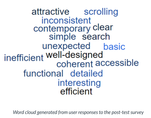
We also asked users at the end of their tests for some qualitative feedback to describe their experience. As can be seen reflected in this word cloud, it was mixed. Users identified an average of 8.4 problems each across the home page, search results page, and other areas. Words they used to describe their experience ranged from more neutral (coherent, contemporary) to positive (attractive) to negative (inefficient).
We also asked users to complete a brief quantitative System Usability Scale (SUS) survey for the NY Phil to use as a benchmark for testing against any improvements they made to the site, based on our feedback. The site received a below-average score of 60.3, leaving it with a just an “OK” measure of usability. Those detailed results, and how to use them, were discussed in more detail both with the client and in our full report (see link at the end of this post).
Recommended Redesigns for Home & Search
We identified five general areas for improvement, but essentially four major recommendations across both the home page and the search results page. All recommendations focused on improving site usability through accessibility updates, layout tweaks, consolidating features and more. The 5th recommendation included miscellaneous additional findings and areas for further investigation.
- Improve navigation usability and accessibility by updating styling, spacing, and text.
- Update style and navigation elements on the carousel to make it more intuitive and accessible.
- Streamline search results page with consolidated sort and filter options and highlighted search results.
- Move pop-up modal underneath each filter and introduce a search bar for the filter options when opened.
- Minor findings and recommendations
Home Page:
On the home page, several users experienced issues using the main navigation bar and the carousel. One user echoed the experience of several: “It’s luck to see what the page loads on the carousel and if it wouldn’t have showed up [via the automatic timing that flips through the banners], I wouldn’t have known that it was there.”
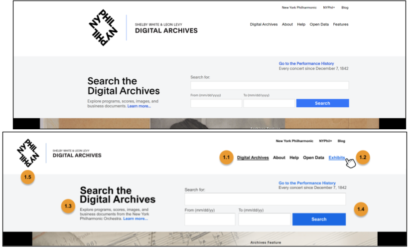
Recommendation 1: Improve navigation usability and accessibility by updating styling, spacing, and text. This included reducing logo size and white space, changing “Features” to “Exhibits,” and adding styling to the navigation elements to indicate the current page to the user.
Top: Before
Bottom: After (With recommendations implemented)
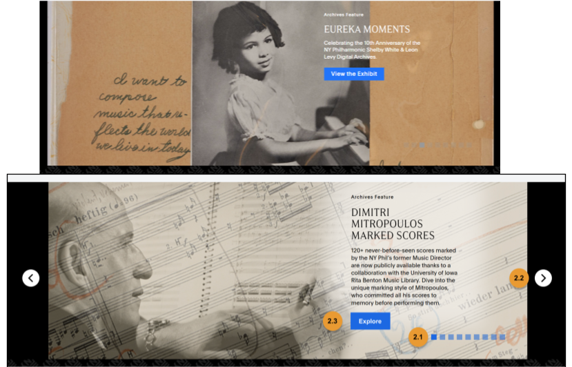
Recommendation 2: Update style and navigation elements on the carousel to make it more intuitive and accessible. Includes changing the navigation and Explore button colors and un-hiding navigation arrows.
Top: Before (Current carousel image)
Bottom: After (With recommendations implemented)
Search Results Page:
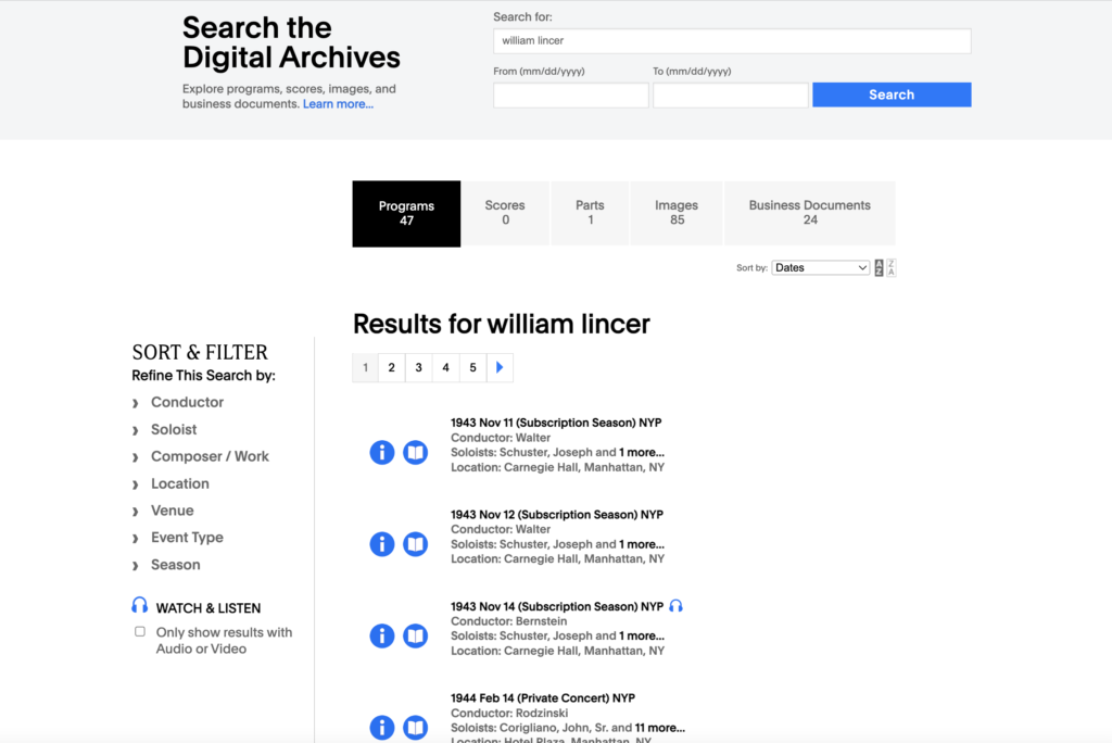
As users tried to find and narrow their search results through various filters, they got stuck in different areas of the results page, either due to missing or inconsistent content or a lack of direction with how to navigate the many different filtering options.
Right: Before (Current search results page)
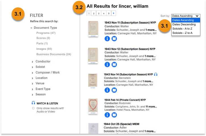
Recommendation 3: Streamline search results page with consolidated sort and filter options. This includes renaming the lefthand section to “Filter,” consolidating the top navigation filters into the lefthand section, consolidating and enlarging the “Sort by” options, and displaying search results with thumbnails in a layout consistent to all other resource type listings.
Left: After (With recommendations implemented)
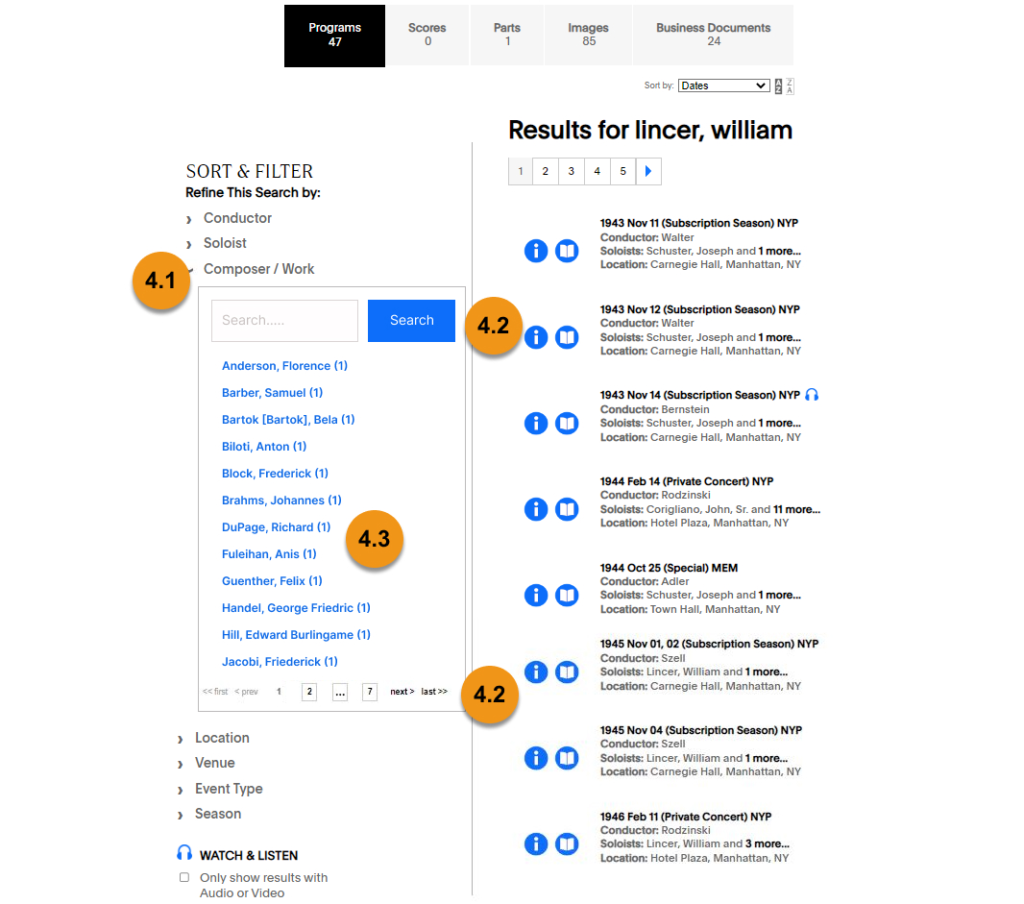
The existing lefthand filters were also frequently overwhelming for users, who found themselves sometimes having to navigate through 20+ pages of names to find a particular composer or musician’s name.
Recommendation 4: Move pop-up modal underneath each filter and introduce a search bar for the filter options when opened.
Right: After (With recommendations implemented)
Digging Deeper into Metadata, Accessibility, & Site Evaluation
One major challenge that came up in my tests was users getting stuck trying to use the “right” keywords to find information. One of the users in one of my sessions said, after trying a search several times with no satisfying results, “When you’re searching and you get a lot of zeroes, you know you’re using the wrong terms.” Another noted that they “had to use the trial and error method to find this [information].” We saw this crop up a few times, wherein searches that users expected to yield results yielded no results — or even incorrect ones. One user received zero results when they searched “Tchaikovsky’s nutcracker ballet,” then tried to correct that by searching instead for “Tchaikovsky’s nutcracker ballet,” and still found no relevant results. In our fifth recommendation section, we decided to recommend further investigation of the backend information organization and metadata to address these inconsistencies in search results.
Additionally, team members looked into the site’s layout and formatting with accessibility best practices in mind and included in the final section a shortlist of relevant recommendations. One example is our recommendation to change all of the website’s “–brand-blue” elements to “–brand-blue-ada’” in the CSS styling. Among other minor recommendations included in the fifth section, we also recommended that the Digital Archives run further SUS surveys and facilitate additional moderated user testing again once they implement any future site improvements, in order to test their effectiveness.
Revealing Recommendations to the Digital Archives
We presented these findings and recommendations in detail to the Digital Archives team, and were pleasantly surprised to find that they not only wanted to hear about the “low hanging fruit” of recommendations, but also were interested in “pie in the sky” visionary ideas for improving their site. Hearing that, especially regarding our carousel recommendations, we revisited our report and included more “inspiration” pieces for them from both The Met (with a layout alternative to using a carousel) and the Museum of Science & Industry (featuring a carousel with more feedback and accessibility features included) websites.
We closed out the project by inviting the Digital Archives team to get in touch with any questions once they had reviewed the full report, and reiterated the positive experience we had getting to know their website and the NY Phil’s history. To view our client materials, click the following links for the client presentation and full moderated user testing report.