Project Overview:
This project was a team effort as part of the “Advanced Usability and UX Evaluation” coursework at Pratt Institute. We worked with Pratt Institute over the course of 1.5 months to conduct an eye tracking study on the redesigned pratt.edu mobile website. Based on our key findings, we came up with several recommendations to enhance the experience of learning about graduate programs on the website, and shared these with the stakeholders.
Project Background:
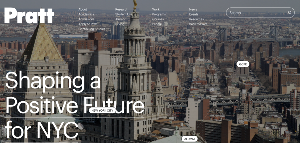
Pratt Institute recently unveiled the redesigned pratt.edu website. The redesigned website underwent a major overhaul in terms of the visual design elements and has a greater emphasis on storytelling. The website serves a range of user groups from prospective and current students, to faculty, administrators, alumni, and visiting scholars. While the website will ideally cater to the interests of all the user groups, one of its primary goals is to serve as a marketing/recruiting tool to attract prospective students. Hence, the stakeholders were interested in understanding how prospective students find the information they need to apply to a program on the redesigned website.
Process:
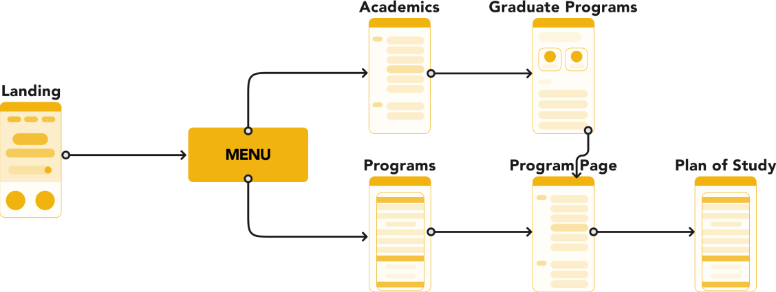
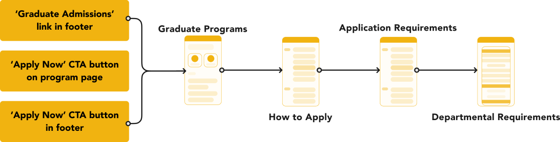
The following diagram provides an overview of our end-to-end project process.
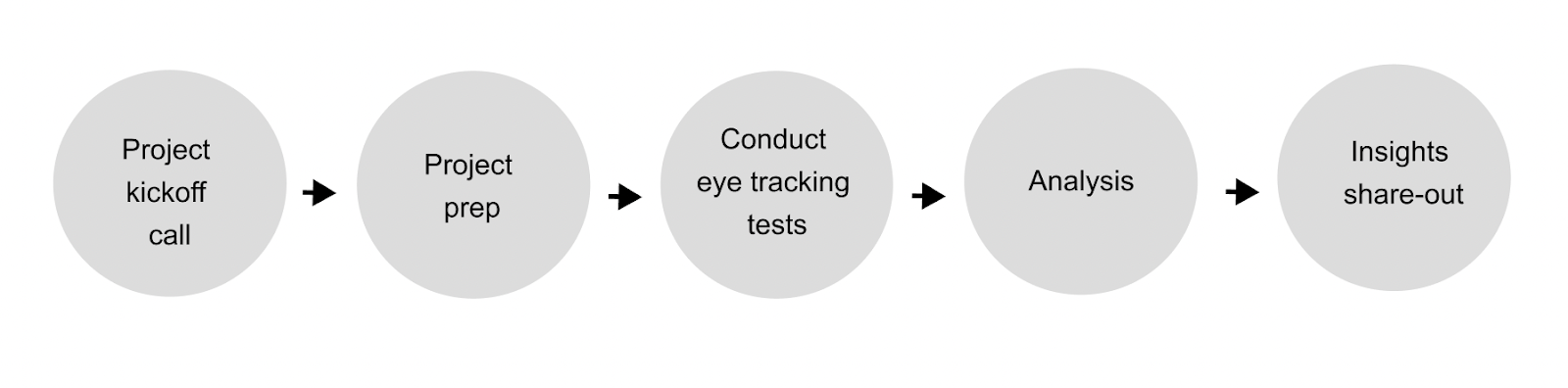
- The project kickoff call with the stakeholders was extremely helpful to learn more about the context of the project and align on what the focus of the project should be.
- Project prep included: writing the project brief, coming up with the tasks for the eye tracking tests, recruiting participants, creating the eye tracking test script and data collection instruments etc.
Research Objectives and Research Questions:
Based on what we took away from our project kickoff call, we came up with the following research objectives and research questions for the study:
- Understand how prospective grad students find the information they need to apply to a graduate program on the pratt.edu mobile website.
- What is the flow prospective grad students take on the pratt.edu mobile website when researching Pratt Institute’s programs?
- How do users find information about the application requirements?
- Understand whether information on the pratt.edu mobile website is useful to prospective grad students when applying to a graduate program.
- What kind of information do prospective grad students look for when applying to a program?
Methodology:
We conducted eye tracking tests using the Tobii Pro eye tracking software with 7 participants. Each test consisted of 2 parts:
- In the first part, we asked participants to complete the tasks on the pratt.edu mobile website and recorded their sessions over Zoom.
- In the second part of the test, we played back the Zoom recording for the participants and asked them to verbalize their entire process.
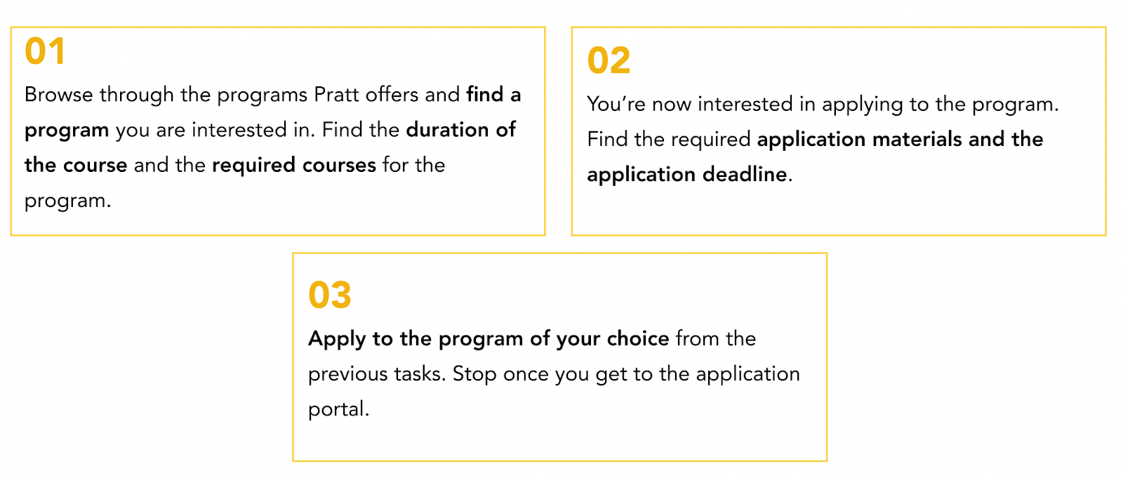
We asked our participants to complete the following tasks during the test:
Our Participants:
Since we were interested in conducting the test with prospective grad students, we made sure to recruit participants who had either completed their bachelor’s degree or were in the process of completing it. We conducted the tests with 3 females and 4 males, who fell within a wide range of ages between 20 – 31+.
What Worked Well:
- Discoverable information: All of our participants were able to complete all tasks (a task completion rate of 100%) within 5 minutes on average.
- Intuitive hamburger menu: All of our participants used the hamburger menu to navigate through the website without any issues.
- Visually-appealing: Participants expressed that they liked the layout, the size of the buttons and the feedback provided by the interactive elements on the website.
Areas for Improvement:
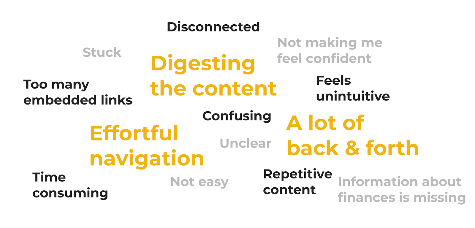
We also heard some feedback from our participants which pointed to opportunity areas for improvement. The following word cloud summarizes what we heard.
Our findings are also supported by the fact that the website received a score of 58.6 based on the System Usability Scale (SUS) 1. An average SUS score is a 68, which means that the pratt.edu mobile website still needs some improvements to its UX.
1 The System Usability Scale (SUS) is a reliable tool for measuring the usability of a wide variety of products and services. It is a 10 question survey with response options on a scale of 1 – 5 (1 = Strongly Disagree to 5 = Strongly Agree).
The following quote aptly sums up how our participants liked some aspects of the website but struggled with others:
“Visually appealing layout, but I really had to dig to find certain information like the deadlines and the application portal which was frustrating. IA felt scattered and I felt like I had to click through a lot of different things to get to what I wanted. Felt like there are many different ways to get to the same thing but it doesn’t really feel connected.”
Main Insights – Key Themes:
We dug deeper into our data to identify where the major pain points occurred on the website to inform opportunities for improvement. We identified 3 key themes that our findings fell under:
- Organization of content
- Complex information architecture
- Unclear information
Organization of Content is Overwhelming:
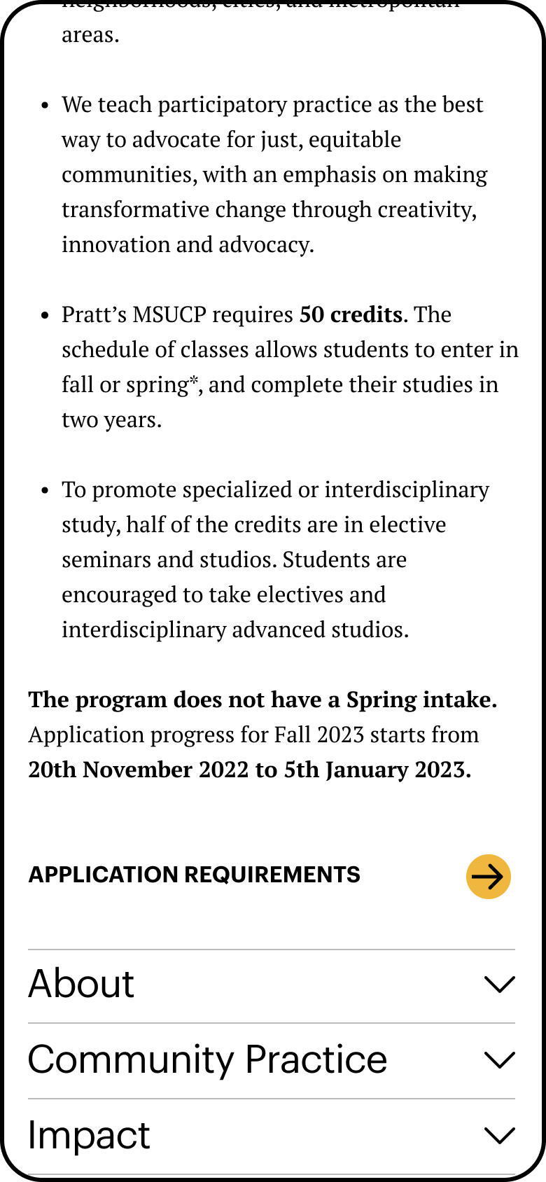
5/7 of our participants found the content on program pages overwhelming and not easily digestible.
“It felt like there is so much information. It is annoying to scroll so much to find the application requirements for my program.”
“I didn’t read through a lot of the info on the program page because it’s in long paragraphs.”
Moreover, from the heatmap of the program page, we learned that users tend to pay attention to the headings, but they do not spend time reading through each paragraph.
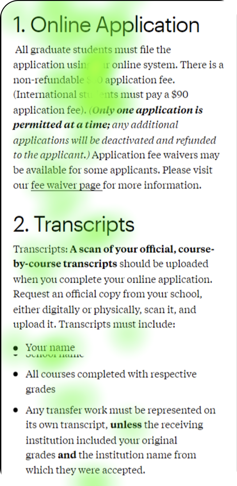
Hence, we recommended organizing the content in collapsible sections and within each section, making the content more digestible with the help of bullet points, headings, and white space.
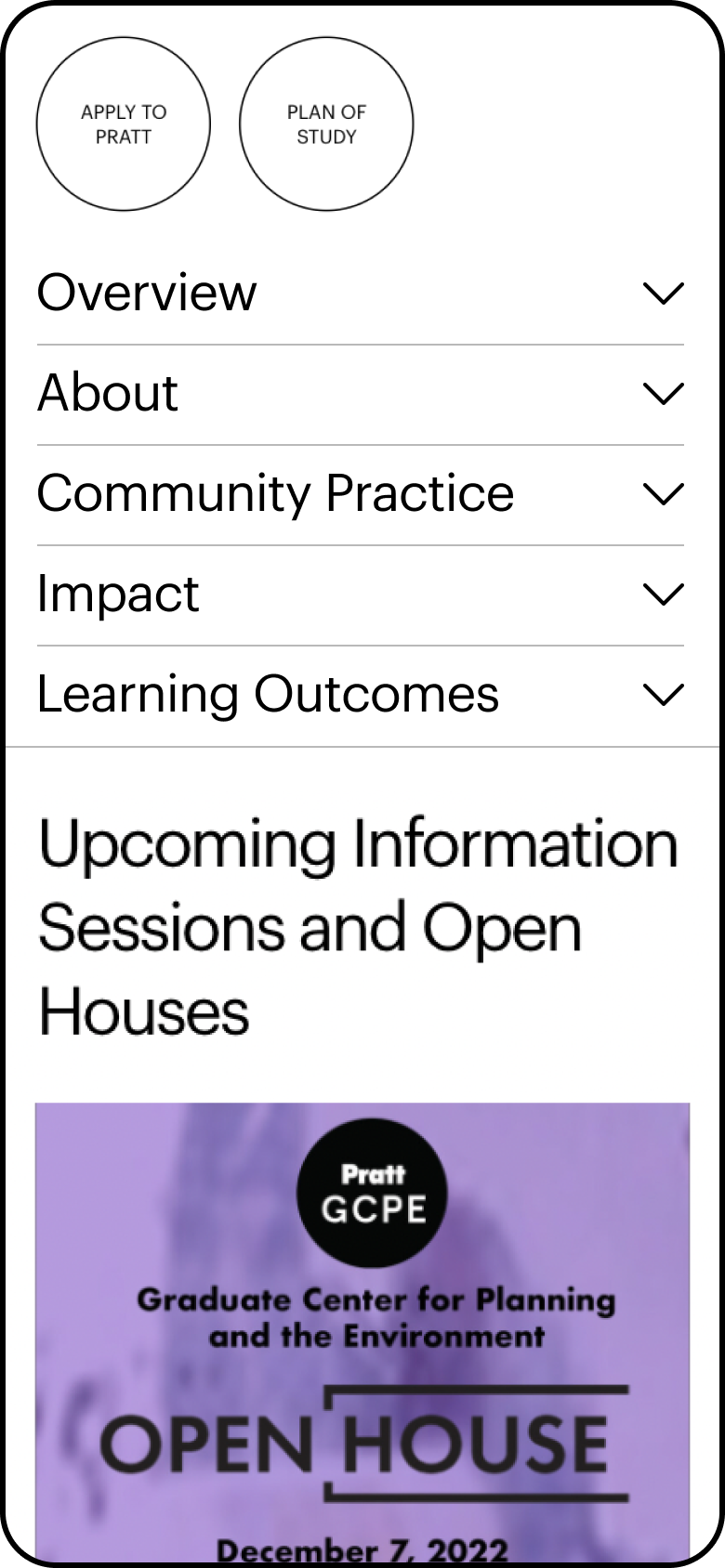
Missing Information Leads to Making Assumptions and Navigating Through a Complex Information Architecture:
We heard during the tests that participants consider certain program specifics such as the program duration and application deadlines as essential during the application process.
“I should see a few paragraphs about the program, a list of the courses, the duration and so on, on the program page which are missing currently.”
“That explicit “it takes 2 years to complete this course” is missing. Especially from a financing your education standpoint it’s important to know how long you’re not going to be making money.”
However, at the moment, this information is missing from the program pages, which is why our participants had to make assumptions about these details. E.g. many participants assumed that a course would take 2 years to complete when they saw that it consisted of 4 semesters.
Then, because this information was missing on the program pages, our participants went looking for it and had to navigate through multiple pages before they found what they were looking for.
users had to navigate through 2 other pages.
And this is what one of our participants said about getting to the application portal:
“This click [referring to the Apply Online link] will be the fourth click on a link that has the verb ‘Apply’ in it already. That to me is too many clicks to get to where I want to go. I’ve gone through four different pages leading me to apply.”
Hence, to combat this pain point, we recommended highlighting the program duration, core courses, and deadlines along with a link to requirements on the program page itself, eliminating the need to make assumptions and navigating through multiple pages.
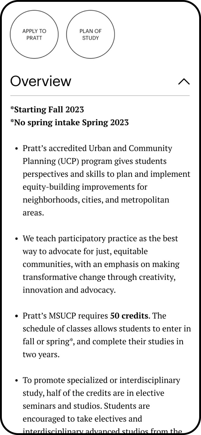
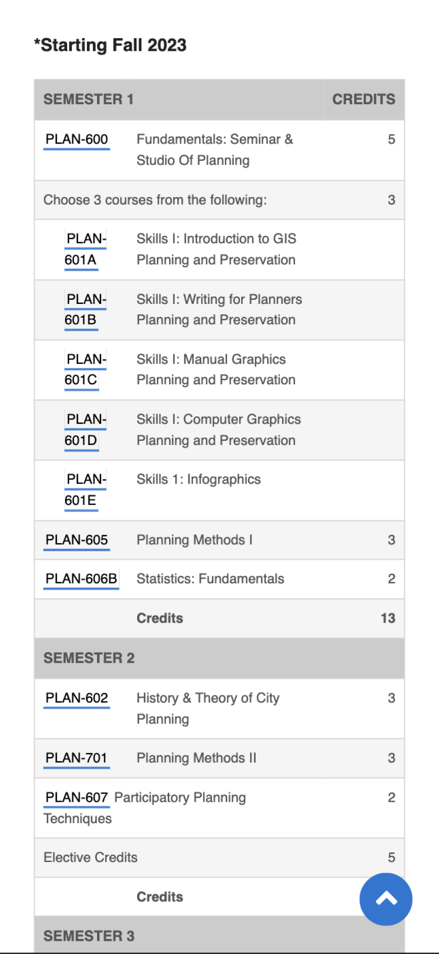
Information About Program Courses is Unclear:
Our third key finding was that our participants struggled with discerning which courses are required and which are electives, again leading them to make assumptions.
“I am assuming that these are the primary courses [while looking at the Plan of Study page] and I assume I chose a linear program, I’ll have to go back to see if there are any other courses.”
To make curriculum-specific information clearer to users, we recommended specifying which courses are core and which are electives by creating separate sections for the two types of courses on the “Plan of Study” page.
Final Outcome and Future Research Opportunities:
We presented our findings and recommendations to our stakeholders which were received with positive feedback. Our stakeholders expressed that several of our findings aligned with what they had hypothesized or were interested in seeing in greater detail which was a win for us.
However, there is always room for further improvement, which is why we recommended the following steps for future user research:
- Conduct follow-up eye tracking tests with a larger sample size
- Test parts of the website we didn’t investigate e.g. continuing studies or events
- Utilize other methodologies such as usability testing or interviews to supplement our eye-tracking findings