Strava is an exercise tracker app and social networking tool in one. Users can track their own activities, like and comment the activities of their friends, join groups and complete challenges. Strava’s goal is to provide an easy way to track your activities and see your progress while also allowing you to join groups of likeminded exercisers and encourage your friends.
In this design critique, we’ll examine the user journey for starting an activity in the Strava iOS app.
Home Screen
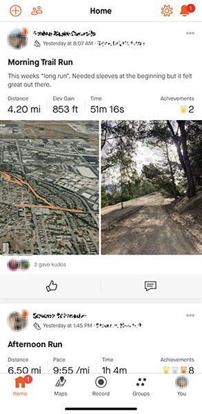
To begin tracking an activity, you will first land on Home, the social news feed. Recent activity from friends is nested between two different nav bars: a small row of unlabeled orange icons at the top and a larger set of labeled icons at the bottom. The size and style of the icons helps create a hierarchy of action, with the lower nav bar taking clear priority. Design elements like negative space and slight drop shadows create space between different friends’ activities.
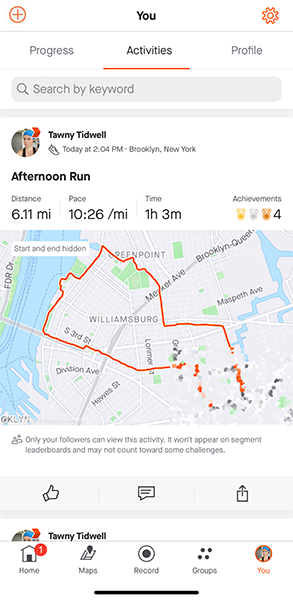
Most of the icons along the top map to common iPhone app functions: a bell can be tapped to see notifications, a cog takes you to settings, and two people icons together represent adding friends. These three match conceptual models users expect in apps. However, the + icon has an uncommon mapping. On tap, it offers you manual upload options for activities from outside the app (e.g., a yoga class or a deviceless run). This is an uncommon use case for Strava and not necessary to include on the Home navigation. I would move this icon off the Home tab into the You tab at bottom right where many other similar features already live (see mock above).
Additionally, I would make the notifications bell consistent across app screens. You can see in the mock above that it disappears when I go to You, but that the Add Friends and Settings buttons are persistent. This inconsistency could lead to needless clicking around for a user trying to match their conceptual model of the app to what exists on the screen.
As to the bottom and primary app navigation: when starting an activity, it’s easy to discover the Record button in the bottom center. This is a common position for primary controls in iOS, and will feel intuitive and familiar to users immediately. Once a user taps Record, they are taken to Screen 3 below.
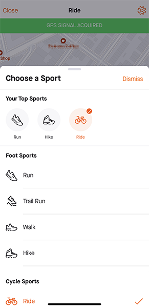
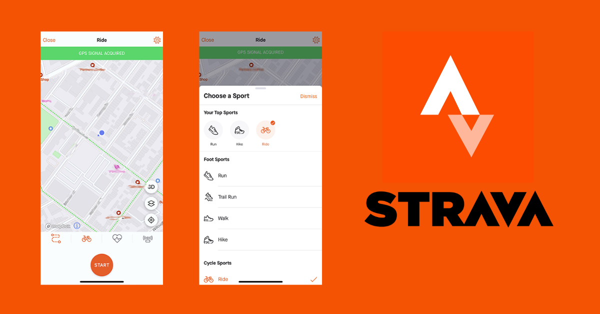
Tracking an Activity
In the Record screen, a green banner indicates the app is ready to track (great feedback). The map that dominates the screen provides additional feedback about the GPS signal and accuracy. At the bottom, a set of icons indicates what is active in the app. The leftmost icon lets you choose a saved route. This icon is uncommon, and it’s unclear why it appears orange regardless of whether a route is selected. If no route is selected, this icon should be grey, similar to the rightmost two icons.
Speaking of these, the grayed out heart with EKG indicates whether it has a heart rate monitor active and the final icon is the Strava beacon, which is a safety feature that allows others to track your run. In this walkthrough, neither HR monitor nor beacon are active, so they are gray. The final icon, the bike, indicates the activity you are about to record. Despite consistent use of this app over a number of years, it has never defaulted to my primary activity: running.
Because Strava’s Record screen for me defaults to biking, getting on the road requires a little extra effort. I have to tap the bike icon, leading me to the Choose a Sport menu (Screen 4 above). Strava seems to know that I usually run (the running shoe icon under Your Top Sports takes the left-to-right reading priority left slot), but nonetheless the app highlights and checks the bike icon as the default choice. This is not a huge headache (it’s easy to perform the two taps necessary to get the setup right), but when compared to how seamlessly I could begin a bike ride, it is a sticking point.
A redesign of this experience could include updating the background process that tracks for primary activity type and saves this information to the Record screen. The app already knows I prefer to run, but for some reason it’s not always “aware” of that. A second, more manual option would be to allow the user to select a default in Settings. (Maybe the average user often does many things, and would prefer to select a default.) An A/B test of these options could be run on new users registering for the first time to see what causes U-Turns and other frustrating experiences.
Overall, starting an activity in Strava is a user-friendly experience. Much more user-friendly than the Voyager Electronic Interactive Book version of The Design of Everyday Things, and something that I think Don Norman would find accessible for all.
*screenshots have been edited to remove personally identifiable information (PII) where applicable.