Design Critique: Codecademy
Codecademy is an online educational platform for student to learn all sorts of coding software such as, python, java, SQL, C++, etc. Relevant courses are design for student at all levels, from foundation learning to technical practices. It has became one of the most popular platform for self-driven leaners to extend their professional skills. Its well-organized mapping and engaging design help it wins the loves of younger users.
Read more: untitled post 33270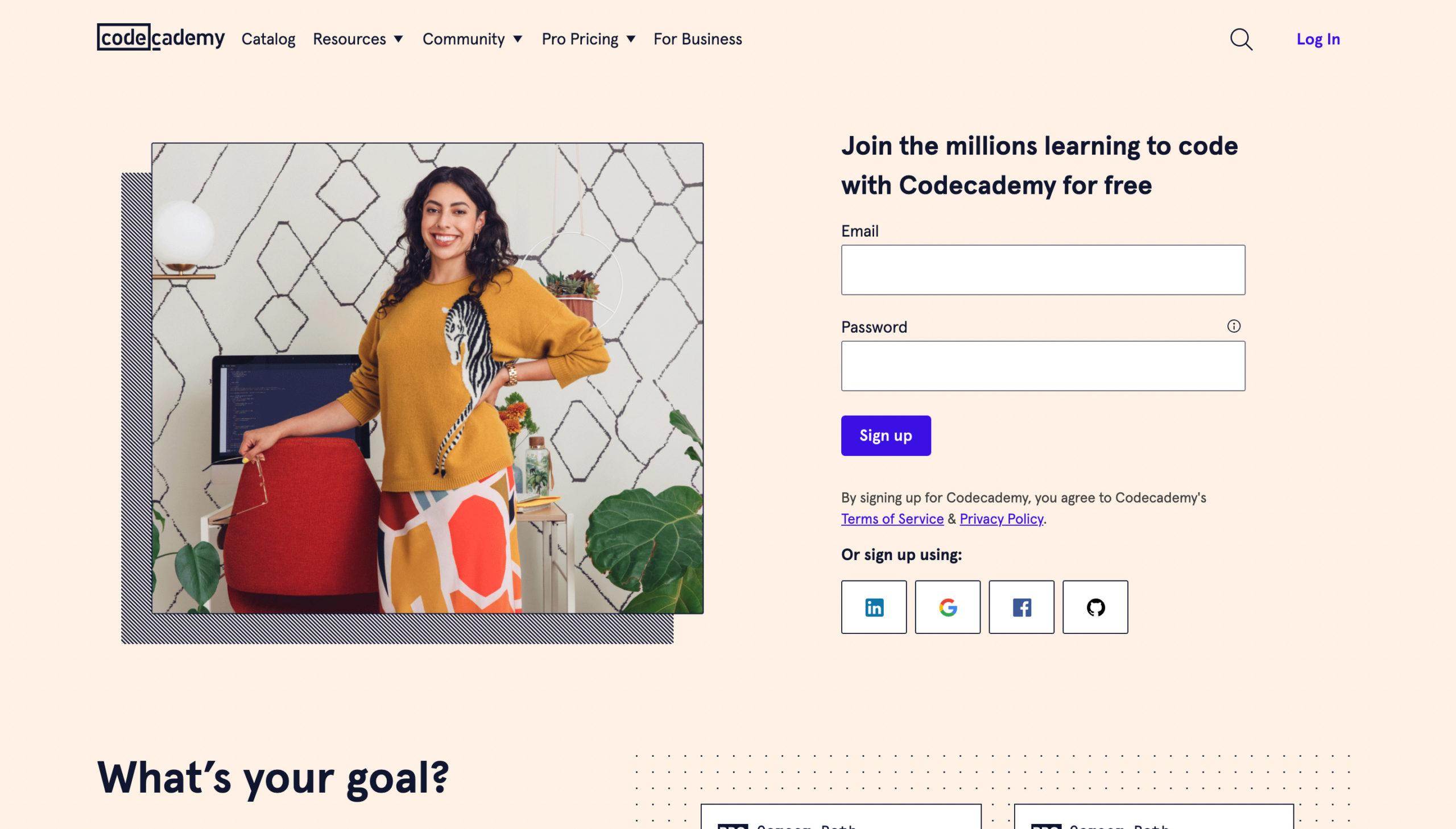
The first sign up page has a natural mapping of a sign-up page with the email and password boxes right align with user’s view point, and the supported third party login platforms are placed right under them, leading first-time users to a smooth and easy-understanding process. Another notable point on the page is its design, where a user’s image is taking half of volume on the website and with a warm color background, it invites users with a positive welcome without intimidations.
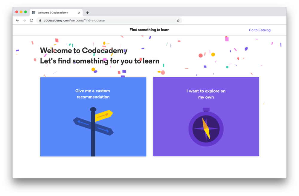
The next page after signing up has a fun feedback that celebrates user’s action with spreading color objects, and leading them directly to the next process.
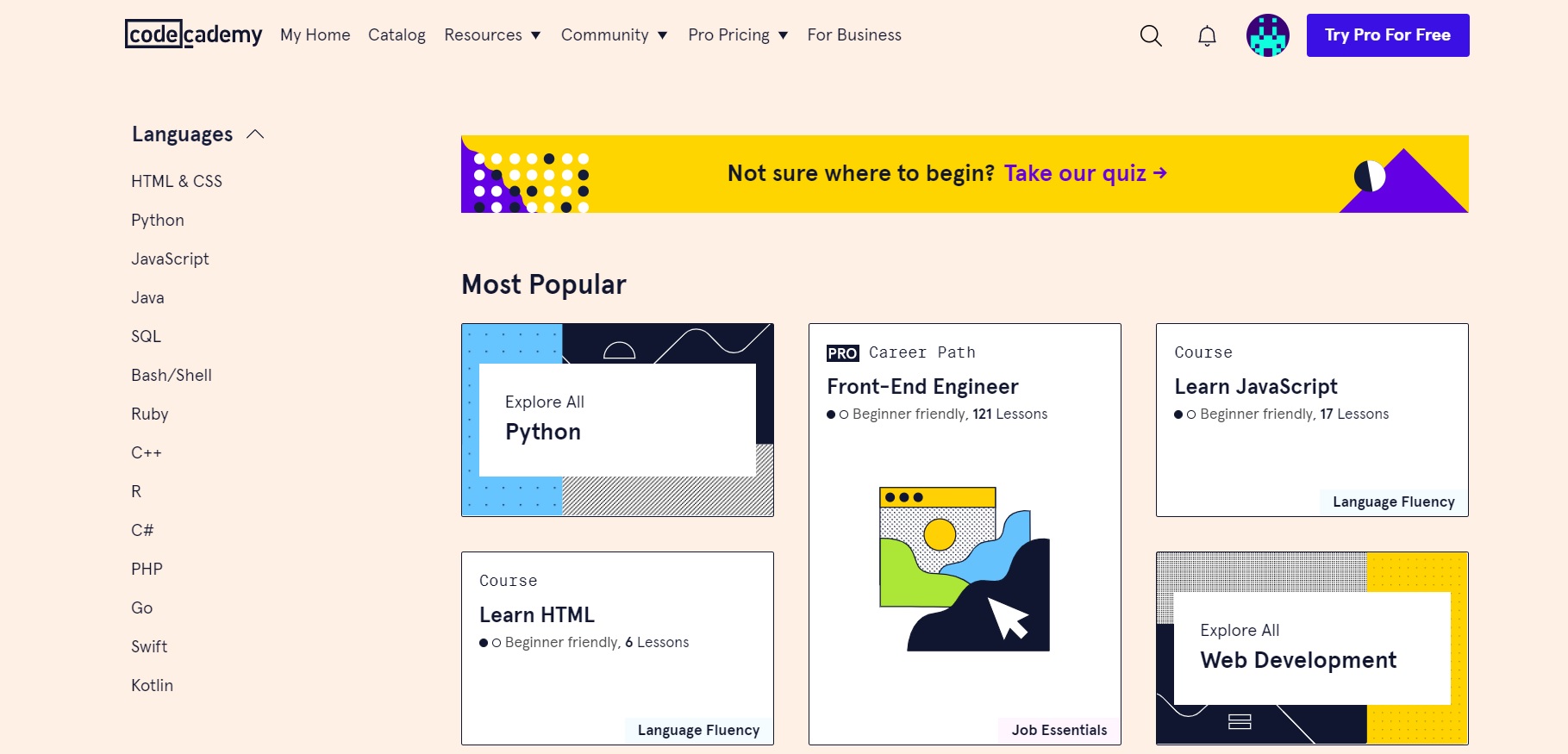
After signing up, user are encourage to upgrade the account by the apparent purple button displays on the top right side of the page to access full materials and resources. Besides that the overall mapping design of the page is natural and easy to discover, each section are distinct by various fonts and sizes, and slightly outlined by organized group of low saturated dots, allows the individuality of each section without overwhelming users’ sight. Moreover, all the main sections are placed at the very top of the page and the extendable categories have black triangles pointing downward, reminding users to click for more options, which I identify as a fairly successful signifier.
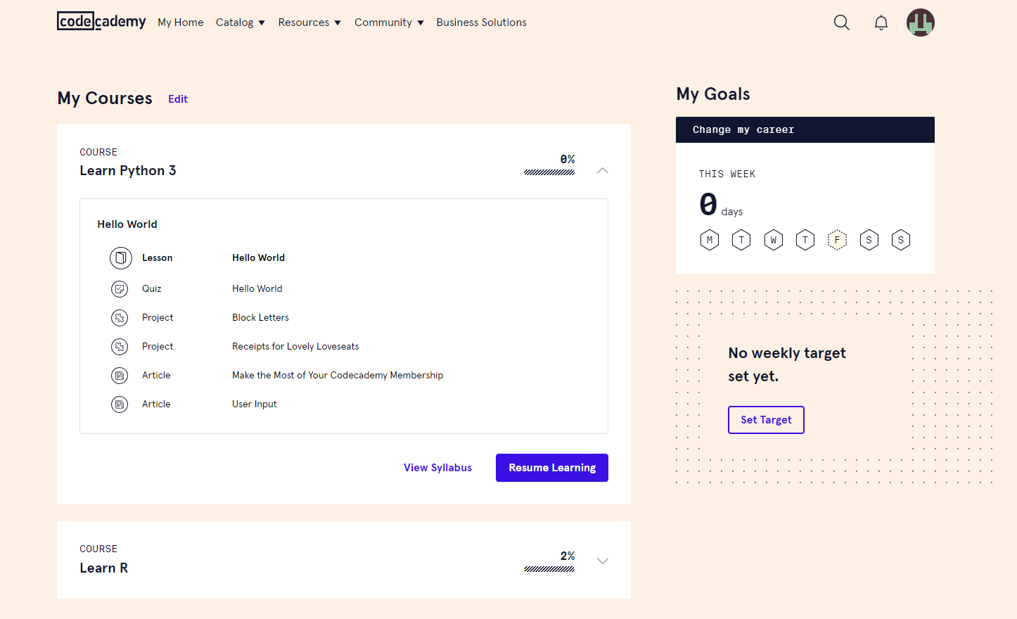
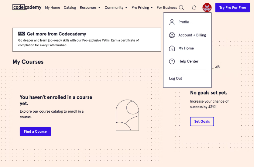
Picture. 4 is my personal account which is the full version that already paid for the annual fee. The homepage of the paid version is very personalized, which seems like Codecademy is intentionally creating a personal study space for the paid users. The mapping of the page is similar to the previous pages, where all categories are placed on the top of the page as sub pages. Another thing that I am fascinated about the website is their signifier, because all signifiers are designed in different level of visual effectiveness, the most used button is the “resume learning”, which is designed as a blue rectangular, following with the “view syllabus” button with a blue font without a broader, and the “set Target” button as another important signifier is designed in blue font with blue boarder. The various types of signifiers can be supporting user with a easier study journey.
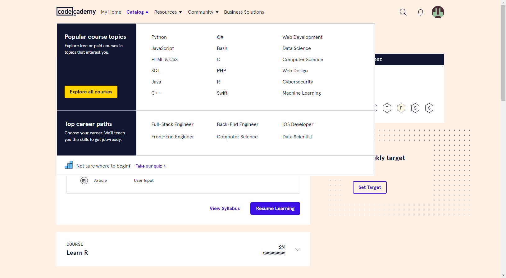
Another thing that I love about this website is the subpages of extendible categories. Within the sub page it gives a lots of useful information, for examples, the popular topics, various coding languages and career paths, which can be really helpful for beginners to decided what languages they can learn to best prepare for their future career. Overall this is a website that I really like and it helps me a lot long the side. If there is any advise that I will give is to have a homepage with diverse topic instead of having a homepage that looks like a personal workspace.