Introduction
AllTrails is a fitness app to discover outdoor activities such as hiking, biking, camping, and more. The app helps users explore activities, join a community, and navigate trails all in one place. During the pandemic, millions of people turned to outdoor activities, and AllTrails was at the forefront of helping people do so. The application has a very streamlined and minimalist layout that helps the user navigate seamlessly.
Initial log in
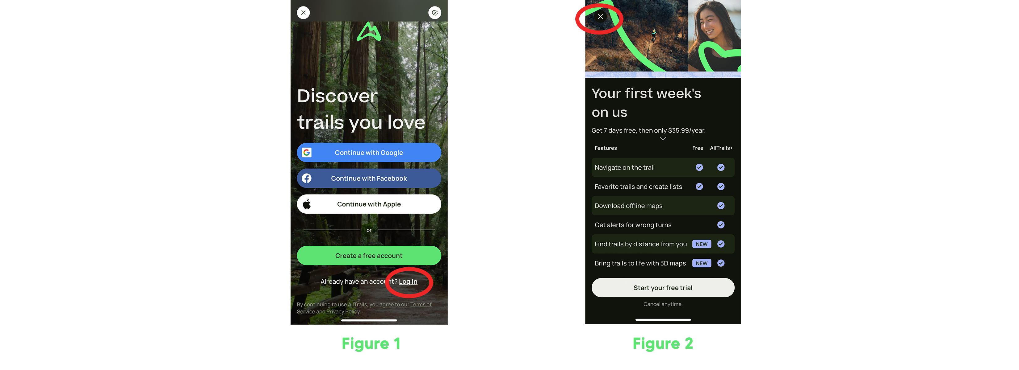
I, myself, created an account during the pandemic, but haven’t used the application since then. I thought the login process would be standard, but there were too many entry points. There were five ways to log in and I didn’t know which entry point to go through. There was an option to log in through Google, Facebook, Apple, and a “Create a free account” option. Finally, at the very bottom written in a very small font was a “Login” link, not a button. The lack of a login button fails to be a signifier that the application affords login (see figure 1).
Once I had finished signing in, I was not brought to the homepage but instead to a subscription page. There were options for a 7-day free trial but I noticed a small gray “X” at the top left of the screen which finally brought me to the homepage (see figure 2).
Homepage
Once the user is logged in, they will notice that the homepage has numerous key signifiers (see figure 3). This helps the user to proceed and successfully find what they are looking for.
The homepage is a simple way to help users get started to find an outdoor activity. The high-contrast colors help the user stay focused on the content. In terms of usability, AllTrails provides many prompts to help the user to navigate through the app (see figure 3). The application teaches the user how to navigate new features, helping them create the perfect system image.

Navigation Bar
The navigation bar at the bottom of the application uses natural mapping. The icons on the bar are the interface controls that give a clear image of what the user will experience when the icons are clicked (see figure 4). This is an example of knowledge in the world because users can make assumptions based on real-life materials.
The feedback mechanism of the bar informs the users what part of the application they’re exploring, by highlighting the connected icon on the bar. For example, if I am on the community page, then the icon on the navigation bar will be highlighted (see figure 4).

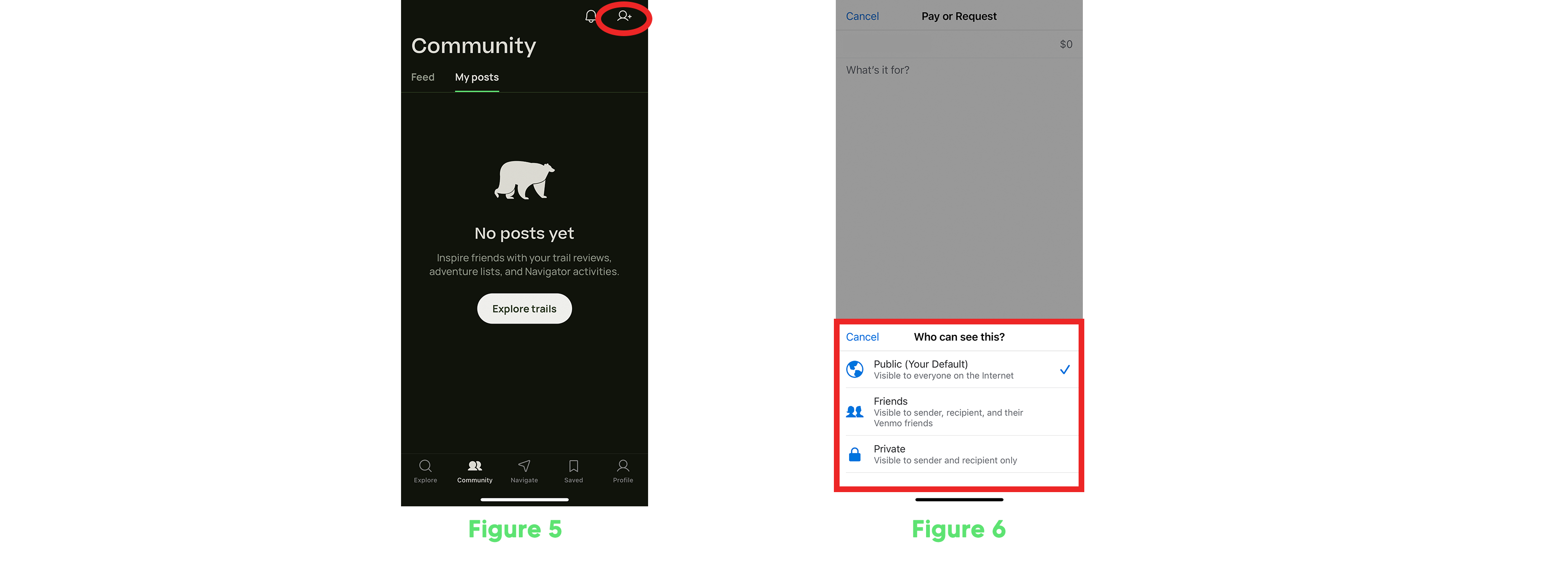
Grow Your Community
The function of adding connections/friends is made discoverable. The icon of a person with the + button (see figure 5) tells you that it affords to add connections, whereas the icon itself acts as a signifier.
The application helps one connect with their friends either by Facebook or from the contacts on their phone. However, some people might want to post anonymously even if they do have friends on the application. I suggest that AllTrails should implement a privacy setting for each specific post. In the same way, Venmo does it with each payment, there should be an option before posting if they want it to be public or private (see figure 6).
Conclusion
The AllTrails application is overall seamless and attractive due to its minimal and smart design. The app is straightforward enough for a new user to find an outdoor activity in their location. However, the avid user might want to see some changes for them to rely on the app more regularly.