Air bed and breakfast as its popularly known, Airbnb, is a platform where property owners can rent out their properties for the travellers to stay in. Airbnb is leading the charge when it comes to creating a booking experience that gets the job done for websites. Airbnb has clearly done their research and has been in the scene since 2008. The renting/booking marketplace “giant” has thrived in the global market for a decade and still hasn’t found anyone that can stand up to it.
Why are we willing to sleep in strangers’ beds, or conversely, let strangers into our homes? We do so because Airbnb has established a trusted, secure, and easy to use customer experience.
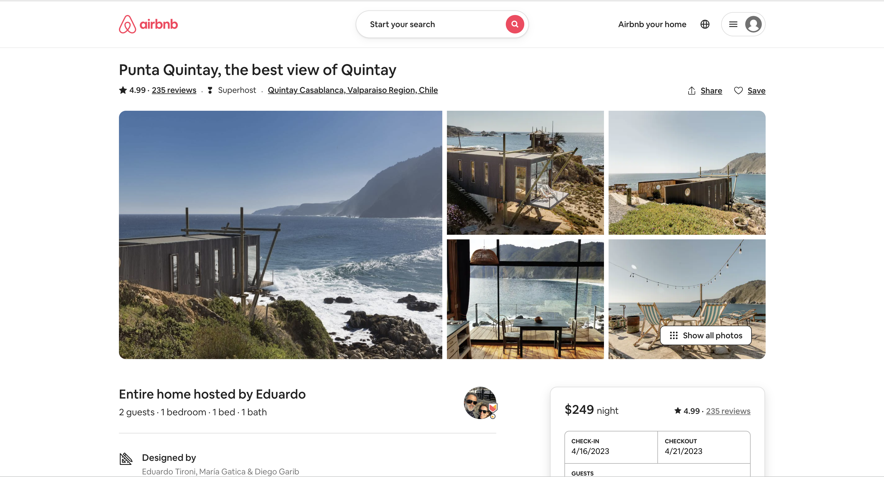
Landing Page
The initial interaction with the Airbnb website generates a sense of visceral response in the user. The website uses great design and aesthetic sensibilities to drive visceral responses. For designers, the visceral response is about immediate perception. There is a sense of great understandability as the user is able to figure out what is the product about and how to use it.
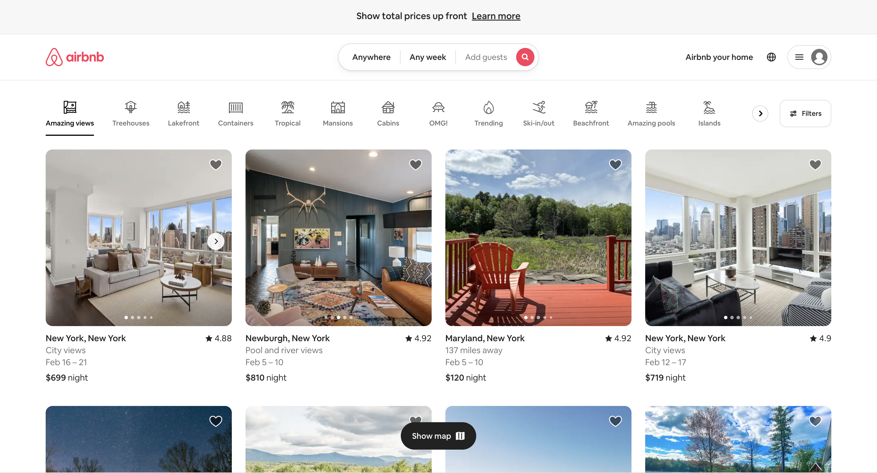
The design uses colour contrast and shadows and the user interface is basically structured as two layers: The card, which contains the explanatory text and the Call-to-Action (CTA) button, forms the upper layer, while the rest of the page is perceived as the background layer. The Design strives to achieve Visual Clarity and Minimalism.
On the usability front, the website provides several user prompts that help the new user navigate through the website. It also educates the user about different types of search , helping them create the perfect system image.
The text serves two purposes:
- Validate the reason a user visited the website in the first place — “I’m where I was supposed to.”
- Set a user goal — “Now I should search for places I want to visit.”
Airbnb avoids unnecessary jargon, while choosing a set of words that their target audience will comfortably understand.
Key Takeaway:
The text in play is carefully chosen to reveal specific message and the value of the product as early as feasible. All of that without running the risk of their audience not understanding what they are delivering.
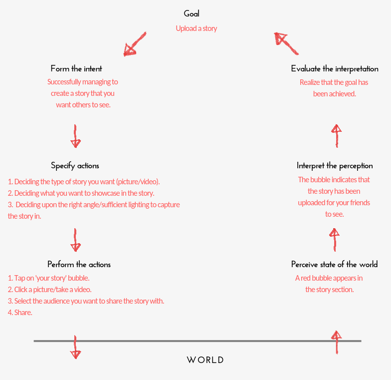
Don Norman’s seven stages of action are followed while using the website. Taking an example of making a booking for my birthday celebration.
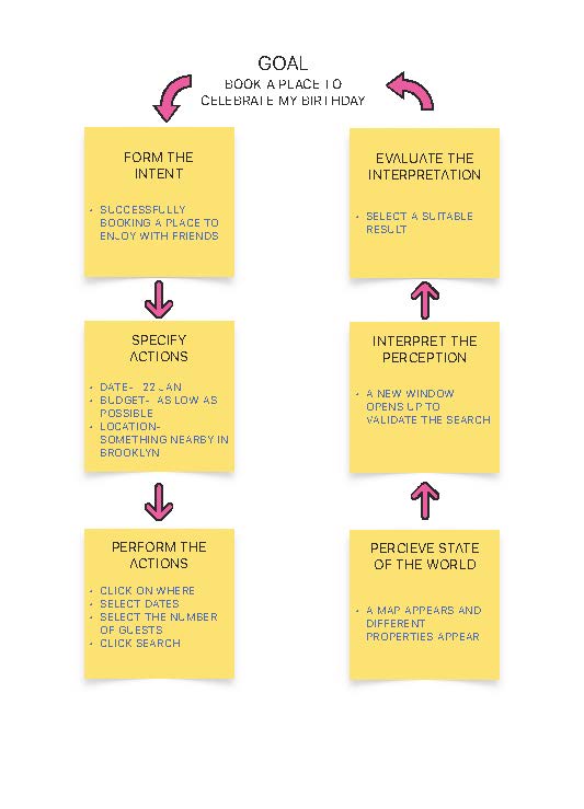
The function of searching for a property is very discoverable. The search button acts as a signifier and it affords searchability. When the user tries to find a price to fixate a budget, a Gulf of Execution arises and the user makes an action based slip. There is no direct option available to set the price of the property. The user is instinctively presses search causing frustration at visceral layer of processing, also causing learned helplessness. There is a disconnect between conceptual model and the system image.
Price as a filter
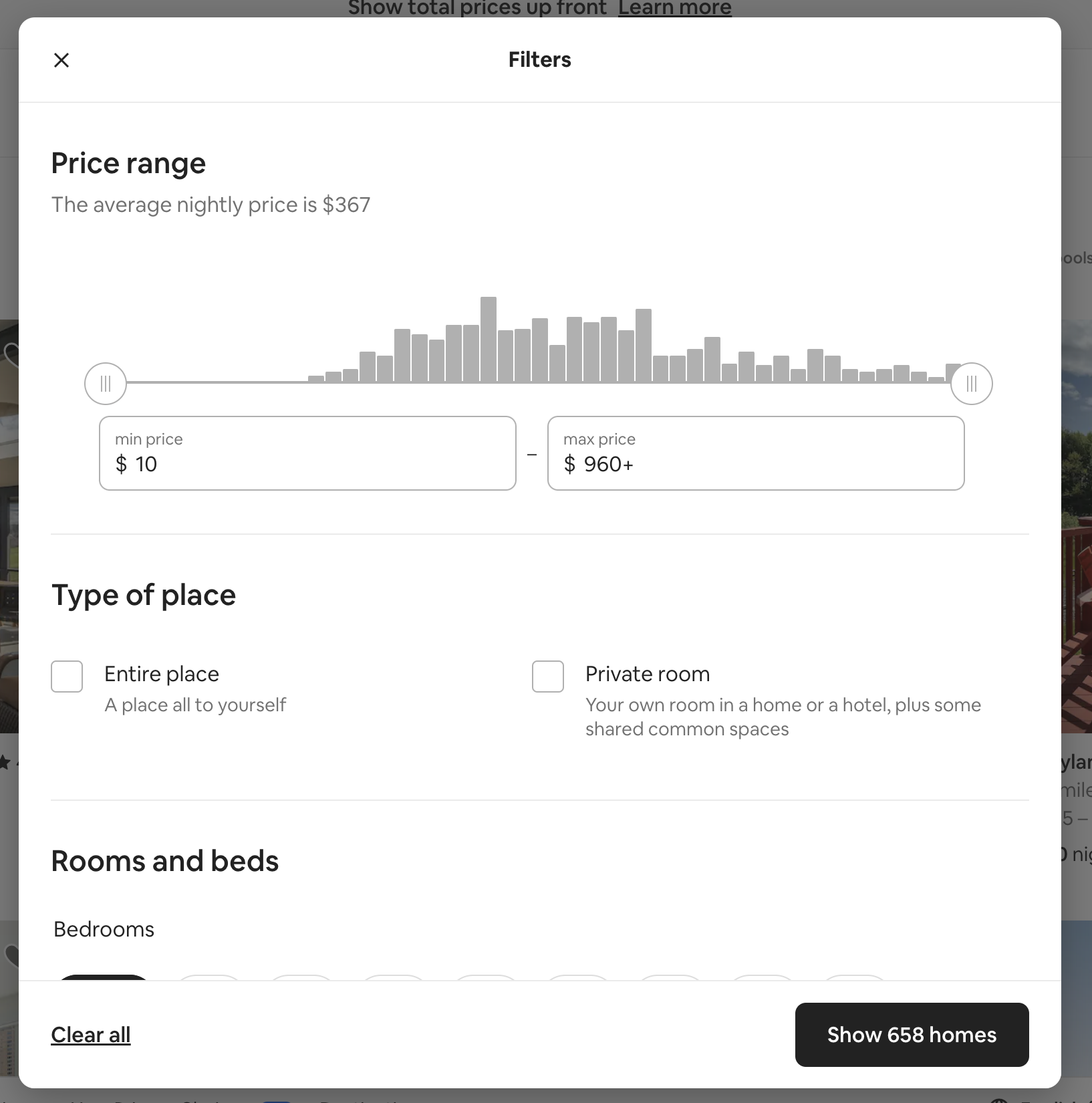
Setting up the price is provided as a filter whereas it should be the first thing that the user should be able to do. It is something which is not discoverable and the user needs to use Procedural knowledge (“knowledge of how”) to find a way to set a range for their price points.
Booking Page
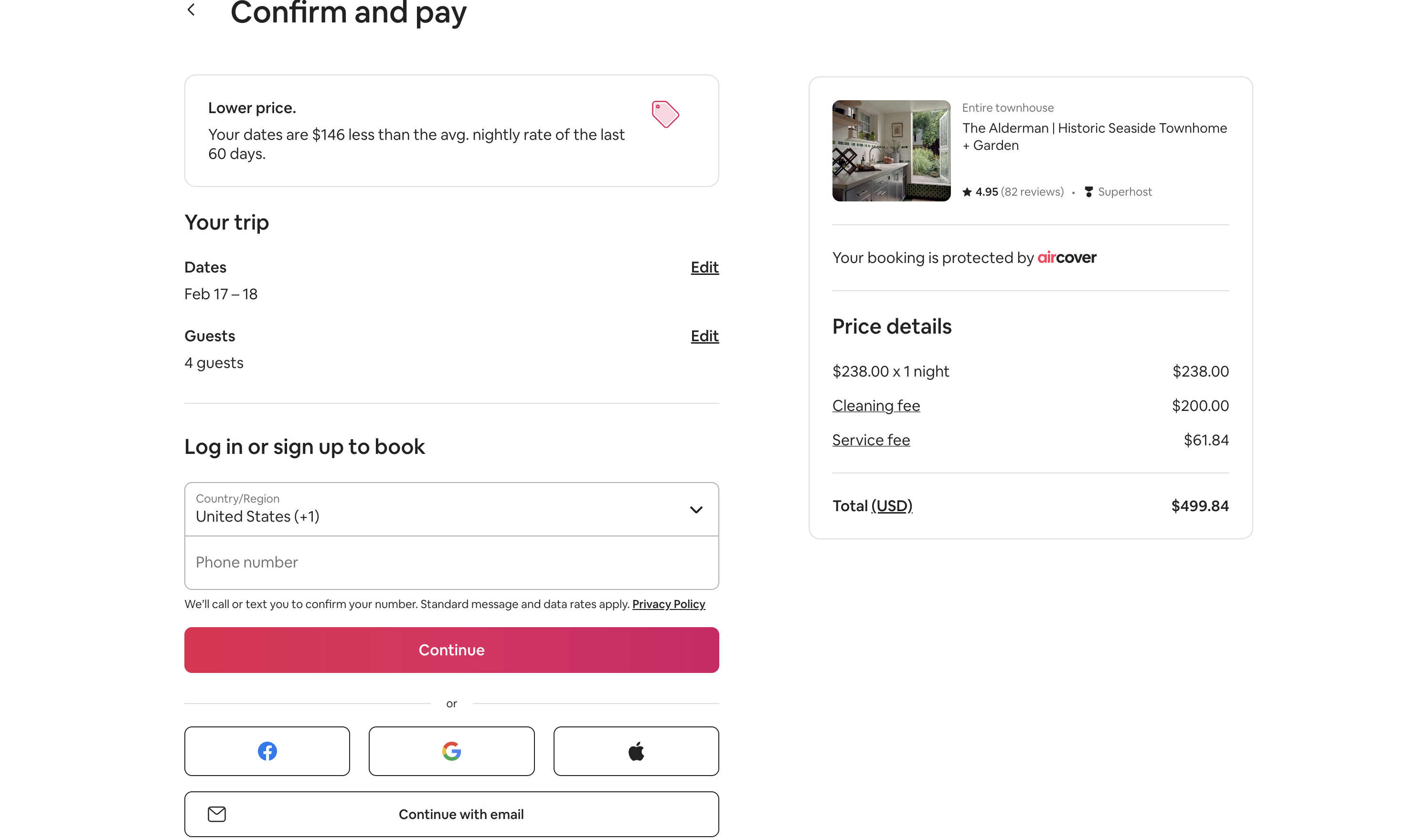
The booking page is very standard and it uses knowledge in the world which lets the users log in to the information effectively. The continue button has a signifier and affords moving forward in the process.
Focus on the user
For designers, the most critical aspect of the behavioral thoughts is that every action is associated with an expectation. A person uses his or her memories or mental associations to shape how they will act in the future when confronted with a new situation.
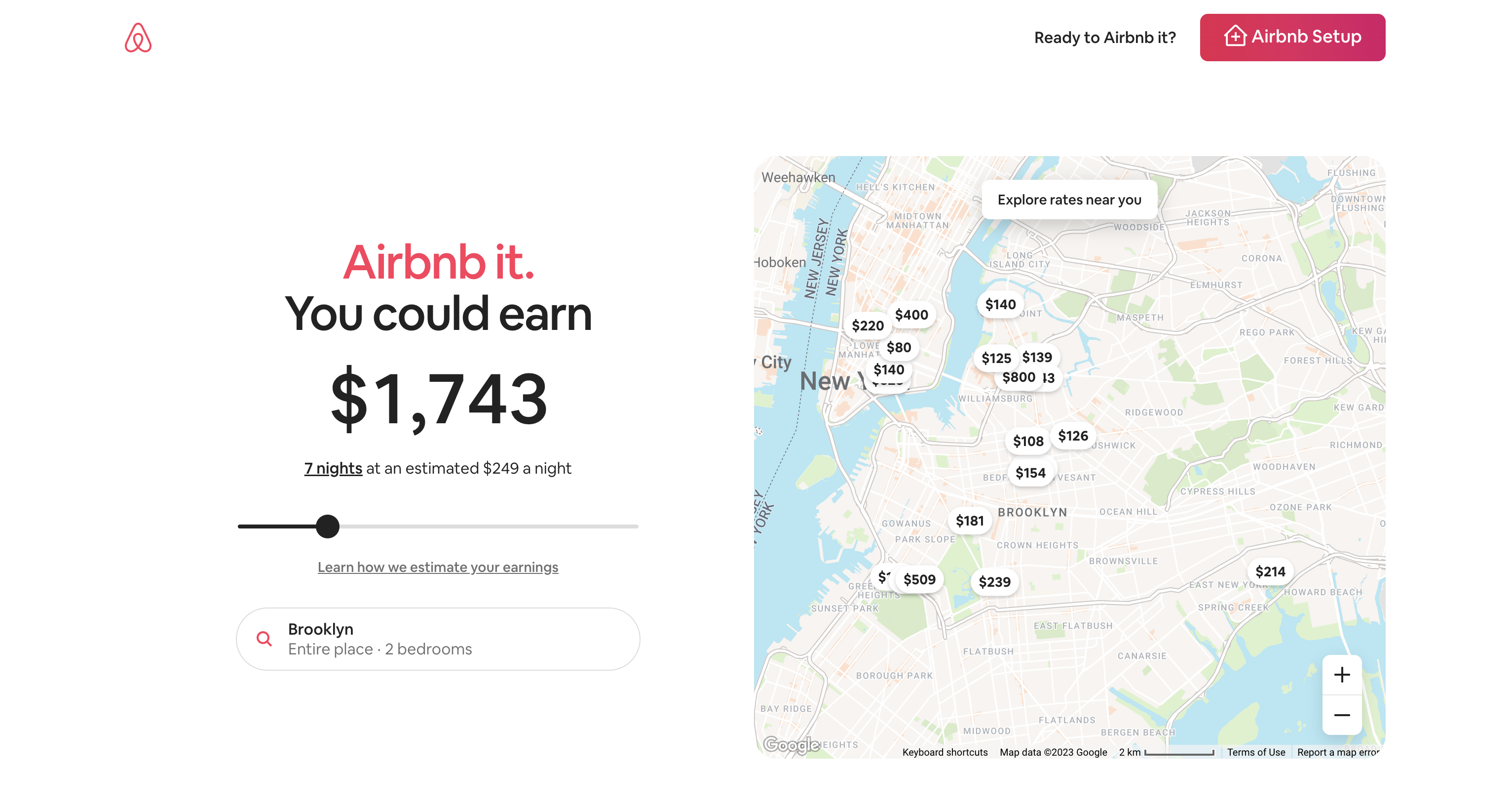
For the users who aspire to become hosts the website shows them how much money they can make. This triggers an action to sign up quickly on a subconscious level. It generates a feeling of excitement and delight insinuating the user to put their property on Airbnb.
For the user trying to make a reservation the website tries to sell experiences. Feeling of calmness and happiness are generated.It is a reflection that drives us to recommend a product, to recommend that others use it.
Designers need to make things that satisfy people’s needs, in terms of function, in terms of being understandable and usable, and in terms of their ability to deliver emotional satisfaction, pride, and delight.
In our case, the Airbnb landing page, visitors are subject to behavioural and reflective thoughts with the use of imagery. The design team is doing a great job of identifying visuals that properly correspond to the company’s target audience so they can guarantee that the correct emotions will be elicited.
Discoverability- location of hosts
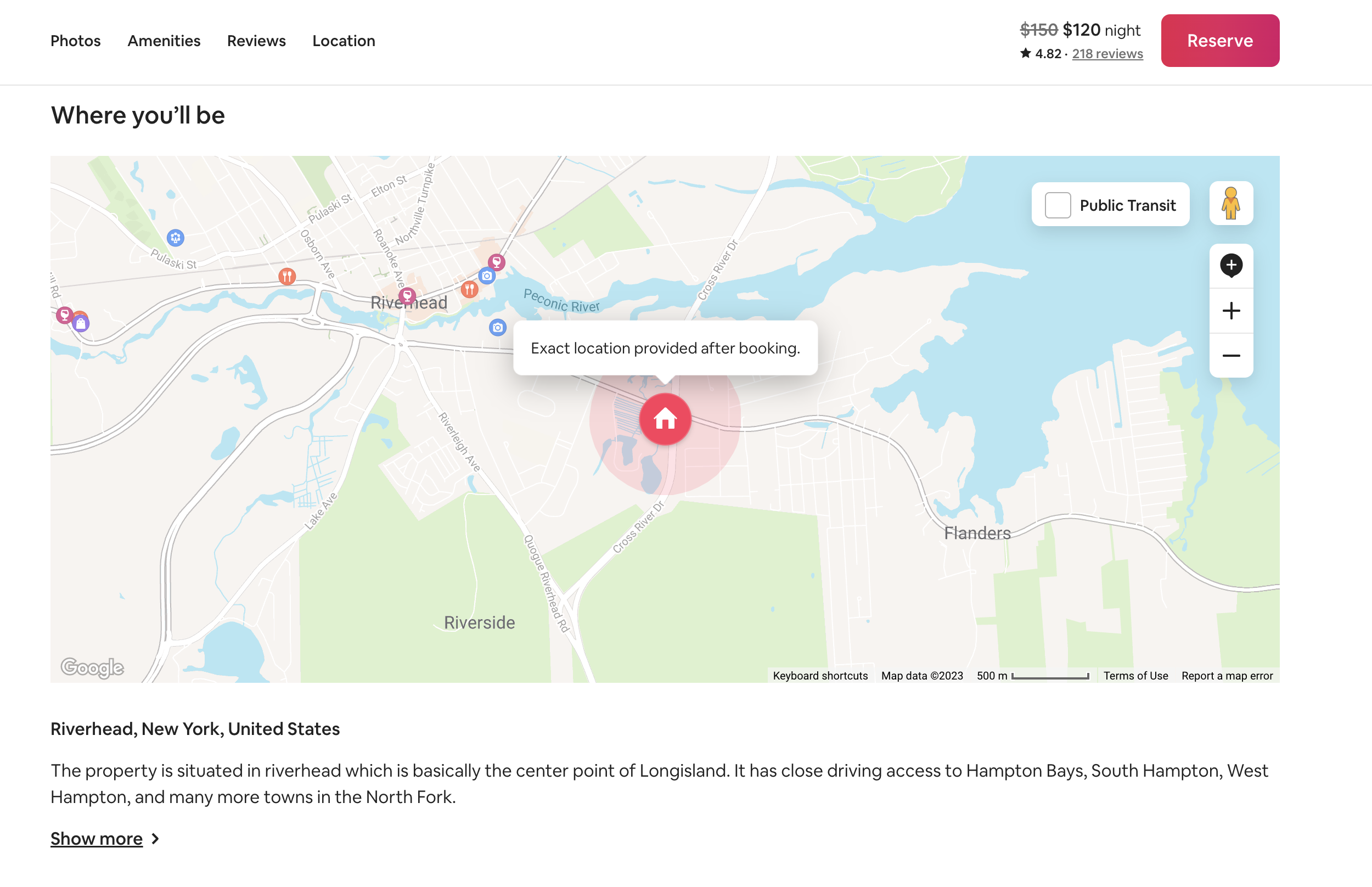
Although the design is very engaging, the website doesn’t let the user see the exact location of the property, causing frustration at visceral layer of processing, also causing learned helplessness. The user is forced to use google maps to locate the correct location of the property leaving the booking midway. By providing a feature to locate the property on maps clearly the website can account for these customers who end up leaving their product and may or may not return.
Should focus on relevant experiences rather than any experiences
The website shows a lot of experiences that people can do but none of them are relevant to where you are or what you have done in the past. If the landing page can be designed with reference to their specific user that would be more helpful in my opinion. by using the principle of Knowledge is both in the head and in the world– Behaviour is determined by combining the knowledge in the head with that in the world the users will engage more with the relevent information.
This will be a clear use of Declarative knowledge which is specific to the user by introducing human centered design, which is a procedure for addressing user requirements but with an emphasis on two things; solving the right problem and doing so in a way that meets human needs.
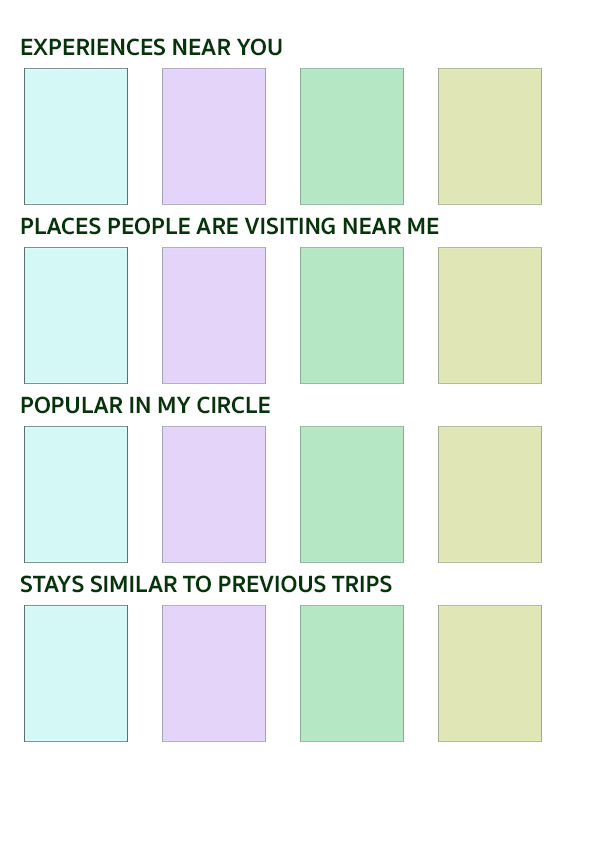
Adding things like-
- Experiences near you- can give you a perspective on the things that are within reach and can be done.
- Popular in my city- wherever you are travelling, this feature can show what are the most famous locations/restaurants to visit
- What are my friends doing/places people around me are visiting- this can help users connect with more people and do things collaboratively
- Experiences similar to my previous ones-suggesting things that are specific to people’s tastes and preferences is always helpful.
Conclusions
The actions and emotions of people are driven by thoughtful design, which is human-oriented. The design team at Airbnb came up with a very subtle—almost transparent—method of influencing users’ behavior on their website. The experience’s framing was so expertly created that it speeds up interaction while keeping the main user objective in mind.