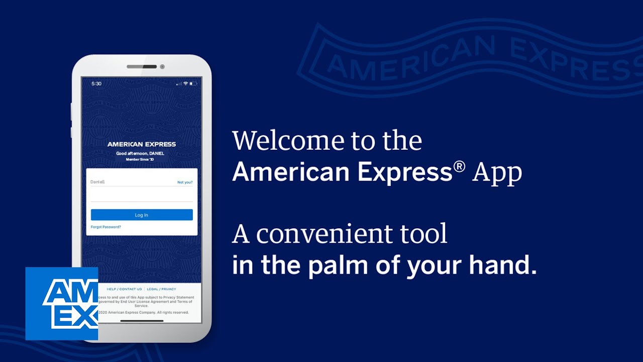
The American Express mobile app lets American Express clients manage their credit card account and saving account through a simple interface, and it delivers personalized offers.
The American Express mobile app has a user-friendly interface to click through different American Express credit cards or scroll through different accounts with just a few taps. It’s also letting users make payments and redeem rewards in just few clicks. The relatively simple layout of the app makes for a more intuitive user experience than American Express’ website, which has so many options it can feel overwhelming.
Initial login
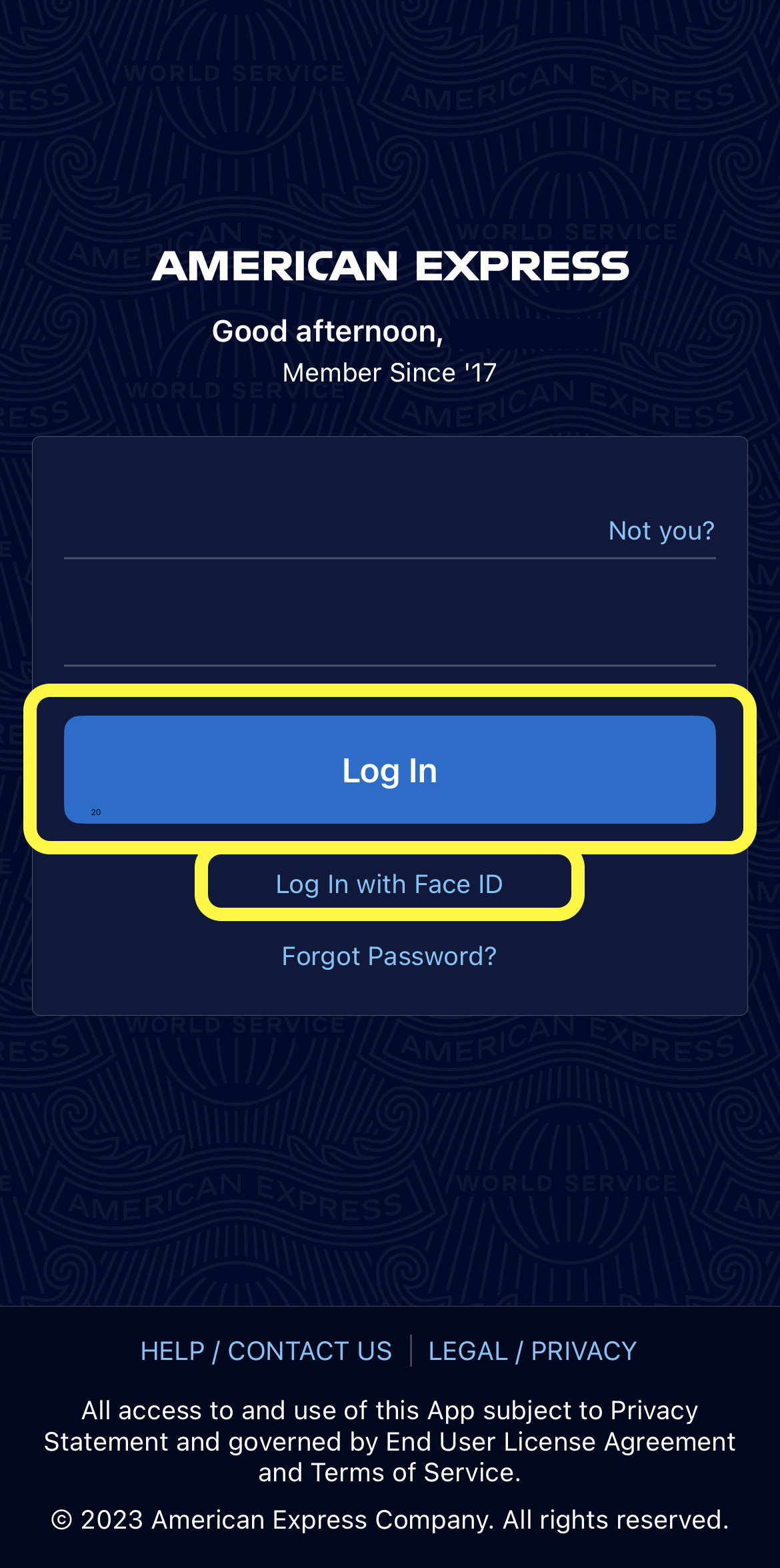
The American Express mobile app follows a very standard format in terms of the login process. Users can either choose log in by password or log in by Face ID. The ‘Log In’ button and the ‘Face ID’ option act as a signifier. Users know what their access options are by just looking at the interface.
Accounts overview
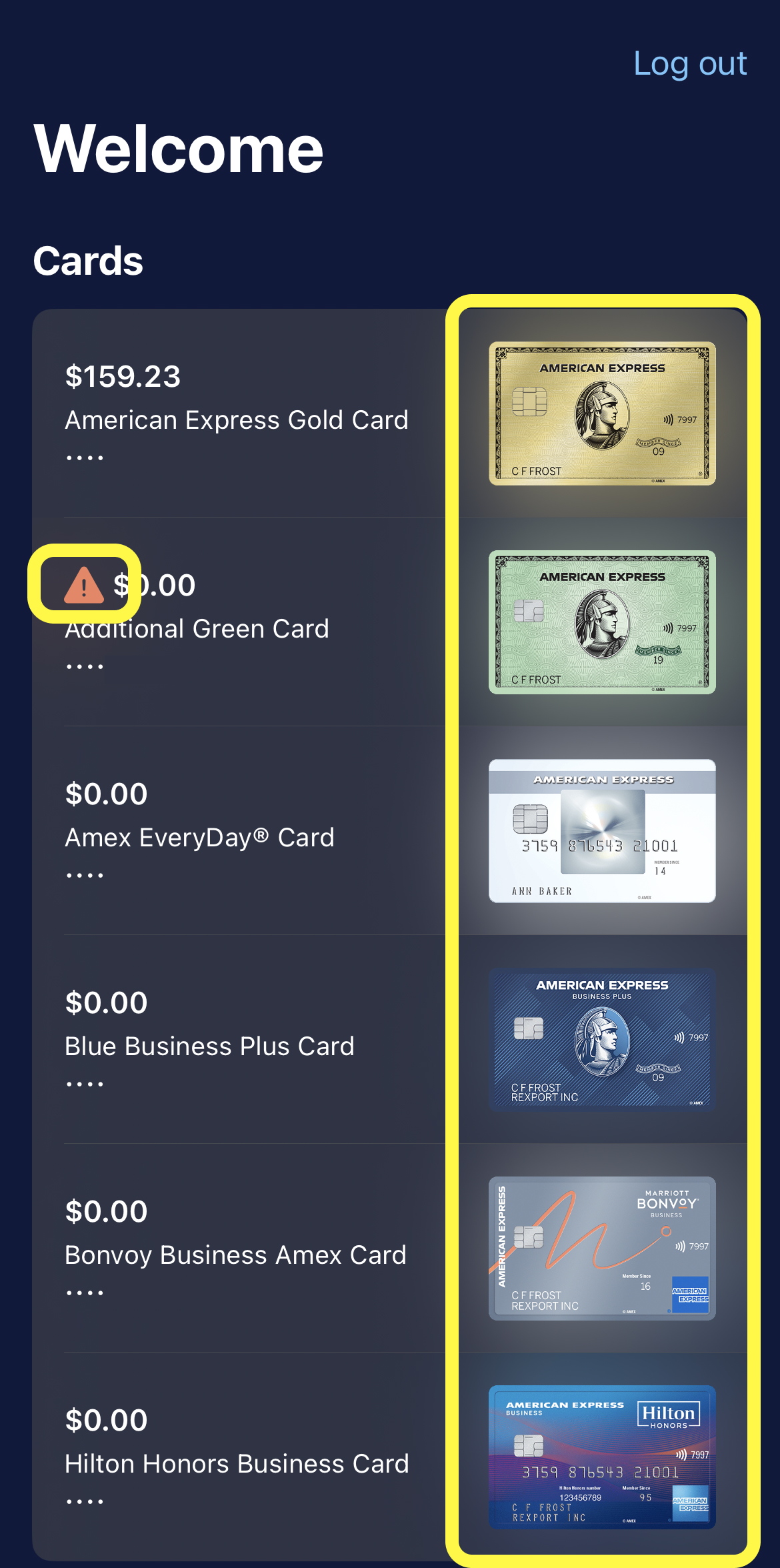
The American Express mobile app makes it easy to get an overview of your accounts (figure 2), including seeing your total balance and card types. This discoverability allows users to see more details between different credit cards and saving accounts. Users can maintain many different accounts in a single app without puzzles.
Also the American Express mobile app is made based on different blue and white color, but sometimes users may see orange icons with exclamation mark that notifies users to pay attention to something.
Accounts details – cancelled account
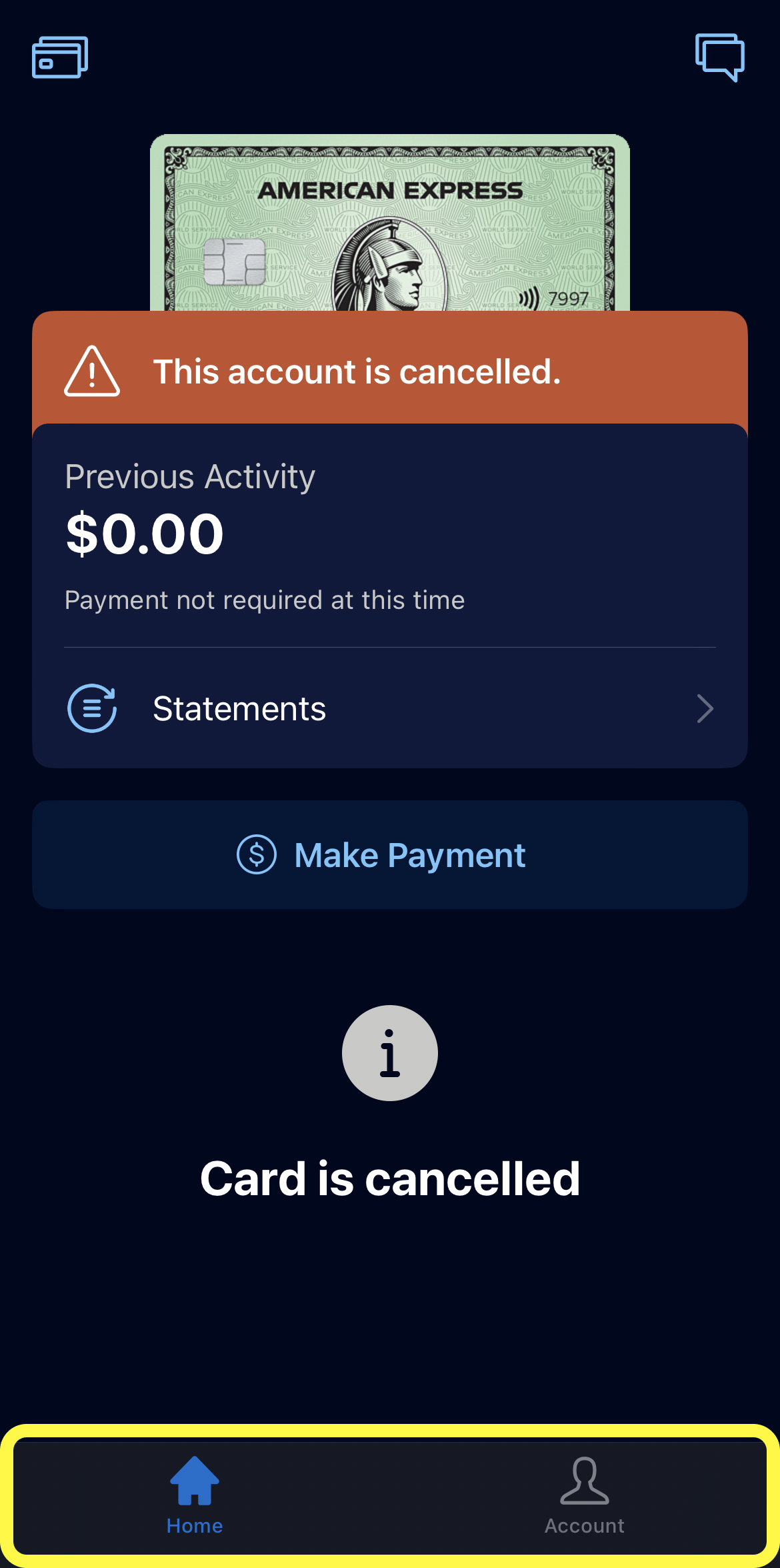
The American Express mobile app has 4 main icons on the bottom of the app (Home, Membership, Offers, and Account). Once users’ account had been cancelled, the constraint of this app will restrict the actions of certain accounts. Users will not be able to go on next step to make payment, enjoy membership benefit.
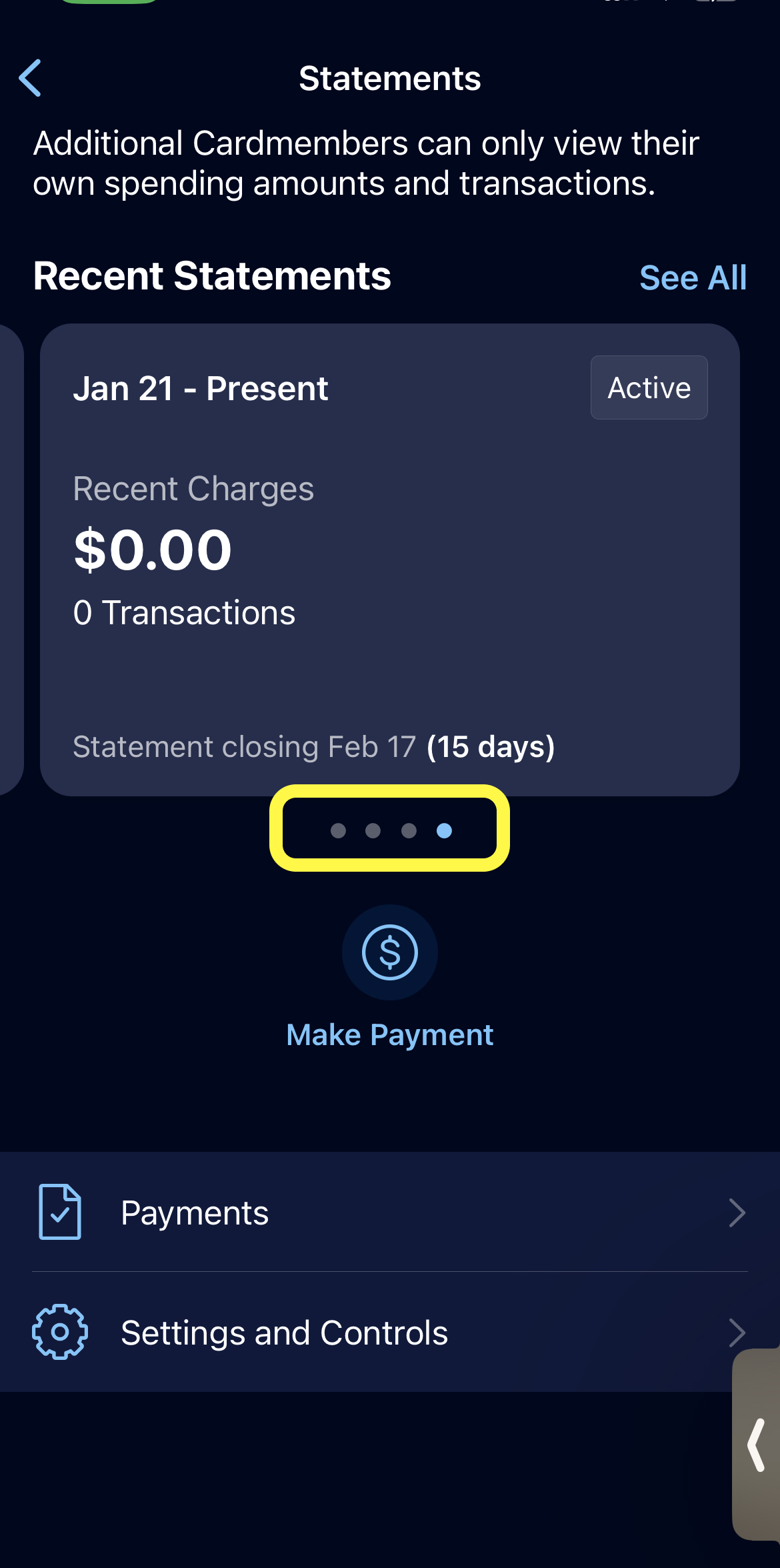
Even thought users can’t do many actions after account had cancelled, but users can still review statements. The bottom navigation bar of the statement uses natural mapping that users can view monthly statements by clicking it.
Membership benefits
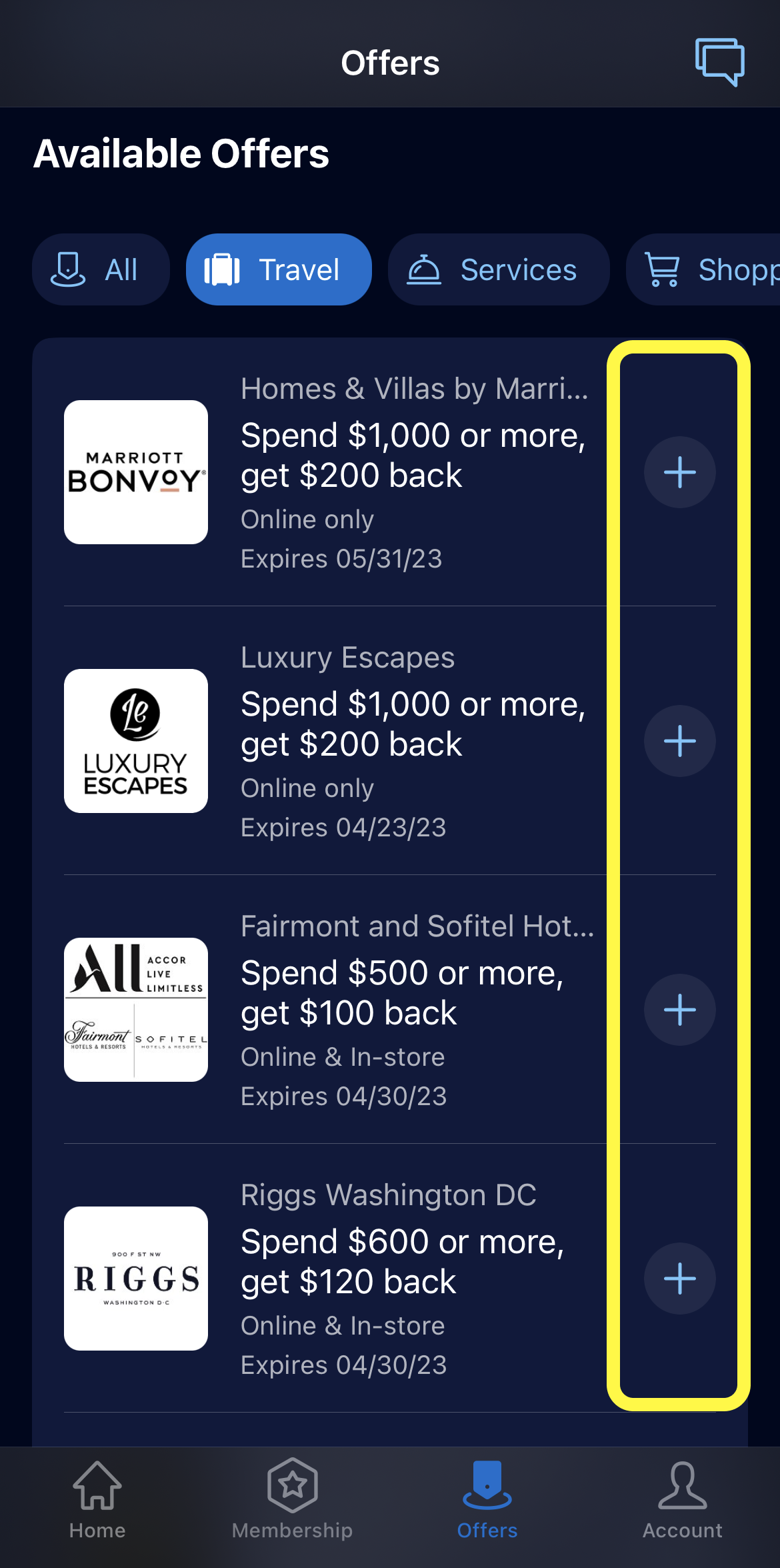
User can find membership benefits and offers on the bottom of the American Express mobile app. The function of adding new offers into certain account is made discoverable. The blue ‘+’ icon (figure 5) tells you that it affords adding new offers, wherein the icons themselves act as signifiers.
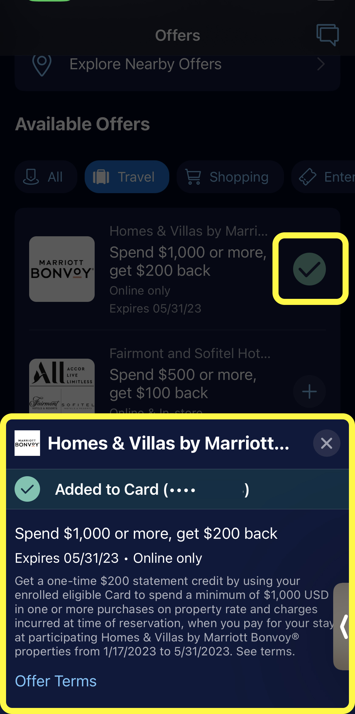
After users click the ‘+’ icon, there is a pop-up window describes the rules of the offer and the expiry date (figure 6). This feature gives users feedback that indicate of the adding action.
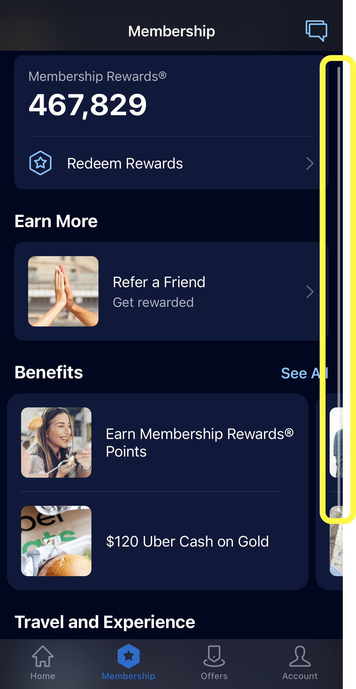
The American Express mobile app offers a vertical bar that helps mapping function (figure 7). Users can easily locate when they are searching membership benefits. However, the vertical bar feature only exist on account page and membership benefits page. There is no vertical bar feature on offers page, so users can’t get an estimate about how many offers they have when they are searing for offers. App consistency is a point that developer should be aware of.
Conclusion
The American Express mobile app offers a really good function that users can easily maintain all the accounts. However, some of the options, such as looking up your credit report or clicking an offer for a high-yield savings account, prompt you to leave the app and enter Amex’s website from within the app, it leads to loading delays.
It can also be frustrating to get kicked out of the app for idleness when you get distracted in the middle of trying to complete a task. Some users comment online that they get kicked out of the app even when in the midst of using it.