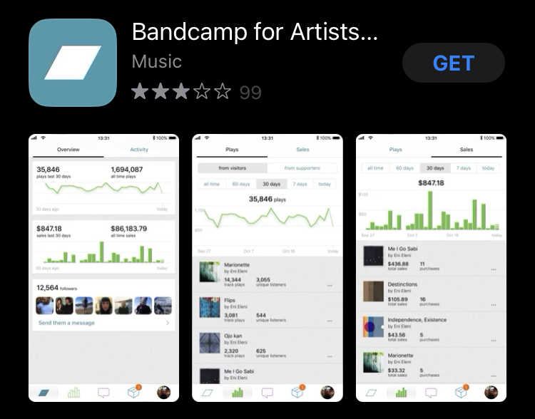

Bandcamp is an online record store, music community, and streaming service known for supporting independent artists with favorable profit splits and flexible pricing options. It enables fans to purchase artists’ albums digitally and physically as vinyls, tapes, and CDs. The platform also hosts merchandise like shirts and hats. There are social features which allow fans to display their collections publicly and list their favorite tracks on each album in their collection as well as leave messages explaining what they like about the tracks. Fans can follow artists, their labels, and other fans to be alerted of the recent album purchases of other listeners or releases of other artists signed to the same label as one that they already enjoy.
Signifier Highlighted
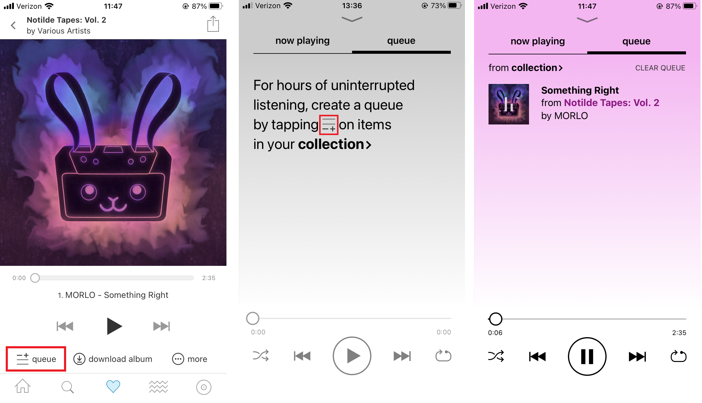
I would like to draw attention to a recently added affordance for the Bandcamp mobile app: the custom queue feature. The custom queue feature allows users to build a custom playlist of tracks across all the albums they own through the Bandcamp platform. The custom queue feature has a signifier of a hamburger with a + symbol, and it is clearly labeled “queue” in the main player. The feedback for using the feature is easy to see and understand as you can see the album cover art slide down into the now playing box in the bottom right corner of the screen.
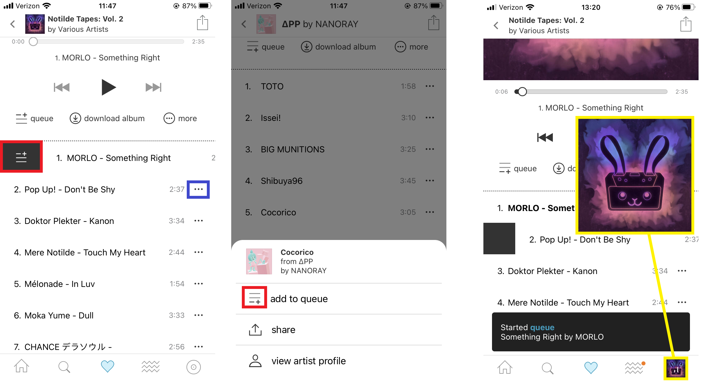
The ellipsis menu button is highlighted in blue
The yellow highlight shows the feedback method of adding a song to queue
There are a few pain points regarding the ease of use of this feature that I will list:
- When pressing play on any song that is part of an album, an automatic queue is made of all the tracks in the album.
- This feature is good for making long playlists that include whole albums, but it adds extra steps to selecting favorites and moving on to the rest of the user’s library.
- The option to start a queue using a single track is hidden behind an ellipsis menu that can be seen to the right of the track display, or through a click and drag gesture from the left of the screen to the right.
- The gesture selection is both convenient and inconvenient because it overlaps with the iOS’ built-in gesture where swiping from left to right commonly acts as a ‘previous screen’ command whereas the ellipsis menu brings up a button you can tap, but this still constitutes an extra step.
- There is not an affordance made for saving custom queues.
- The custom queue feature gives users many options to control the way they listen to their collection, but it is missing a major feature in the form of saved playlists. This affordance would allow users to take their time once to create their ideal playlists and simply select them once and begin listening. There is also the potential for users to share custom playlists publicly as an expansion of the social features already present
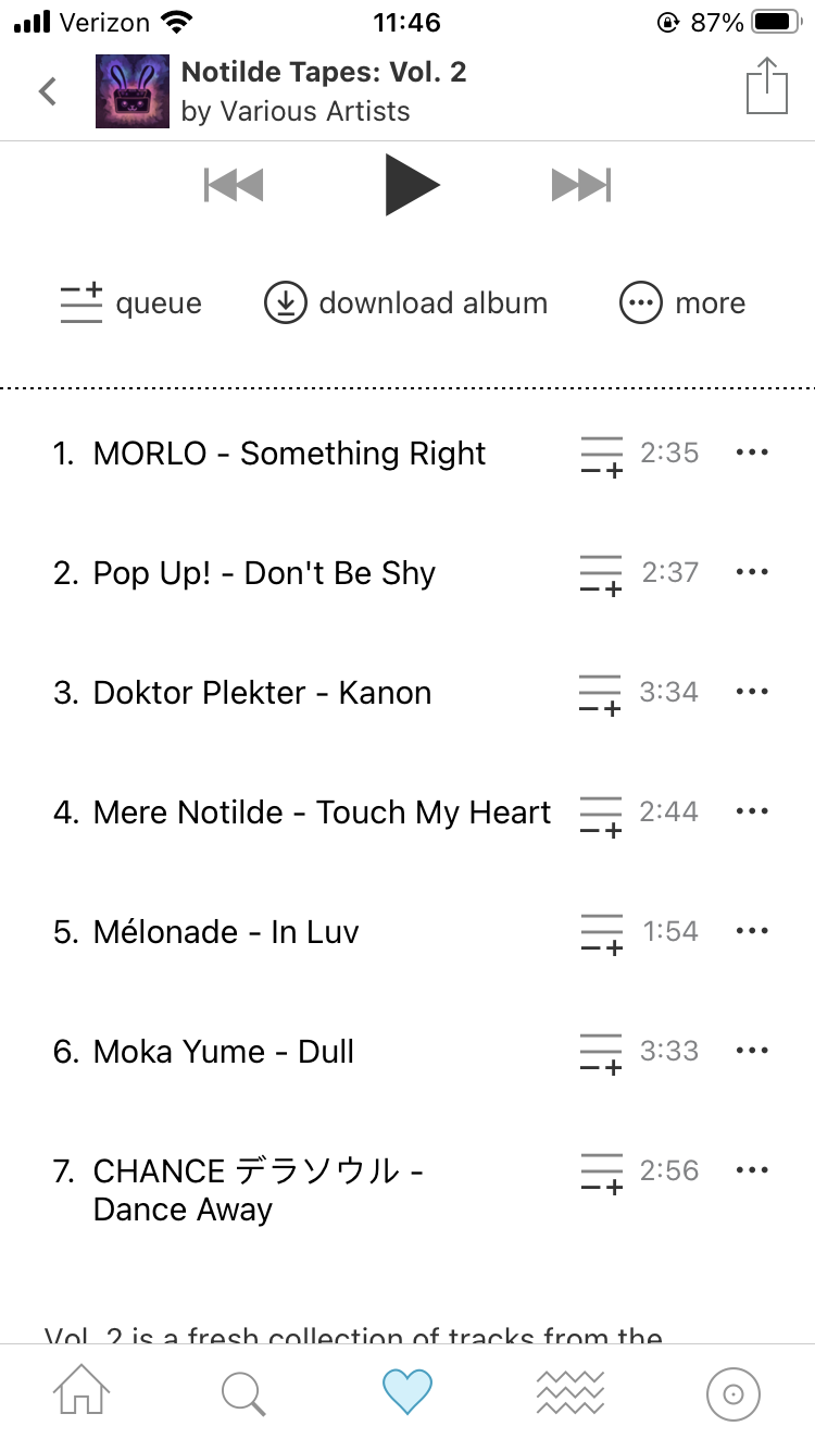
My proposed solution to the custom queue system would be to make single track queue additions into a one button operation to match the operation of adding a whole album to a custom queue. I would suggest that the same signifier be added on the track panel next to the ellipsis menu button. This would make it easy to quickly scroll through an album and pick favorites without the potential errors described in the second item in the list above. To the queue tab, I would add an affordance for saved custom queues, using a widely recognized signifier such as a heart icon, which is used elsewhere in the app to denote features like adding wish listing albums and the tab that displays a users’ collection. This would make saving a custom queue into a simple one button operation that is easy to use.