
Data Is Plural is a website that provides information on creative and unique datasets as well as sources that can help with better research. Which is why the website is a very useful resource to people who are interested in data, work with data or are just interested in different information. The website is founded by Jeremy Signer-Vine and it currently has 319 editions and a new one is sent every week to the users email once it is put in.
Although Data Is Plural has a simple and clean interface, the site can still improve in some areas based on concepts discussed by Don Norman in The Design of Everyday Things.
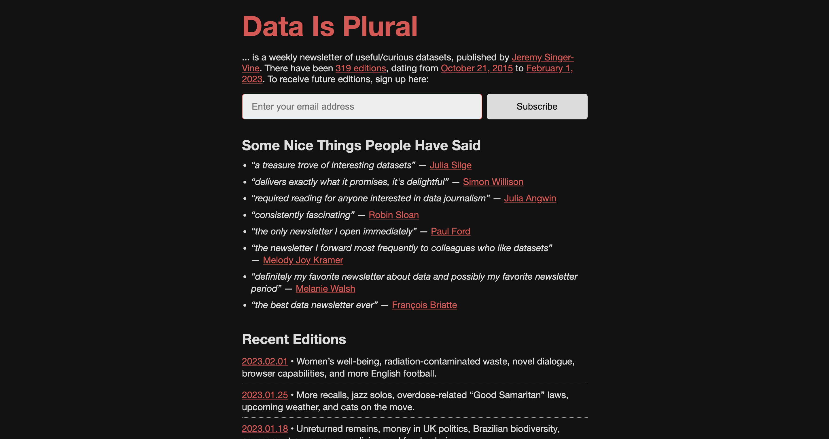
Visuals Are Consistent Throughout The Site
The term consistency refers to the use of a consistent layout, language and design. With the black and red and white layout and correct headings and body fonts, the website does have a consistent and clean layout and design. However, because of the black background, the site may be hard to read for certain users at certain times of the day, which is why the site should also have a light mode. Even though it has a good color contrast and satisfies the visual standards, it can still improve and be more accessible.
Newsletter Submission
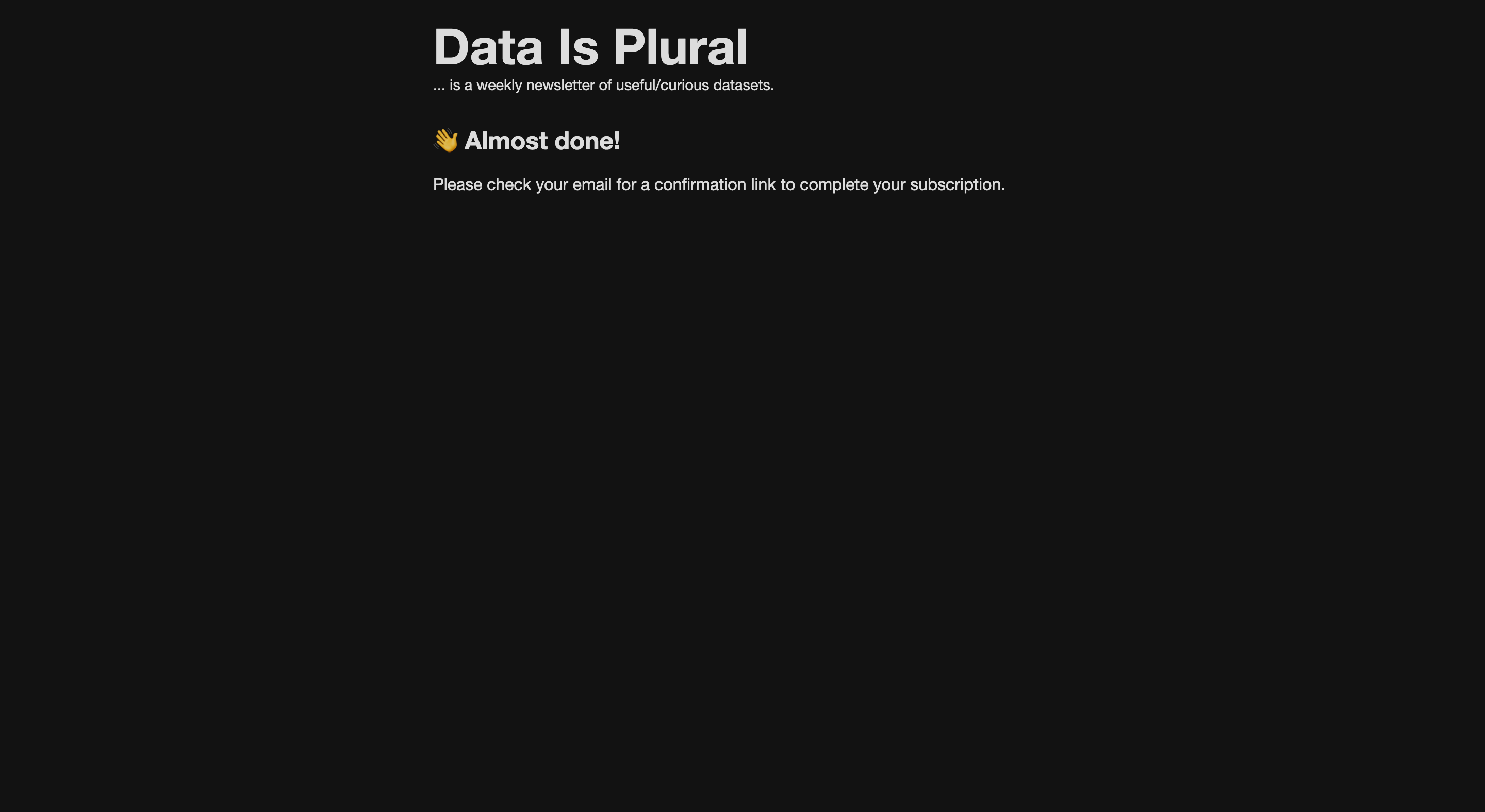
The term used when information or a new page is displayed after a user has made an action is feedback. Data Is Plural does show this when pressing subscribe for the newsletter as shown below. This is a great example of good design because by adding these visual clues, the user is not confused of what each action might lead to since there are correct indicators and confirmation/feedback messages shown. In addition to this, the site shows a different color while hovering over links or buttons, which is another way to show good feedback and speak to the user.
Lack of Search Feature
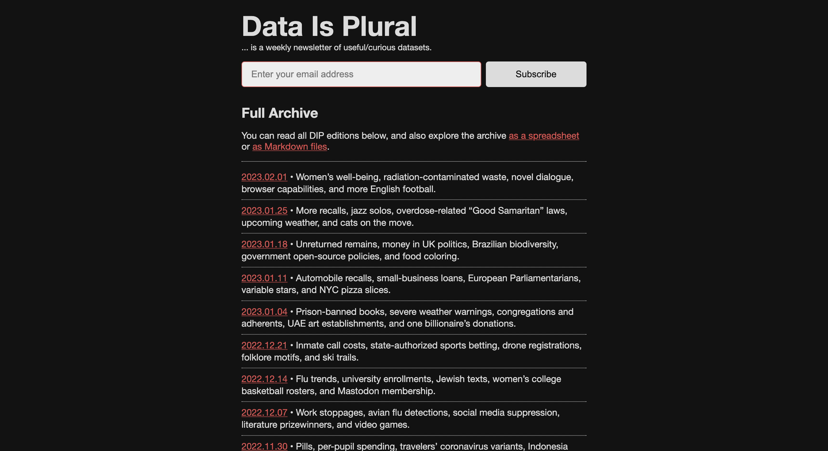
Since the website has no menu or search bar which can make it hard for the user to go back and forth and ask for a specific data set or a specific article from a week, the website is lacking discoverability. This can hurt the user since they would have to scroll through the full archive and find ways to search on their own. Furthermore, there are no clear signifiers that will let the user see a search engine for the user which can make the user even more frustrated. For example, in the full archive page, there is no search feature so this is an example of how the website needs to add a search bar in the navigation or top of the page.
No Visual Indications
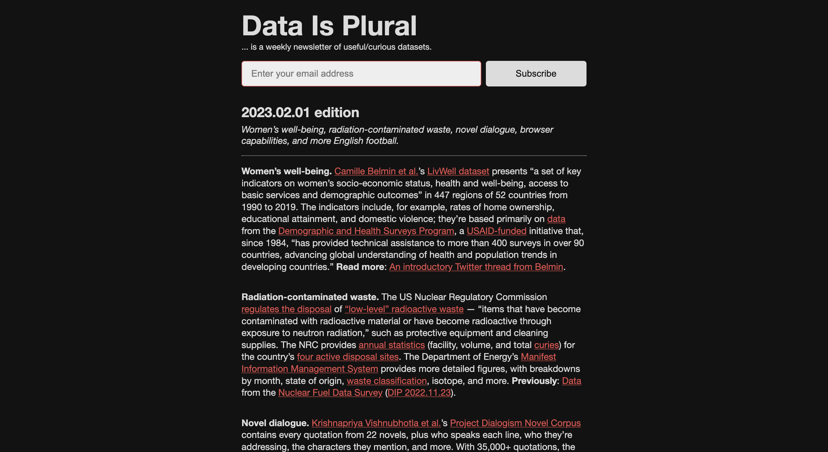
Affordances refer to properties of an object that determine how the object can be used. The website has a variety of buttons and links that although have hover features, they can still be better designed to display their function. To explain further, the website can use icons and rather than just underlining red links to show that it is clickable. For example, in the home page, there are no images of the data sets next to the Recent Editions section. This can can leave the user to only read the words and not have any visual feedback. So with adding icons and images, users will be able to understand what they are viewing more easily and without confusion.
Conclusion
Data Is Plural is a great website that is able to display day and give information about that data to its users. Even though the site does follow some of Nielsens Ten Usability Heuristics (user control and freedom, aesthetics and minimalist design, help and documentation), the website can still improve by addressing consistency, feedback, discoverability, and affordances and therefore the user will have a better experience going through the site and learning the data sets.