Delta is a free iOS emulator for retro video games. It runs games from older game consoles like Game Boy Advance, Nintendo DS, and more. Users can enjoy their favorite childhood games without jailbreaking. It also allows users to save game progresses in multiple files and resume playing one of them of their choice. This article will critique some of Delta’s main features based on Don Norman’s Fundamental Principles of Interaction.
Opening a Game
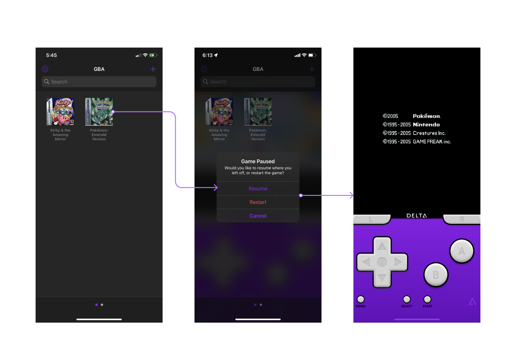
After launching the app, users are given a list of games that they previously imported to the app. After tapping on a game, they are prompted to choose between resuming and restarting it. “Restart” is highlighted red to prevent action-based slips, since restarting the game might result the user in loosing their current progress. The alert subtitle also explains the differences of these two options, giving users a clear conceptual model of how the they work.

On the other hand, the games are categorized by different game consoles, but the additional consoles lacks discoverability. The title of the screen “GBA” indicates that users are viewing the game list of Game Boy Advance, but there is no indication of what other consoles are available. The dots on the bottom are minimal signifiers telling users that it is possible to swipe horizontally, but there is little to no clue on what content would be in the other page. To enhance the interface, listing out all the available consoles as tabs would demonstrate the affordance of switching to a different one.
The Controller Menu
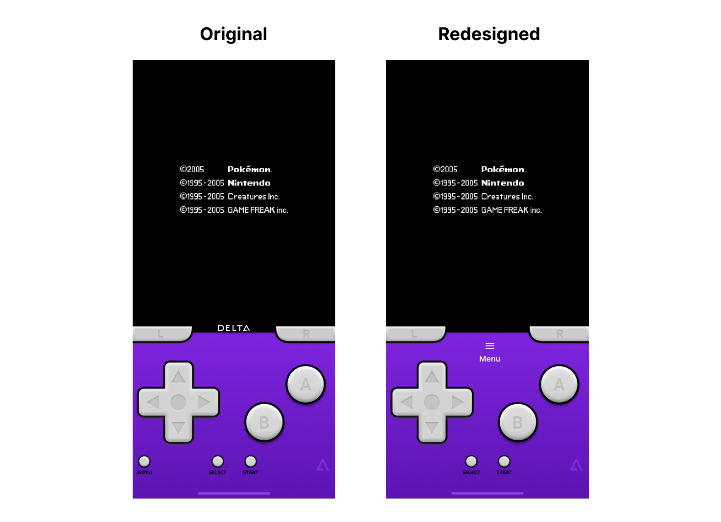
The controls are laid out as the original Game Boy Advance. However, the menu button on the bottom left corner that gives users options to control the emulator is styled similarly as the other buttons. Users may confuse its affordance to “Select” and “Start”, which controls the game instead of the emulator. This can be resolved by styling the menu button differently, so it can be easily distinguished among others. Moving the button further away adds extra constraints to the interface, and reduces description-similarity errors.

When users tap on the “Menu” button, the game is paused, and a bottom sheet appears to offer several options. The “Main menu” button here is colored red, and users could interpret its affordance as something undesirable. In fact, It merely takes users back to the list of games, and their progress is auto-saved. Therefore, using a primary color, an icon, and the action verb “Exit” better signifies the action as benign. Moreover, the icons for “Save state” and “Load state” have similar silhouettes, and may fail to signify the opposite affordance at at glance. By using icons of different shapes and altering the length of the labels, users would be able to better tell them apart.
Saving Game Progress and Loading a File
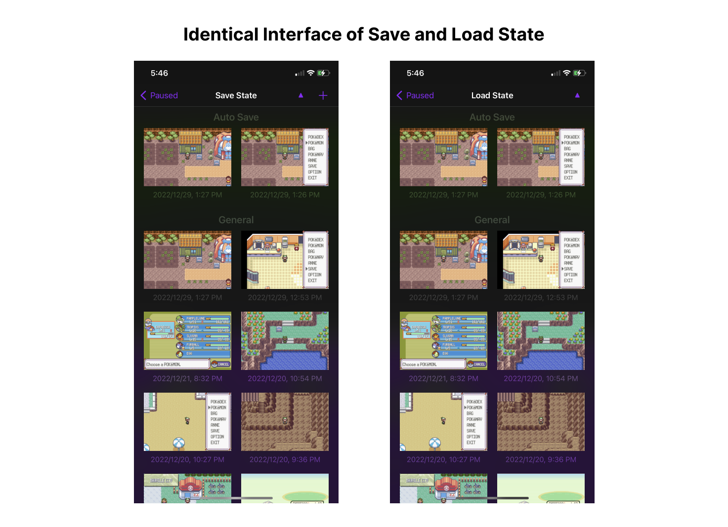
The save and load function allows users to manage their saved game file. Both flows have clear feedbacks, while saving to an existing file will change the thumbnail, and load would return to the game control screen.
The shortcoming of these screens is that save state and load state looks exactly the same, but they have the opposite affordance. When tapping on a file, save state overwrites it, while load state opens it. The lack of prominent signifiers or constraints may cause description-similarity slips, as users tap on the usual route and end up with the wrong result. Users might overwrite their files while they want to open it, or loosing their current progress by accidentally loading a file.
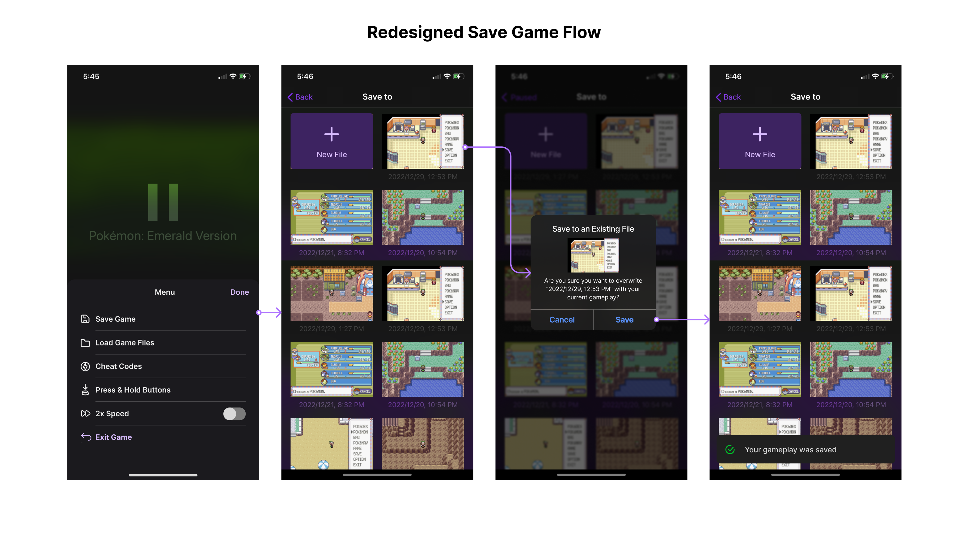
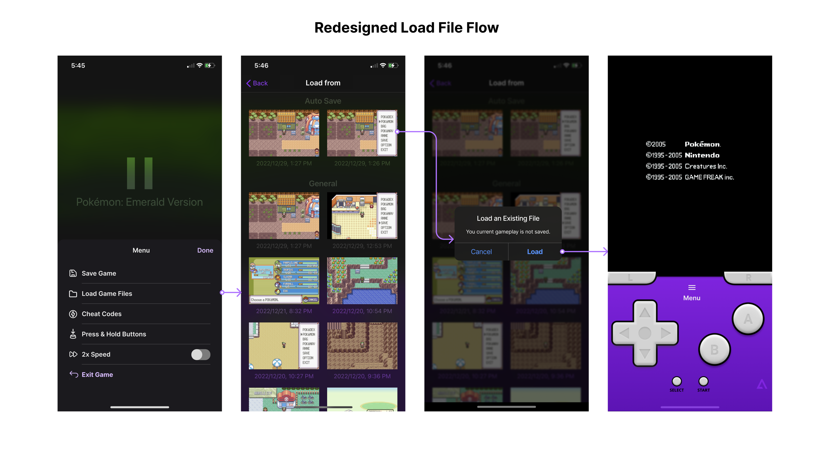
Adding a confirmation in the flow and altering the interface would lower the possibility of mixing up these functions. The redesigned save screen has a bigger plus icon to hint its affordance, and it adds a constraint by confirming with the target file’s thumbnail. After the file is saved, a toast pops out on the bottom to give a visible feedback. A prompt is also added to the load file flow to lower the possibility of slips.