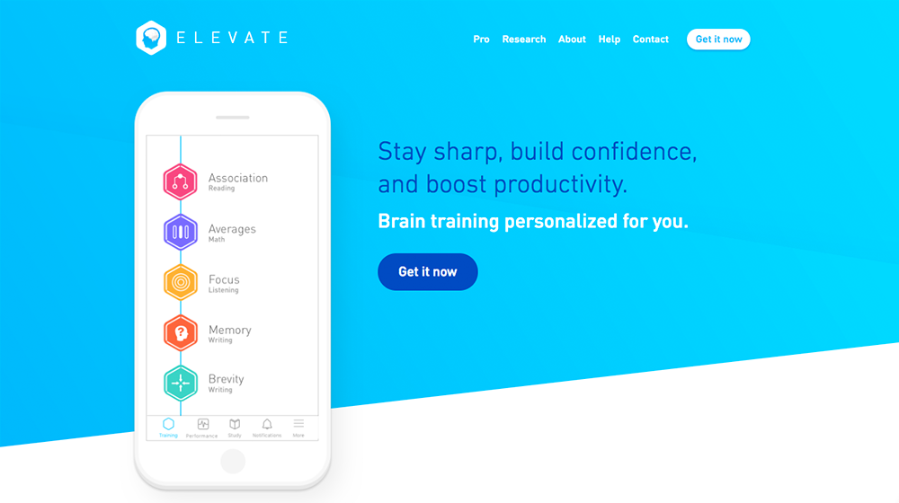
Elevate provides users with personalized “brain training”. Using a series of initial assessments to determine user needs, Elevates create a bespoke regimen of mini-games that trains five categories of cognitive skills and evolves as users advance through the app. Users can track their progress and partake in activities outside of the regimen to continue their development.
Selecting a Training Regimen
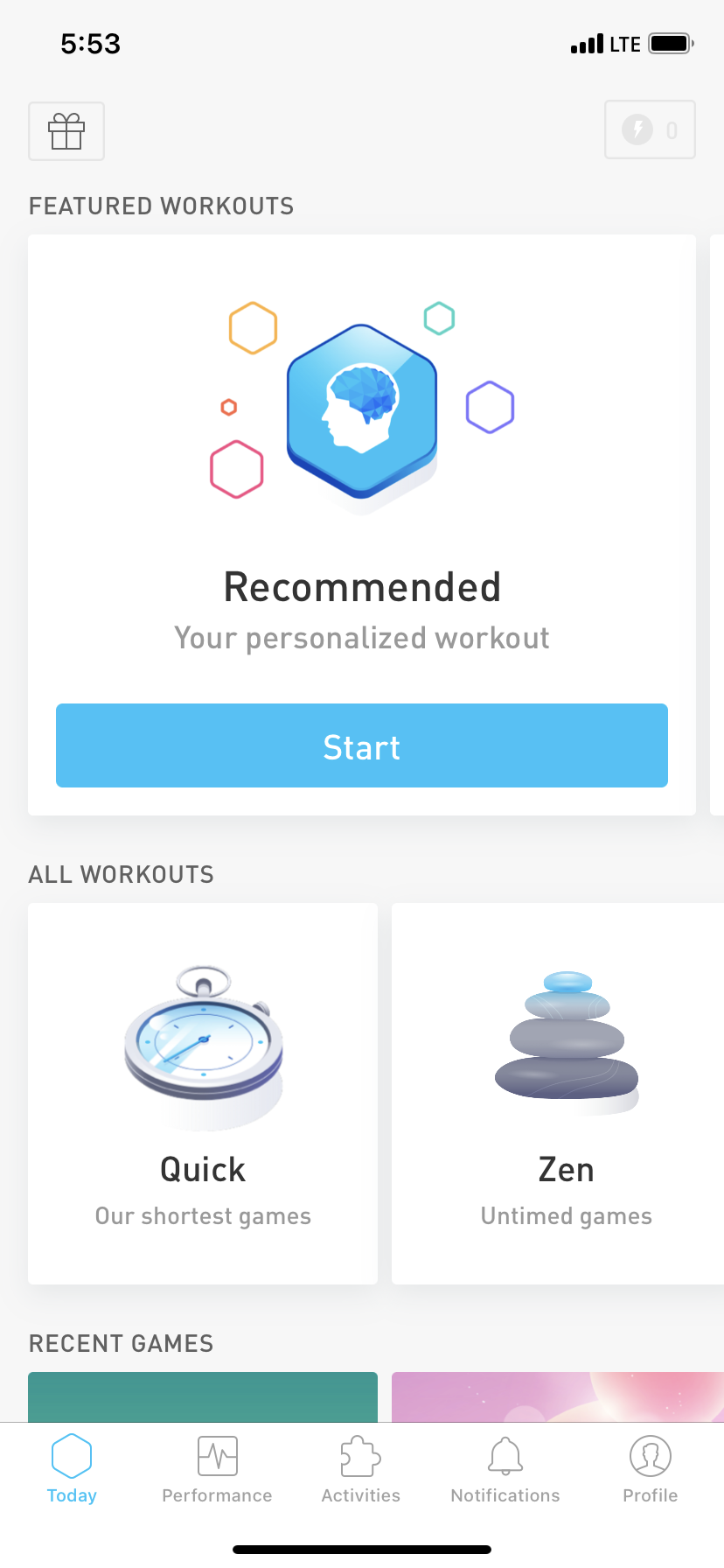
Upon opening the app, users see a homepage that displays the “recommended daily regimen” (i.e., the key feature) on top, with alternative options below. Making this the largest option and placing it at the top of the page maximizes the discoverability of this feature and helps Elevate bridge the gulf of execution for users seeking this feature. Because this option is the first thing users see, they only need to use minimal effort to begin their daily training. The button to begin the training also makes effective use of color and label signifiers to further reduce the amount of effort expended by the user – the blue color differentiates it from the rest of the page as a button, and the “start” label is an unambiguous statement of its function.
However, the alternative regimens available on the homepage are not explained during user onboarding. Thus, a user whose conceptual model of the app is that it is a once-a-day pre-set brain “workout” may be confused by these offerings. They may not understand how these alternative regimens could impact their app experience, since the program is supposed to evolve with your progress. The alternative features are arguably an example of “featuritis”. Having so many options immediately apparent may frustrate a user’s pursuit of their primary purpose (daily training to progress through the app) or users may ignore these options altogether. In either case, the multitude of features ultimately frustrates their usability. This problem may be solved by providing users with more clarity on how the user can leverage these alternative regimens in pursuit of their learning goals (increasing the user’s knowledge in the world) or by relocating these features to a separate tab, so they do not overwhelm the user when completing the app’s primary function.
Completing Your Daily Regimen
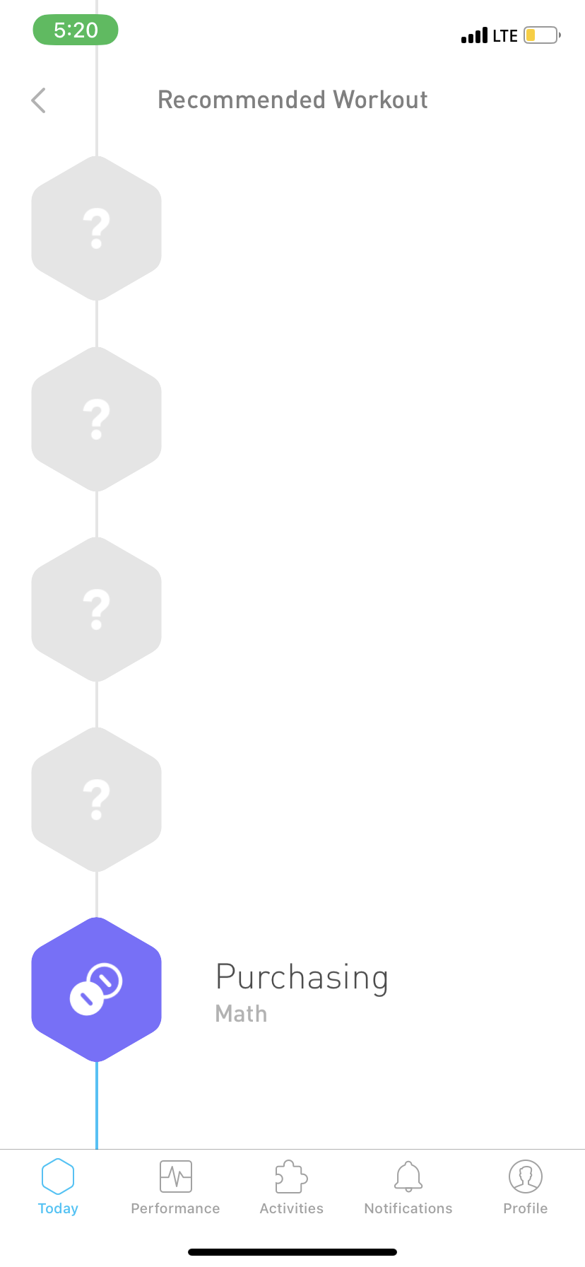
When users select their daily regimen from the homepage, they are taken to the regimen dashboard. From here, the page stays static until users tap on the first game to begin. In this way, Elevate is unsuccessful in bridging the gulf of evaluation. Users might expect that clicking “Start” on the previous screen would immediately launch the first game, so the lack of feedback on the next screen may cause them to wait needlessly to see some movement. This is especially true because the control to launch the game on this screen lacks discoverability. It does not share any of the signifiers of the button on the previous screen, so users are unlikely to immediately recognize their next action. This problem can be solved by launching the game when the user presses start (giving the user more immediate feedback) or adding a button to launch the game on this screen that conforms with the user’s expected signifiers based on their prior interaction with the app.
Once the regimen is launched, the app proceeds almost automatically. When one game is completed, Elevate pulls up the screen for the next. This could be considered a lock-in constraint, as it forces users into the desired course of action by creating the impression that they are required to complete the daily regimen in one sitting. In practice, users can close out of the app and resume the regimen later, but this is not apparent from the design of the sequence, so users may feel compelled to stay in the app until the app signals they have completed all the required games for the day. This constraint ultimately optimizes the app for the user’s needs, since the training is more effectively tailored to the user through increased completion of the games.
Checking Your Progress
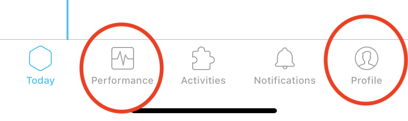
To check one’s progress in their training, the user can navigate to the “Performance” and “Profile” pages via the bottom toolbar. This navigation system is an example of a cultural convention constraint. Elevate leverages the mobile convention of the bottom toolbar which is established through the user’s knowledge in the world to ensure the user has only one clear and direct path to these features. Using iconographic signifiers such as the face profile in the circle for “Profile” and the line graph for “Progress” also ensures users will be able to predict the contents of these pages and therefore find the information they are seeking more easily.
Overall Visual System & Experience
The visual system of Elevate is aesthetically appealing, using bright colors, rounded lines, and pictographs to give a relaxed appearance to an experience that might otherwise be considered stressful if viewed as academic or medical (e.g., a user wishing to prevent the onset of a cognitive disability). The gamified experience also incentivizes users to login daily and play instead of viewing it as a chore. These design choices help Elevate address “The Stigma Problem”; making the app aesthetically pleasing and fun means people will want to use it, even if their use is for a specific kind of necessity rather than simple enjoyment.