Etsy is a popular e-commerce company that has huge collections of unique products. It’s an enclosed ecosystem where users can sell, buy and collect distinguished items from different countries. Customers are exposed to one-of-a-kind handmade products, encouraging them to purchase these products to create their own personalized space.
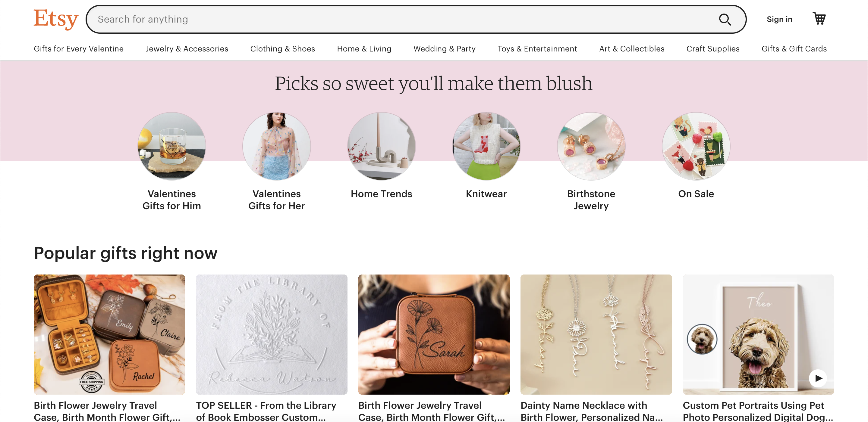
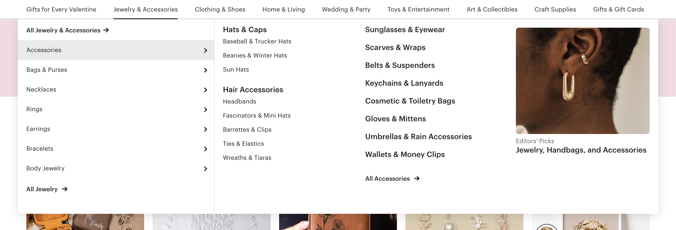
Etsy speaks vintage when you land on their homepage with its font styles, colors, and designs. A list of seasonal top picks like “Valentine’s Gifts” and “Knitwear” is displayed for users to quickly access trending collections. Users are also exposed to a wide range of products based on themes like “Boho Decor” and “Minimalist” simply by switching tabs. The primary navigation has comprehensible titles and distinct sub-classifications simplifying the search process for the user.
Homepage
Frequent users’ results are customized based on their previous purchases. This means they don’t need to spend hours searching for what they want. On the other hand, new users spend more time scrolling through, familiarizing themselves with the interface. Some products on the homepage only have the like/wishlist button and price mentioned, leaving out necessary information like the product title and popular tags. This slows down the learning process by making information less discoverable.
User process
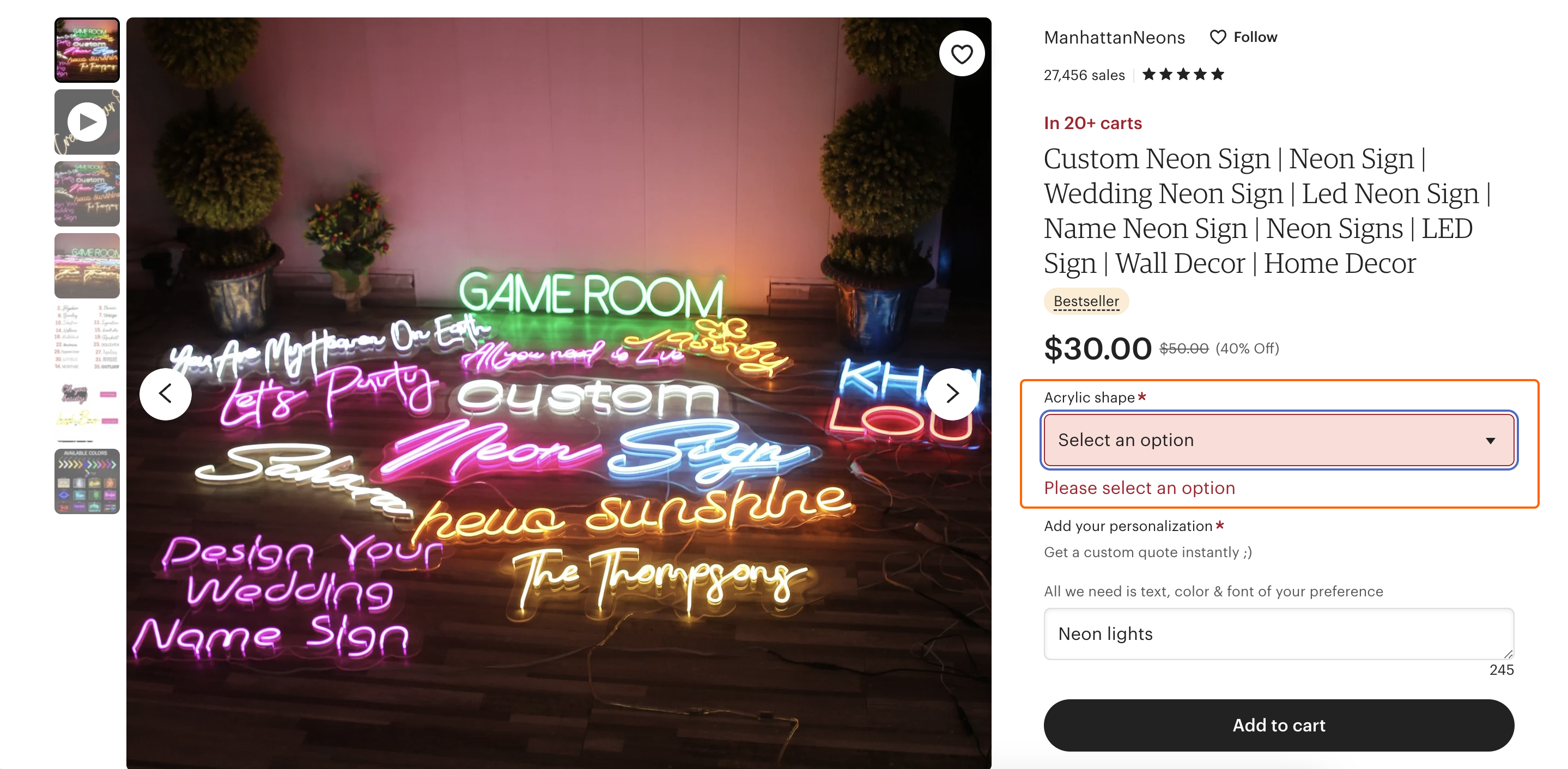
In order to understand the flow of actions better, I created a user goal to buy a neon LED sign. One way to achieve this is to directly search using the search field at the top of the homepage. This provides the user with filtered suggestions while typing. Another way to find the products is to use the navigation bar by browsing through the categories. The search displays the “Most Loved” results first and then lists the remaining products. The like button on the right allows users to save the search making it effortless to access this search result in the future removing the mental load off of the user reducing the need of ‘knowledge in the head’. The customer is taken to a detail page after clicking on a product. Users can customize based on their preferences and add the product to their cart. If the user misses filling in a required field, the field is highlighted in red with a prompt allowing users to rectify it immediately. The user can then complete their purchase.
User emotions
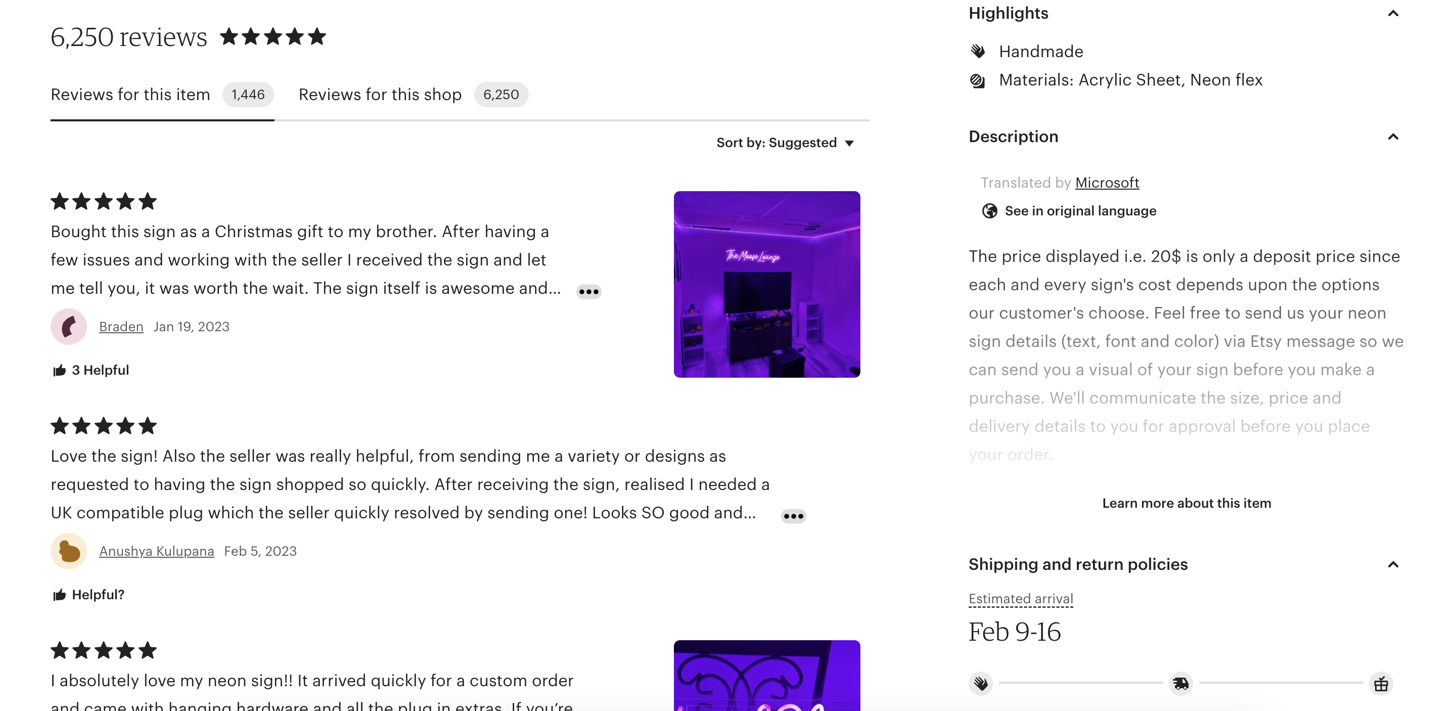
Users feel a rush of emotions while browsing on Etsy. Initially, users are calm. They come with a clear goal of finding a particular product in their mind. However, as they scroll through the website, they get excited and motivated to discover products beyond what they came looking for. This results in increased engagement with the website leaving users with positive emotions. Users are in a “flow” state where they are challenged just enough to keep their attention but not so much as to cause frustration. Although, sometimes users may feel overwhelmed by the overload of information. For example, the product detail page provides users with all the necessary information but lacks organization and looks cluttered. Additionally, Etsy displays breadcrumbs at the bottom of the page which might be overlooked and adds to the cognitive load of the user by making them have to recall how they got to that particular page.
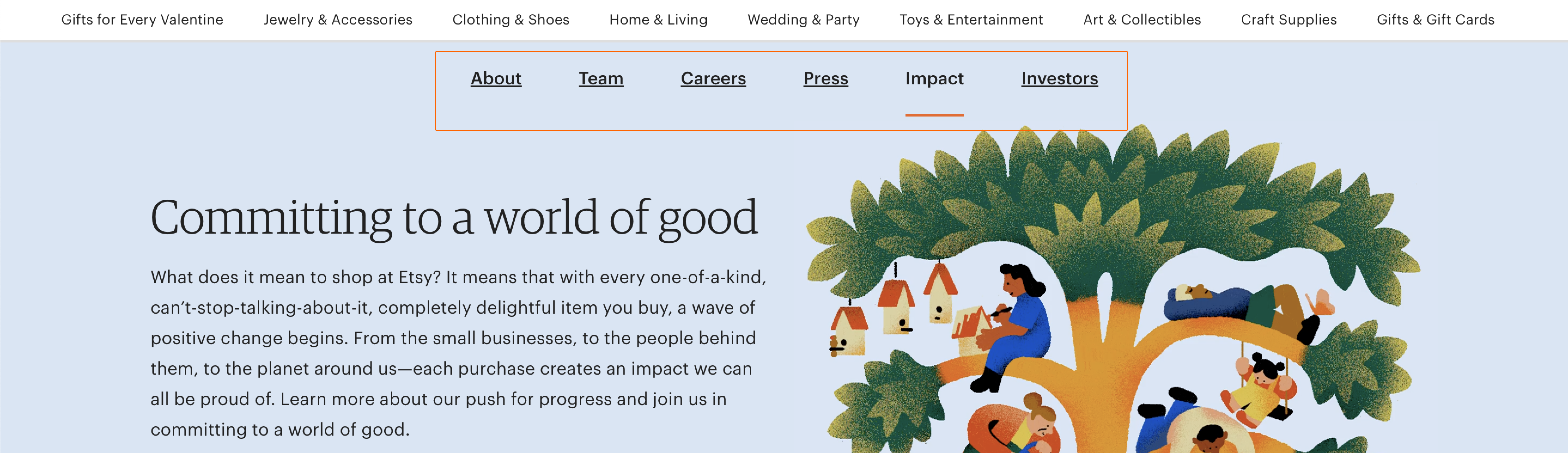
To go beyond the main function of the site, I was curious to find out more about its environmental impact. I was led to a new page with an additional navigation bar that was previously absent. In the past years, customers have become more aware of their purchases by taking initiatives to support certain communities. Etsy’s motive of supporting small businesses and protecting the environment adds to the users’ positive emotions, nudging them to support this movement. Upon switching tabs in the secondary navigation bar, users are directed to different pages with varying layouts leaving users confused with no way back.
Solution
In order to improve the user experience, a few changes could be made. For starters, every product image must have a product title to map the details together. A clear secondary navigation bar needs to be designed to establish a hierarchy and maintain consistency making it accessible to users. It is also essential to structure the information on the product’s detail page by removing redundant information and leaving white space to make it easy for users to make sense of the information. Lastly, users shouldn’t have to rely on their own memory to navigate through the site. To overcome this, breadcrumbs need to be displayed on top left corner of the screen allowing users to go back and forth in cases of slips.
Conclusion
Don Norman says products are designed to be used by people making it essential to deeply understand its users and Etsy does a great job in this by providing users with a variety of products they’re looking for and more. In a world where customization has become an individual’s second personality, Etsy works to this advantage of users’ psychology by bringing together artists and buyers from all around the world and creating an exclusive community.