
In 2022, Netflix achieved several notable successes. It brought its total subscriber base to over 200 million and released several successful original series and films and has continued to expand its footprint globally, launching in new markets and building its local content library.
Behind these tremendous accomplishments lies elaborately built user experience design created by vast amounts of data, technologies, and experts. In this post, I would like to apply UX heuristic evaluations to look at how Netflix successfully created a user experience and would like to suggest improvements.
1. Personalization and Hick’s Law
You might experience when you endlessly scrolled through the thumbnails looking for something to watch and couldn’t decide. When we use a platform that offers many choices, such as Netflix and YouTube, we feel tired and confused about our decisions. We call this ‘Hick’s Law’; the more options a person has, the longer it takes to decide on an action.
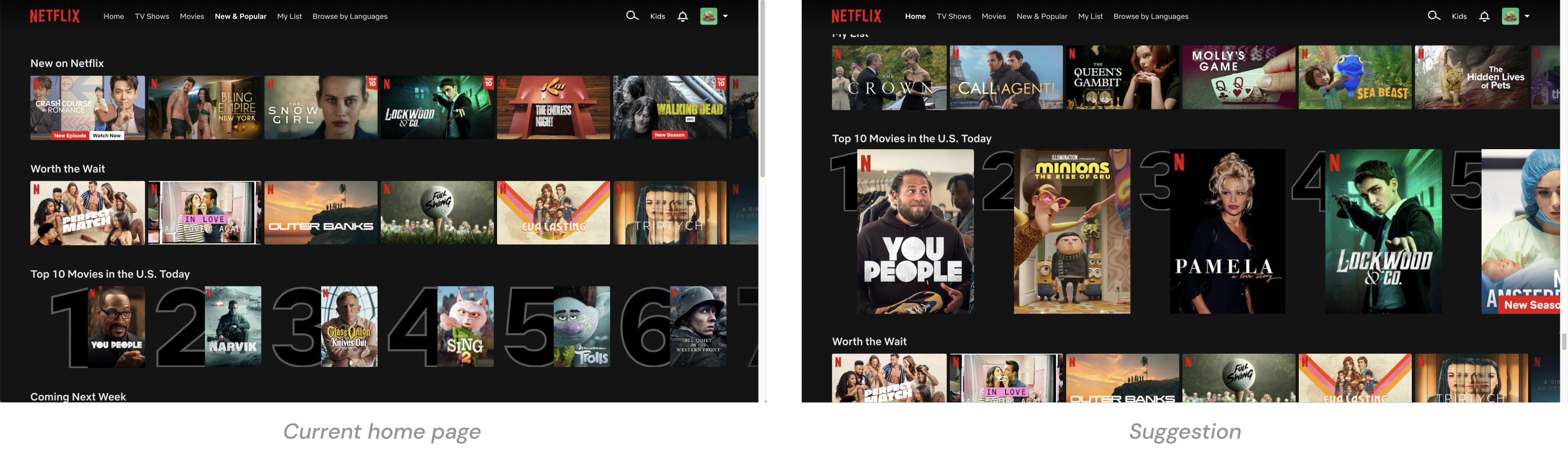
To solve this cognitive problem, Netflix provided ‘top 10 movies in your country’ to users, providing a personalized experience while reducing possible choices. Nonetheless, since all content thumbnails are scrolled in the same size and format, we encounter a large amount of information at once without any hierarchy of content.
I would suggest putting an emphasis on highlighted content on the landing page and changing it to a dynamic design. While all content is currently arranged in a uniform column, I suggest highlighting some content collections, specifically Netflix original series, new content, and upcoming content. This content can be highlighted like big posters hanging in a movie theater, which will create an immersive experience on a digital platform and improve the user experience simultaneously.
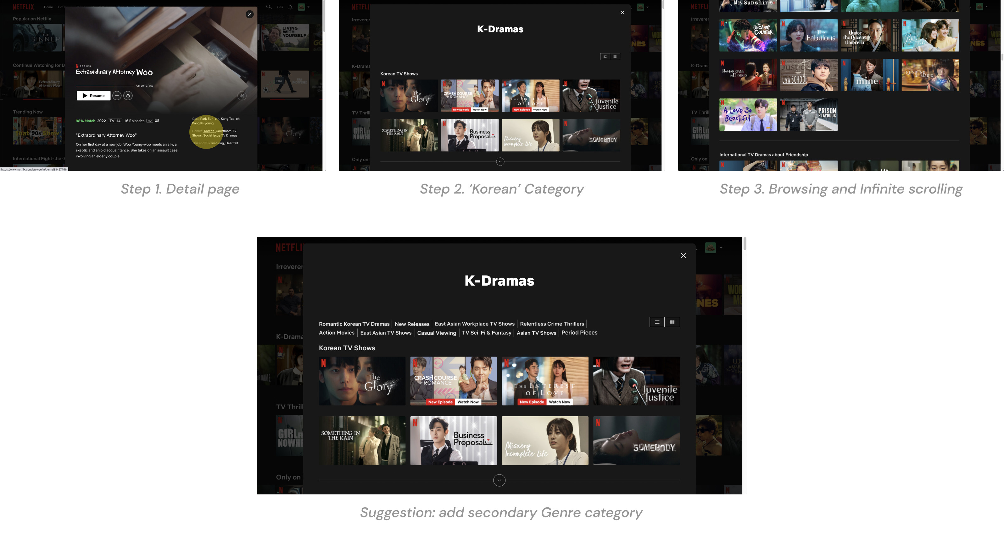
One of the user journeys on Netflix to the detailed category has the following flow. When users click ‘Korean’ on the Genres on the content detail page, they can see the ‘K-Dramas’ content list. Then, they can scroll down to see all the content, categorized by specific themes such as ‘New Releases,’ ‘Korean TV Shows,’ ‘East Asian Workplace TV Shows,’ ‘Asian Movies,’ ‘Romantic International TV Dramas,’ ‘Relentless Crime Thrillers,’ and ‘Period Pieces.’
However, the number of these categories is so large that users constantly scroll through them. I would recommend adding a tag section on the top, so that users can move directly to the corresponding location when they click on the tag.
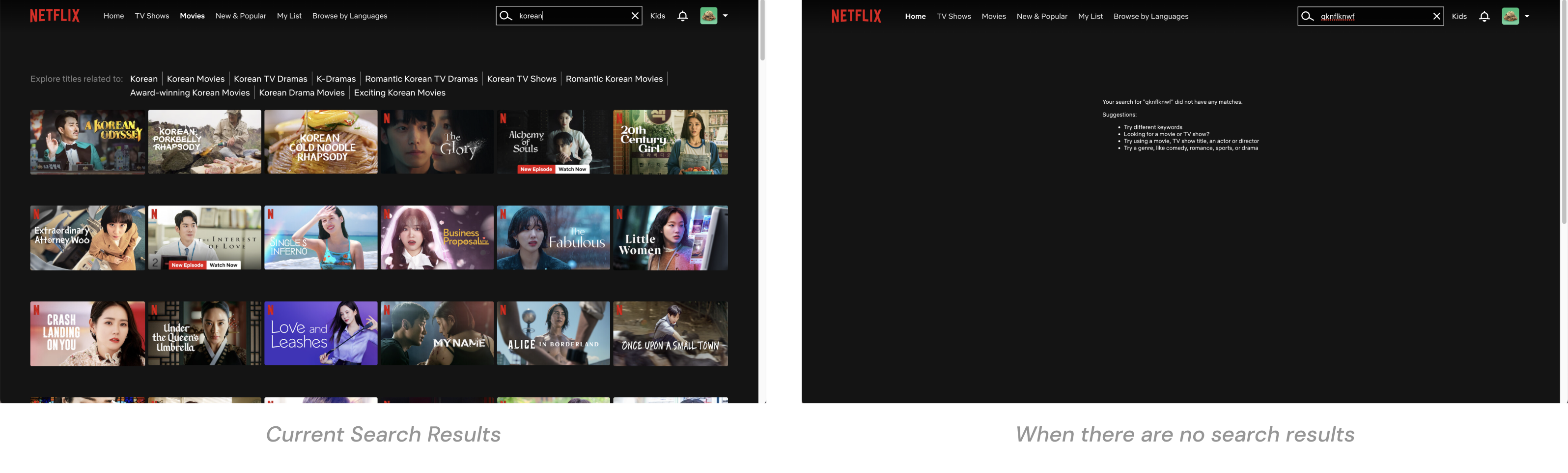
In the search experience, I found two main issues. First, after entering a search word, a large amount of content is displayed at once without tagging or classification. This makes users challenging to determine which content to select from the search results. To help users narrow down the scope they want, I suggest adding a tag section at the top that shows secondary search keywords created by AI.
The second issue is when there are no search results. Netflix provides the following guides to users: ‘ Try different keywords,’ ‘Try using a movie or TV show title,’ but does not provide any other content to acquire users. In addition, the guide text currently displayed on the screen is relatively small, resulting in poor readability. I recommend displaying content customized to the user so the user can face other channels of viewing other content directly.
2. User control and freedom in UI elements
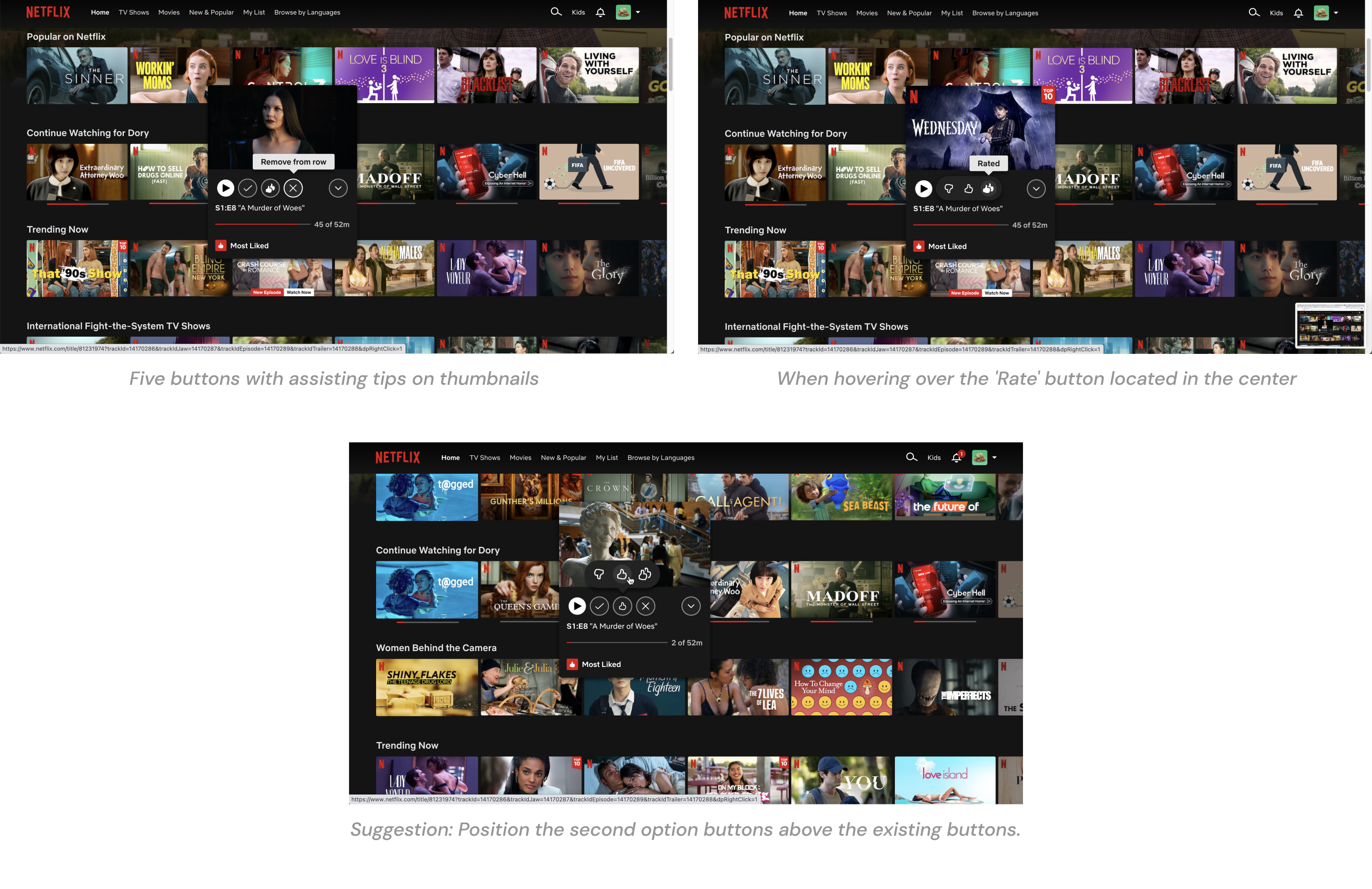
Users can undo it by simply clicking the buttons again. This seems to be a winning factor in terms of ‘User control and freedom.’ However, in terms of ‘Error prevention,’ I often experienced inconveniences.
Hovering over the ‘Like button’ shows three horizontal options, which overlap on top of both buttons. I tried to click the ‘Save to my list’ button located on the left, but there were cases where I accidentally clicked the ‘Dislike button’ as the mouse hovered over the ‘Like button’. To prevent these errors, I would suggest positioning the second button list above the existing buttons.
Netflix’s video player follows the heuristic principle of ‘Match between the system and the real world.’ It can be seen as a player design that maximizes accessibility and visibility while having similar functions and UI systems to video players on other platforms such as Vimeo and YouTube. All text and icons are prominently displayed in a considerable size and display system status and feedback with precise color and contrast when hovered or selected.
3. Doherty Threshold and Efficiency of Use
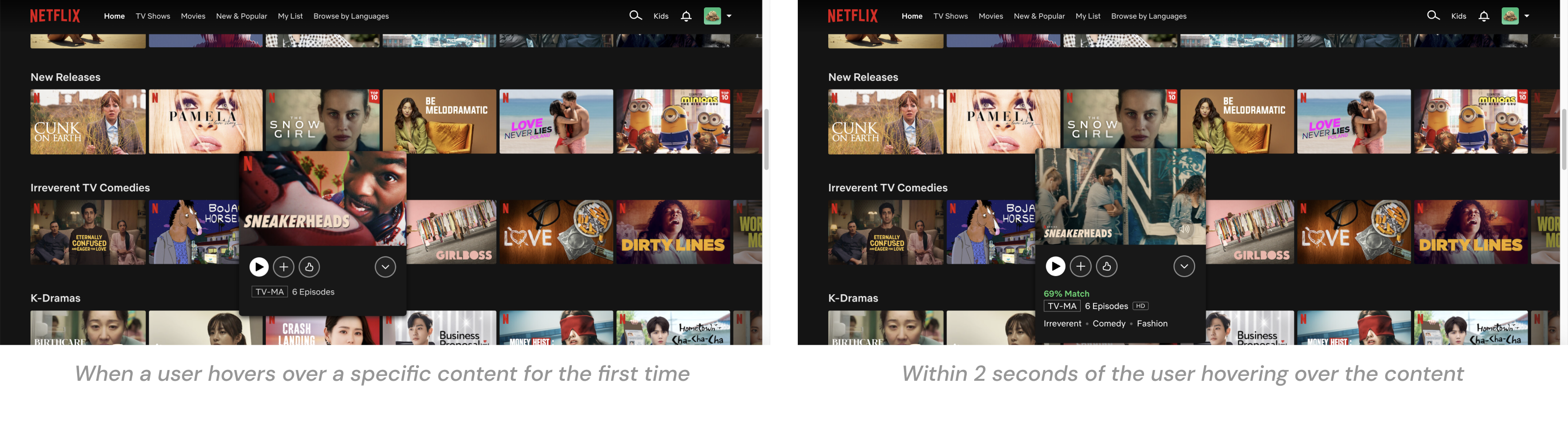
The Doherty threshold means that the user’s concentration and usability decline when the product’s response increases to more than 1 second. Productivity soars when a computer and its users interact at a pace of less than 400ms, which ensures that neither has to wait on the other.
This concept is applied to the UX feedback. While Netflix pulls in massive amounts of content information when users hover over one of the content, users can get instant feedback by first viewing important thumbnail information on hover. Within two seconds, Netflix plays a preview, showing additional information on the card, including match rate and genres.
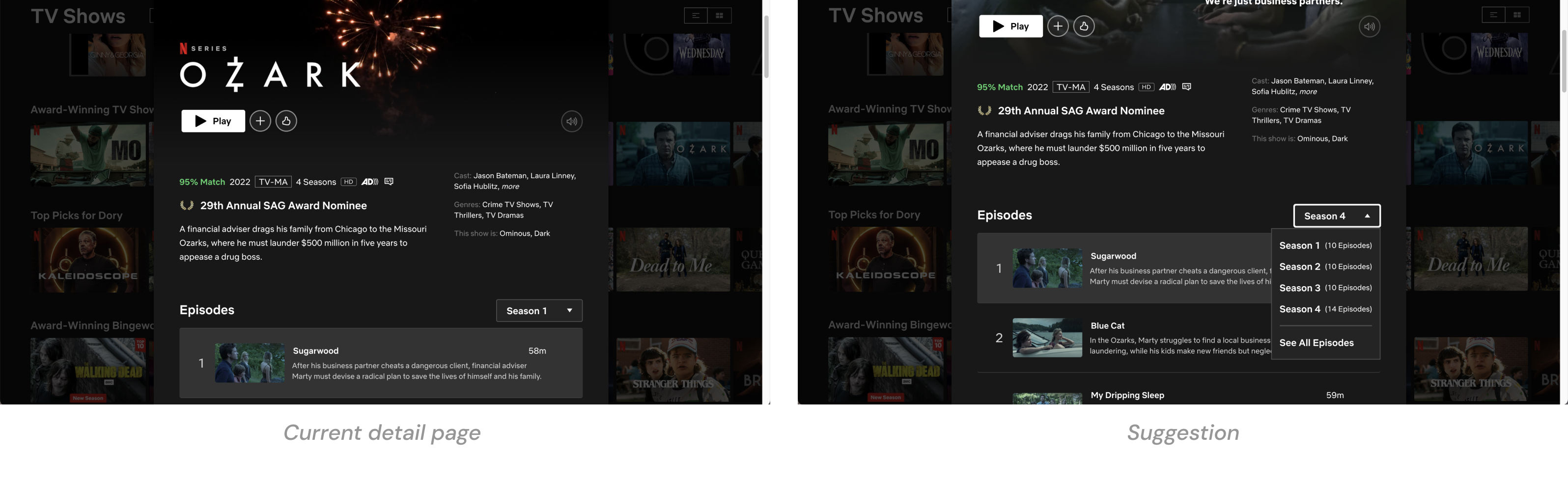
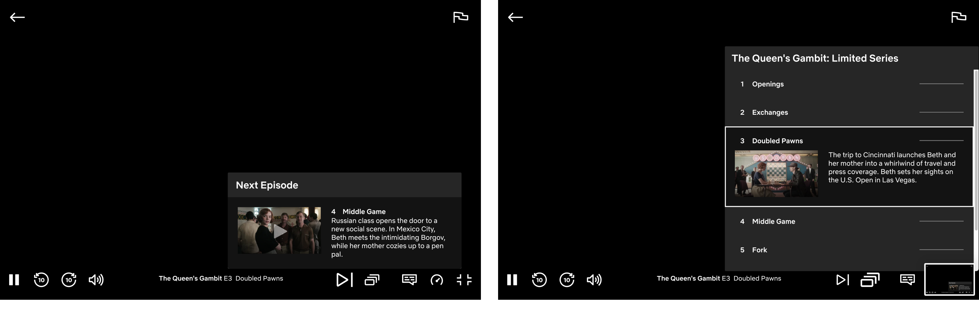
When viewing chronological listings, it is natural to look at the newest options first. However, in the case of Netflix’s season content that includes multiple episodes, the content of season 1 is shown first on the detail page. Some of the content is less attractive because season 1 was released a very long ago. I suggest showing the latest season first, and it will contribute to inducing content viewing.