Almost all modern day customer experiences are integrated with digital infrastructures to support user’s convenience. Today, movie theaters commonly offer web application services where users can purchase movie tickets ahead of time. The Regal mobile app, similarly enables users to find showtimes and buy movie tickets online at a Regal cinema hall nearby. This article aims to critique the effectiveness of the certain UI features of the Regal App (IOS version) using the theories and principles set forth in Don Norman’s Design of Everyday Things.
- Purchasing a Ticket
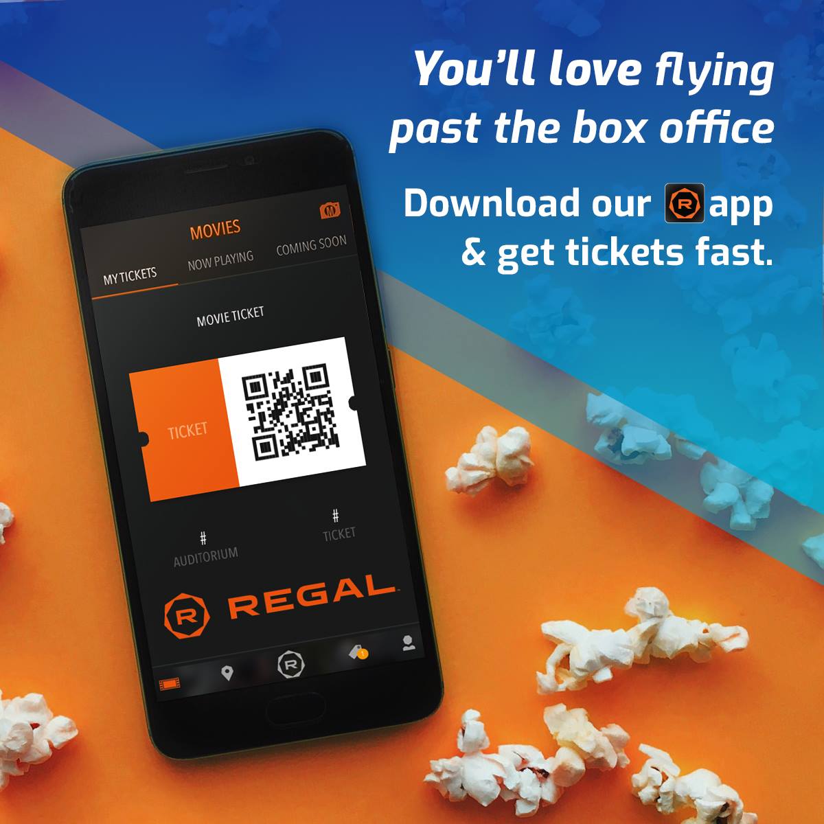
Purchasing movie tickets online is the primary affordance served by the Regal App. The app is easily discoverable on App Store and its understandability is reinforced by users’ conceptual models of being familiar with completing the task of purchasing tickets for events and exhibitions online.
Upon opening the app, the homescreen displays the “Now Playing” tab as the default landing page showcasing a list of movies currently being screened which can be browsed using scroll. Alongside, users can find the ‘Coming Soon’ and ‘My purchases’ tabs ensuring the other two immediate needs of the user to plan and discover future choices as well as track previous interactions. This presents a seamless mapping of prioritized user needs contextualized by the factor of time.
Users can discover movies using their names (labels), images of the still from the movie or posters, a brief synopsis supported by showtime and location of screening as the performing signifiers. The process of selecting date/day, time, location and seats is direct and standardized. However, users might face constraints while selecting the location as they have to scroll and scan through a rather text-heavy, stacked list of addresses of the Regal Cinemas center in their locality to select a preferred location. Non-resident users who are not familiar with all addresses might face frustration here.
The interface is inclusive of users with disabilities by helping them locate accessibility-oriented facilities using icons. The ‘zoom-in’ feature allows users to comfortably access information such as seat numbers and prevent slip errors by compensating for the constraint of a smaller screen in the mobile version.
Solution
To resolve the issue of text-heavy information and multiple ‘call-to-actions’ saturated in one screen, the task of selecting date, showtime and location of screening can be broken down into 2 subtasks :
A. select time and date.
B. select screening center
Furthermore for task B, a GPS system such as Google maps can be integrated into this step so that users can effectively choose and locate their preferred location for better discoverability.
2. Moviebill
The Regal App integrates Moviebill powered AR experiences for latest films for users to download digital collectibles of blockbuster movies and streaming entertainment. Although this marketing feature aims to engage audiences through latest technology in the entertainment industry, it introduces new users to the Moviebill experience. The poor communication begins with an illegible icon of the Moviebill logo, having been shrunk and placed in the top right corner of the homescreen. Upon clicking the icon, users escape the existing interface of the Regal app and are immediately prompted to a sign up/in screen to download the collectible tickets.
This serves as a classic example of Featuritis where the Regal app fails to drive existing user traffic to the Moviebill experience without easing the user through their visceral, behavioral and reflective levels of processing information due to inadequate provision of information. In fact, an immediate ‘call to action’ requiring users to opt into a digital contract might challenge their conceptual models and cause them to drop out.
The affordance of such a feature with the potential to induct users into emerging technologies is compromised by the sheer lack of human-centered design communication.
Solution
To effectively sensitize users to the AR technologies offered by Moviebill, the UI design of Regal app should consider the following before prompting users to sign in or register:
- Improve visibility of the icon by substituting it with a banner with a tagline to generate user interest and curiosity.
- The Moviebill screen should be presented within the existing Regal app interface so that users’ conceptual models remain at ease.
- The Moviebill experience should begin with an introduction of AR collectibles and how they can be used.