Splitwise is an expense-splitting application that can record expenses and share them with friends or groups. This display is unambiguous in the way it shows who should pay and what amount is due. This design critique focuses on the iOS applications using Don Norman’s principle and concepts from his book “The Design of Everything Things.”
Homepage:
Splitwise adheres to most of the principles of design. There is clear discoverability and useful signifiers besides the feedback that action has been done. It demonstrates the three labels including what you owe, what you are owed, and the total balance, enabling the user to keep track of shared expenses. A straightforward “+” in an emerald green button indicates the addition of an expenditure but without giving any instructions. As per Norman (2013) inclusion of greater basics for information like Friends, Groups, Activity and Account icons would enhance the scope and functionality of the design feature of the app to display their name labels beside the “+” button at the bottom of the User Interface Design. The labels are facilitating what a person wants to do and how it needs too be done. This app shows the user that whatever was required has been done.
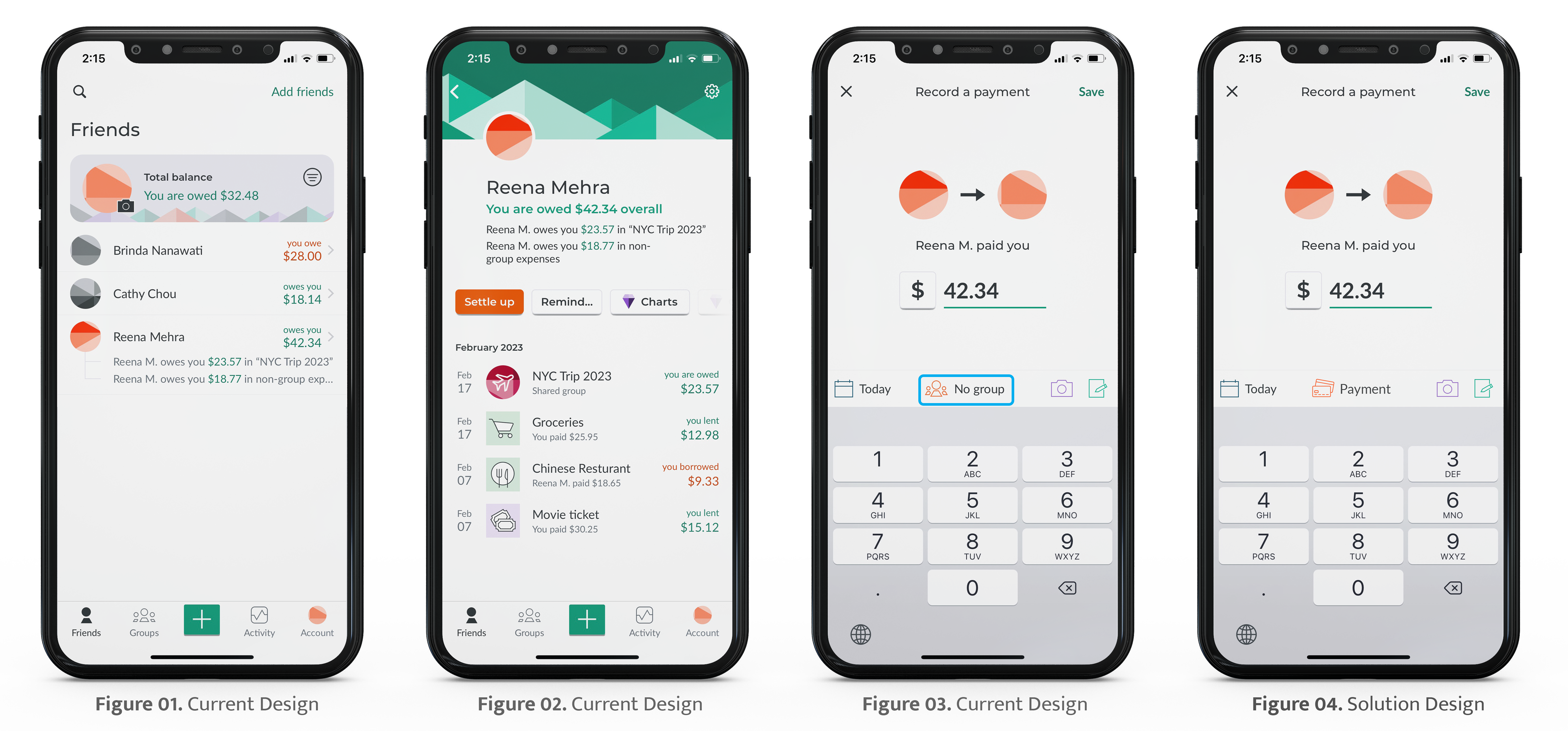
The user wants to pay what is owed, but can’t do so from this app. The user will have to use another money transfer app, such as Venmo to pay. Then, they have to return to Splitwise to record a payment (Figure 03), which takes some time (Figure 01 and Figure 02). This app does not provide the payment feature to the user. As per Norman’s principles (2013), this constitutes lapse in a gulf of execution and constitutes an incoherent system image when the payment happens. The user wastes his time and effort in two applications. Aligning with the discoverable principle of Norman, one would expect to see both wallet/payment options to be on the same page but it is missing. The “No group” option (Figure 03) is confusing and not a conceptual model, because the user is having both an individual and NYC trip group with the owner, so the labels seem meaningless.
The solution of this issue (Figure 4) is providing the feedback by removing “No group” and adding the wallet or payment option. This will allow the user to save his time instead of using two applications. Norman (2013) describes it as “some way of letting you know that the system is working on your request.” He states that feedback must be immediate, informative, discreetly planned and prioritized.
Organize and Group expense of the people:
Splitwise’s group expense section is aimed to help the user to share, organize, and structure expense debt with friends, roommates, and groups without using a calculator so it simplifies discoverability of the debts.
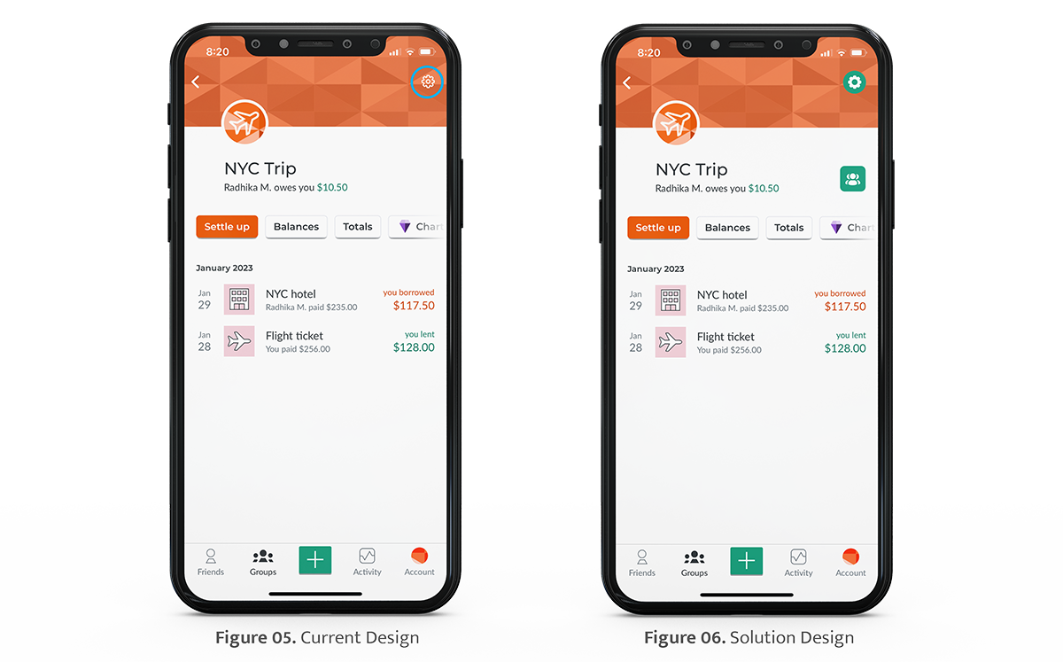
As the lists of people are missing on the menu, the app is lacking in clear discoverable and useful signifiers. This issue is inconvenient to the user because they now need to find out if people have been added or deleted to the existing list in this group section. It can detract from the user’s behavioral level of processing in a design process as the user may feel lost and confused when looking for the list of people in this section. After a few clicks later, the list of people is found under the settings icon, which itself does not have good visibility on the orange vector banner (Figure 05). Norman (2013) states that the behavioral level manages the execution of previously learned activities. All actions have expectations, and Norman believes that this is the most significant component of the behavioral level.
The solution of this issue (Figure 06) is to add a visible people list button. Another visibility issue, the setting button, can be a filled button in order to which contrast with the orange vector banner.
Friend’s record shared expense:
Splitwise’s friend’s record of shared expense is launched by clicking a name, “Reena Mehra,” and shows the list of the receipts which is shared and paid from the individual or those in the group. This screen is very convenient and has precise constraints and conceptual model, which clearly signifies what is lent and owed.
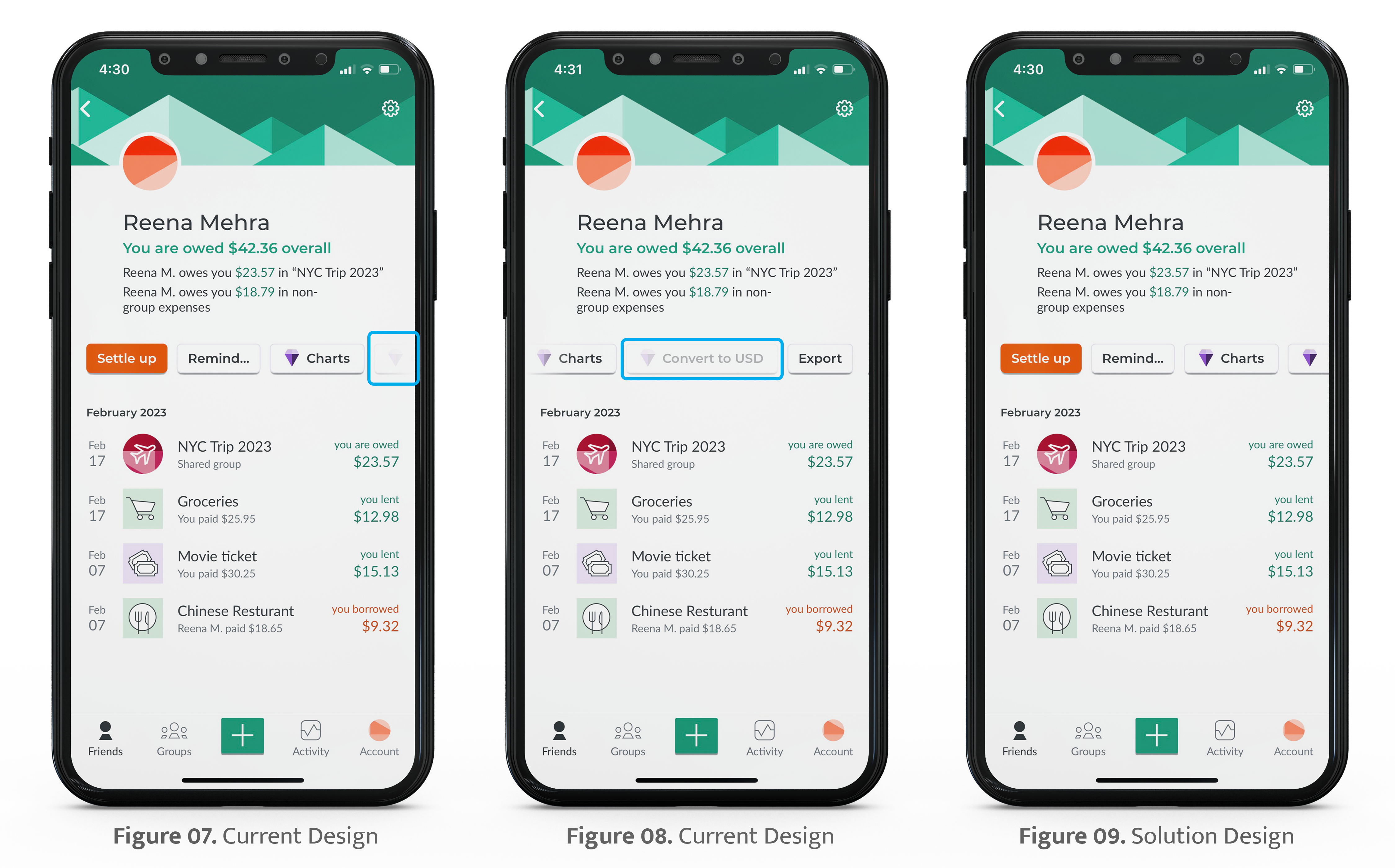
The last button is invisible at the end on the right side of the display, and it is unclear if there are more buttons. It does not provide clear feedback conveying the outcome of user action if this area box is scrolled horizontally by human accident. (Figure 07). Also “Chart” and “Convert to USD” are provided by Splitwise Pro version only, which shows up when choosing Charts, but Convert to USD is grayed out and not functioning in the same way. It shows no consistent conceptual model (Figure 08).
“When people err, change the system so that type of error will be reduced or eliminated. When complete elimination is not possible, redesign to reduce the impact.” (Norman, 2013)
This issue should be easily resolved by making a detectable Convert to USD button, which when clicked shows the same feedback about requiring the Splitwise Pro version, and shows the user where they can afford to click (Figure 09).
Conclusion:
Overall, Splitwise enables the successful sharing of group expenses without using a calculator or being obsessed with how to handle expenses. It features a minimal and sleek user friendly interface designed with the simplicity of navigators except some navigators which are lacking in discoverability and signifiers. Moreover, the design provides enough information in this application to assist the user reduce confusion. With a few changes, the app can definitely get more user friendly.
Reference:
Norman, D. (2013). The Design of Everyday Things: Revised and Expanded Edition. Basic Books.