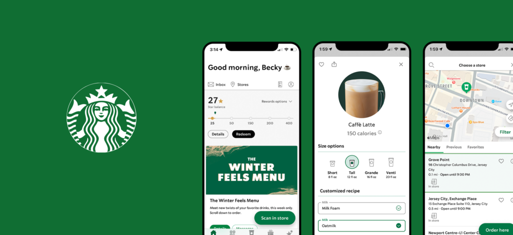
Starbucks APP provides users with the functions of online ordering, rewards earning, and mobile payment. Their goal is to decrease customers’ waiting time for coffee and offer them a sense of intimacy through the APP. To encourage users to use the APP, Starbucks conducts a business strategy that customers can earn more rewards if they order on the APP.
Home Page
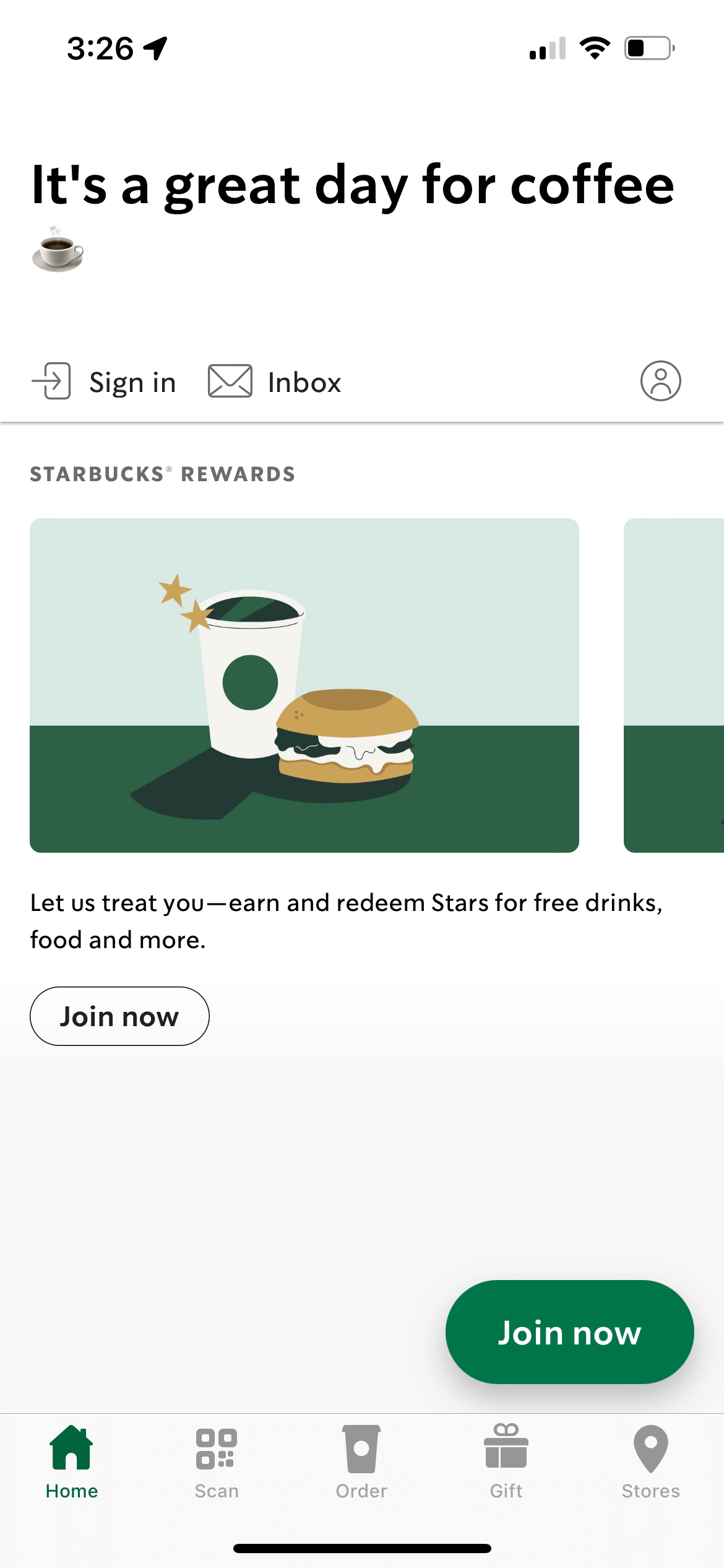
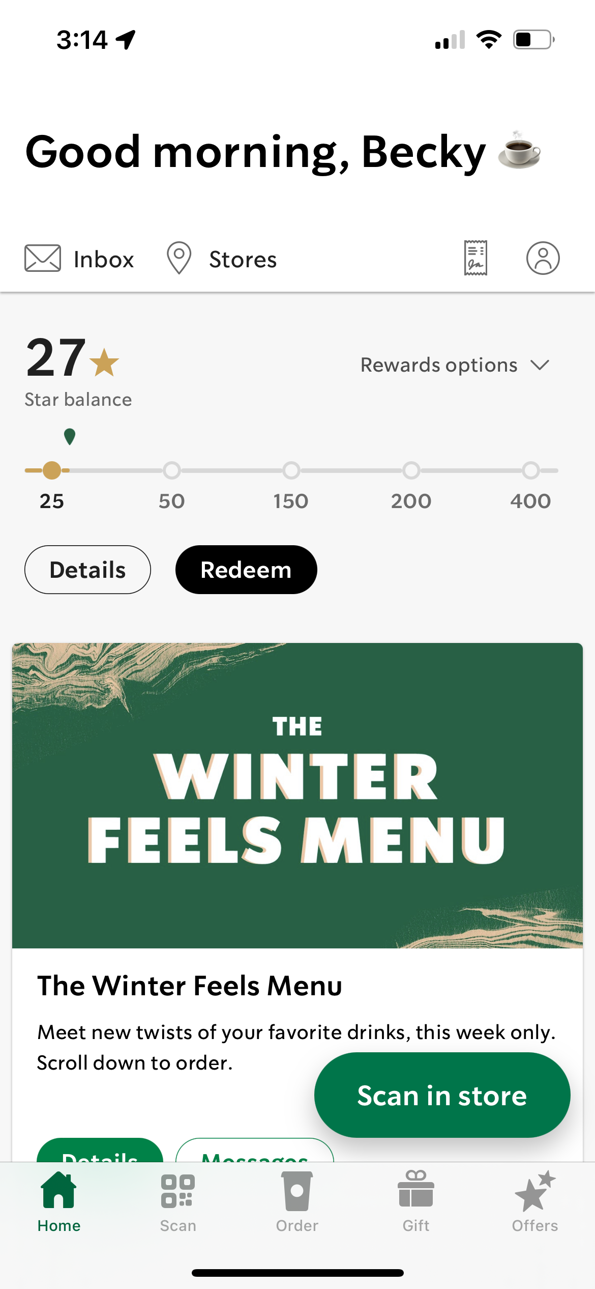
These are the home pages that users first located, figure 1-A is the page without sign in and figure 1-B is for those who have already signed in before. The floating buttons of “Join now” and “Scan in store” provide affordance of the main actions. On this page, we can see icons such as a receipt, cup, and gift, which give users a conceptual model to help them predict these buttons’ functions. The title names on the tab also provide understandability for users.
Choose a store
When clicking on the order tab, users need to choose a store that they want to pick up first as a forcing function. When users click on the store, the map will show the store’s location immediately with a green cup pin as feedback, and the map’s dynamic movement between two stores provides mapping to let users better know the stores’ direction.
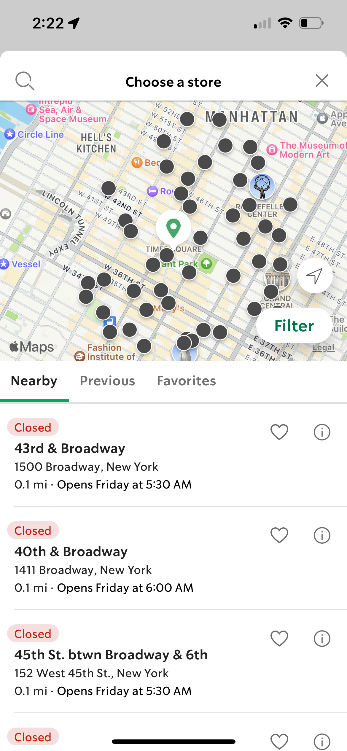
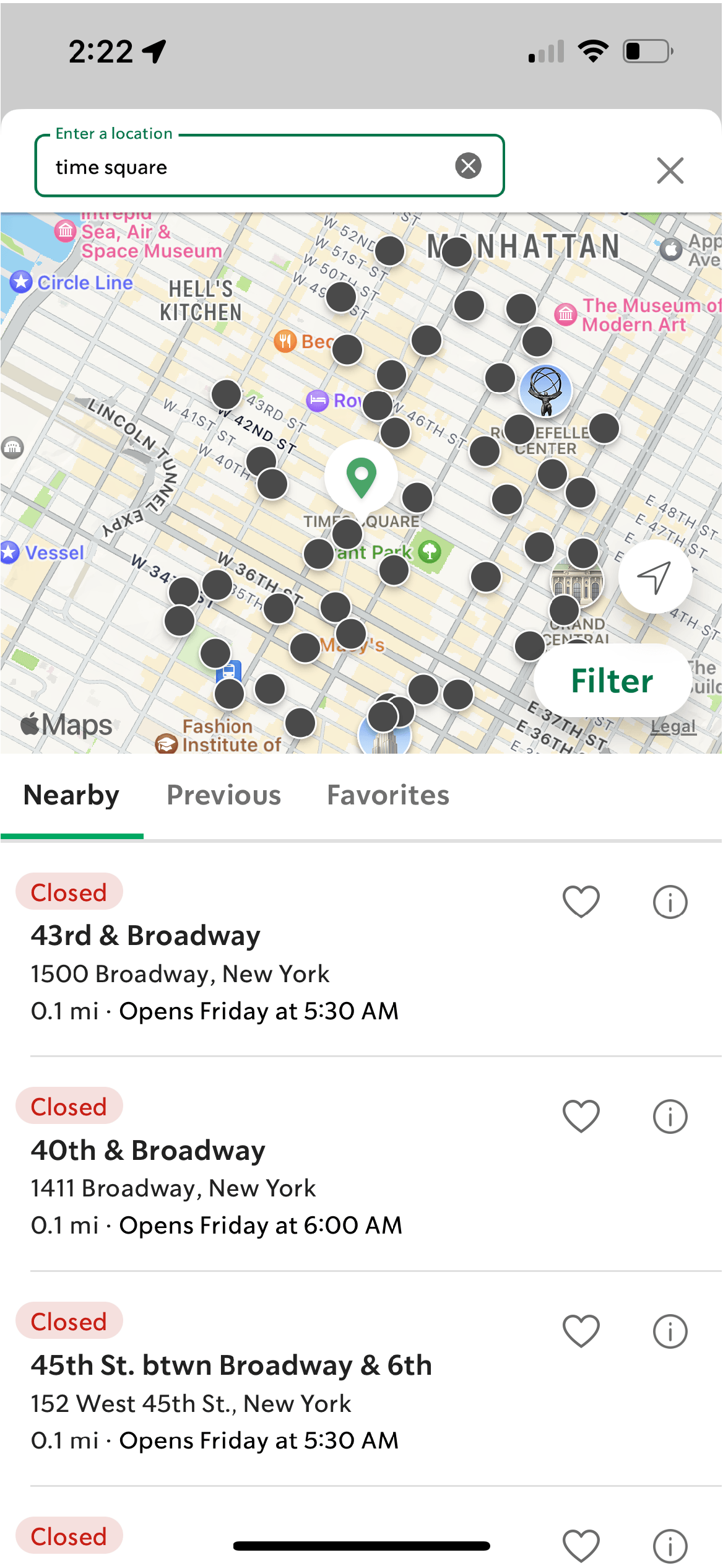
When searching stores by using the search bar, after users typing the keywords, it will show the stores which near the place users search for. However, there is a lack of affordance for users to cancel their search filters. They are forced to type another keyword for searching another area or close this page directly to start over. Therefore, I recommended putting the search bar on the same page and providing a cancel button as well, therefore keyword can be deleted directly, and it can provide Nielsen’s usability heuristics “user control and freedom” to help users exit and continue their actions.
Order Your Drink
After users choose a store to pick up, they will lead to the menu page to customize their drinks. We can see some sufficient feedback here: the circle background for size options and the green outline of boxes help to stand out the item that users customize.
Also, the move-in direction of the options list and the customize page, with the signifiers of arrows and exit buttons, give users a clear mapping of which page level they are located.
The last step is “add to order”, the picture of what users add will shrink into the bag icon, just like in the real world, how food is put into a bag, this interaction design provides users with the knowledge related to the real world.
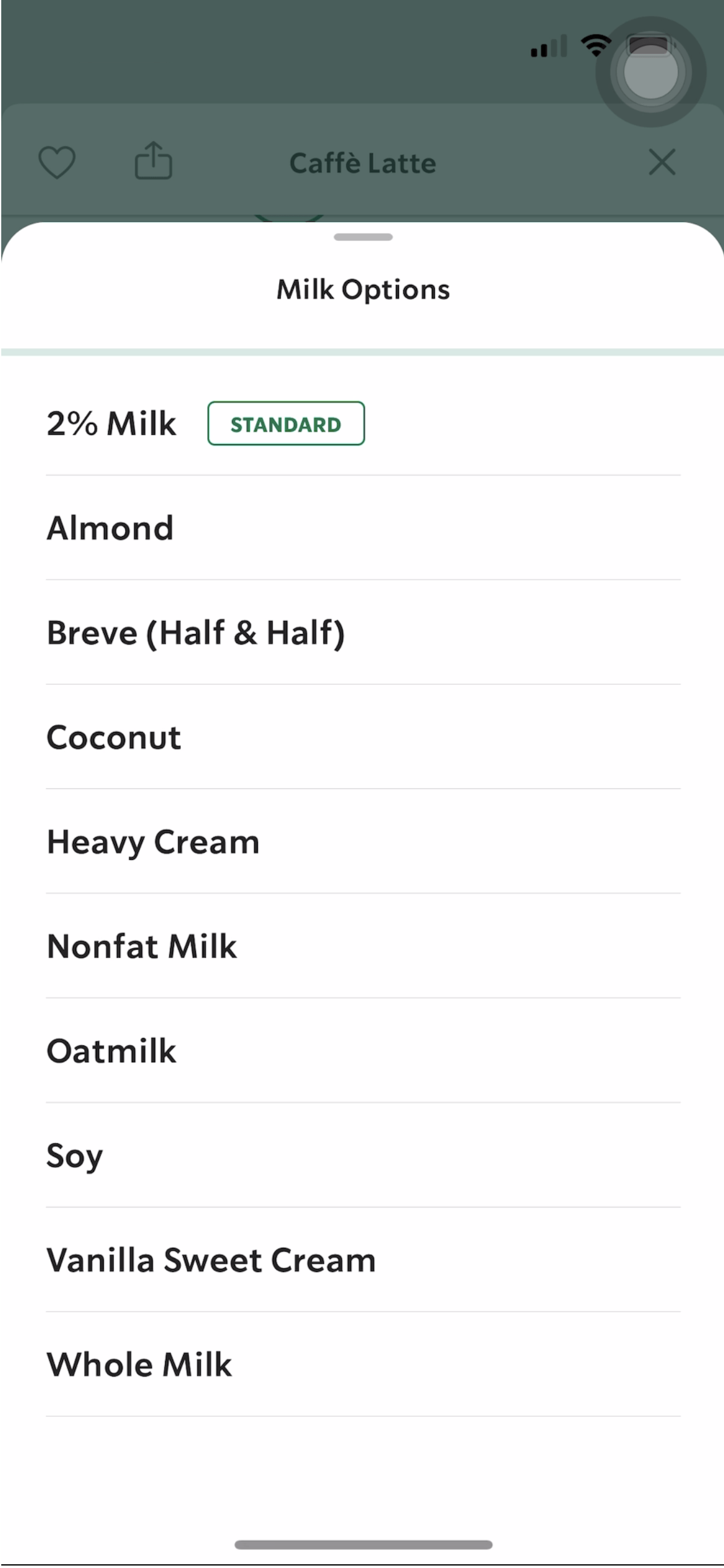
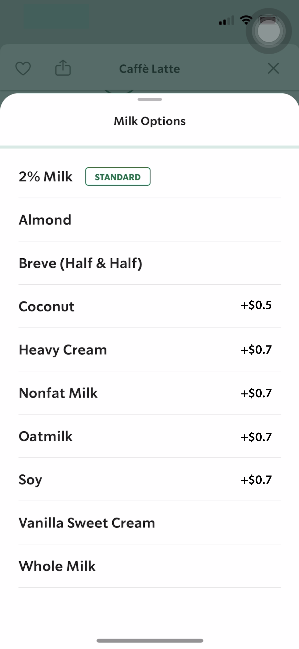
However, the additional price of customization won’t show up until users go to the checkout page, which let users feel hesitant when customizing their drinks. I recommend putting an additional fee next to the customized option. To provide users with discoverability of additional fees.
Pick Up In Store
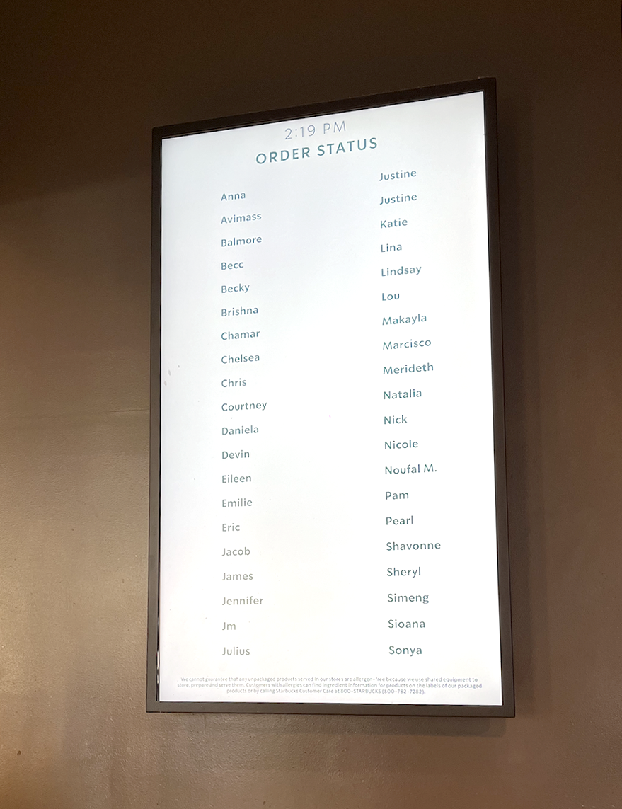
For applying ethnography, I made an order and picked it up myself. There is an electronic board next to the pick-up area. As a logical constraint, the alphabetical order of customers’ names makes customers find their names faster. However, due to cultural constraints, it will not be an advantage in Asian countries, because Chinese names are not able to arrange in order.
Conclusion
Compared to other coffee stores or fast food restaurants, Starbucks insists to call the customer by their name, letting customers avoid the memory-lapse of memorizing their order numbers and providing a sense of intimate user experience! In the market of suppliers using low-price to compete with each other, Starbucks insist on their high price, to maintain high quality of service and environment. As Norman mentioned “The best products come from ignoring these competing voices and instead focusing on the true needs of users”, I think that is the reason why Starbucks become the largest coffee chain in the world.