Introduction
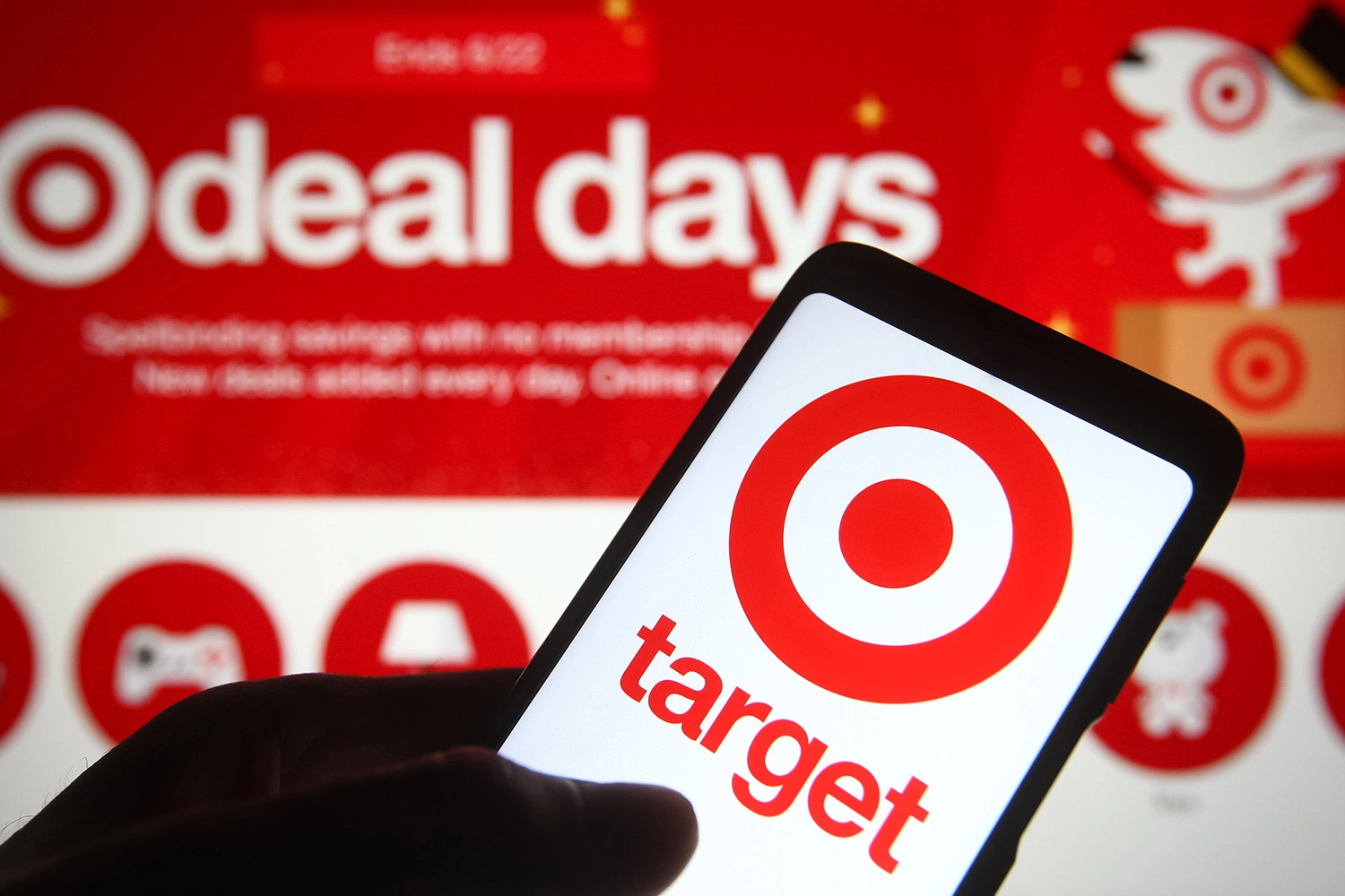
The Target app is an e-commerce site representing Target, a long-standing retail establishment based in North America. It contains features aiding both online and in-store shopping, such as order and pick-up scheduling, home delivery options, a barcode scanner and more. This post critiques the app in accordance with principles and concepts outlined in Don Norman’s ‘The Design of Everyday Things’.
Homepage
The homepage of the app caters to more urgent uses, such as finding an item at a store or scanning a barcode in its top portion. All options are signified by icons colored in high contrast to the background, each of which afford a shift to the corresponding page within the website (Figure 1).
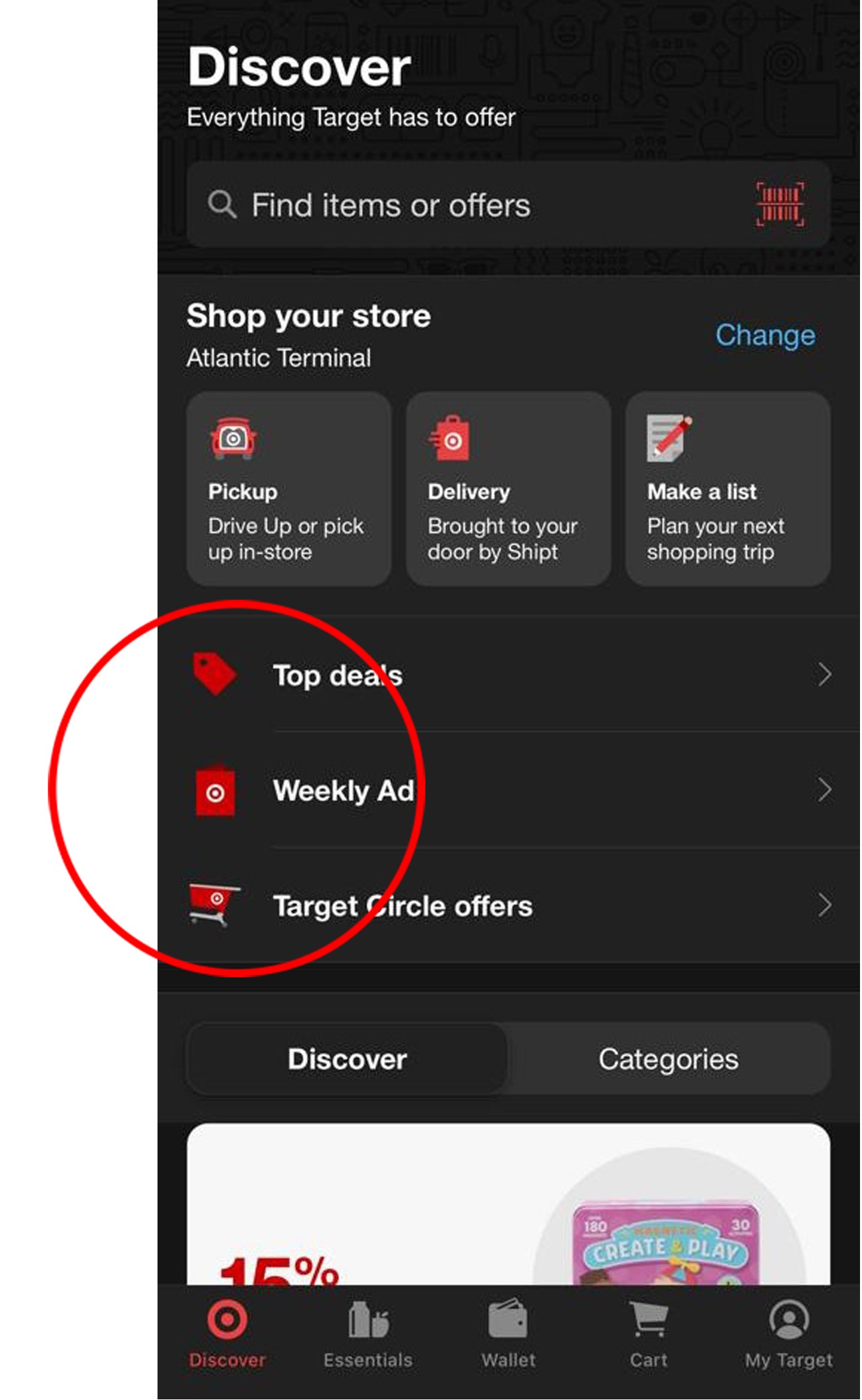
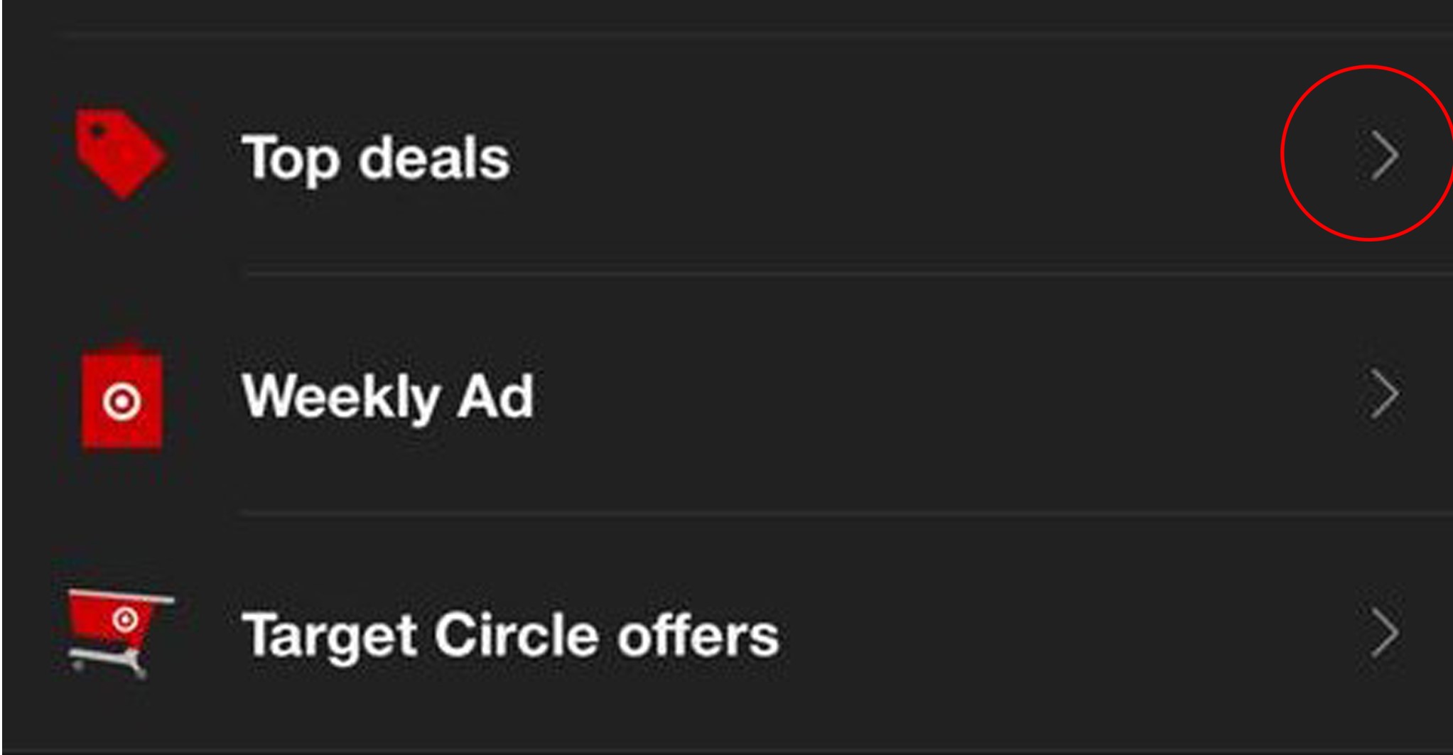
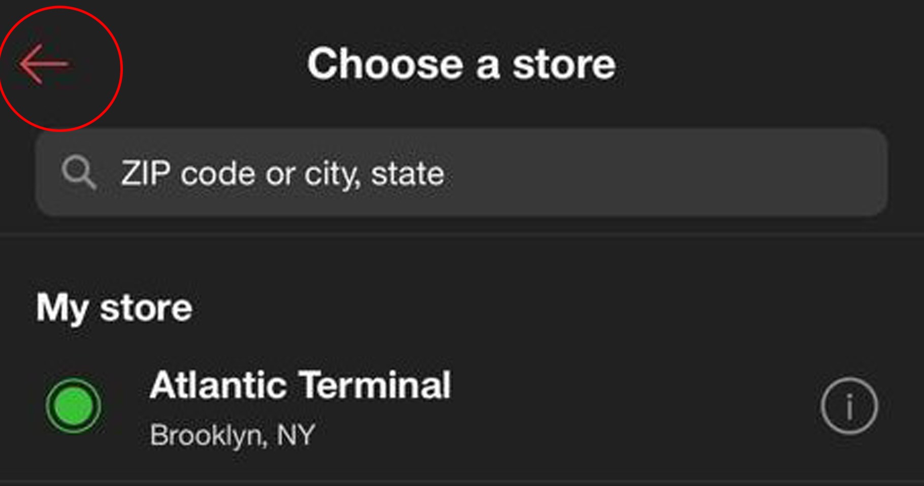
The arrows on each of the options, facing the right, signify their affordance to lead further into the site and are consistent with natural mapping (Figure 2). Similarly, the arrow on the top left of the page navigated to, facing the left, signifies its affordance to go back to the previous page, another element following natural mapping (Figure 3).
Both arrows are colored in contrast to the background, making them discoverable. However, blocks of information in the Discover page below have no signifiers to indicate their affordance to move to other pages (Figure 4). These utilize the conceptual model of the app formed by users, involving knowledge-in-world to understand that they must be clicked to be expanded further.
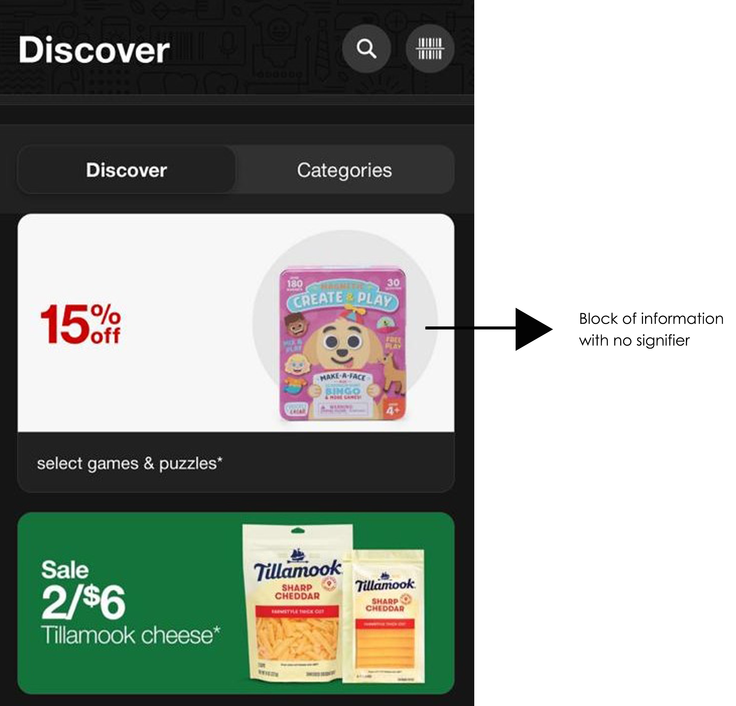
Arrows like the ones shown in Figure 2 and Figure 3 would be a good option to signify the affordance of these sections to act as a shortcut to access more information.
Scanning barcodes / finding items
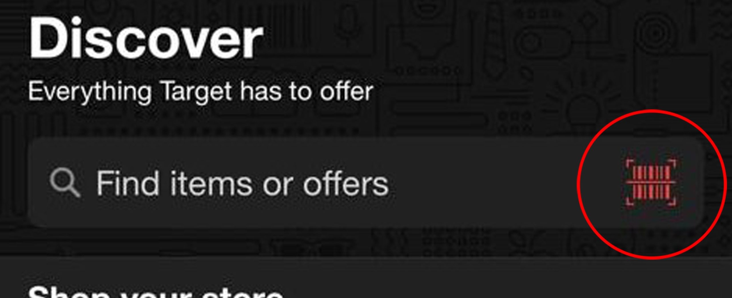
The search bar at the top of the homepage hosts icons that signify different functions. The icon at the right end of the search bar signifies its affordance to open the barcode scanner, which appears as immediate feedback when the icon is touched (Figure 5). This icon is bright red, making it immediately discoverable.
Similarly, the search bar itself signifies that it can afford text input through a written explanation, and display results. Typing in characters into the search bar triggers immediate feedback both in terms of the letters appearing on the screen and the predictions that pop up below. The search function has two search categories, ‘Items’ and ‘Target circle’, signified by an element highlighting the category currently displaying results (Figure 6). This highlight is created by a difference in shade and addition of depth to the part of the element containing the current category, which could help users avoid mode-error slips while using the website. However, the elements containing both the current category and the remaining category are colored in shades of the same color, which may make it less discoverable or visible for people with vision difficulties.
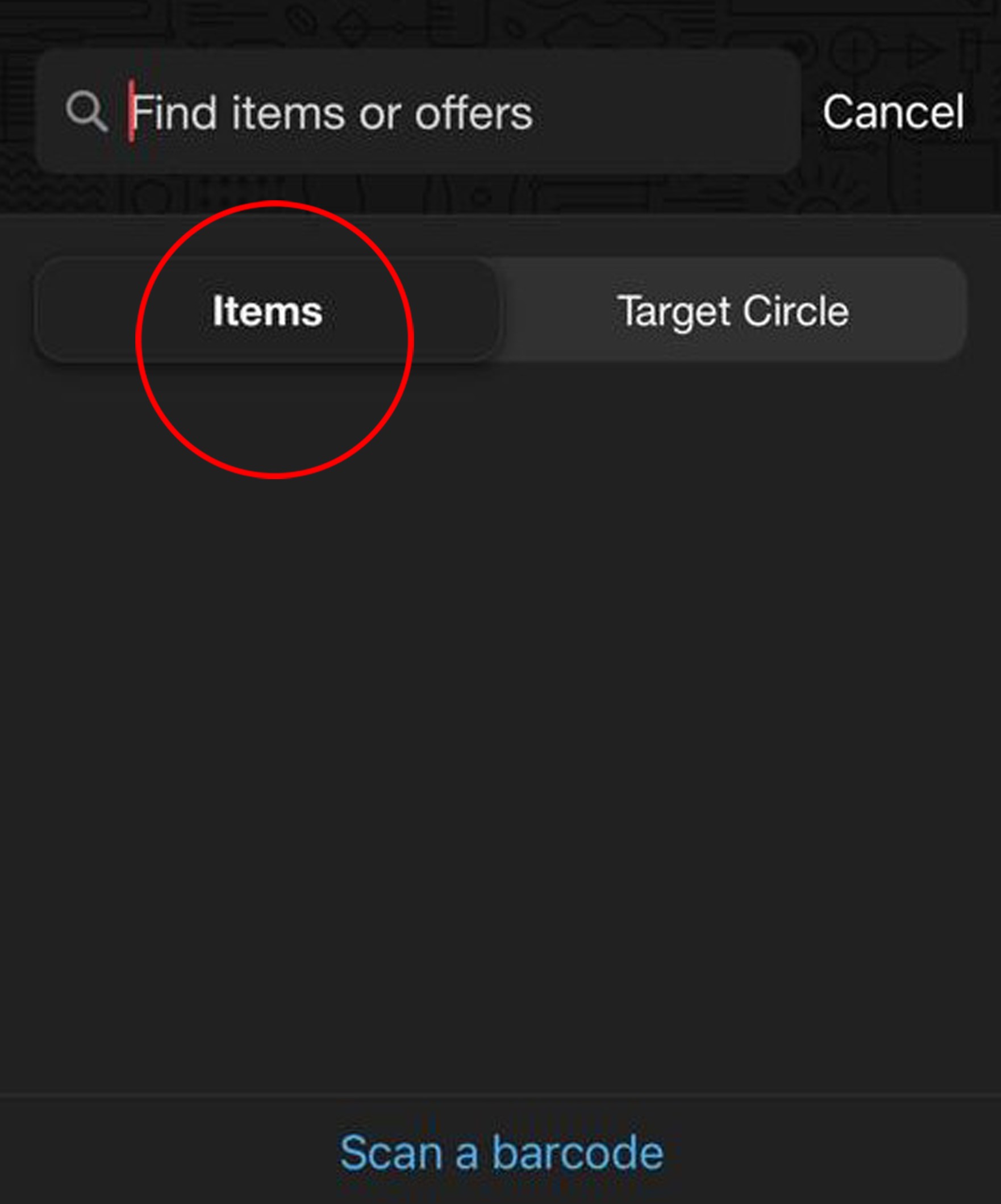
This could be remedied by using a brighter color, perhaps red (since red is associated with Target’s brand), to always make it noticeable.
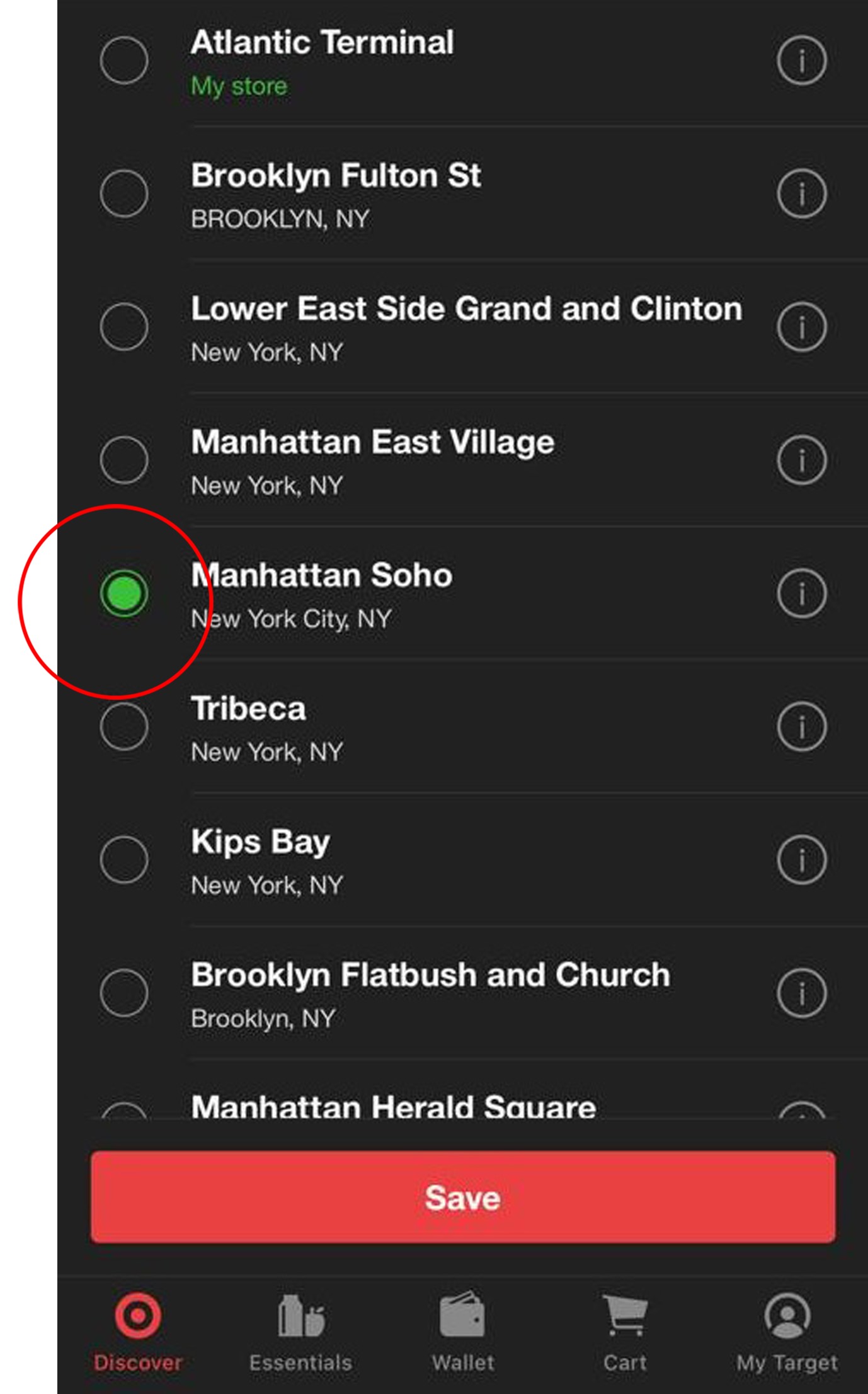
Locating stores
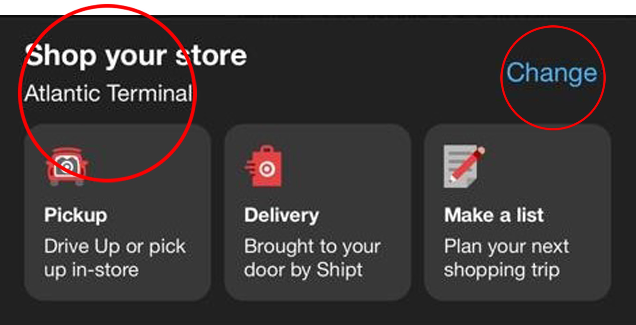
The store in the location selected as the user’s most convenient location is displayed at all times under Find a Store and is easily discoverable (Figure 7). The ‘Change’ option is also discoverable due to its size and font color, which is different from the selected store name as well as surrounding font colors (Figure 7). The option signifies its affordance that enables the user to change their selected store.
A search bar similar to that on the homepage appears as feedback when the ‘Change’ option is touched, with store locations in and around the area corresponding to the zip code entered appearing as feedback. The current selected store name has a circle filled with green on its left as a bullet point signifying its selection, while all other options have empty circles as bullet points that fill up with green when selected, providing instant and discoverable feedback (Figure 8). An attempt to prevent mode-error slips is evident here as well, with the words ‘My Store’ appearing below the previously selected store until a new selection has been saved.
Conclusion
Overall, the app is adequately usable due to its signifiers for most functions, incorporation of discoverable elements and consistency with natural mapping, within the sections explored in this post. However, it does have some room for improvement in certain minor areas.