TikTok is the most popular social media app that allows users to post, edit, like and share short videos on the platform. It has been downloaded over 2 million times globally. TikTok use personalized algorithms and clear, minimalist layout let users spend time on it. This article will critique the TikTok app by Don Norman’s book – The Design of Everyday things.
1. Home Page
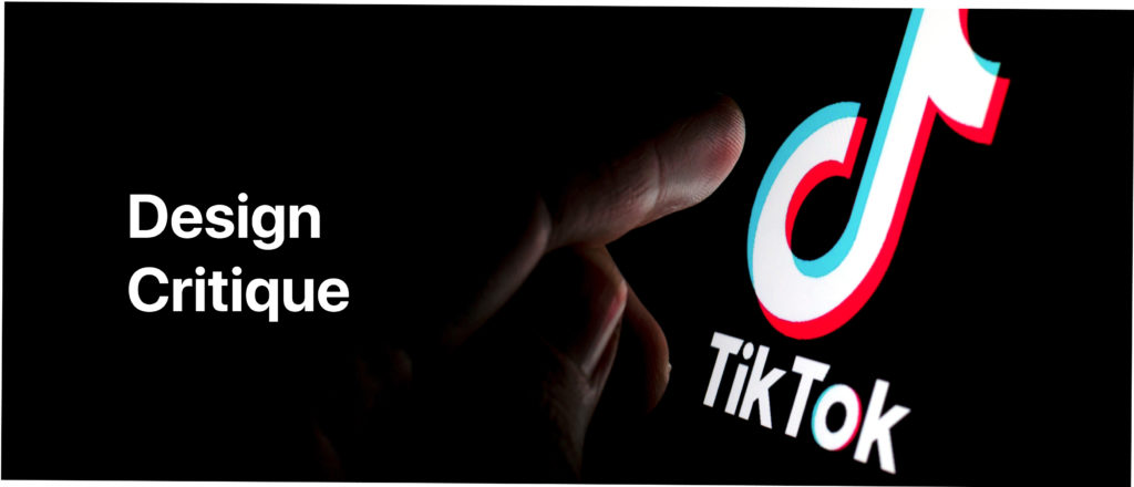
When a user first downloads the TikTok app, they can click and like the profile immediately, giving the user feedback about how much you like the video. The application gives user feedback very responsibly, even the first time user can easily understand. But there are lack of signifiers on the home screen. Users have no idea what will happen if they swipe the screen to the right, they should get more arrows and icons to indicate what will happen when a new user first time login to the app.
Solution:
TikTok could provide essential signifiers to give TikTok users a clue of how to use the app, Make some icons leads the first time users to play the app, pop up a sign if they swipe left/right, and let them know that users can review the author’s profile when they swipe to the right.
2. Profile Page
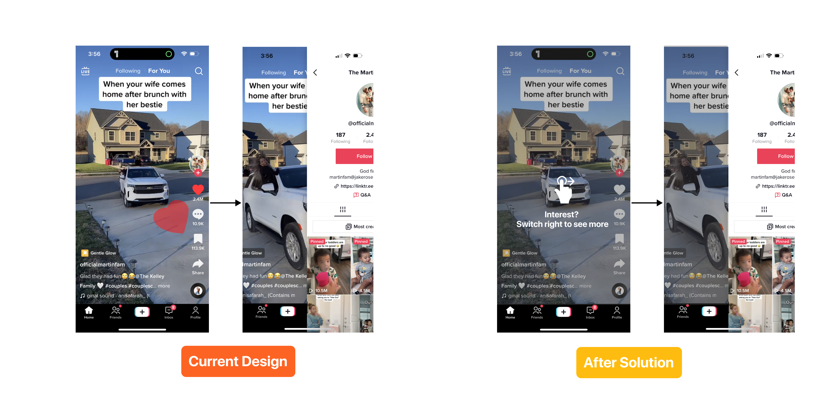
There are navigation bars that help users switch different screen features, and provide a natural mapping. Let the user easily find the profile page. If a user wants to change their profile photos, it is pretty easy to find because the navigation bar has a profile icon and word and a typical knowledge for users who use the social media app for a long time. Once the user clicks in to edit the profile. There will appear two types of profile image changing. On the left side is to change the photo, on the right side is to change video. The mapping goes wrong here, these two types of profile change will make it complicated for the user and curious, because the knowledge in mind taught users that changing video will switch photo to video, once they click on change videos, it’s inefficient they cannot go back to photo for profile. There’s no user feedback once they change the photo/ video, User did not perceive the systems feedback, nothing about what user should do next.
Solution:
In this case, to fix the mapping, I will suggest to make a pop up sign “Do you want to change to video profile?” and there is a click box wherever the user wants a video profile or picture profile. So users would not get confused, they will get feedback after they click the decision, the screen will display a small pop up message at the center of the screen to confirm it was successfully processed.
3. Following Page
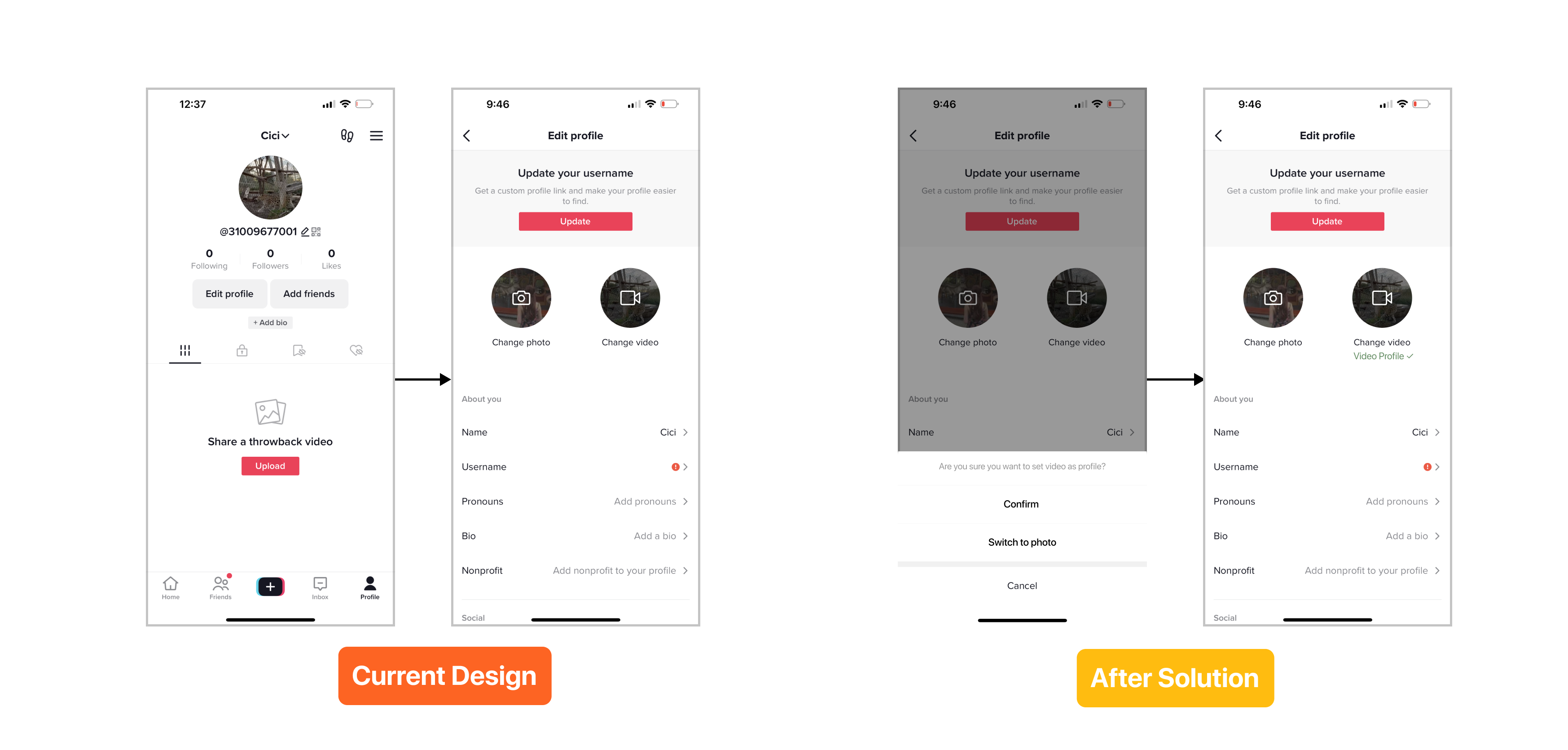
The Following page discoverability, they give users an idea about potential trending creators they might be interested in. It shows different slides, it is possible for users to determine which action to click through next. The interface is functional. Users can see the next trending creators when they swipe, three pages are visible in the limited screen space; additionally users don’t need extra to click in the authors detail page to follow the user and the background video give the user insight, a simply sufficient knowledge to distinguish different types of creators (such as fashion & beauty creators, fitness & health creator.. etc), the logical constraints are help guiding behavior, by using transparent page beside, users can easily conclude what actions they can do. But in this case, the problem is it is ineffective for users to see multiple creators at the samething, it will be a waste of time for users, they usually lose interest after they scroll past a few creators.
Solution:
In this case, by showing more creators for the first time user, we can show two sides, Pinterest style, showing creators page, it will show more content than before and also it will effectively save users time and their experience through TikTok app.